|
| Group |
Round |
C/R |
Comment |
Date |
Image |
| 52 |
Jun 17 |
Comment |
Also, I took a second look, and I do believe it was my monitor that made it look hazy. I use a high-quality one for my image work, but you know....you take what you can get when you can't get to your own devices! Sorry!!!! |
Jun 26th |
| 52 |
Jun 17 |
Comment |
Also, I took a second look, and I do believe it was my monitor that made it look hazy. I use a high-quality one for my image work, but you know....you take what you can get when you can't get to your own devices! Sorry!!!! |
Jun 26th |
| 52 |
Jun 17 |
Comment |
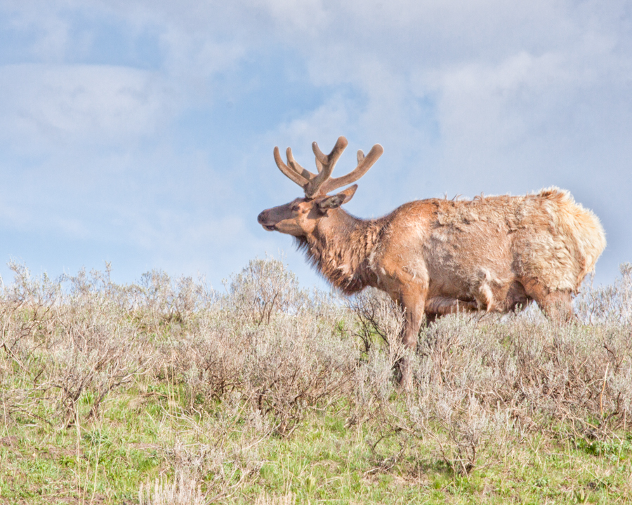
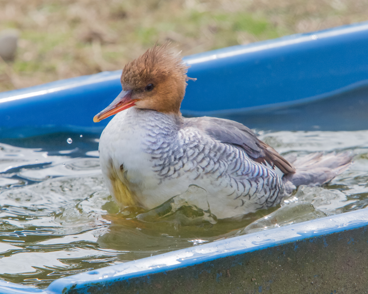
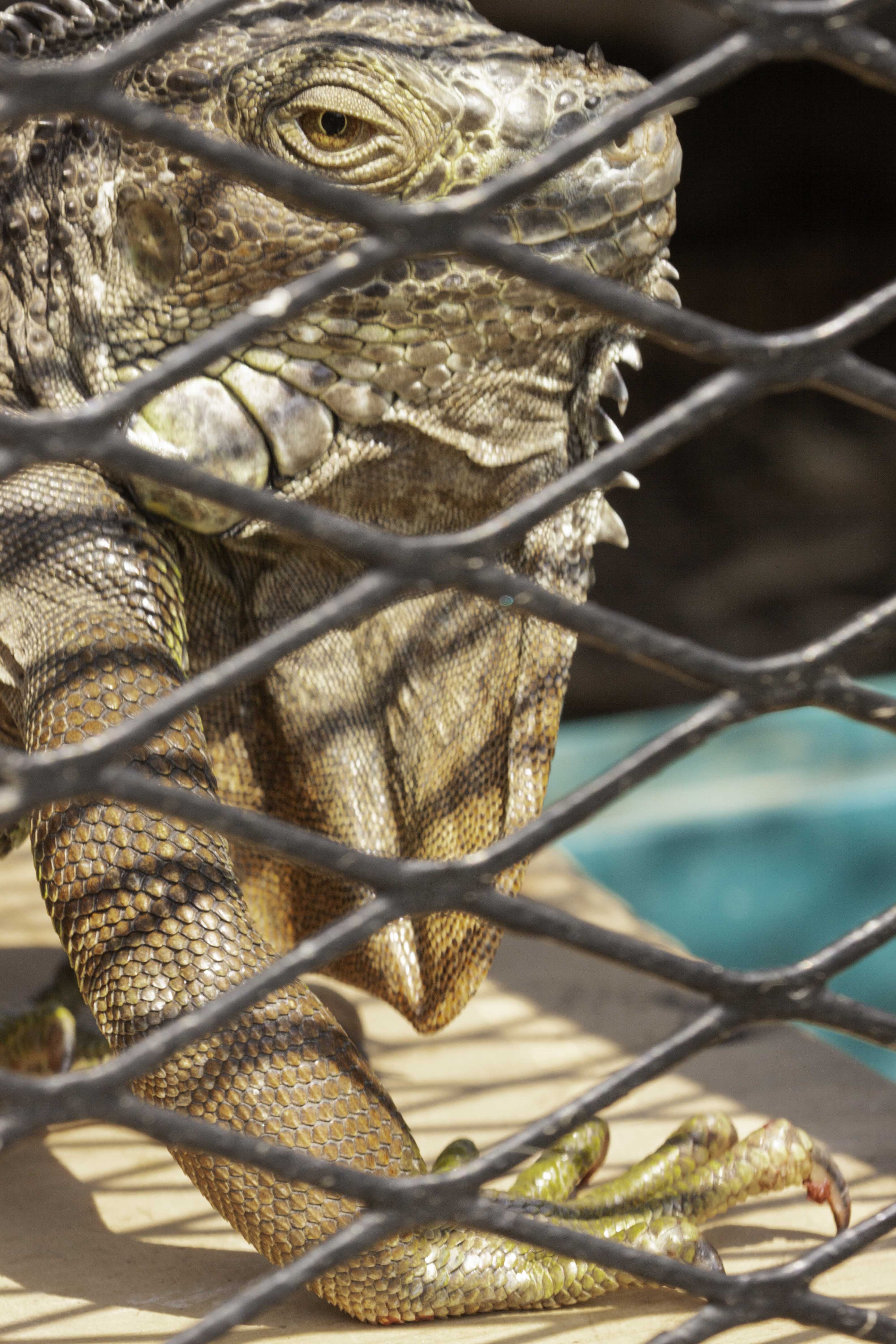
Oh, that makes sense! I got the impression that it was standing still. That answers my question! Thanks, John!
|
Jun 26th |
| 52 |
Jun 17 |
Comment |
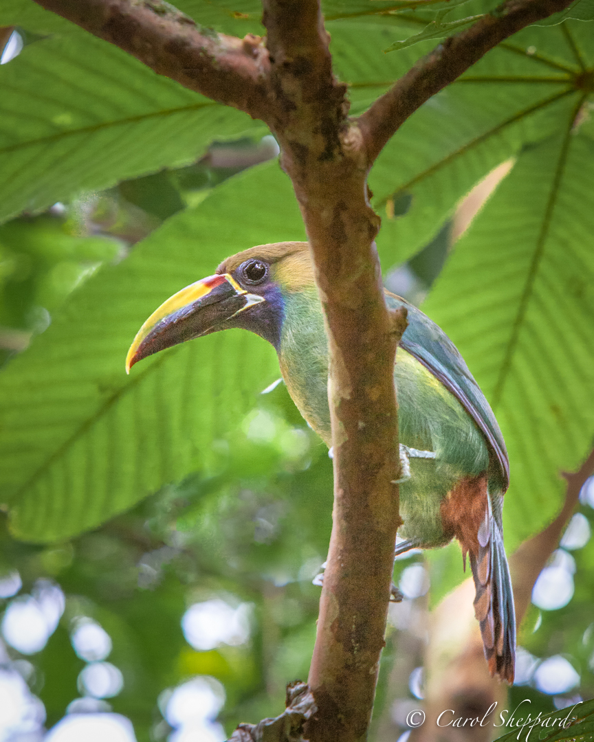
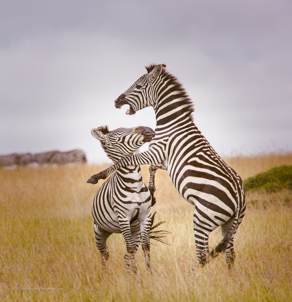
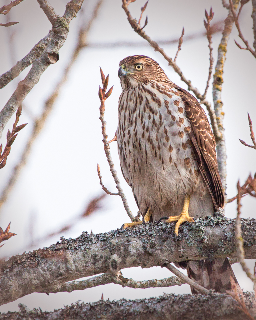
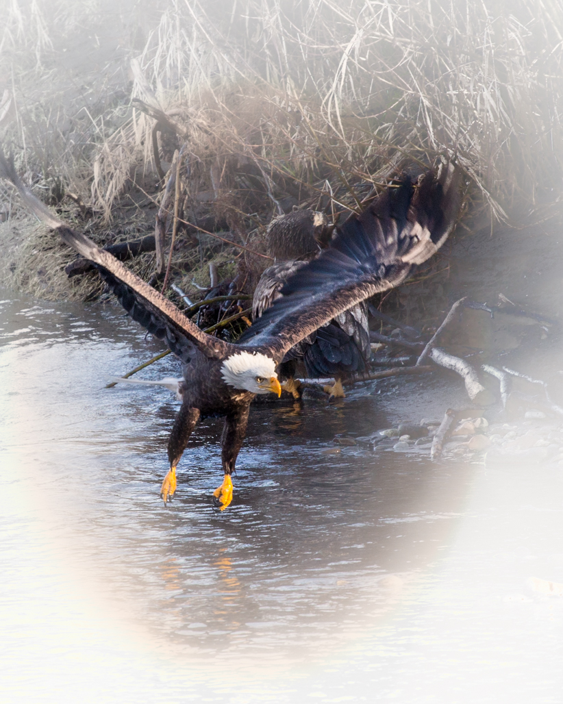
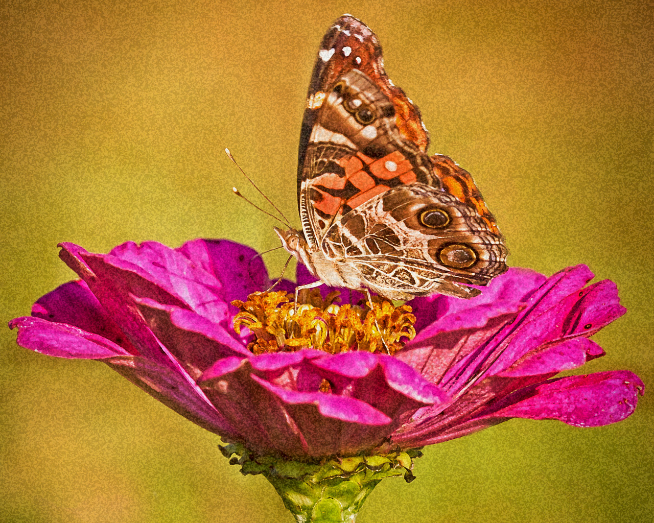
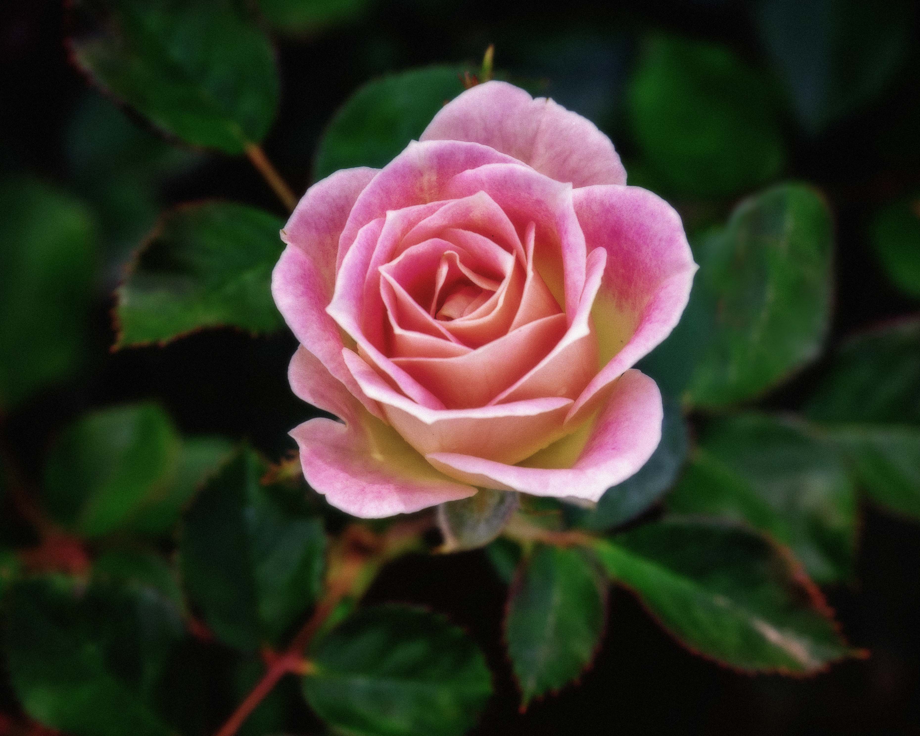
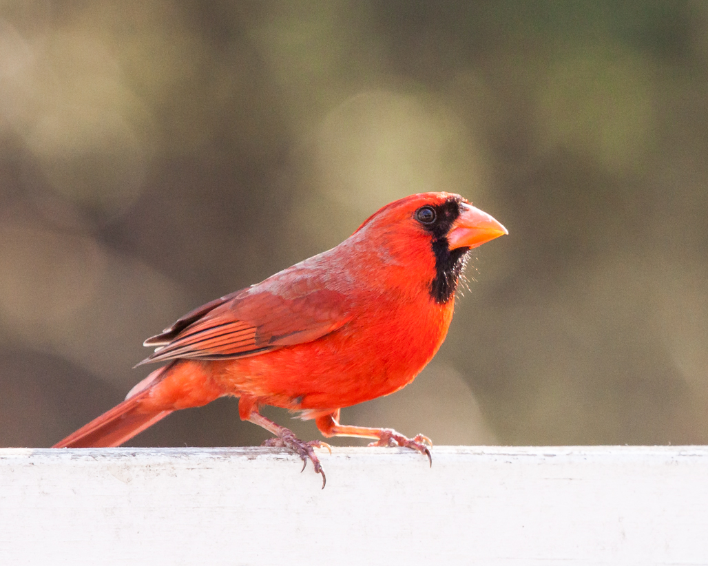
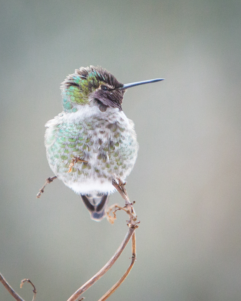
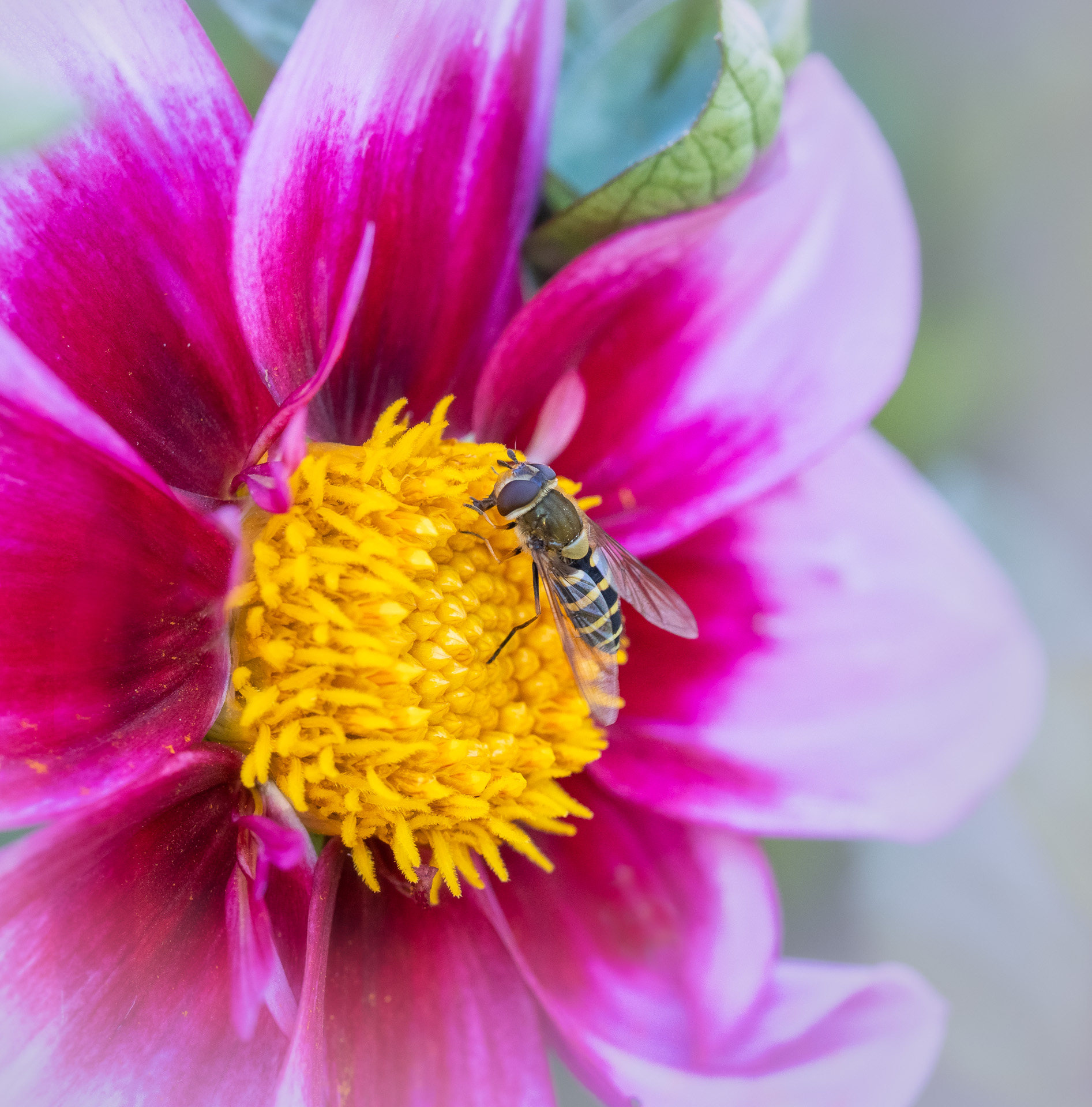
Mike, your images always remind me of the possibilities with patience! I love this image. I would not change anything, including the brightness of the image and the contrast level between bird and background. The softness of your background works phenominally well against the sharpness and texture of your bird and your post. My eye was drawn immediately to both the bird and the post--which together tell the story. Without the post, it's a different story. I would leave it exactly as is! Another competition-worthy image!
|
Jun 26th |
| 52 |
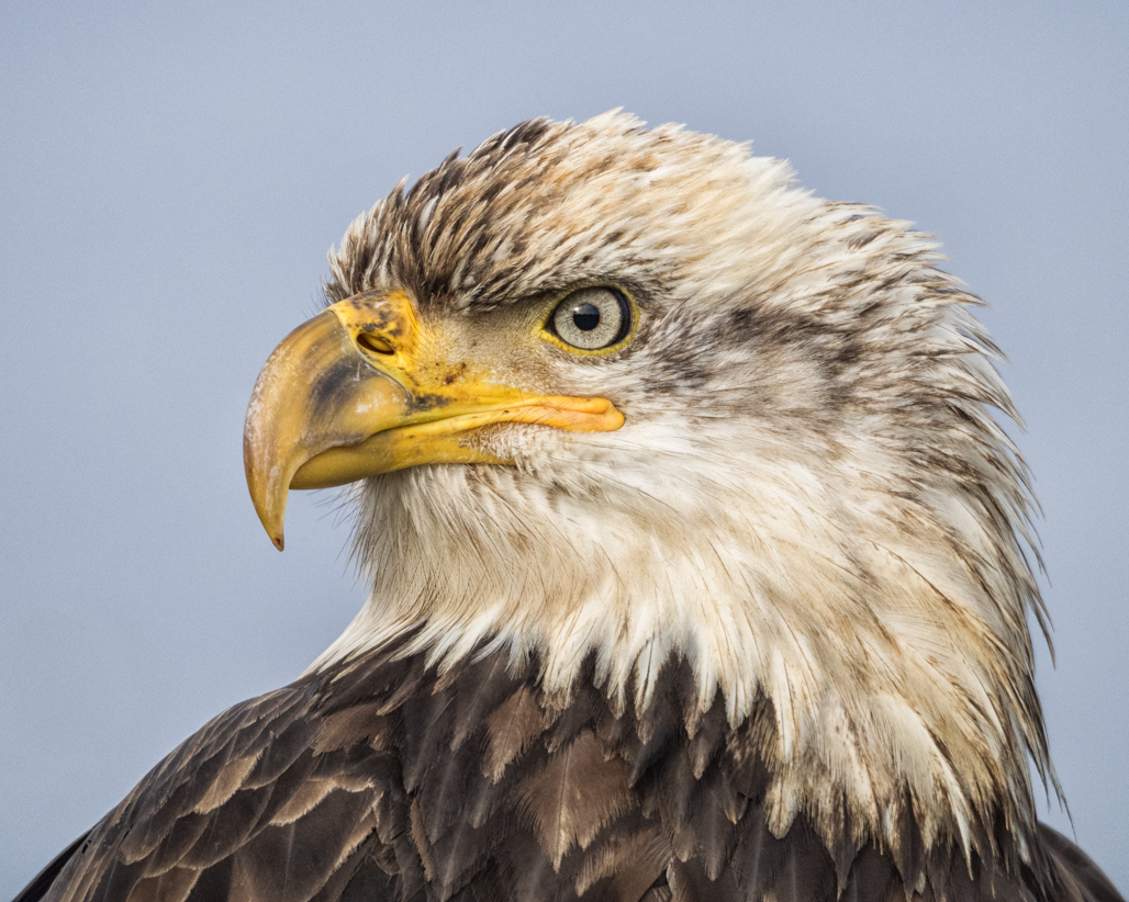
Jun 17 |
Comment |
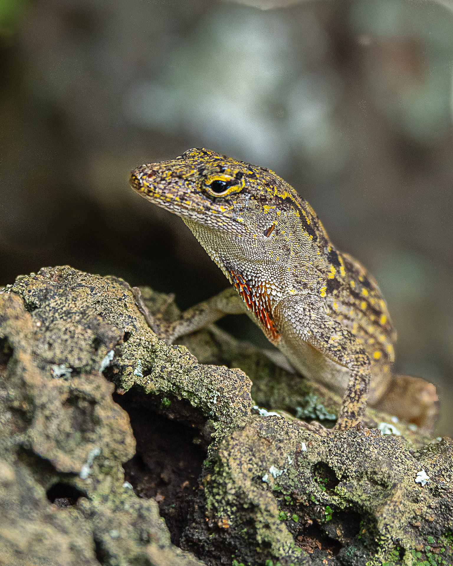
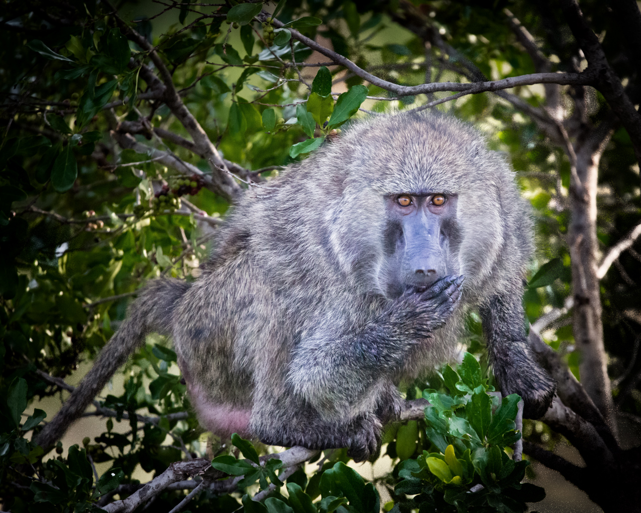
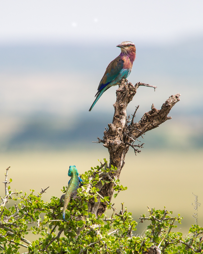
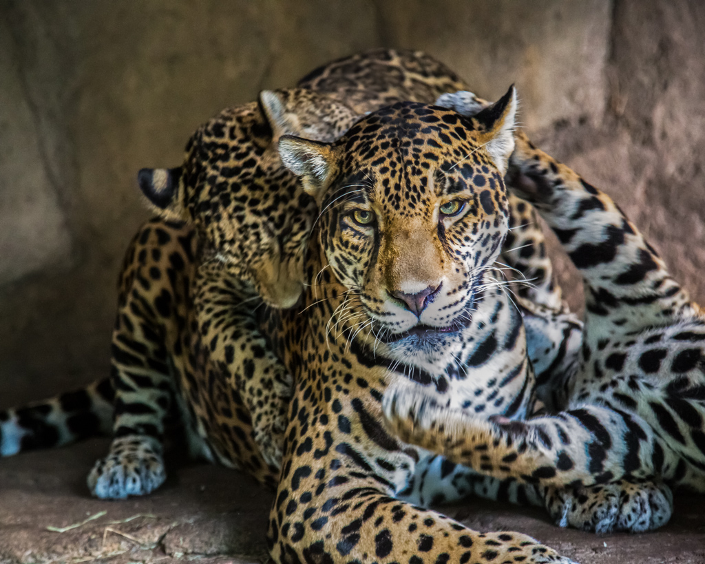
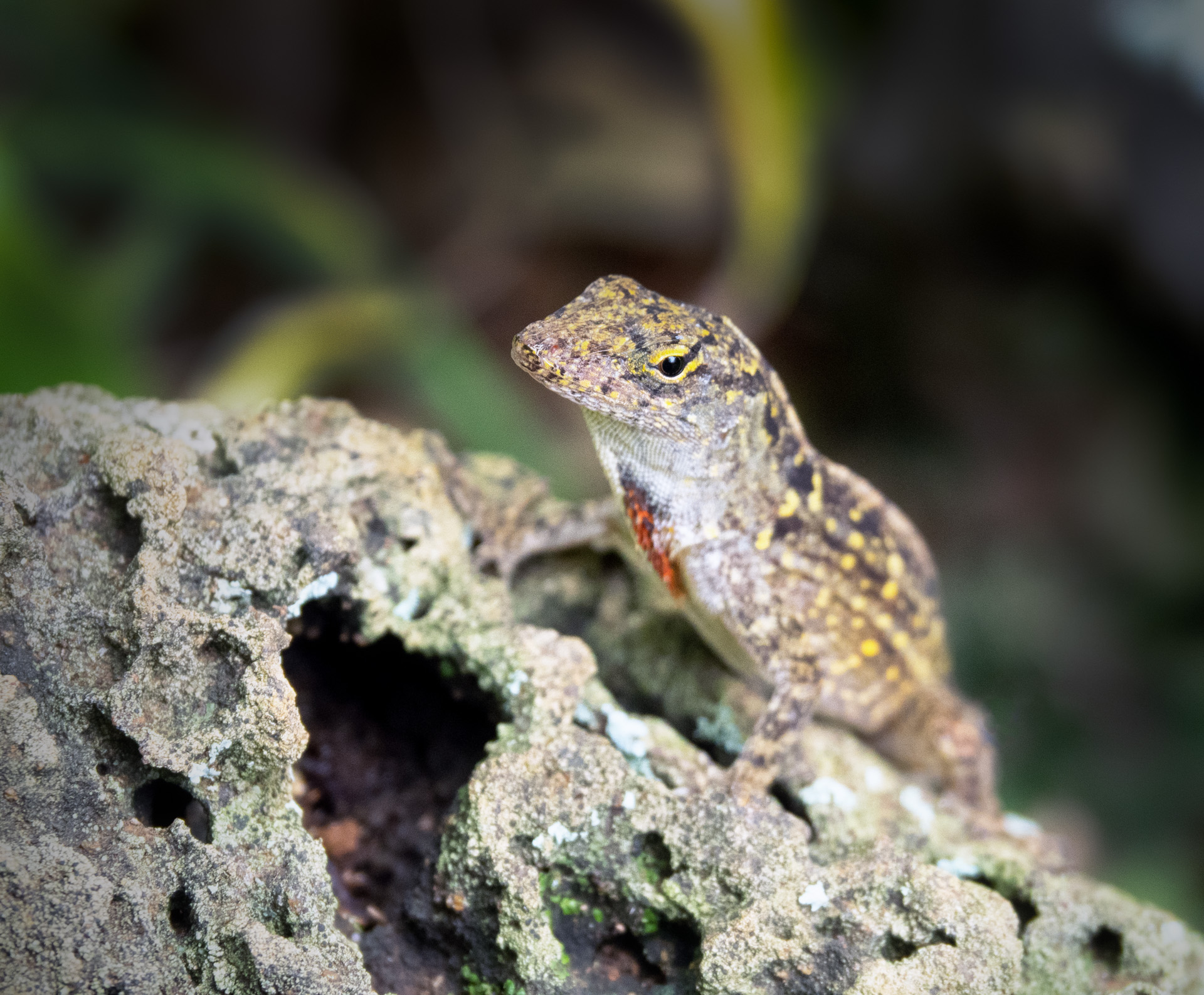
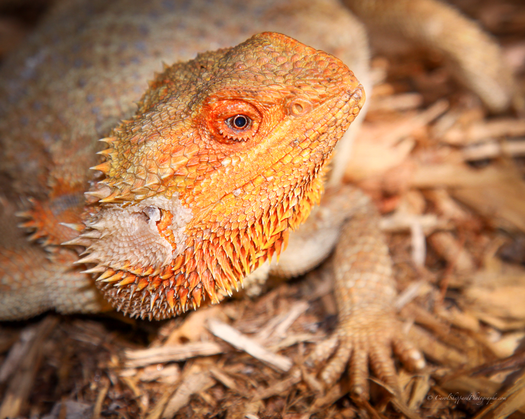
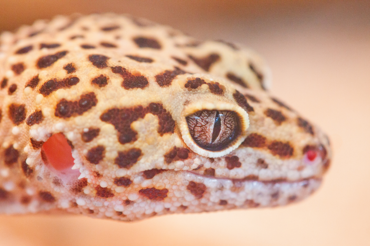
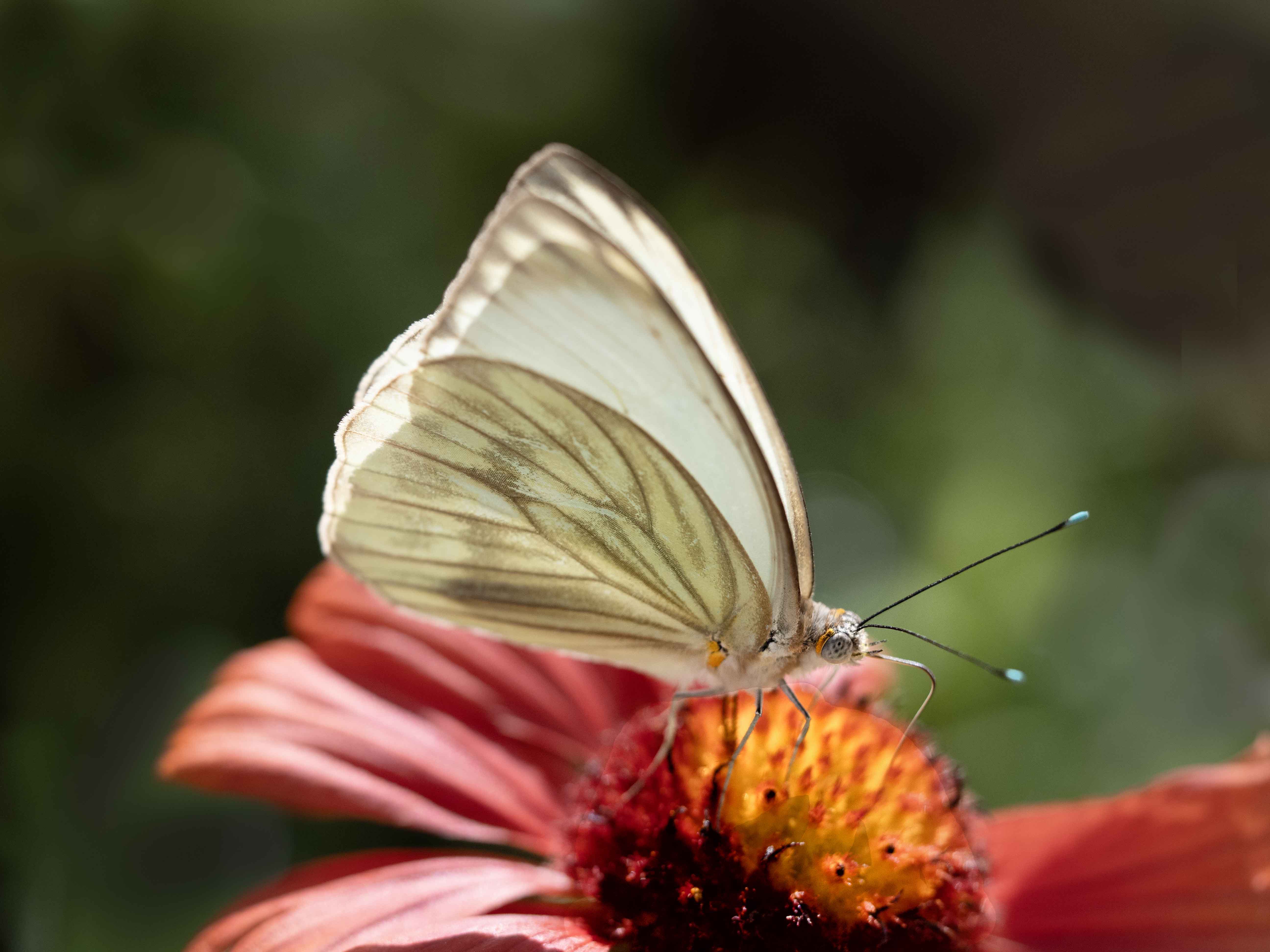
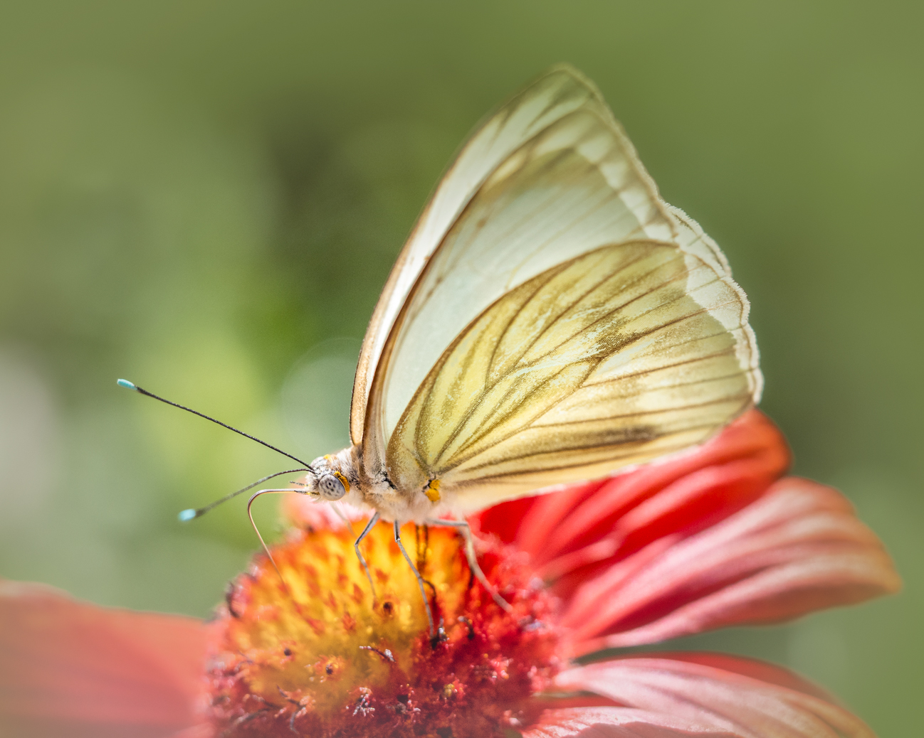
Nice job! I love that place. And I also love your composition, placing the eye as front and center! So often, these gorgeous birds are shown in totality as they are so gorgeous, when their faces are so captivating. The curvature really works for your image, as do the combination of colors between eye and feathers. |
Jun 26th |
| 52 |
Jun 17 |
Comment |
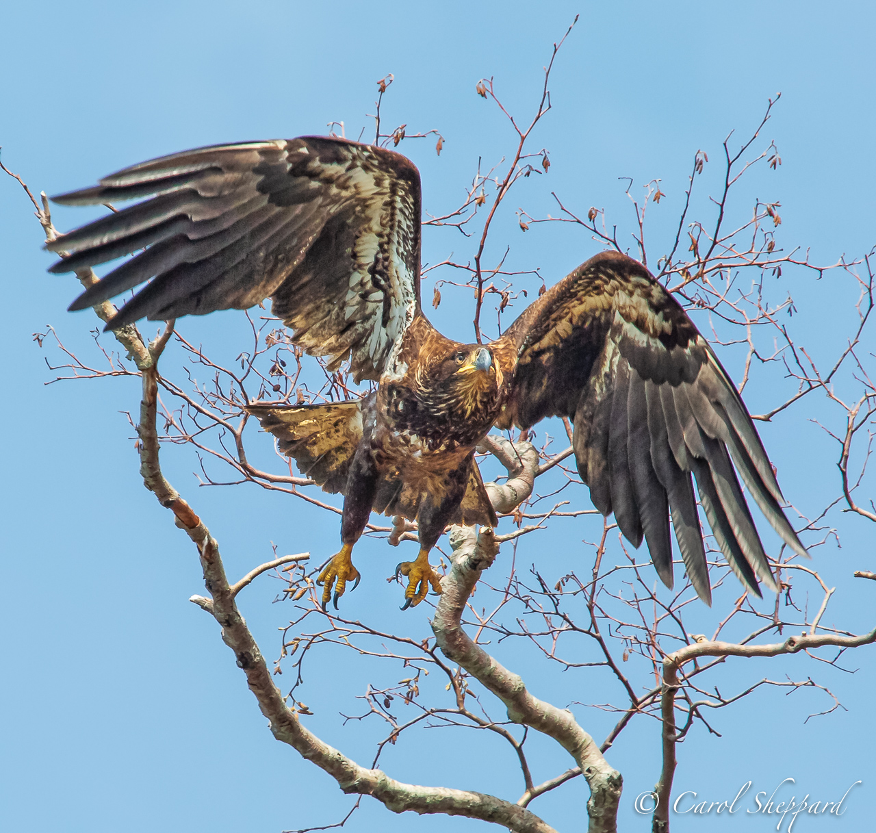
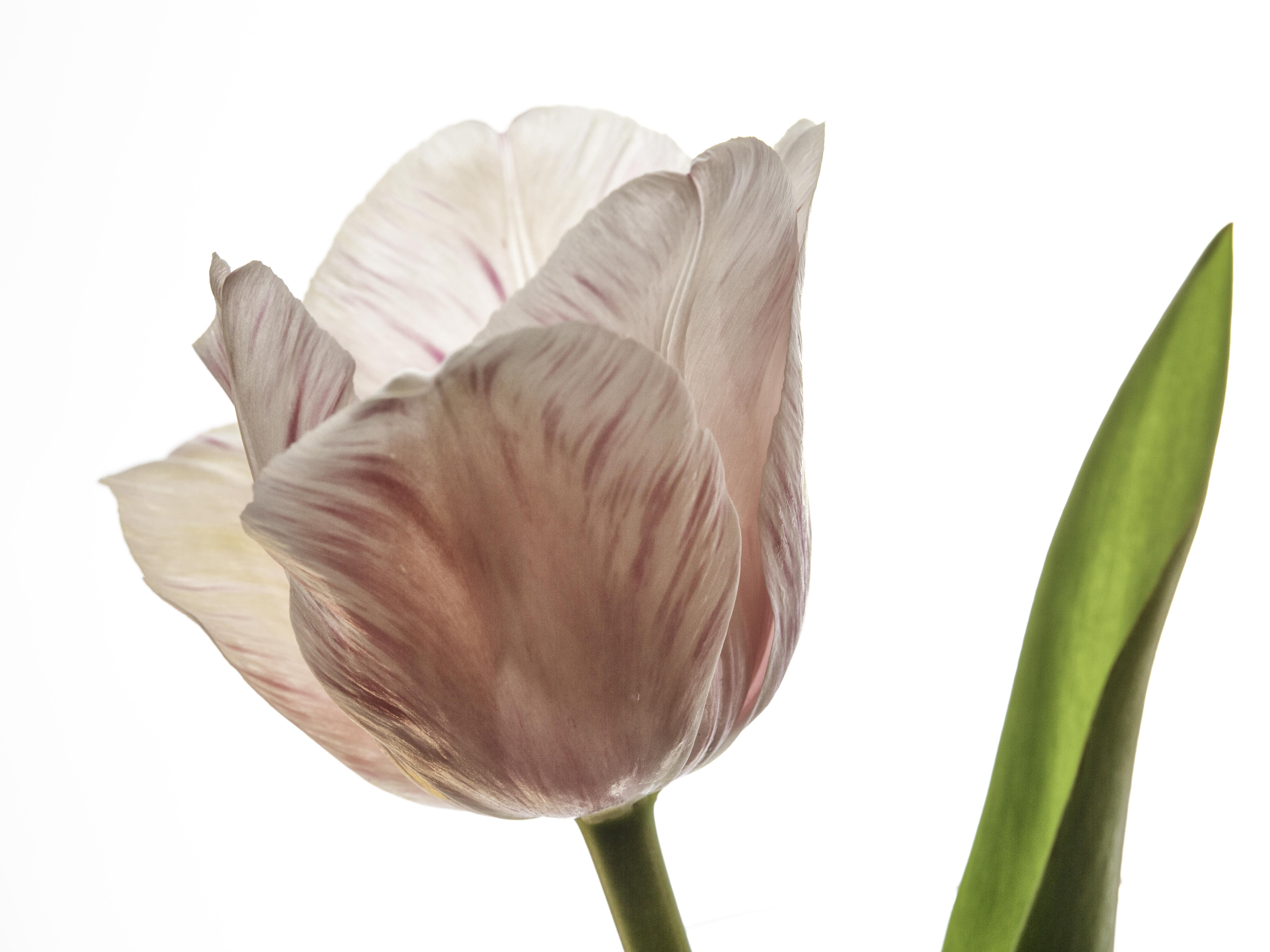
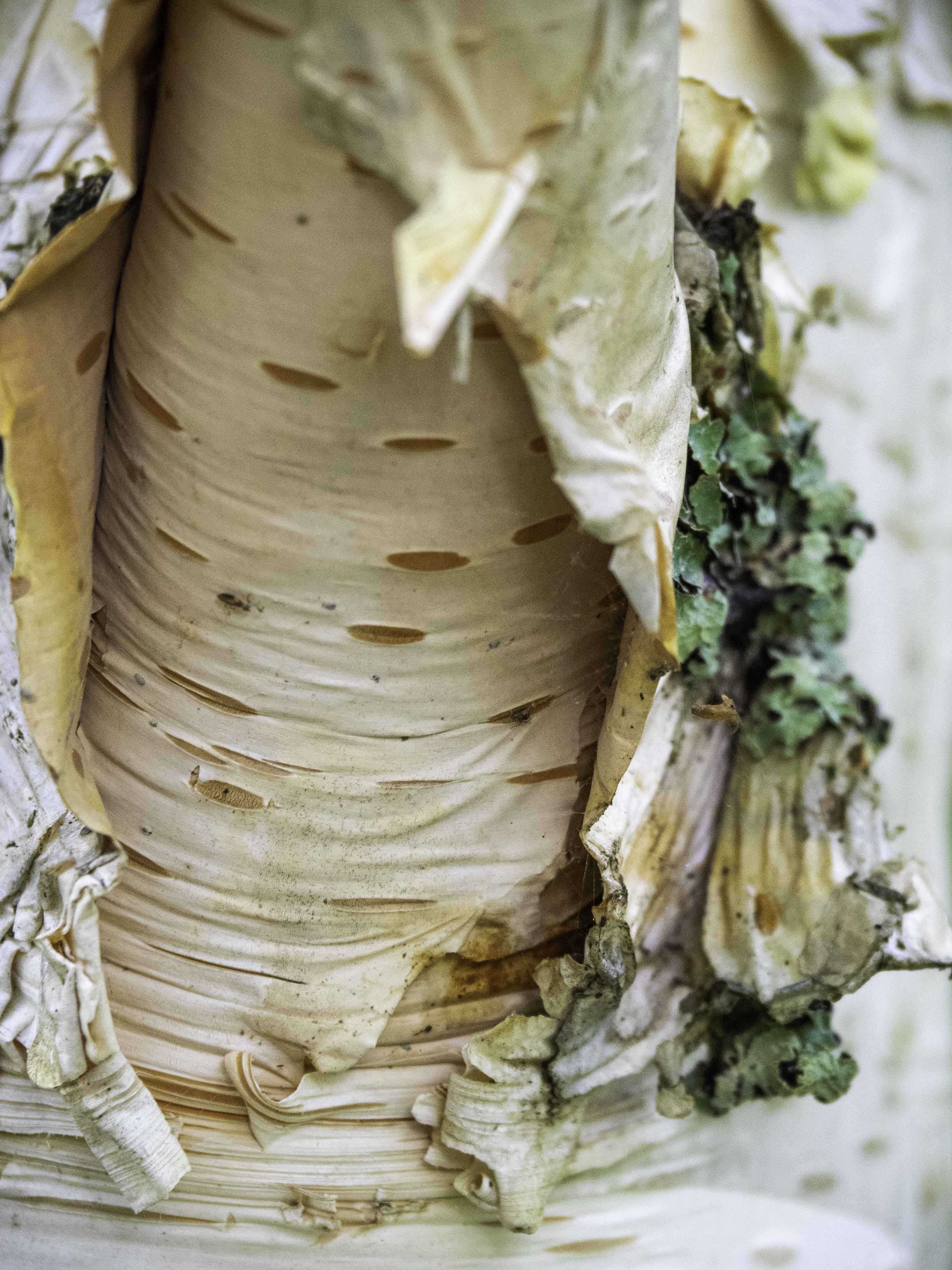
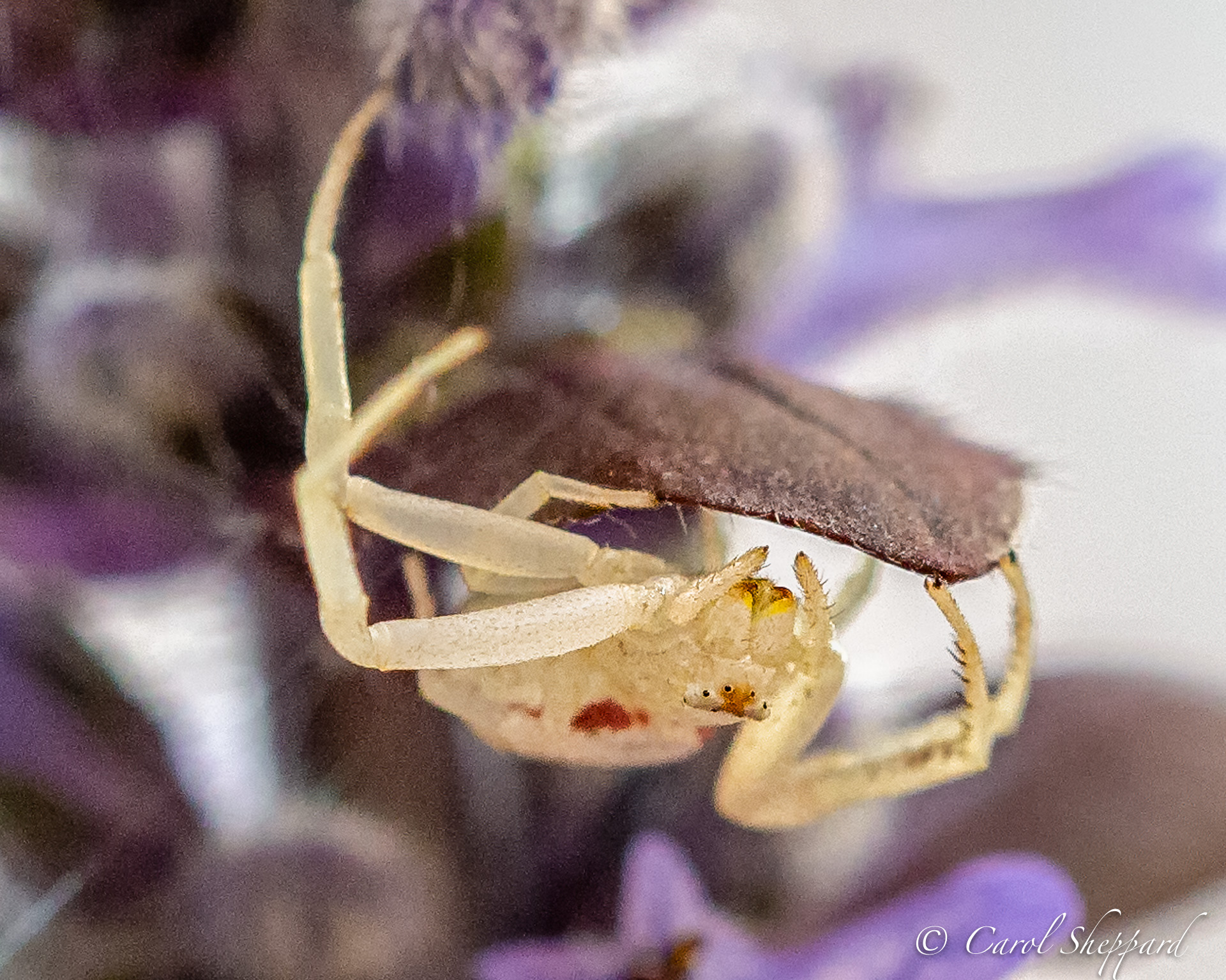
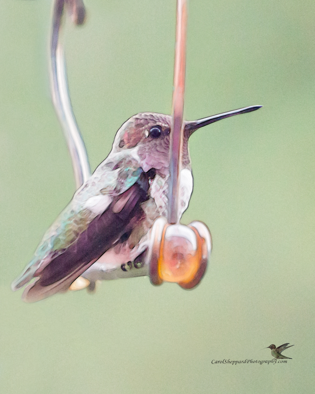
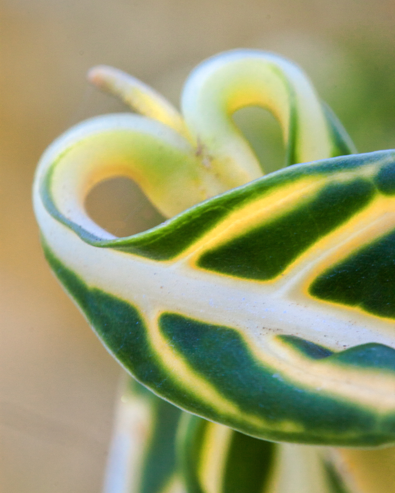
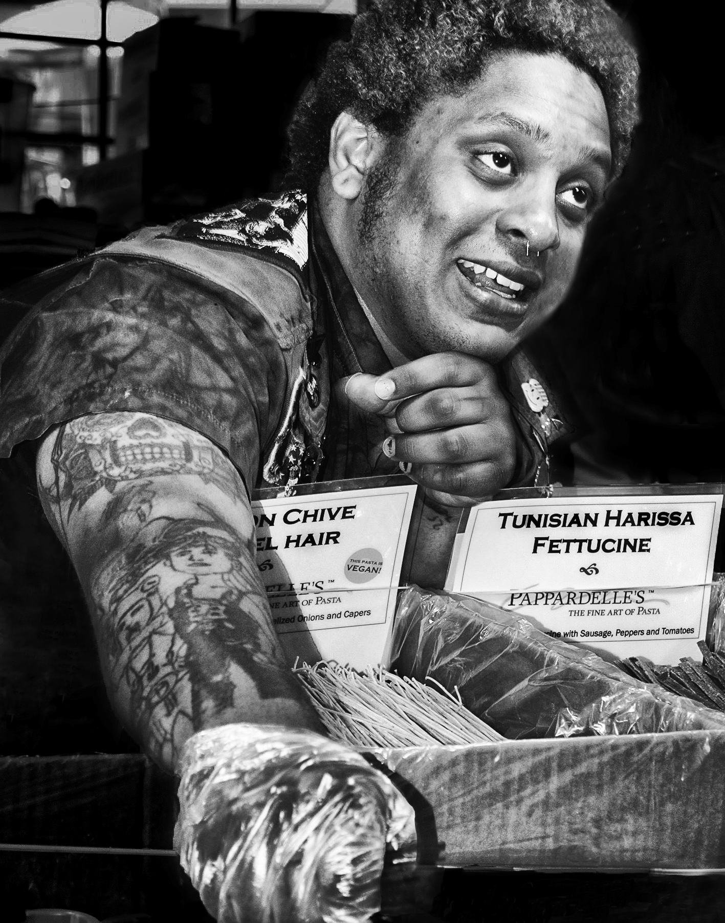
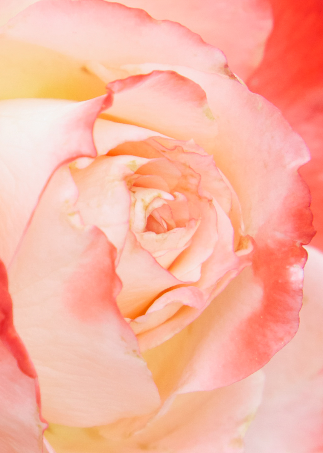
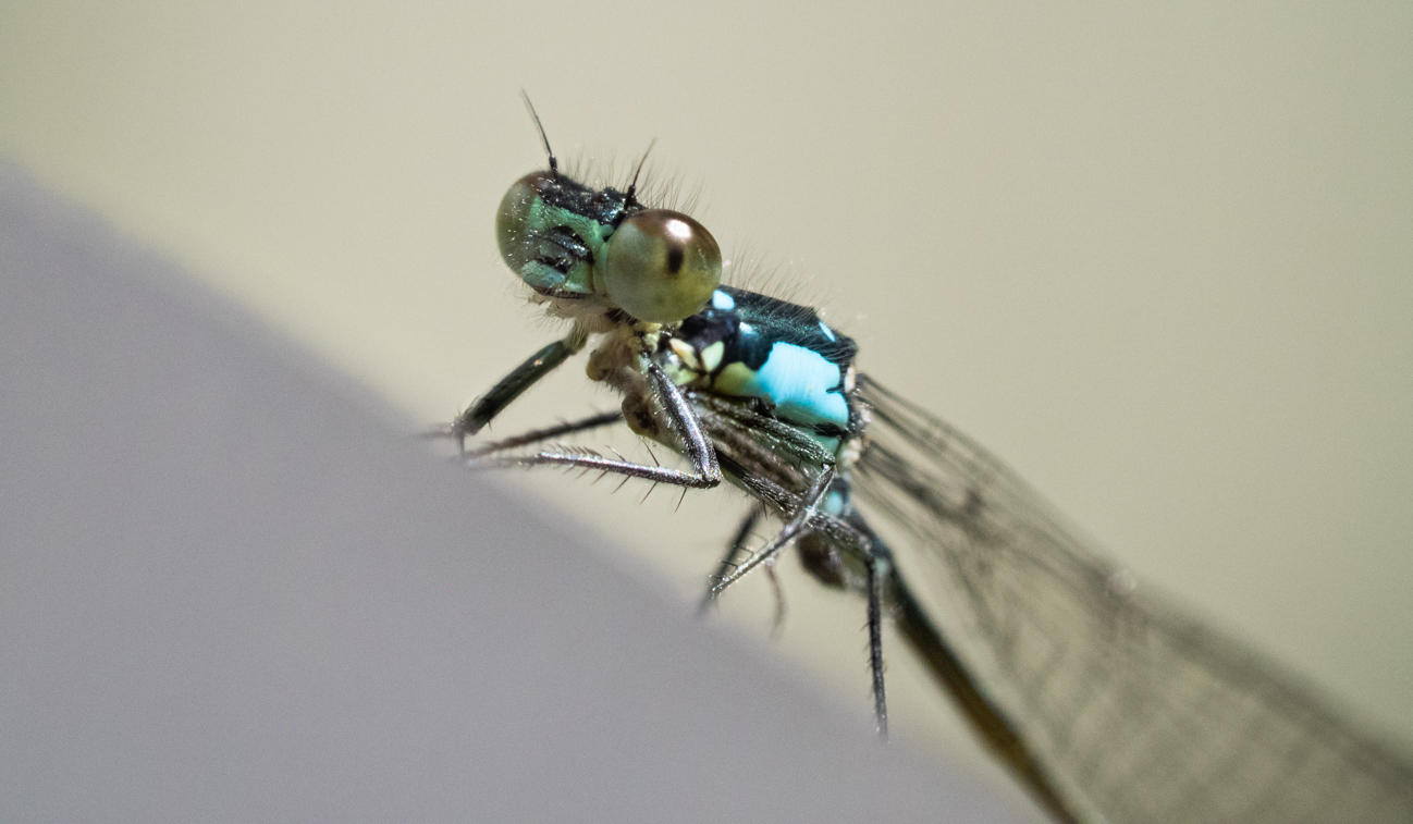
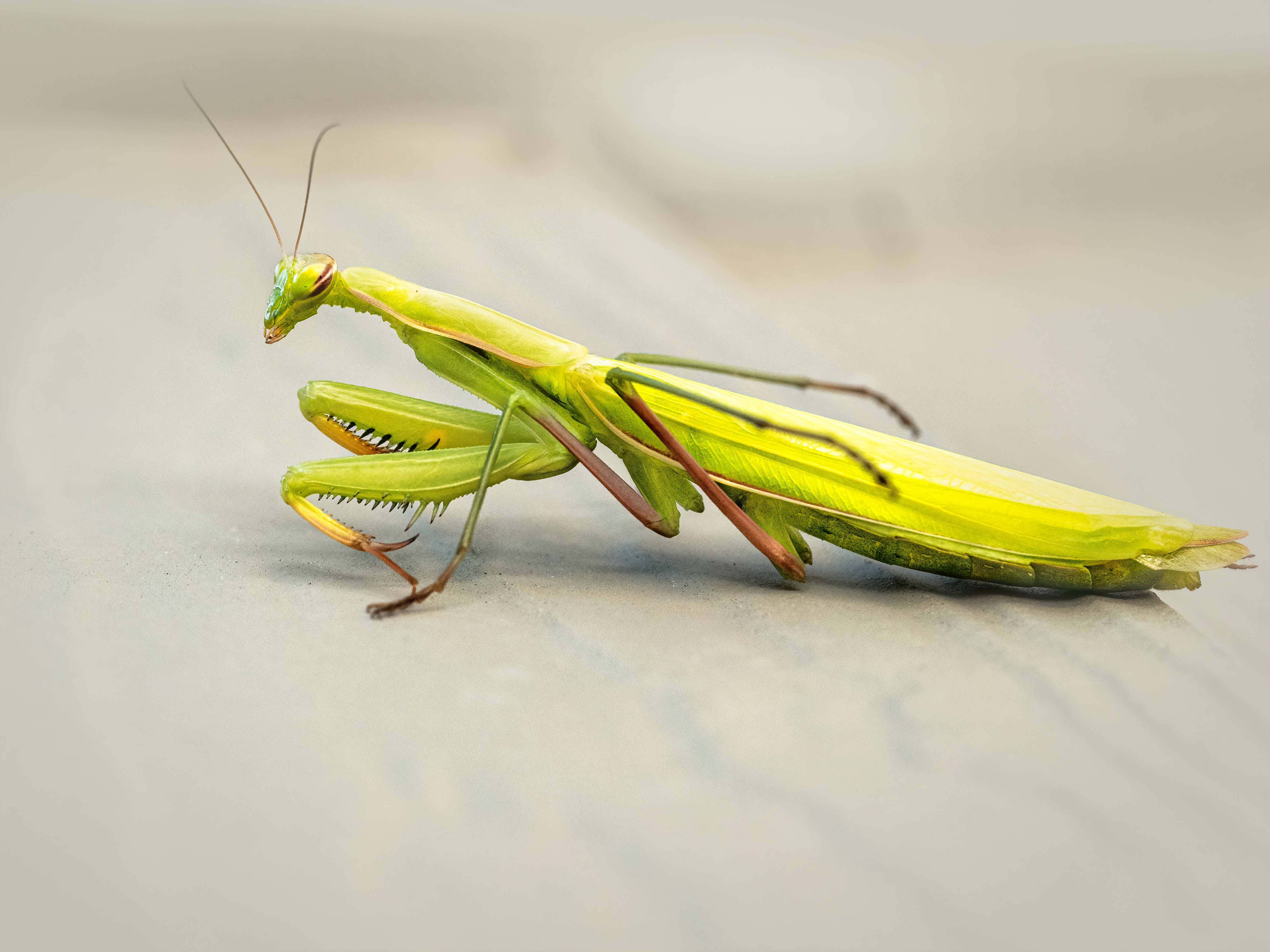
I am going to say the same thing as Judith, but it is my own original thought, not just a copy of what was said. Toning down the branches behind the head would be helpful to me as a viewer. And perhaps dehazing the face...it has a filmy cast to it on my monitor, which may or may not be your image. But you did capture a nice, sharp image other than that! I looked with interest at the settings you used...could you have reduced the ISO at all by a lower shutter speed since it wasn't flopping around or flying?
|
Jun 26th |
| 52 |
Jun 17 |
Comment |
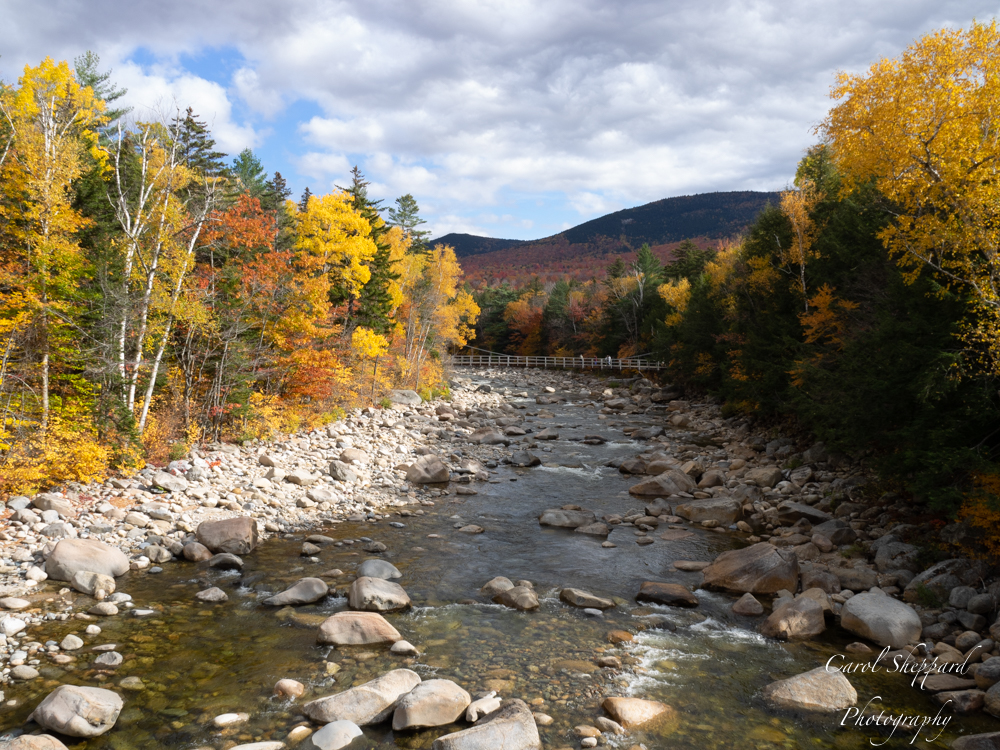
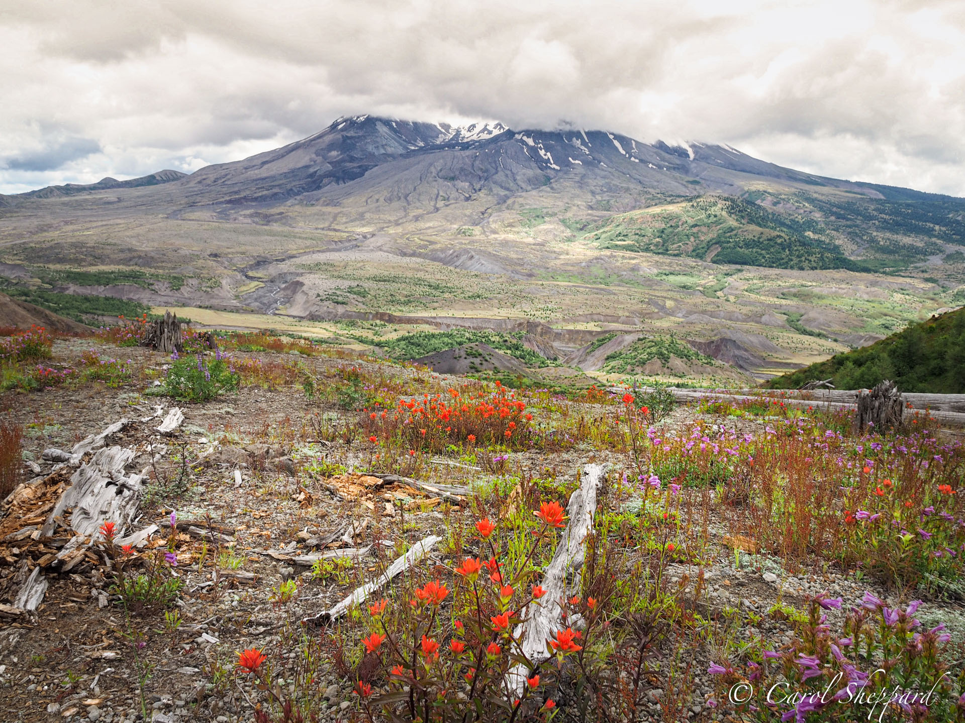
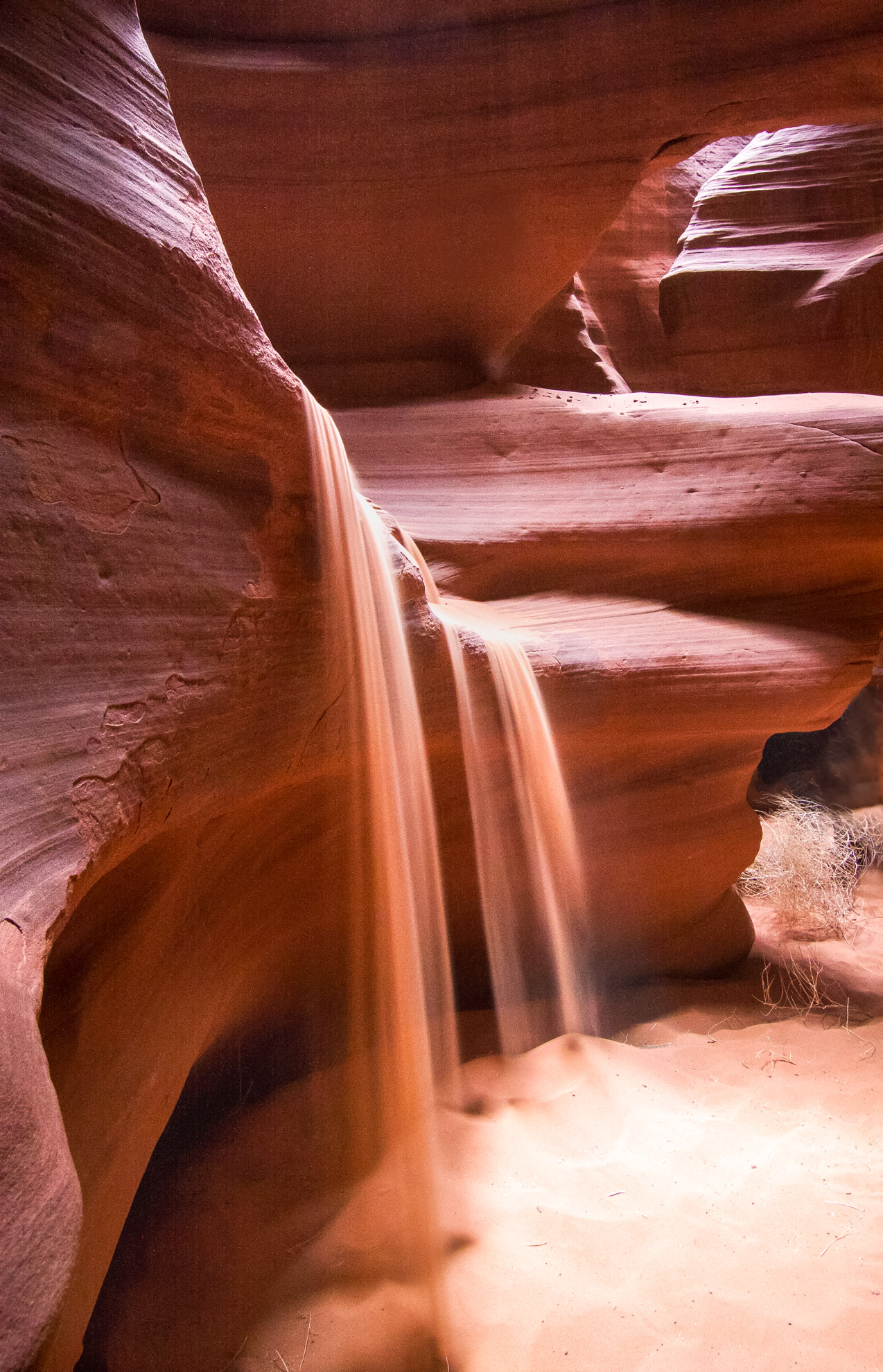
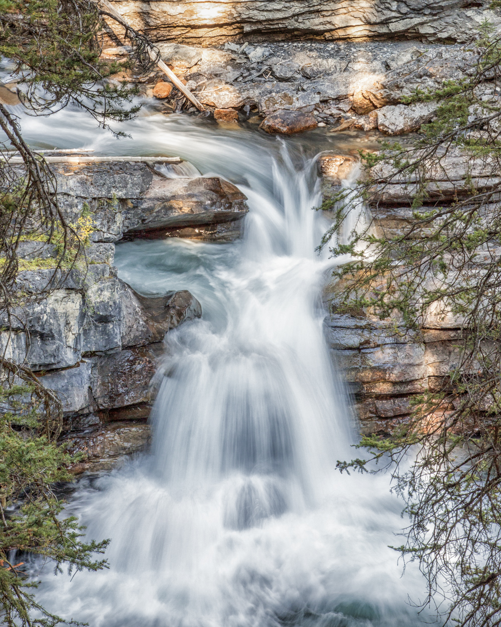
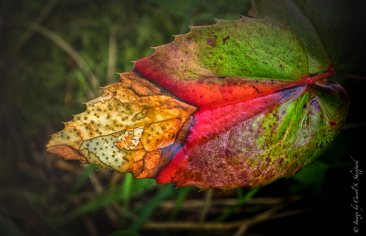
Apologies for submitting this so late! Without going into ad nauseum comments that parallel what has already been said, I think that adding some light on the leading line and the "cave" itself would help the viewer's focus on what is important in this image. You have caught some beautiful texture and color....but it will benefit from some work to bring it out more. |
Jun 26th |
| 52 |
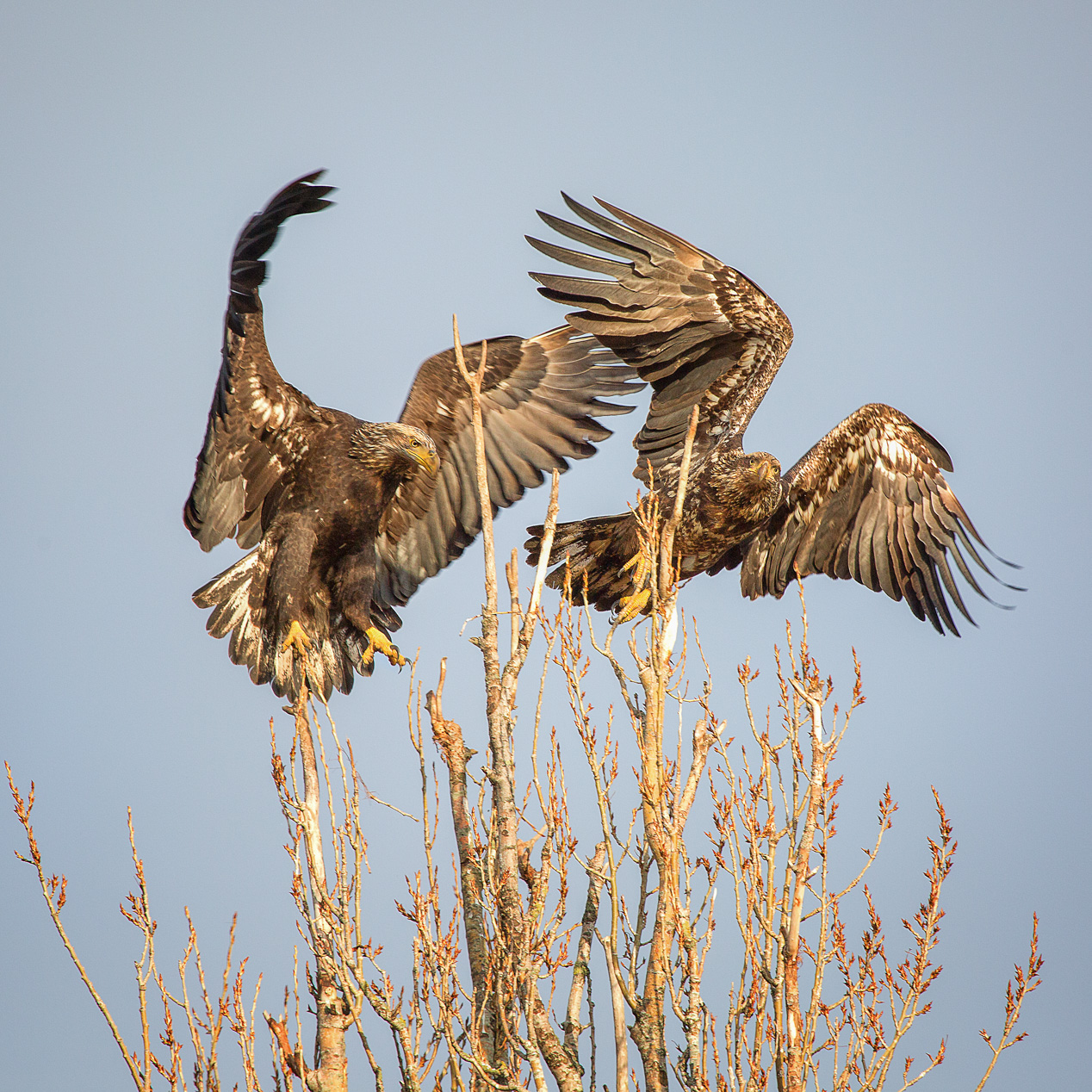
Jun 17 |
Comment |
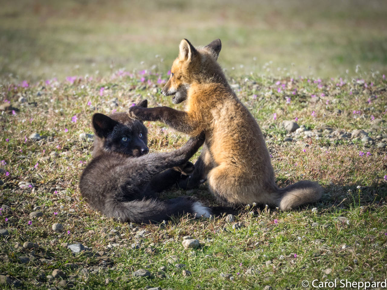
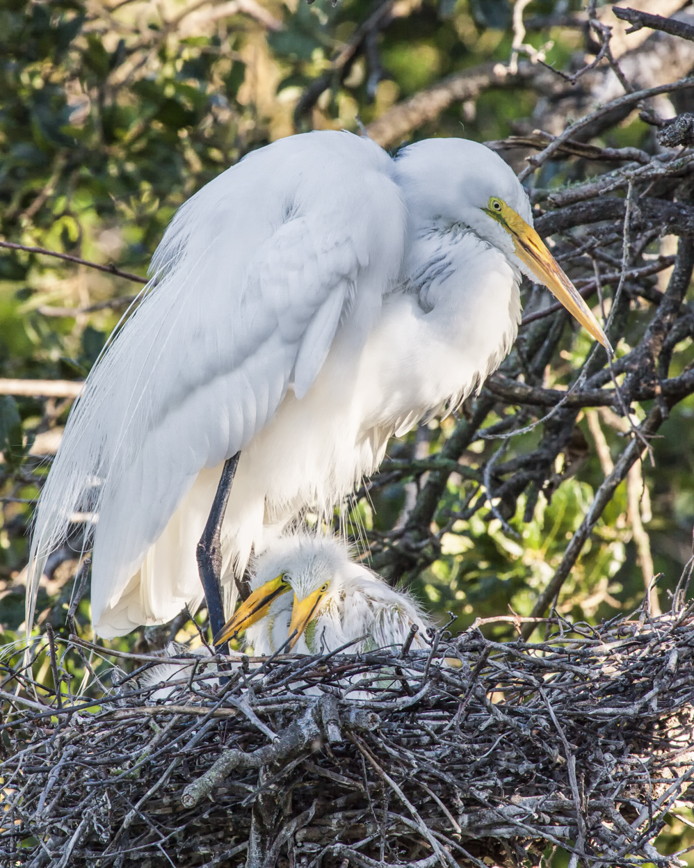
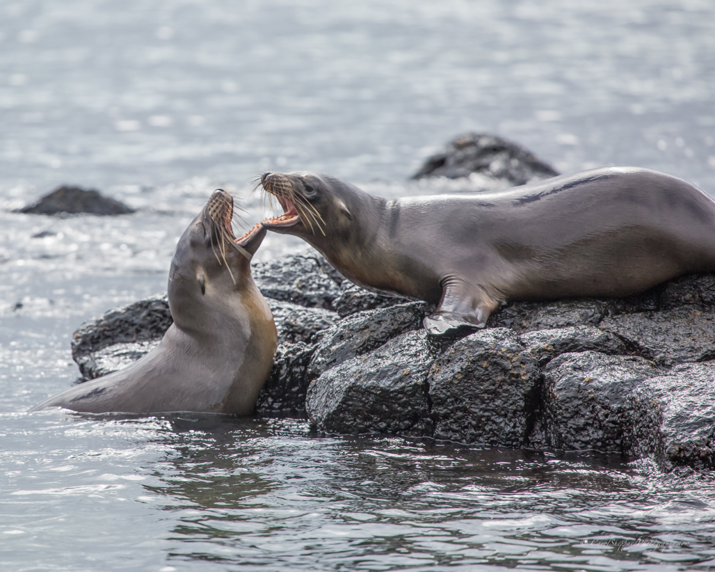
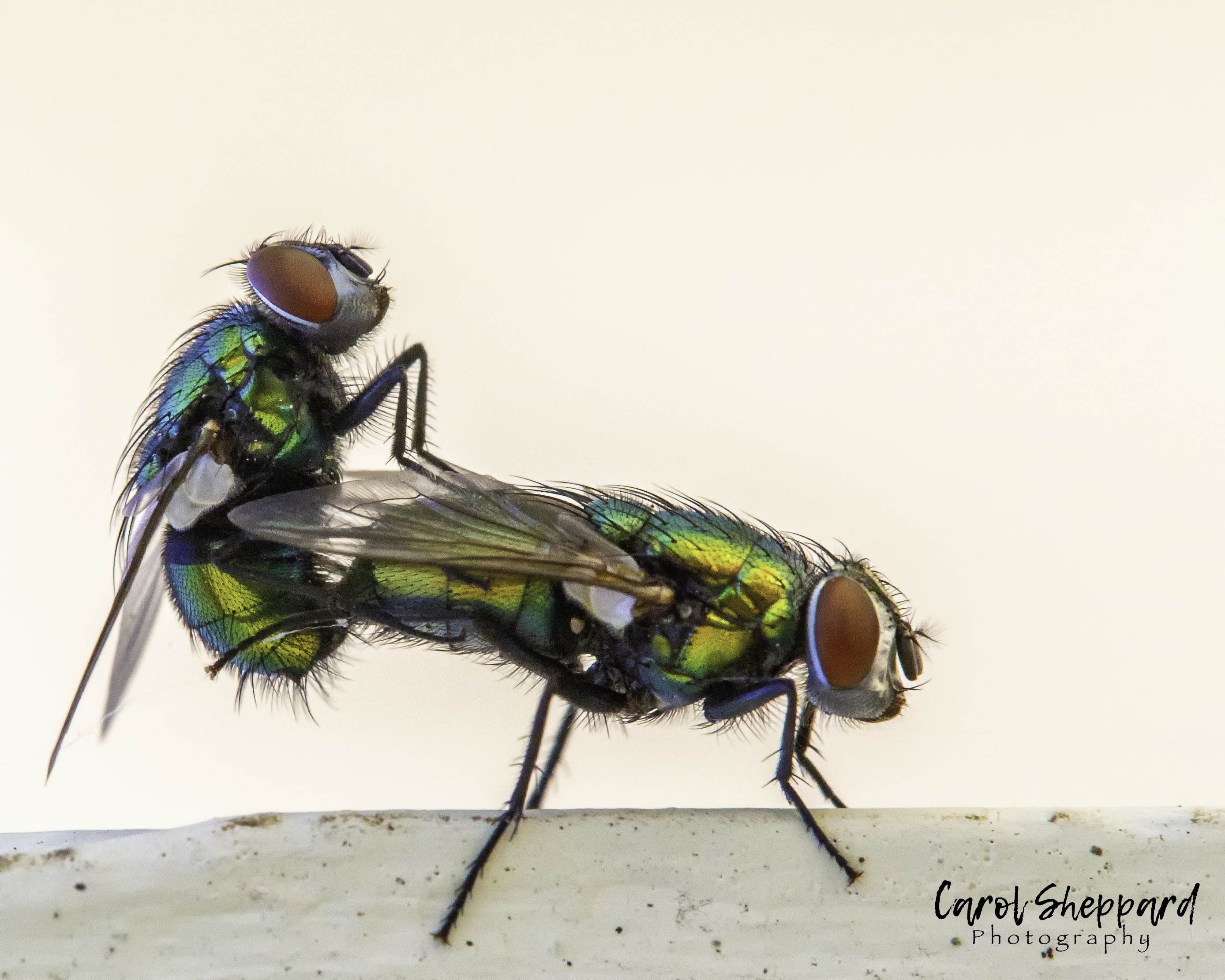
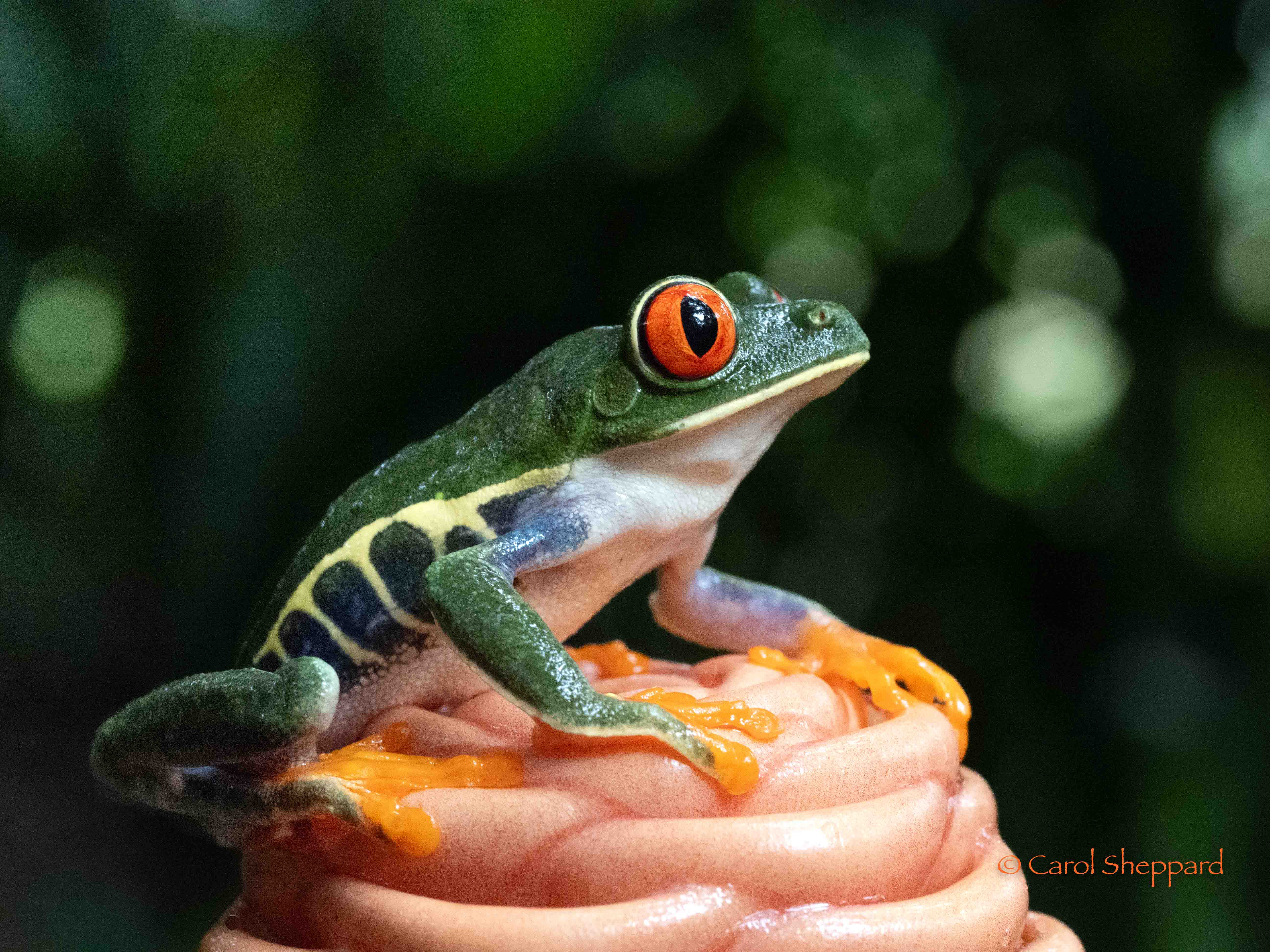
This is a wonderful image, Sharon. To catch that moment is the truest sign of a professional. I love the balance of three and the composition, which we don't always control when we catch nature in the act! I think this is definitely competition-worthy!
|
Jun 26th |
| 52 |
Jun 17 |
Comment |
Thanks, Mike!! |
Jun 14th |
9 comments - 0 replies for Group 52
|
| 60 |
Jun 17 |
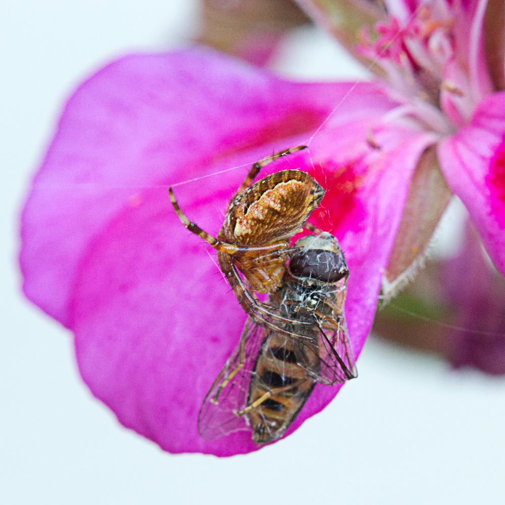
Comment |
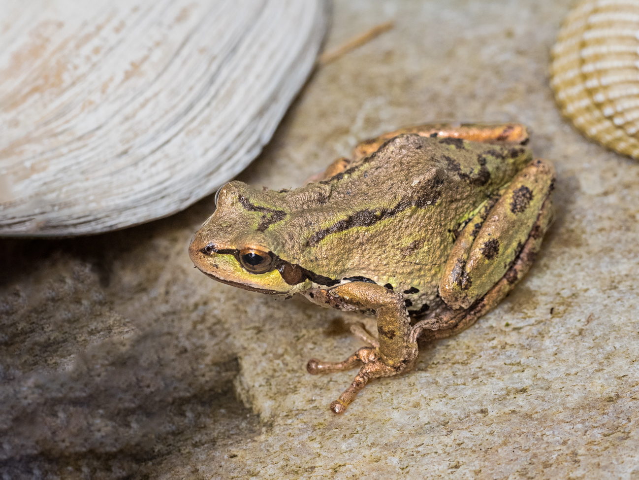
Yes, Bill, you are right. I know how subjective it can be. Sometimes you see a beautiful image with great technical know-how behind it, and they choose instead a poorly executed image without any pzazz at all. It is a "beauty is in the eye of the beholder" thing, I guess; if only more judges were trained to balance the image against the technical aspects as we are taught by PSA. But this is a great image!
|
Jun 14th |
| 60 |
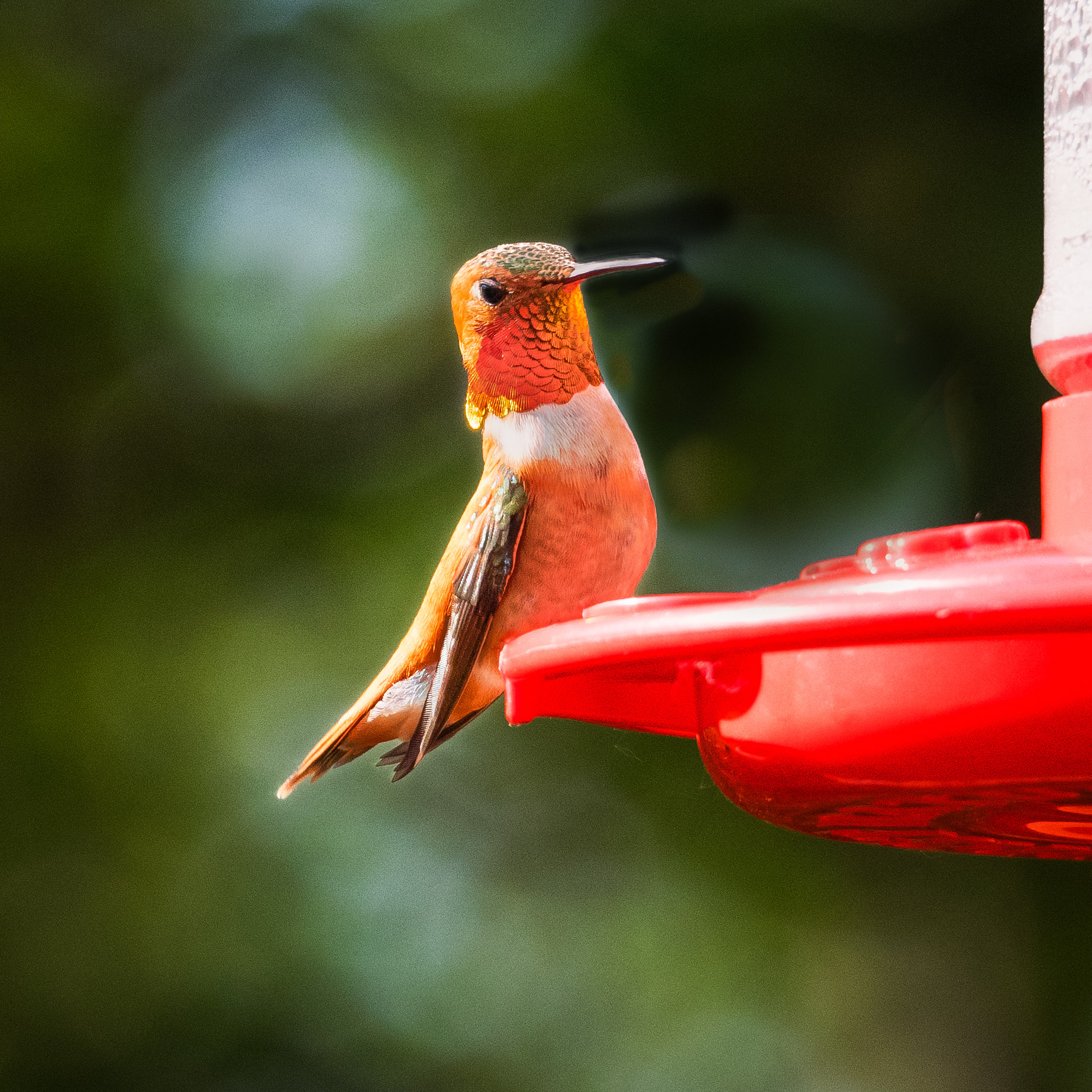
Jun 17 |
Comment |
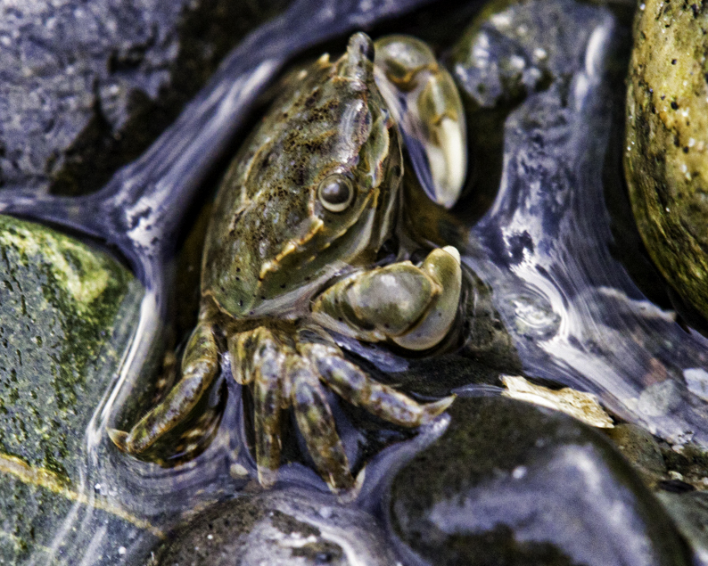
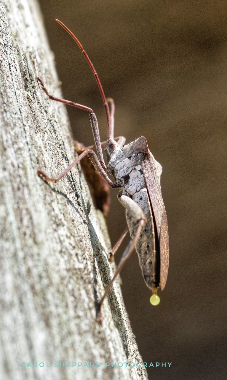
BTW, those weird dark spots by the beak? That was my attempt to eliminate bright areas and I am not good at it!! I usually make a mess like in this one.
|
Jun 14th |
| 60 |
Jun 17 |
Comment |
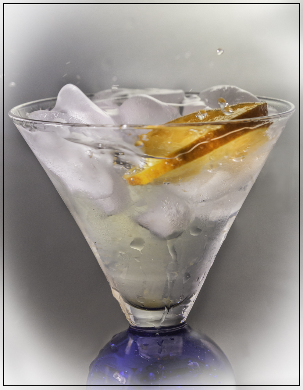
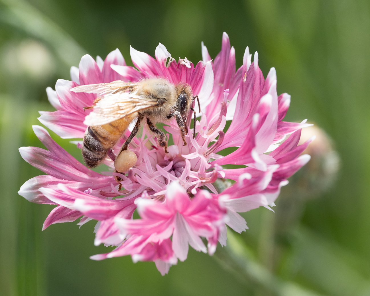
Thank you! I know everyone feels differently about that bokeh-look. I have tried to treat my images by darkening the background to eliminate all the light circles but honestly, when I look at them later, I find no joy as they feel very dark to me. And yes, I like vanilla but doesn't mean to say I don't prefer chocolate ice cream on the right occasion! |
Jun 14th |
| 60 |
Jun 17 |
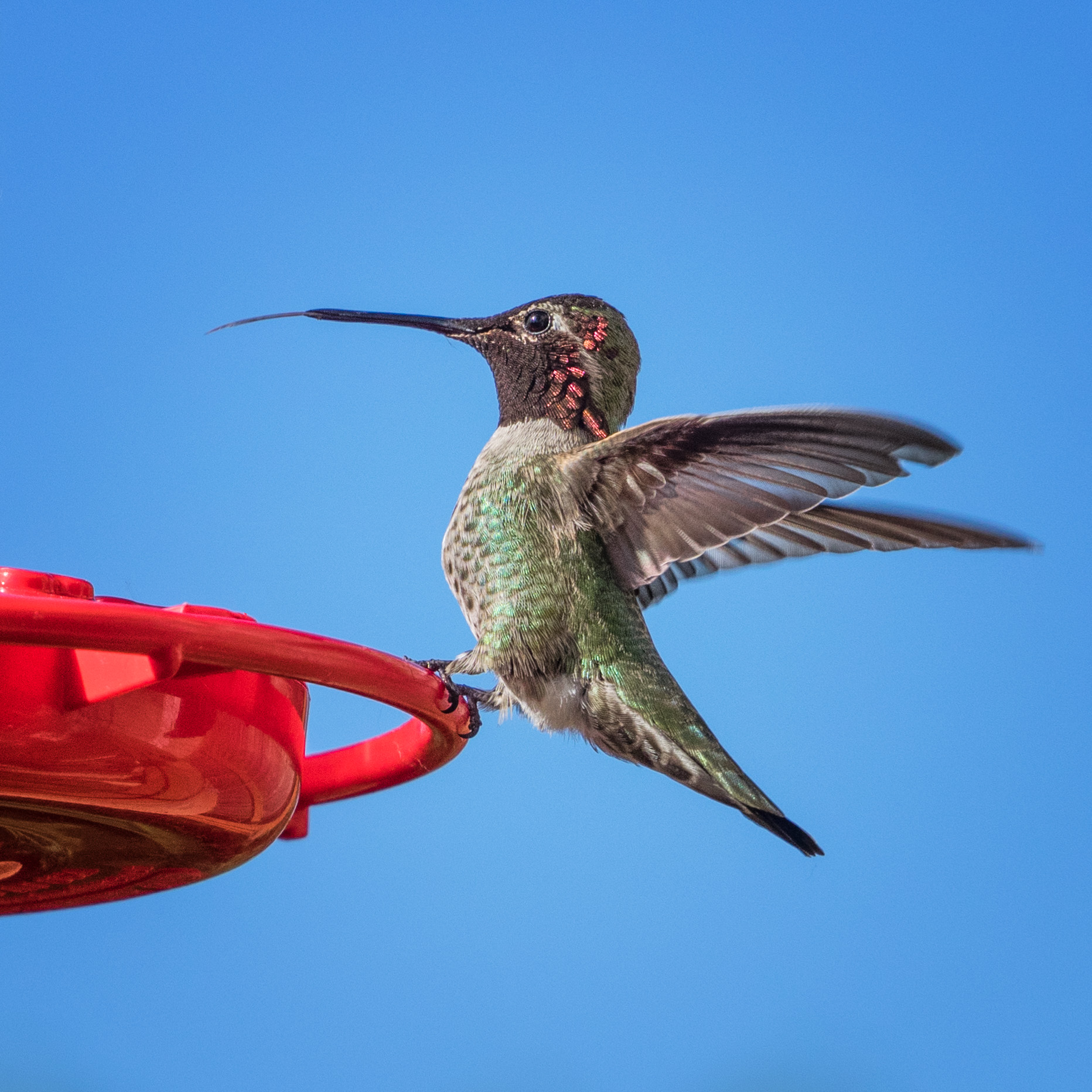
Comment |
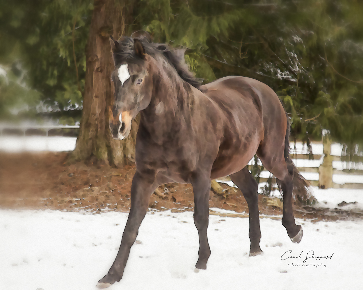
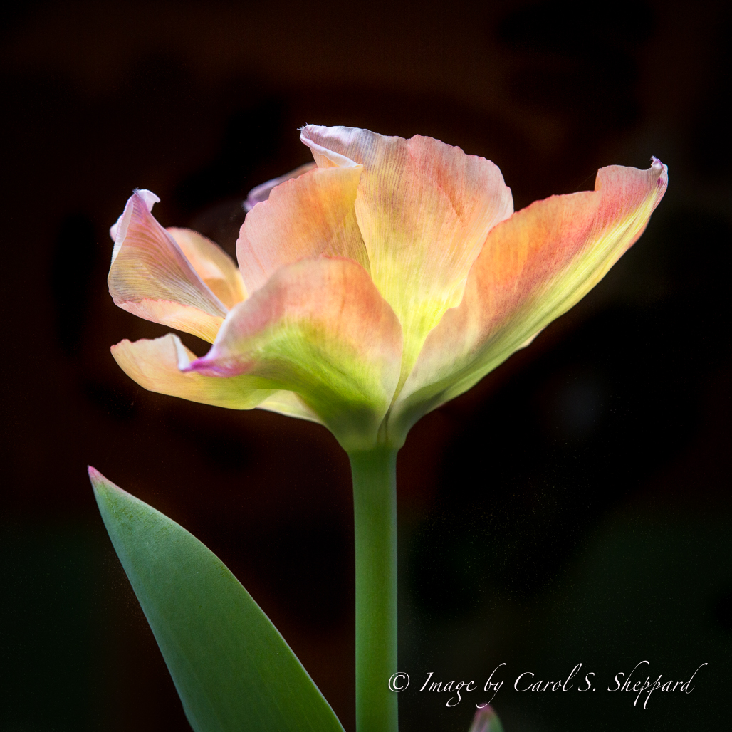
I particularly like the texture you added and the way you firmed up my weak outline on the Hummer. Can you tell me more about how you did this? What product did you use? Thanks!
Carol |
Jun 12th |
| 60 |
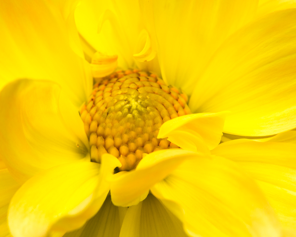
Jun 17 |
Comment |
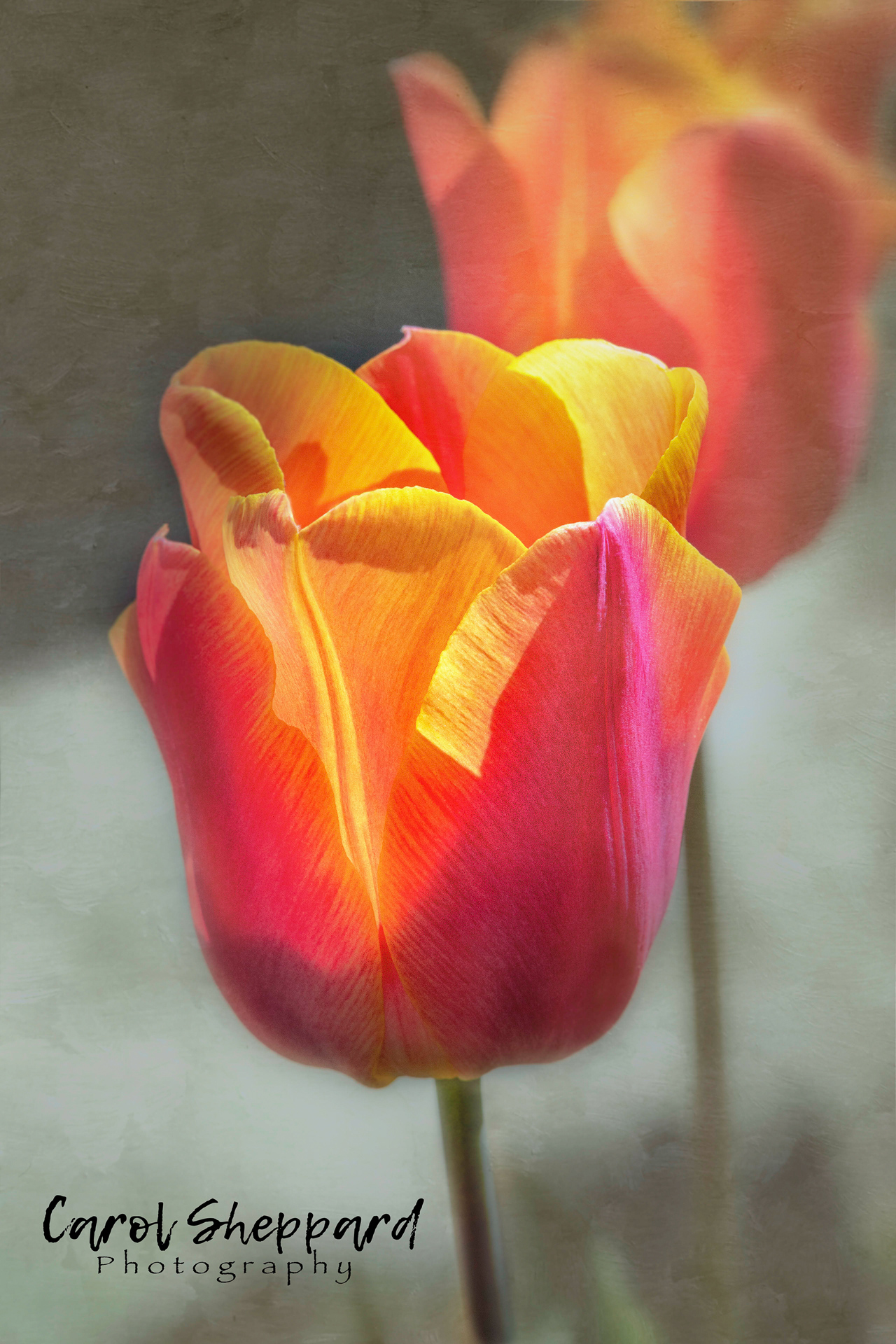
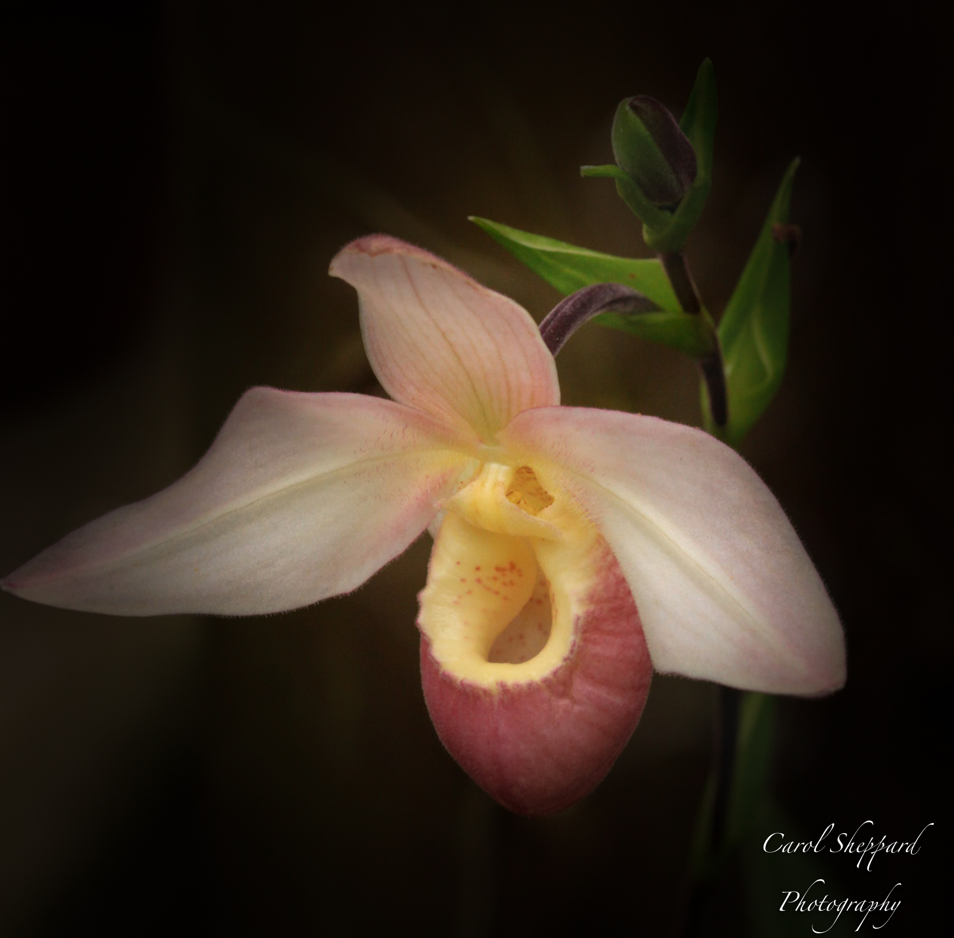
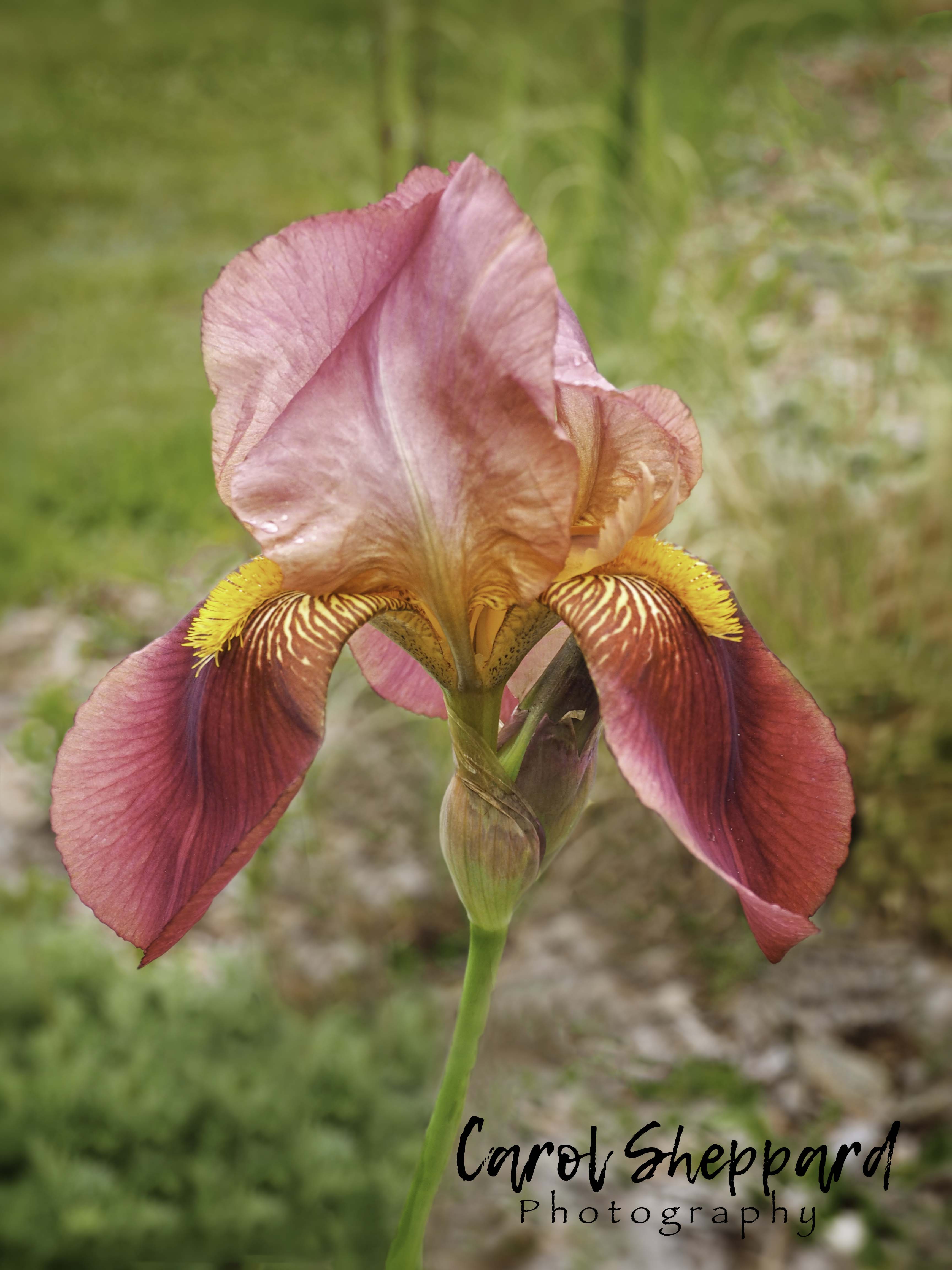
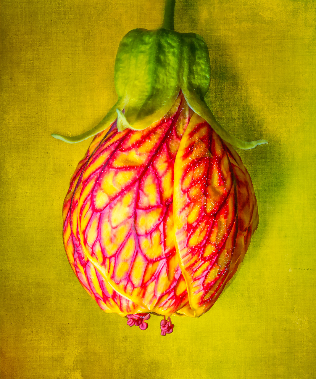
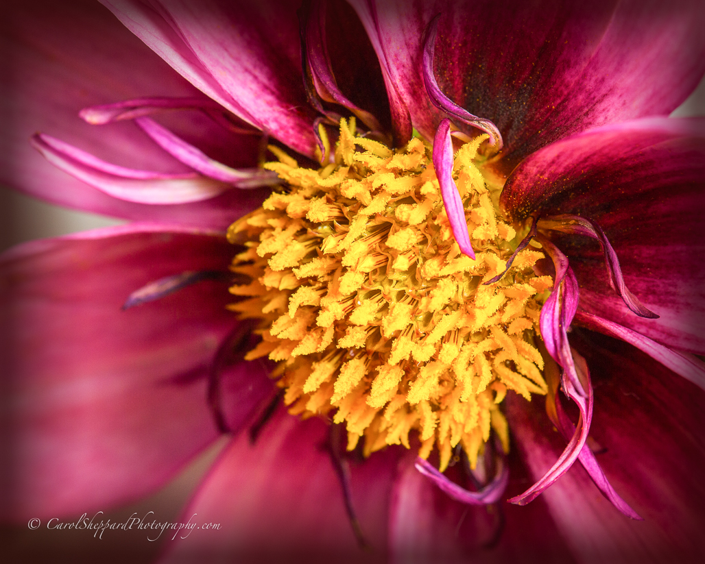
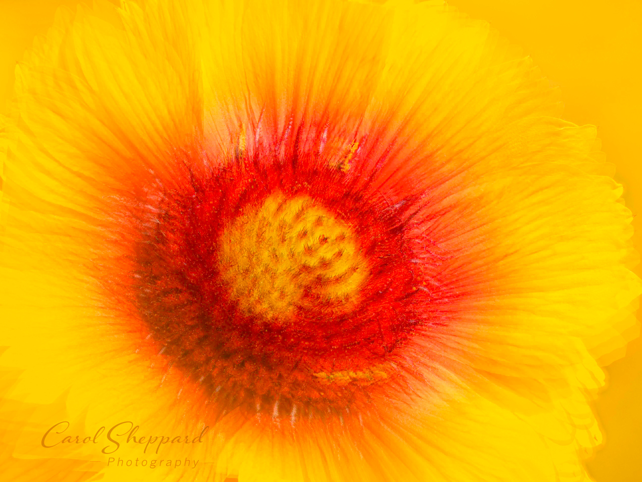
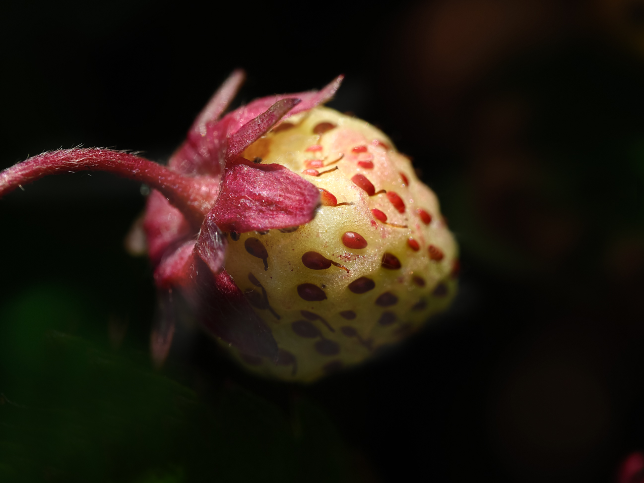
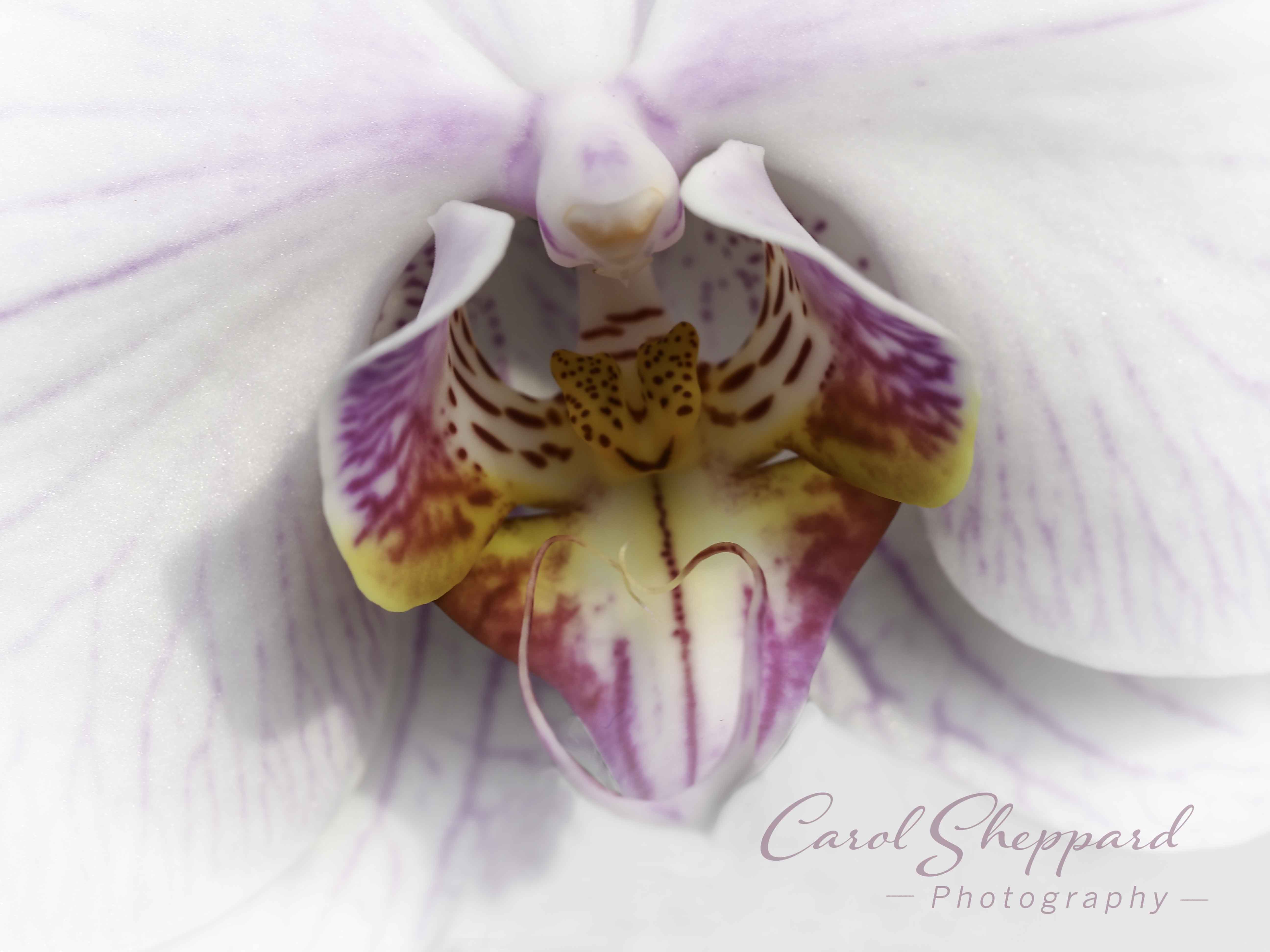
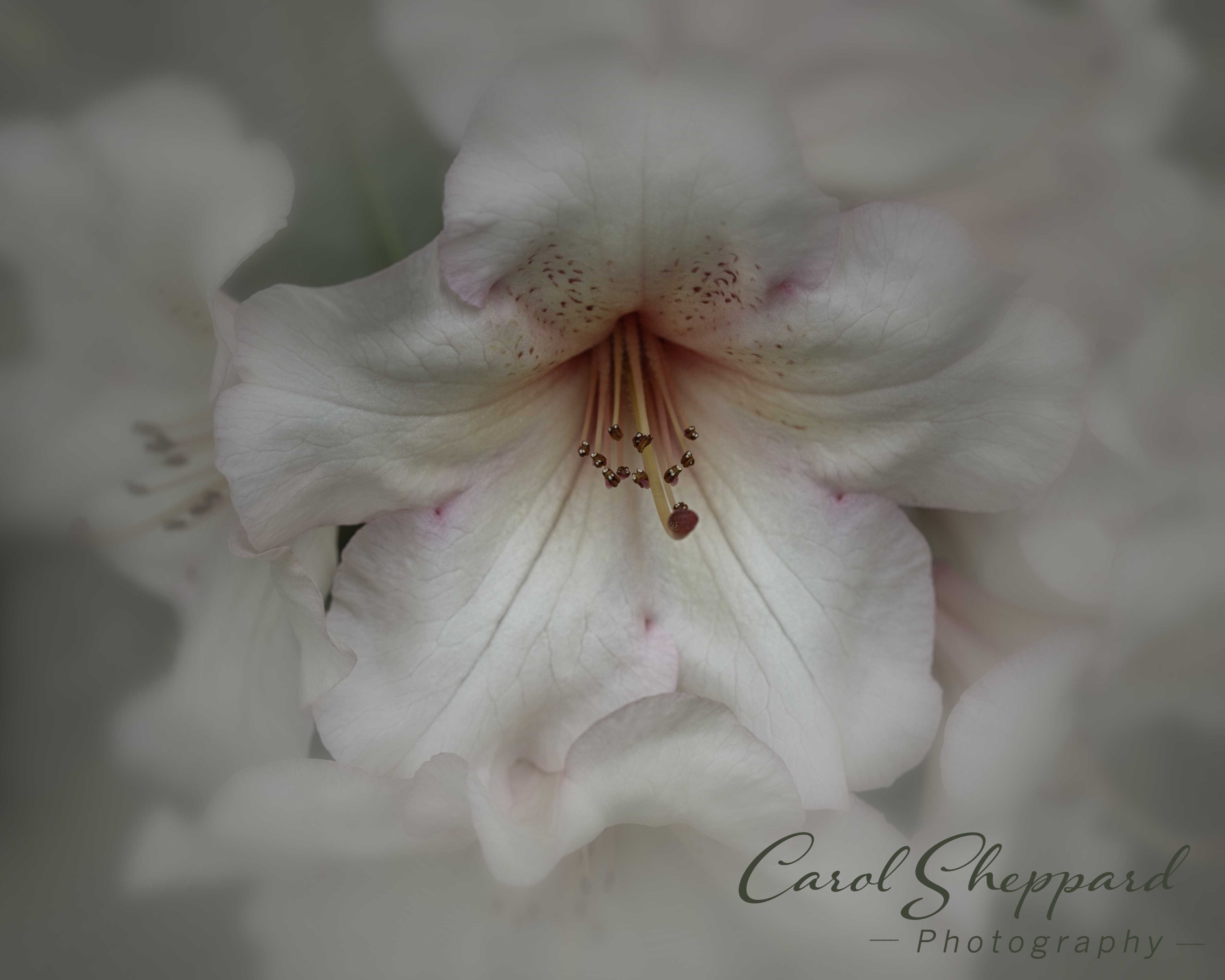
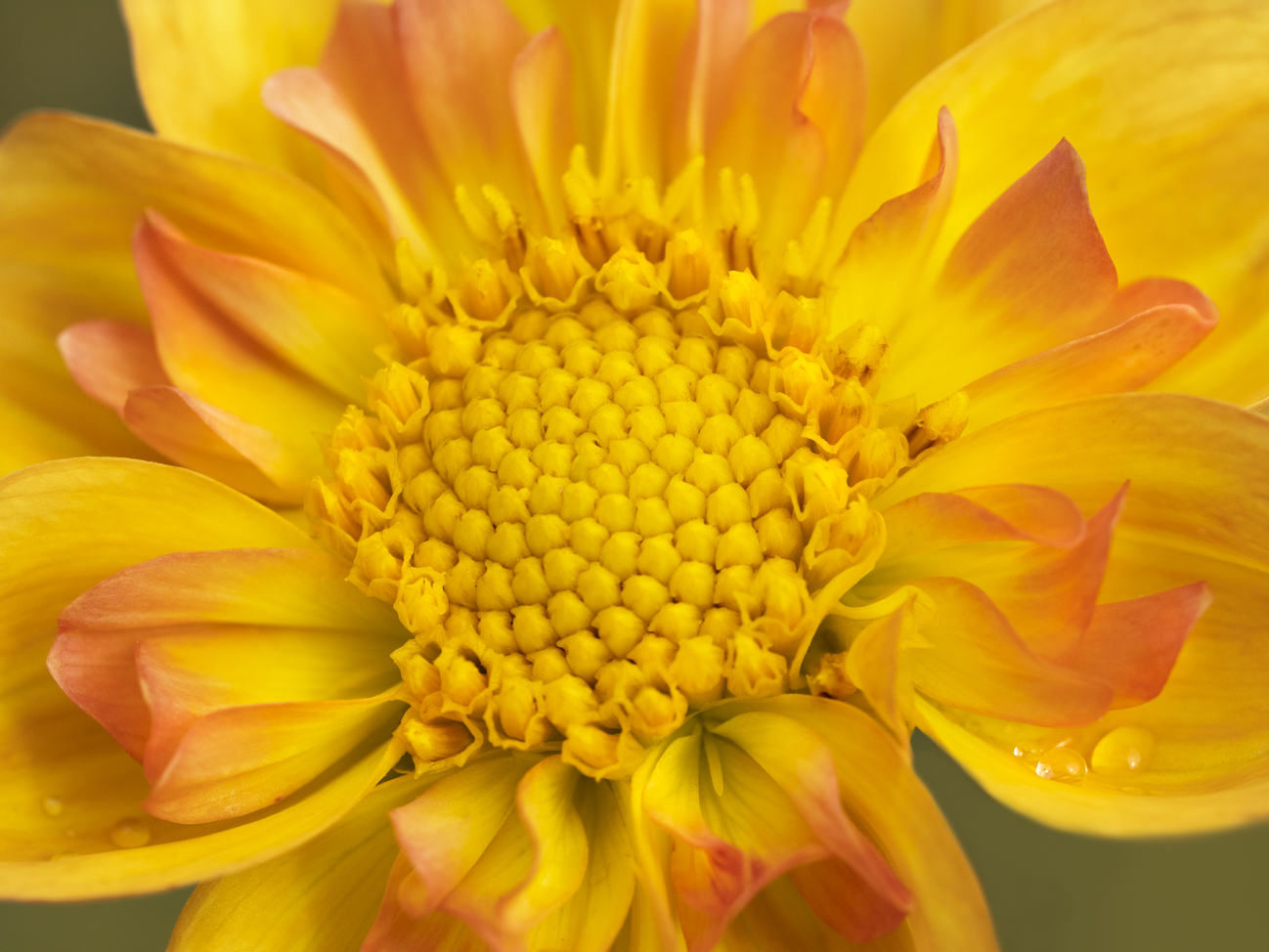
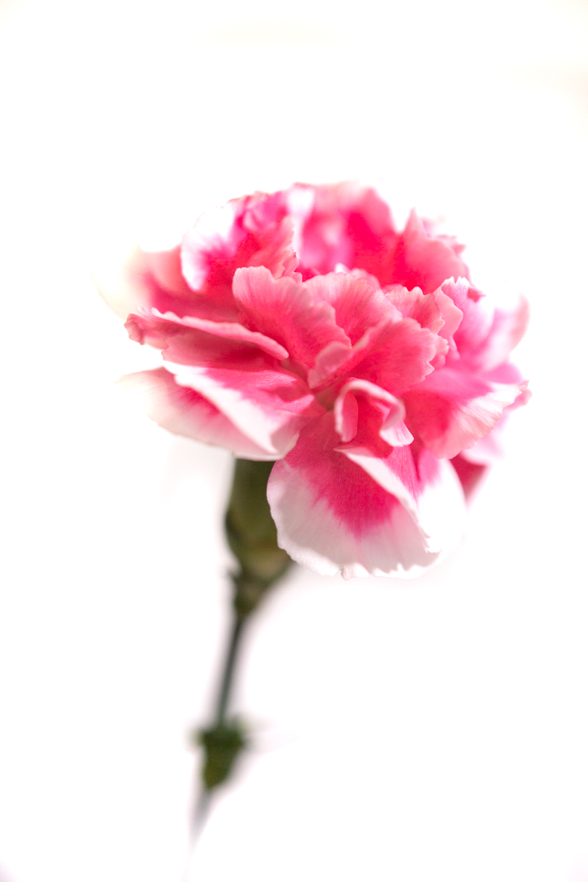
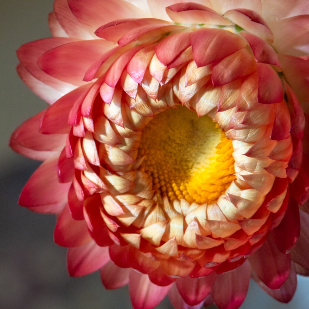
This image has a bit of an HDR feel to it...but in reading your description, I can see that it wasn't done in HDR. For having used a flash and auto settings, it has great detail in 98% of the flower. There is one fairly significantly-sized area toward the top of the flower that is blown out and another on the bottom. Sometimes, if they are small enough and I can't bring back the information, I will clone carefully to at least deflect attention away from that highlighted area. The black background works well, but I did notice some areas where you went over onto the flower, and I do that as well. The only suggestion I have is to blow it up to 200% when doing this kind of work. I know even on my image, I can see where I didn't get a good clean edge when darkening my background. This has a very artsy feel to it and lots of possibility. |
Jun 12th |
| 60 |
Jun 17 |
Comment |
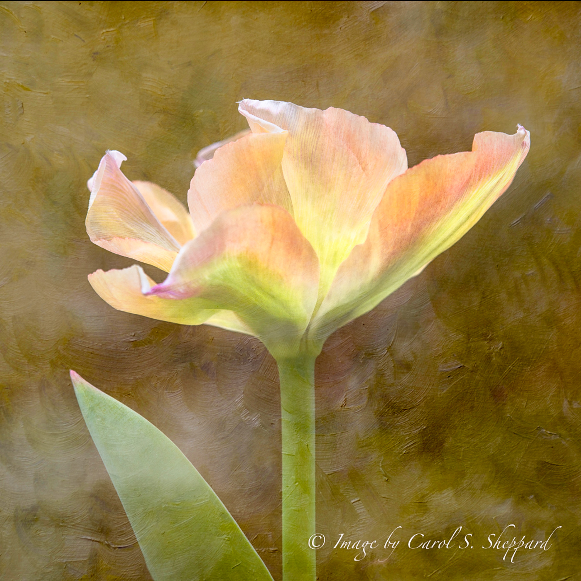
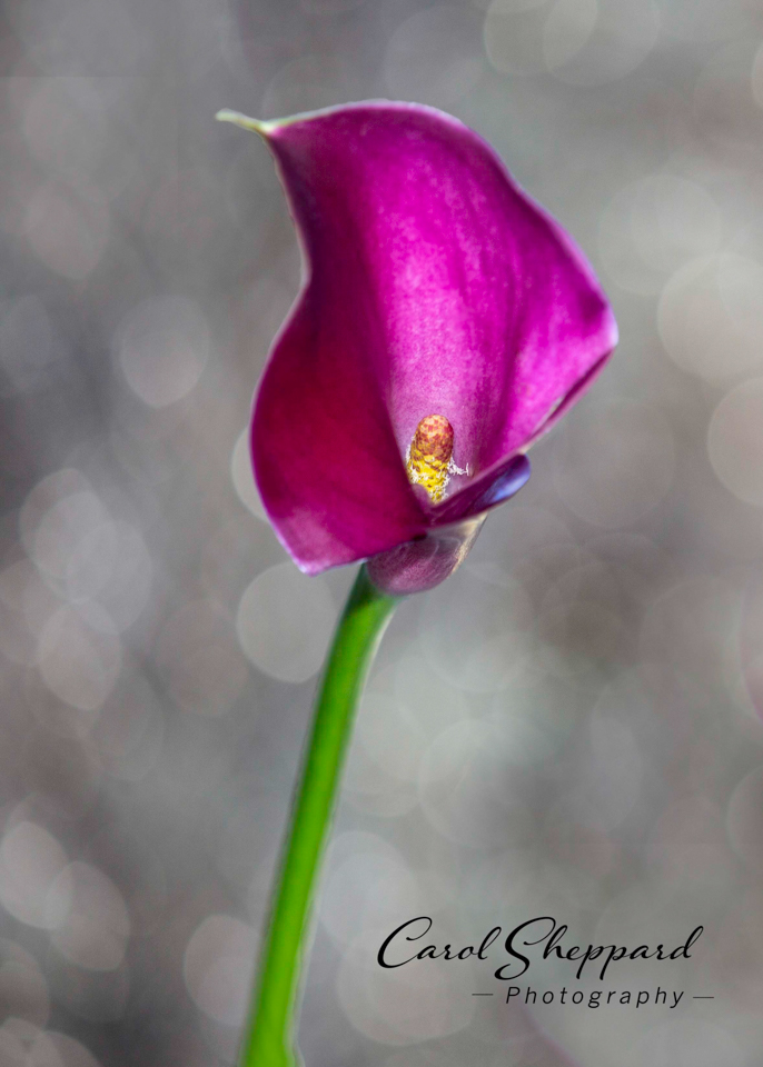
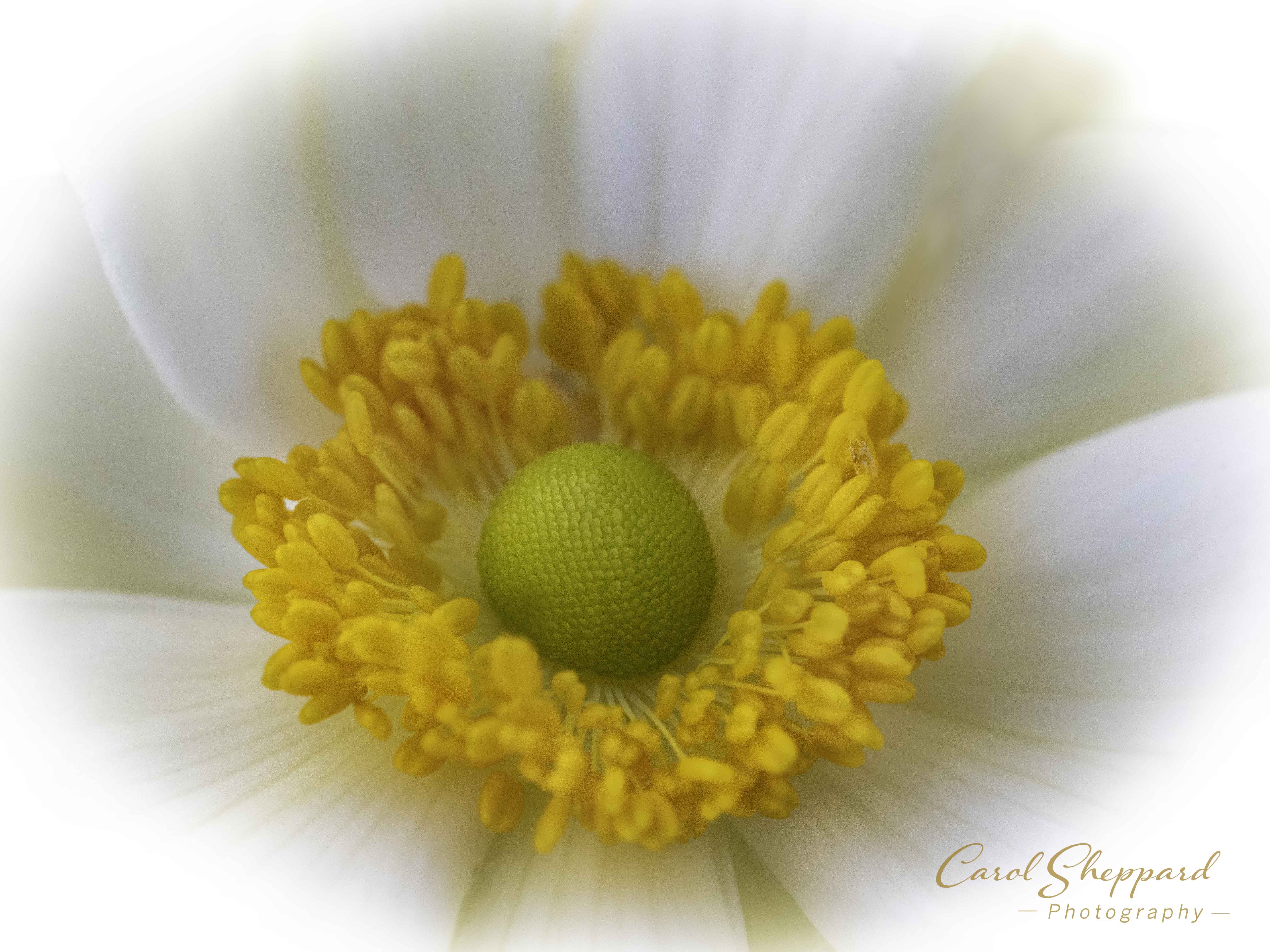
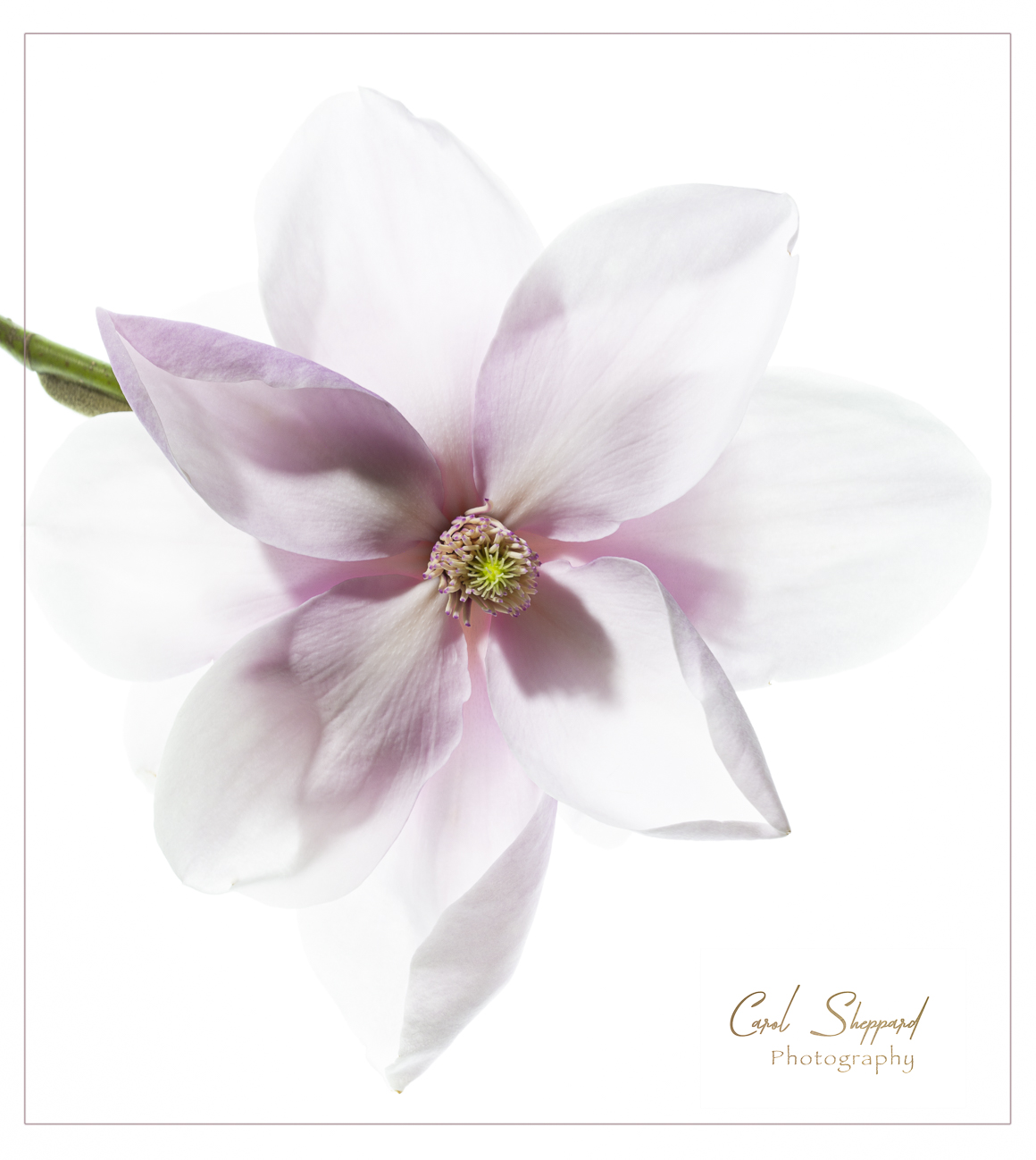
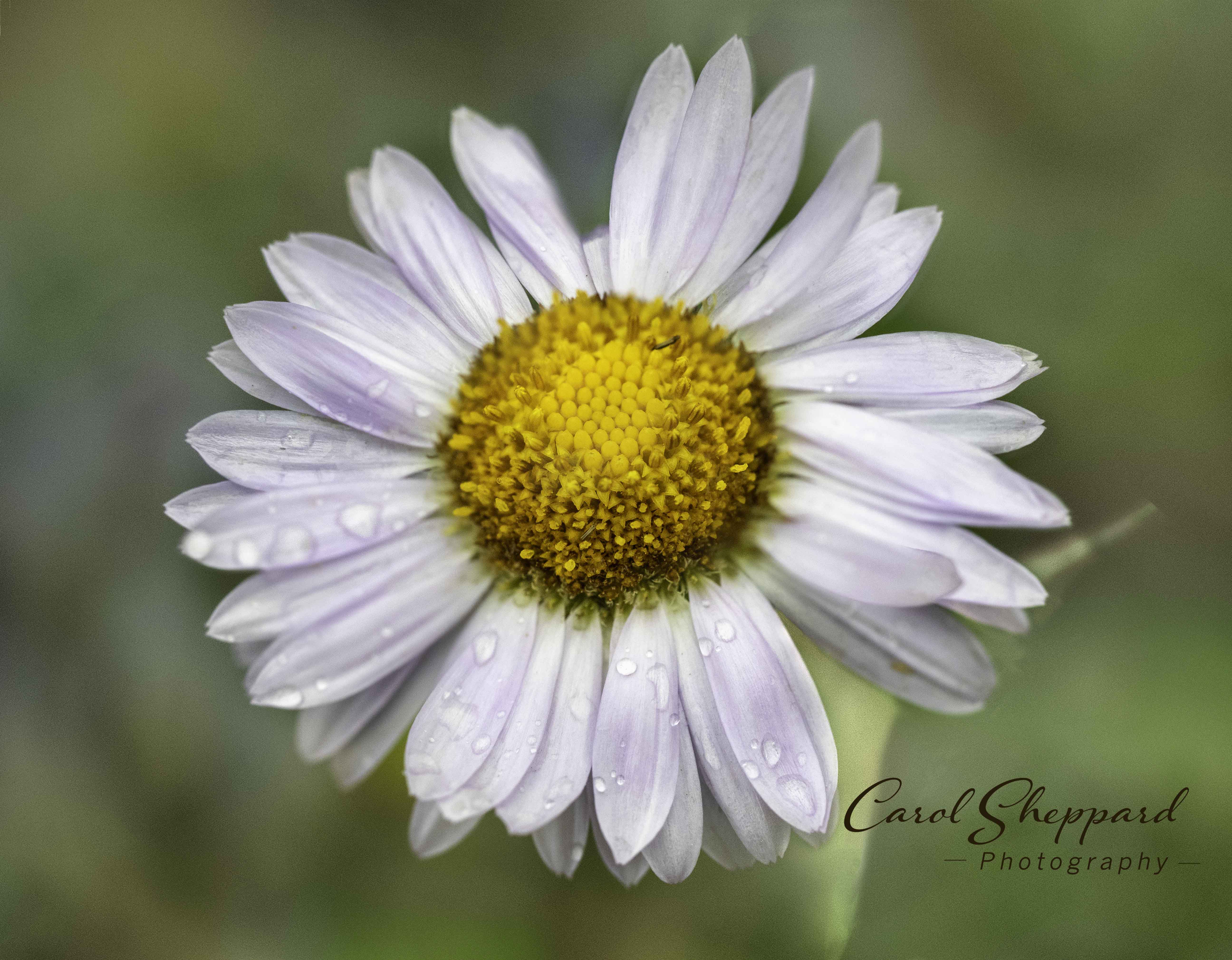
I found this image beautiful and captivating! Your capture of the most intricate details is amazing! Added to that, the tack sharpness throughout the center portion and continuing toward me as Viewer, and the wonderful simplicity and contrast, there isn't anything I would change. This is a marvelous image....contest-worthy for sure! |
Jun 12th |
6 comments - 0 replies for Group 60
|
15 comments - 0 replies Total
|