|
| Group |
Round |
C/R |
Comment |
Date |
Image |
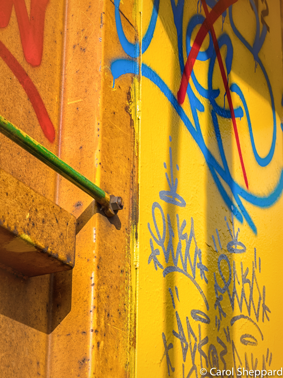
| 52 |
Apr 17 |
Reply |
All of your comments are very valid. John, you are probably spot-on about the difference in metering. Sometimes I am rushing and forget to change it, but have been trying to be better about that. Layers in Photoshop is probably going to be the most versatile way to darken that backgound. I admit to having a really hard time darkening backgrounds, as I like looking at overall lighter images--it is something I have heard before on my images! That is also why I suffer whenever I use the radial filter!! |
Apr 12th |
| 52 |
Apr 17 |
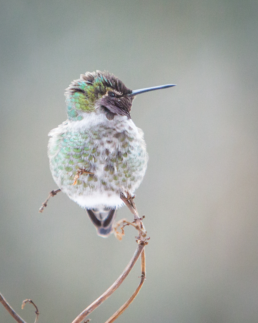
Comment |
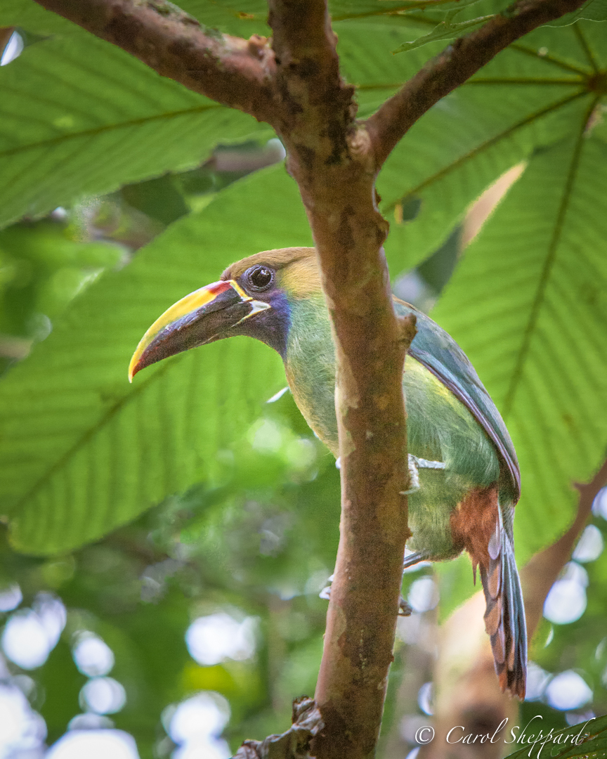
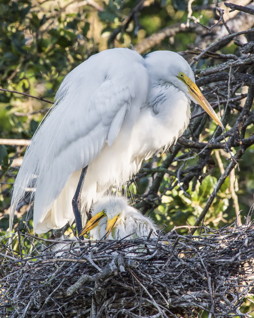
The simplicity of this gives it part of the pleasing impact, along with the lovely contrast between bird/branch and background. It does feel very oriental, doesn't it? Like an art piece.
For me, the branch being in a variety of focus gives the feel of action, or impending action, by the bird, so I like it. I didn't wish to change anything about this....it's a pleasant, attractive image. |
Apr 12th |
| 52 |
Apr 17 |
Comment |
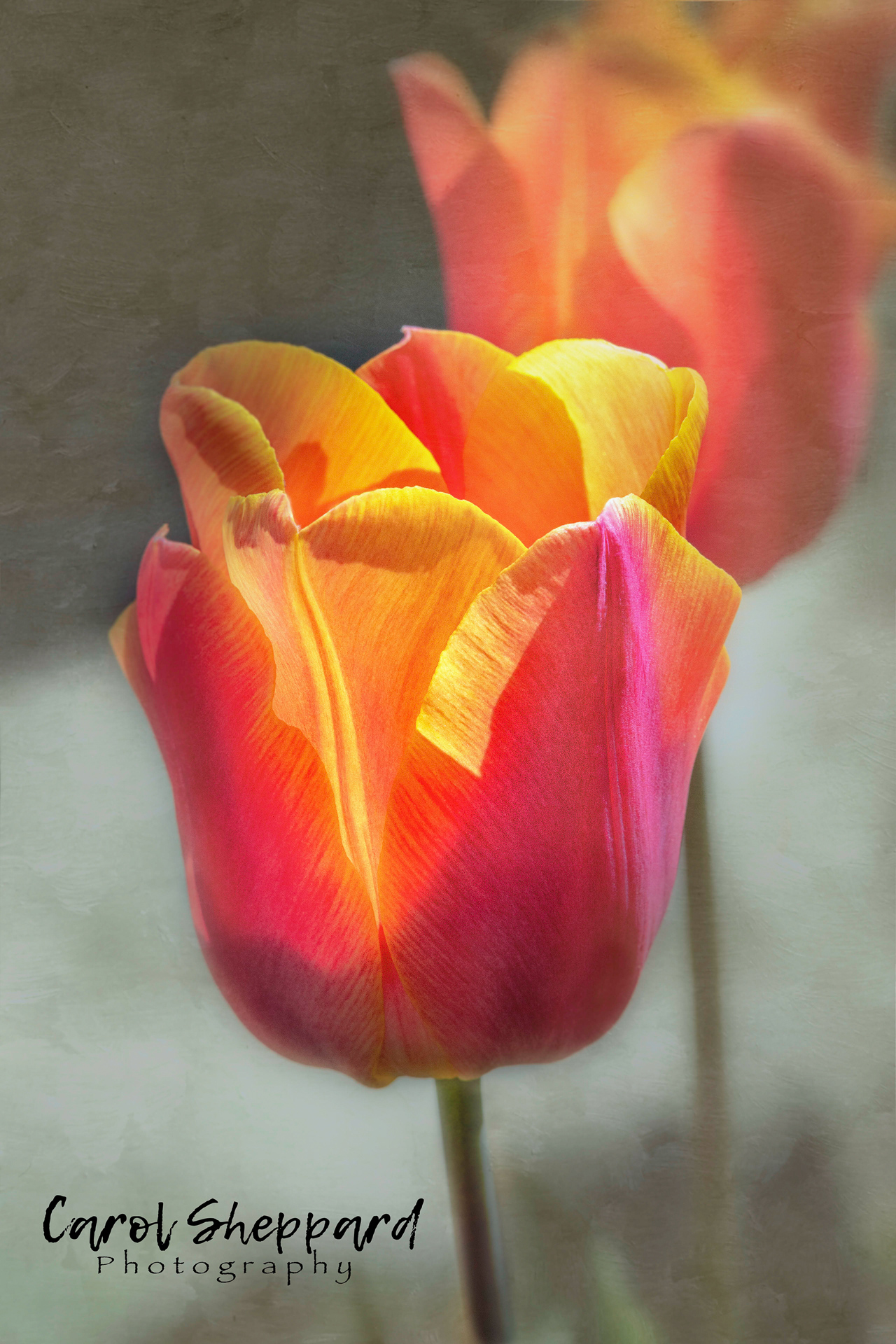
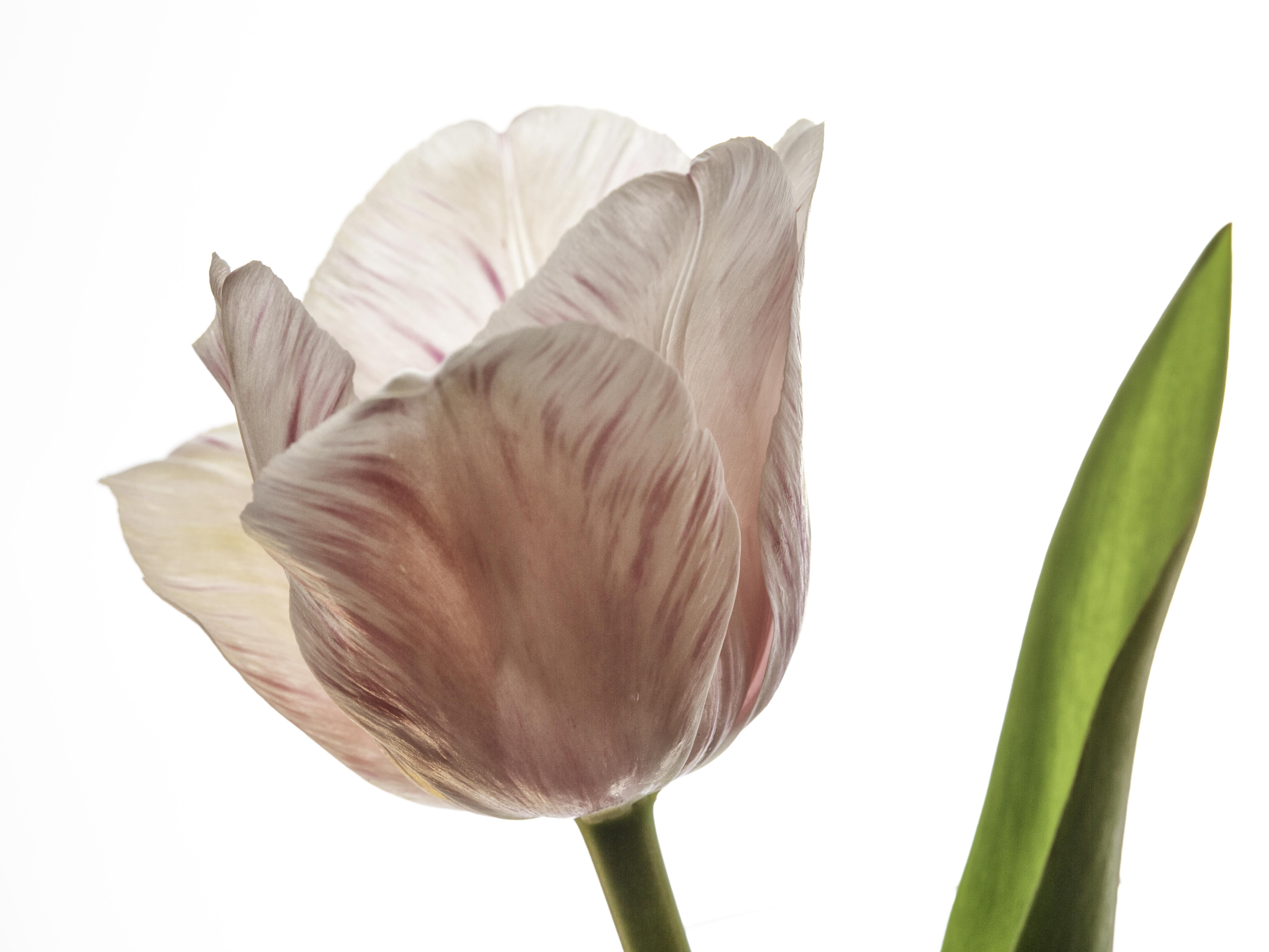
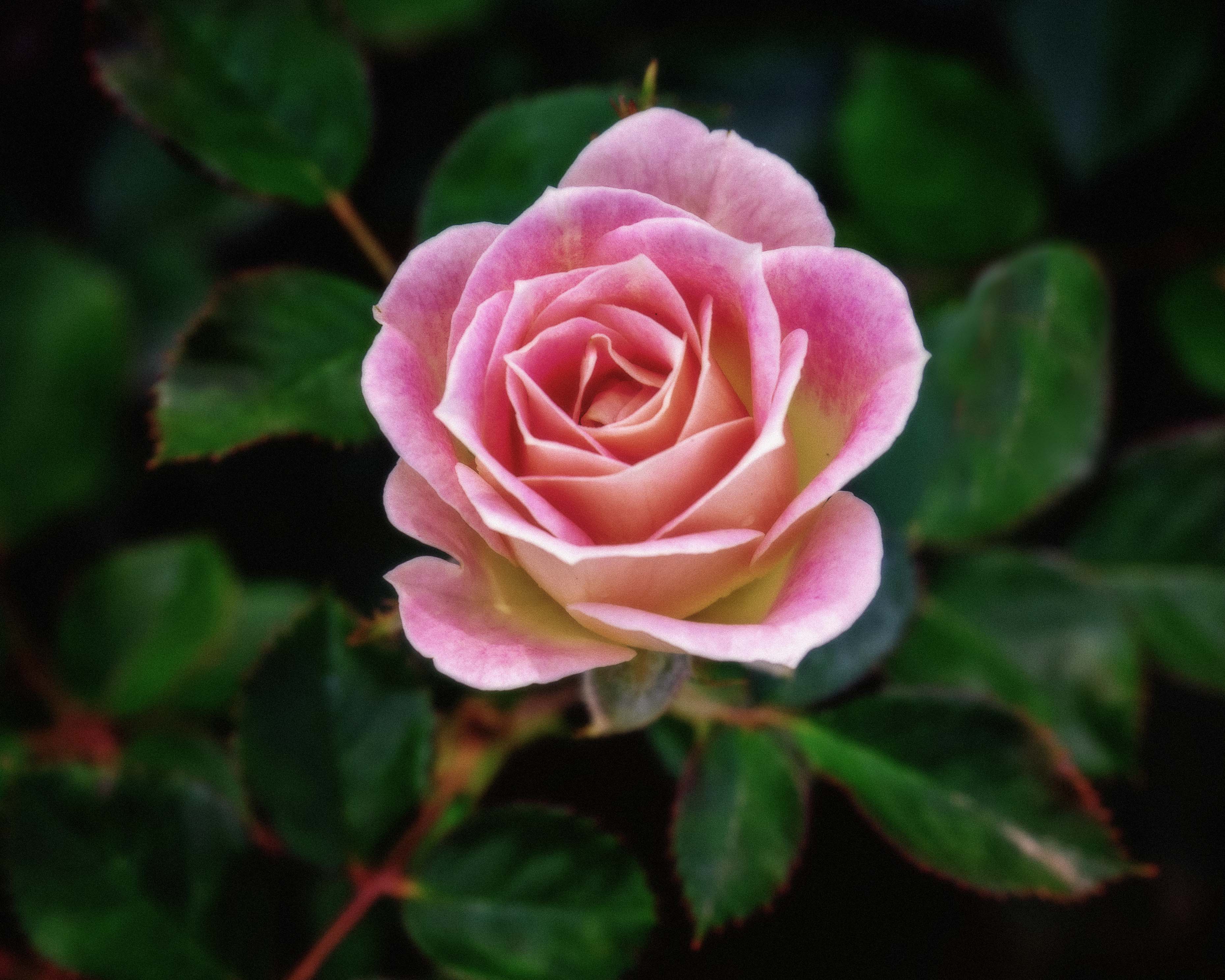
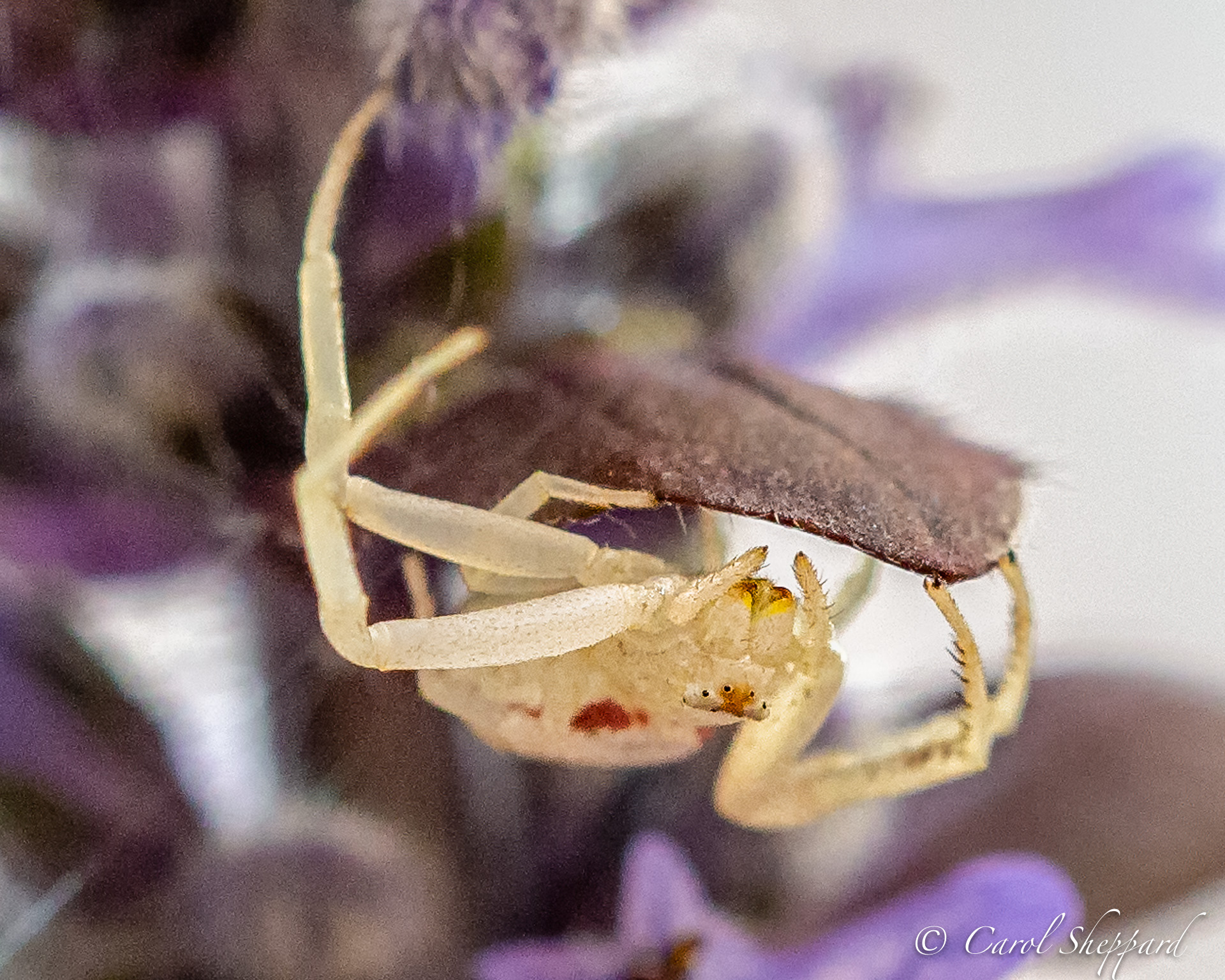
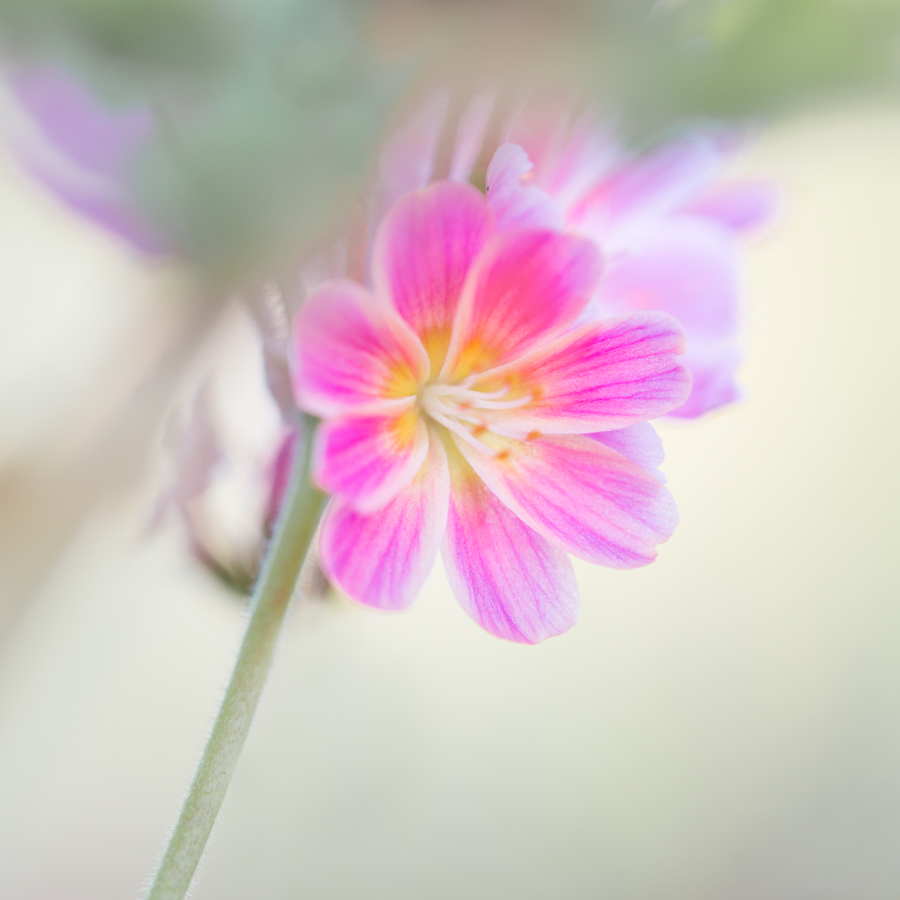
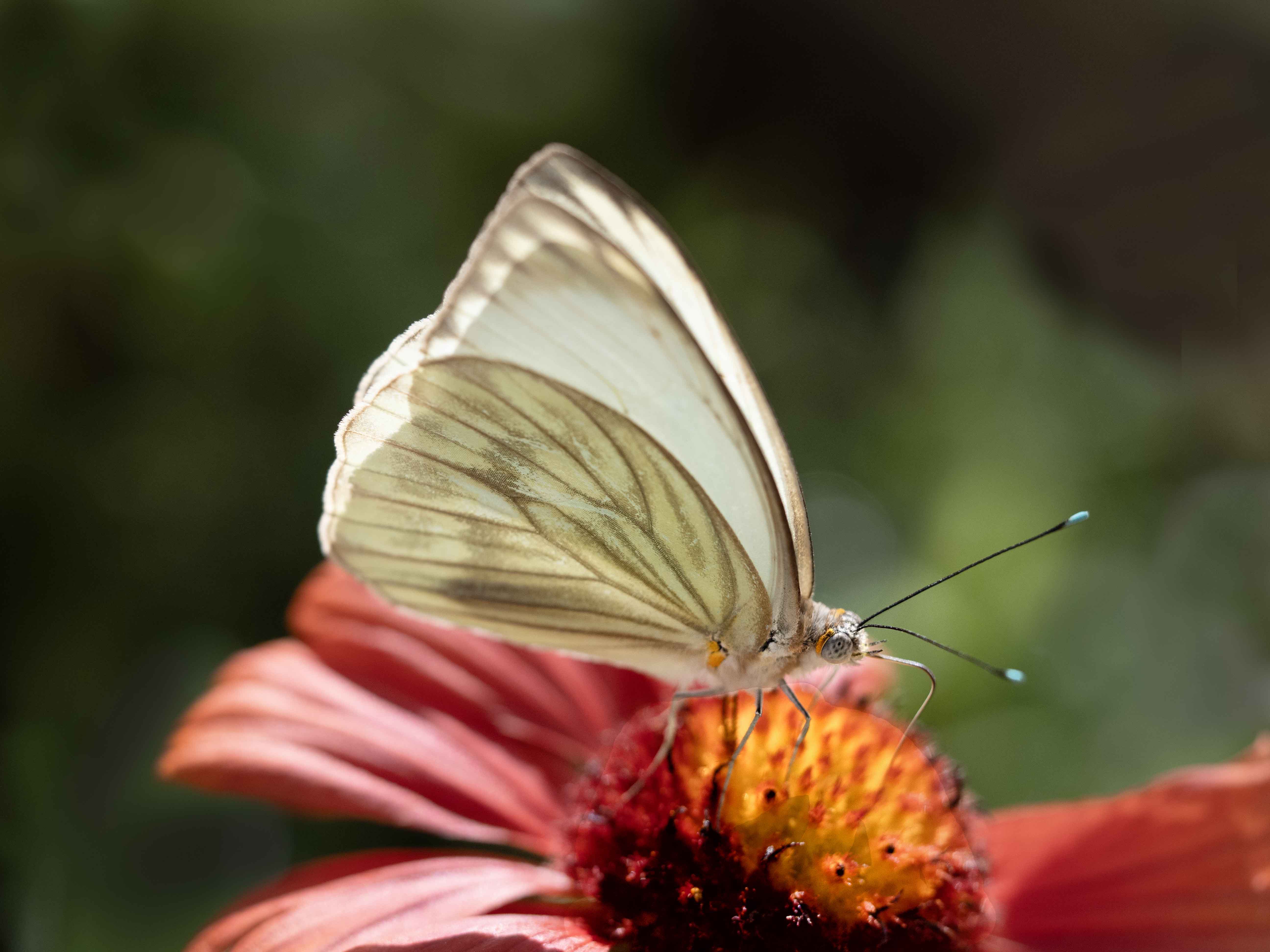
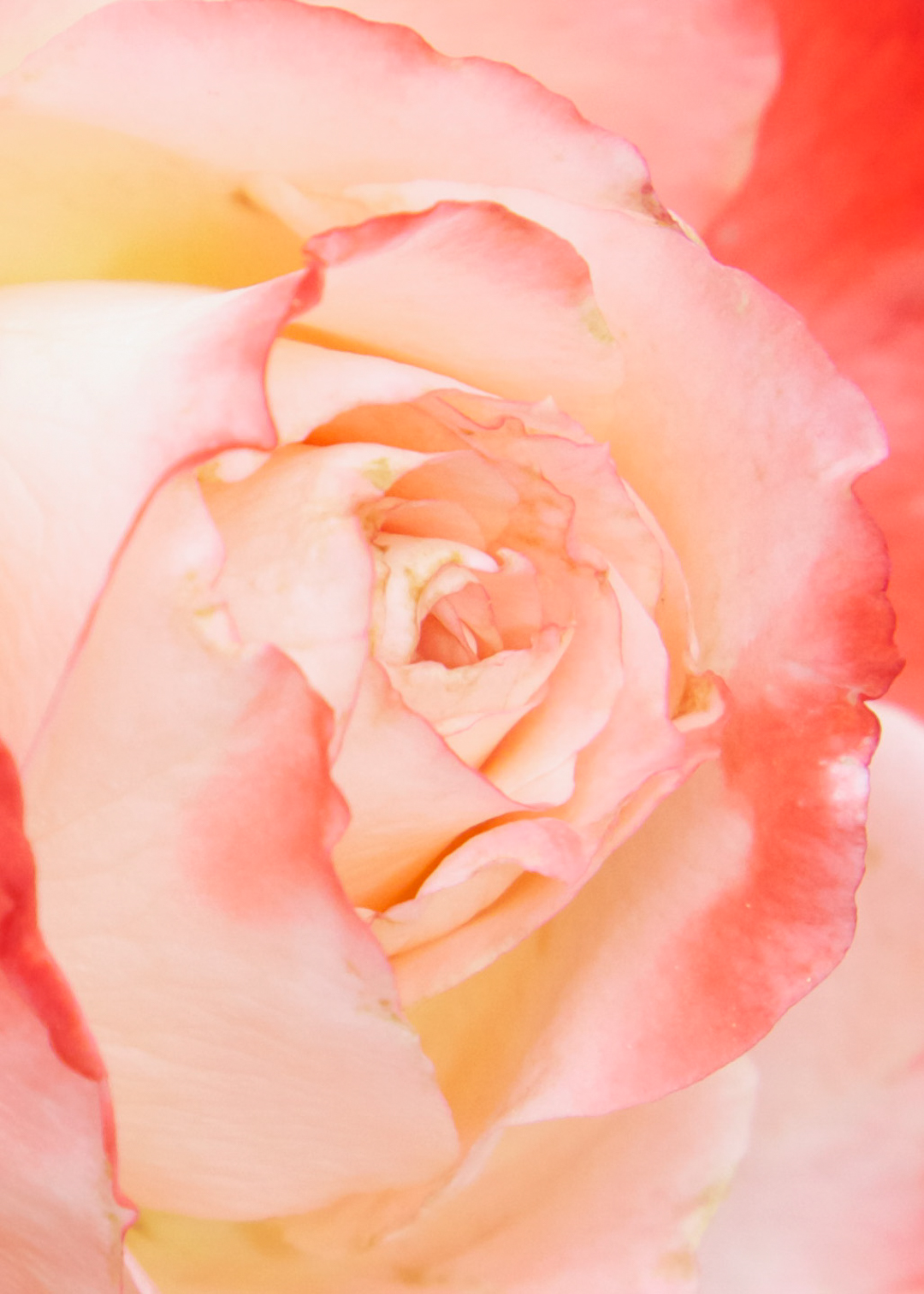
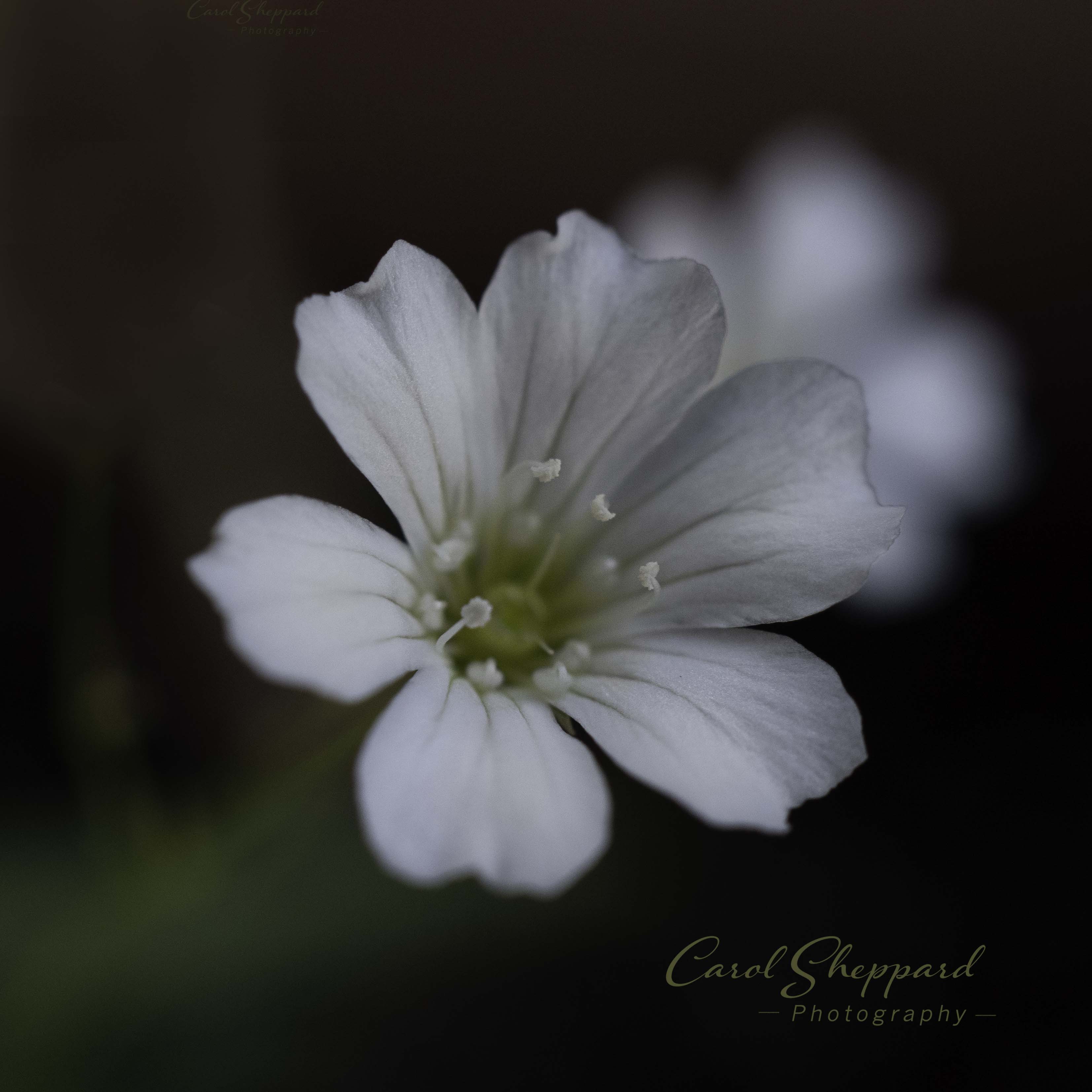
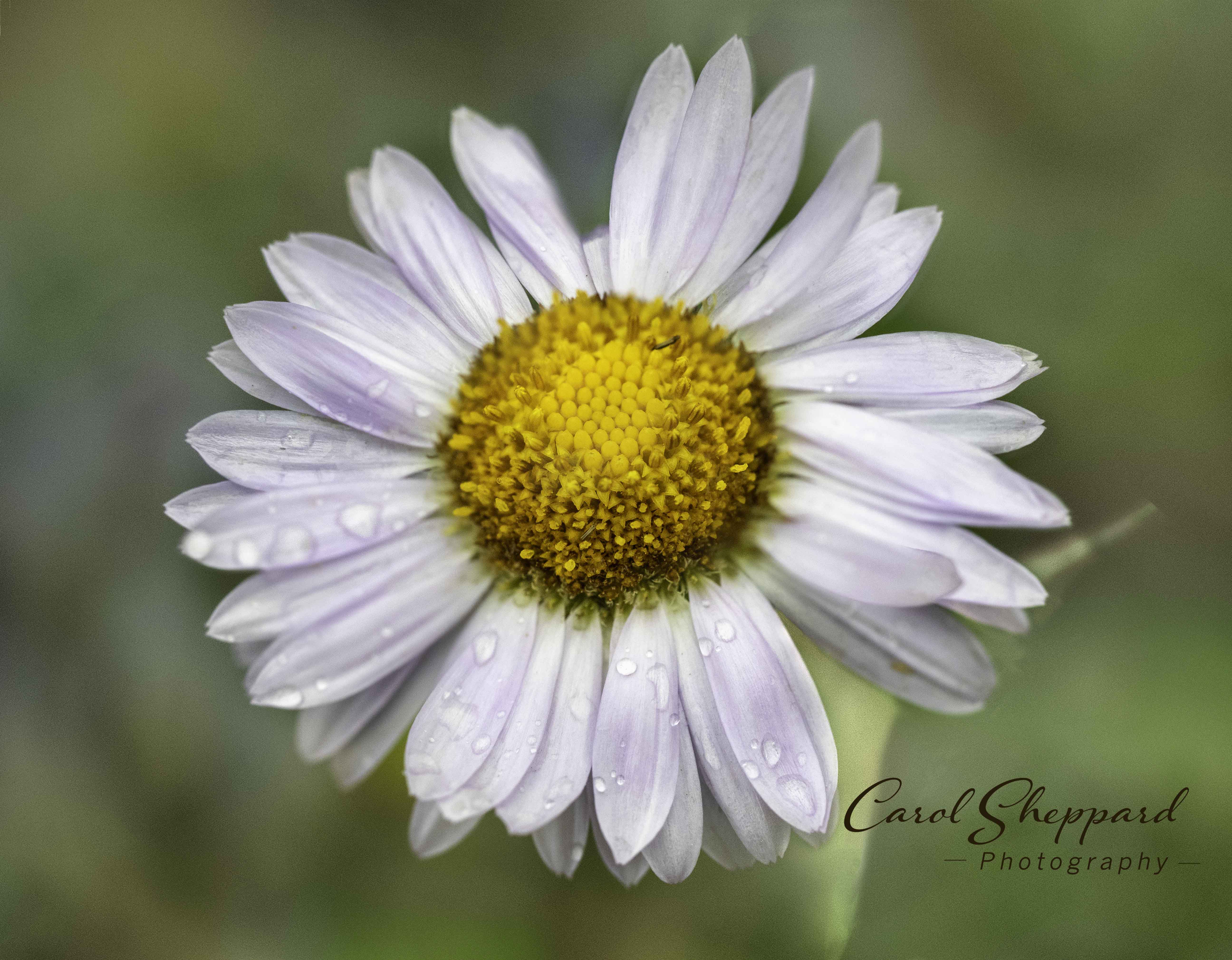
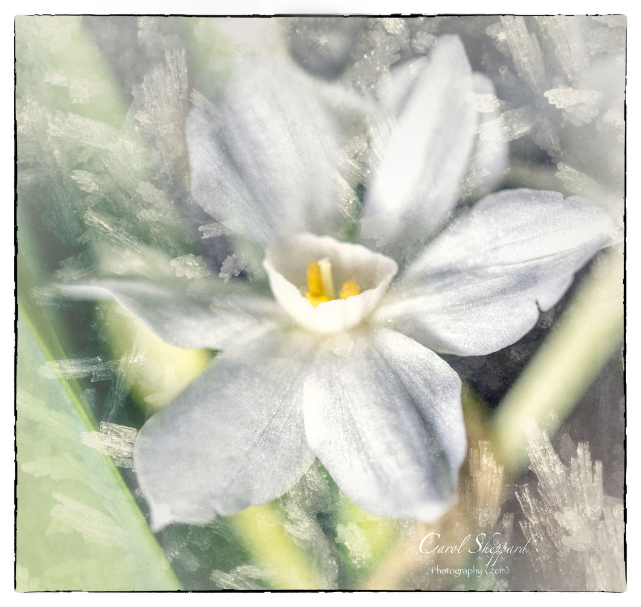
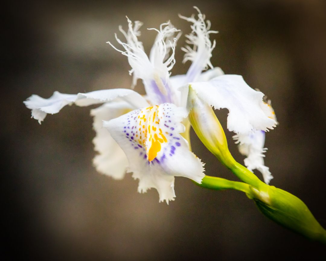
Judith, you have caught a wonderful combination of colors, and your sharpness is perfect! There are some blown out areas, and the diffuser would have been great to have. This is one of the difficulties in photographing flowers...the sun makes them pop in detail, but blows out areas all over the place :-( And flash isn't really a great alternative unless you have one of those ring flashes, and even then.... So, diffuser for a start, and I will pass along something that Mike Moats said and which I have always used as a guide since--when photographing flowers, look for the flower that stands a little apart. With flowers, it makes for a more flattering shot to not have it too busy. |
Apr 12th |
| 52 |
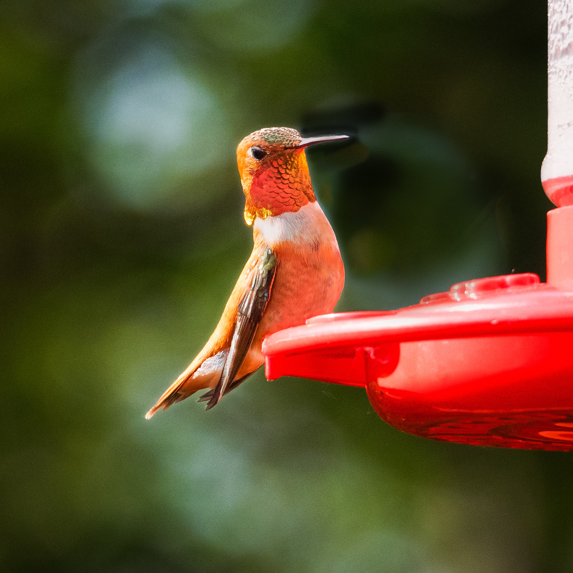
Apr 17 |
Comment |
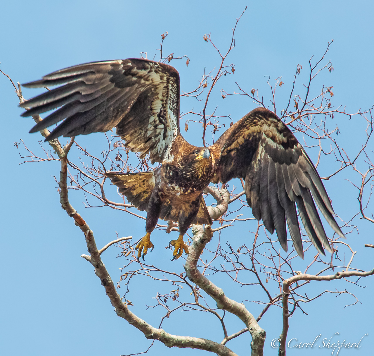
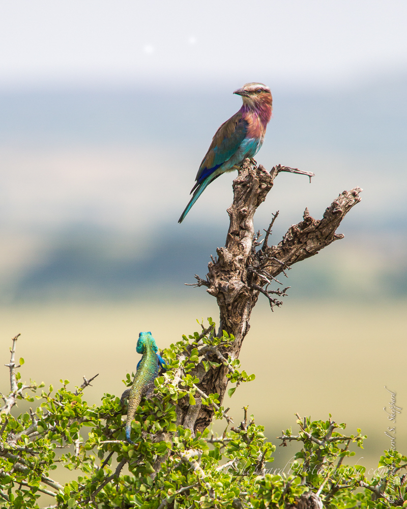
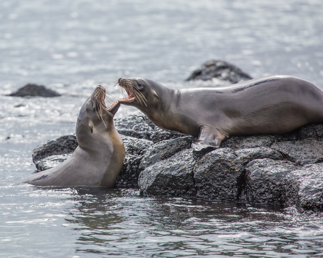
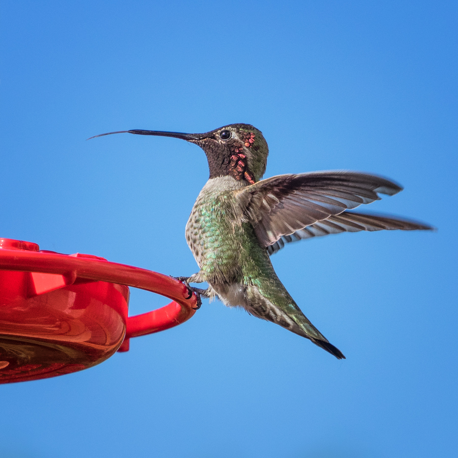
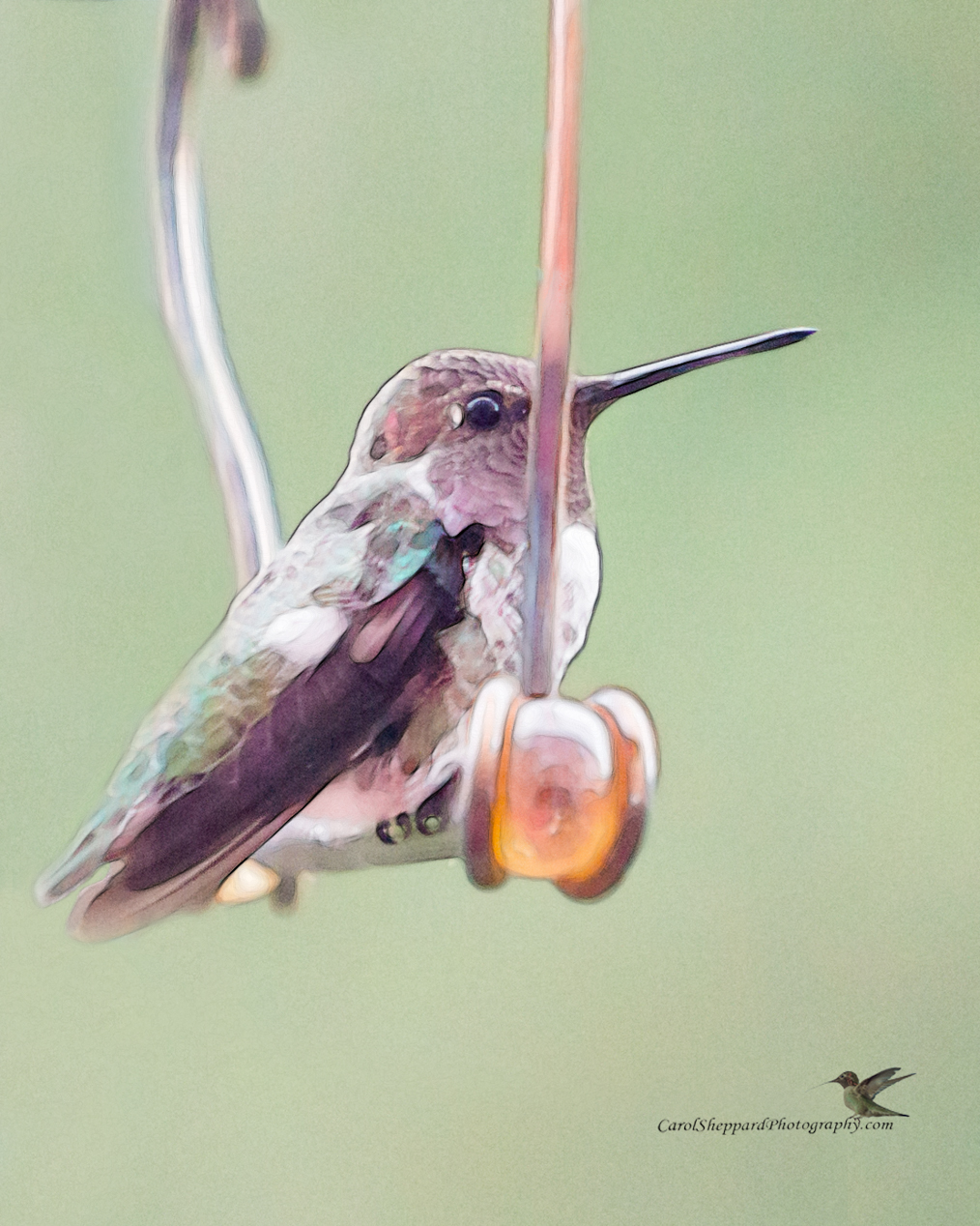
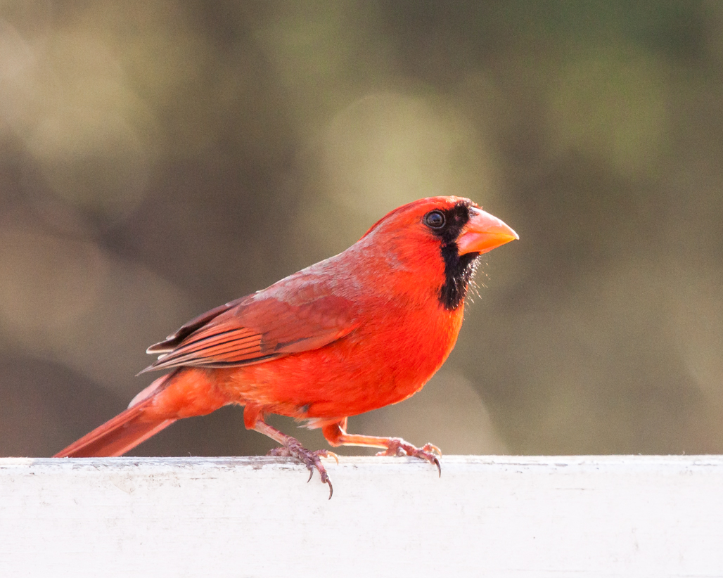
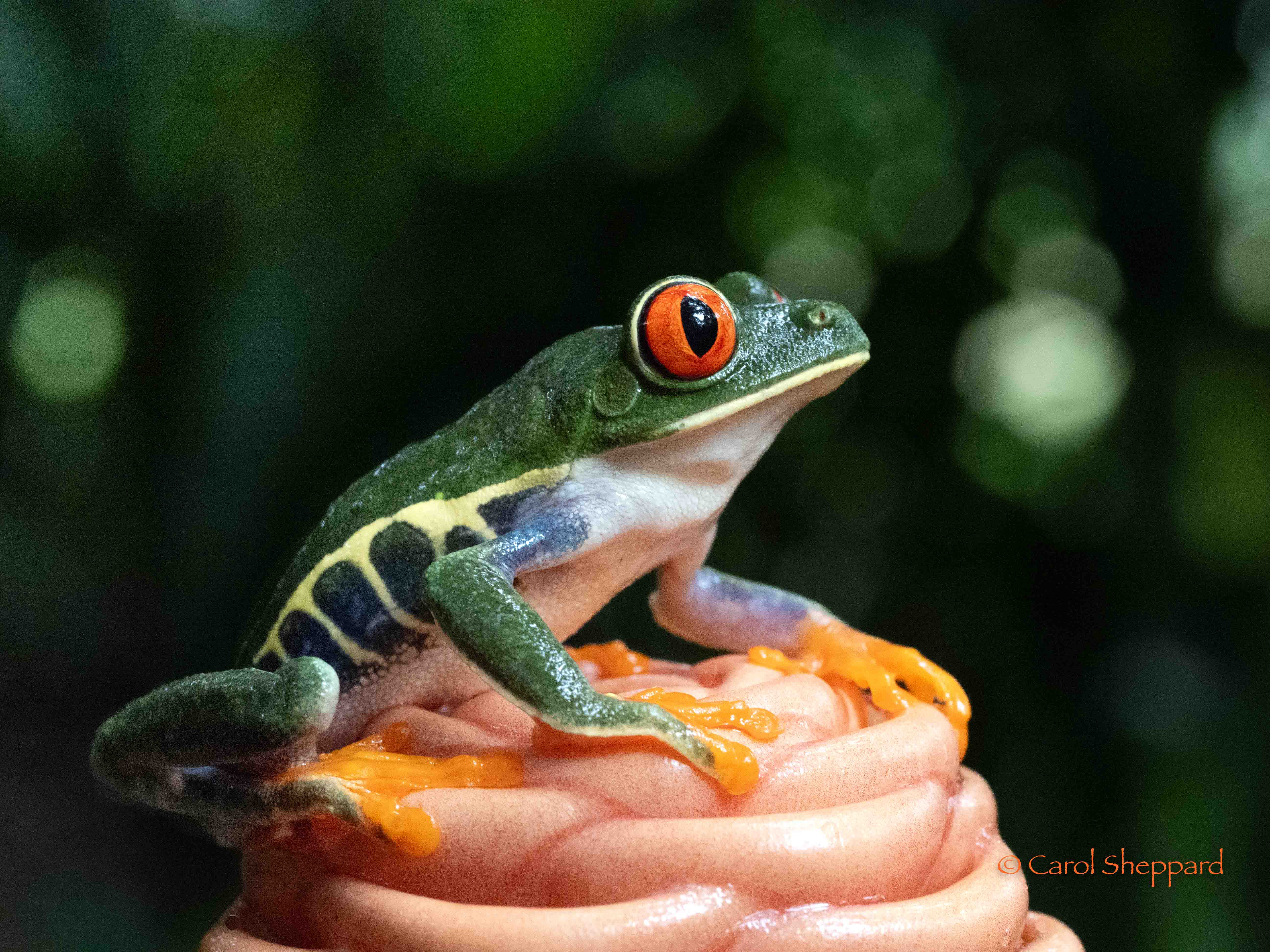
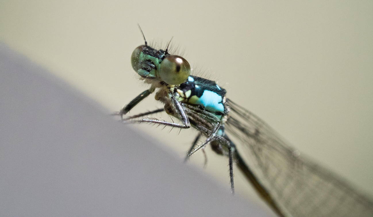
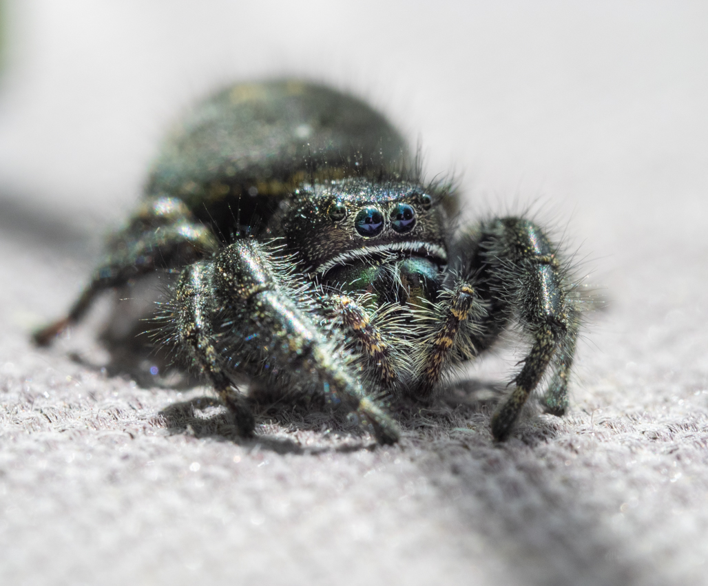
Love it! Beautifully sharp and clear against that background, and the focus on the eyes is magnificent. The simplicity of this makes the image. Did you add sharpening?Great picture, and yes, I know those are really the colors of those birds at that time of year. It's amazing! |
Apr 12th |
| 52 |
Apr 17 |
Comment |
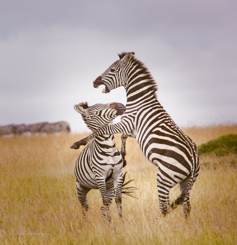
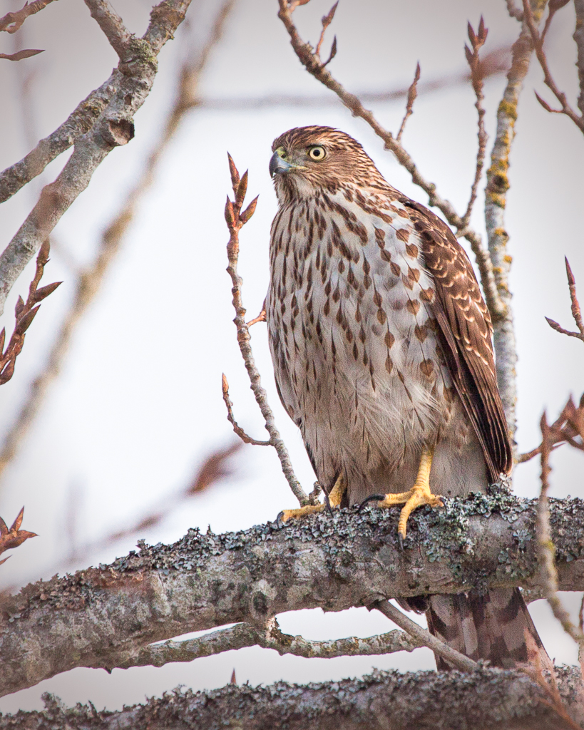
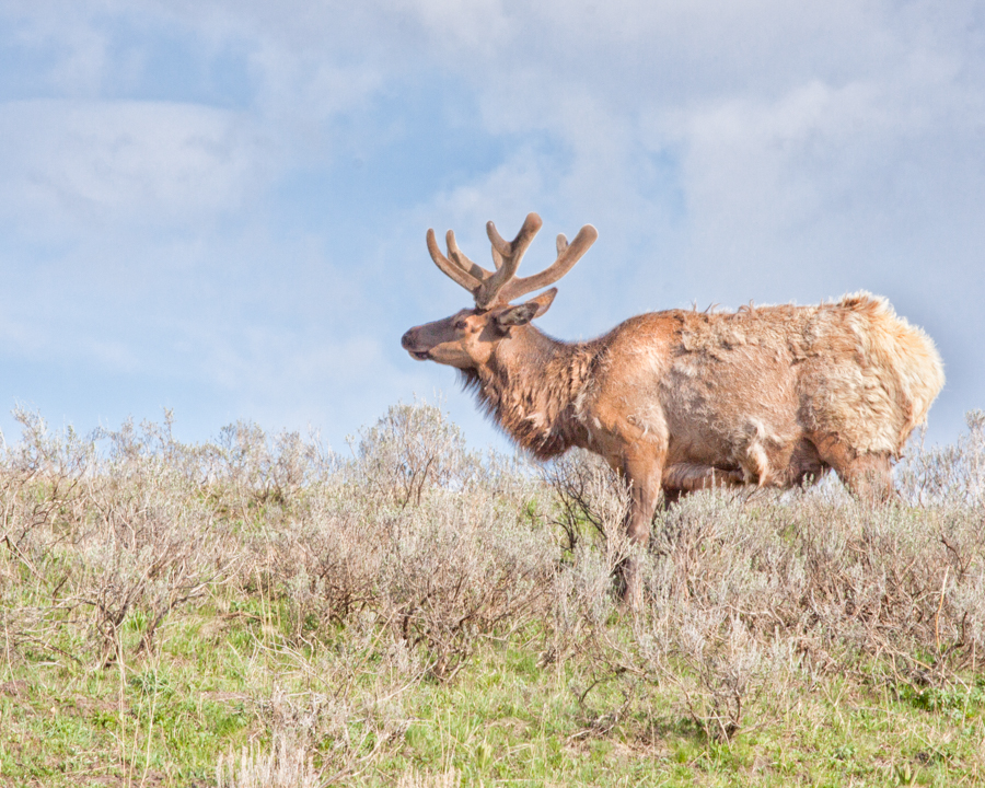
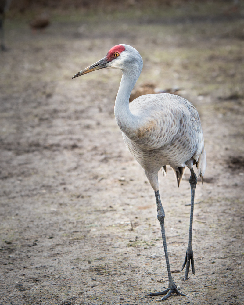
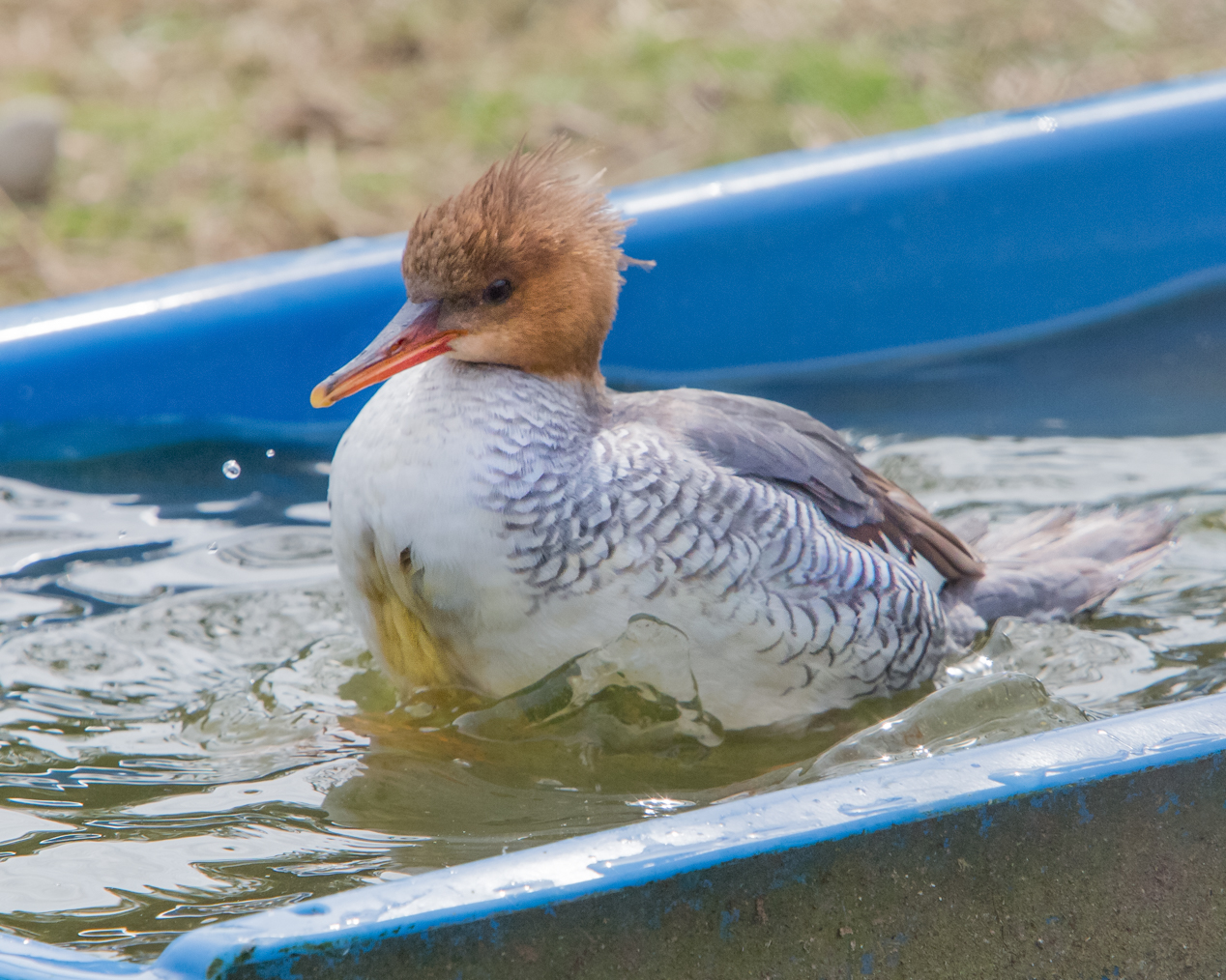
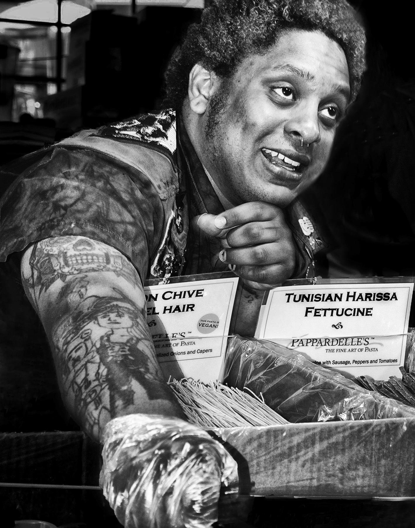
Birds can be difficult! Those darned critters just won't stop moving! However, my first thought was that I'd like to see the bird filling the frame; the empty space minimizes the impact of the capture. I also see the color noise, so know that you are already working with tough conditions. What worked most for me was the alternating stripes in the background--subtle but pleasing! So while I know this isn't much help, I find that the beauty of birds is enhanced by more feather detail and closer captures unless they are exhibiting some cool activity? |
Apr 12th |
| 52 |
Apr 17 |
Comment |
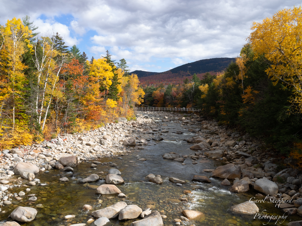
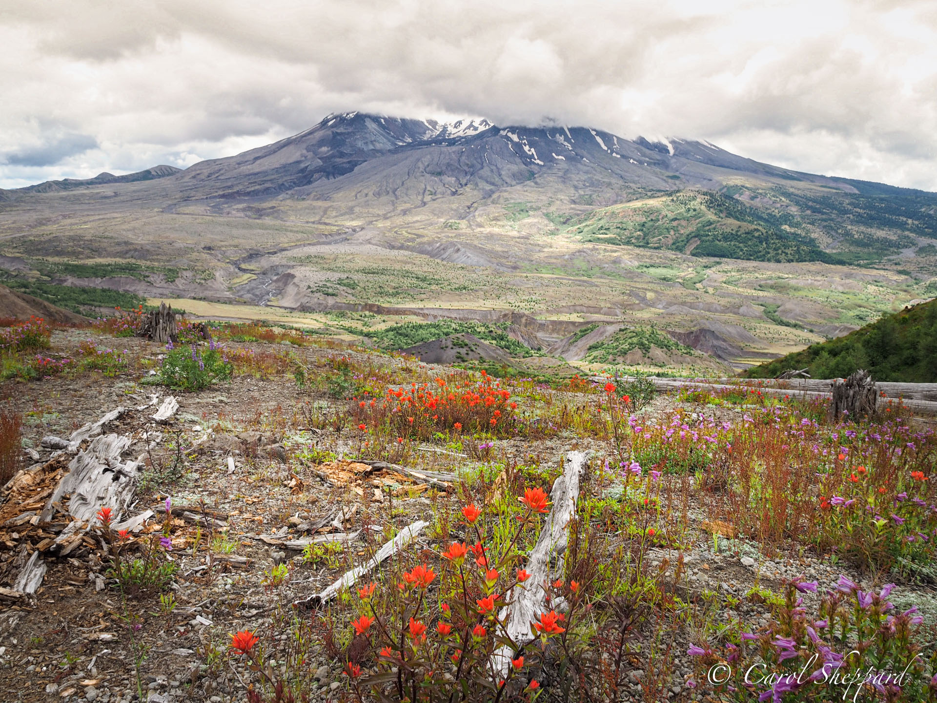
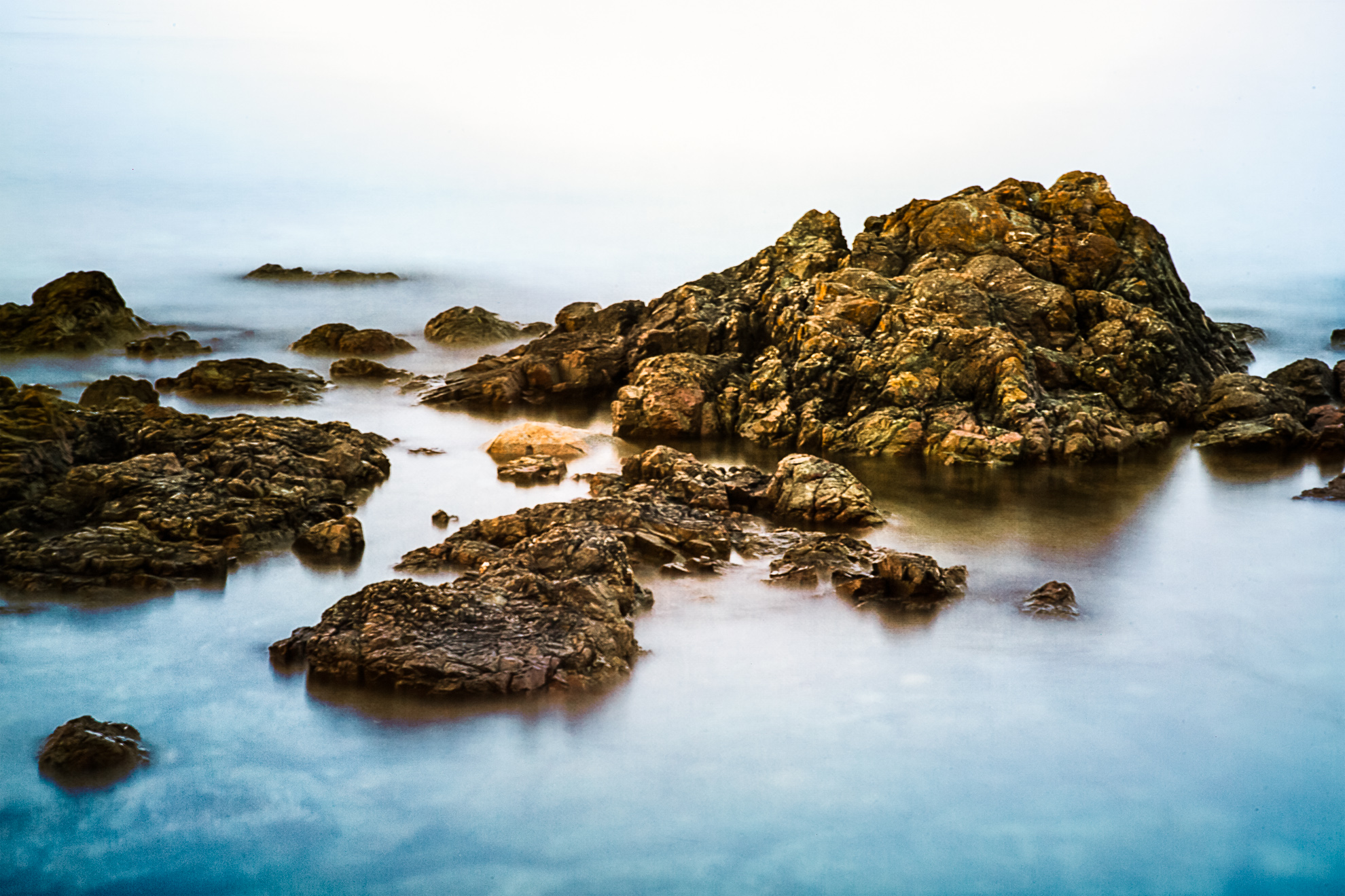
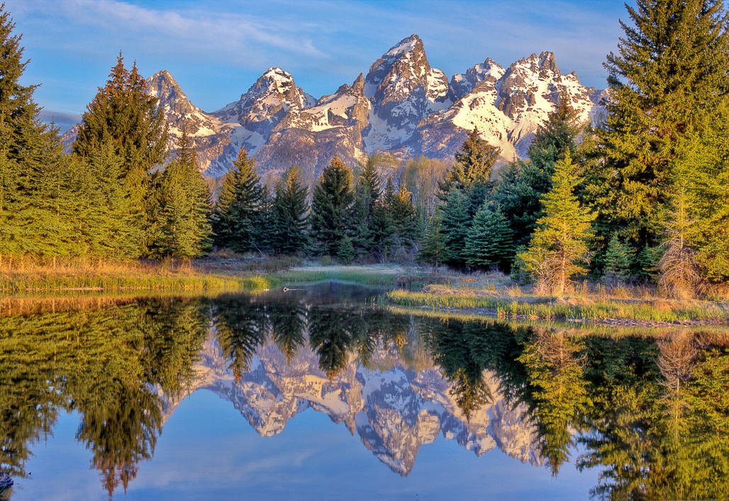
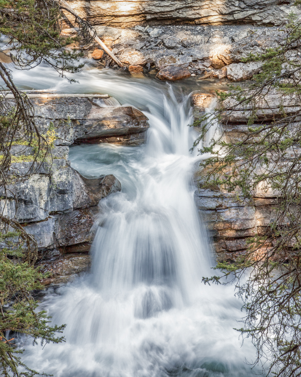
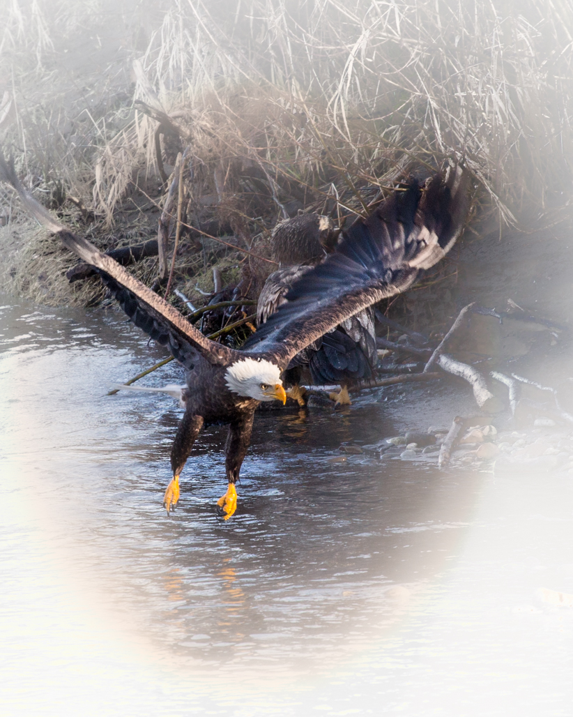
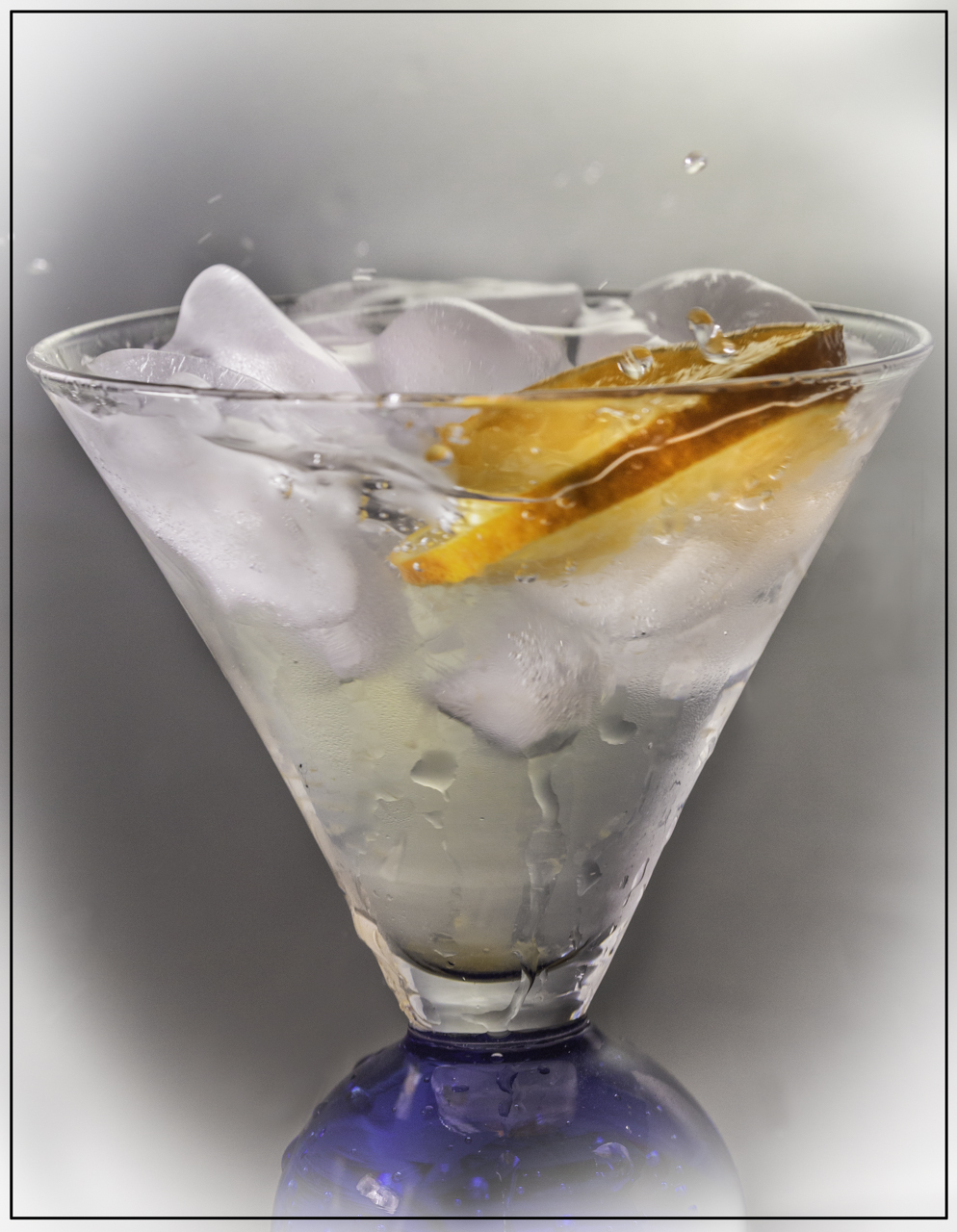
I really like this image! The initial impact could benefit from an increase in contrast, but I would worry about losing the beautiful soft, foggy effect. So, increasing the fog instead does seem like a better idea to me. In particular, I like the composition...and it fits perfectly into the silvery B&W effect that you've selected. Mike's first re-do was nice for bumping up the foggy effect, but honestly the crop worked just fine for me in the original.
|
Apr 12th |
| 52 |
Apr 17 |
Comment |
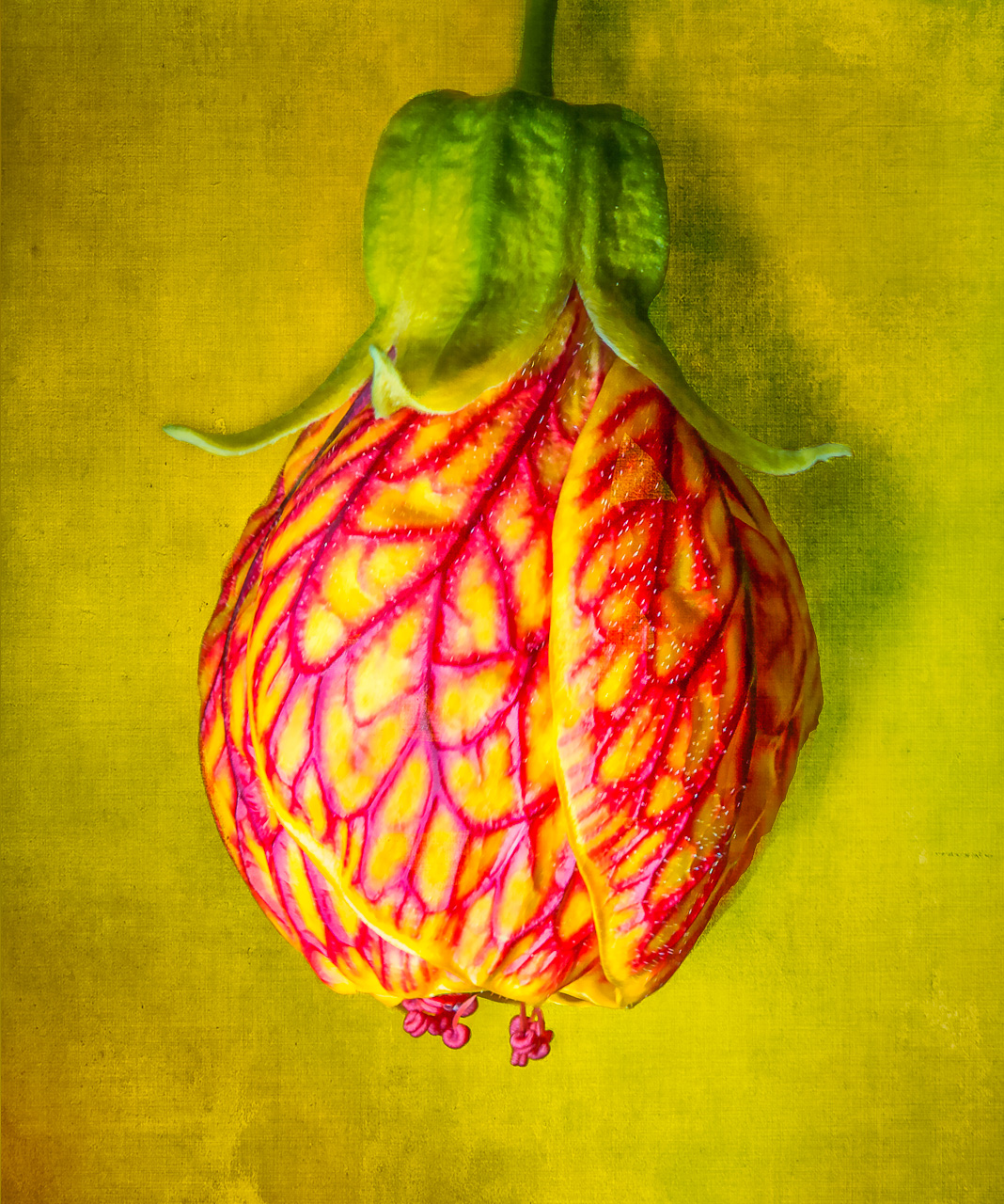
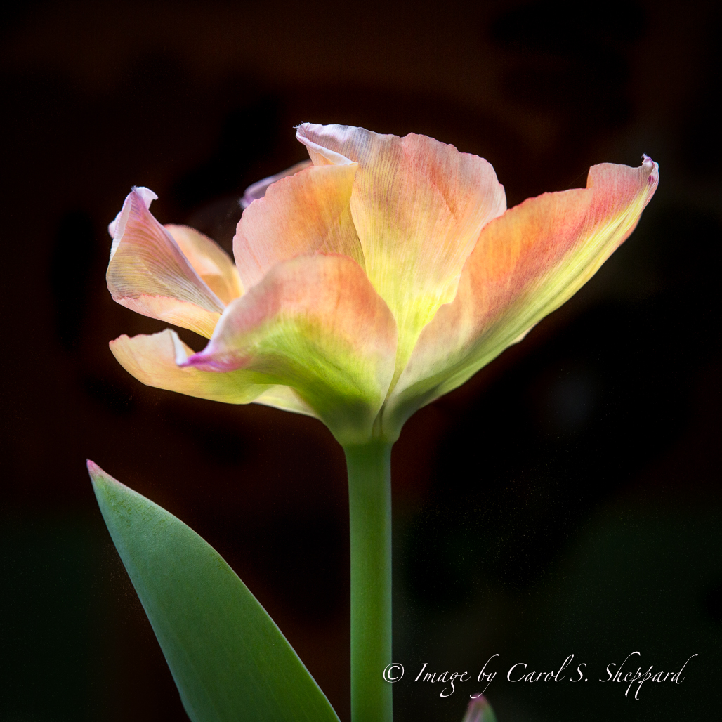
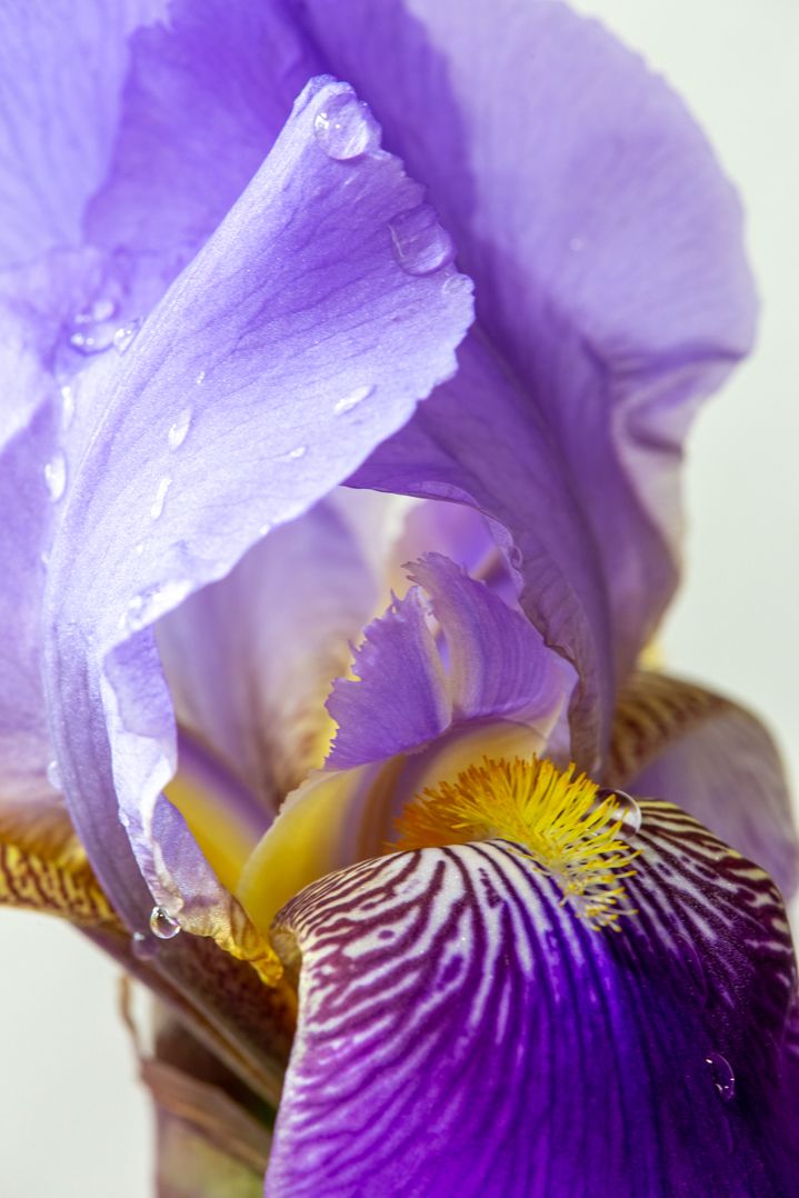
The nature of the background provided wonderful initial impact, along with a great color combination and composition.
For me, the whites lack some detail which I think could be easily corrected locally using a brush.
With the exception of that, your image has a very romantic, ethereal feel; great job! |
Apr 12th |
6 comments - 1 reply for Group 52
|
| 60 |
Apr 17 |
Comment |
Thank you, Lou! I actually like softness in some images, and that causes pretty consistent comments about a lack of contrast. I have begun to automatically pop the contrast on my images, and then I do a comparison. I find that if you go back and forth between images, the softness can be disturbing. But if you take an image by itself, isolated, it feels fine. Hmmmm. The value of these dialogues!
|
Apr 25th |
| 60 |
Apr 17 |
Comment |
Yes, I do like what you did, Ginger. Would you mind giving me some direction as to how you did your editing...ie, what package did you use, and which adjustments/sliders, etc.? A lack of strong contrast seems to be a recurring theme with me, and I have been trying to improve my skills in this area.
And thank you both for your comments!
Carol |
Apr 23rd |
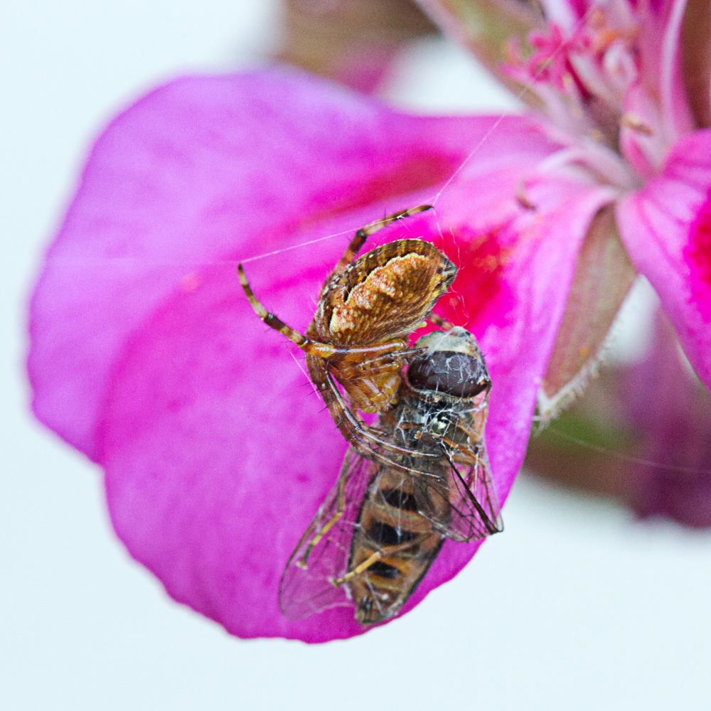
| 60 |
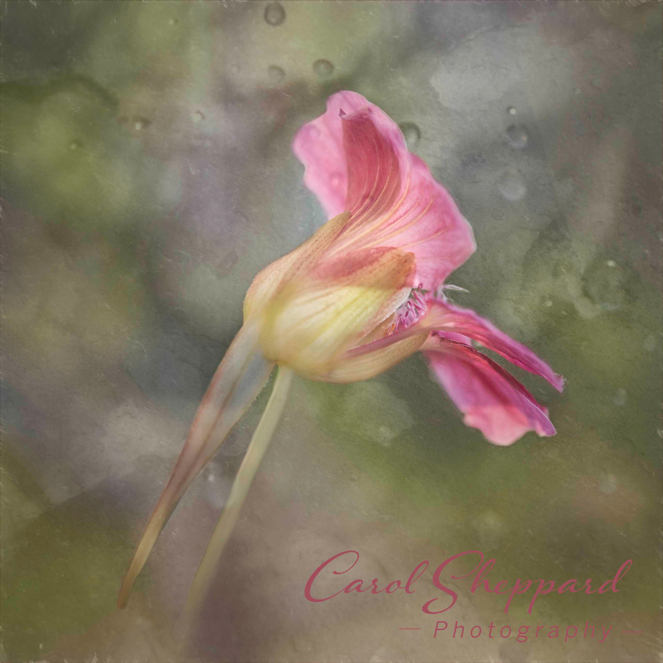
Apr 17 |
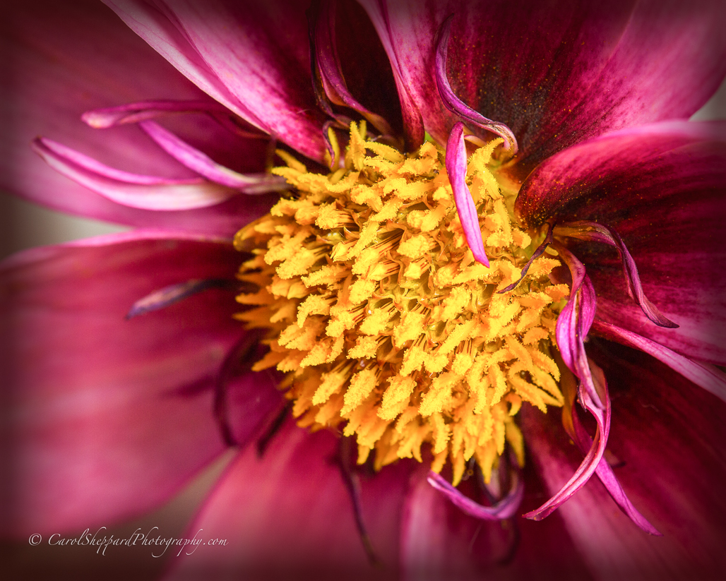
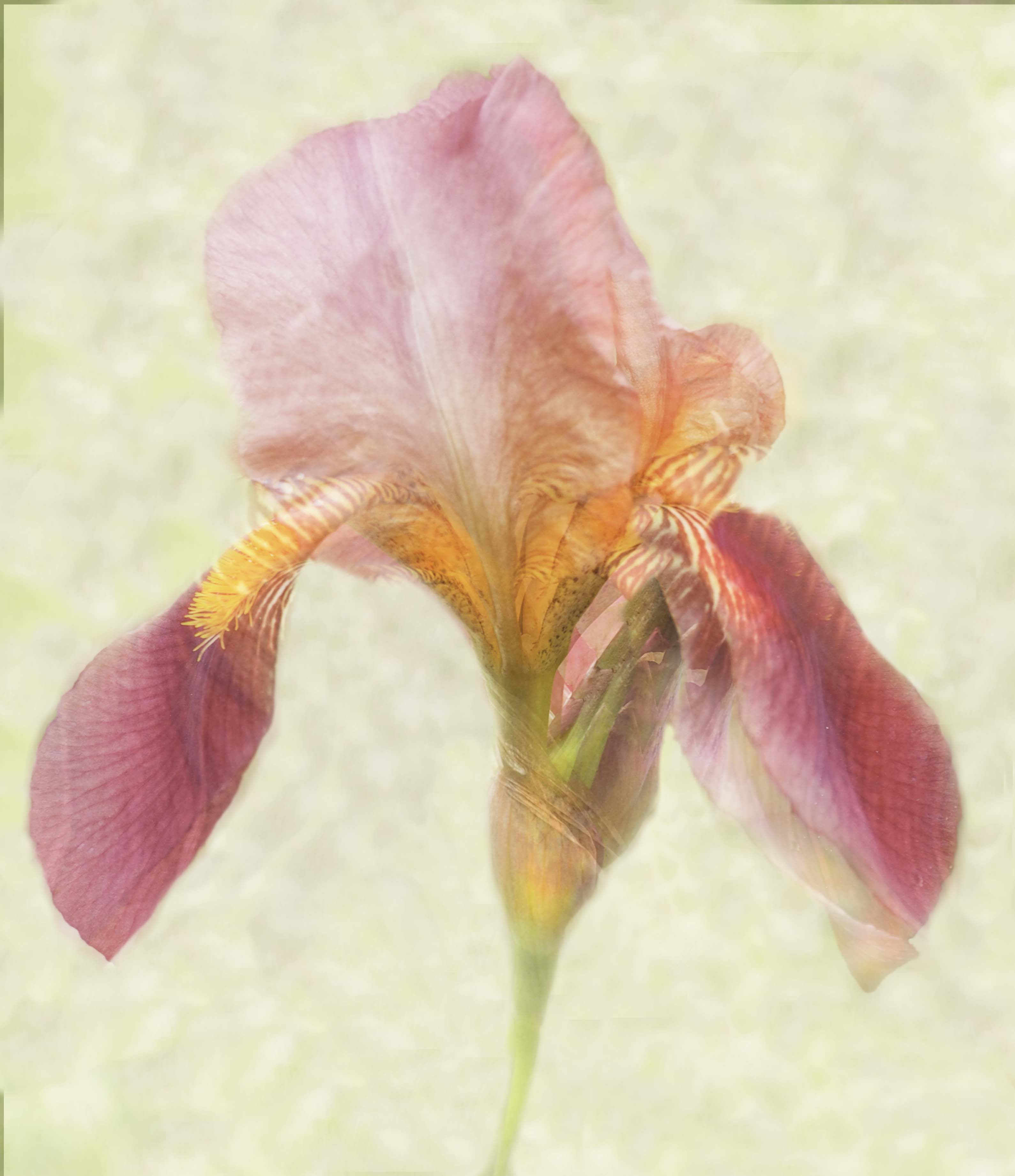
Comment |
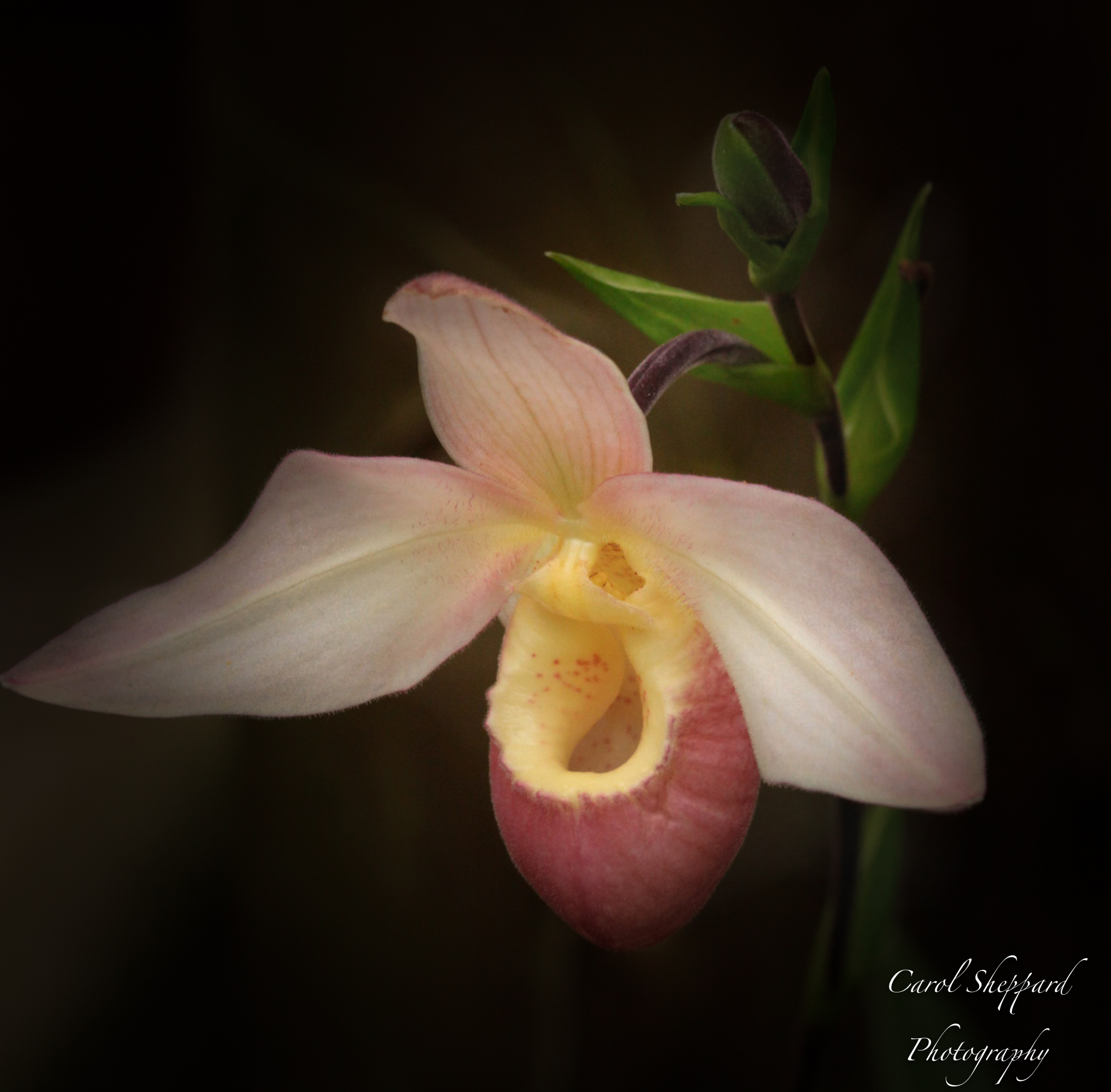
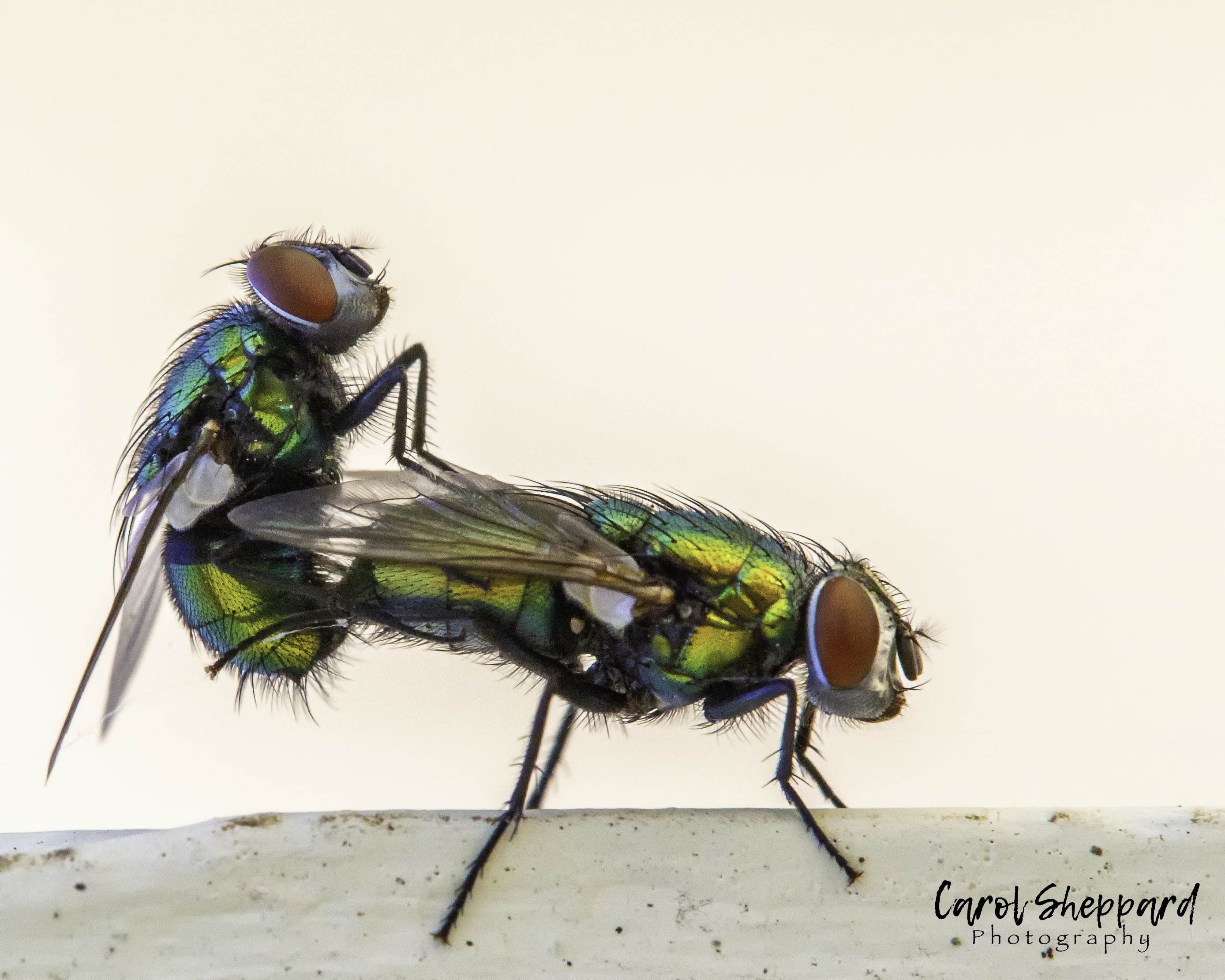
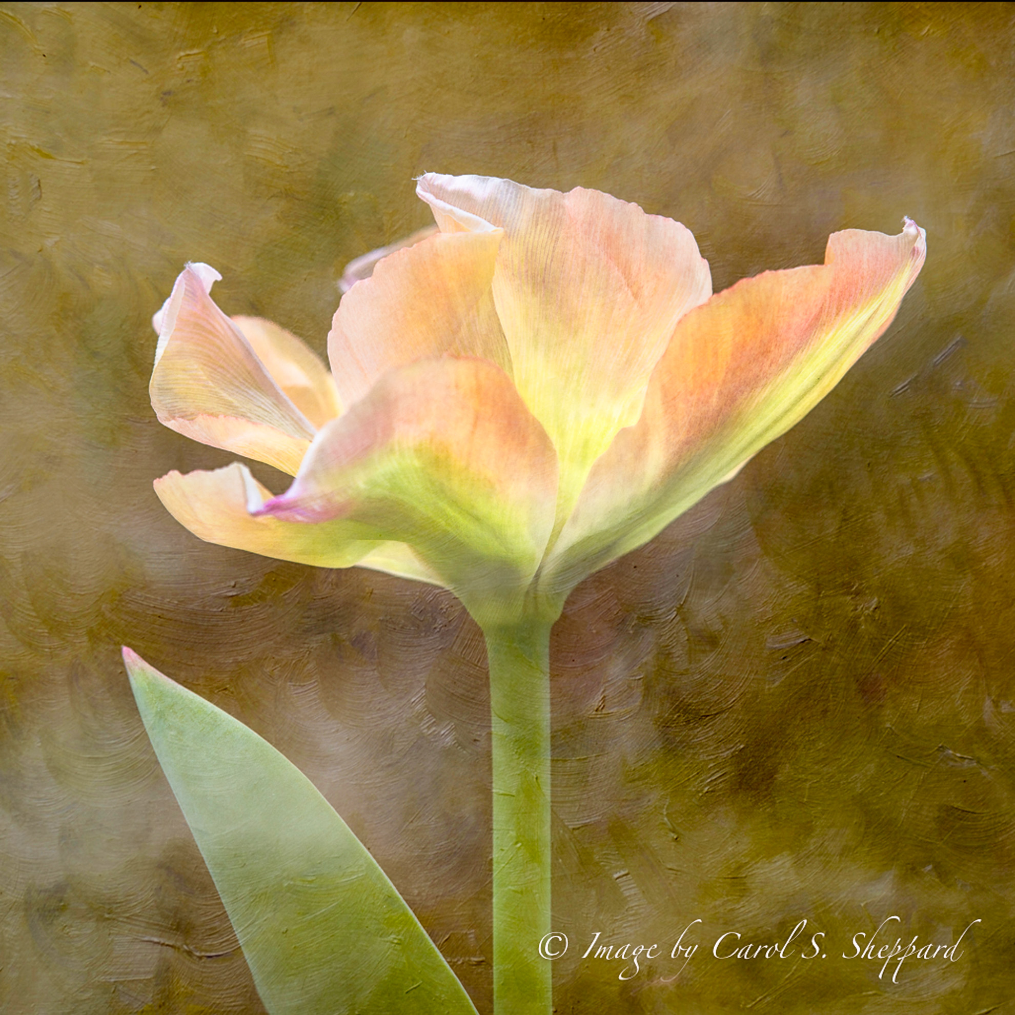
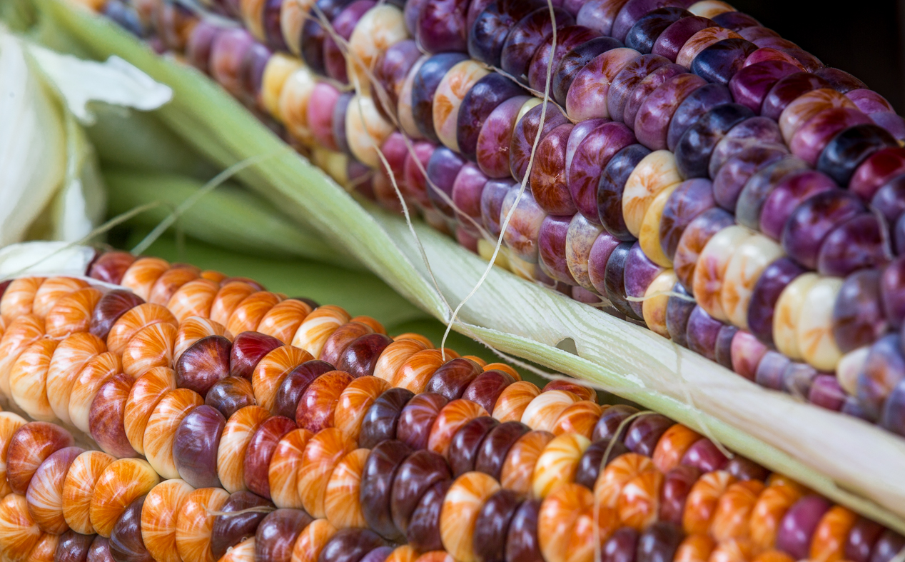
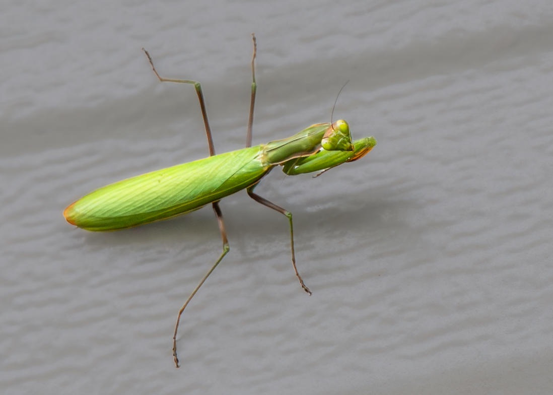
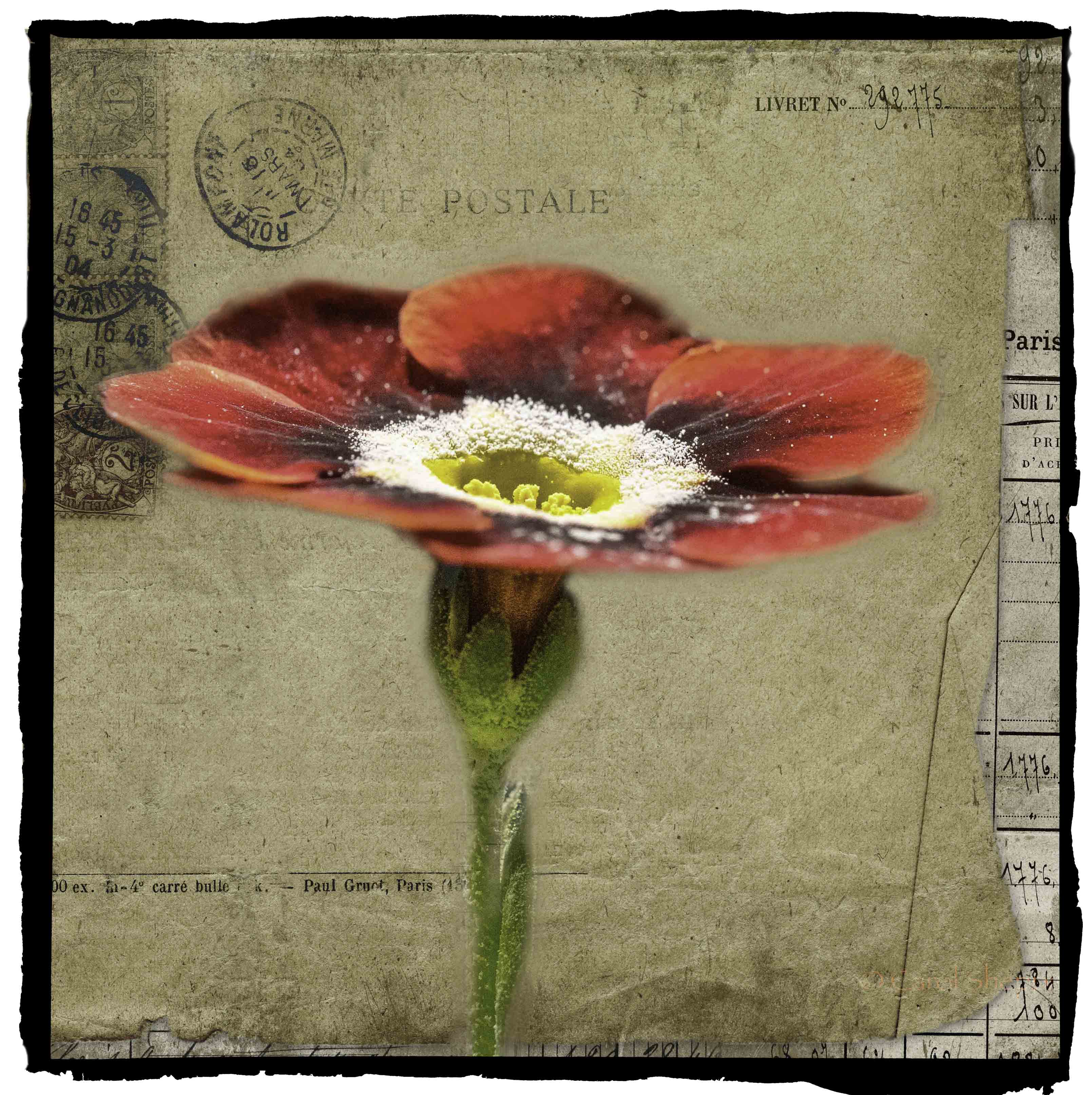
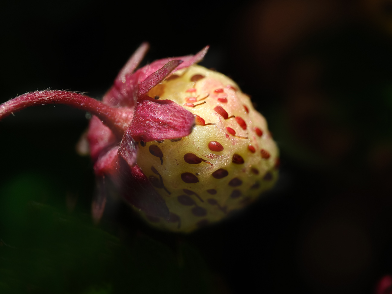
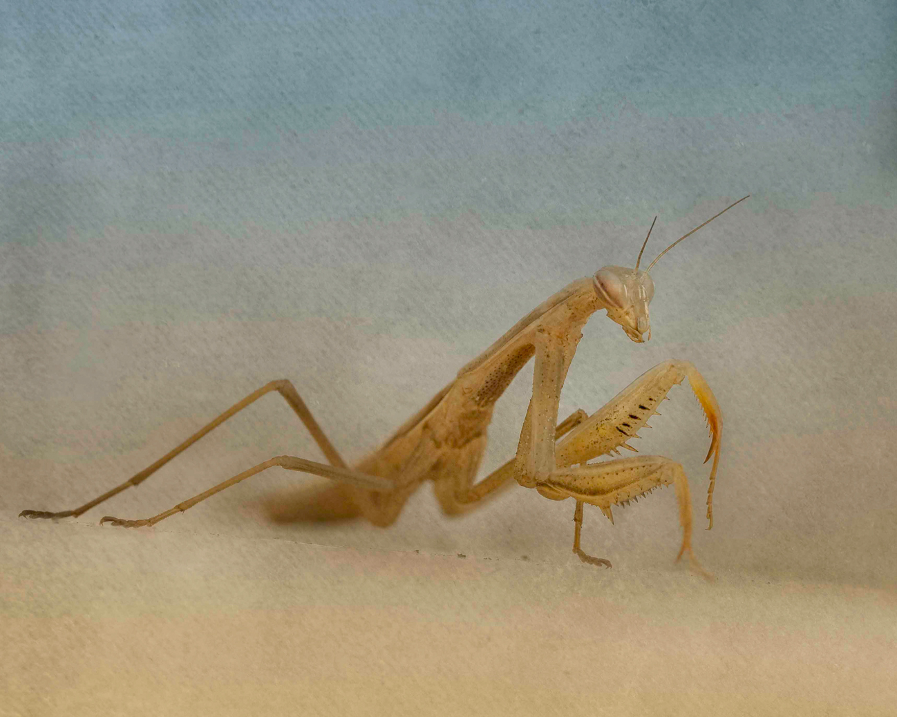
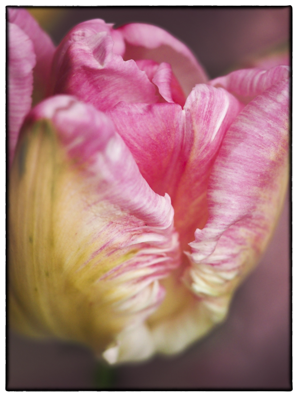
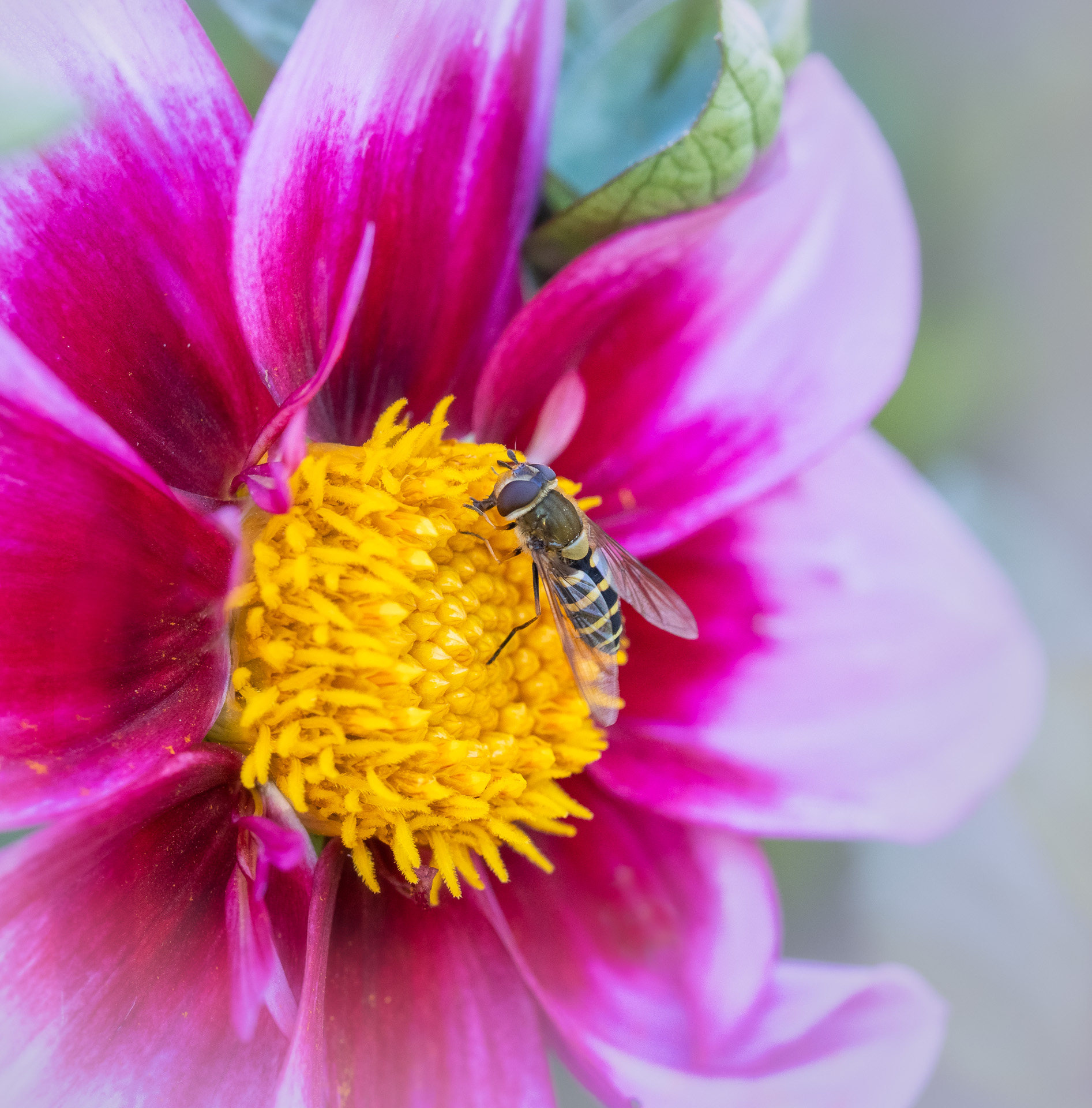
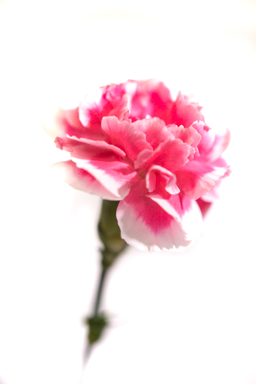
My first thought: how very artful and Old Master-ish! Your arrangement works quite well! It is very balanced between reds and greens, likes and darks, varying size circles....great job. I will say that it may not actually be a Macro so much as a Still Life, but it is a lovely image. You have captured it in such fine detail as to make it feel edible! |
Apr 12th |
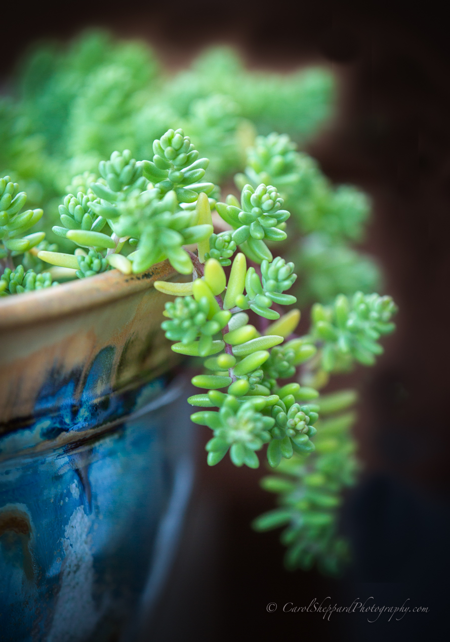
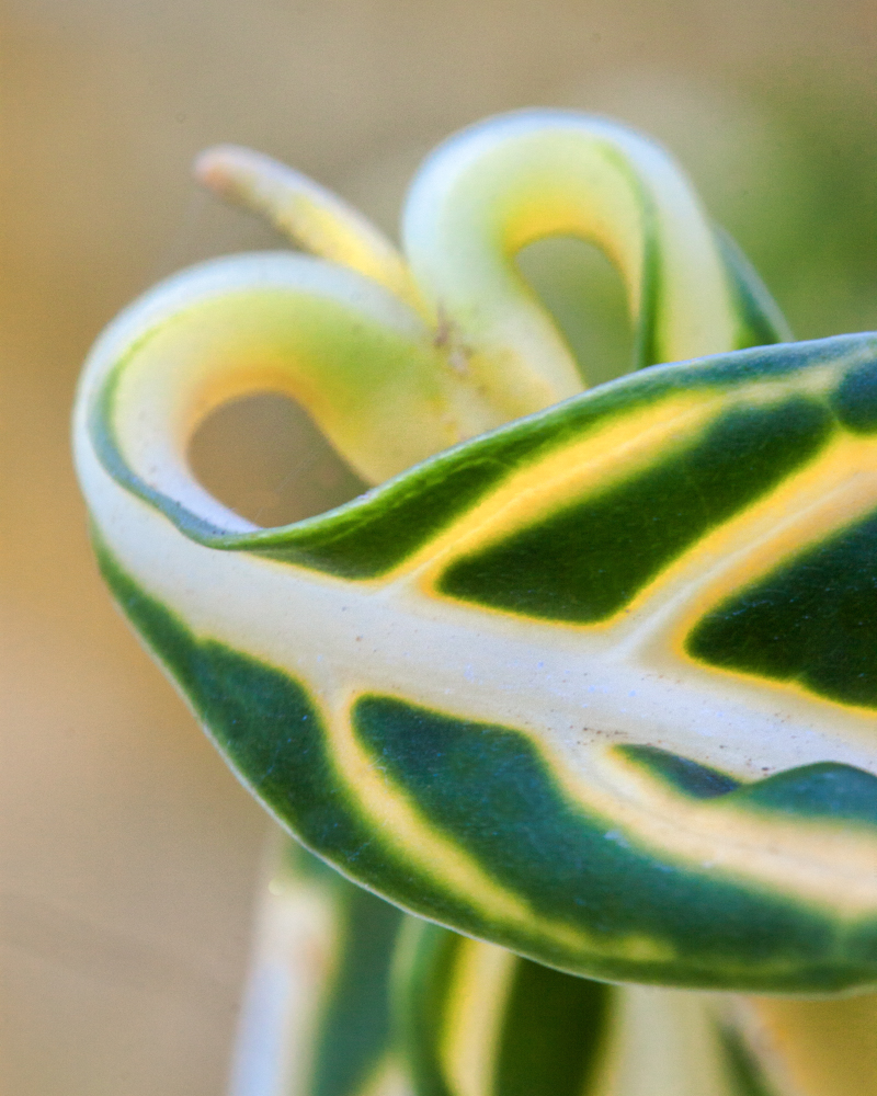
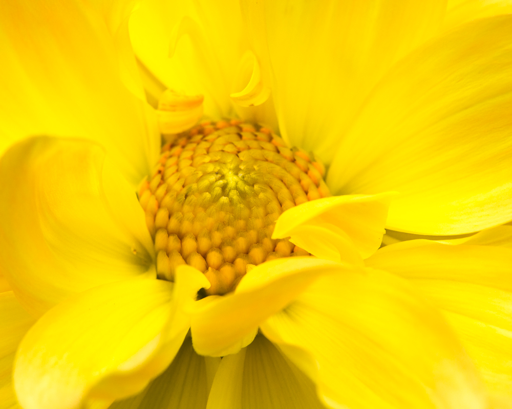
| 60 |
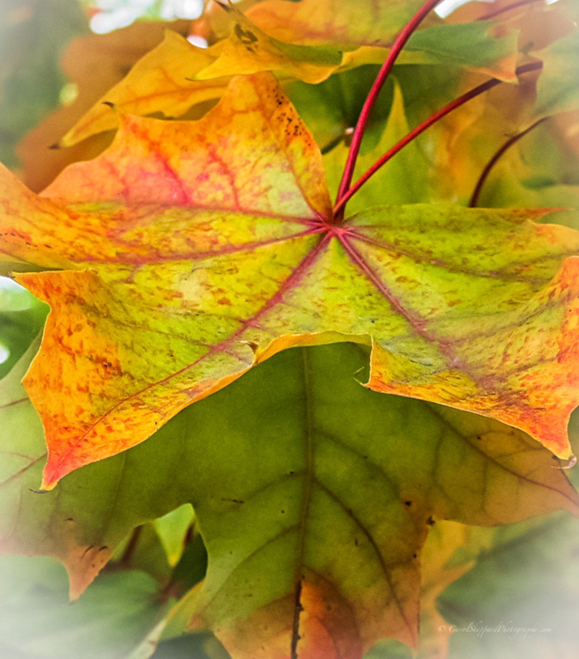
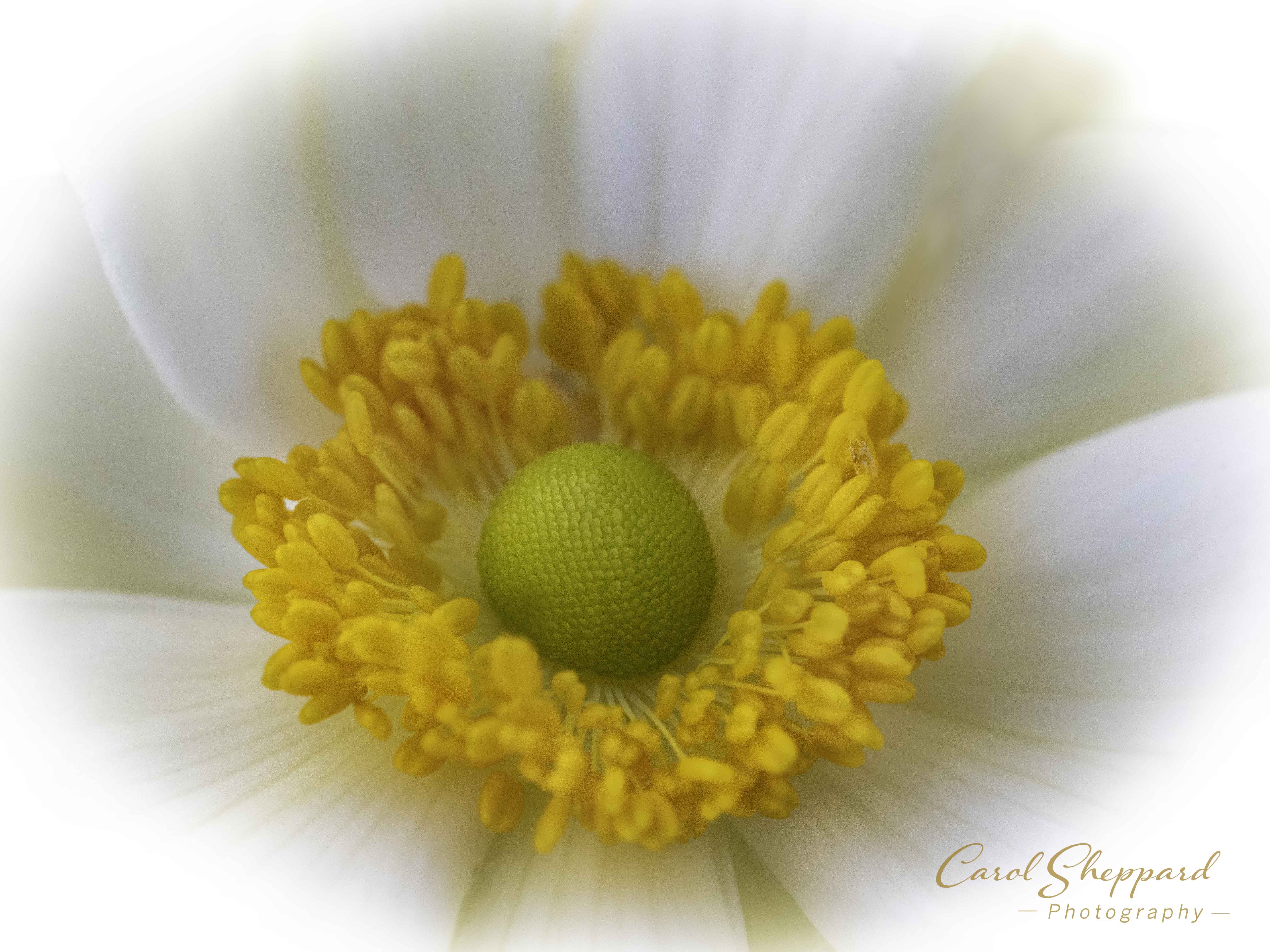
Apr 17 |
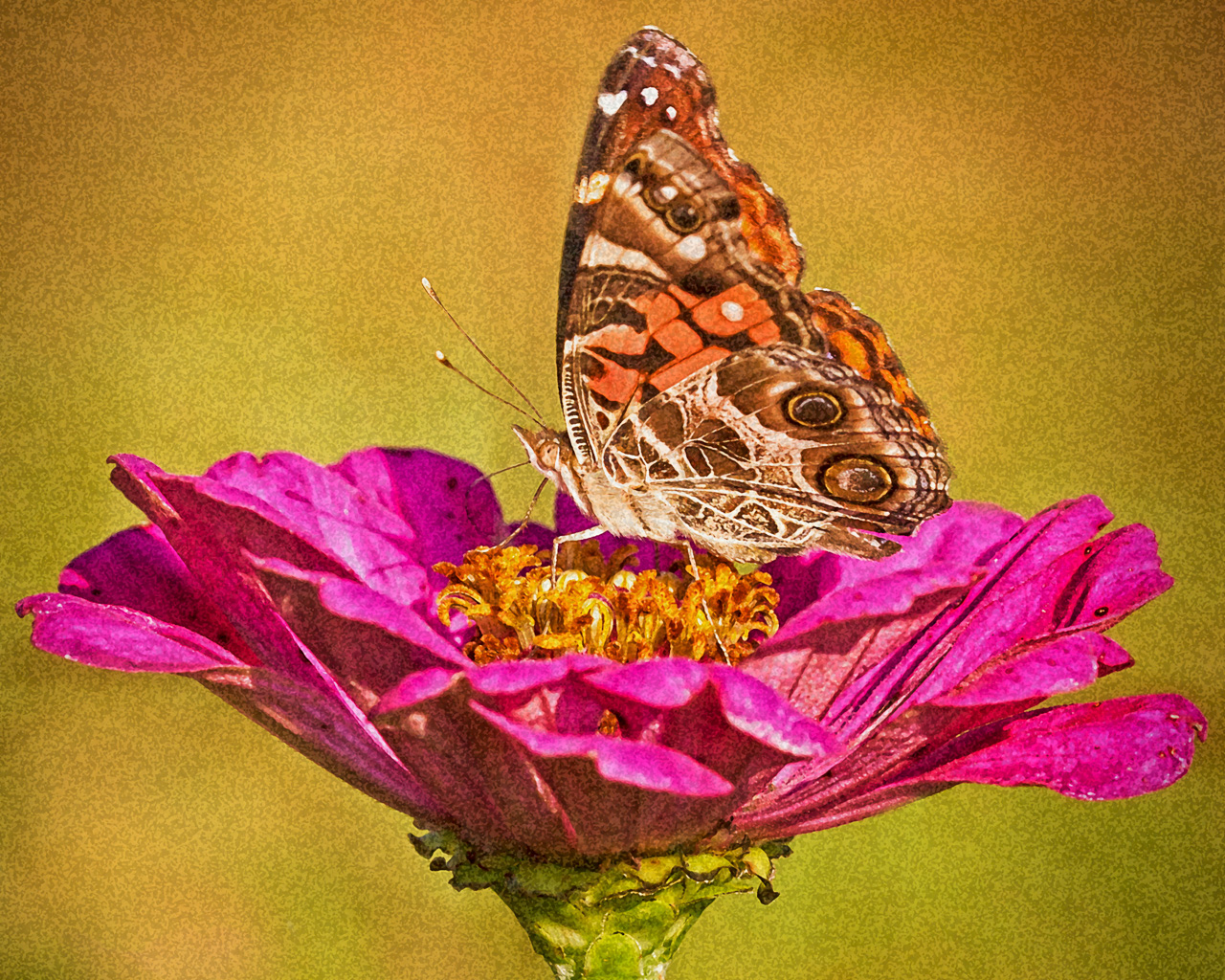
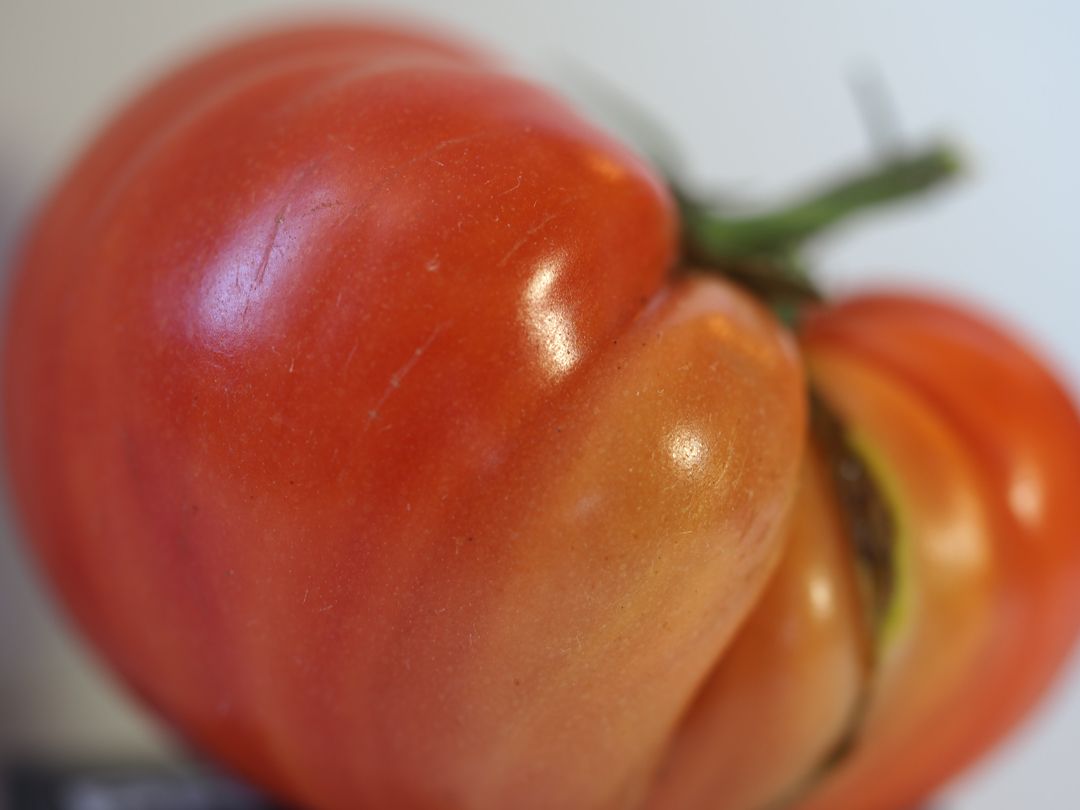
Comment |
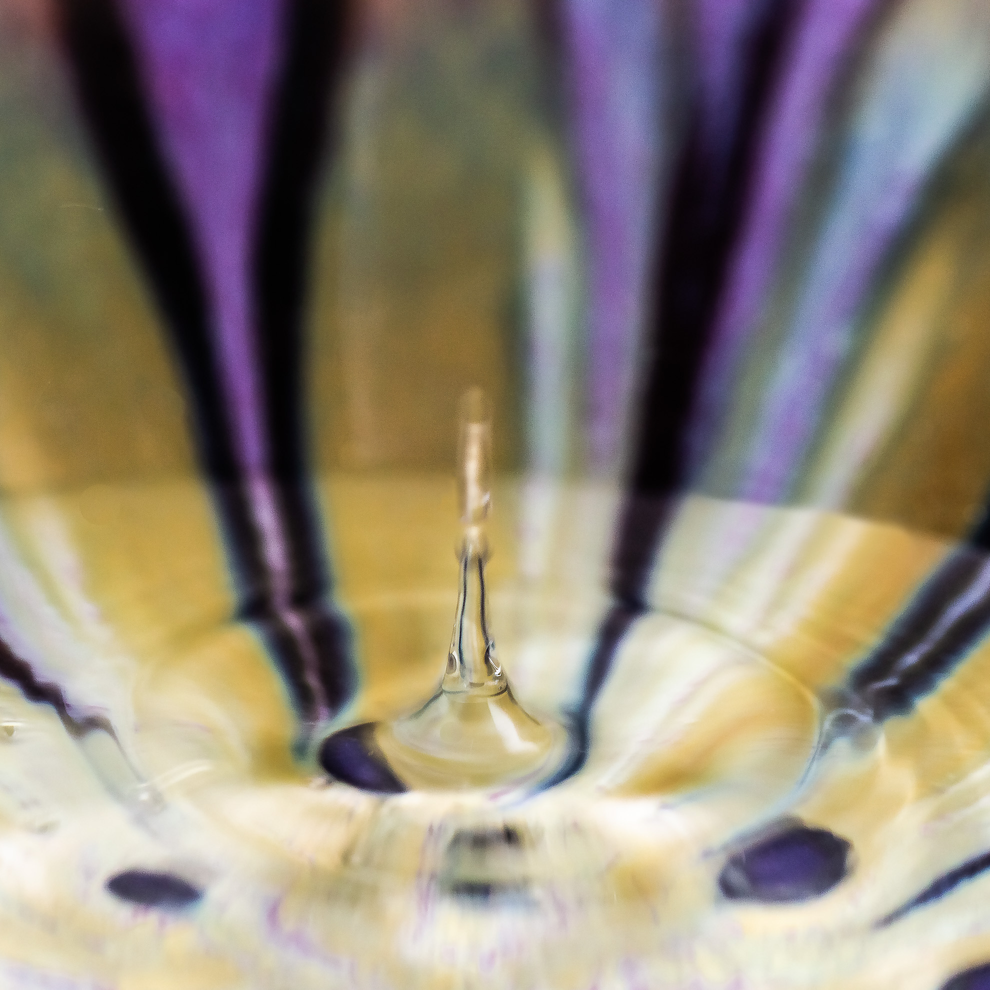
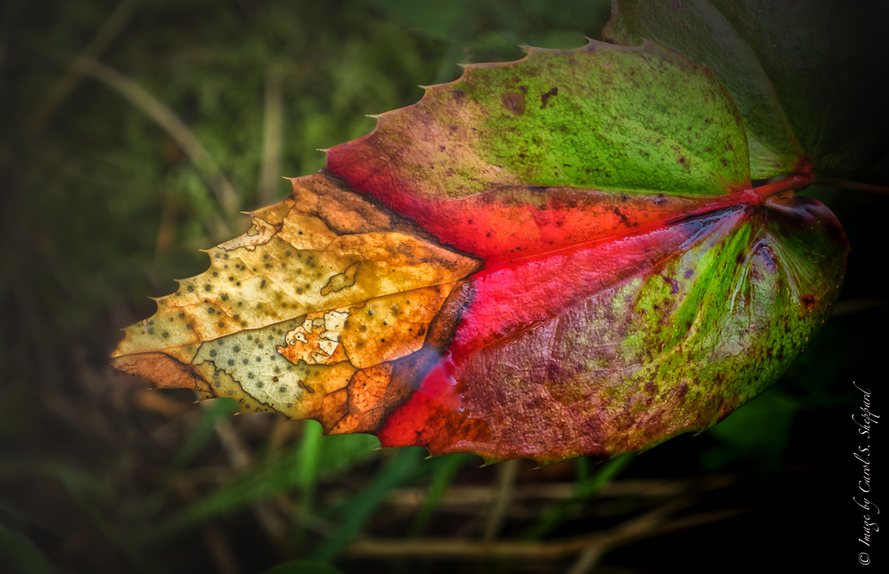
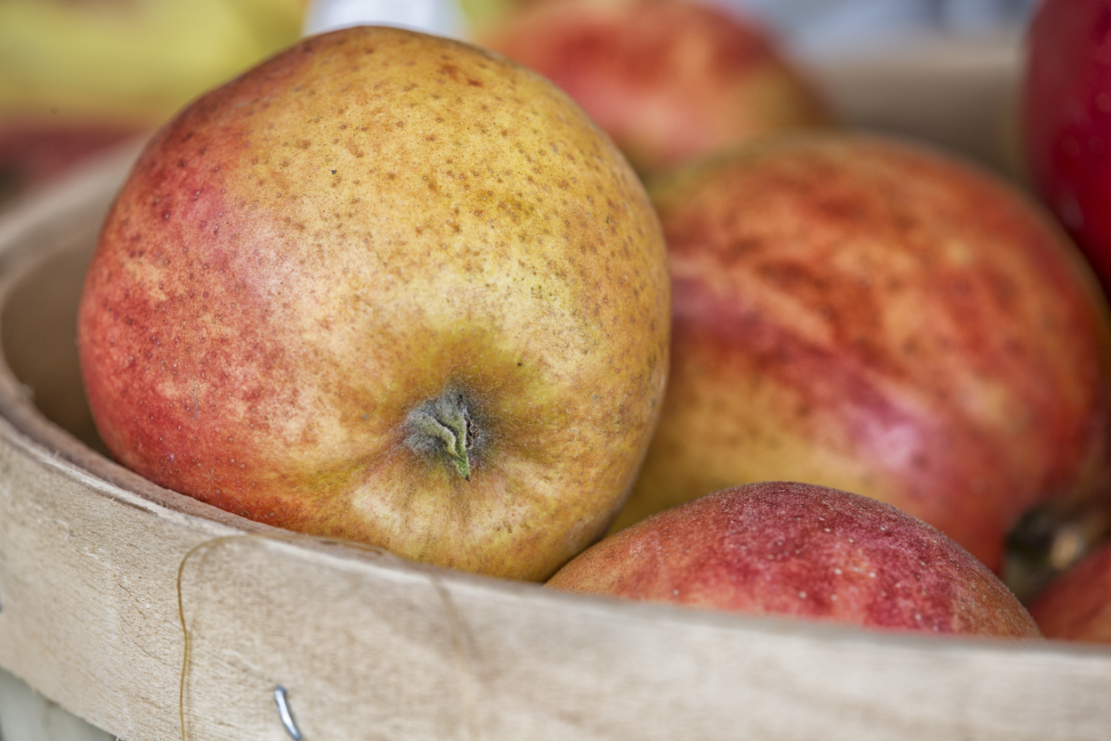
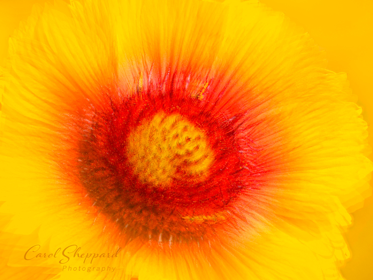
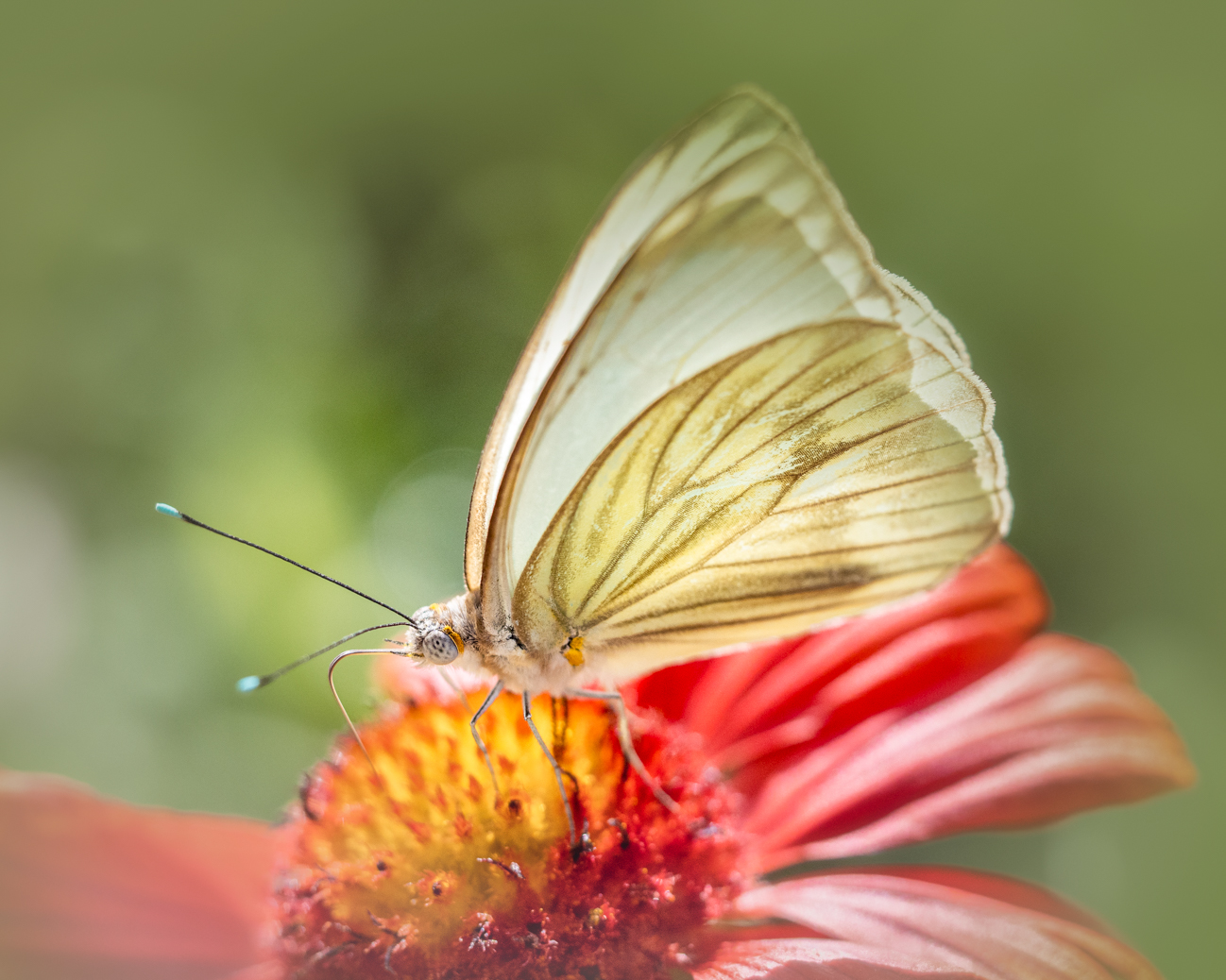
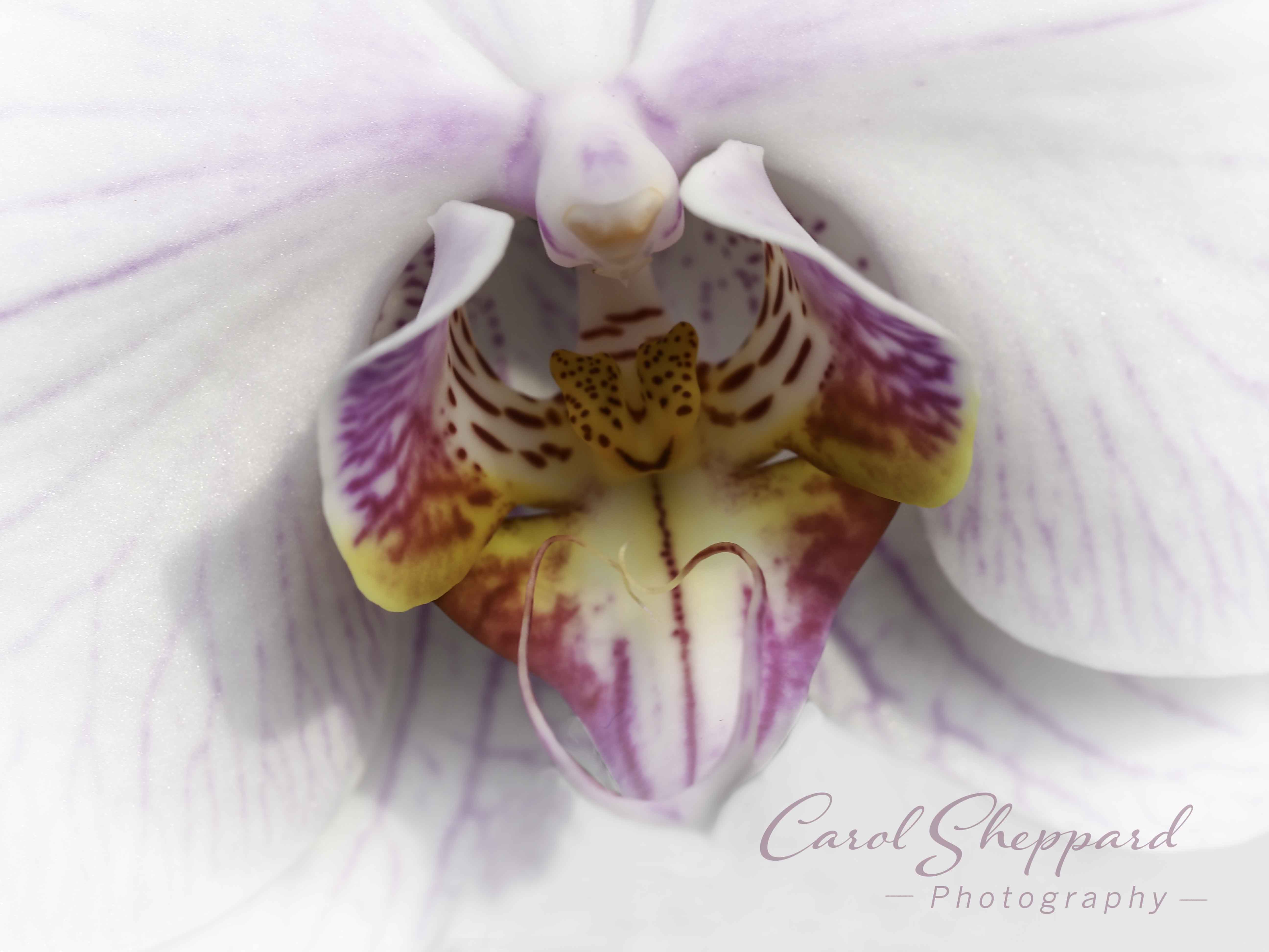
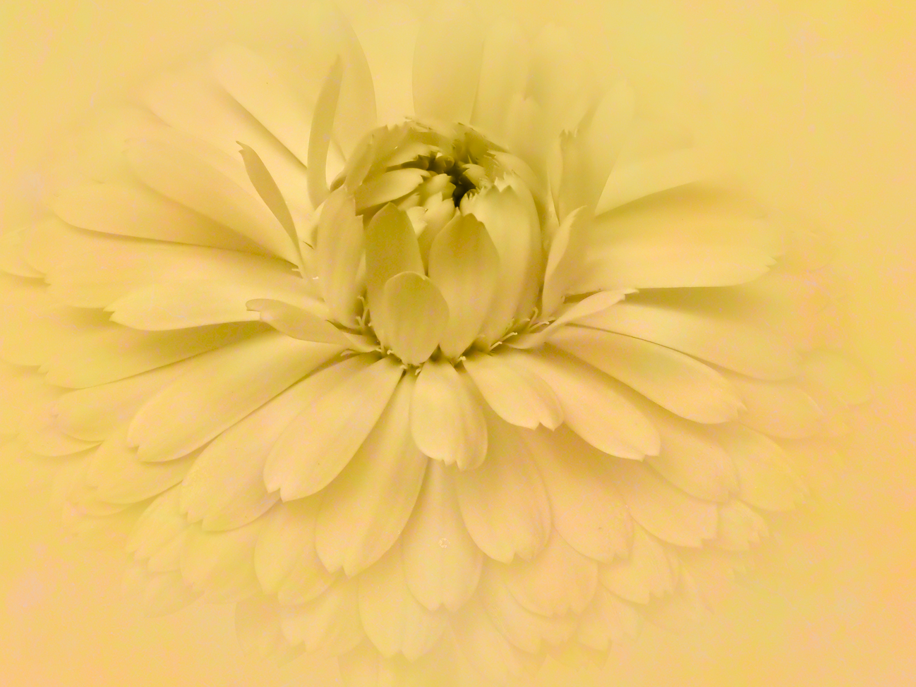
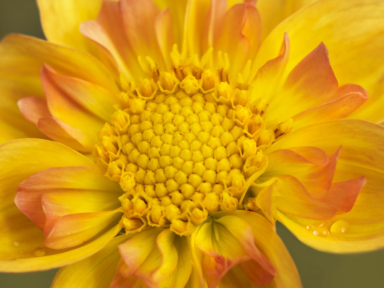
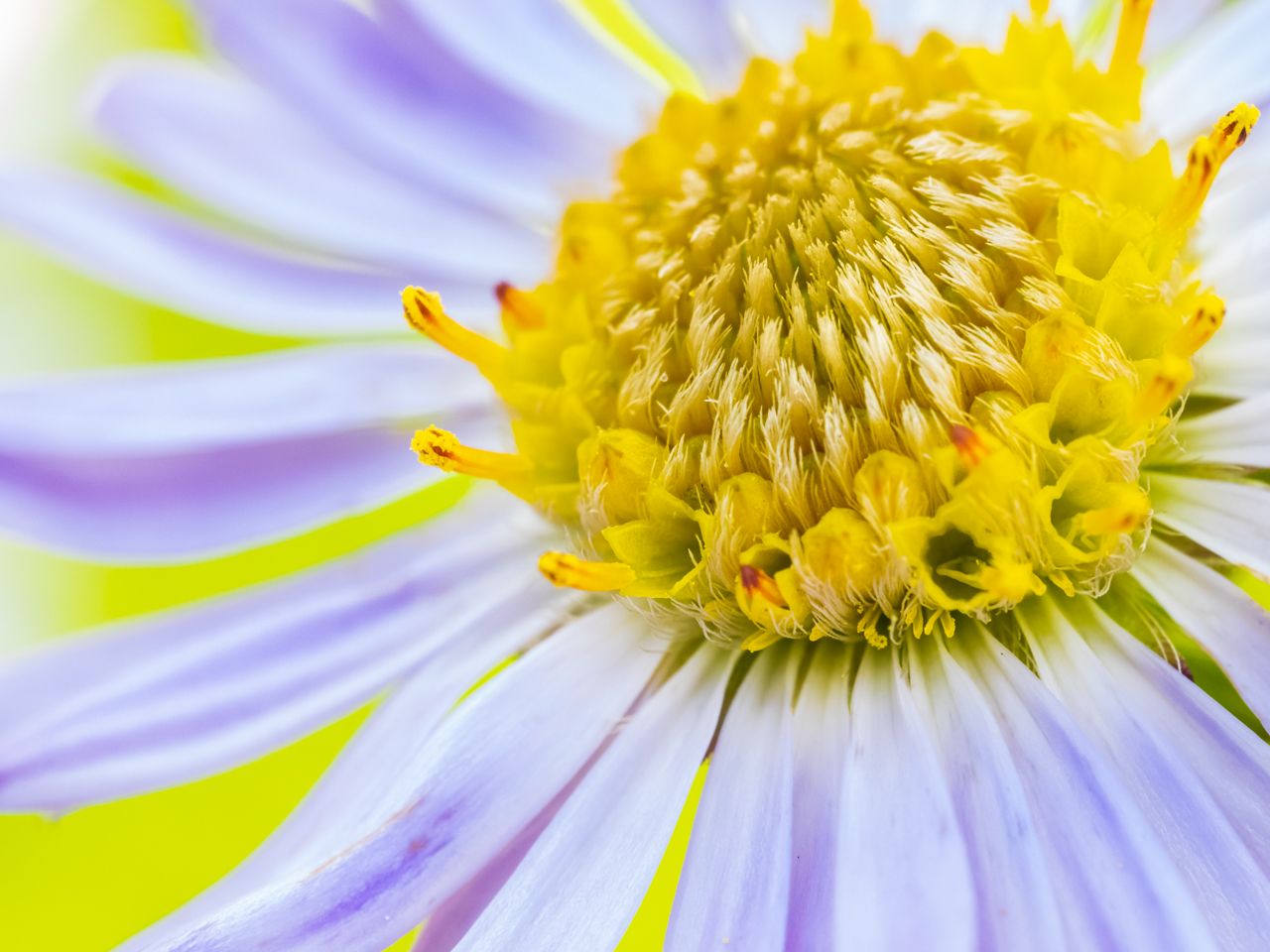
This is an incredibly clear shot! The sharp contrast between the green of the leaf and the yellows of the center, in addition to the play of shapes against each other, works well for this shot. I would like to suggest that you try a crop that eliminates most of the left and particularly the right side. Maybe try a square crop, placing that beautiful center...well, right in the center. One of those composition exceptions, with a circle in the center being "okay." I think the focus on filling the frame with this marvelous center against leaf is worth looking at!
|
Apr 12th |
| 60 |
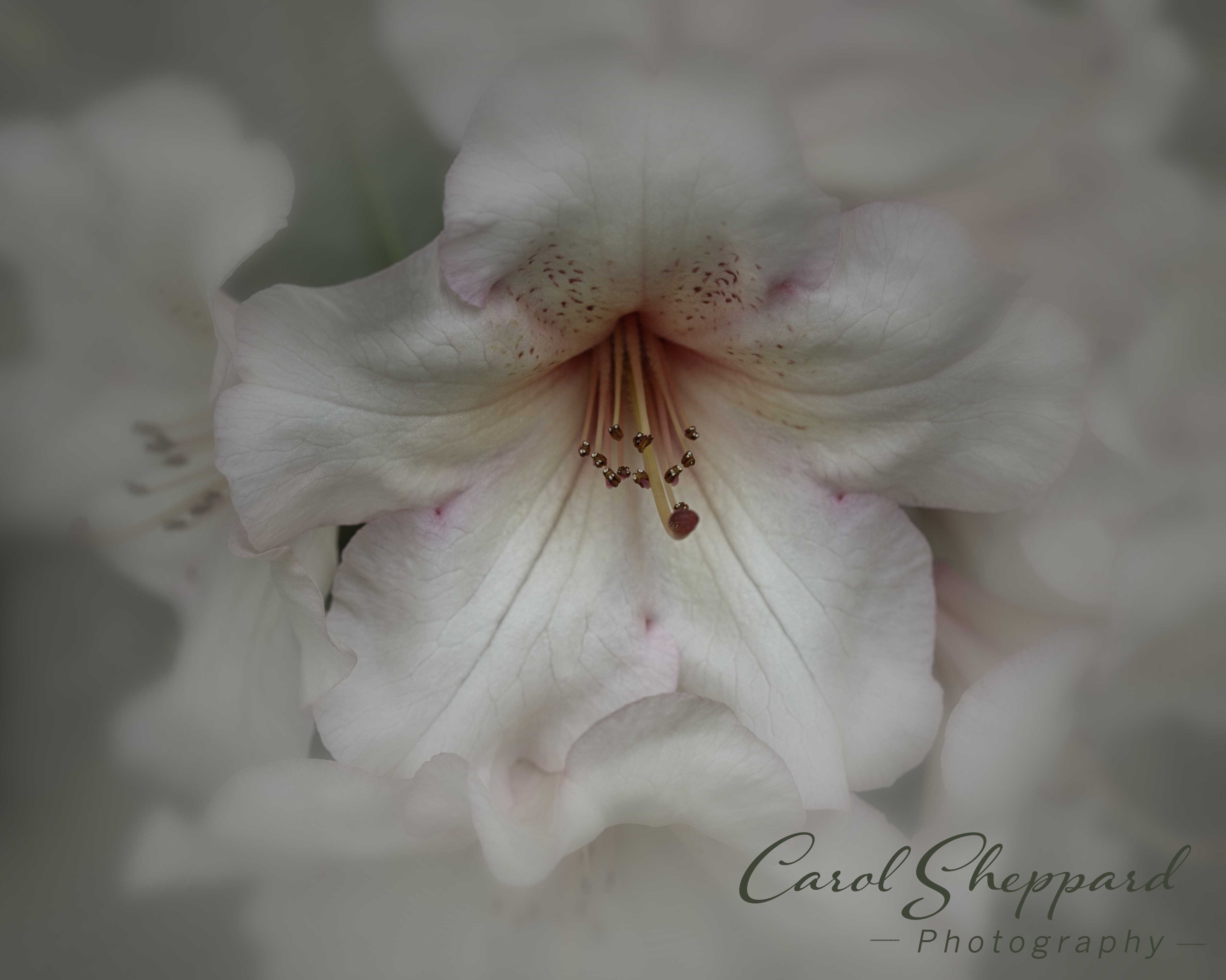
Apr 17 |
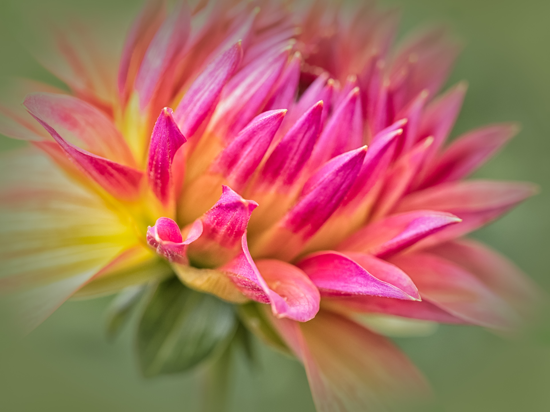
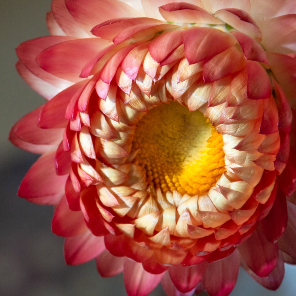
Comment |
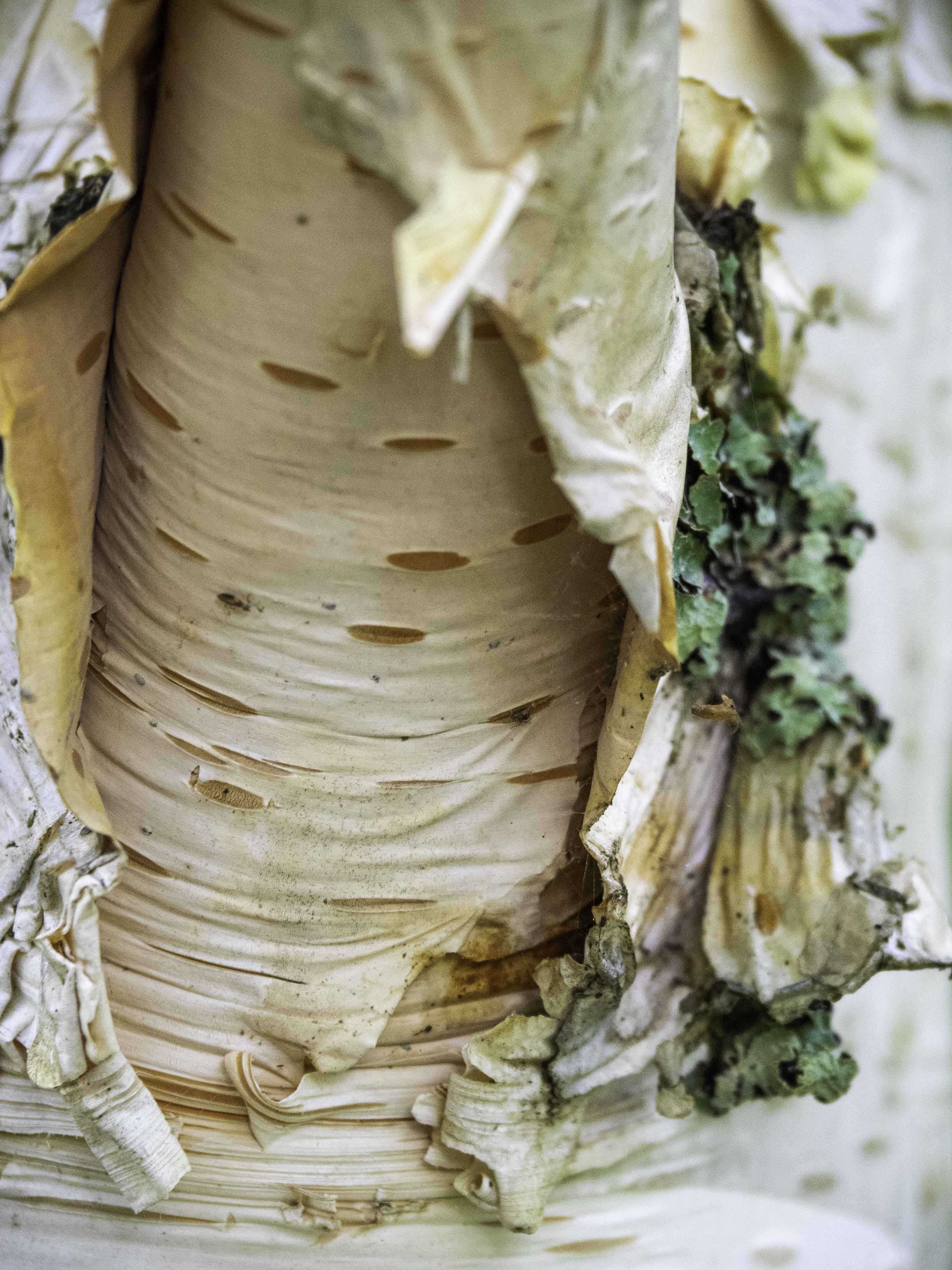
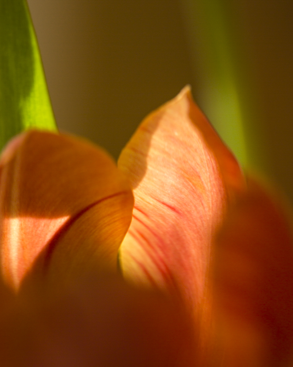
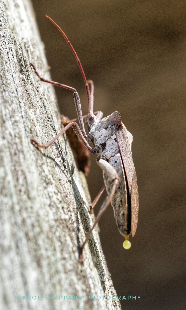
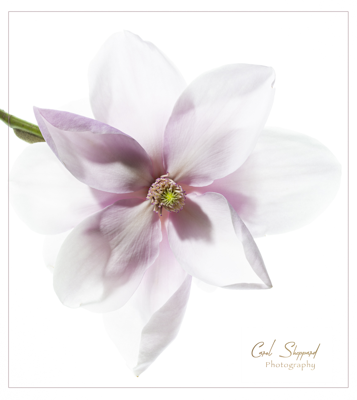
Very artistic shot...your capture of the texture on the lower side in addition to the sharpness of the upper areas meshes well! The composition on this is also very pleasing, along with the minimal number of colors present. This is a beautiful image without any adjustments at all!
Great job, Ginger!
|
Apr 12th |
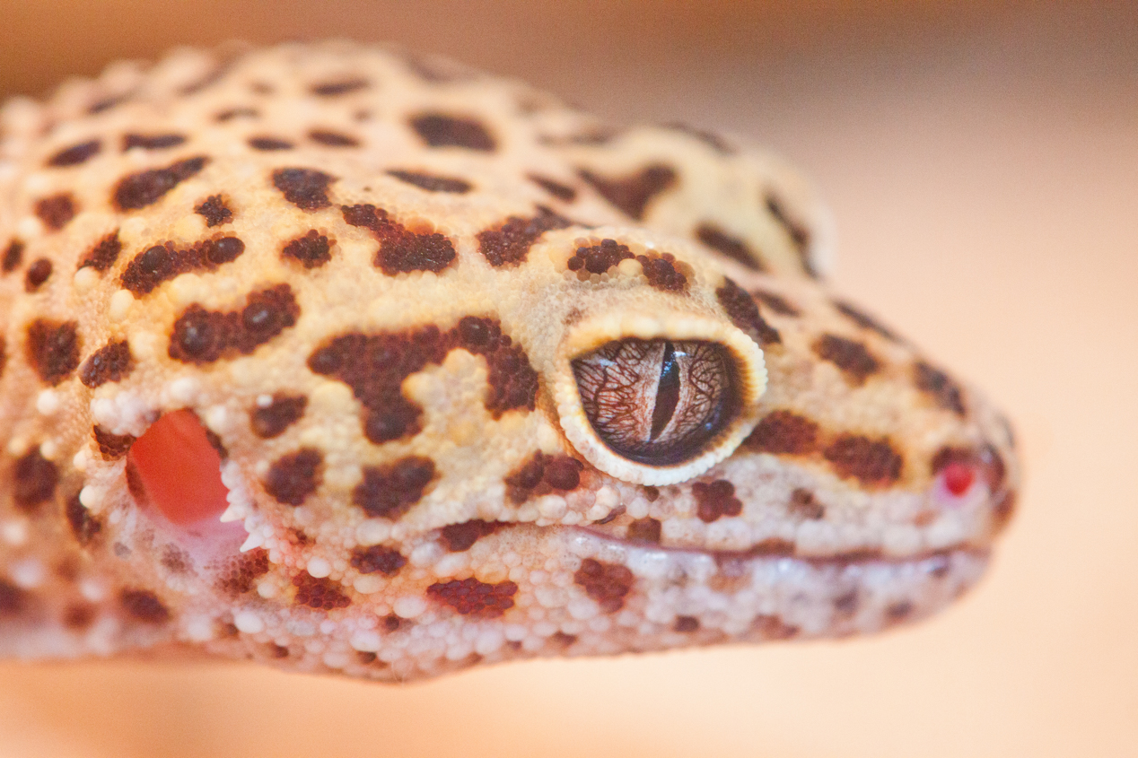
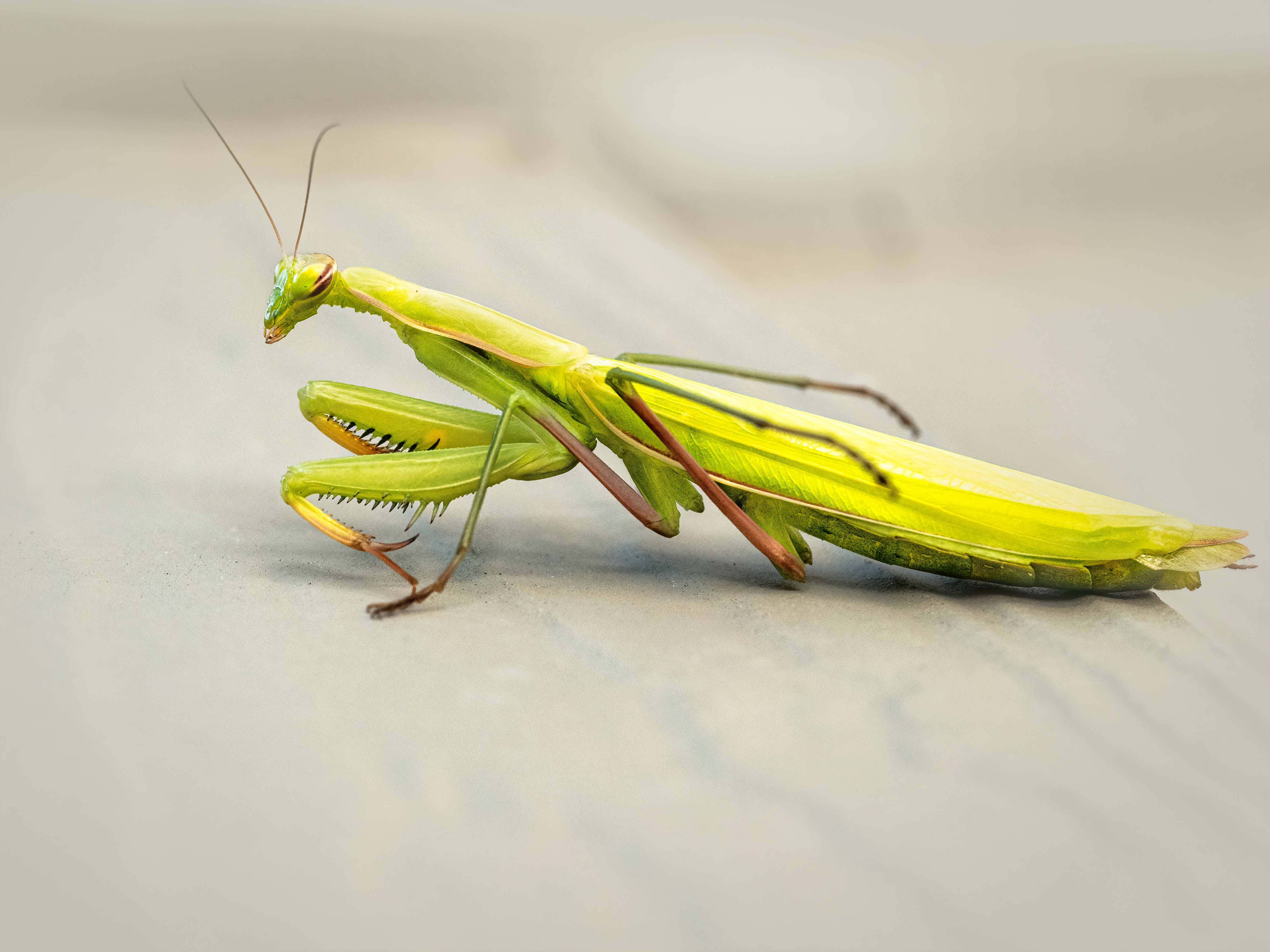
| 60 |
Apr 17 |
Comment |
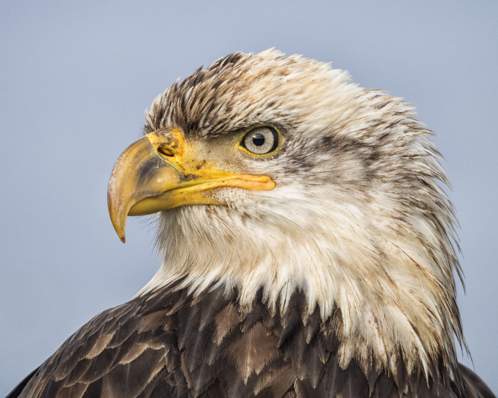
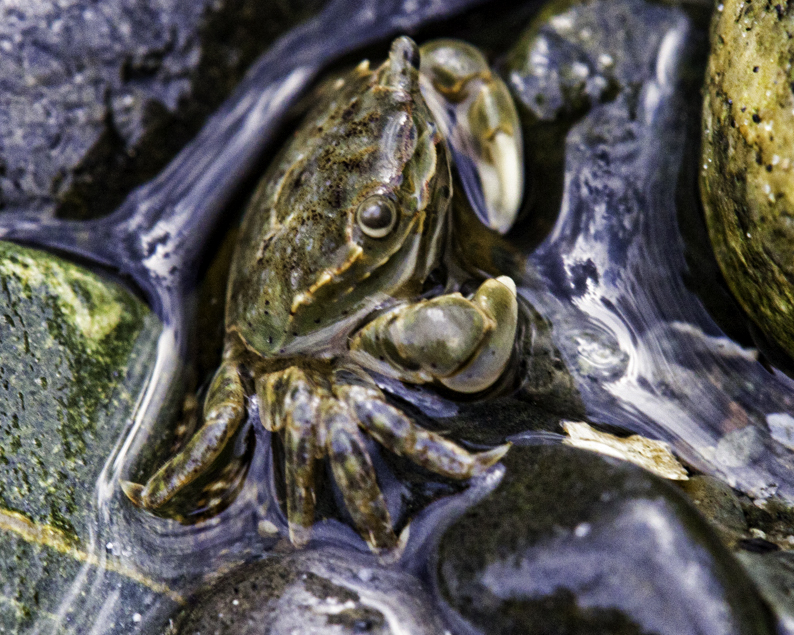
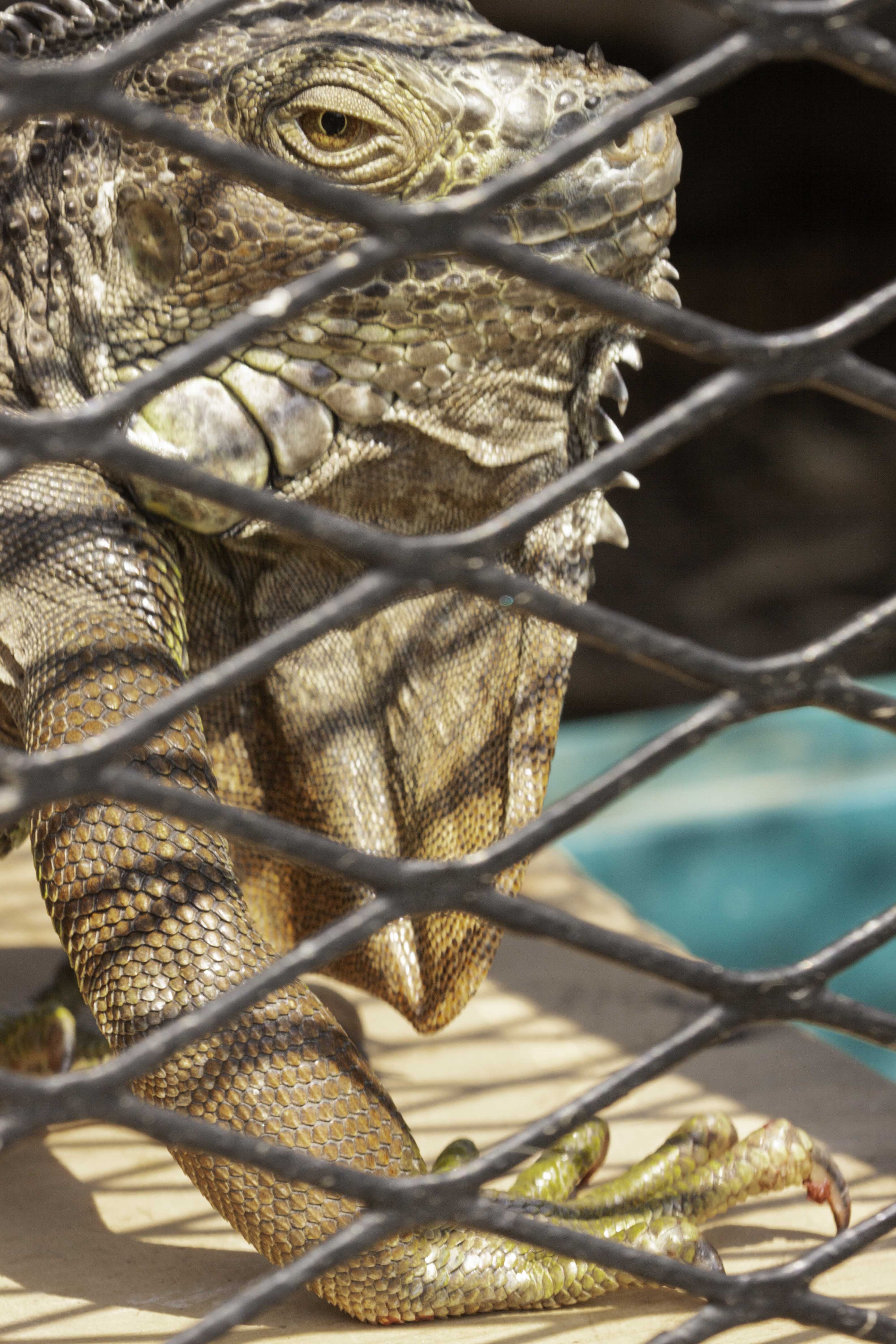
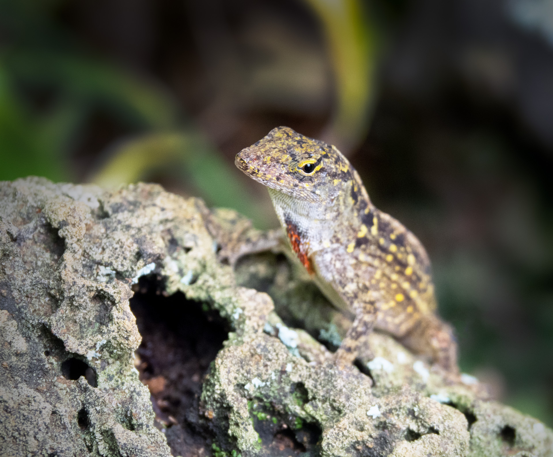
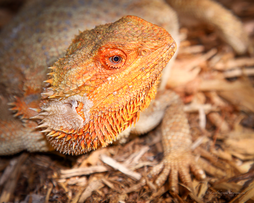
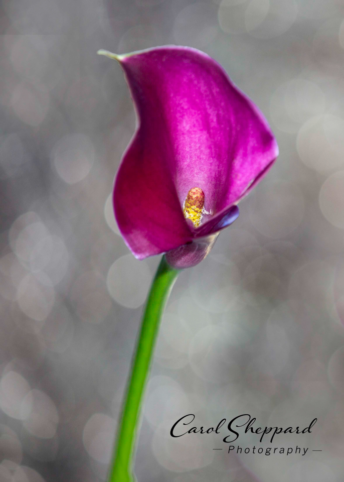
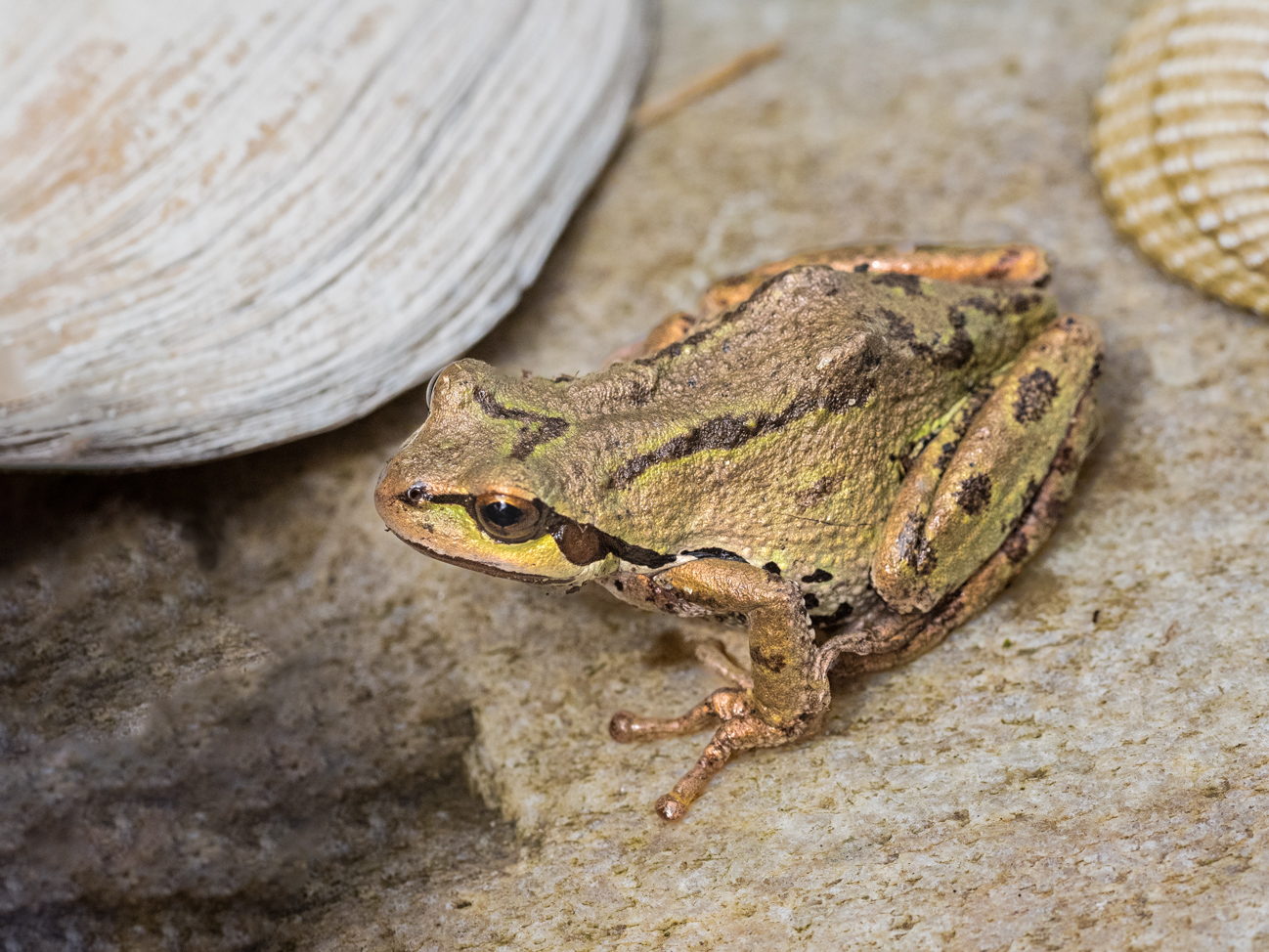
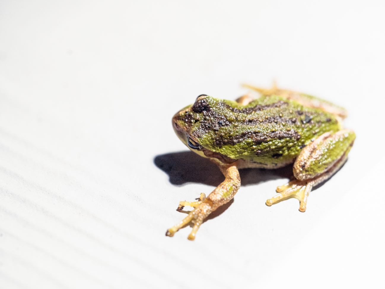
The impact is enhanced by the shape--great eyeball shape--as well as your composition and the crispness of your subject.
I might experiment with reducing the yellow or orange in the color cast just a bit--its hard for me to tell because it could be very true to what was there, and I have no white in the image to look at. But I think just a hair of reduction in that orange would enhance your image....and then again, maybe it is perfect as is!
I can see the appeal and you did a nice capture!
|
Apr 12th |
6 comments - 0 replies for Group 60
|
12 comments - 1 reply Total
|