|
| Group |
Round |
C/R |
Comment |
Date |
Image |
| 52 |
Jan 17 |
Comment |
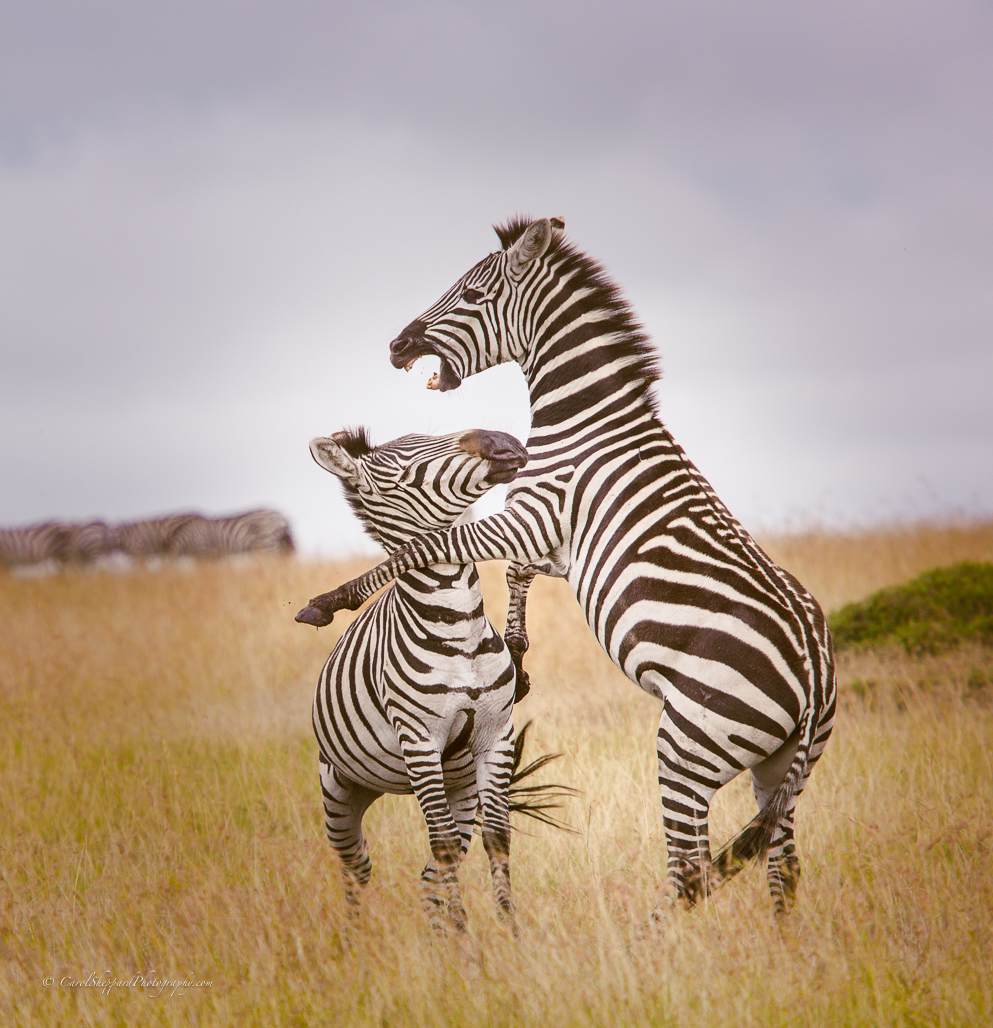
Great shot, Mike, and very fun! There isn't anything I would change about this. It is well-balanced, sharply focused and has great contrast and colors. If the sky was darker, the picture wouldn't work as well. The lighter sky works perfectly with the overall "feel" of the image. Love it!
|
Jan 13th |
| 52 |
Jan 17 |
Comment |
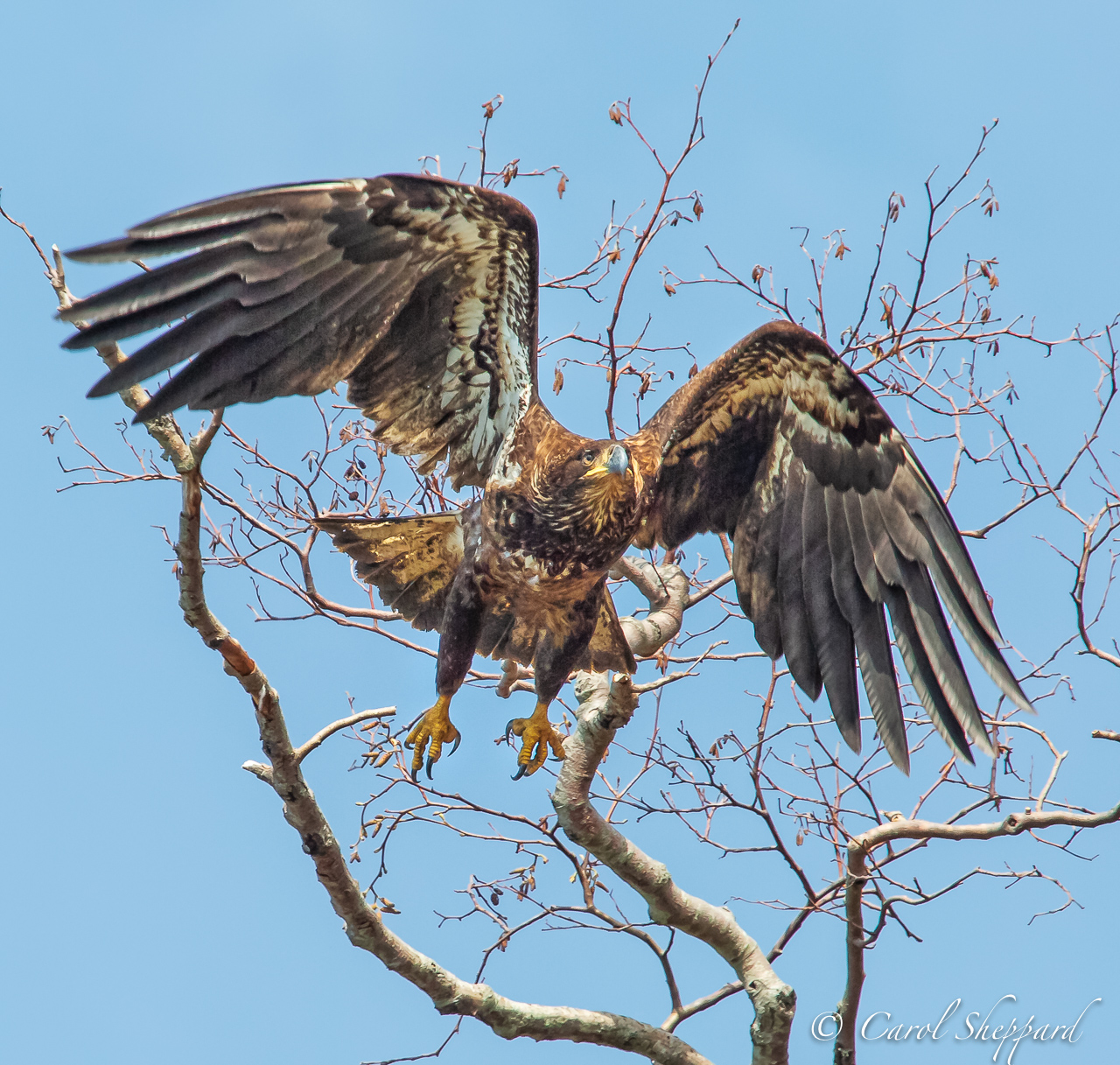
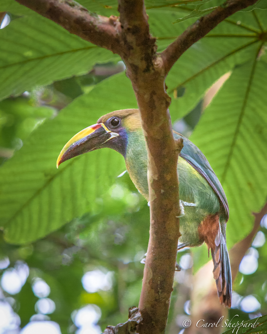
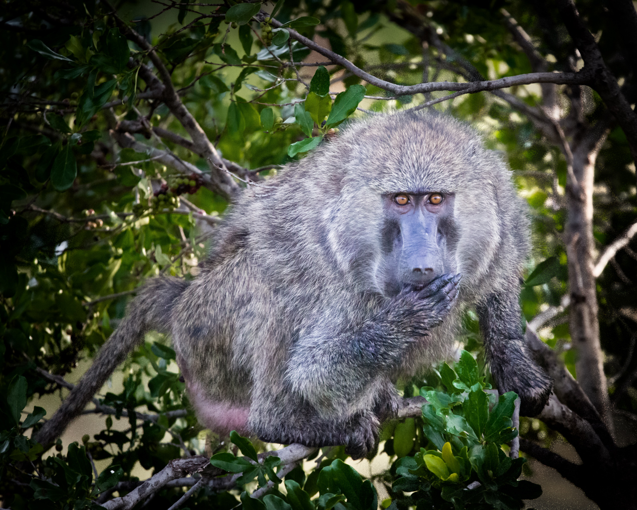
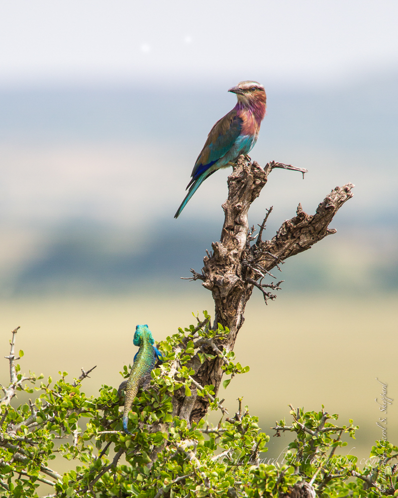
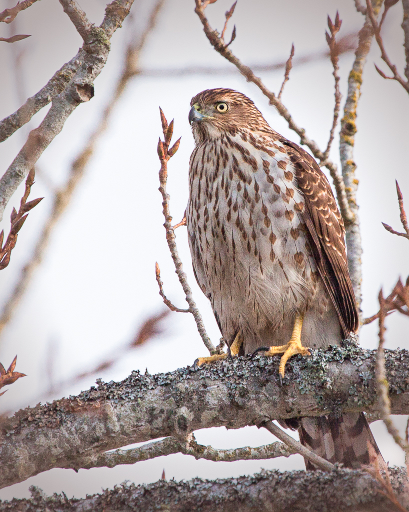
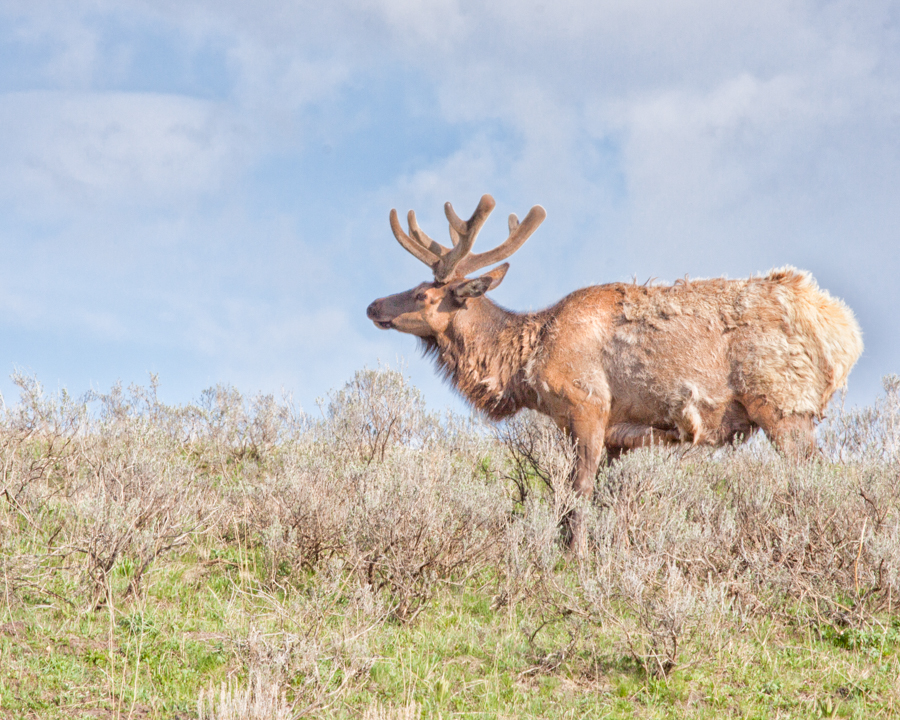
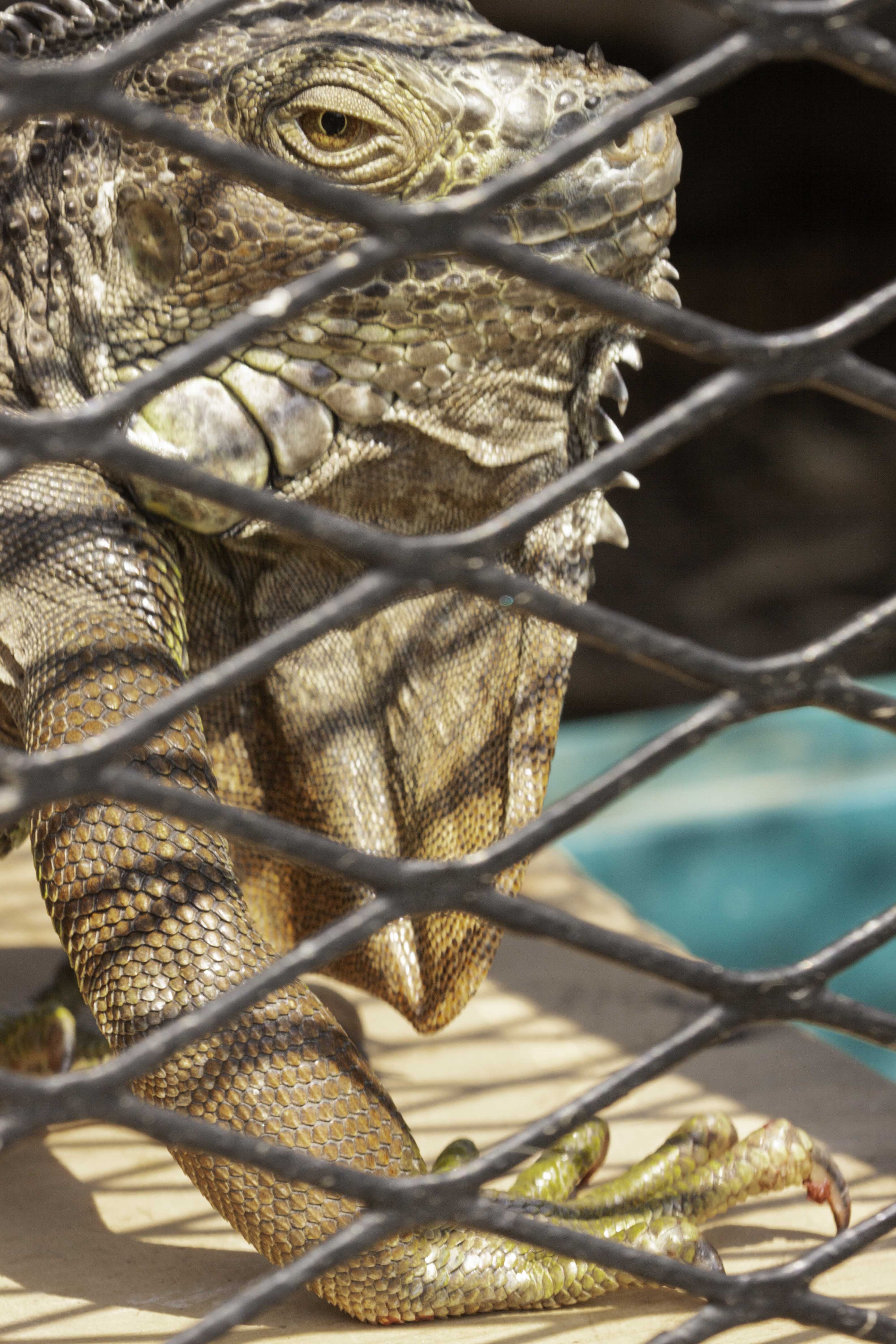
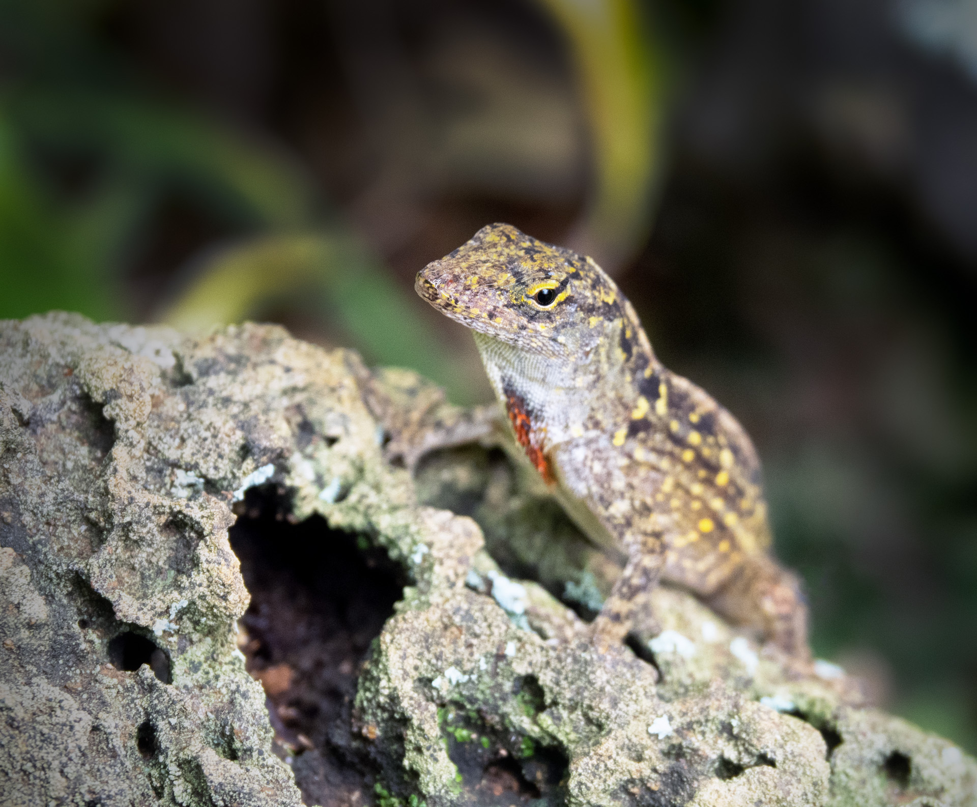
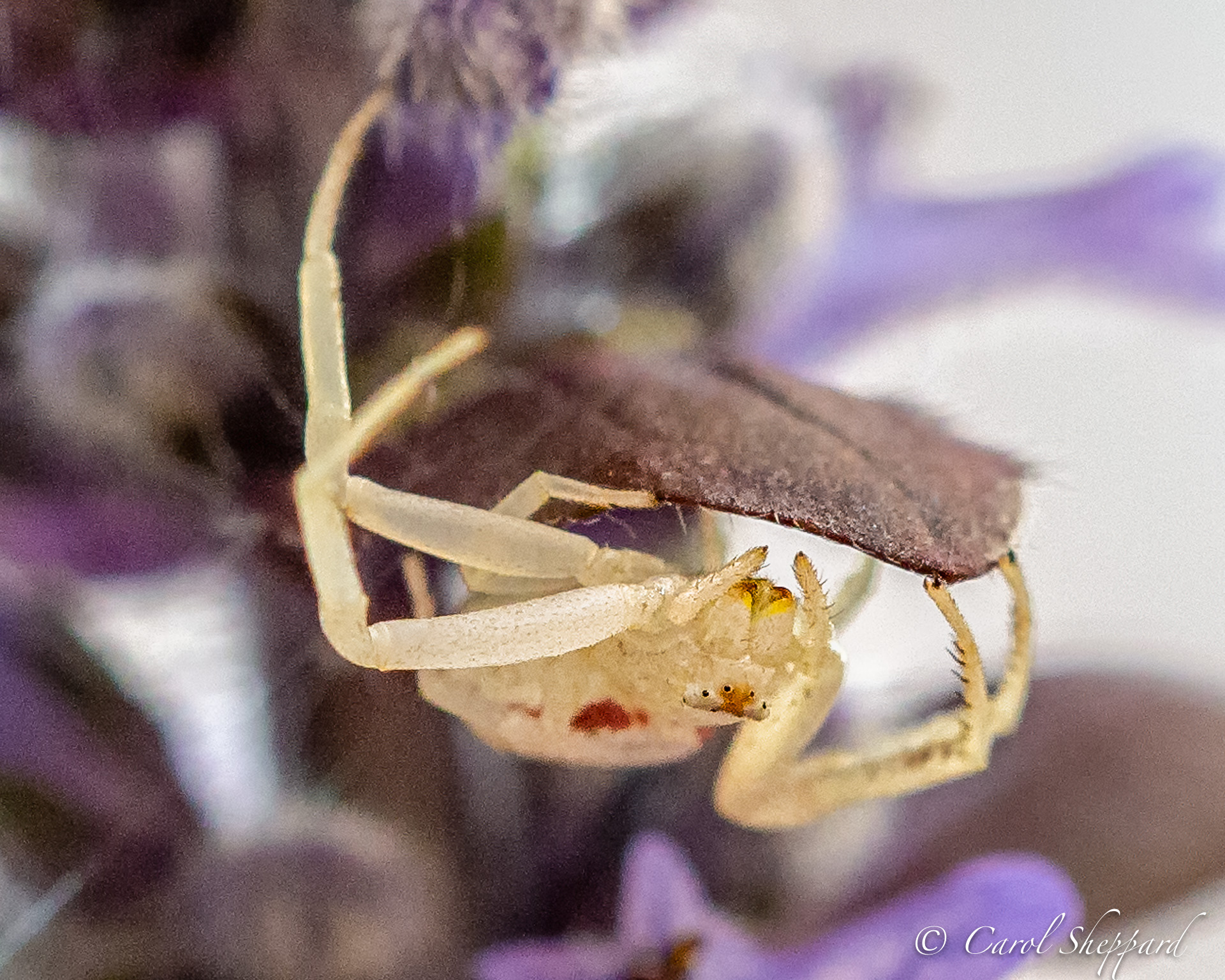
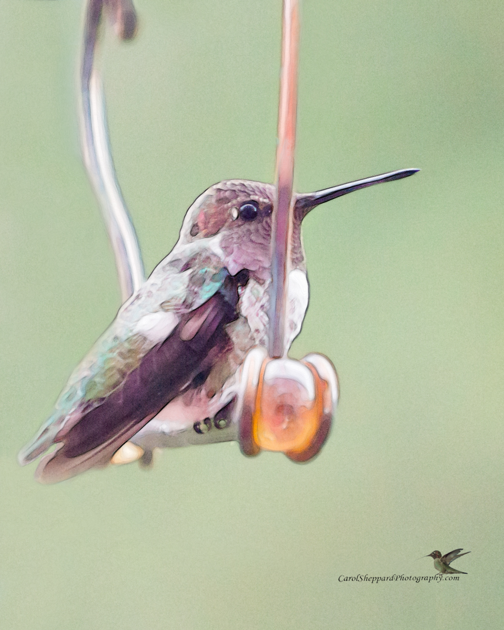
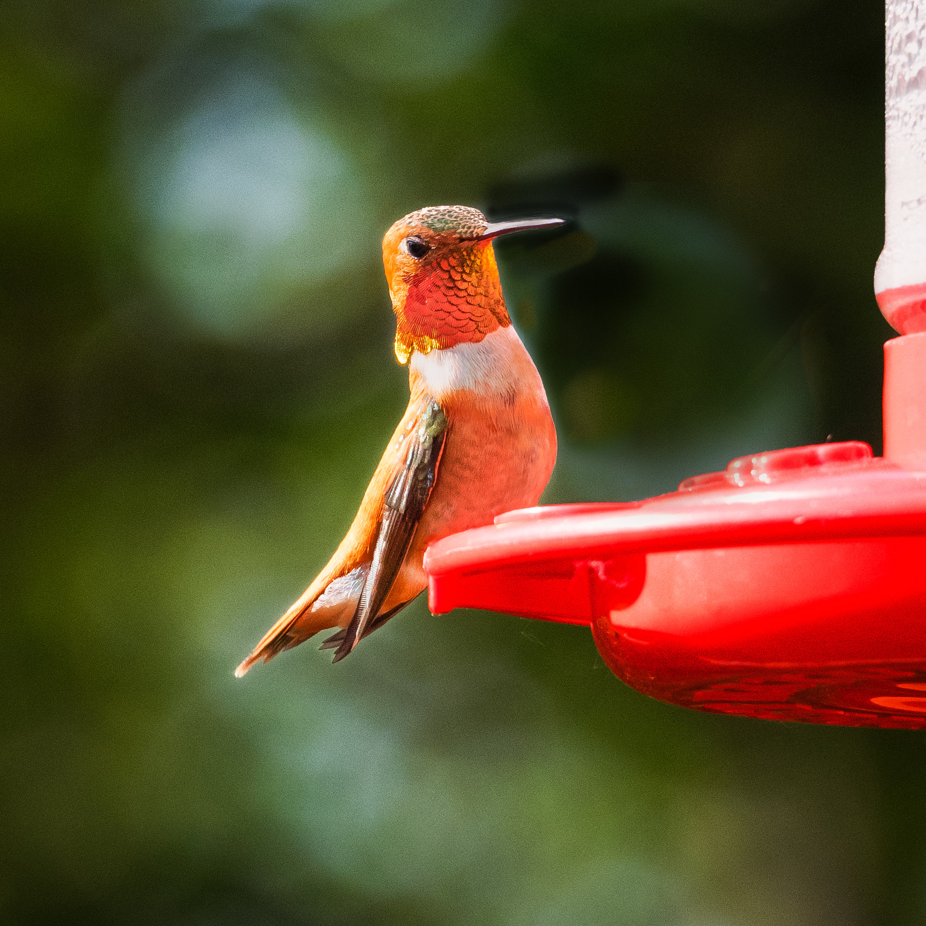
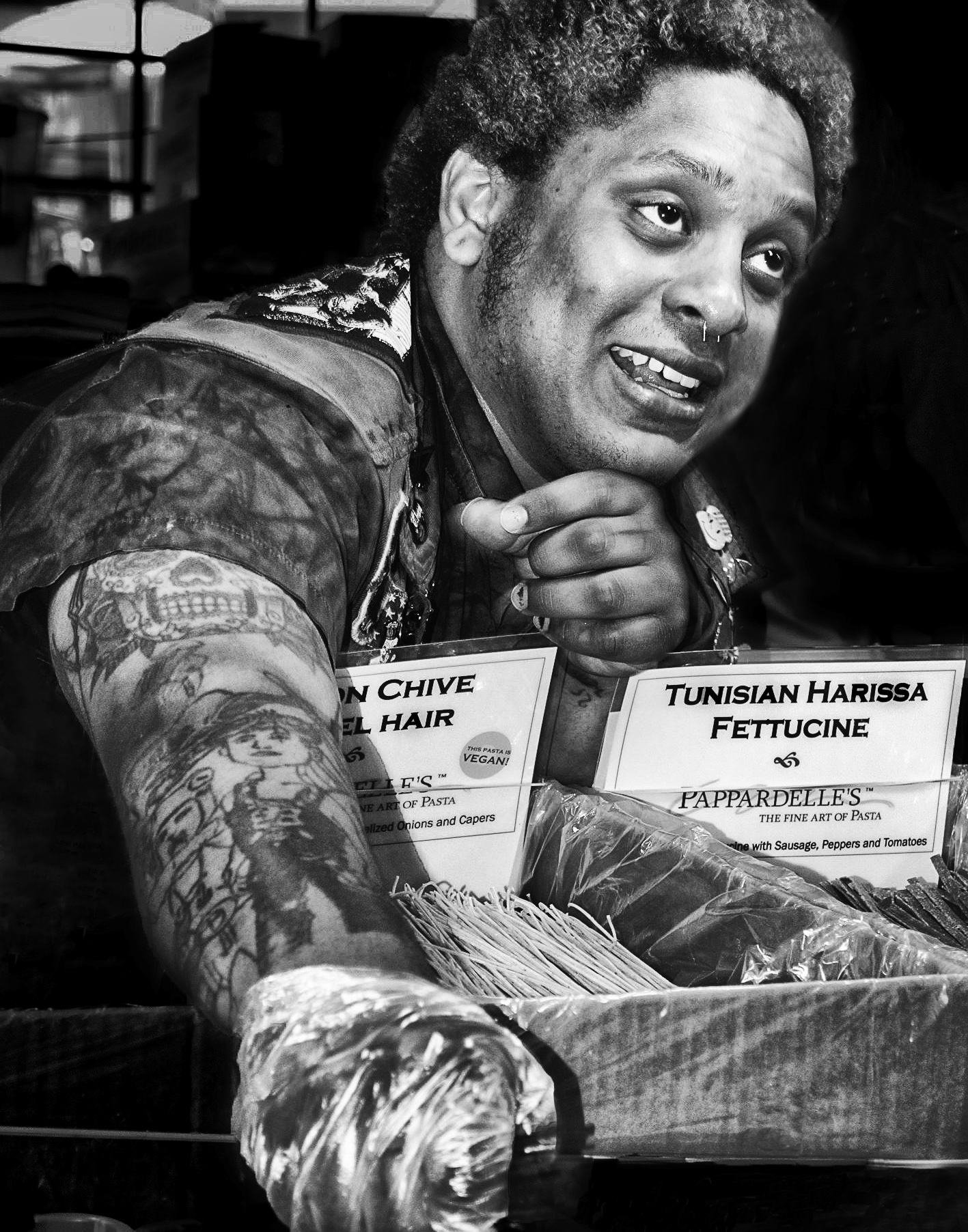
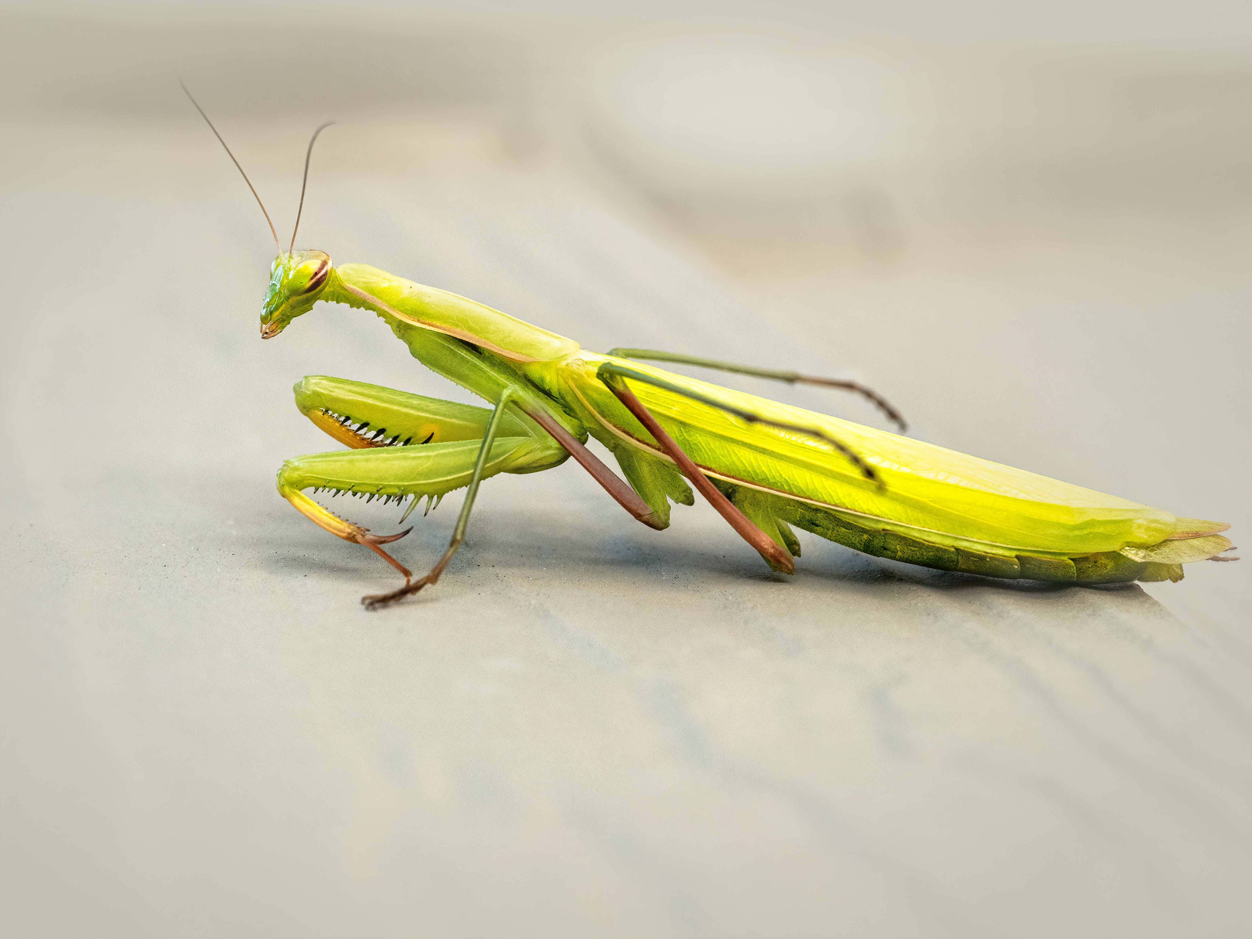
Your capture of the bird itself is terrific! I agree that the lower right-hand leaves are distracting, more so for being out of focus and sparse. The other thing I found discomfitting as a viewer is the amount of the blank space on the left--I know there has to be a good amount as the bird is looking over its shoulder and needs room to look correct, but the amount feels overwhelming to me. I think I crop that isn't quite so wide? |
Jan 13th |
| 52 |
Jan 17 |
Comment |
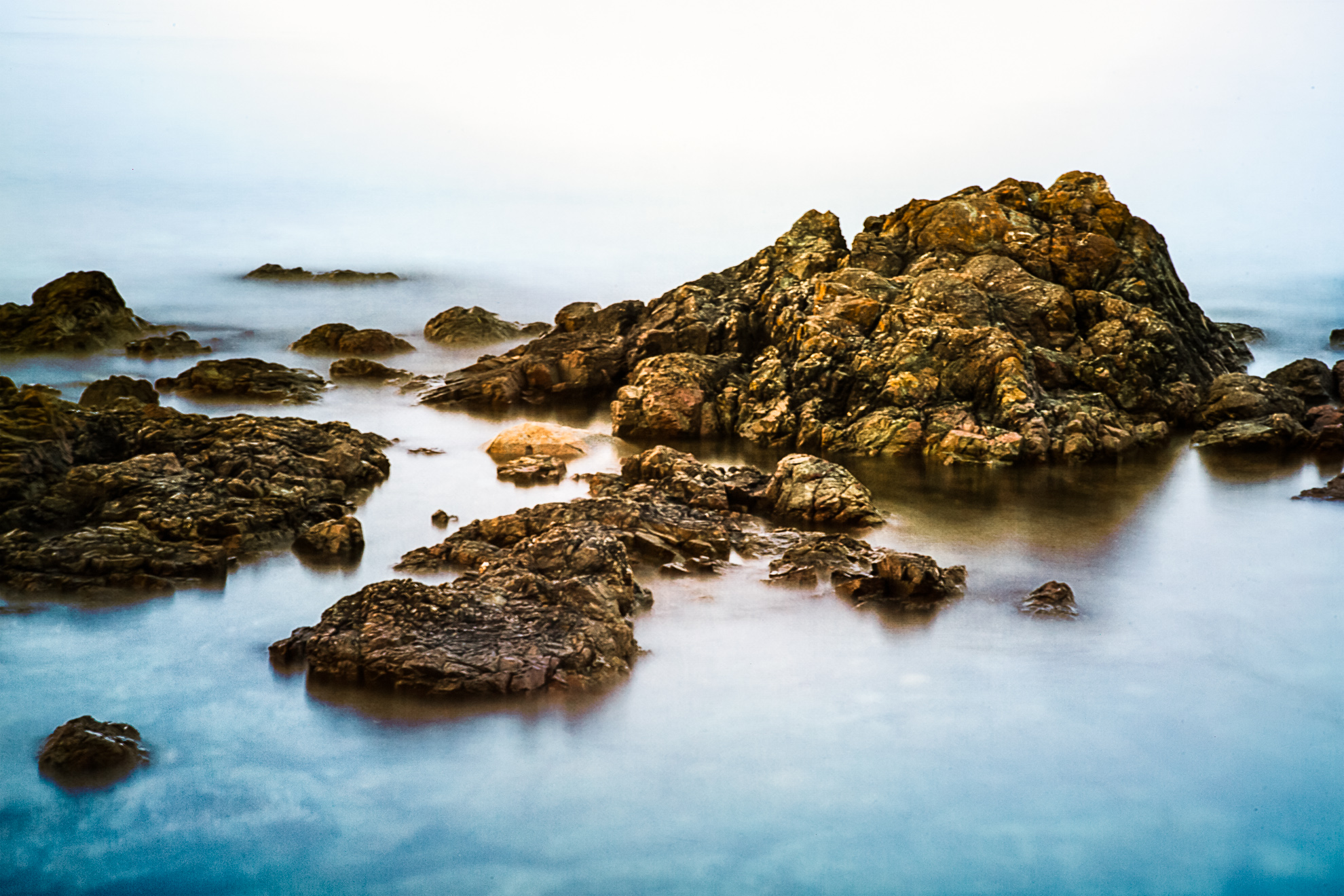
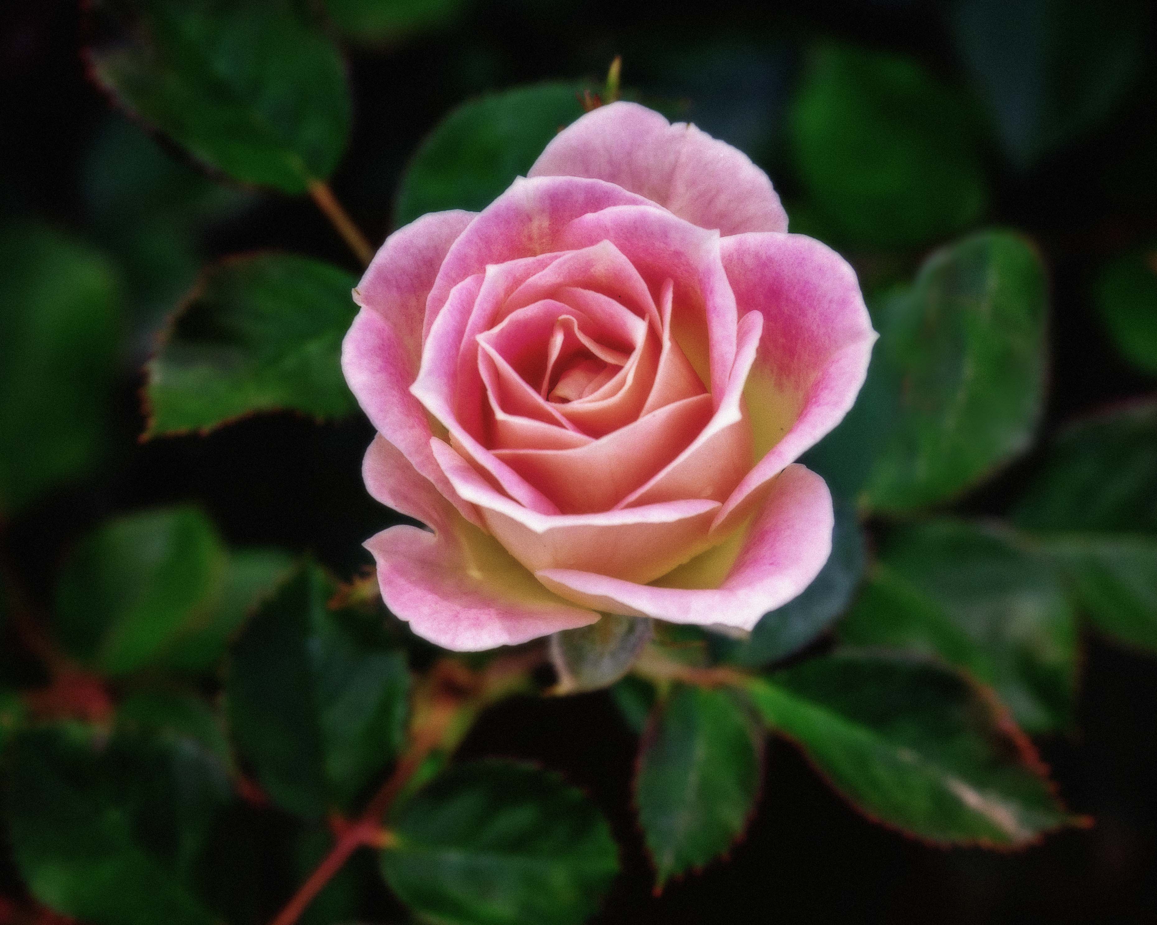
John, I think this image is beautiful as is! The crop you used looks great to me, as does the positioning of the wake to bring the composition to life. If I was going to change anything in an attempt to enhance it, it would be to bring more light to the blues. On my screen, at least, they are a lovely hue but very, very dark. |
Jan 13th |
| 52 |
Jan 17 |
Comment |
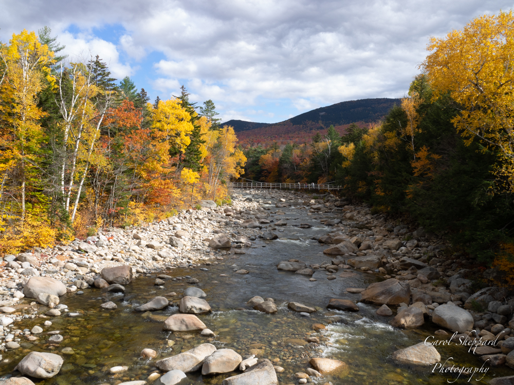
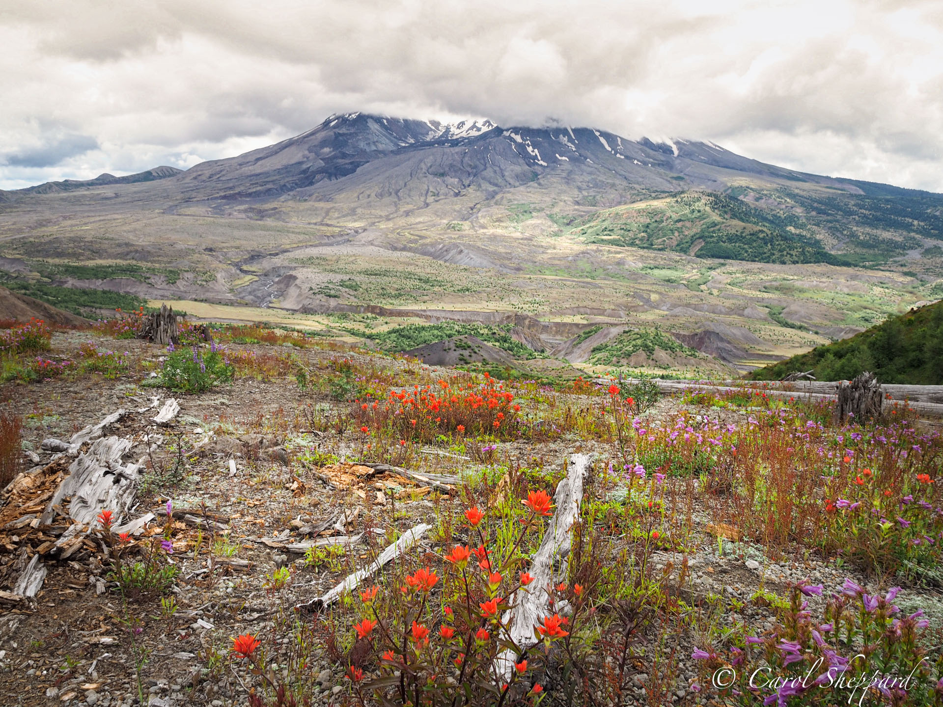
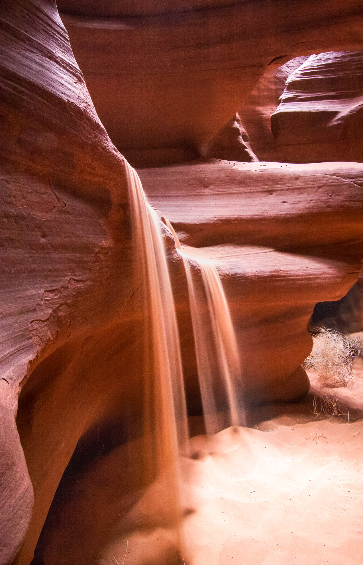
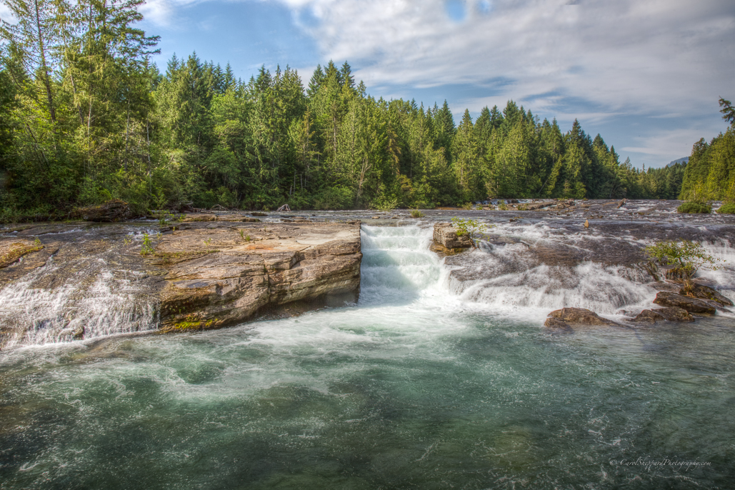
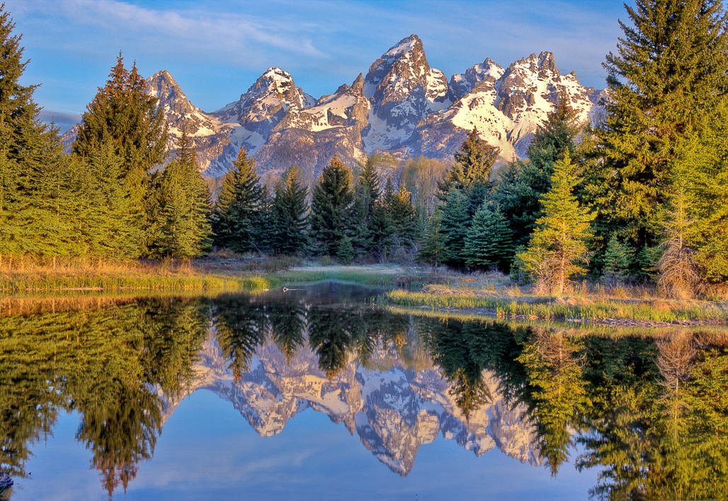
I tend to agree with pieces of each person's feedback. There is a uniformity to the image that, while portraying a vast and beautiful landscape, needs to be opened up somehow--the contrast between lights and darks is not pronounced enough. Mike's remake is a great start. Maybe increasing the luminence in individual colors will help, esp. with the greens of the trees and the oranges and reds in the rocks. What I like best is the angle you caught it from, with a V-shape to the valley that leads the viewer's eye toward the far distant mountains.
|
Jan 13th |
| 52 |
Jan 17 |
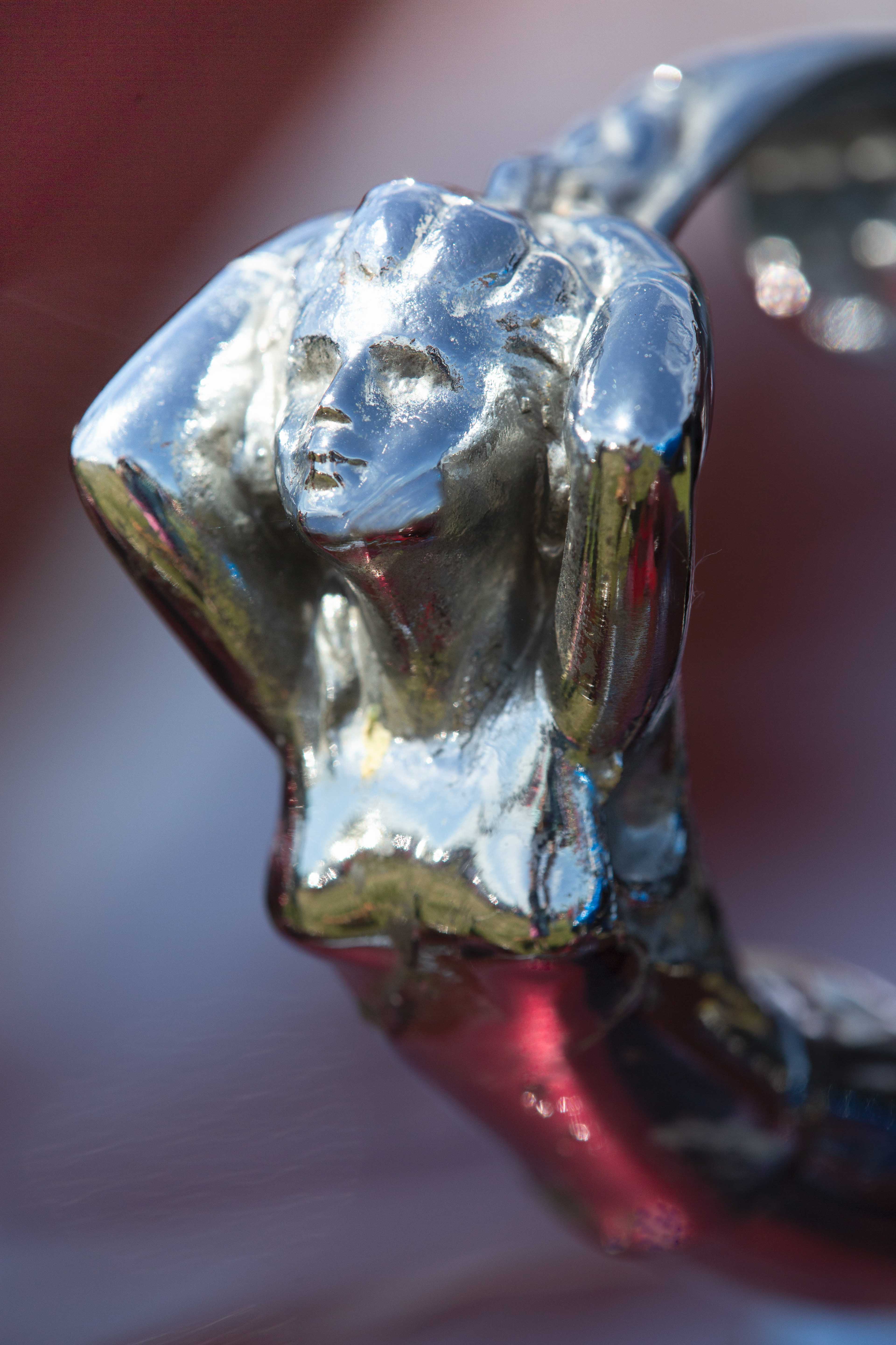
Comment |
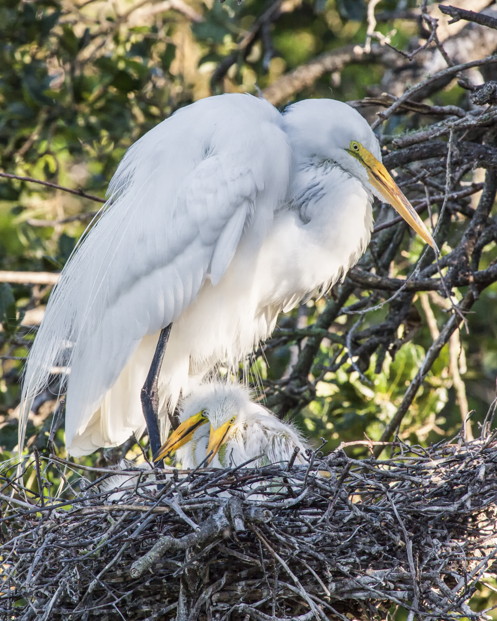
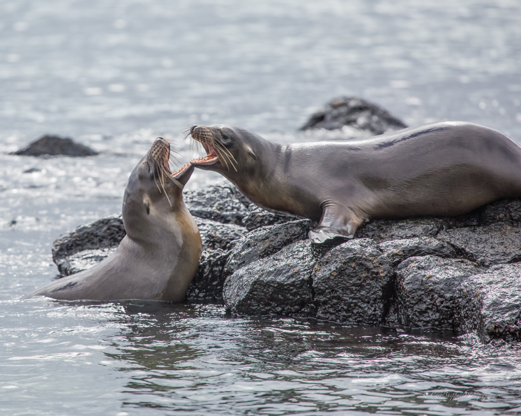
I like your treatment of the image--including the border! With differences in monitors, I am never sure if it is my eyes, the monitor or the image, but I would like to see the faces sharper--I think the forward wings (closest to the viewer) are the sharpest point? Again, it could just be my monitor.
|
Jan 11th |
| 52 |
Jan 17 |
Comment |
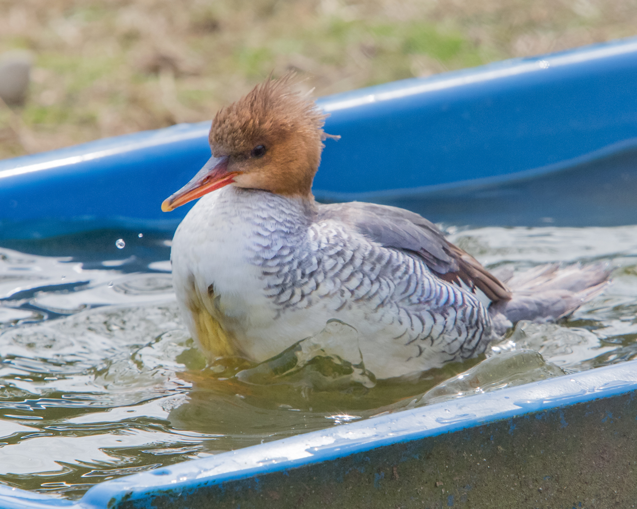
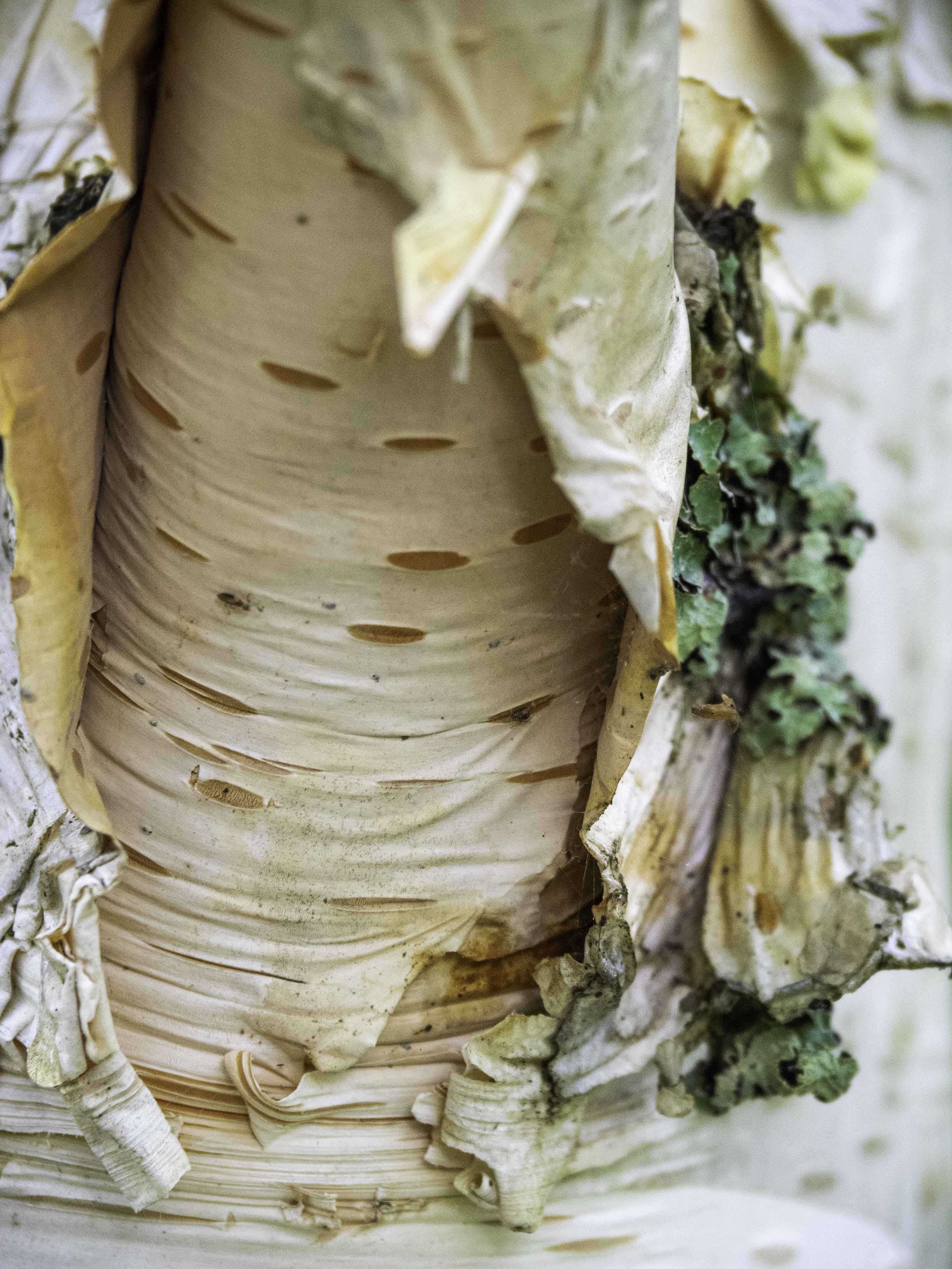
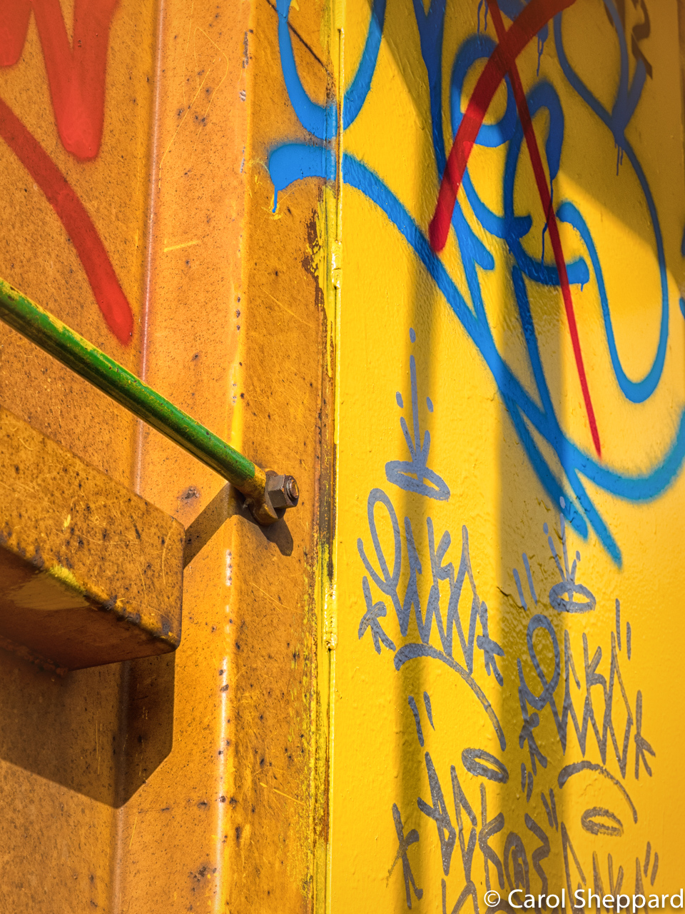
Hmmm, now this is interesting. You see, because it was not level, the water was deeper at the left end, and he is pushing back against it. If I level it, it actually doesn't make any sense, like a shadow in the wrong place. You wouldn't have that build-up of water on just one end in a level trough. The only answer to that would be to cut out the trough entirely. |
Jan 9th |
| 52 |
Jan 17 |
Comment |
I will look at unsharp mask....there is always that fear of creating artifacts and halos for me. Interesting take on the leveling. I had always heard that diagonal appeals more to the viewer while those strong blue lines of the bathtub stop the eye from its travels into the picture. Maybe it acts more like a frame here? I welcome everyone's specific input on how they feel about this specific option. I don't know how I feel about it for this photo. |
Jan 7th |
8 comments - 0 replies for Group 52
|
| 60 |
Jan 17 |
Comment |
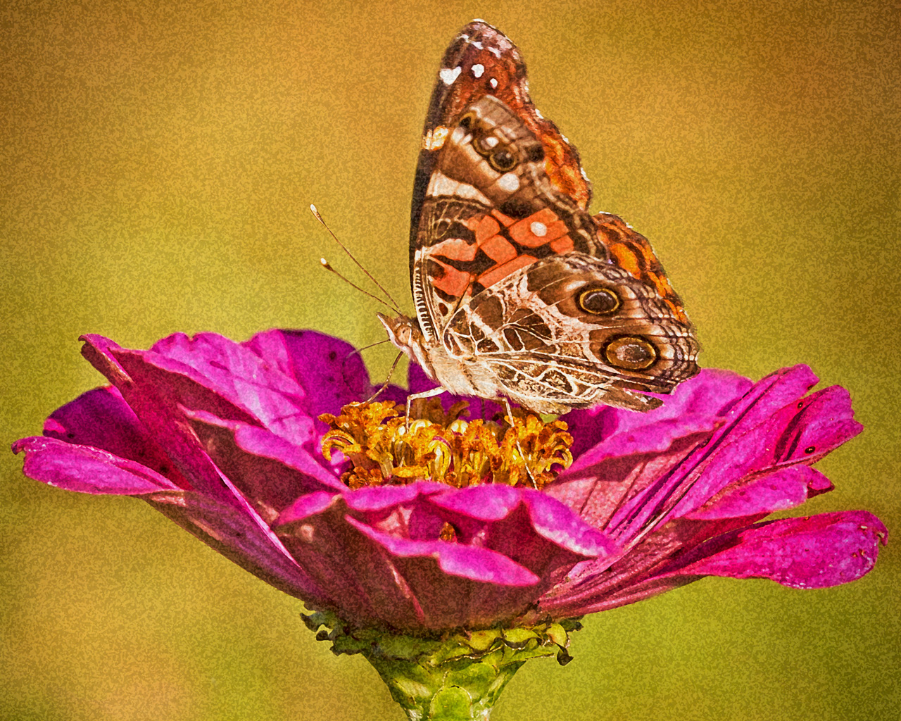
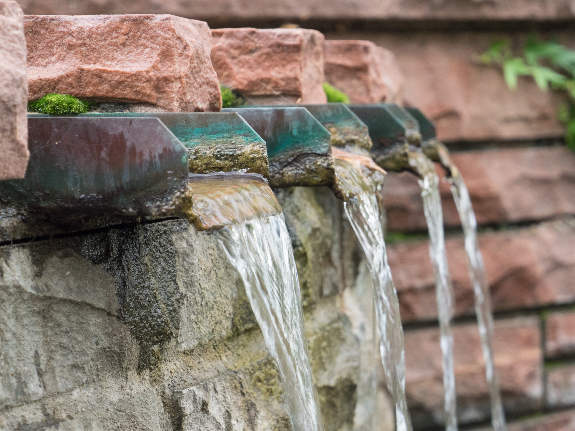
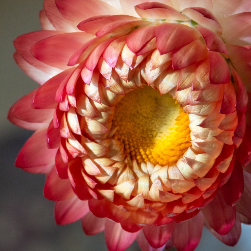
My first reaction when I opened this image was "WOW!" It's a beautiful image; the colors are a perfect and very pleasing combination; the various shades, lights and darks lend even more interest as well as the lines and flakes of texture running through at various junctures. To my eye, the focus point is exactly where it needs to be, along with the wonderful composition. I would be ecstatic to have this image on my wall. If you were going to change anything, I would remove the back edge just forward of that last rivet, as the other three rivets balance each other nicely. The 4th rivet feels more like a "What Doesn't Quite Belong In this Picture?" Great image, Denise. |
Jan 7th |
| 60 |
Jan 17 |
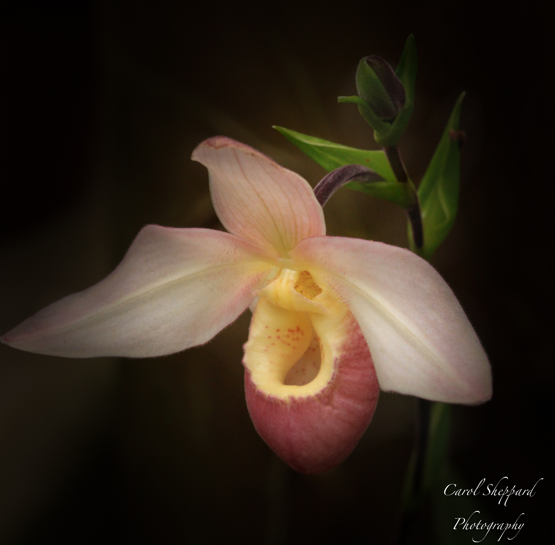
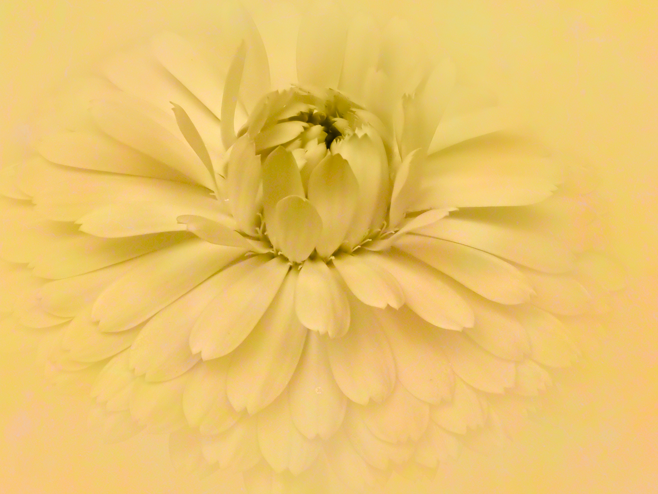
Comment |
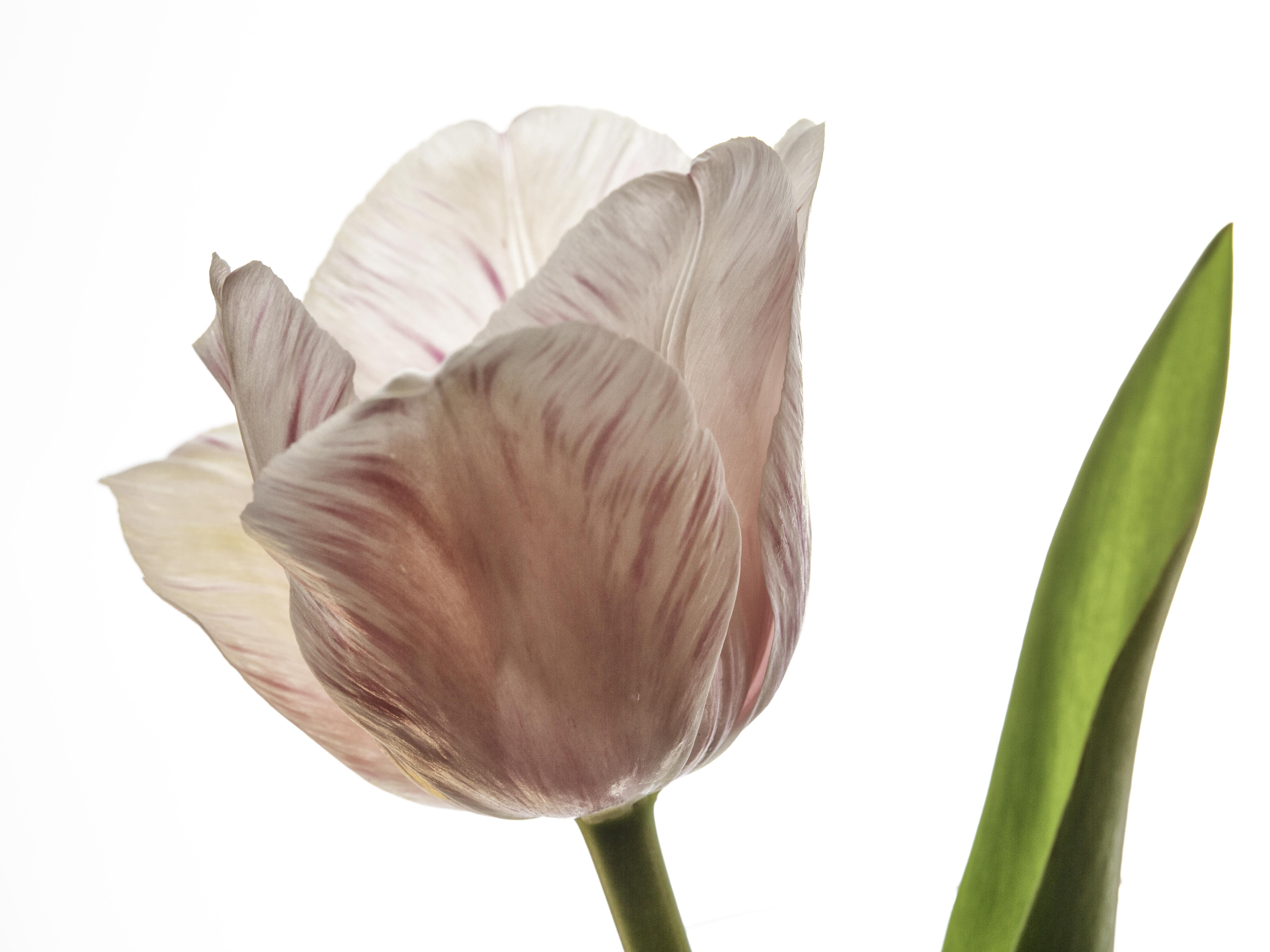
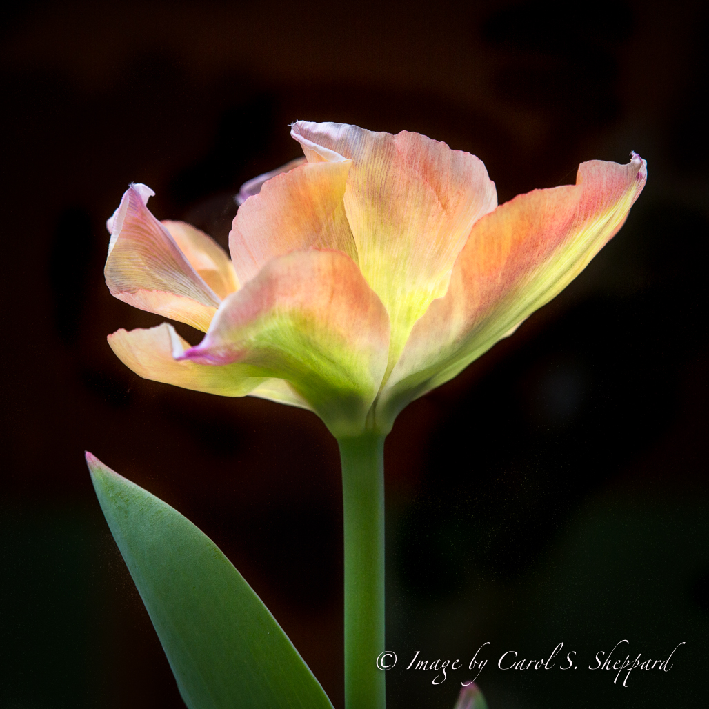
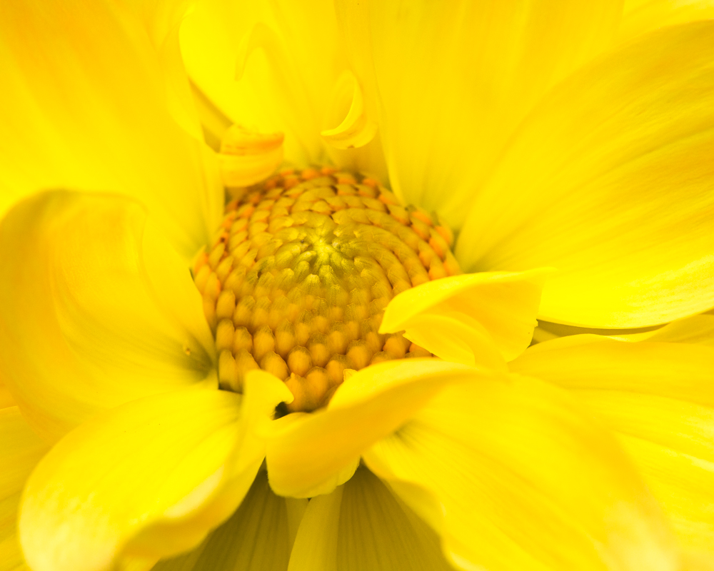
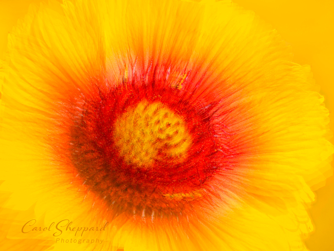
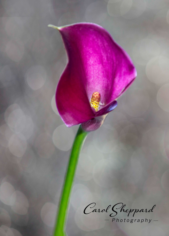
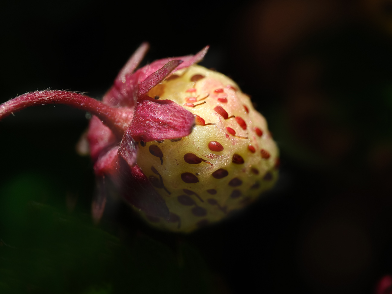
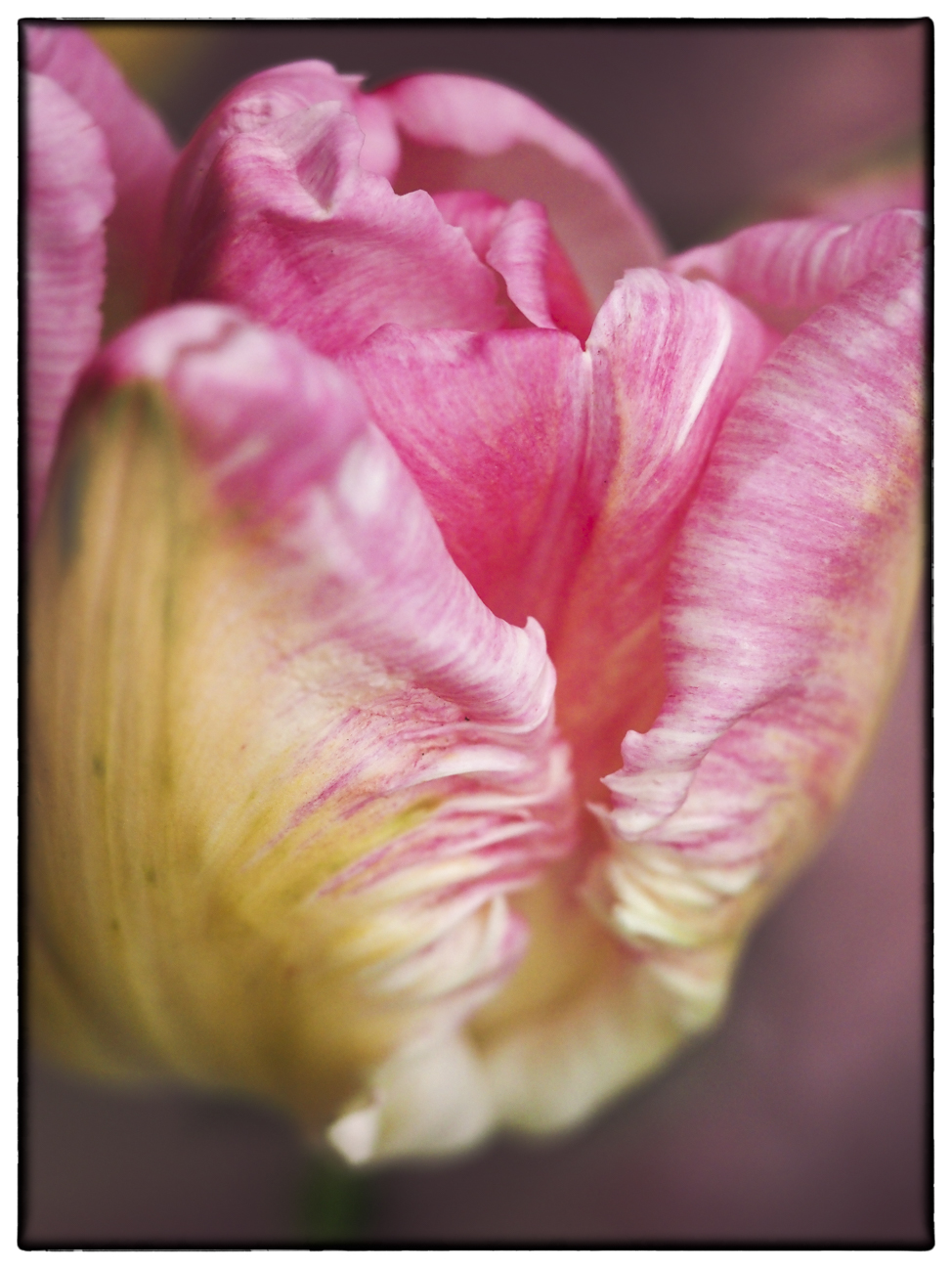
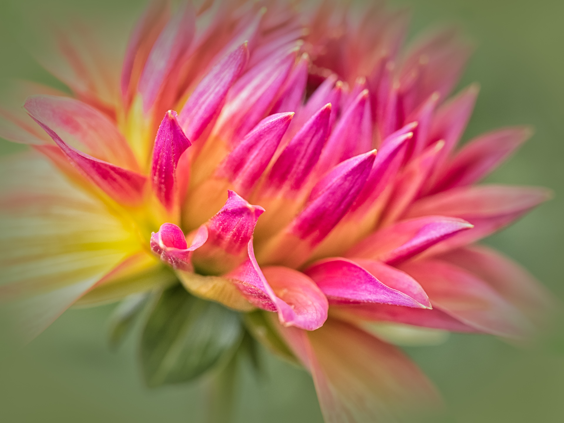
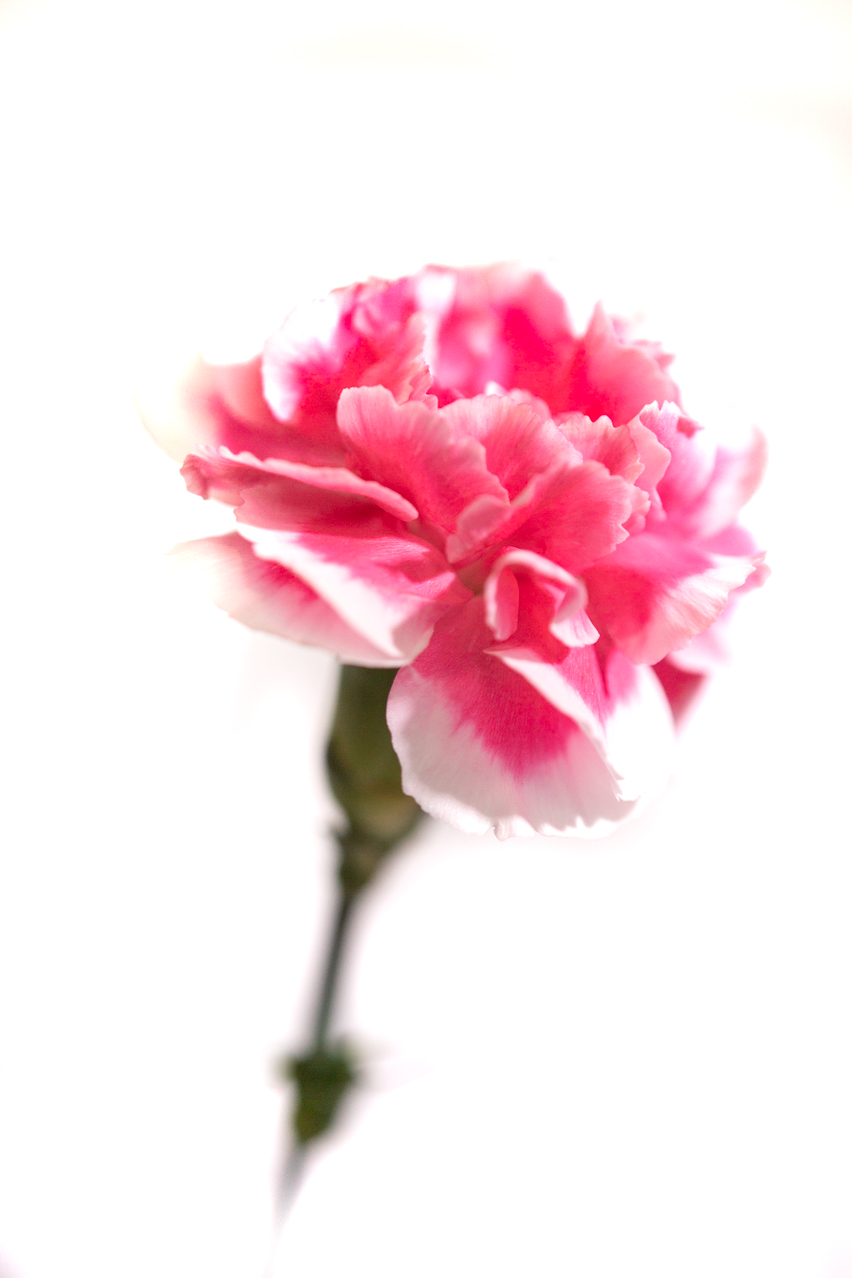
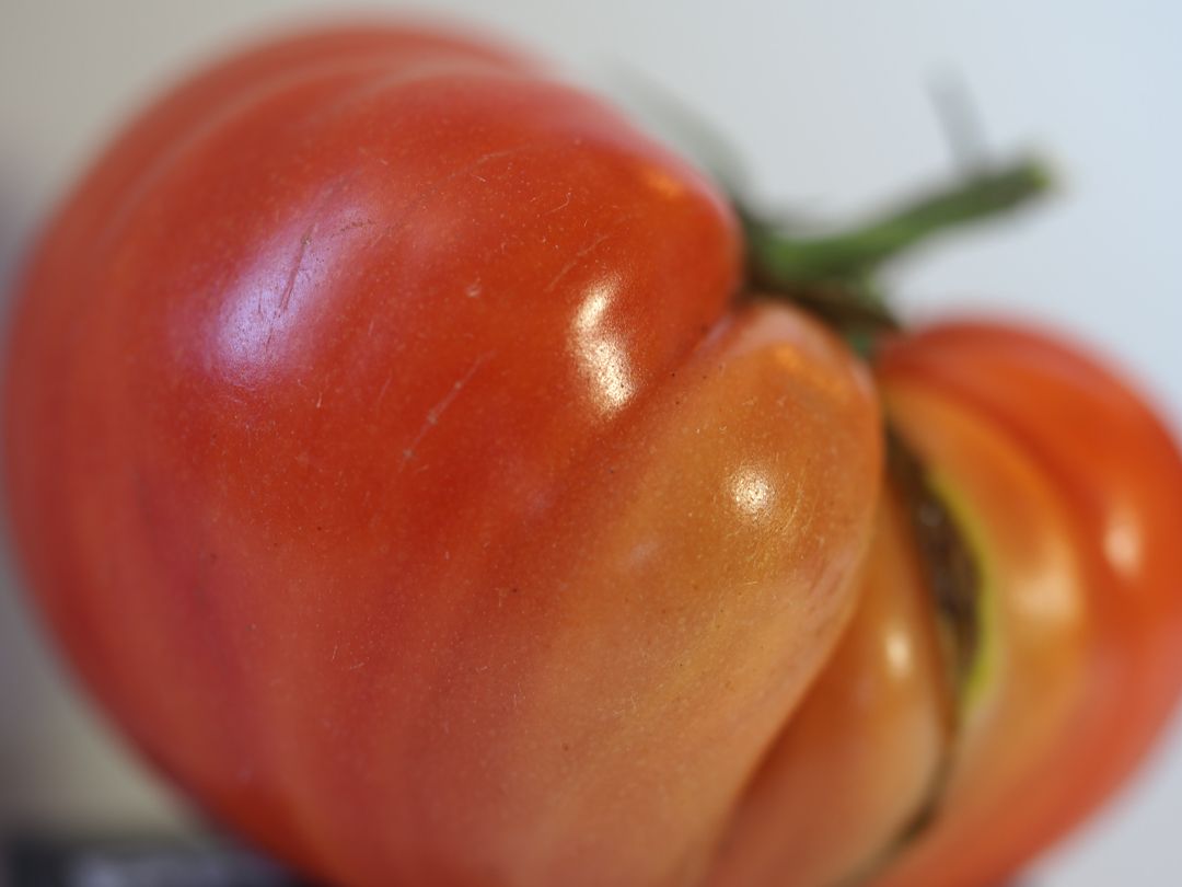
Strong vibrant colors against the black background work very favorably in this image. I kept looking at your settings, because at 1/2000, you would have compensated for any camera shake, I think. It has to be the DOF that leaves the majority of the flower soft but captures the texture and details of the ... (stem?) and the top edge of the petals. The lack of focus in the main part of the flower troubles me as a viewer. The same image with a greater depth of focus would fix that, I think. |
Jan 7th |
| 60 |
Jan 17 |
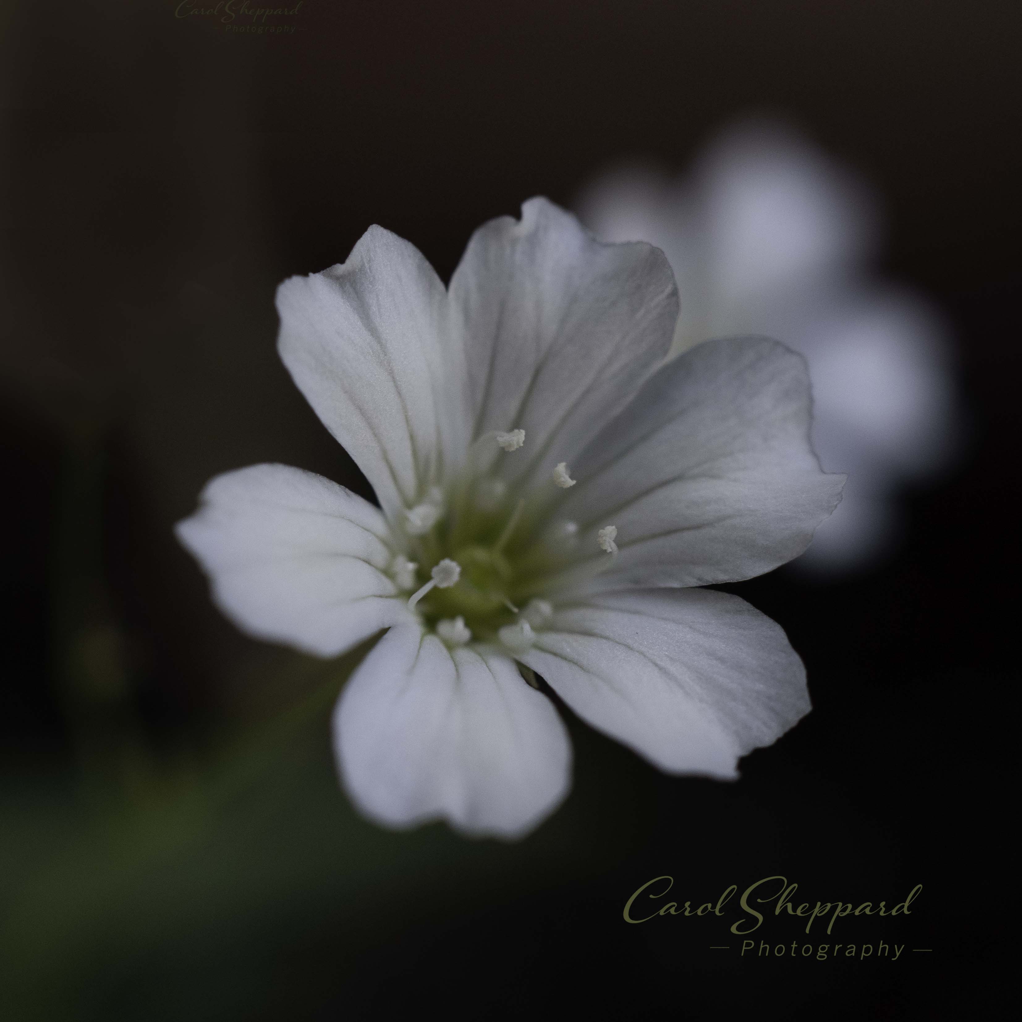
Comment |
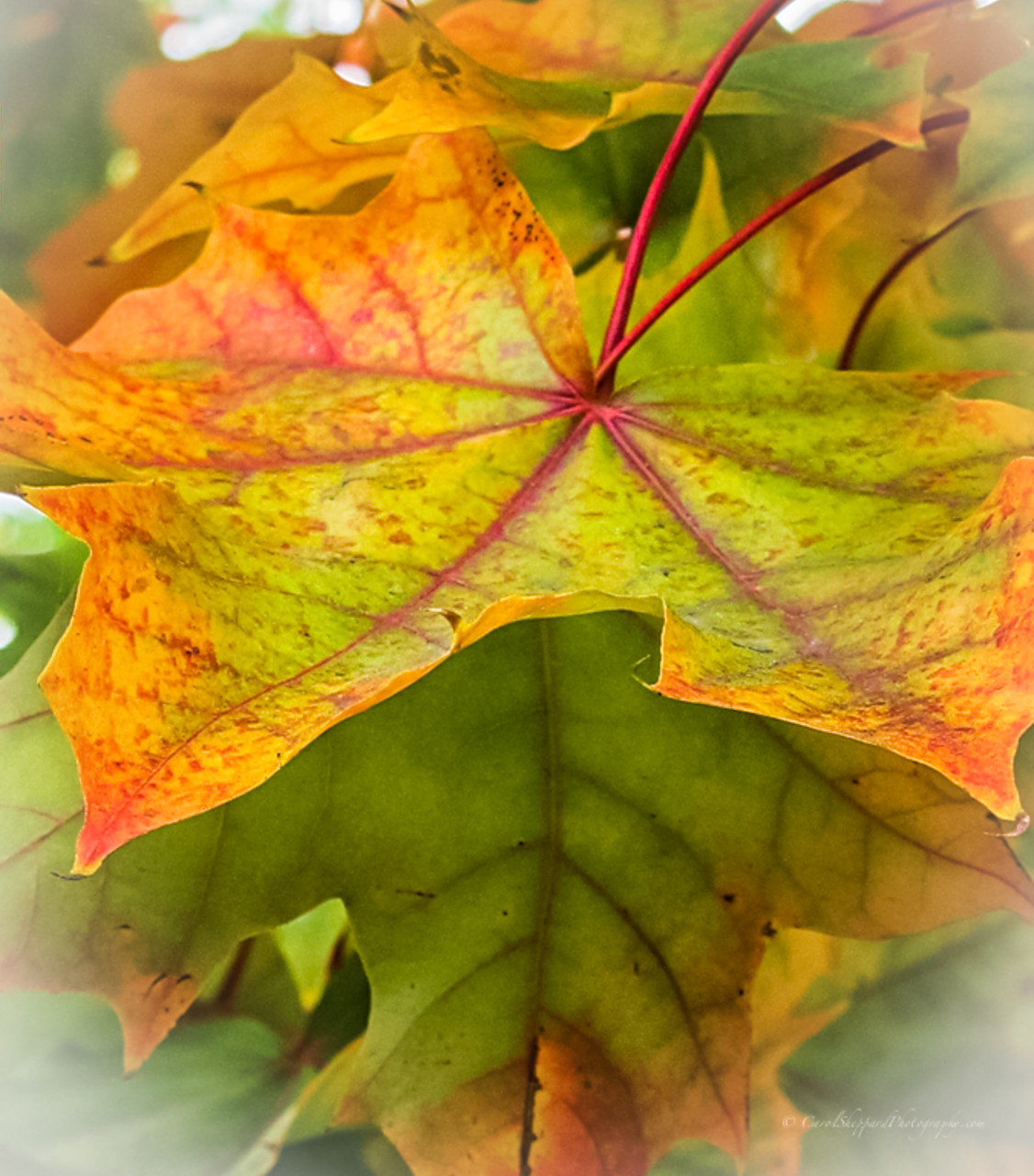
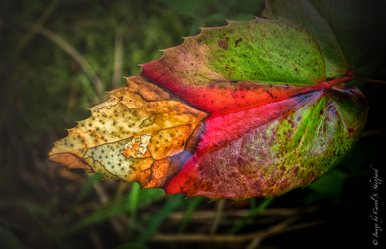
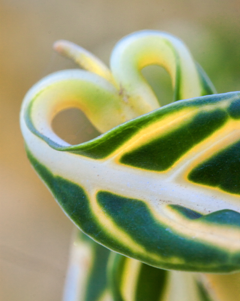
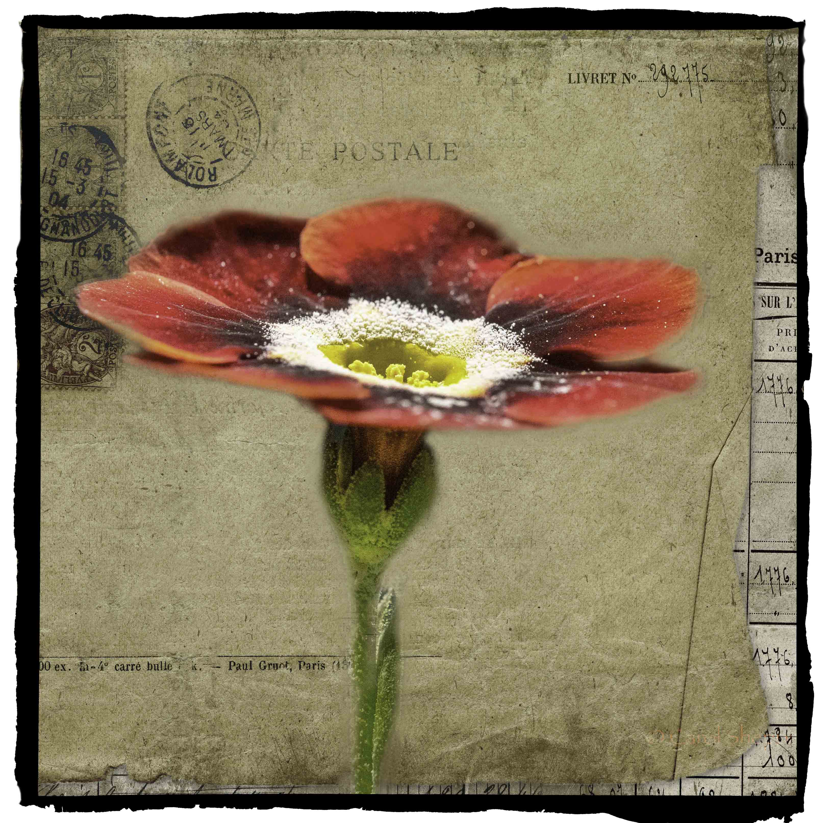
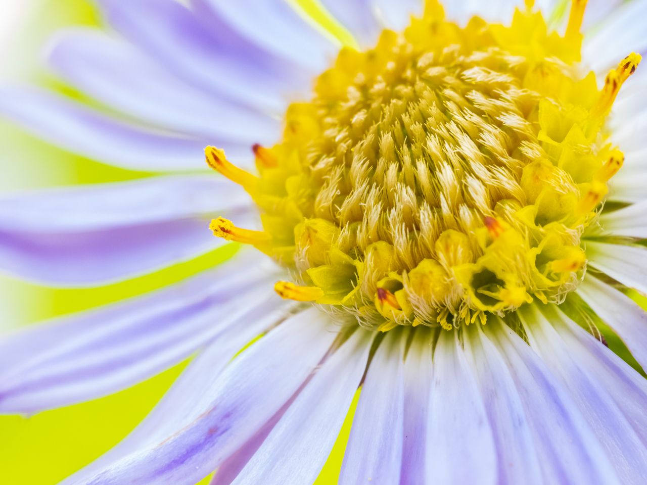
This image has a stunning impact which comes from your beautiful capture of the texture and the intricate shadings of the leaf. Composition works very well for it; I wouldn't change anything. Great image! |
Jan 7th |
| 60 |
Jan 17 |
Comment |
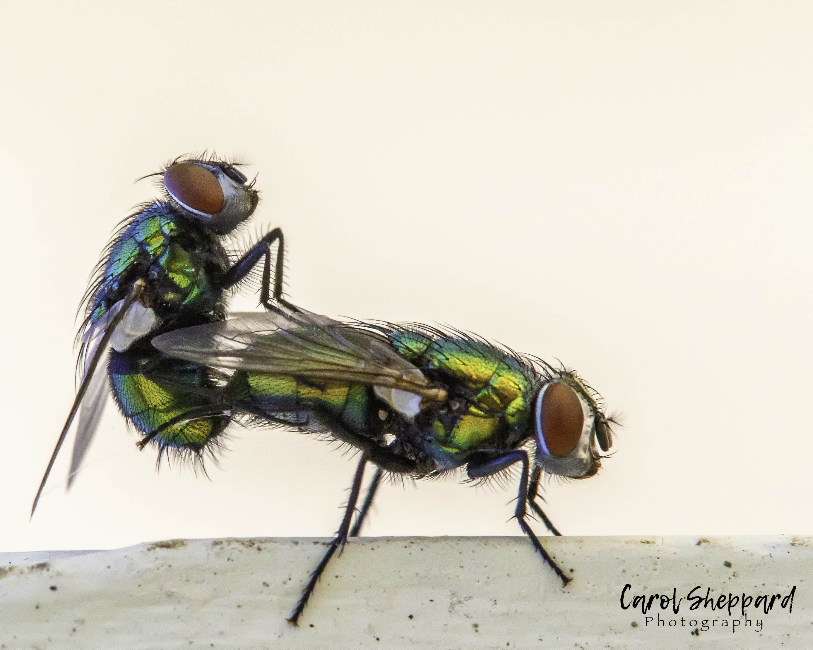
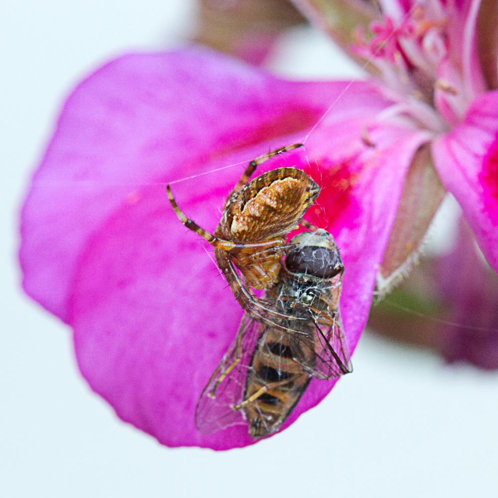
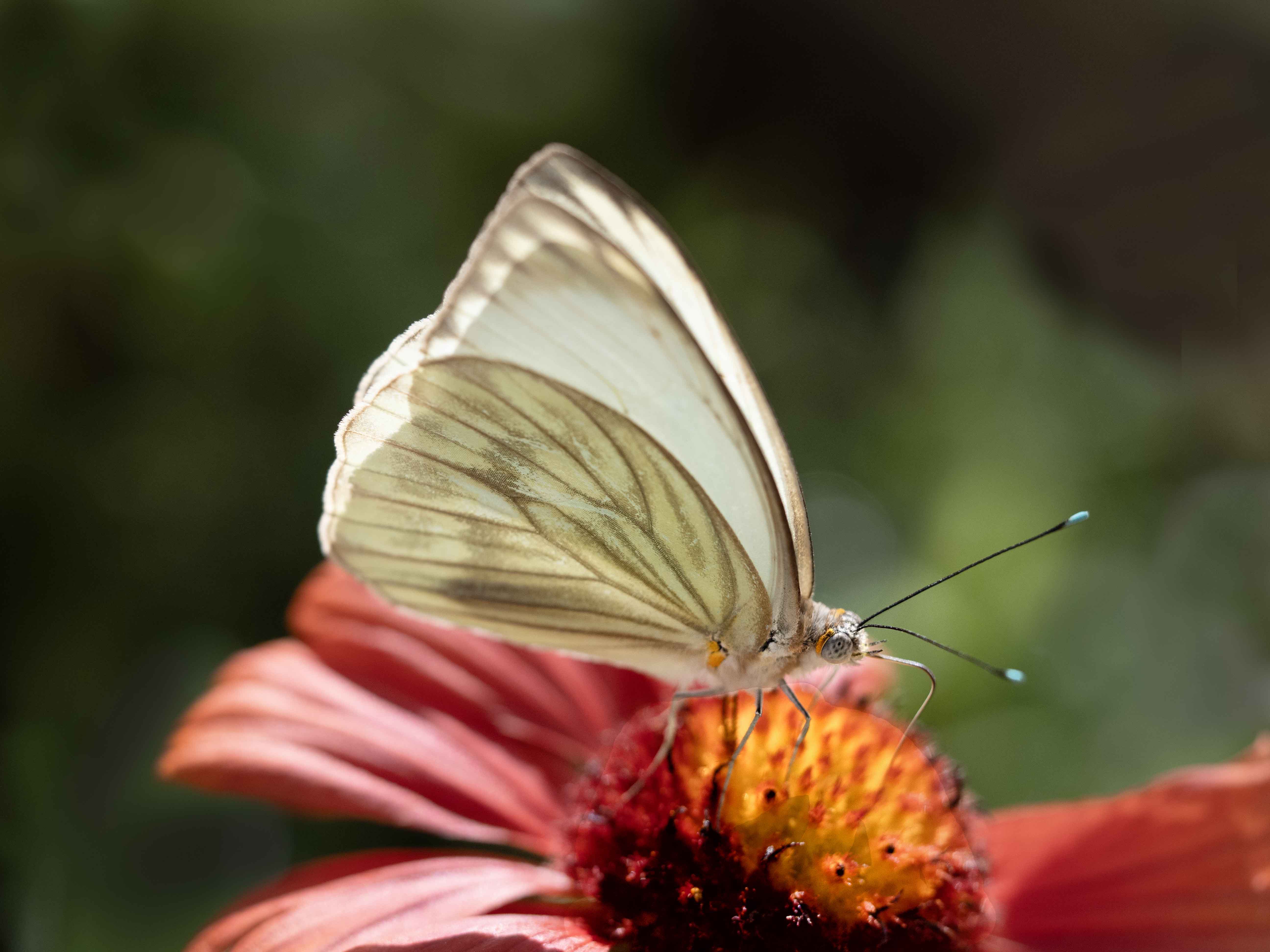
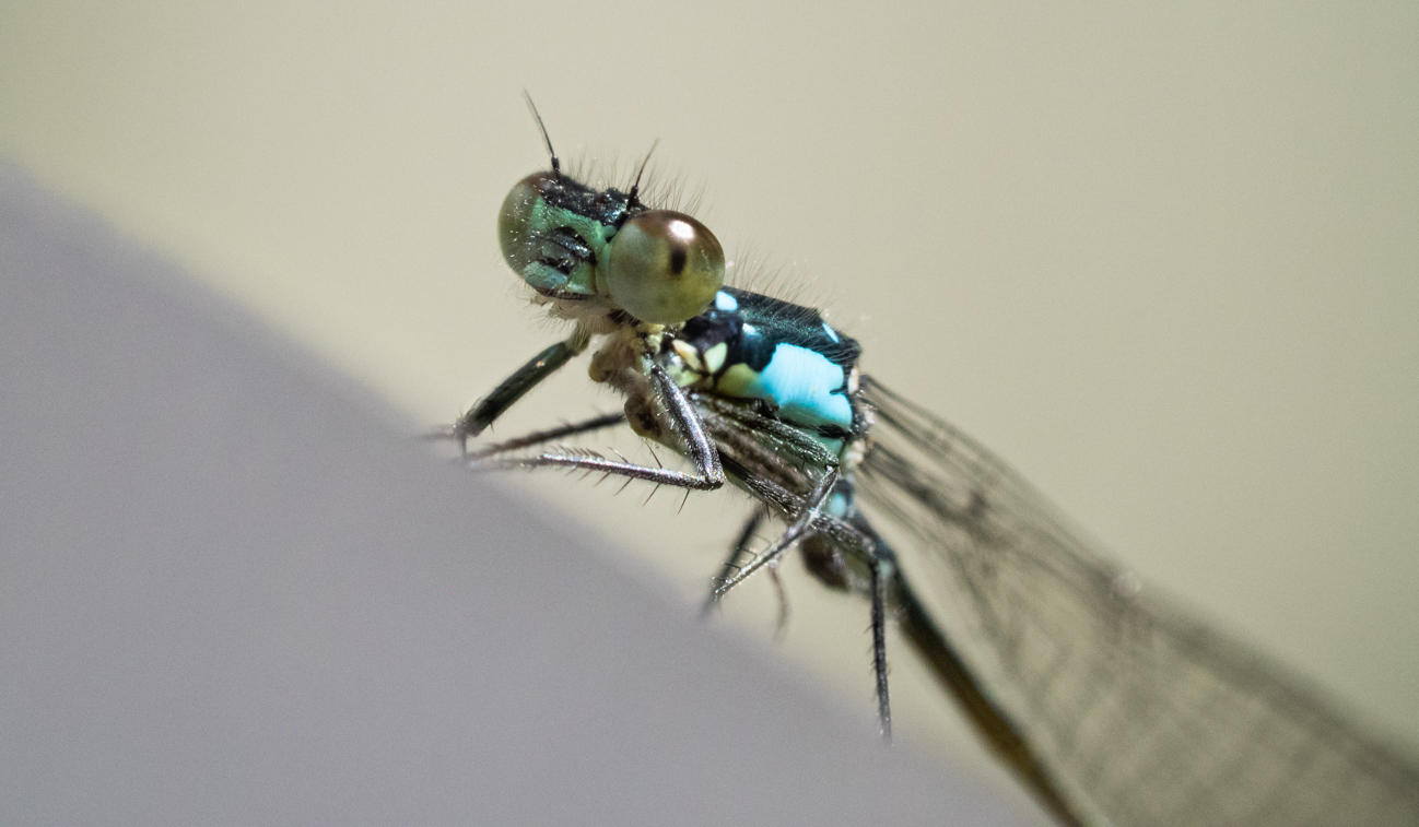
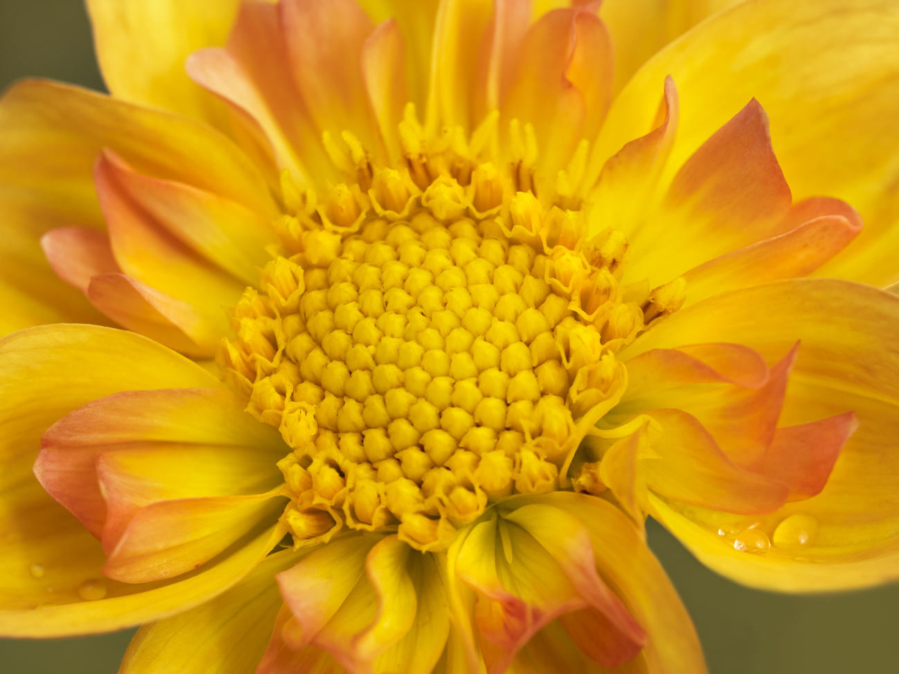
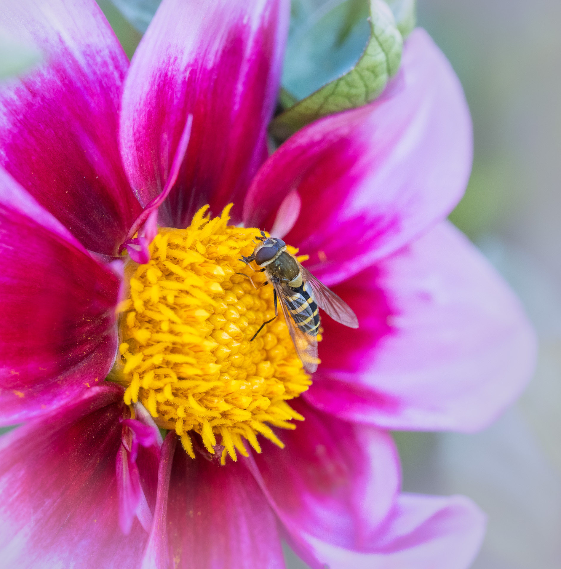
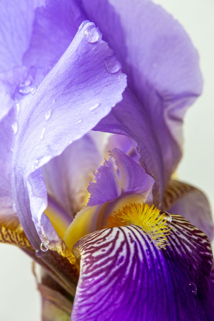
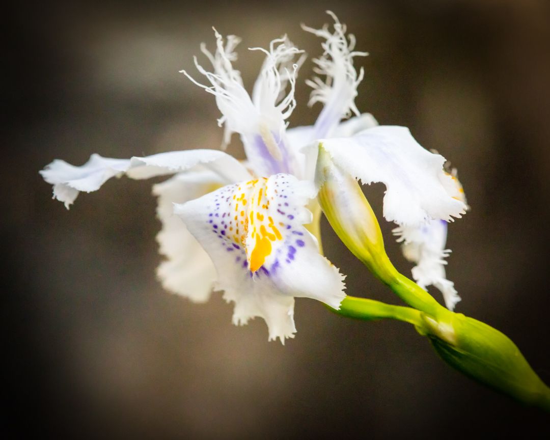
Bill, what a beautiful image! The color combinations, the details, and the contrast between the softness of the petals and the sharpness of the fly all work well together for me. I couldn't open it large enough to zoom in on the highlights, but I do agree with Denise as far as the highlights. If there's any way to minimize them (clone them out?), I think it would be an even greater image. But it really, really appeals to me! |
Jan 7th |
| 60 |
Jan 17 |
Comment |
Yes, you are right, Denise! Great feedback!
|
Jan 7th |
5 comments - 0 replies for Group 60
|
13 comments - 0 replies Total
|