|
| Group |
Round |
C/R |
Comment |
Date |
Image |
| 87 |
Mar 26 |
Reply |
Thank you very much, Chan :-). |
Mar 13th |
| 87 |
Mar 26 |
Reply |
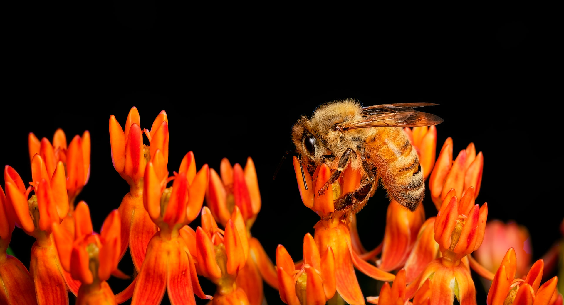
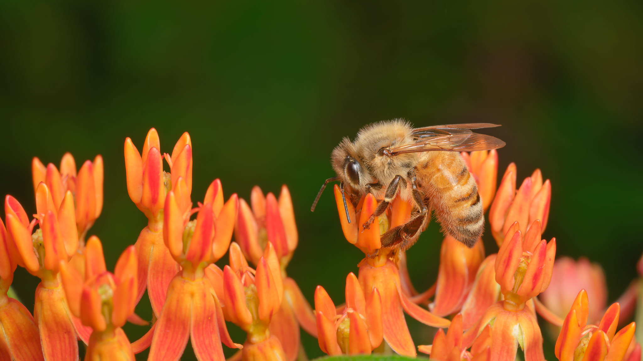
Thanks a lot for the critique. Yes, I like to show the environment of the little critters. I think some people don't think of this as true macro photography, but I think of it as mini landscapes with wildlife. Have fun with your own macro images! |
Mar 11th |
| 87 |
Mar 26 |
Reply |
I hear you! I still feel like that in so many areas, and photography is just my hobby, too, although I wish I could do it 24/7. I got a printer a few weeks ago & feeling totally overwhelmed with all the technical issues & the print jargon.
Just tackle one thing at a time at your own pace and don't try to learn everything all at once. We're all at different points in our journeys, and this is all supposed to be fun. Don't lose sight of that :-) |
Mar 7th |
| 87 |
Mar 26 |
Reply |
Thank you very much :-) And I hope Steven's and Will's comments help you, too! |
Mar 7th |
| 87 |
Mar 26 |
Reply |
Thanks, Steven. Yes, your ideas about banding sound plausible. I'm using Adobe RGB (1998) in both Photolab and Photoshop. Yes, I think the color noise in the background idea makes sense. I'll keep these in mind if I run into this issue again. Fortunately, it's not very often.
And thanks for the image critique :-) |
Mar 6th |
| 87 |
Mar 26 |
Reply |
Thanks for asking! I'm in the middle of learning how to calibrate my screen this week, and I don't know yet if I've calibrated it properly (still waiting to hear from customer support). But now my earlier images look too dark to me, and I don't see as much banding. So I don't know what's going on, but maybe it had to do with my screen calibration? But here's a version where I made the background deliberately light--that's where the banding is. Can you see the problem? If not, then maybe I shouldn't worry :-)
|
Mar 5th |
 |
| 87 |
Mar 26 |
Reply |
Thank you! This is the first time I've tried to calibrate my monitor, and it hasn't been a smooth ride for the last 4 days. The calibrator company (Spyder) just sent me a 225-page pdf in response to a couple of simple questions I had, so I'll try to get through it. I still have hope that I can do it!
I think encouraging others to think about the reasoning behind their choices is really helpful. I submit pictures to various other photography groups as well. I should be more intentional and systematic about it, but I just haven't had the time to think deeply about my choices and strategy. For the low-stakes submissions that don't involve contests, like this one, I generally submit images that I'm not sure about, topics I'm in the process of learning or struggling with, or things have had issues with on my photography journey to get feedback and to see what others think. |
Mar 3rd |
| 87 |
Mar 26 |
Reply |
Thanks a lot :-) Both of the originals look equally dark and identical to me now, but I'm in the middle of learning how to calibrate my monitor, so things may have gone awry somewhere.
This is only the second image I submitted. My reasoning with this was that I was really frustrated last week with trying to figure out this banding issue, so I wanted to see if anyone else had any ideas. What is your reasoning in choosing the images you feature? Do you have any suggestions?
|
Mar 3rd |
| 87 |
Mar 26 |
Reply |
Thank you very much for the critique and the tip about banding. I haven't done anything with the color space, so I'll try out your suggestion. Thanks :-) |
Mar 3rd |
| 87 |
Mar 26 |
Comment |
This is a very good view of what this gate looks like in its environment, with the crowds underneath and the lake/sea and mountains behind it. I like the dramatic contrast between the reds and the blues. Overall, the image gives a very good sense of what it's like to be at this location. |
Mar 3rd |
| 87 |
Mar 26 |
Comment |
Great job with the focus stacking! The soft light works well with these roses, and their colors are very nicely rendered. |
Mar 3rd |
| 87 |
Mar 26 |
Comment |
This is a very good abstract image. I really like the fact that it has all the tonal gradations from pitch black to very white, and the dominant diagonal line provides energy. There is a lot of variety in terms of shades of gray, the orientation of the lines, and shapes, and that keeps the viewer (at least me) interested enough to keep exploring. |
Mar 3rd |
| 87 |
Mar 26 |
Comment |
This is a nice capture of this squirrel. The focus on the eyes is very good, and I like the fact that it is looking in the general direction of the camera. The background is nicely blurred, it is well placed in the frame, and the branch provides a leading line toward the squirrel. |
Mar 3rd |
| 87 |
Mar 26 |
Comment |
I think you achieved your goal of a sharp face and motion blurred body and paddle very well. The intense expression on the man's face captures his emotions and is good for story-telling. |
Mar 3rd |
| 87 |
Mar 26 |
Comment |
The flowers are beautiful and very much in focus. It's especially hard to get good focus throughout orchids with a macro lens, so that's very well done. And I really like the diagonal composition. The cropping, the aspect ratio, and the space around the branch all seem very appropriate. |
Mar 3rd |
6 comments - 9 replies for Group 87
|
6 comments - 9 replies Total
|