|
| Group |
Round |
C/R |
Comment |
Date |
Image |
| 26 |
Jan 26 |
Comment |
Thanks everyone for your great comments. Glad I could join this group.
|
Jan 21st |
| 26 |
Jan 26 |
Comment |
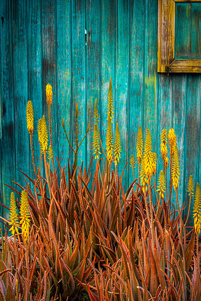
Pleasant still life that you can stare at for a while. I agree with eliminating lots of the black area. Maybe for fun, add more contrast or saturation to make the orange pop. |
Jan 12th |
| 26 |
Jan 26 |
Comment |
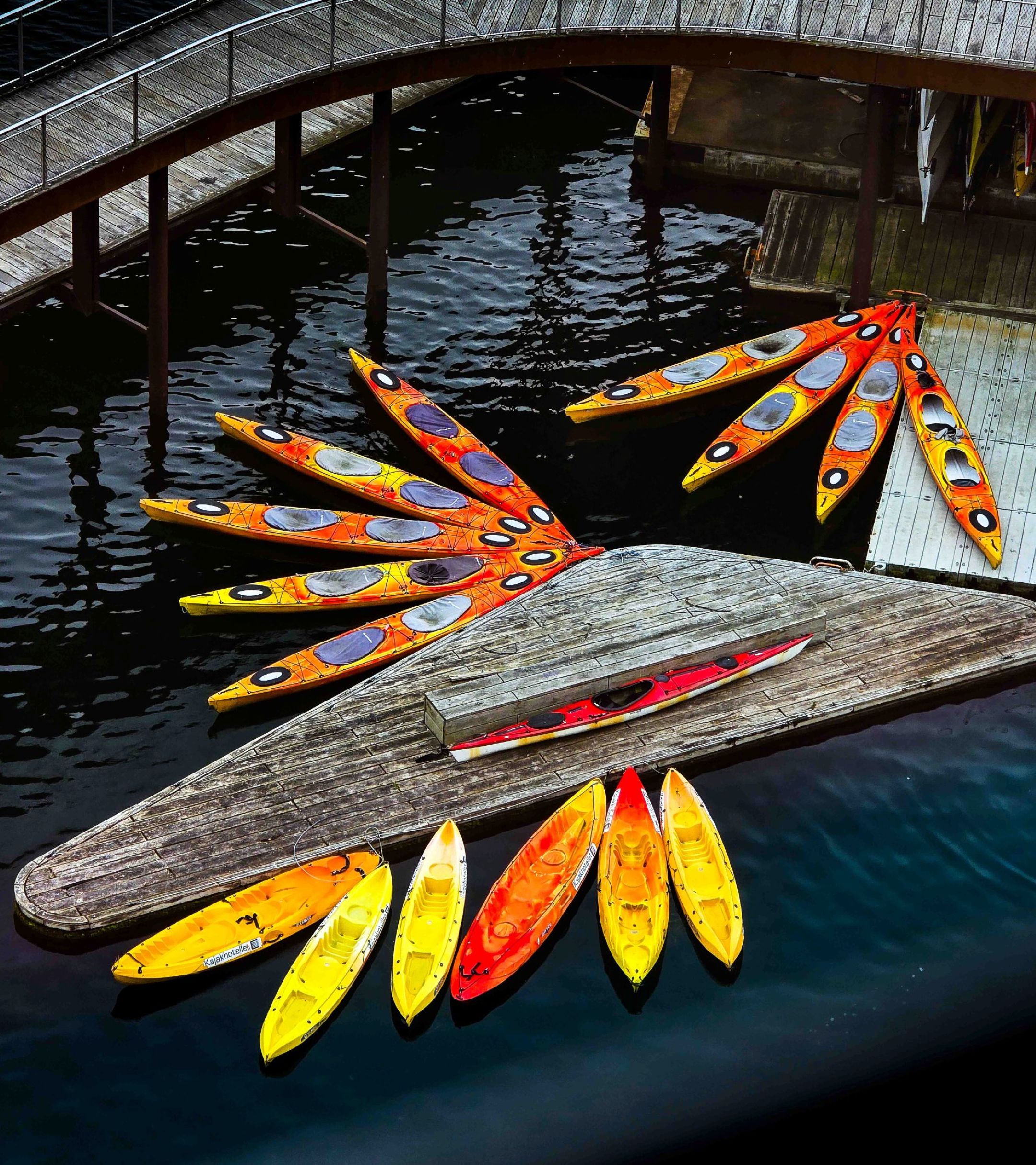
Wonderful abstract. I get lost in it. Great post-processing work. |
Jan 12th |
| 26 |
Jan 26 |
Comment |
I like the B&W version best. It seems like a natural poise. I agree with the others about cropping, as the walls and the multiple roofs don't add to the pictures. When I zoom in on the color version, she stands out. If you leave it as color, maybe darken the walls. |
Jan 12th |
| 26 |
Jan 26 |
Comment |
It looks like they launched the colored circle from their disk. I find the bottom a little distracting and bright. Maybe crop or darken it. |
Jan 12th |
| 26 |
Jan 26 |
Comment |
Nice to see a B&W. Well done. The flow is there with the fabric. There are 2 bright areas - her face and her outstretched arm. The eye usually goes to the brightest spots. If the eye goes to the hand, it leaves the picture. Maybe, like Bob's, try flipping it? Or just darken the edge of the fabric. |
Jan 12th |
| 26 |
Jan 26 |
Comment |
Good job with the post processing. I like the suggestion of motion with the swirls and clouds. The red stands out from the background. I noticed that the hand and knee on the right are little bright. What about flipping the image so that your eye comes in on the hands and stops at the flowing dress? |
Jan 12th |
7 comments - 0 replies for Group 26
|
7 comments - 0 replies Total
|