|
| Group |
Round |
C/R |
Comment |
Date |
Image |
| 28 |
Mar 26 |
Reply |
Thanks for your insights, Deb. Totally agree on brightness. I was just working on this image for a local exhibition. Printing an image always helps me to see what is working and what isn't. I brightened it, increased contrast and ended up here with the blue saturation. |
Mar 15th |
 |
| 28 |
Mar 26 |
Reply |
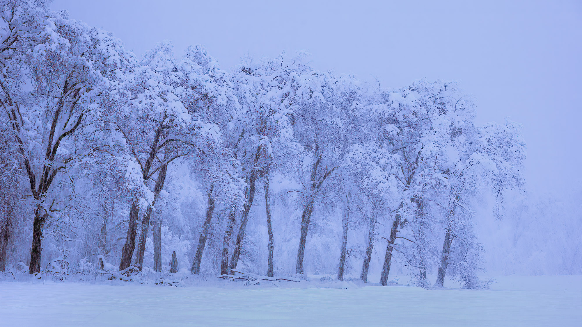
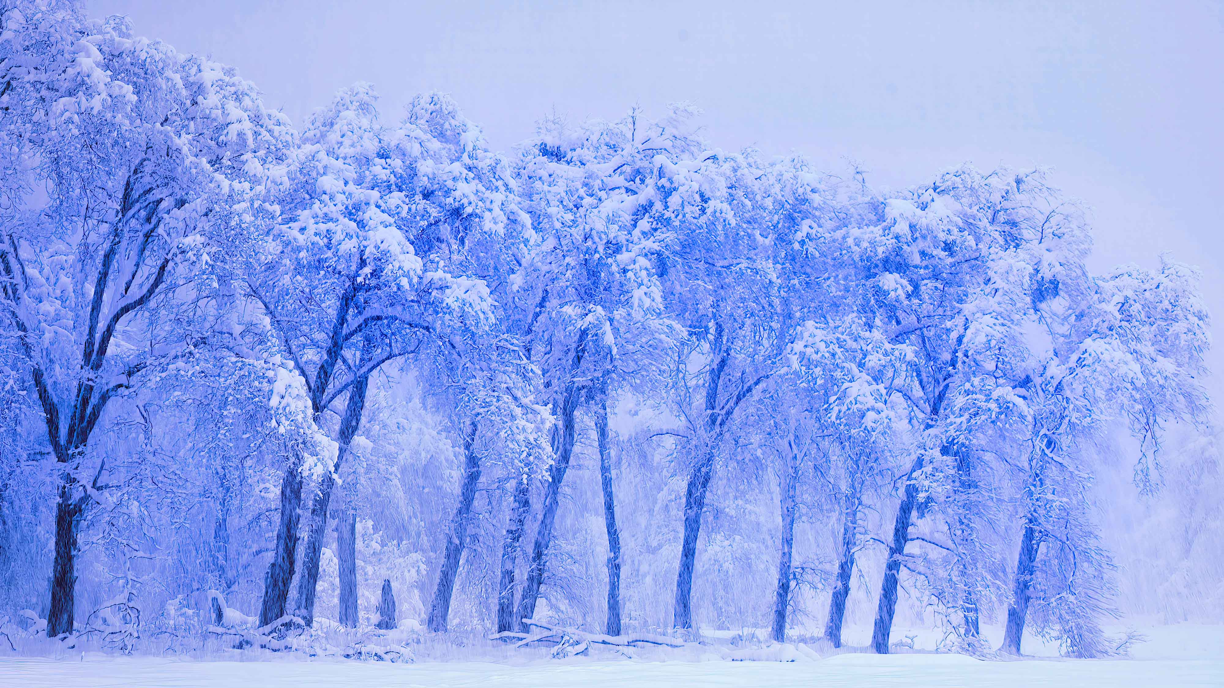
Thanks, Deb. Interesting comment! I was being careful about keeping the camera level on the tripod that morning so I'm pretty sure the actual shot is. If you look closely at the right edge, you can barely see the edge of the meadow. The line it creates is pretty close to horizontal in the frame. I was closer to the trees on the left and not perfectly parallel to them... probably a parallax kinda thing.
That being said, I think I like it... might be too symmetrical otherwise?
The bigger question to me is whether the thick snow on the trees really reads to the viewer. It's almost the same color as the thick snow falling in the background. |
Mar 12th |
| 28 |
Mar 26 |
Reply |
Thanks, Firdaus! Love the snow, especially when it stays in the mountains. |
Mar 12th |
| 28 |
Mar 26 |
Reply |
Thanks, Annmarie! It was like being wrapped in a snow blanket. |
Mar 12th |
| 28 |
Mar 26 |
Comment |
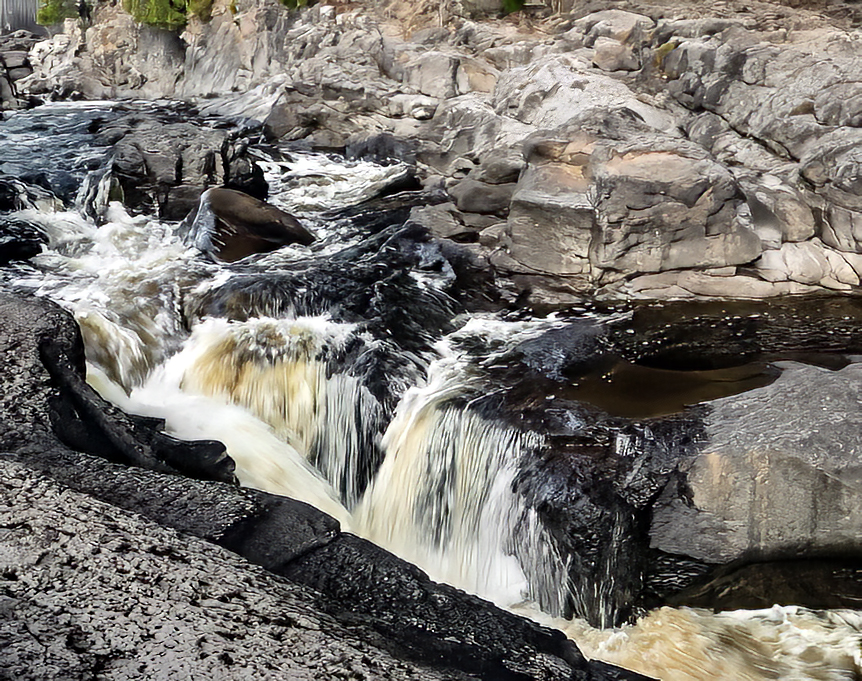
I love to play with moving water too, Kathy! This is a nice scene and I like the triangles in it. My eye goes right to white rapids and then follows it up river. It looks like pretty country so I want to see more. :)
It looks a little crooked to me gauging by the line of the river in the upper left. I took the liberty of rotating it and cropping a bit. I think it uses the space better? I also reduced the saturation by a lot, once I had it in PS, the blue of the water really stood out. The attached image is what I came up with... maybe over sharpened. It looks good in b/w too! |
Mar 12th |
 |
| 28 |
Mar 26 |
Comment |
That's really a delightful image, Deb! At first glance, I was asking what is it? It looks like a space ship! What an interesting and unique super structure.
The blue really pulls your eye in but it's a fun image to explore. The reflections are just as cool as the image. It makes me want to see a big print of it so I can see all the detail that must be there.
It makes such a difference to view these in PS. Don't know how you all look at these images, but I'm finding it helpful in a lot of ways. Like I can see that this uses the full gamut but without clipping. It's also nice and sharp, how did you sharpen it, Deb? |
Mar 12th |
| 28 |
Mar 26 |
Comment |
Wow, Firdaus! That's really a striking image. The symmetry makes such an immediate impact. I found it better to view it in PS where I could see the black border and the image frame. Black and white was such a good choice and makes the solid black border so effective.
The clouds give it an ominous feeling for me somehow. It is like looking into the past. Tremendous to have such history around you. I was reading 15th/16th century? Something we miss here. Thanks for sharing! |
Mar 12th |
| 28 |
Mar 26 |
Reply |
Good to know about judges preferences, thanks! Gotta keep that in mind. :) |
Mar 5th |
| 28 |
Mar 26 |
Comment |
So nice to see such a range of subject matter from you, Debbie! I guess photos always have at least 2 stories: the story of what's in the photo and the story of how the photo was taken. Fun to see the world through others eyes.
My eyes go to the leather pants which looks wet and makes me wonder what he's looking at. I like the details in the patterns and the cross he wears. |
Mar 4th |
| 28 |
Mar 26 |
Comment |
Clever way to use the monopod! Thanks for that tip. I was visualizing it right side up somehow so the photo was helpful. Love the tilting screens on cameras now. :)
What a wonderful photo, Steve! It feels like you are right there. The connection with the eyes makes the whole picture. It looks like there is more light that what your settings show and I don't see strong shadows, was it overcast? The high ISO gave us some noise and since you gave us such great resolution, viewing at 100% makes it visible. Probably not much in a 8x12 print....
I ran the photo through Topaz denoise and sharpening and found it to be pretty darn effective. See attached.
|
Mar 4th |
 |
| 28 |
Mar 26 |
Comment |
Very nice, Annmarie! Love that one water drop on the top which is in such sharp focus and where my eye immediately went! I always surprised when f/8 doesn't have greater depth of field, do you know the focal length? I like the out of focus green which compliments the flower but something makes me want to have the whole flower in focus. But perhaps this was intentional?
I went through a flower phase last year as the garden supplied new victims. Love the shapes and colors.... |
Mar 3rd |
7 comments - 5 replies for Group 28
|
| 96 |
Mar 26 |
Reply |
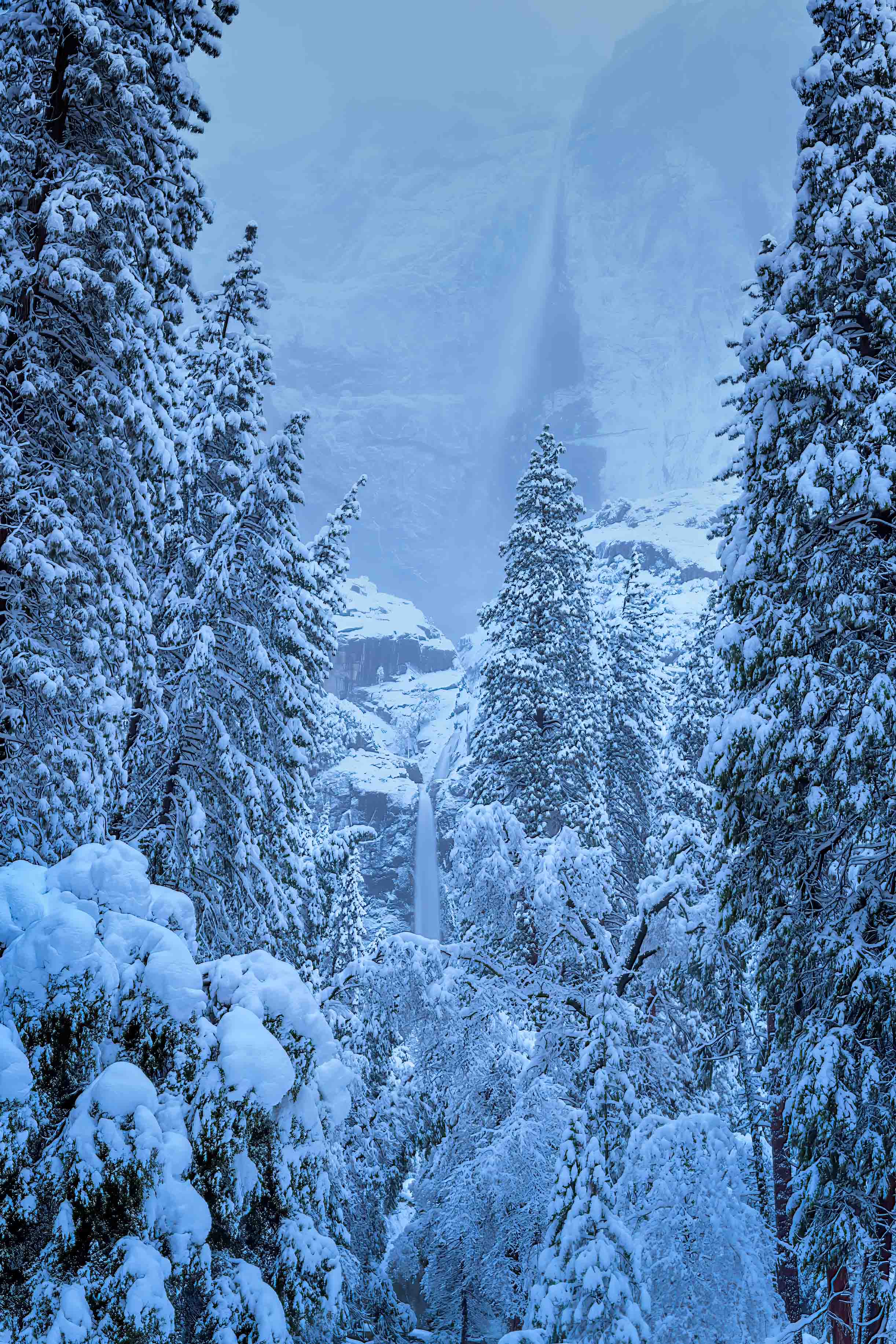
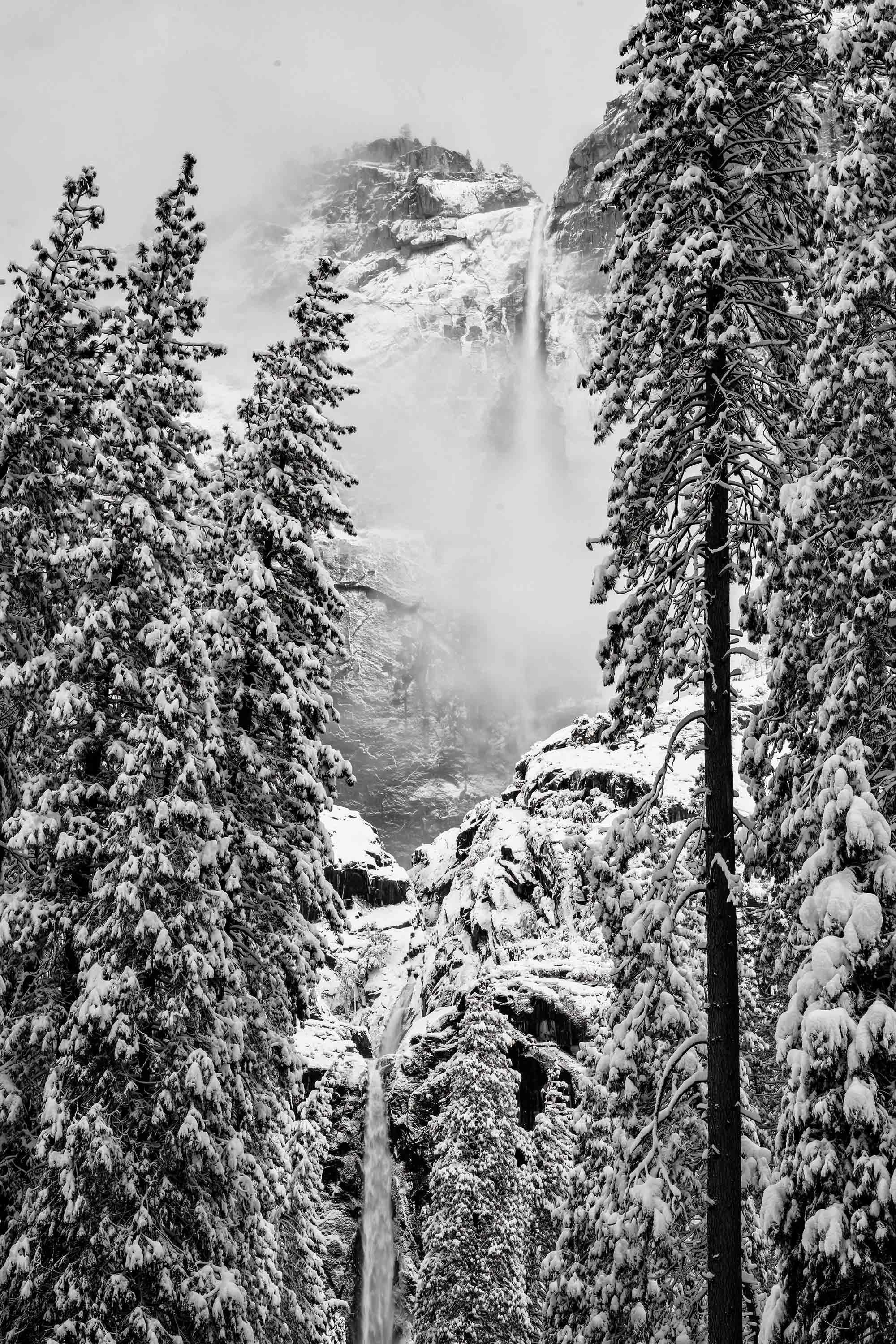
Already dried up even after all that snow, I'm surprised. Amazing place, hope you had a great time! I think the fall would be great there too.
As I worked with images this month, I struggled with the blue hour images. They were overall too dark and lightning them up made the blue go wonky. B&W solves that problem but changes the mood a lot. But after several rounds of prints, I ended up liking the b/w better and better. I'm trying out Nik Effects to see if it offers a benefit; I'm seeing it improve sections of an image at times which I can mask into other layers.
Anyway, of all the views of Yosemite Falls that I came away with, this attached file is my favorite... today. :) |
Mar 24th |
 |
| 96 |
Mar 26 |
Reply |
I'm wondering about resolution here too. Are you using compression when you save the final files, Ken? If your camera can give you a 7 MB or so file, you would have to reduce resolution to get to our 1 MB limit for uploads. |
Mar 12th |
| 96 |
Mar 26 |
Reply |
Thanks, Pinaki! You're right, kind of loses the falls for the forest. |
Mar 6th |
| 96 |
Mar 26 |
Reply |
That's a good tip, Bob! So like a curves or levels adjustment layer, masked and blending set to luminosity... I have noticed some color shift when doing a lot of burning in. |
Mar 6th |
| 96 |
Mar 26 |
Reply |
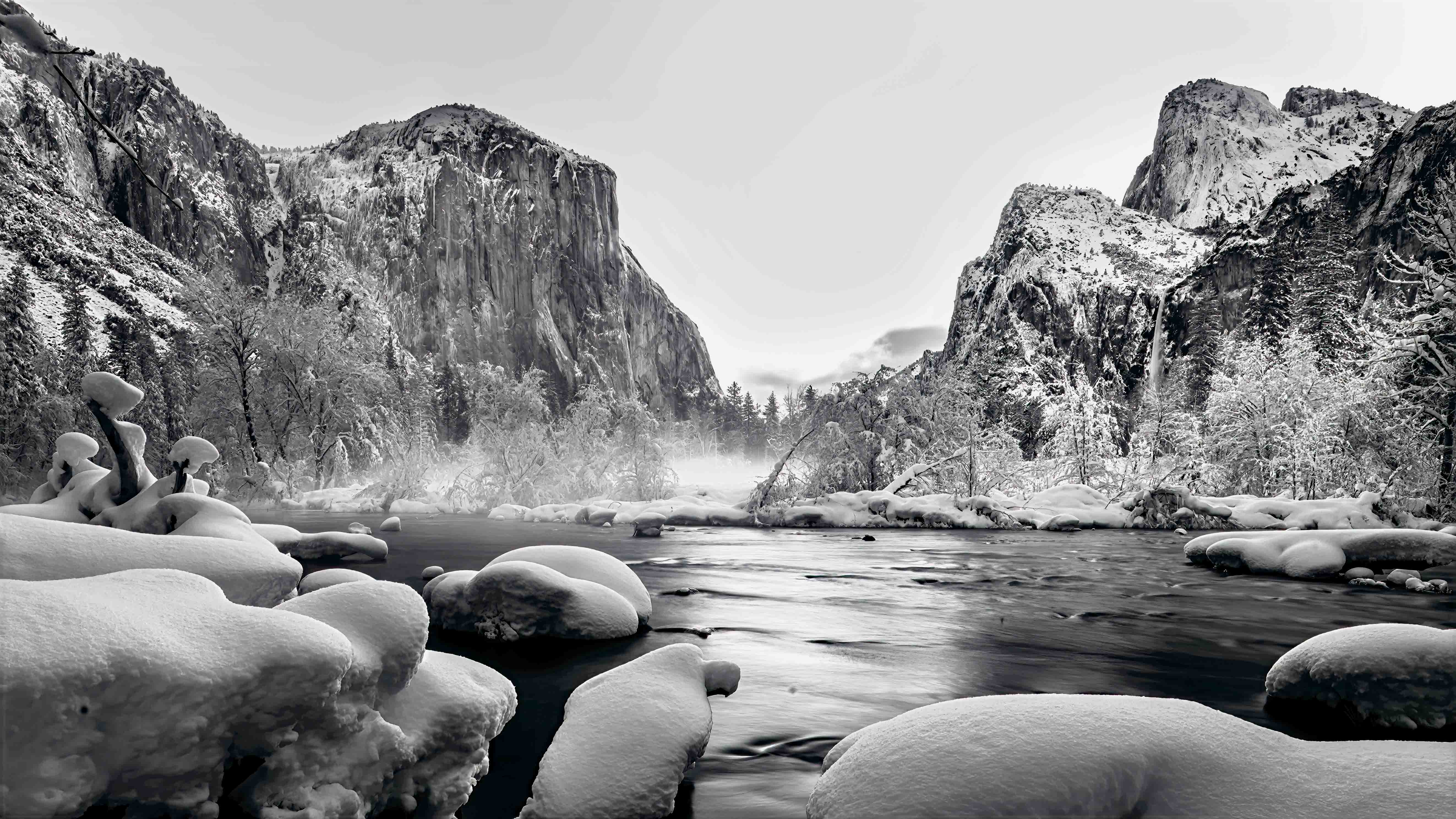
Thanks, Rick! The original with just the lower falls is my choice too. Yosemite and snow each scream b/w, I know. I was so taken by the color, I had to see what others thought about it. |
Mar 5th |
| 96 |
Mar 26 |
Reply |
Yes, Bob, that was the idea before mother nature took over. It was socked in every evening I was there but maybe for the best. |
Mar 5th |
| 96 |
Mar 26 |
Reply |
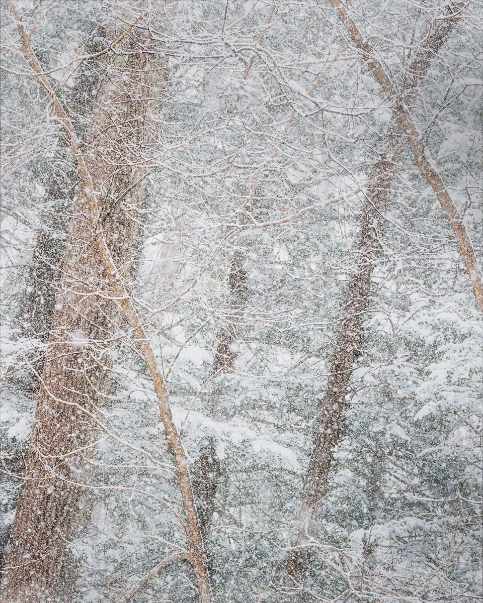
I like the frozen snow :) I'm used to seeing streaks with long exposures. The high key makes it look anything but dim light, it's an interesting transformation.
My method for dodging/burning in PS is to create a new layer with a soft blending mode filled with a neutral gray. I think paint on that with black or white brush. That's been an easy non-destructive way to tackle it. |
Mar 5th |
| 96 |
Mar 26 |
Reply |
Thanks, Bob! Yep, pretty amazing place. It will be another country if I go back without the snow. This was taken on the trail that comes out at the base of lower Yosemite falls, not too far in where the upper falls are still visible.
Good to get your thoughts on color cast. It does come at the cost of a reduced tonal range.
I saw that visual merger with the tree after awhile but didn't have room to move enough to help it. Took it anyway!
I did make a first pass at dodging the center and darkening the edges and played with b/w too so those are helpful comments. If the upper falls aren't enough of an interest, I think the original photo of just the lower falls tells the story and doesn't have a problem with the visual merger. |
Mar 4th |
| 96 |
Mar 26 |
Comment |
I'm thinking a train trip might be in the future, Kenneth! A great way to see the country from the ground but it certainly has it photographic challenges. I like the idea of a 16x9 horizontal crop too. Nice country! Do we know where about? |
Mar 4th |
| 96 |
Mar 26 |
Comment |
Lovely spot, Bruce! The layered hills remind me of the Great Smoky Mountains. I like the placement of the island and it looks like you have done some discrete dodging the bring it out. It looks like it could be a drone shot.
Bob's idea is interesting. Playing around with this, I found it easy to get a haunted house kind of feel it I went wild. Perhaps some selective focus keeping the island sharp but slightly blurring the rest. |
Mar 4th |
| 96 |
Mar 26 |
Comment |
That is crazy! That was my first thought and continues to be. I just love it. So many place to for the eye to travel. The blue corner with a backward L really anchors it for me. What a find. I've heard that Portugal is amazing and now I can see why. Viewing it at 200% in PS fills the screen nicely and doesn't really degrade the sharpness or bring out noise, at least for these old eyes.
I think you are right about the conspiracy with the mirrors. :) |
Mar 4th |
| 96 |
Mar 26 |
Comment |
Wow, Pinaki! I agree: simply stunning! Just being in that kind of terrain is a blessing but what a great image to take away from it. Gotta love the S curves of life! It makes such a great leading line taking you right into the mountain.
Looked at your Instagram page too and was instantly jealous. :) You have a rich history of travel!
It's fun to play with the images sometimes in PS. It allows time to analyze beyond an initial take. It was easy to spend time looking at this one. The ice on the right is indeed the brightest spot. I might tone that down and bring up the mountain as my suggestion? |
Mar 4th |
| 96 |
Mar 26 |
Comment |
Really nice, image Bob! Great idea about tilting the camera! I'm often so hung up about making it level. :(
I can relate to stomping around in the snow. It's even better when you can leave it in the mountains.
I have always loved patterns and visual textures so it's easy to see this image like a painting. Trees and branches are a story of their own when it snows. The hidden depths and the organic shapes are what attract me. Being in a snow storm usually means soft light, focus and low contrast unless you have sun. That could argue for a soft focus, low contrast image. But I'm stubborn and hate to give up the amazing details we can get with cameras. Pushing light or dark sets a mood but at the expense of other visual interest like detail or even recognition. I was surprised at the high ISO. You must of have been thinking of this interpretation from the get go?
I played with the image a bit. It doesn't have a strong focal point to me but I love the juxtaposing shapes and the empty spaces they create. I would want to lead the view into the center, away from the edges, into the deep, so to speak. Soft focus didn't really do it for me when I tried a little motion blur. I ended up with a little creative vignetting to draw the eye in but it's very soft. |
Mar 4th |
 |
5 comments - 8 replies for Group 96
|
12 comments - 13 replies Total
|