|
| Group |
Round |
C/R |
Comment |
Date |
Image |
| 33 |
Jun 25 |
Comment |
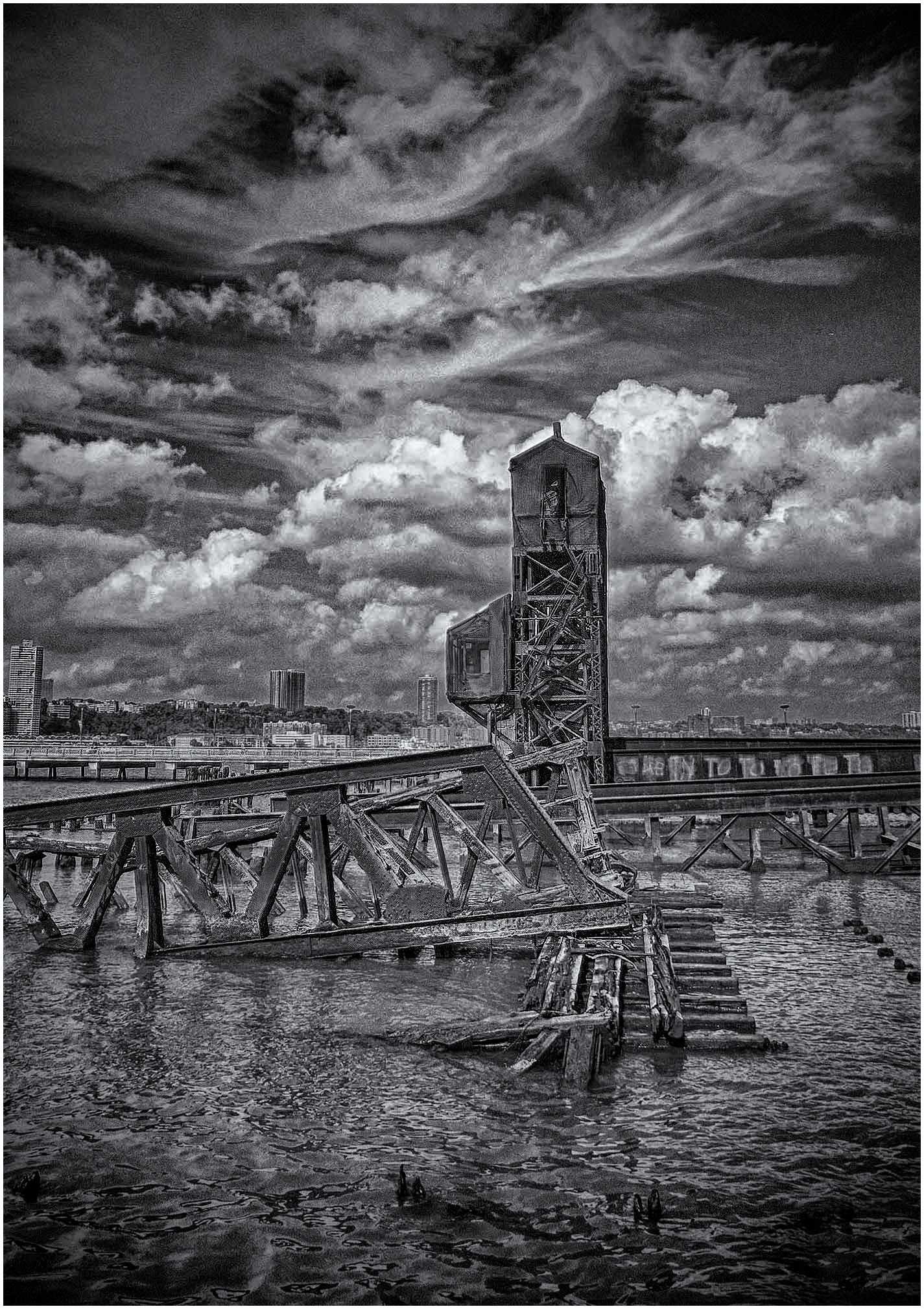
You have found a good image here, the strong structural architecture of the old industrial against the modern high-rise in the background, I do look at this and wonder if a portrait was the best way to go, I know this is a tower, but there is so much more in front of you that a landscape may have been the better option.
I am not sure what you are after with your effect and toning of the image, but I am not sure it has worked. I do wonder if this is calling to be monochrome.
|
Jun 13th |
 |
| 33 |
Jun 25 |
Comment |
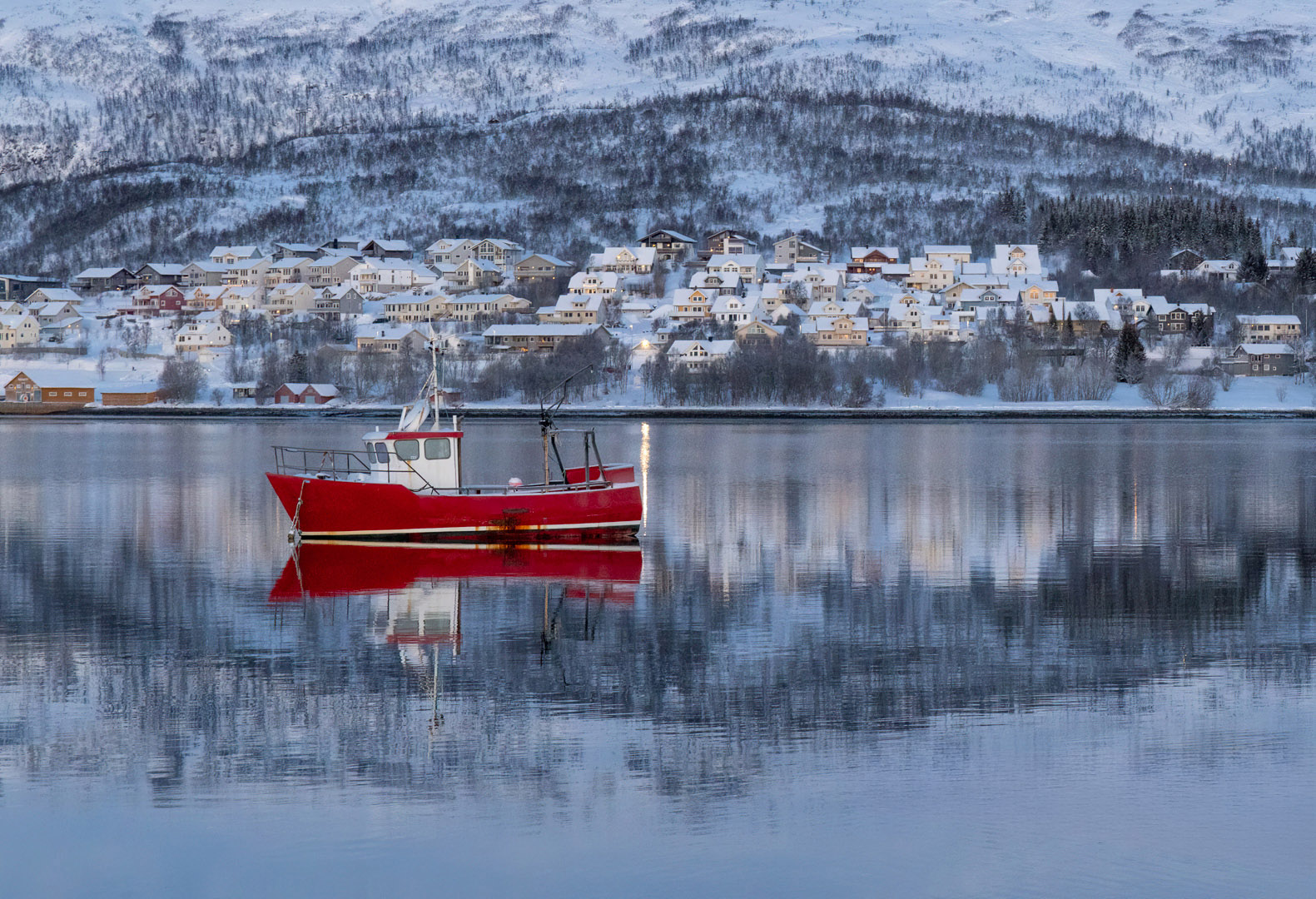
This is a strong image but for me has a but which I will get to. First the good. That boat sitting in the reflection of the town and just kissing the real town is a joy, the tone and colour of the image against that red is perfect and it all holds together well.
But I find that the three ducks break that line and feel and for me I wish they were not there as the image is stronger without them.
Strong image either way. |
Jun 13th |
 |
| 33 |
Jun 25 |
Comment |
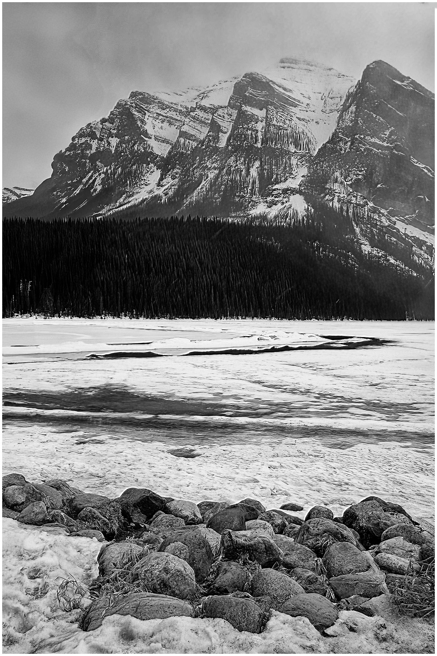
This is a well seen and taken image, your DOF is spot on and the tone and colour is just right. The light of clouds leads you nicely into the image and I like the speed you have shot this image, It would have been so easy to slow this image down and i think this would have spoilt it.
For my taste I would like just a touch more land at the base but you have placed the windmill on in a good position. Very nice image to view.
|
Jun 13th |
3 comments - 0 replies for Group 33
|
| 39 |
Jun 25 |
Comment |
Your composition is spot on for the image you are trying to present, yes the image is grey and flat and is lacking contrast, but we are unable to help you explain why without seeing the original image it came from. Please show that and we may be able to help you solve your issue. Also what software to you use? |
Jun 13th |
| 39 |
Jun 25 |
Comment |
This must have been a joy being up there, the piece and solitude must have been wonderful, this is a nice image and shows off the area well, but it leaves me wanting more, It does need to be Landscape as David says and I do wonder if that tree is needed as you have it, either include it in the image or not have it at all, the foreground stones are lovely and I am sure there must have been an angle with out the tre, but with a big landscape you could have had the whole tree. Still lovely to see and a good conversion. I have had fun and done some tree surgery. |
Jun 13th |
 |
| 39 |
Jun 25 |
Comment |
I think the big issue here is the format that you have chosen to show the image. The conversion is pretty good and the tones are not bad and the larger you view this the better it gets, yes you could try and improve this by working on the skin tones, but the image works. The piece of cloth is behind her by quite a bit, so she is looking in to space, what you have done is remove that space and the light and texture that you had in the original of the stage, I think having the landscape version with her looking into the space would of allowed the viewer to be more settled as you would have been sitting in front of the large stage. Just a thought. More space left please. |
Jun 13th |
| 39 |
Jun 25 |
Comment |
This does sit well as a travel image and your composition is well thought out the the fountain and tower. The two people give great scale to the image. It would be interesting to see this image converted on a different colour spectrum so the girl cloths were not bleached out etc. The painted ground is the winner here and gives instant impact to the image. I take it they did not want epileptic to visit here.
|
Jun 13th |
| 39 |
Jun 25 |
Comment |
You have done well to capture the girl from so far away in such a still position, it is a shame you were not a nano second earlier so the fan did not obscure the face. The monochrome works as an image and shows of the lass well and has good tone and depth, but the colour image does have the impact and shows off more of what you were seeing. I would work a touch on the back ground of the colour as that is competing the the lass. Both good images. |
Jun 13th |
| 39 |
Jun 25 |
Comment |
David - You have done a very good conversion of this delicate image, the tones have been handled well and no highlight burnout. I think if you had an isolate flower with its stem this would hold its own, but I look at this image and my eye is being draw to the stem behind and then the leaves off to the left. It is a nice image but not a great image. |
Jun 13th |
6 comments - 0 replies for Group 39
|
9 comments - 0 replies Total
|