|
| Group |
Round |
C/R |
Comment |
Date |
Image |
| 33 |
Sep 24 |
Comment |
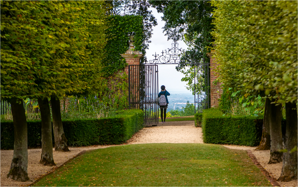
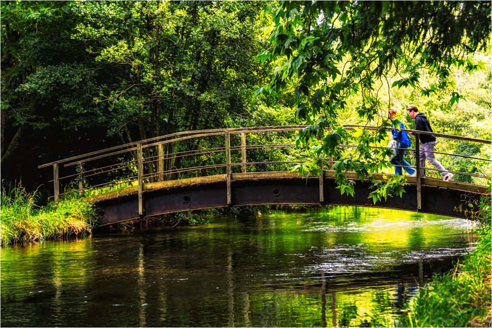
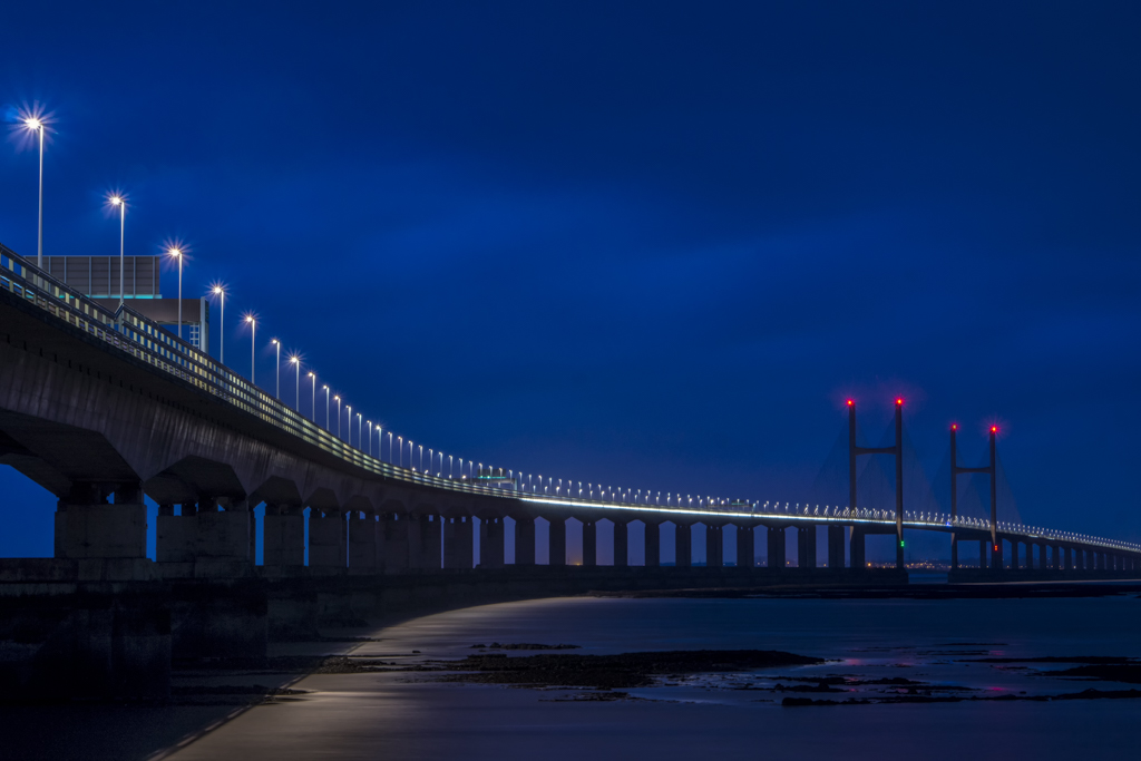
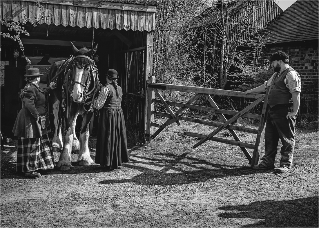
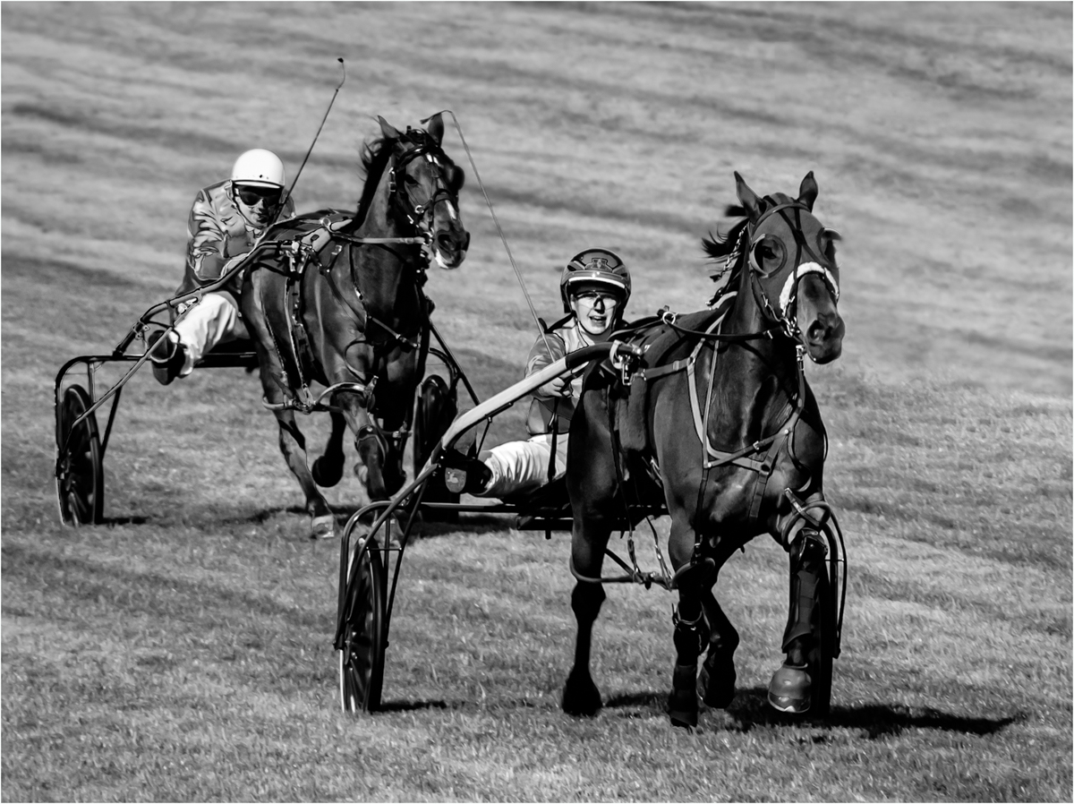
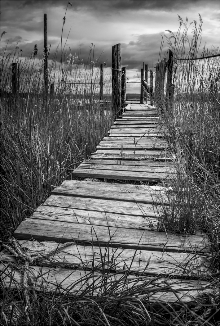
You do ask yourself why is she there? what are they doing? Where are they going as it seem to be in the middle of nowhere?
But I must admit I prefer the image with them not there. The strong straight lines of the old bridge taking us to the two pylons in the distance is very strong on there own. The sky is very brittle and could do with softening. |
Sep 13th |
| 33 |
Sep 24 |
Comment |
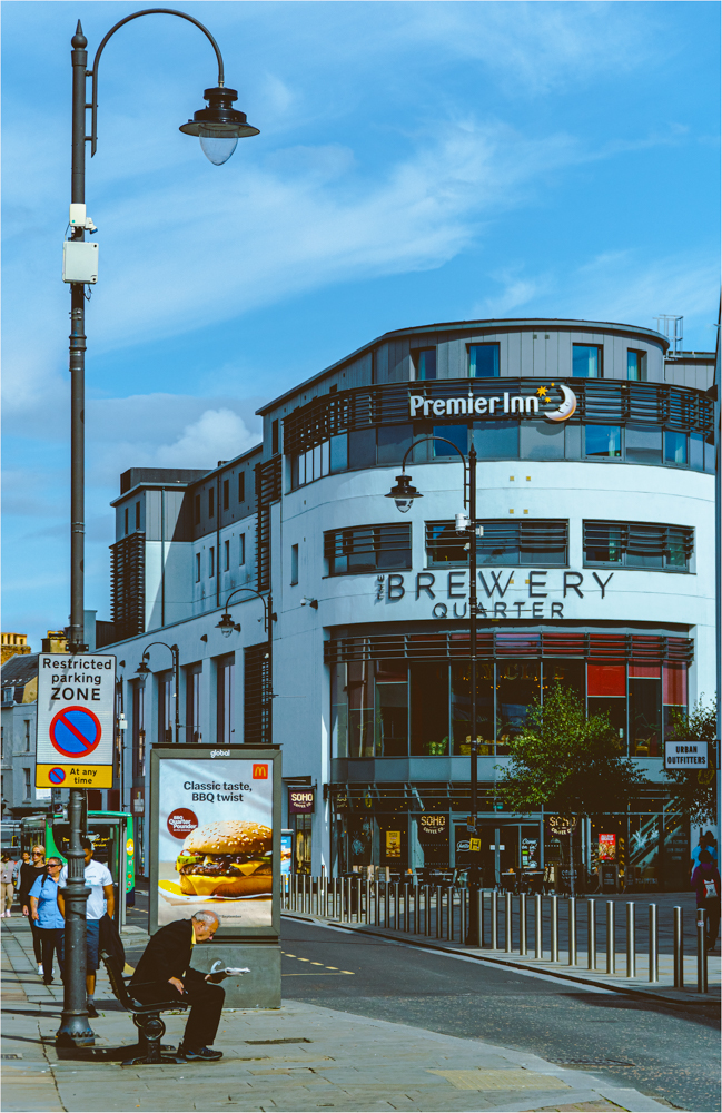
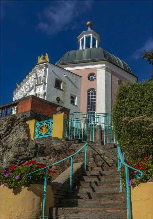
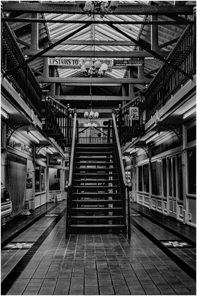
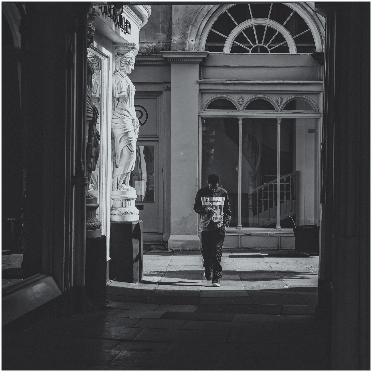
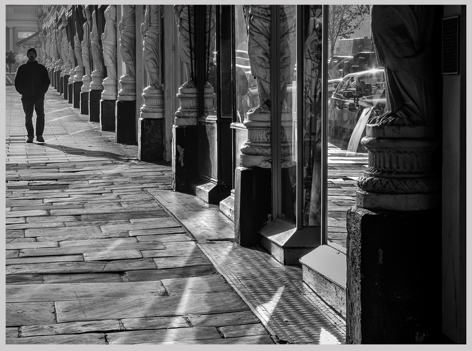
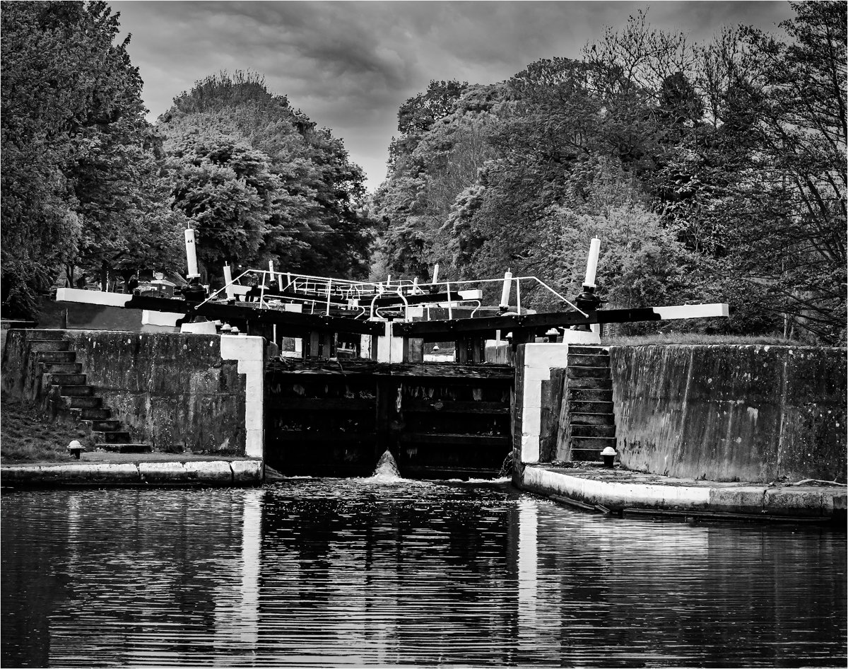
This is a well seen street image that is full of contrast and shapes and patterns. What every the designer and planner was on when they came up with this must have been good stuff and this does not sit well with its surroundings, but it does sit well for us, photographers. The zig zag is so dominate it is great and the colours stand out against the white background. Suggestion if you go back and have another go, try to get the station and central tower more central as the colours in the roof of the station is very strong and would enhance the image and stand up to the lost of part of the left hand side.
I love the bit of movement on the bottom left and would love to see that more central to add even more of a contrast. but these are only a suggestion to what is a strong street image. |
Sep 13th |
| 33 |
Sep 24 |
Comment |
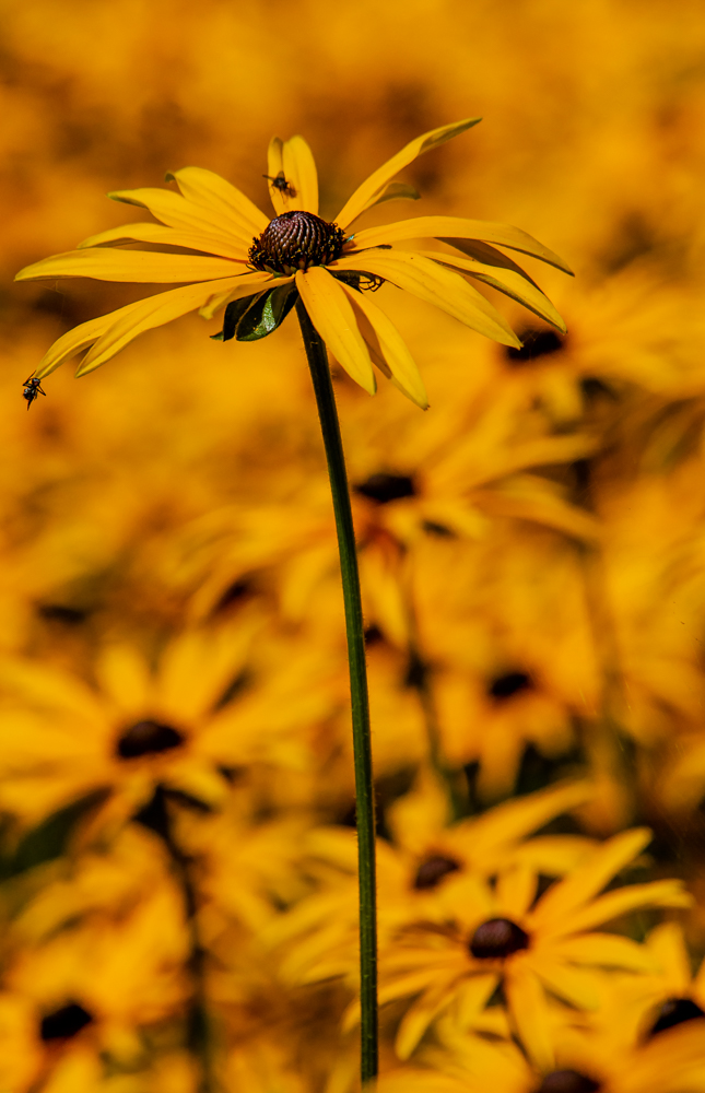
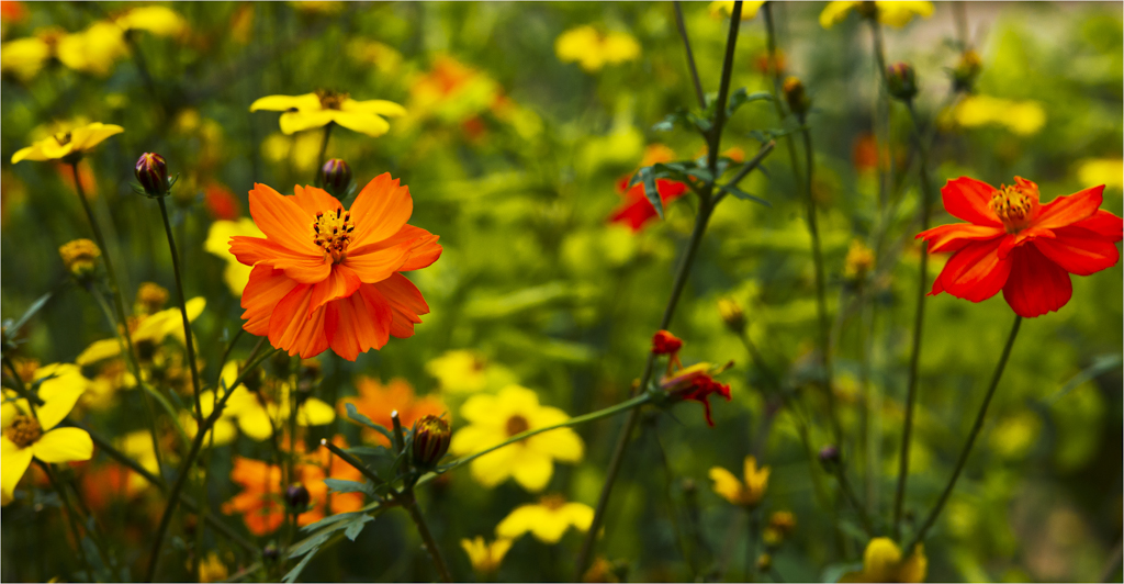
This could be a painting hanging in a National gallery with all the colour and tones of nature in one image. The sun and sunflowers complement each other perfectly and the rest just fall into place. that sky is so delicate and does not fight the sun. Great image.
This cropped to a square format would make a natural card image. |
Sep 13th |
| 33 |
Sep 24 |
Comment |
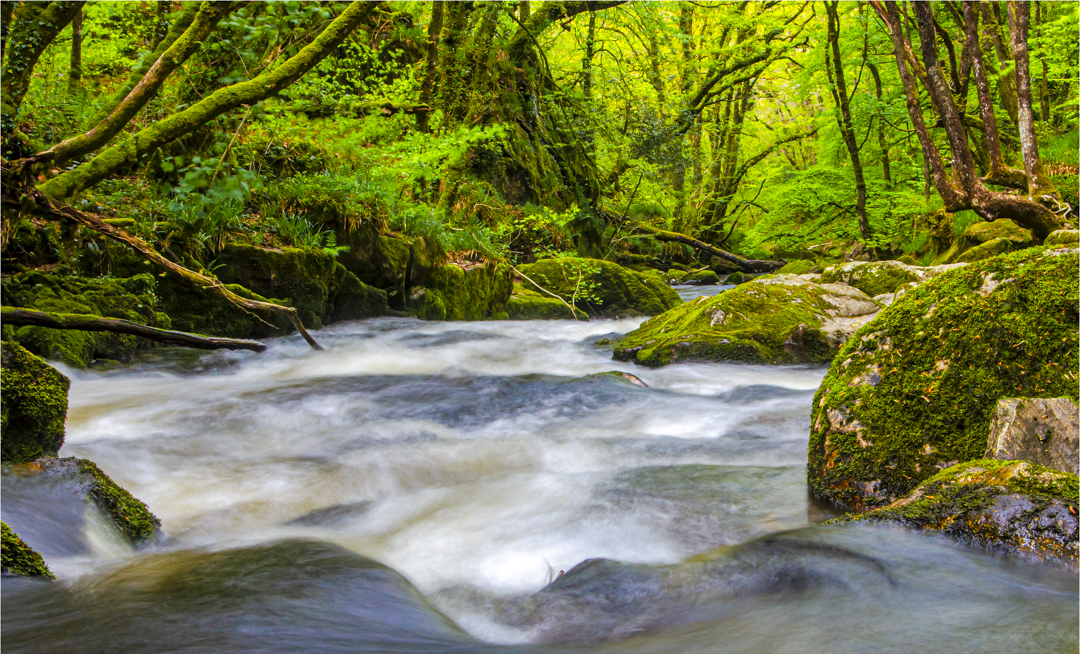
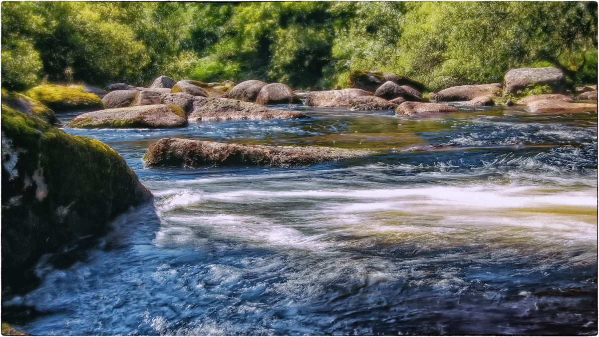
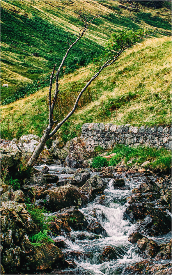
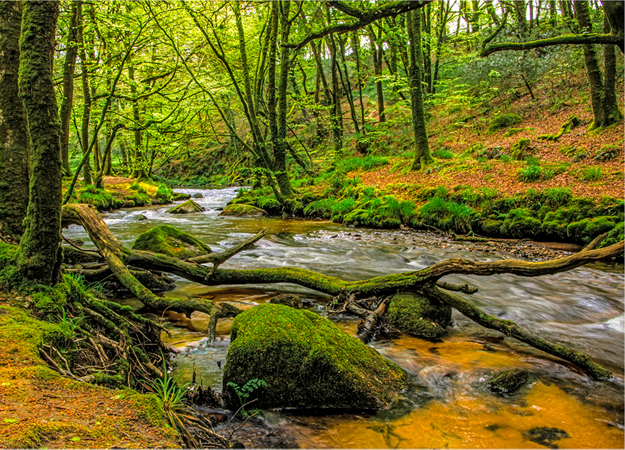
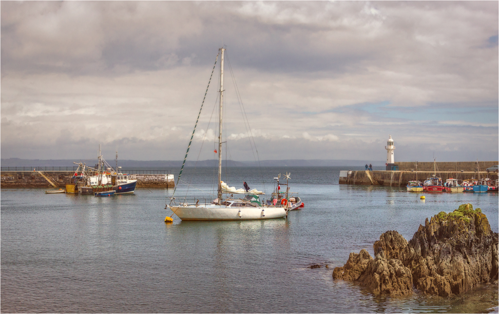
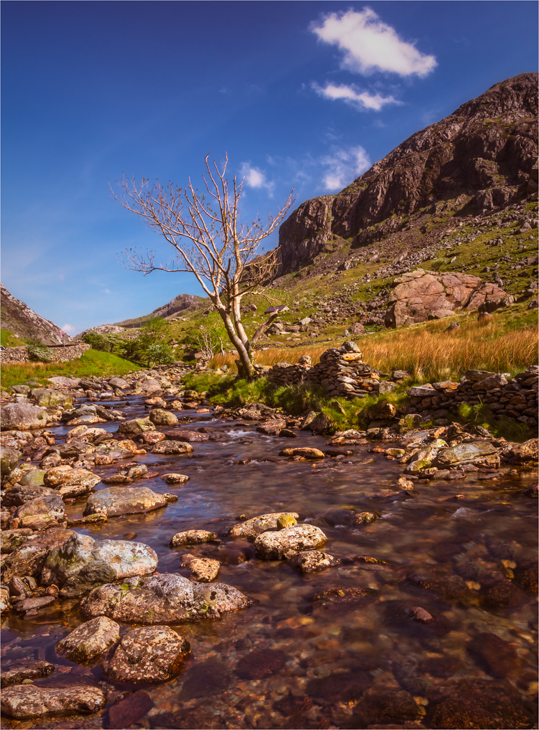
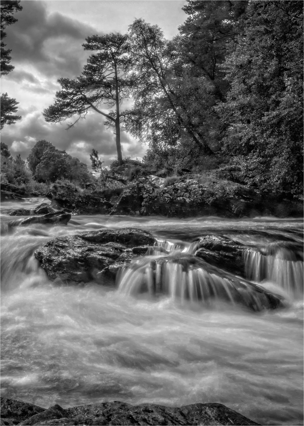
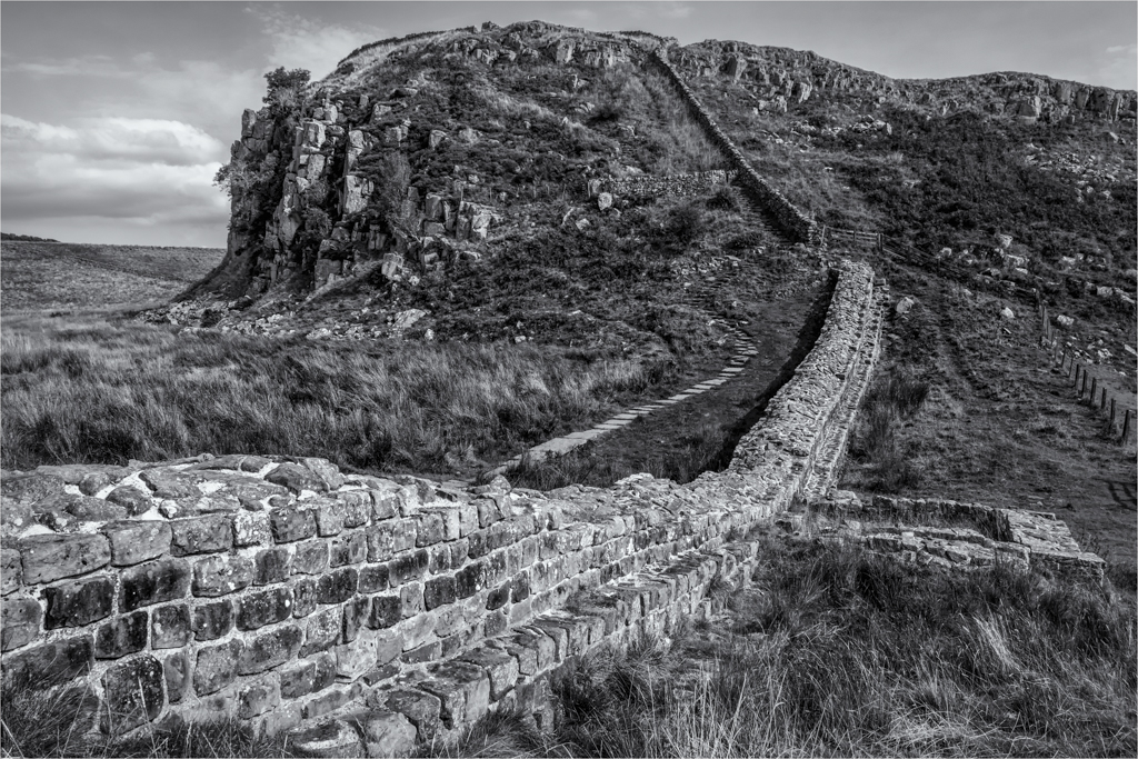
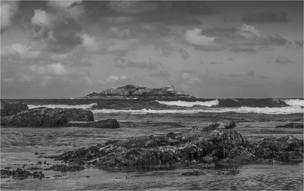
I look at this image and I want more. I want to know what's on the end on the left, I would love the tip to finish and go somewhere. There are more rocks by the main rock, are they any good? what do they form?
The colours and detail coming from the river bed is very good and the rock is nicely detail, but I look and want more and I wonder if there is more to come from the vegetation.
Does have a mood but that is not enough to hold the image for me. |
Sep 13th |
| 33 |
Sep 24 |
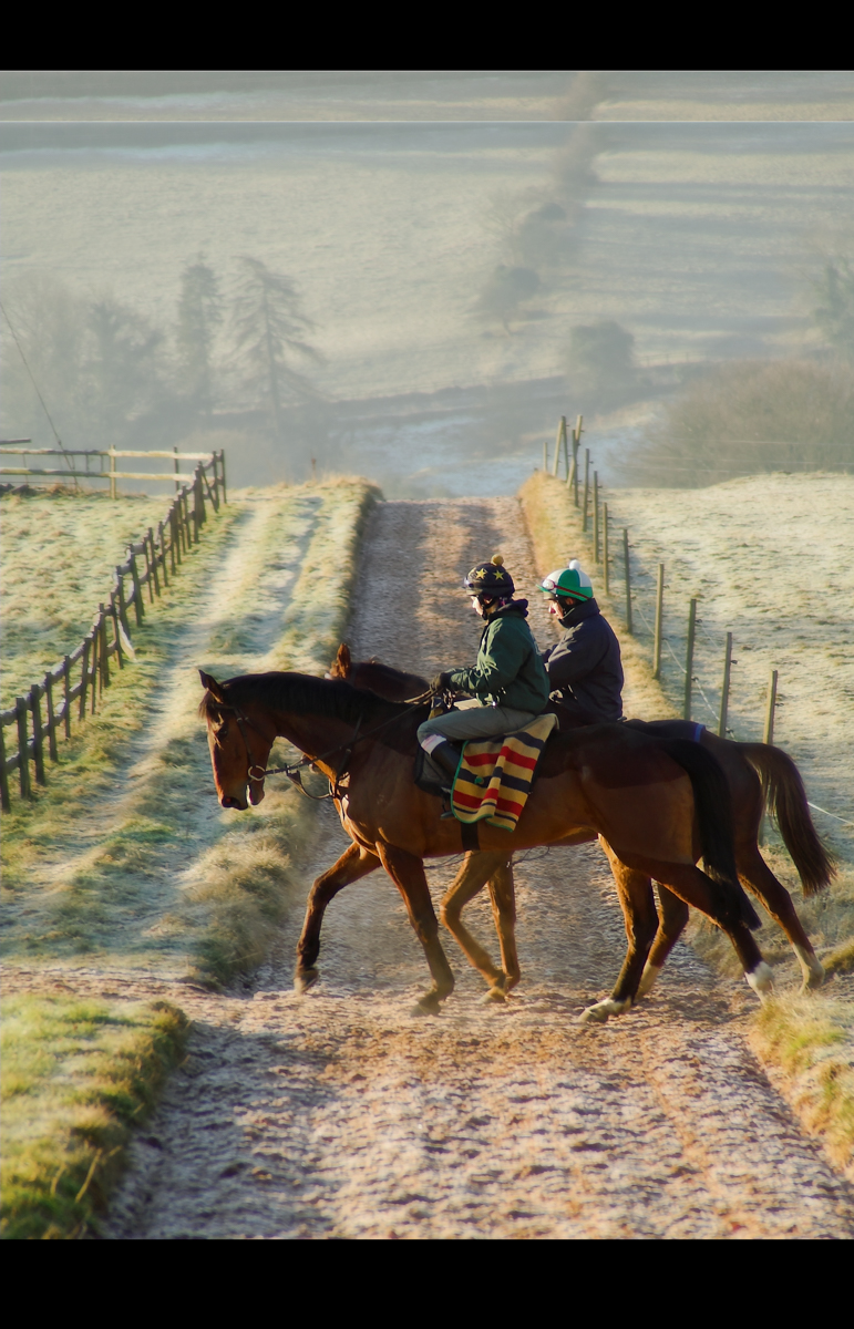
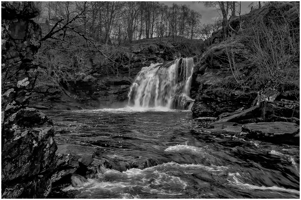
Comment |
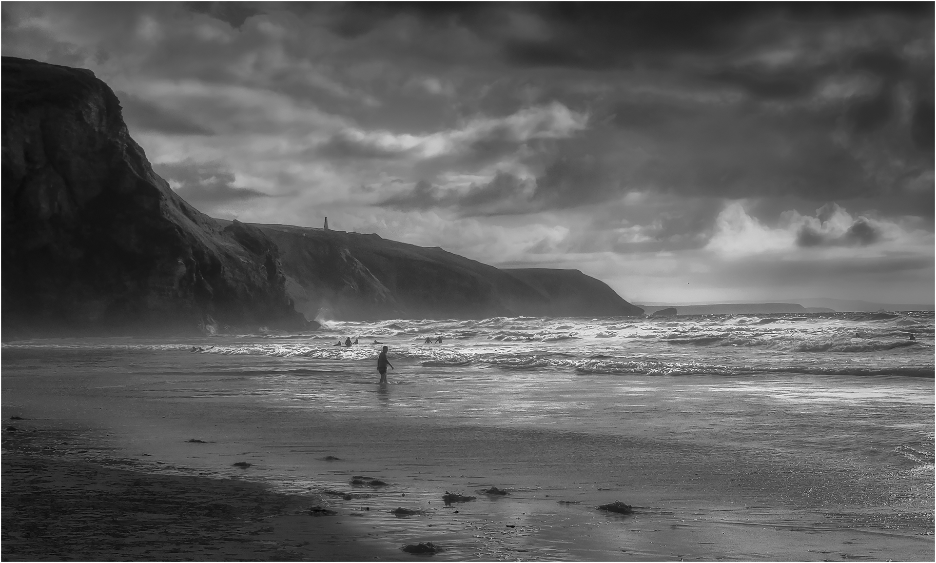
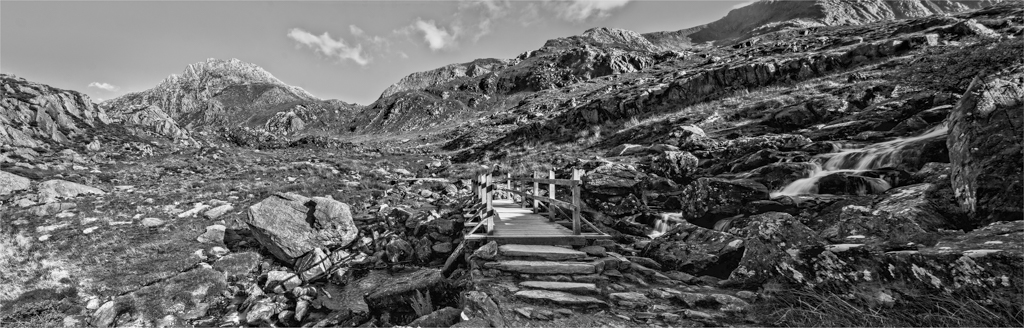
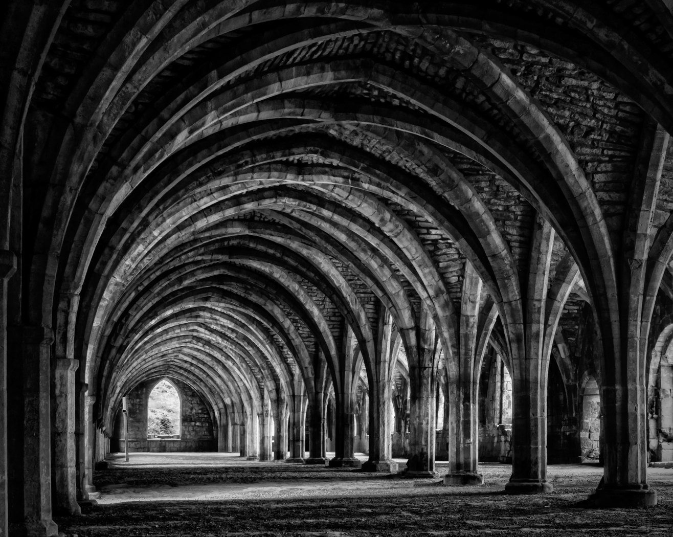
What I get from this image is scale. The walk way and the people seem so small and insignificant to the power of that water that it give this image strength in depth.
This is a magazine style image that just works and is perfectly composed. Well done and must have been amazing sight. |
Sep 13th |
| 33 |
Sep 24 |
Comment |
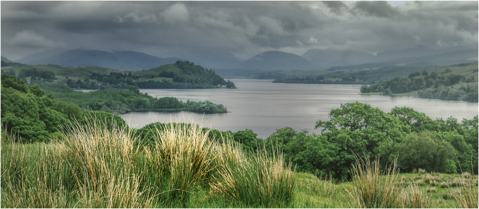
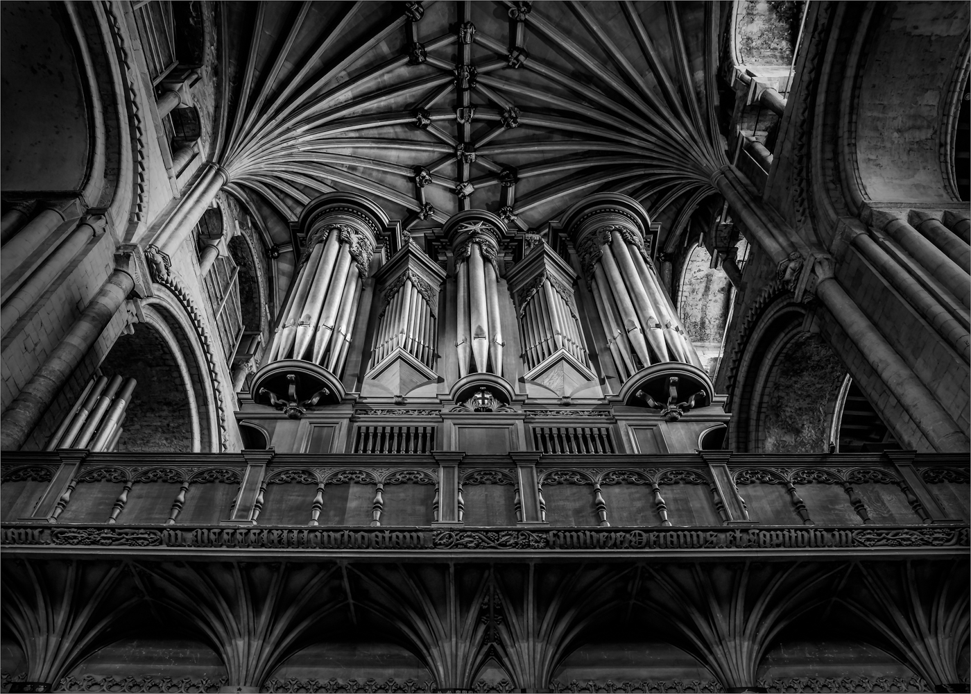
Having seen many images from this place and hearing some stories of terror from the mayhem of photographers fighting for position and people pushing in. You have done so well to beat them all to the prize. It is a natural grand spot for spectacular images and when the sun is right the magic can happen.
The star glow is great and it is great that you have keep the detail of the distance in detail. Personally I would pull the tonally of the rock face back about a stop to bring more contract in to the image so the sun rays work stronger and the detail of the rock itself come over more. But a cracking capture that was worth the effort. |
Sep 13th |
6 comments - 0 replies for Group 33
|
| 39 |
Sep 24 |
Reply |
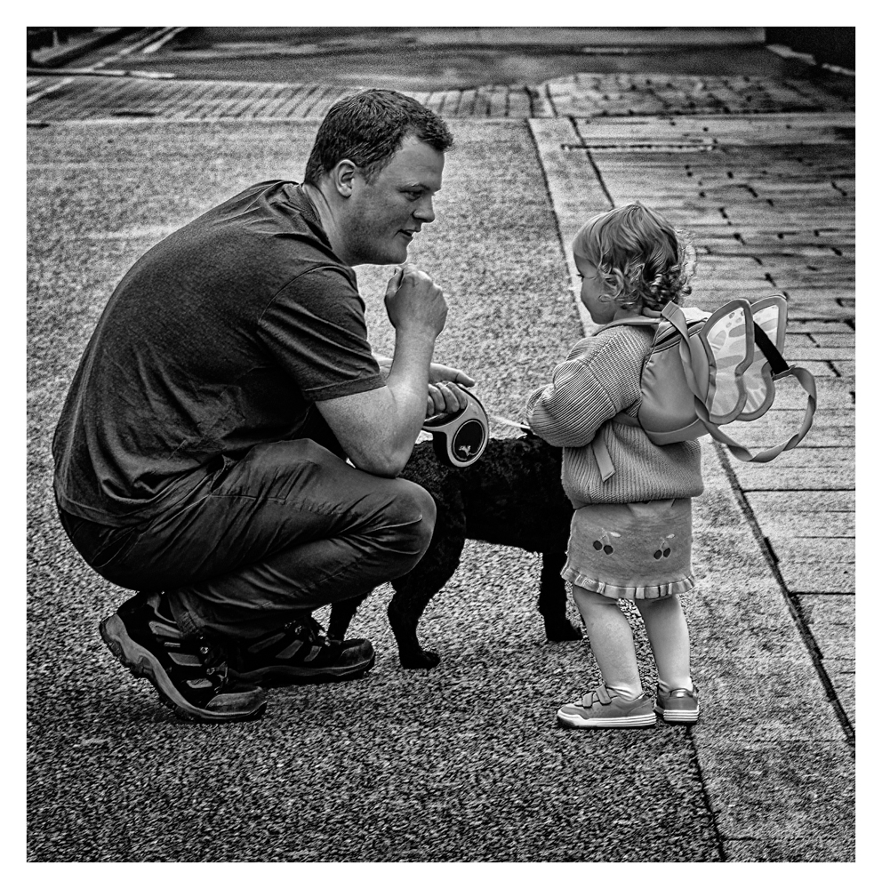
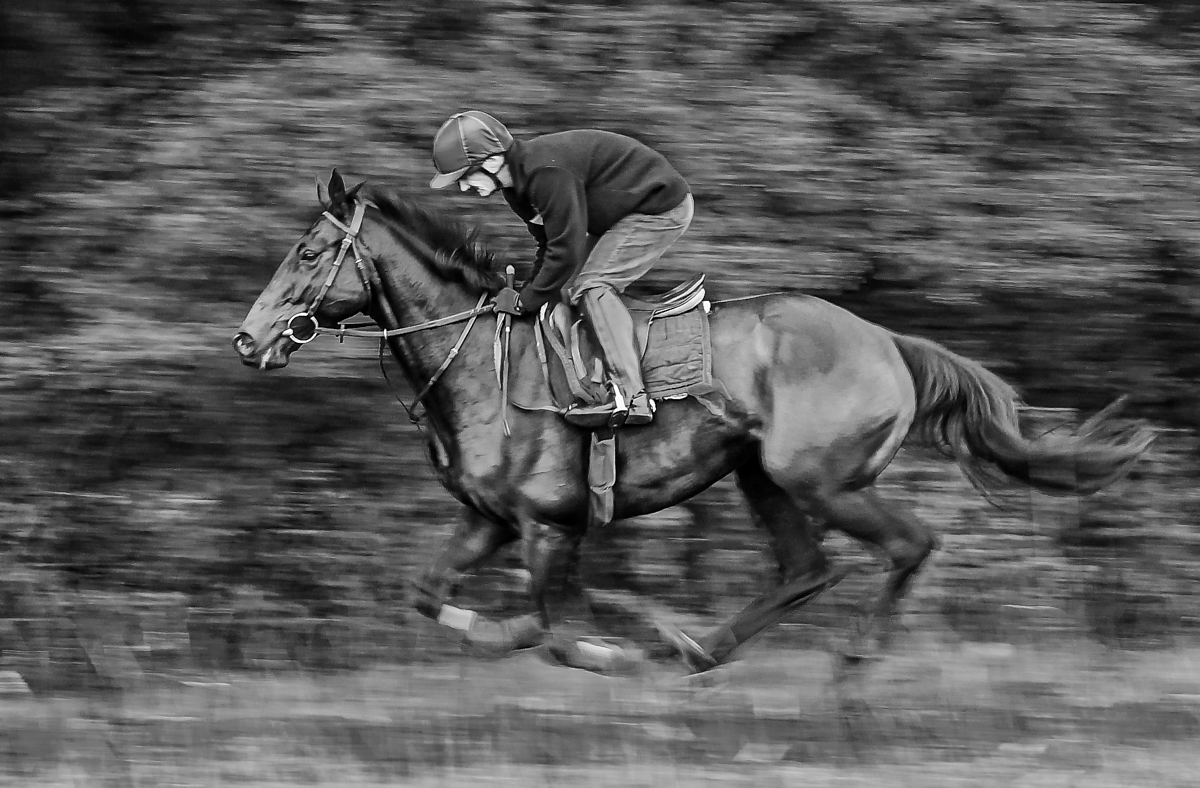
Sorry cannot extend the mans head, as said this was a spin on the heals and a grab shot. i was surprised it came out so well as it was shot from the hip. |
Sep 18th |
| 39 |
Sep 24 |
Comment |
I love the idea of this image and the set-up is great and the light behind him is working very well. The smoke is ok, but it is a shame that it is not moving around his feet, but you could quite easily do that in photoshop. He dose look cool in his suit.
But I don't get after you set this all up di you then go a take the image off to the right with him looking away from the camera when the image was you in front of him with that light behind him the the smoke and mist.
But he really does look cool. Now take him to a coze play. |
Sep 13th |
| 39 |
Sep 24 |
Comment |
The message that was posted to all of us talked about these group are about learning not just complementing each other on our images.
SO I am going back to basics on your image and talk about your original image. Its wrong. The idea is not. The set-up and taking is.
The fundamentals of great photography is to get the original taking of the image correct before you do anything else.
You have come up with a good idea for a still life and you have set the display up so you are happy with it.
Then you forgot to do two things.
Light it properly. You do have one of the best camera on the market, but even the Z9 is going to struggle with that amount of contrast specially at the setting you had.
Secondly and most importantly you forgot to focus. This is a still life, it does not move, so why is the image blurred. You are fighting a losing battle to do anything because of both of these.
Lighting is easy. You don't need anything special for something this small, Do you have a table lamp? Stand it to the left side, if you need to light other areas use white card or paper and balance them in place about a foot away from the subject. Also try a touch suspended above and again use white card to fill in. Use tracing paper to defuse the light or your wife's net curtains or some fancy clothing can work. Focus on the closest point and try deferent DOF to see which you prefer. I would do a perfect shot at f11 and then play with the smallest apertures focusing on certain areas. like the lasses face or the watch. But this only work if you are in focus.
Please keep trying and give this another go as it can be great fun. Hope you take this in the way it was meant. |
Sep 13th |
| 39 |
Sep 24 |
Comment |
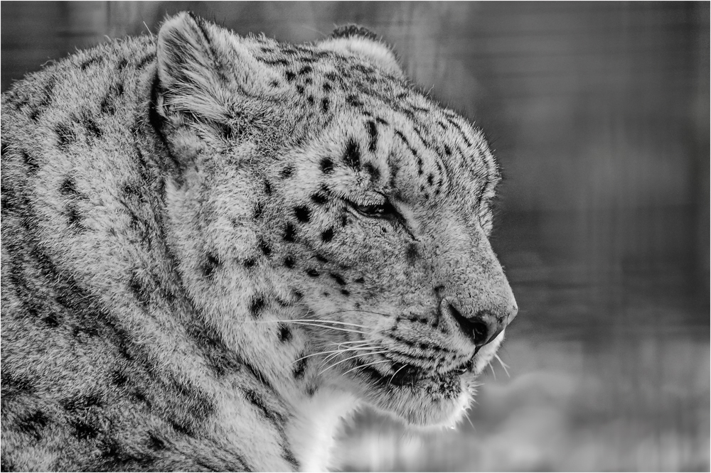
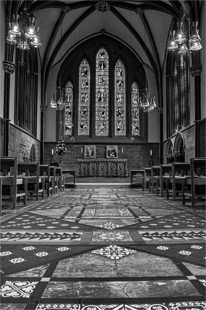
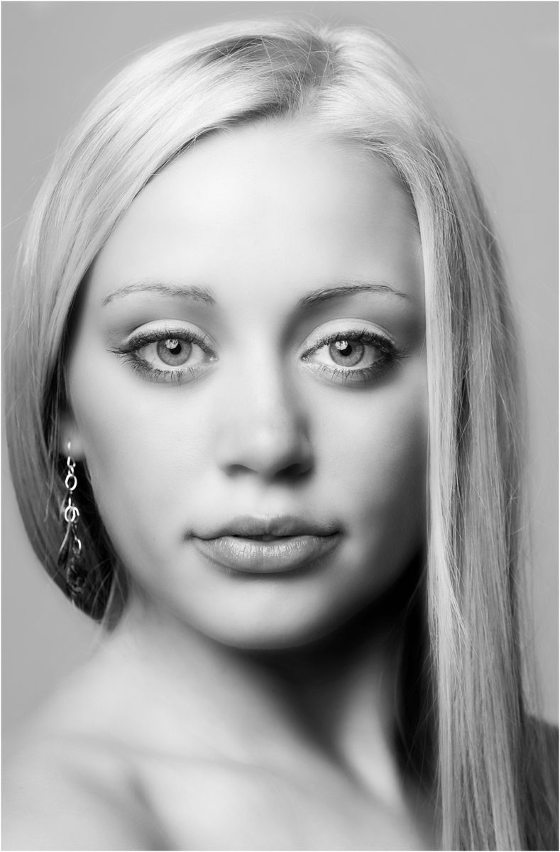
She is a pretty lass and you have captured her nicely, the conversion is good and the tones are nice across the image. The original looks a bit under exposed so you pull from deep down so the detail in the eyes is not there and for me are a touch dead. But a nice image of the lass. |
Sep 13th |
| 39 |
Sep 24 |
Comment |
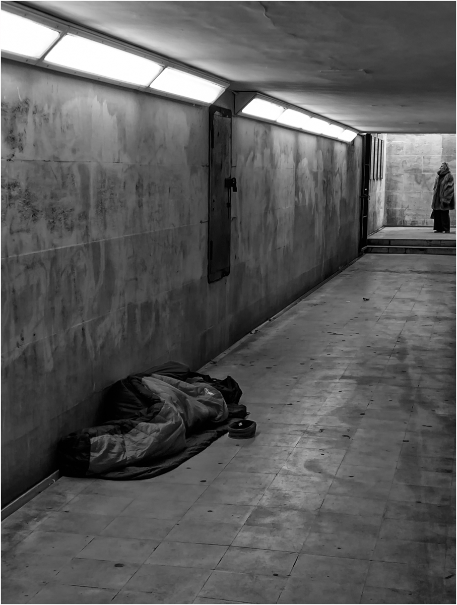
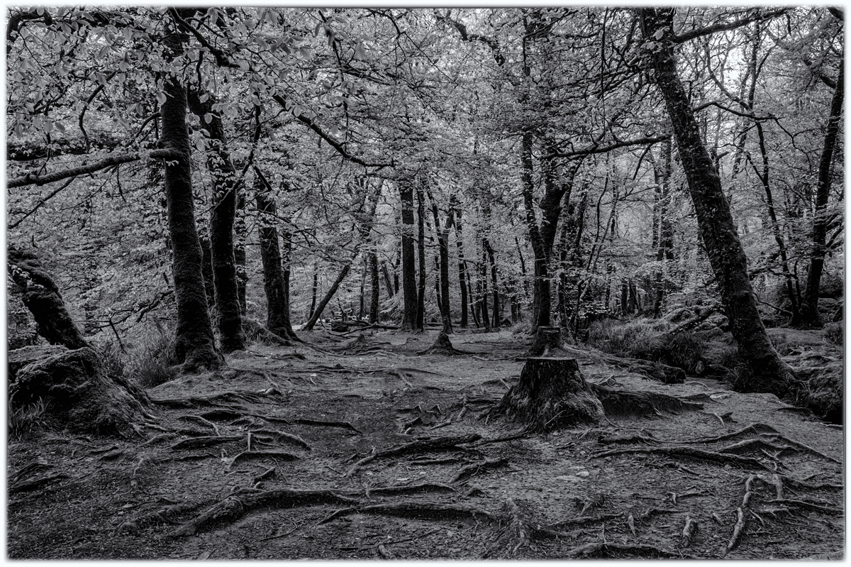
It is so sad when this happens and I would have to do the same thing for the same reason. The IR is taken very well and your iPhone has done you proud and shows off the scene well. As an image it is very busy but it dose show off the situation and the sadness of losing another tree. |
Sep 13th |
| 39 |
Sep 24 |
Comment |
Really I only need to say three words
WOW! GORGOUS! JELOUS!
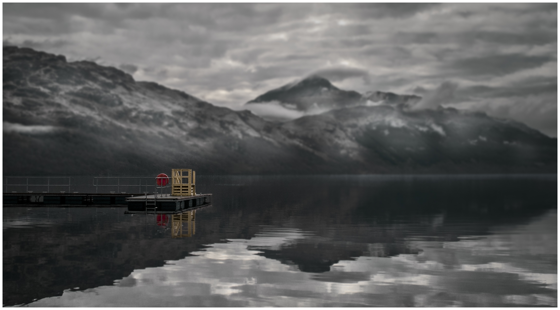
The balance you have with that triangle of plane maintain and reflection grounds this image perfectly and those clouds are a joy. Oh such a lovely image to view.
Now please say you all sat round a camp fire sing songs toasting marsh mellows. lol |
Sep 13th |
| 39 |
Sep 24 |
Comment |
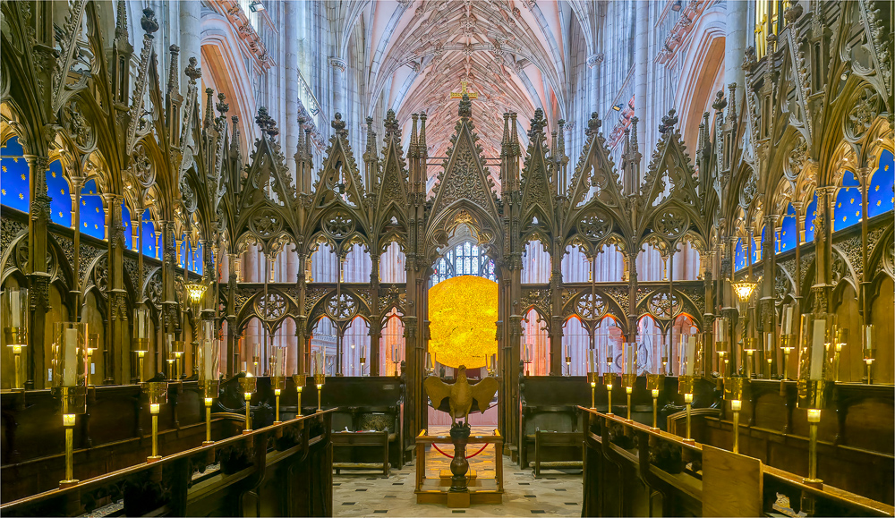
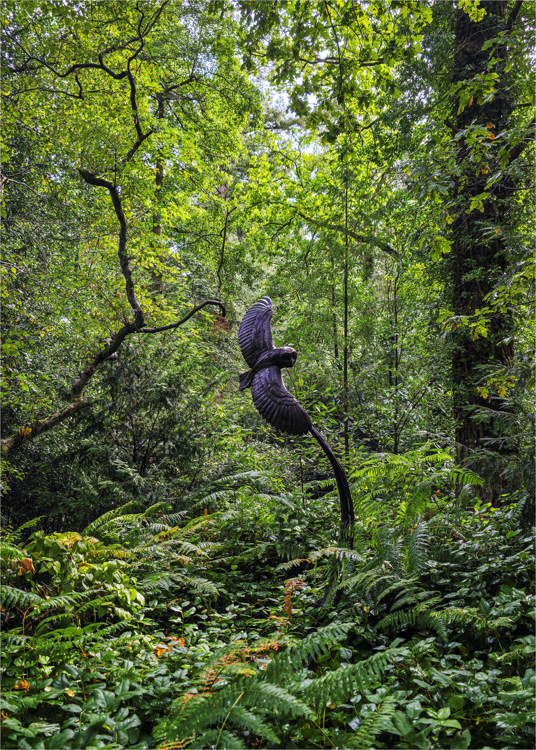
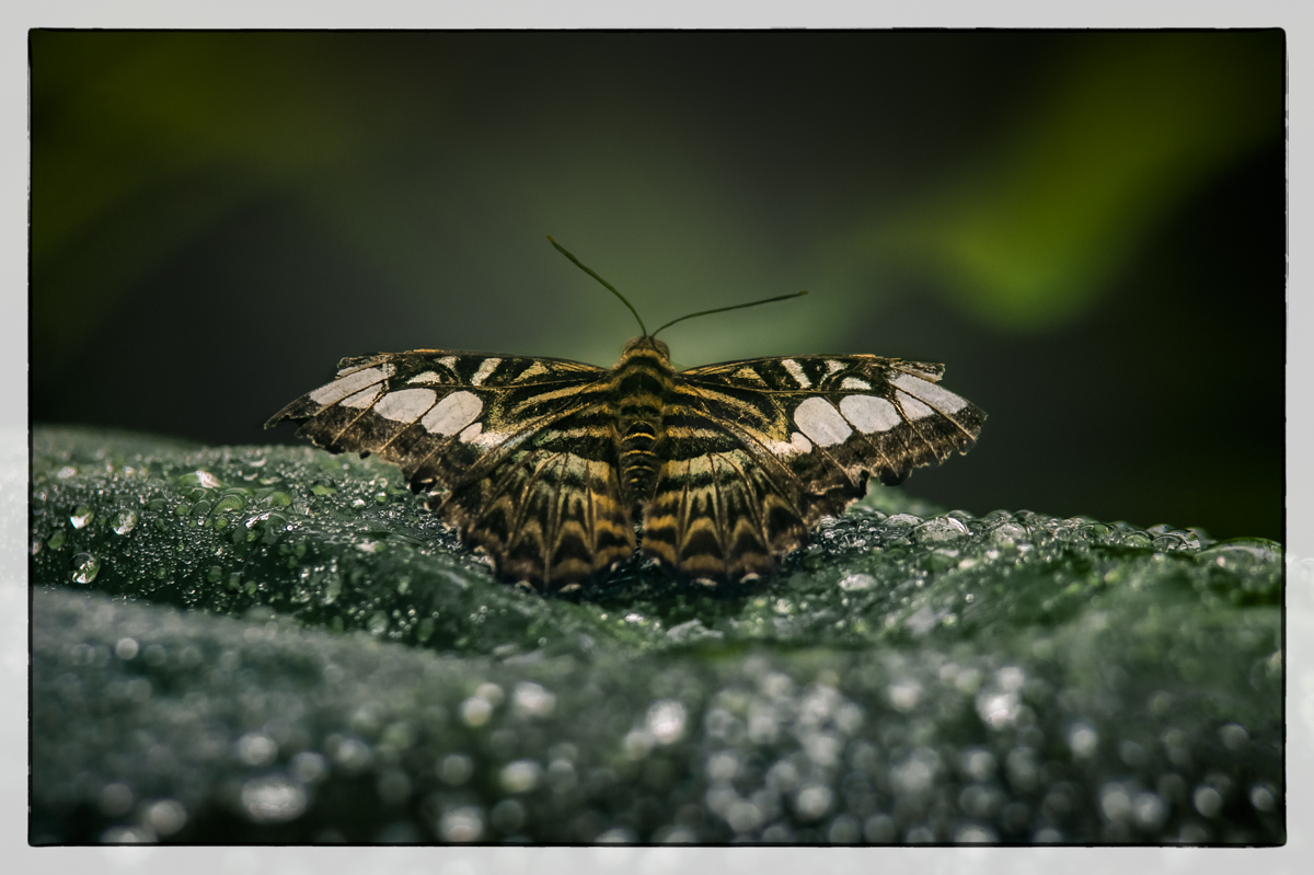
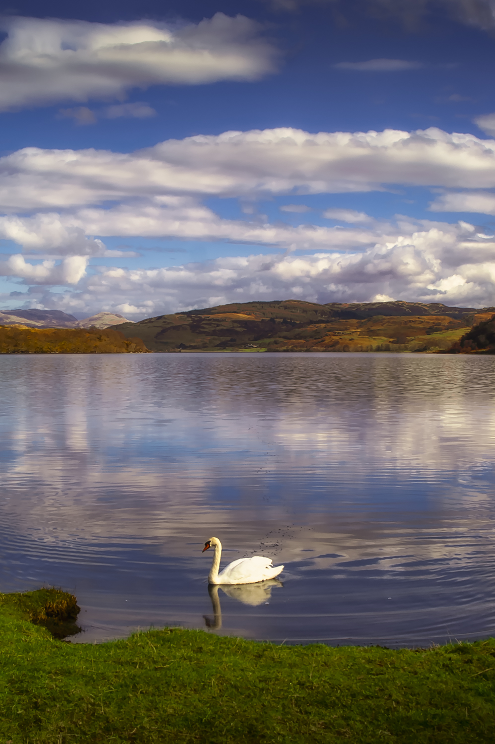
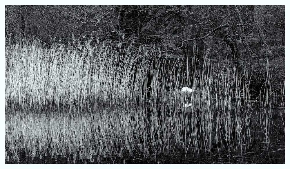
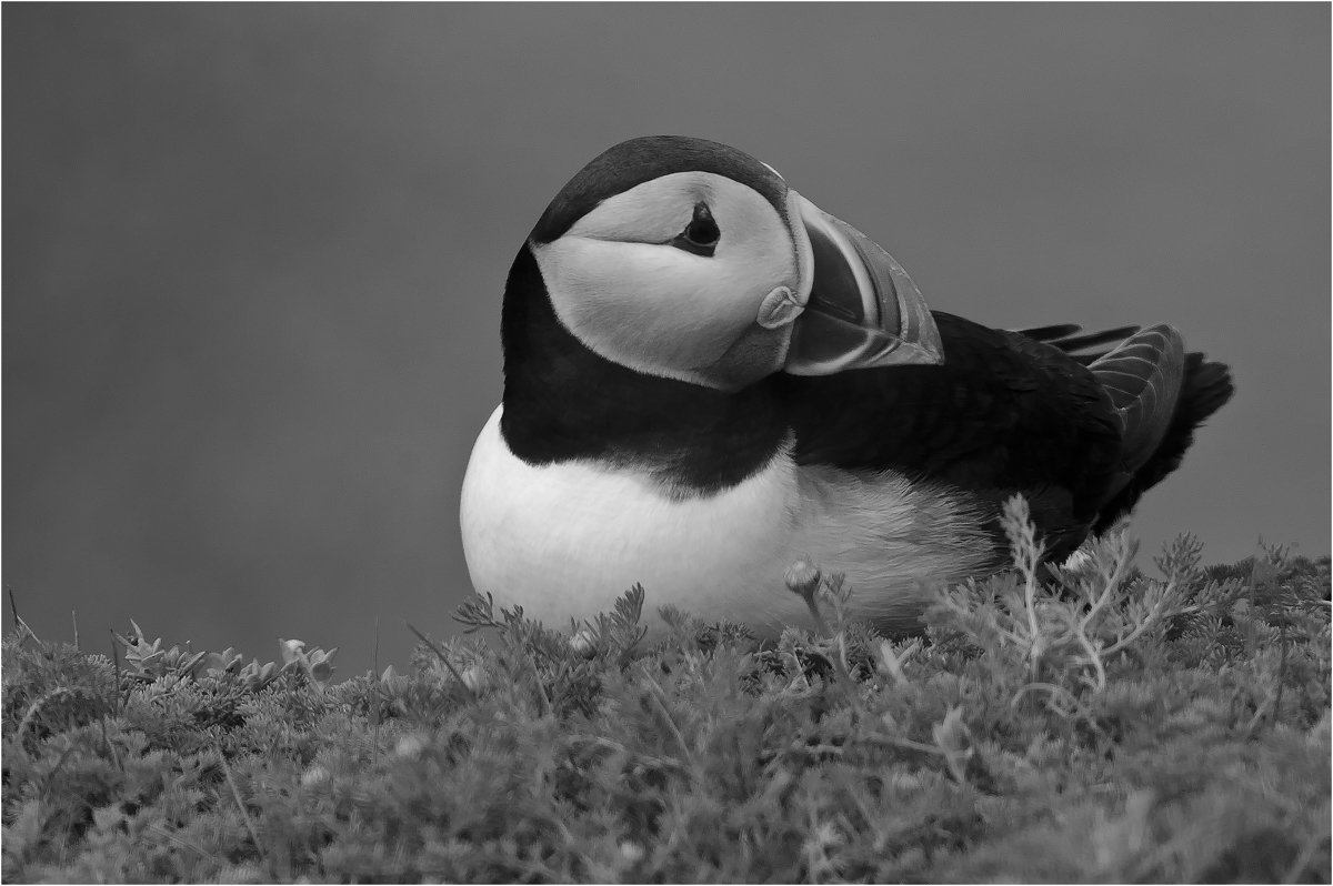
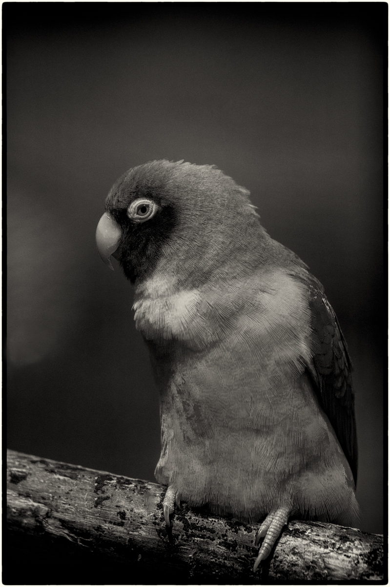
First thing I must say, that is an excellent conversion from your original, the detail you have managed to gain is very good. The tones and levels on the water are very strong and the detail in the wings and lovey, the one negative is the lack of detail in the head. But is does make for a very pleasing monochrome image to view. |
Sep 13th |
6 comments - 1 reply for Group 39
|
12 comments - 1 reply Total
|