|
| Group |
Round |
C/R |
Comment |
Date |
Image |
| 33 |
Dec 22 |
Comment |
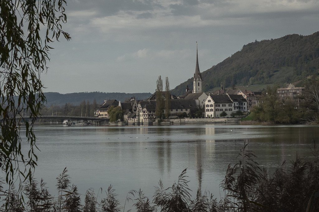
I nice pictorial image of the Town with nice reflection on the river and nice dapple light. Pleasing postcard picture. I like the framing you used on the left. But this is a great image for the argument of original or do you clean. The giant Crain spoils the silhouette> Some with like the gull, I find it dominates the image and that lose brunch on the left that sticks out a bit.
Do you leave or do you remove. PS is so good now it is so easy. The question is. Is it right to remove? |
Dec 16th |
 |
| 33 |
Dec 22 |
Comment |
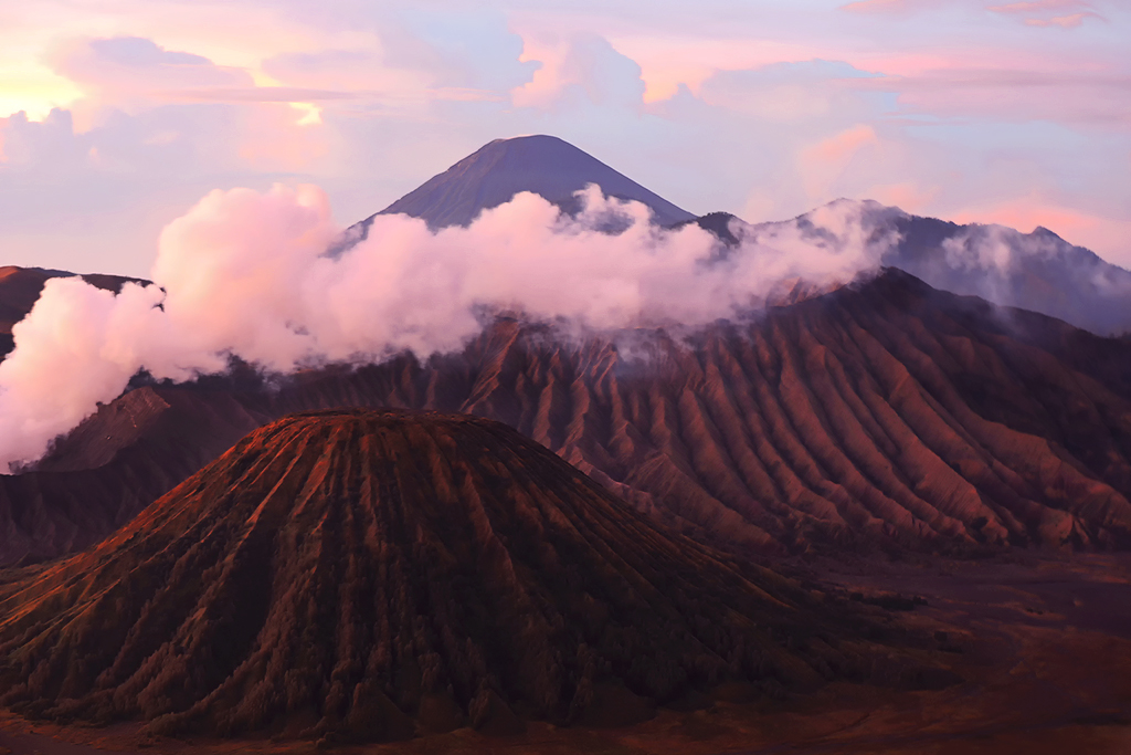
You have chosen a great spot for the shot and this lighting must have been great to see live. Live all the lava lines in the sides of the volcanoes. But I look at the image and I wonder if you push the processing a touch to far. But I must admit this one is a difficult one to get right as their is so much in light and tone going on. But I find it a touch to pink. I had a play with luminosity mask with your original and still not happy, so this is one you may keep trying. I do think this may be one for Lightroom and a touch of colour grading in there. |
Dec 16th |
 |
| 33 |
Dec 22 |
Comment |
How many images, man you have to much time on your hands. But what a wow image. This is one that needs to be projected very large or printed large on say and metal to get the effect, but it will have a presence that people will have to stop and view. Outstanding. |
Dec 16th |
| 33 |
Dec 22 |
Comment |
I view this image and my brain does go into automatic 20-30 year old mode and think what an inviting walk. I can see a natural line through the valley and a much harder line over the ridge. But that peak is there to be conquered. So it does invite you in and shows off the vastness of the area and the grace of the natural place and its surroundings.
I would like to get hold of this and have a gentle play with it in luminosity masks to see if we could balance the contrast of the image more as it is a little flat but other than that and the saving of the image it is very impressive. So back to reality and the arthritis and busted spine from to much of 20-30's time. Well Done. Paul |
Dec 16th |
| 33 |
Dec 22 |
Reply |
Hi Keith. You more than likely know this, but if you own Lightroom and Export your image through the Export programme you won't get any reduction in quality. Also if you resize in Photoshop and save as separate file on your Desktop you should have no reduction in quality. So be interested to know how you resized and saved to lose quality. Maybe we can help to stop this from happening. |
Dec 16th |
4 comments - 1 reply for Group 33
|
| 39 |
Dec 22 |
Comment |
What a beast she is, 8 wheel power house that must have been wonderful to see at full steam. This is a great record shot of the engine and has some lovely detail and sits in the frame at a nice angle for the viewer.
But you say it was on a run and for me that is the problem with this image, No Steam. No power or movement. That is a shame. The sky is great and sits well with the engine.
Thank you for sharing this great shot of the engine, but do you have any in steam.
|
Dec 16th |
| 39 |
Dec 22 |
Comment |
Yum Yum Yum. A photographers monochrome image that has been framed just right with just enough light and dark and texture to give the viewer a full course meal.
That placing of the Dodge is just perfect. Just magic. Can you hear the jealousy. |
Dec 16th |
| 39 |
Dec 22 |
Comment |
I am now waiting for the thunder clap or the lightning bolt and the B movie trailer title "The Power Line Murder's" come across the screen. You have got a great atmosphere with this image and that is mode by those storm clouds behind the power tower. Makes for a dramatic monochrome and will make for us now to take a closer look at are local power network. Strong image. |
Dec 16th |
| 39 |
Dec 22 |
Comment |
The colour version is a lovely portrait of the lady with a lovely line to her shoulders and good balance to chine and head. Very pretty smile. Your conversion to monochrome is good but has some flaws, the biggest is the left hand side of head she is losing her hair. Well and couple of bit a fly off.
The face is nicely defined but you are losing the lines on her cheek which I think is import as the focus is so shallow and is quite defined on the colour image. The softening seems to come in a touch sharper on the monochrome to the colour which for me does not work, but she does have a pretty face and smile and your shape and angle is spot on. |
Dec 16th |
| 39 |
Dec 22 |
Comment |
The horses are wonderful in both colour and monochrome, the colour giving those rich shades of browns and orange and the reflection stands out well. But the monochrome does well with its delicate tones and shades of grey. If you look carefully the detail is there to count the hairs. I am not a fan of the dark spot in front of the horse, i know it is part of the image but it jars the image. You have built the background well but the bright steps on the left I would lose the back to as they look wrong. Lovey image and joy to view. |
Dec 16th |
| 39 |
Dec 22 |
Comment |
What makes this a strong image from a good image is that dark V to the front that pushes the viewer to the exact spot you need them to start their journey into the image. I like Frans clean up of the image and makes it a nice flowing image that is easy to view and enjoy. Nice one. |
Dec 16th |
6 comments - 0 replies for Group 39
|
10 comments - 1 reply Total
|