|
| Group |
Round |
C/R |
Comment |
Date |
Image |
| 33 |
Oct 21 |
Comment |
When I first looked at this image I thought a bit messy, but then the thought crossed my mind of the harshness of living and working up there in these cold stone huts and that does come across, It is not one of my favourit images as it does not appeal to my taste but it does give a powerful feeling. |
Oct 15th |
| 33 |
Oct 21 |
Comment |
Wow this looks a lovely place to visit, what fascinating rocks and such a beautiful place, your highlights are a touch over exposed and you seem to have to normal problem of humans.
Not sure how good you are with photoshop but I had a quick play to see if it was possible to make it more how photographers would like to see it. |
Oct 15th |
 |
| 33 |
Oct 21 |
Comment |
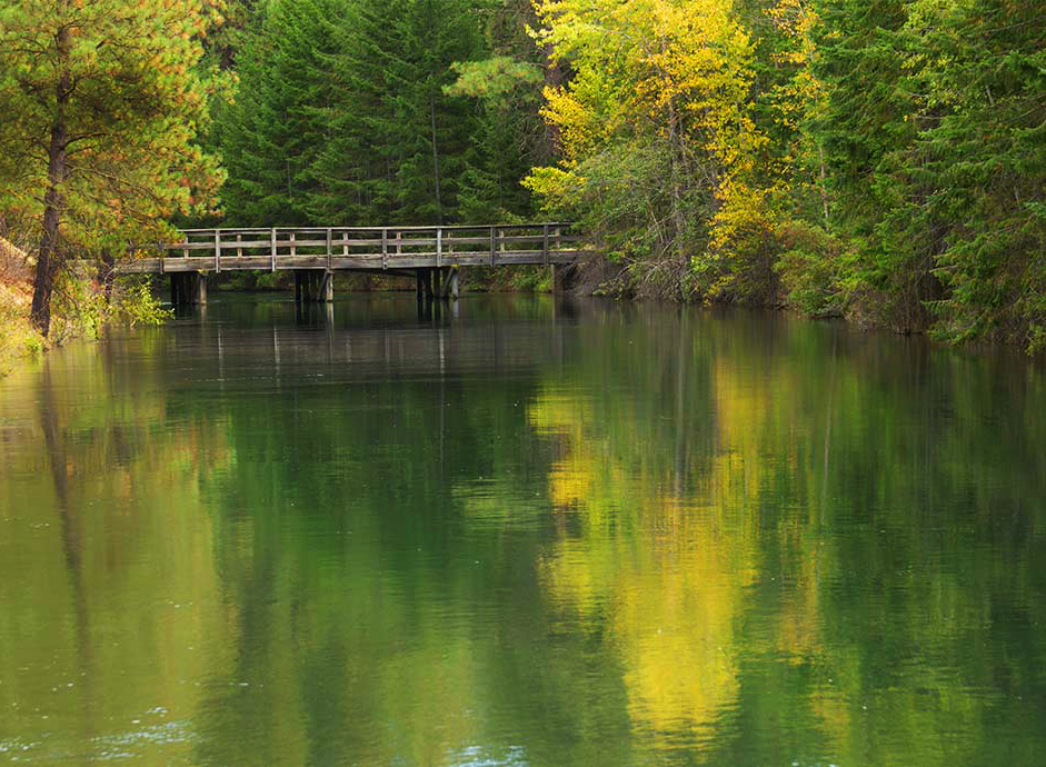
You have spotted a lovely simple image that forms a very pretty picture, the shape and reflections are very strong and the bridge holds its own in the mass of colour.
But I do find the left side lets the image down as it is a bit weak and I think you could improve this with a simple crop and slight tweak in contrast and colour. |
Oct 15th |
 |
| 33 |
Oct 21 |
Comment |
This is a lovely image with a very pleasing format to view. The main interest has been placed perfectly in the frame and the clouds on the mountains is just right.
If this was mine there are two things I would do, first I would remove that bush/growth bottom left corner, not needed and catches the eye. Second I would select the sky and clouds and then just brighten the landmass a touch and I mean a touch. If you use luminosity mask a lights 2 on a curves and lift the bright's and paint black on the mask over the sky and cloud. Otherwise lovely. |
Oct 15th |
| 33 |
Oct 21 |
Comment |
The story of is all about he open space and how that expanse of water falls suddenly into the rapids. To capture an image that depicts all of this is very difficult. You have done quite a good job with this, the branch as said is not needed and gets in the way of the view. Big sky's for me are good for images like this as that is part of the image, the wilderness is full of big sky's.
Your second image is much better and more open and shows off the space much better and allows the viewer to get the feeling of open space. |
Oct 15th |
5 comments - 0 replies for Group 33
|
| 39 |
Oct 21 |
Comment |
The image as an image has impact and is a fabulous building, I agree those two people on the left are so important and add wonderful scale.
Your treatment and conversion is to harsh and destructive for this image and for me is over powering the how thing. More subtle conversion with the detail would be superb for this building. |
Oct 15th |
| 39 |
Oct 21 |
Comment |
Good simple image of the top half of a lighthouse and that is what it is and my brain is screaming at me that I want more, I want to know what it is attached to, how does it sit in the landscape. Just leaves frustrated for more sorry. |
Oct 15th |
| 39 |
Oct 21 |
Comment |
What you don't say, was the studio shoot solo or a group shoot so you did not have control of the lights. The problems with the image is the original lighting, they are very safe and have over light the model from all angles which leaves you nothing to use when you return with the image to your PC. So being braver with the lighting would help.
The work you have done is very good to get the result you have from the original you took. But you need the ground work first.
Watch your focus, it should have been on the eye not the camera, the eye is just falling off.
Good effort. |
Oct 15th |
| 39 |
Oct 21 |
Comment |
Yes this is a bit tight and I would have love the front of the engine, but you have captured the steam and poser of the engine and how complicated this engine is. I do look at this and think this is a touch grey. I don't see a true black and that engine is black.
Must have been great to get up that close. |
Oct 15th |
| 39 |
Oct 21 |
Comment |
This is a lovely digital image that is going to make a fabulous print. You could try and lift the front rider and camels a touch but I like it the way it is. This is a magic travel image. |
Oct 15th |
| 39 |
Oct 21 |
Comment |
With the black and white you have the added depth from the shadow and tones even though you don't have any depth on your image. From a distance your image looks like a mushroom and the focus comes into play the closer you get to it, but I am talking far away.
For me the big reason this does not work is the harsh brightness of the stalk of the mushroom. Good test and good to see. |
Oct 15th |
6 comments - 0 replies for Group 39
|
11 comments - 0 replies Total
|