|
| Group |
Round |
C/R |
Comment |
Date |
Image |
| 33 |
Apr 20 |
Reply |
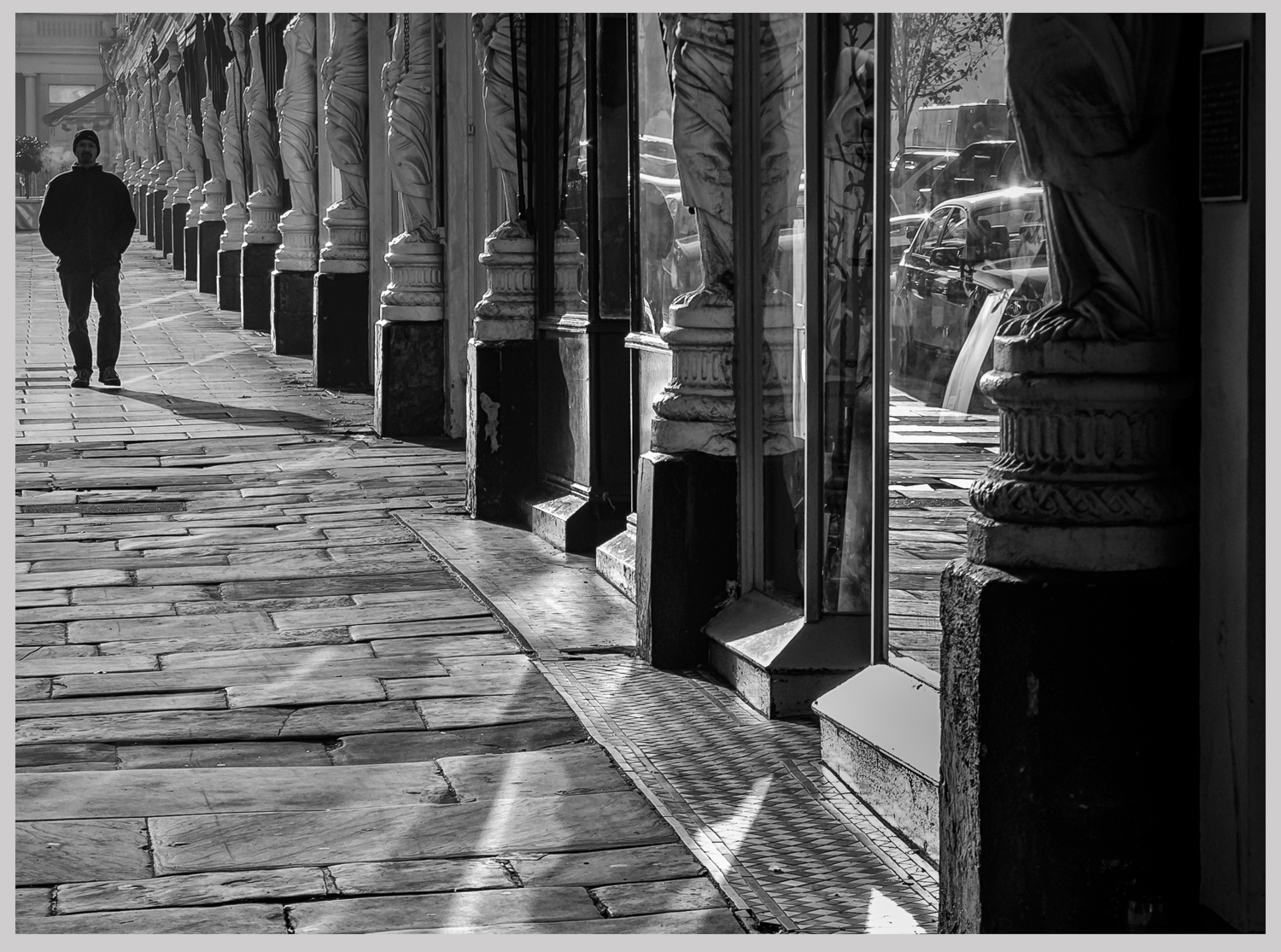
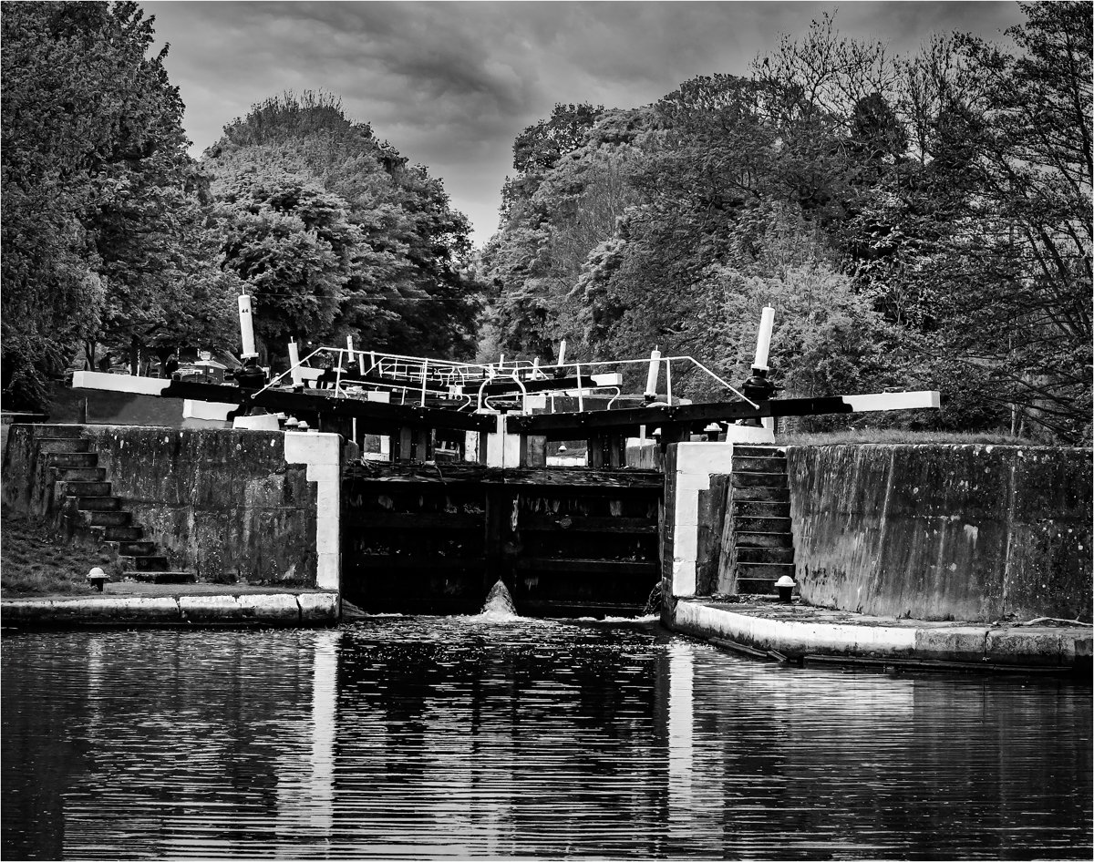
If I had taken one or two steps to the right I would have lost the symmetry of the two walls. Also, you would not know this, but a tree would start to come in from the right that did not fit the image. |
Apr 15th |
| 33 |
Apr 20 |
Reply |
See what you mean, but don't see an edit button.
Paul |
Apr 15th |
| 33 |
Apr 20 |
Reply |
I had a play with the one image in TKV7. The problem is pushing it too far to get the effect you saw there with your eyes, if you did not get this in the camera you may never reproduce it. But I think with going the long hall route and not using the HDR Pano options in Lightroom may produce better results. |
Apr 15th |
 |
| 33 |
Apr 20 |
Reply |
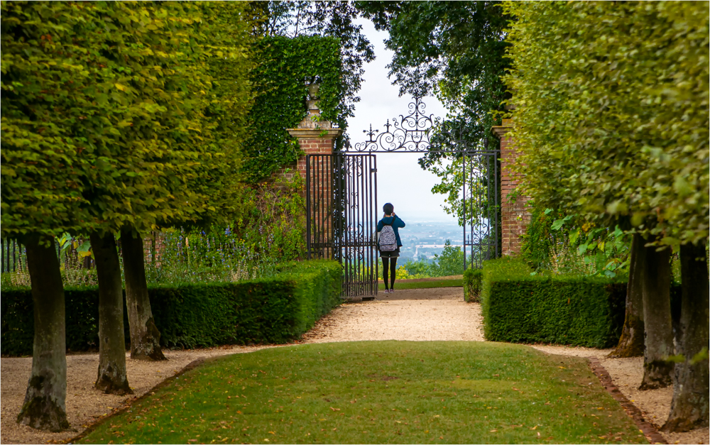
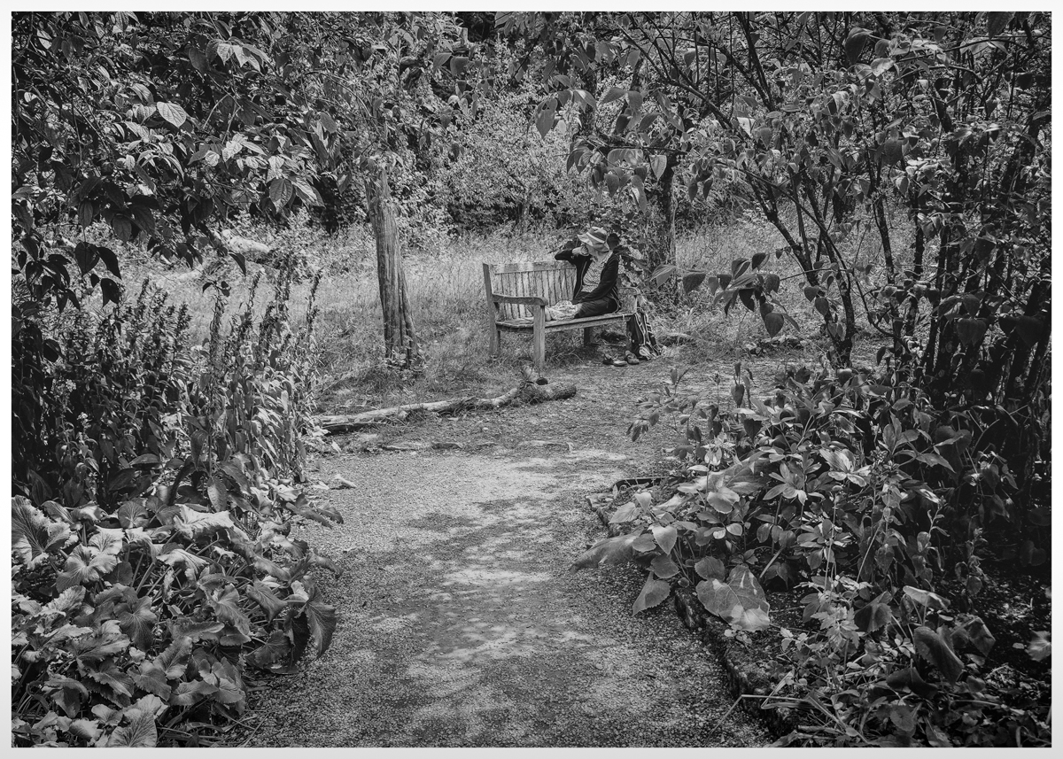
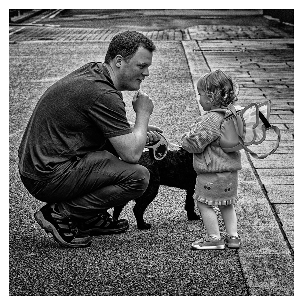
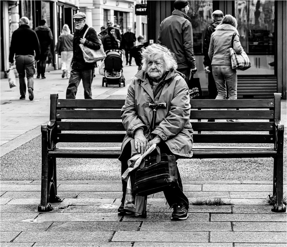
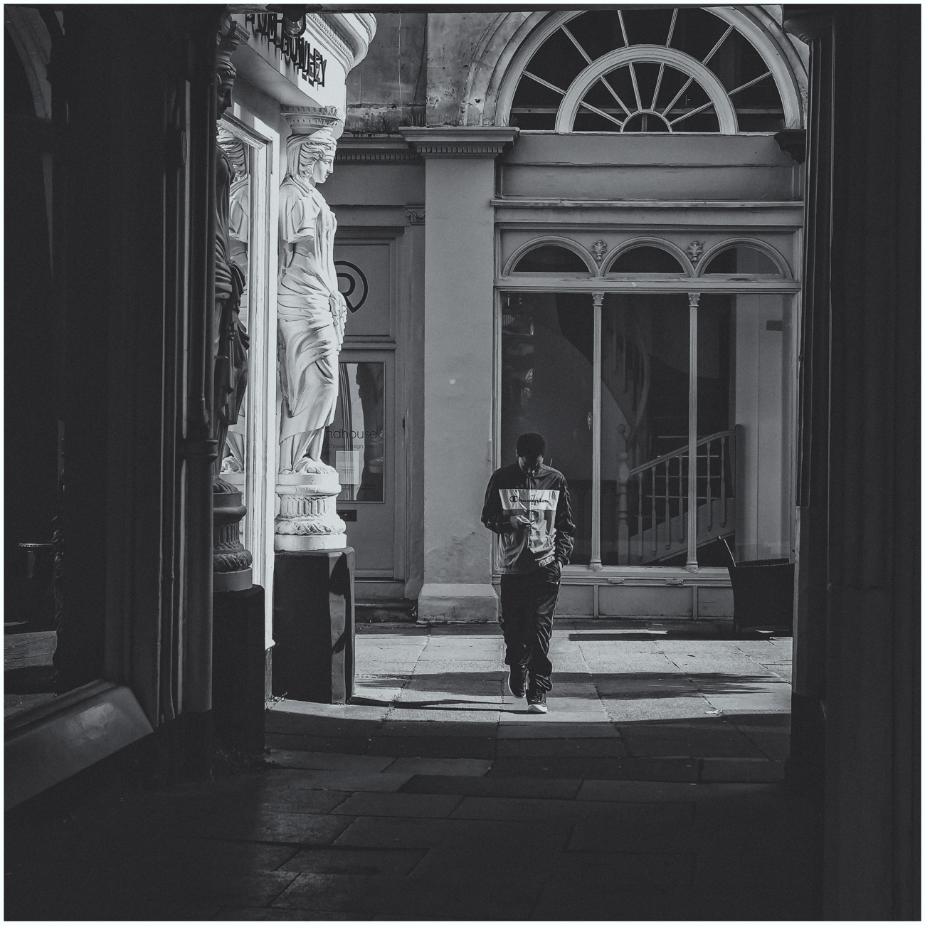
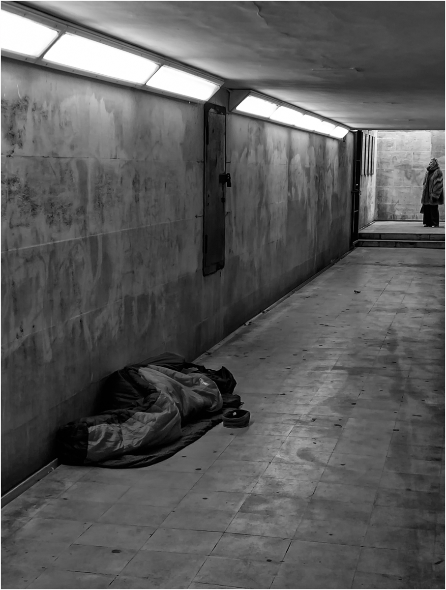
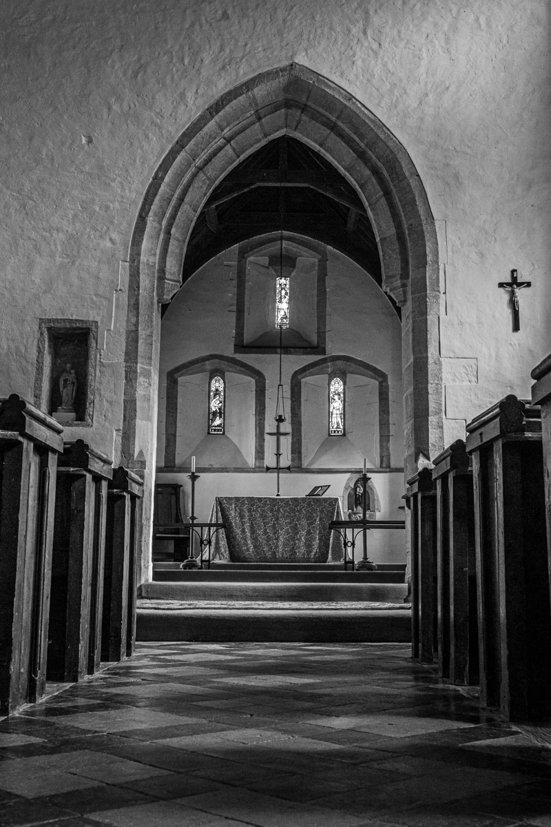
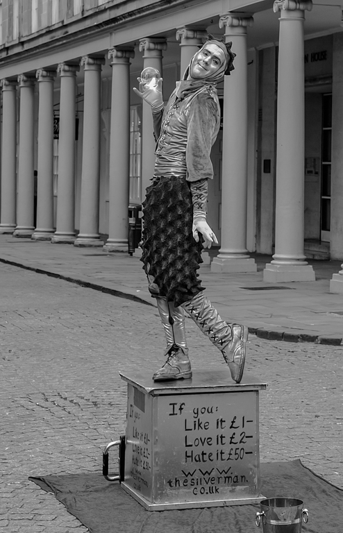
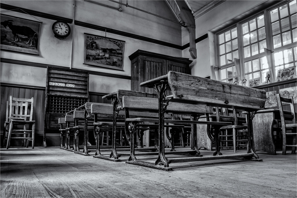
If the man was moved centrally, it would then highlight more than that the green bench is off centre.
So I find he works well in this position, and within the balance of the image, he seems to form a step with the green bench from the centre point. |
Apr 12th |
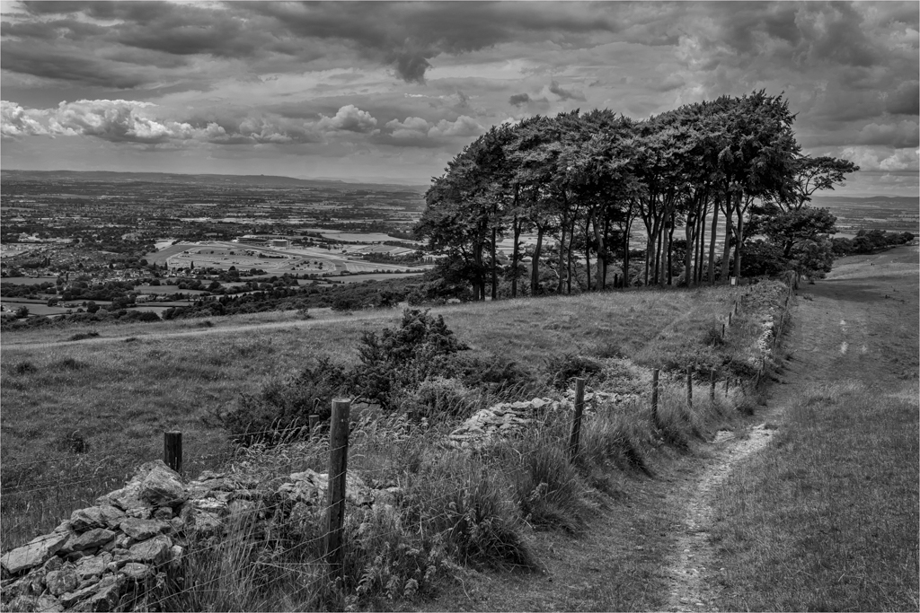
| 33 |
Apr 20 |
Comment |
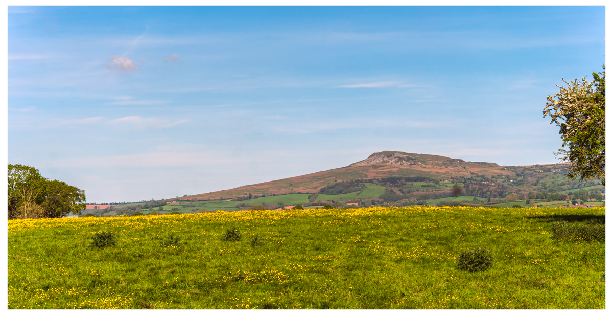
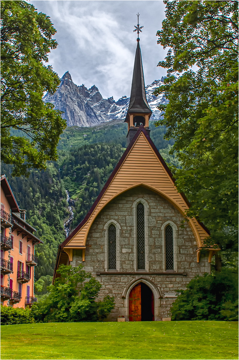
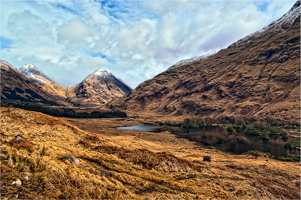
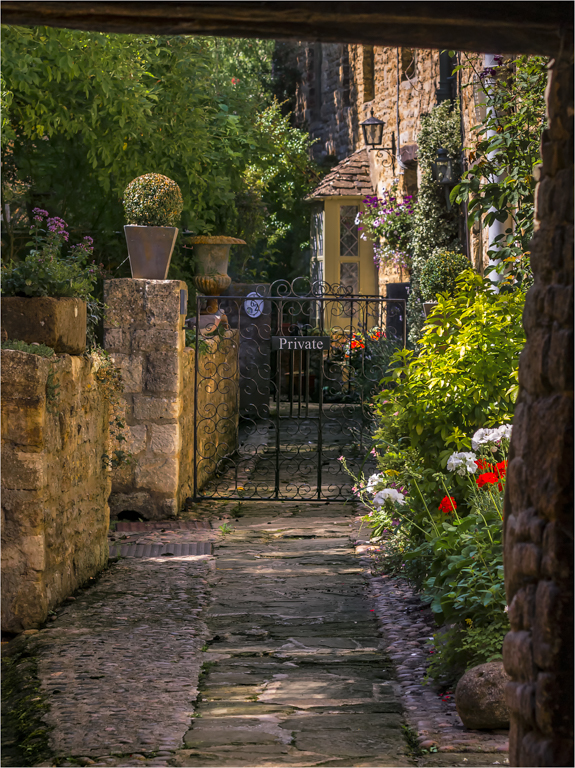
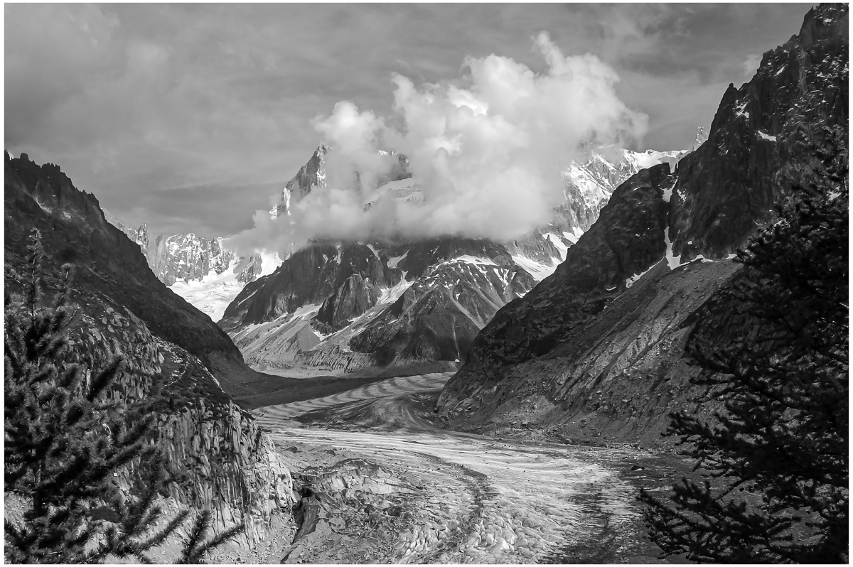
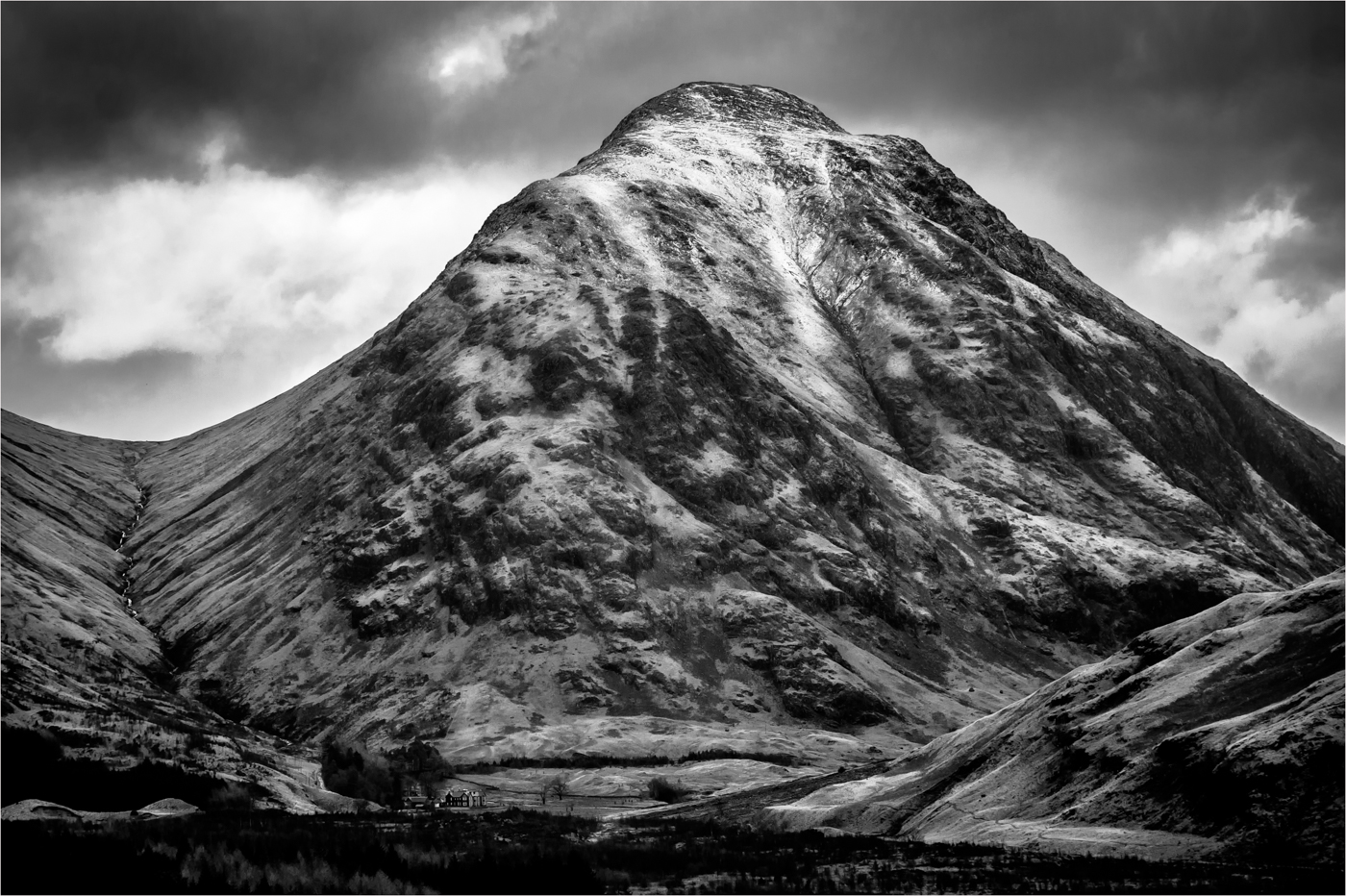
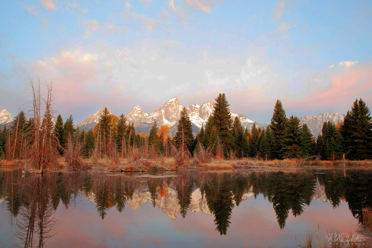
Another icon Alps view that shows off the vastness of the place, the composition is spot on and leads you up the mountain, I do find it a tad dark and wonder if a touch of work in the shadows could work. But the tops of the mountain and the sky are wonderful.
|
Apr 12th |
| 33 |
Apr 20 |
Comment |
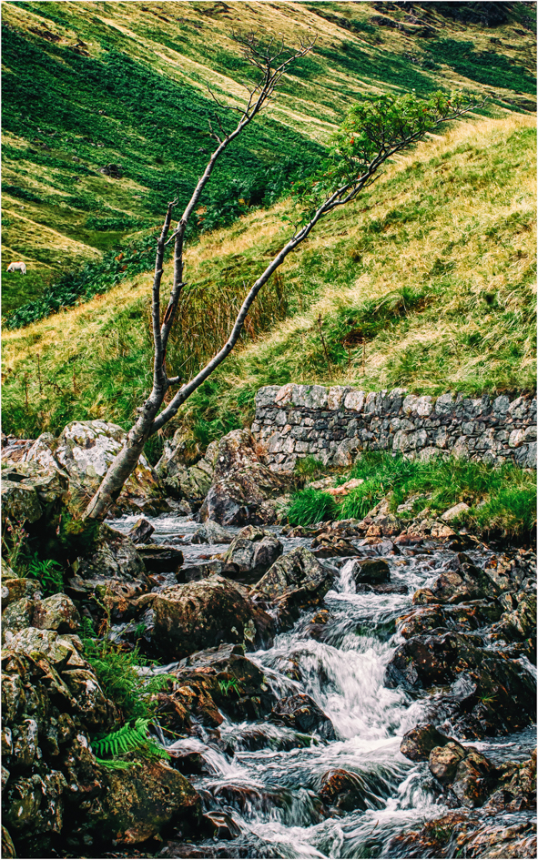
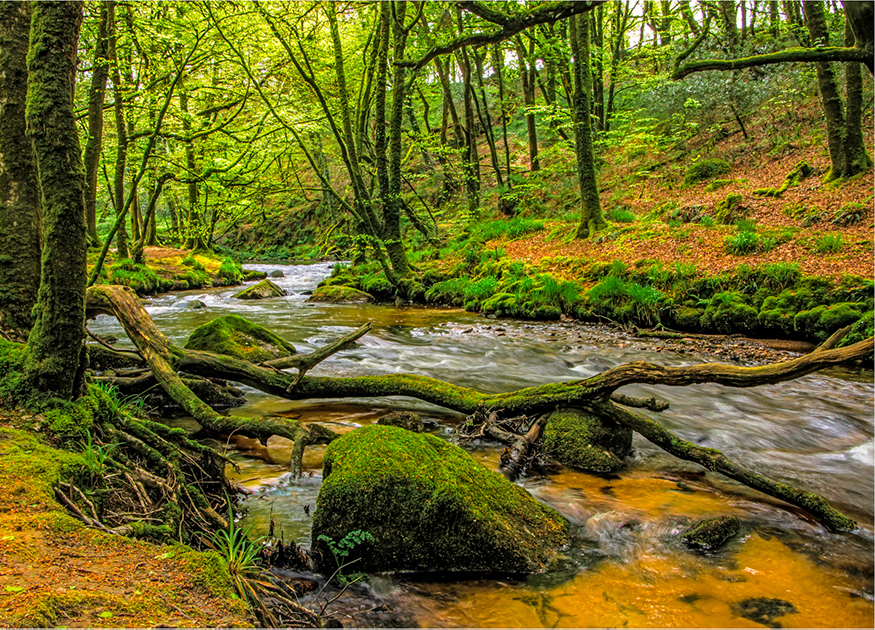
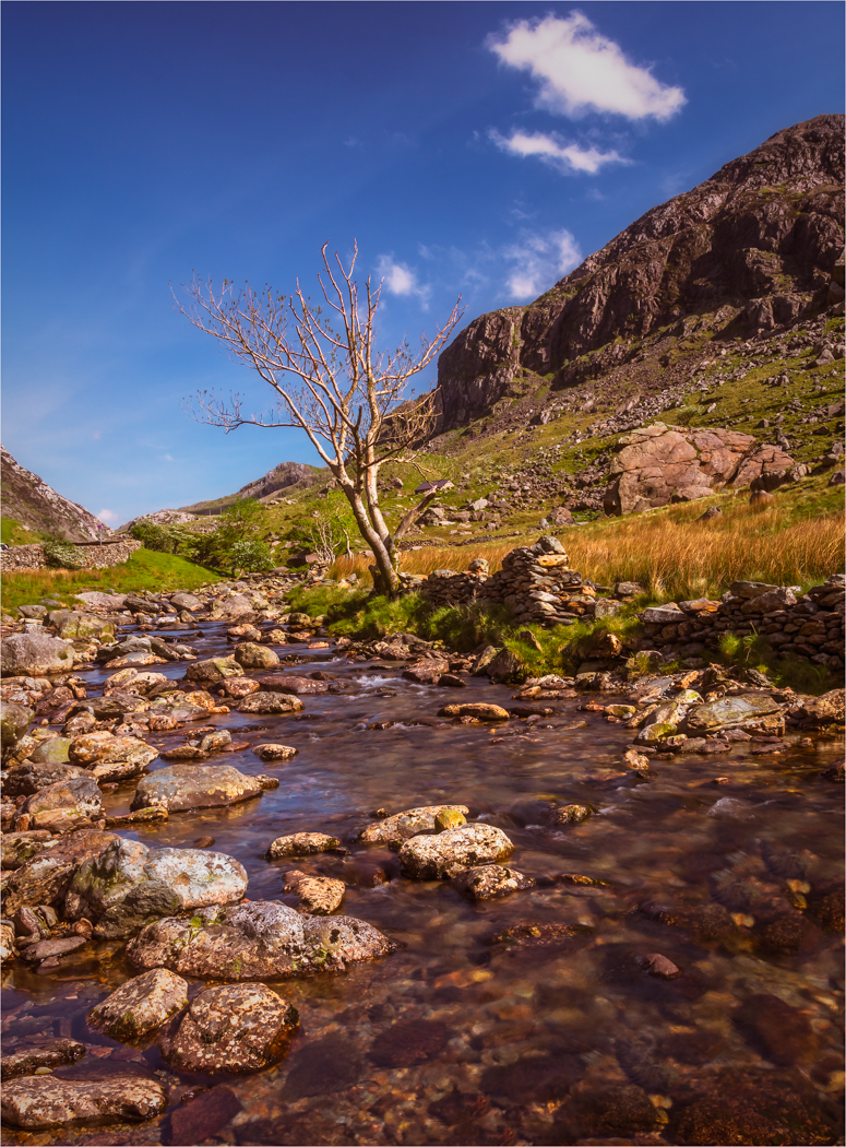
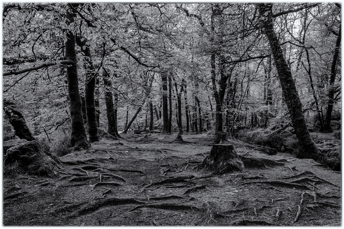
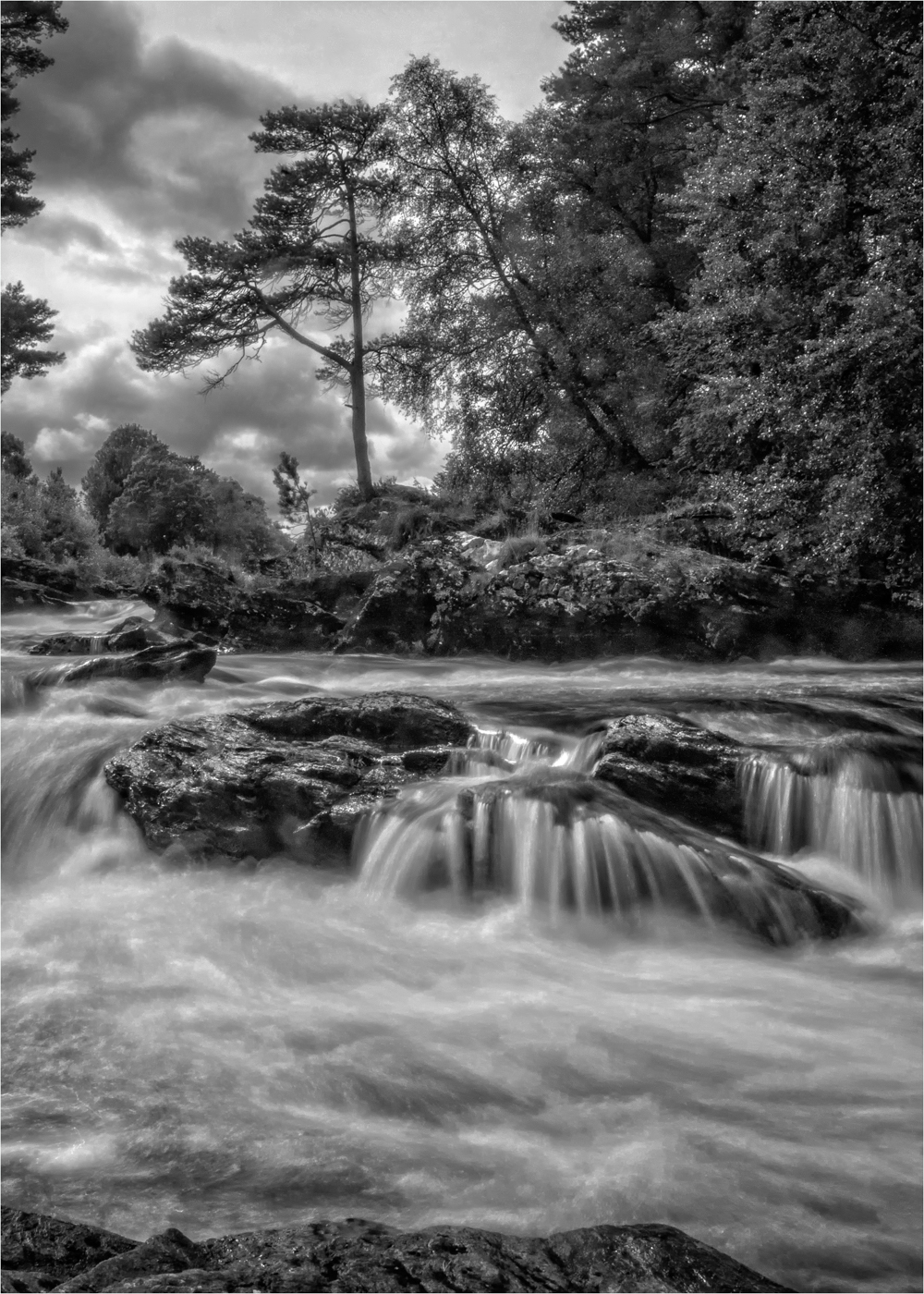
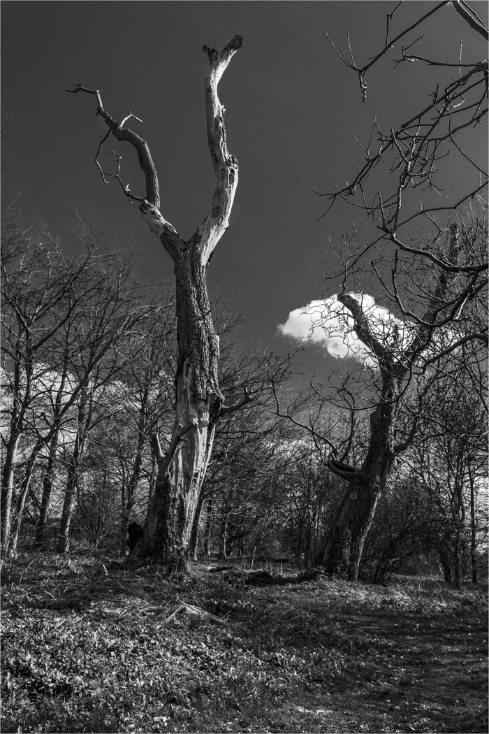
Let's start with the negative, lose the vignette, it does not improve the image, it helps to make the image-heavy and is not need.
This image is all about that tree and how it sits in the frame, it is a lovely tree and I love trees and you have placed it in the frame perfectly, you have exposed it and focused it right so leave it alone and lets us just smile as that is what this image does at a time like this.
Thank you.
|
Apr 12th |
| 33 |
Apr 20 |
Comment |
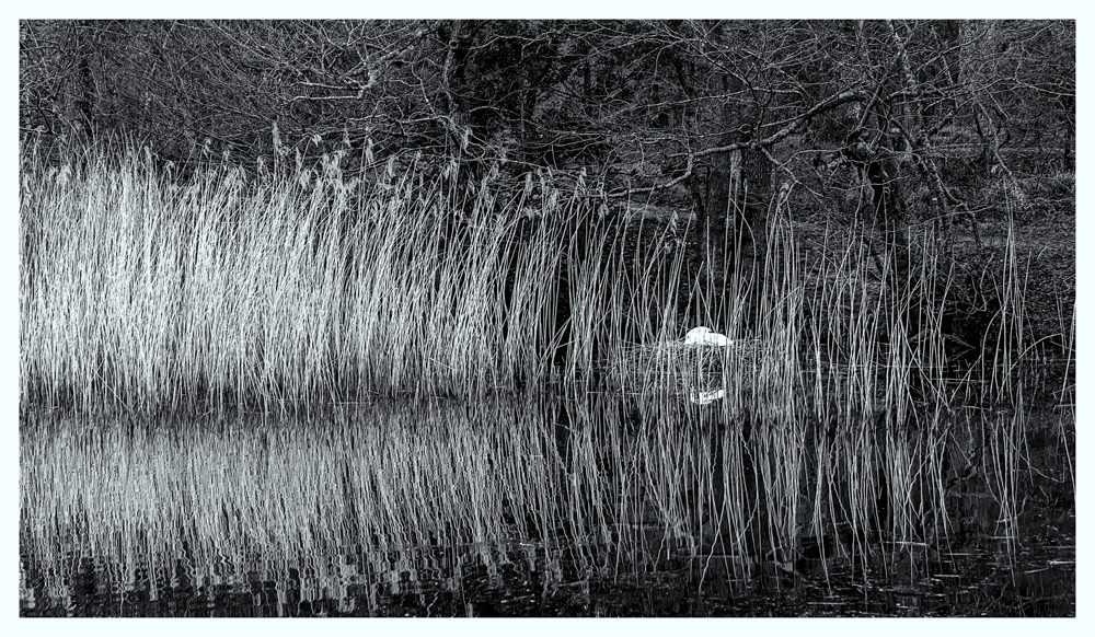
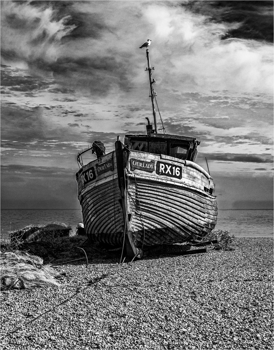
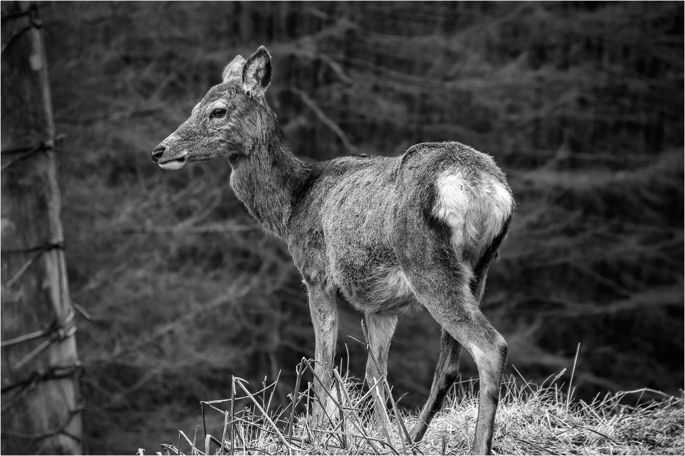
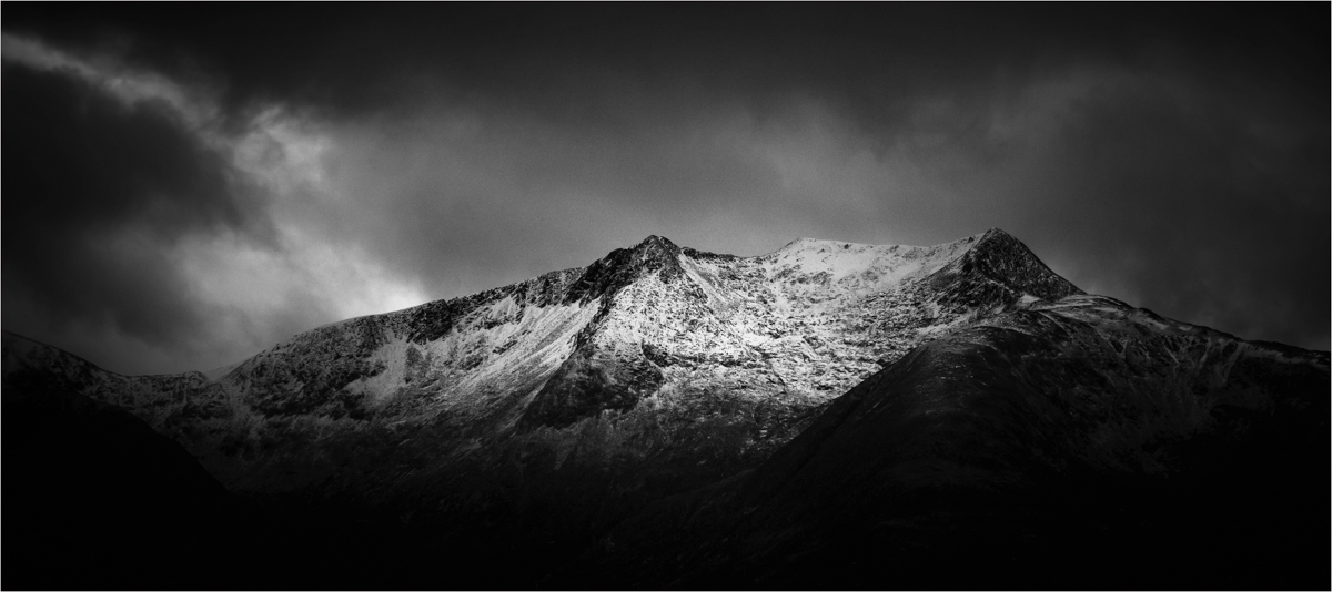
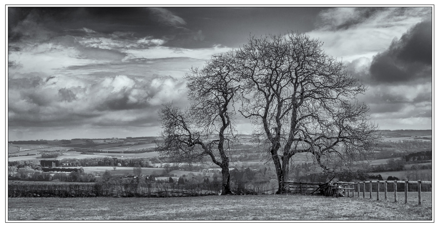
You have found a gem for the notebook to go back to a few times. This would be great in the winter, snow if it gets any.
To me, your DOF is a touch shallow for my taste and Raymond has beaten me to the punch as this is crying out for good monochrome conversion. |
Apr 12th |
| 33 |
Apr 20 |
Reply |
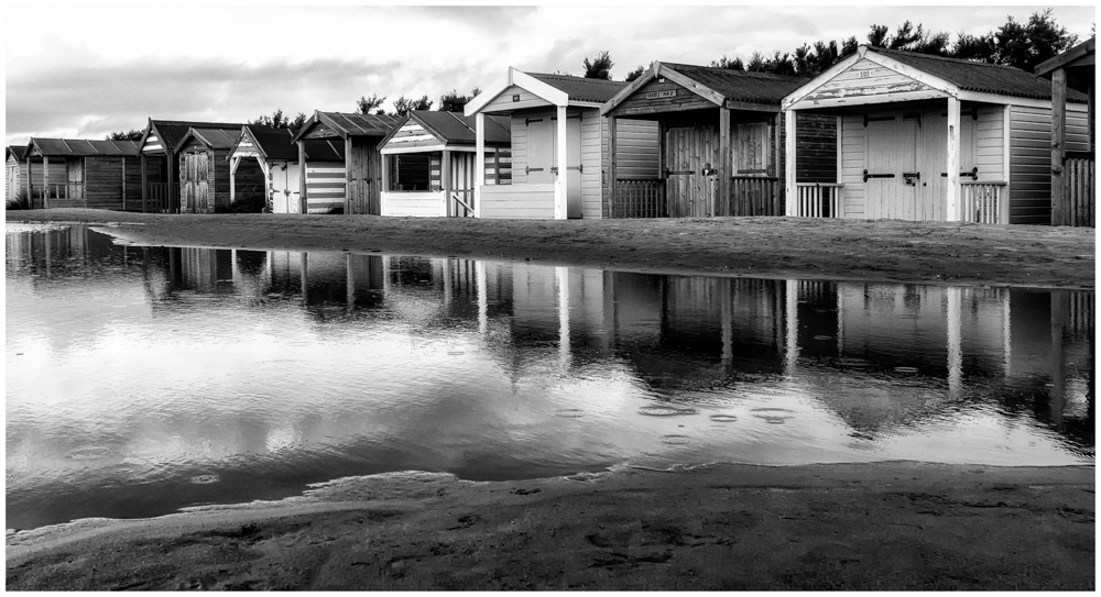
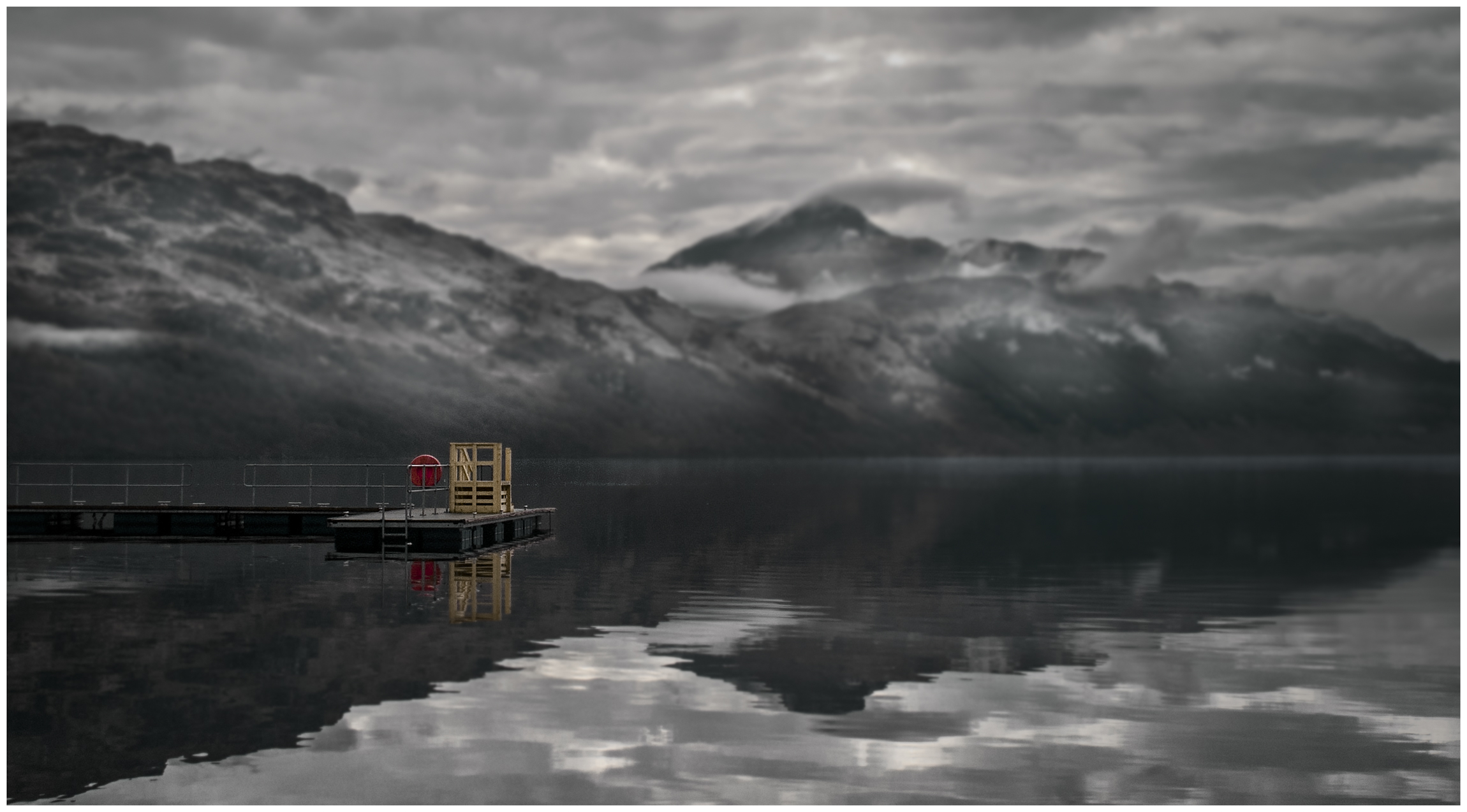
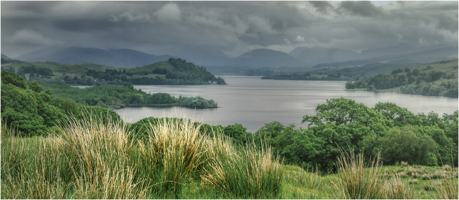
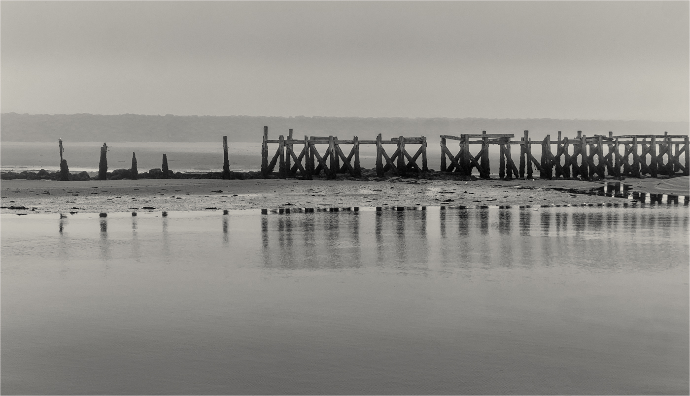
The image that you have presented is a lovely composition with a great reflection and nice balance from the sky to the landscape. But I look at this and I get the feeling of a slightly over-processed HDR.
I get the feeling that you have pushed a lot of the set far up their scales and a more subtle approach would suit this.
One of the ways is to process the individual five HDR before making the pano and copy the process from the first HDR to the next four. Then make the Pano and do a final balancing in the full form, you may get better control in the sky.
For me, if you want to this image real justice, I would do above and make the pano, but then take it to Photoshop and bring out all the delicate colours and tones you are after using Luminosity Mask as you can make masks for each individual colour or tone you want to effect and not damage any other part of the image. Think you may be stunned what is in there. Great image though. |
Apr 12th |
| 33 |
Apr 20 |
Reply |
Sorry, you did not get what I meant.
How did you process your HDR, i.e. PS, Lightroom etc.
How did you make the Pano?
Do you have lightroom?
|
Apr 10th |
| 33 |
Apr 20 |
Comment |
Randy, you have not said how you did the 3 hdr and the pano. Could you advise? |
Apr 9th |
| 33 |
Apr 20 |
Comment |
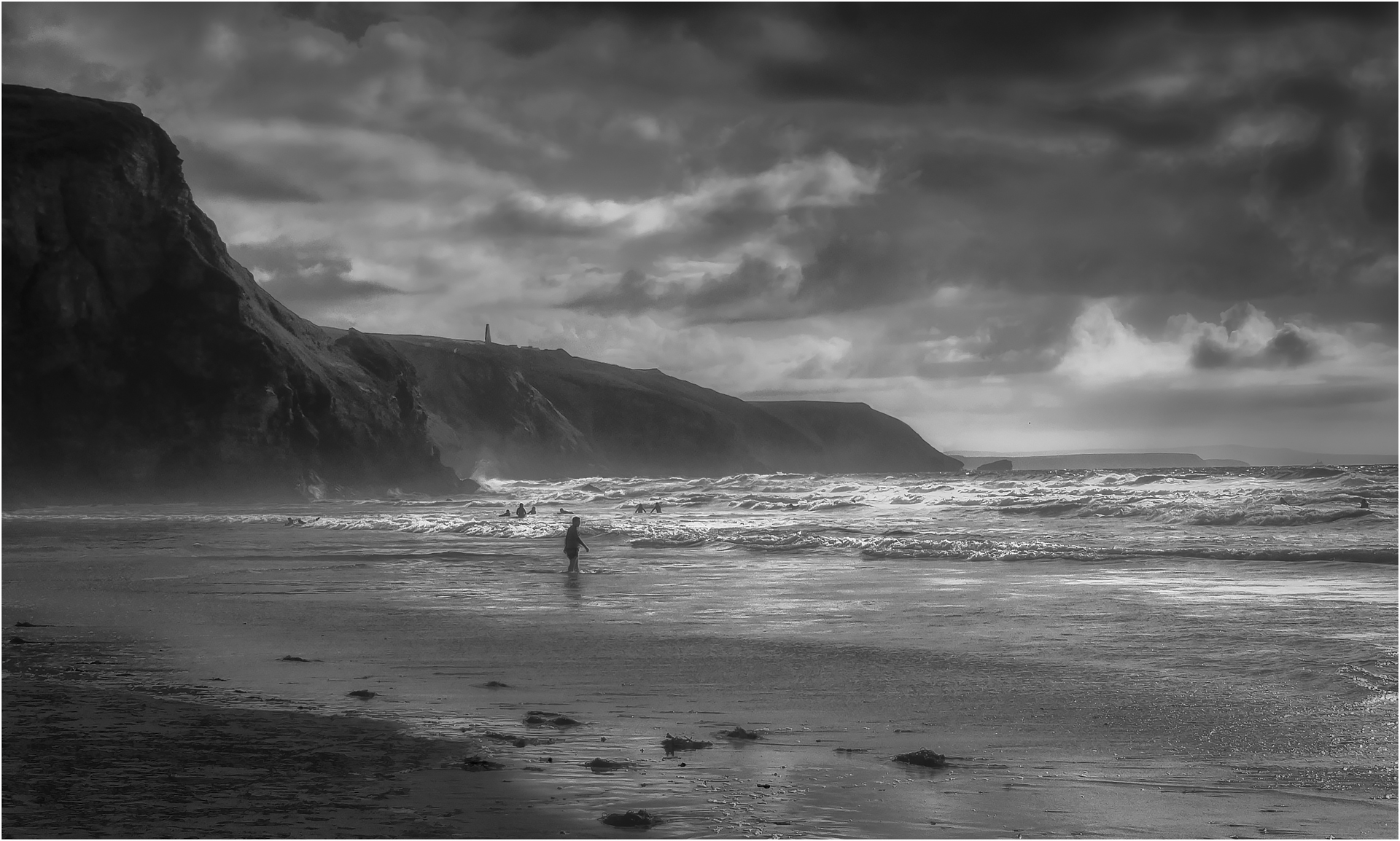
Iceland is one of those places that you go to and realise more than anyway how powerful nature is and has been and this image shows this off so well. The people show off the scale well. A real shame the conditions were not in your favour. |
Apr 9th |
| 33 |
Apr 20 |
Comment |
I must admit it does make you wish you were the man standing there, this must have been spectacular to watch. Cracking image. |
Apr 9th |
6 comments - 6 replies for Group 33
|
| 39 |
Apr 20 |
Comment |
This has a lot of nice layers to look through and that sign is holding the viewer well. Personally, I would have like a step or two to the left so you had more of the road and the sign completely separated from it. If you look at the colour, it is amazing that you can get that wonderful effect in the sky on the right in the mono like rain, acts as a good focal point.
Good picture. |
Apr 9th |
| 39 |
Apr 20 |
Comment |
They are very nice thinking of us photographer leaving these nice set-ups ready-made for us to just pop along and take a picture of. You have taken the image well, but I get the feeling the image is a stop or stop and half overexposed. It could do with adding some mood and contrast to the image to add some atmosphere to the image. I do agree it feels a touch tight in the frame but I expect if you pull back you get something horrible, but I would have like to see more of the item top left.
I have had a go at converting the colour image in PS with Luminosity Masks and add a small tint to add contrast to the image. |
Apr 9th |
 |
| 39 |
Apr 20 |
Comment |
Wow, that must have been a sight to have seen. Full of power and majesty. It does convert well to monochrome.
But I must say that Larry's version brings out the detail beautifully that you can count all the droplets of water on the edges. It also shows off the layers of water that are there.
Magical picture. |
Apr 9th |
| 39 |
Apr 20 |
Comment |
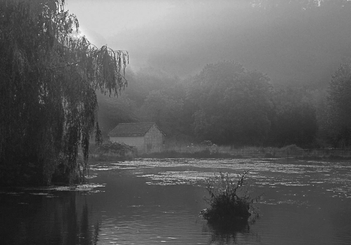
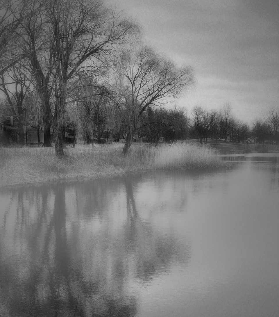
Now I may be going the other way here, I like the trees and the bank and the way it feels, the delicate early morning feel is what I get, but then you have this very hard and striking reflection that does not suit or marry the background.
So I had an idea, I have had a go at adding some mist to soften it down, this is done using a cloud layer, stretching it and burring and then opacity to like. I also crop the foot of the image as I thought the pieces of twigs or grass did not add anything. |
Apr 9th |
 |
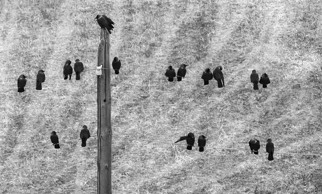
| 39 |
Apr 20 |
Comment |
It does make for a good picture and I see a lot of images similar to this over in the UK as this is a common sight on telephone or power lines.
I love the two heads of the committee sitting on the top of the post waiting for the rest to turn up to start the meeting. It is a real shame the conditions were so poor as some more detail would have been nice.
I have done an alternative crop as your eyes start to lose those outer birds and concentrate in the middle. |
Apr 9th |
 |
| 39 |
Apr 20 |
Comment |
David, all I can be is honest. I think the idea of this image has potential, but the execution has not achieved what you were after.
For me, you have taken two images and slapped them together and said that will do, but not connected the images. If you look closely at the eagle you have some hard white edging and white blotches, when you view the colour version you see a lot of the sky still visible on the cut-out, so more practice on cutting out needed as PS should cut this out easily.
I do think with work on shading and shadows you can make this work better, make the pocket edge more dynamic and more of a rocky perch and get more separation of the eagle from the jeans. I watch a lot of people like Rafy A on YouTube to get ideas for combining images and montages as they are masters at it and you learn a lot from watching them work.
This has potential and would be a great image to keep practicing on to get the cut-out spot on and a great one to practice shading and colouring. |
Apr 9th |
6 comments - 0 replies for Group 39
|
12 comments - 6 replies Total
|