|
| Group |
Round |
C/R |
Comment |
Date |
Image |
| 33 |
Oct 19 |
Reply |
I do agree with all your comments, but my main purpose of this image was to show the members of the circle how the village sits in the landscape. I have exactly that image for another round. Well, I did have hehehe. Great minds think alike. |
Oct 14th |
| 33 |
Oct 19 |
Comment |
A pleasing image of the churches interior with good tones and colour. I do agree the shadows are good but are lost in your image, But Elizabeths simplified image it comes across much stronger and forms a very pleasing image. |
Oct 14th |
| 33 |
Oct 19 |
Comment |
WOW! The contrast between the flowers and the Aspens are quite striking and come across to the viewer strongly. This is one for the card list. I agree you could brighten the Aspens a touch, but only a touch. Great image. Well Seen. |
Oct 14th |
| 33 |
Oct 19 |
Comment |
At least over there you have room to fly them, overhear drones are becoming a swear word. You have captured a pleasing view of the watercourse and the valley.
I take it that this is a straight upload of the image from the camera, the focus and clarity could be improved. |
Oct 14th |
| 33 |
Oct 19 |
Comment |
Must admit this is a great way to spend a day, you have done well with capturing the splash and the feeling of the wave. I do have to agree this does have more impact in monochrome, but I prefer monochrome. |
Oct 14th |
| 33 |
Oct 19 |
Comment |
Looking at this I think you have done pretty well. Firstly you have taken the image well. The house and its surroundings are sharp and have good colour. Your PS works are well done and not over-processed and you can see no lines. As for the tone of the image, I think it is pretty spot-on, it was a dull, overcast day with little sunlight, so if you push the image any brighter than it is you are then giving a false feeling to the image and that building becomes too overpowering.
You missed one blade of grass about 3 cm from the left on the bottom. Well done on your editing. |
Oct 14th |
| 33 |
Oct 19 |
Comment |
Oh this must have been wonderful to just stop and take in the moment of being there. You have captured and wonderful image that would grace many a postcard or birthday card. The reflection is brilliant and is lifted by the two rowboats. I would not alter this. |
Oct 14th |
6 comments - 1 reply for Group 33
|
| 39 |
Oct 19 |
Comment |
I look at this and find myself thinking I am so happy the dog is there as the focal point of the image otherwise the main focal point would be the post on the left. The image does come across rather grey and I do get the feeling that it may have been very windy. 1/500 and the clouds are blurred. Just needs a touch more contrast to lift the image for me. |
Oct 14th |
| 39 |
Oct 19 |
Comment |
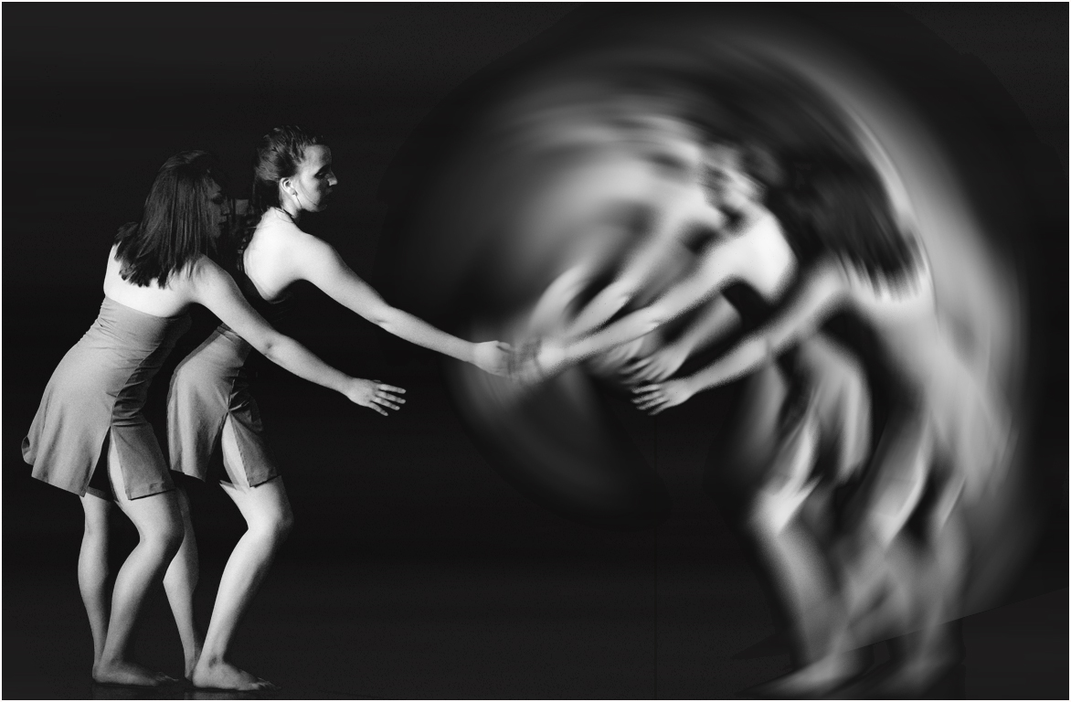
Vincent I have to agree, you have captured the pose just right, but you will have to have words with the lighting engineers as they have not fone you many favours with the heavy shadows, In a way, the colour versions are stronger owing to the deep background colour.
However, if you do take up PS, you could have lots of fun with your dance images, just an idea, this is mirror shock. |
Oct 14th |
 |
| 39 |
Oct 19 |
Comment |
I love the idea of this image and the shape and angle you have captured through the sculpture. There is some nice texture in the sculpture but for me, I think it could be at least half a stop toned down. I love the buildings in the background and how they contradict the sculpture. Real shame about the sky. You could replace it which may work. Not sure what is going on the top left corner. Great idea for a shot. |
Oct 14th |
| 39 |
Oct 19 |
Comment |
Cracking portrait of the man, full of character and life. The dark tonality comes across well with a very strong mood. However, if this was mine I would like to two things. First to do a luminosity mask for a light three or lights four just to pull those highlights back a touch. Second, I like the idea of the texture, but I just think it is too strong, I would pull it back to about 75% of what it is now and I would not make it as solid as it is. I would have less dense patches on his hair and shirt. But the portrait is very strong and the sitter should be proud of the image. |
Oct 14th |
| 39 |
Oct 19 |
Comment |
I must say that is a lovely sky, full of tones and texture and a nice shape from the light. Is the foreground enough I am not so sure, but it is a simple image of a very strong sky. I expect this is amazing in colour. |
Oct 14th |
5 comments - 0 replies for Group 39
|
11 comments - 1 reply Total
|