|
| Group |
Round |
C/R |
Comment |
Date |
Image |
| 33 |
Nov 18 |
Comment |
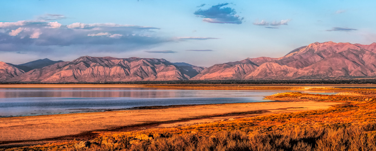
I think this has the potential to be a lovely landscape image. The bottom two thirds are well composed are well taken with lovely colours and pin shape. But for me this image falls into "less is more". The high clouds do not fit the image and our fighting the balance and our best removed and go for a letterbox landscape. See image attached. |
Nov 14th |
 |
| 33 |
Nov 18 |
Comment |
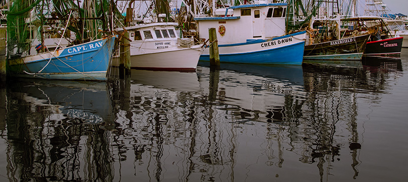
I have given this deep thought. 1) Take large saw, angle grinder and large wire cutter. Remove where needed, take picture and leave as fast as possible. 2) Take one of those large old fashion hand drills, sink boats so only the masks are visible, take picture and leave as fast as possible. 3) Crop. I have done an idea for the crop, the other thing I have done is to mask and remove the colour from the water and allow only 20% of the water back. With the tonality you have chosen for the image, I saw someone, I think it was Arran Nace add subtle mist to the top of the image to give more of the feeling that you are depicting here and that would tone down the mask and sky. |
Nov 14th |
 |
| 33 |
Nov 18 |
Comment |
At this moment this image is dominated by the blue of the sky and this image should be about the colours on the ground and the fog in the distance. I would have mad a feature of the plough and the sunlight hitting the field and the fog on the horizon and the slight cloud cover. There is a very strong image there but I think you got caught by what was around you and missed what was in front of you. Sorry. |
Nov 14th |
| 33 |
Nov 18 |
Comment |
This must have been great to see, you have chosen a good vantage point and have captured a pleasing image with all the spray and the tree framing from the left. But I wish this was sharper so those rocks were pin sharp and we had about another inch on the right hand side so that we get more depth to the view. |
Nov 14th |
| 33 |
Nov 18 |
Comment |
You have composed and chosen a very pleasing 50/50 reflection landscape image that has a lot of colour and good cloud cover. The placement of the larger coloured tree on the third is very good. I find the image a touch dark and filled in on the colour and tone side and wonder if this could be opened up a touch. |
Nov 14th |
5 comments - 0 replies for Group 33
|
| 39 |
Nov 18 |
Reply |
I agree 100% with what you say, the problem I had. I pulled this image back so much from a dark image that even with luminosity mask pulling the tones any more I started to notice edging pixel breakup and halo's so I was getting to the image limit. But I will go back and have another go at this by trying to create an HDR version in Lightroom and make a larger Raw file. |
Nov 14th |
| 39 |
Nov 18 |
Comment |
I am always amazed what they can produce in glass and how tough it really is. This shows that off to its best, the persons imagination who produced this must have been out there. You have captured this well and held all the detail as this must have been reflecting and glowing all over the place. Thank you for sharing. |
Nov 14th |
| 39 |
Nov 18 |
Comment |
What a lovely image and full of beautiful faces to view. I think the tones are not that bad but I agree the keyline would lift the image as the dark borders are dominating the image and a 3 pixels white line breaks that. I love the faces, the first in line seems to be concentrating on her position on stage and No. 3 does not care a bit and is just posing to the world. Love it. |
Nov 14th |
| 39 |
Nov 18 |
Comment |
This image has the feeling of being taken in the 1950's and is well composed and well handled in the IR conversion. There is slight halo on the trees to the left and the right that can be solved easily with the clone stamp tool. But I look at this picture and I feel there is something missing and I could not put my finder on it. It then came to me while lying in bed. It needs some noise, just to add to the feeling of the image. Not much, but just a touch as the corn and field is to clean for the feel, if you get what I mean. |
Nov 14th |
| 39 |
Nov 18 |
Comment |
When you first look as this your eyes for a second have to settle to realise what you are seeing. The monochrome is much stronger version. But I think you have captured a brilliant image and an image that shows off a moment in time perfectly. But this image needs to be printed big, framed in a black frame with a white border to be appreciated to its best and the viewer can stand and take their time viewing all the individuals. Great picture. |
Nov 14th |
| 39 |
Nov 18 |
Comment |
I love monochrome images of Aspen as they have this wonderful tonal quality that sits so well in black and white imagery, specially if you get it at the right time of day with long shadows. I do find this image a touch busy and I find that the firs in the foreground don't add anything for me to the image accept for getting in the way of the Aspen. There is a nice depth in the Aspen but I would have liked to see more. |
Nov 14th |
5 comments - 1 reply for Group 39
|
10 comments - 1 reply Total
|