|
| Group |
Round |
C/R |
Comment |
Date |
Image |
| 33 |
Oct 18 |
Comment |
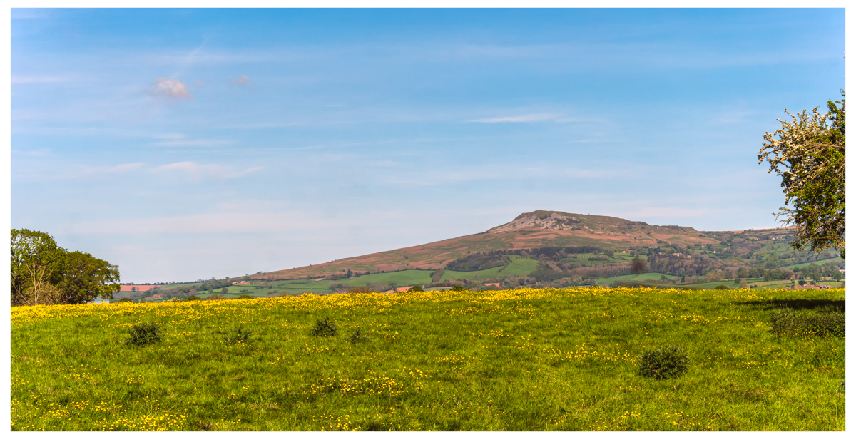
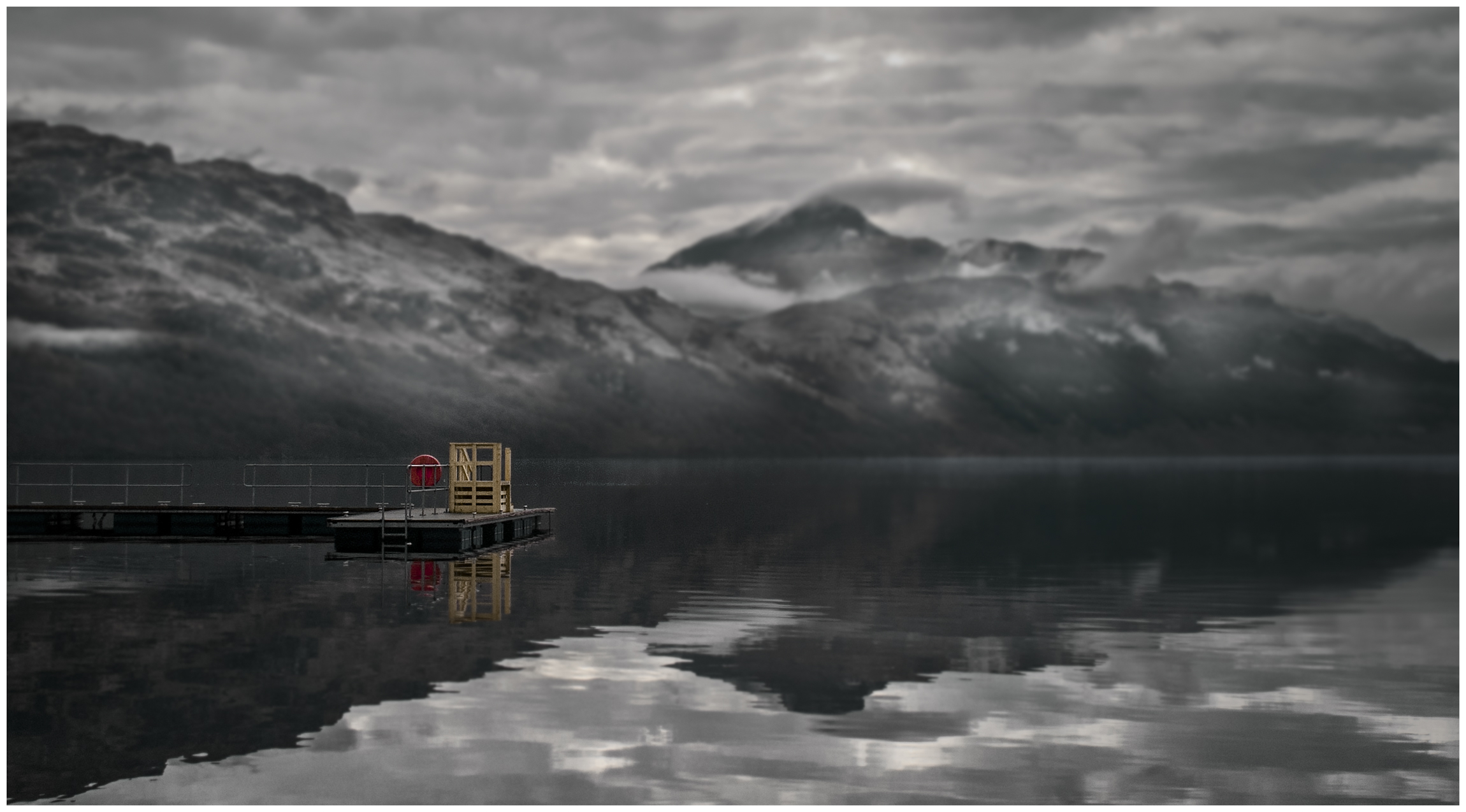
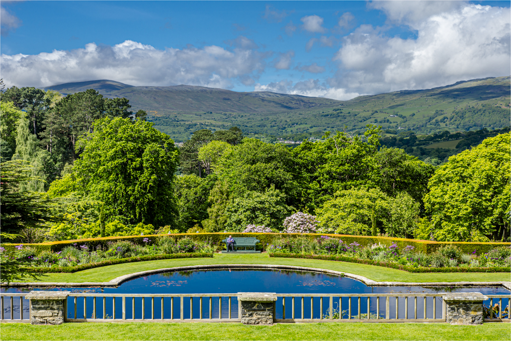
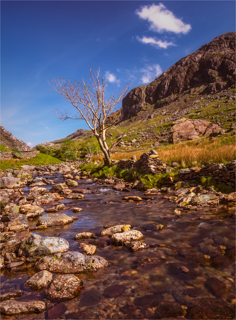
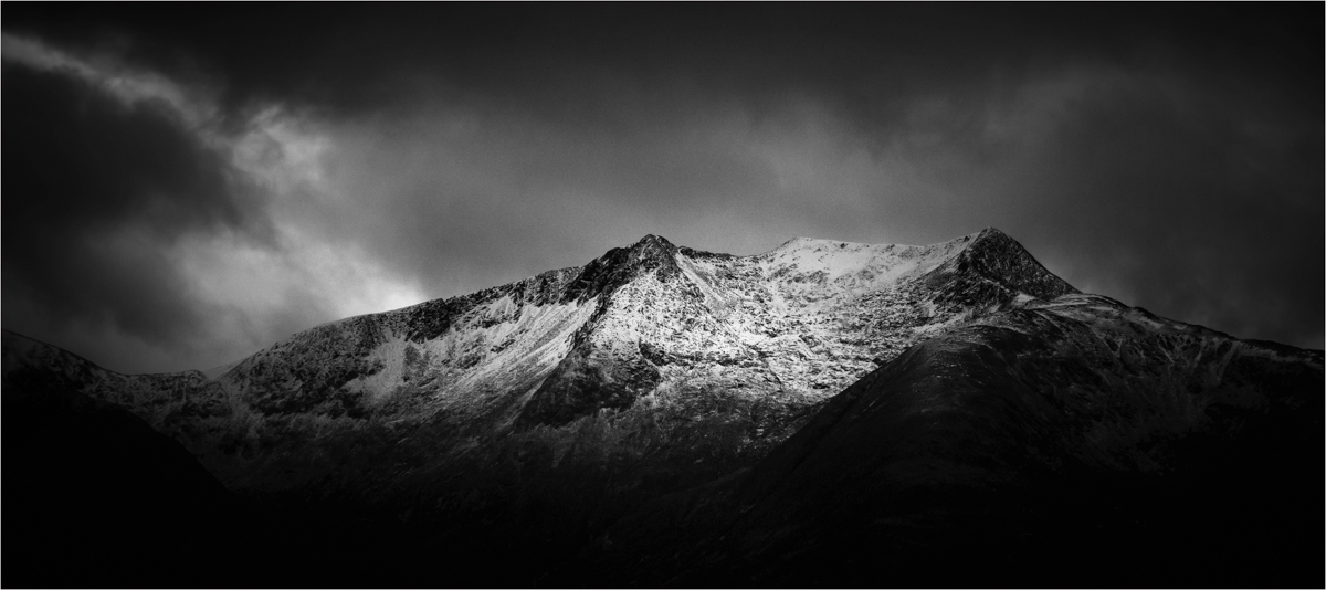
I think you have chosen a beautiful spot for an image and you have taken a pleasing picture of the scene with all the colours and the mountains. I know we always say to get down low but I wonder this time if a touch higher would have been better so we get more of the mountain reflection. But I could be very wrong there.
What I do think is wrong is your DOF. For an image of this style, shooting at F5.6 is way to shallow unless you are trying to get the foreground in focus and the background falling away. For an image like this it should be F11 or F16 and focus to infinity and then everything will be crisp. |
Oct 18th |
| 33 |
Oct 18 |
Comment |
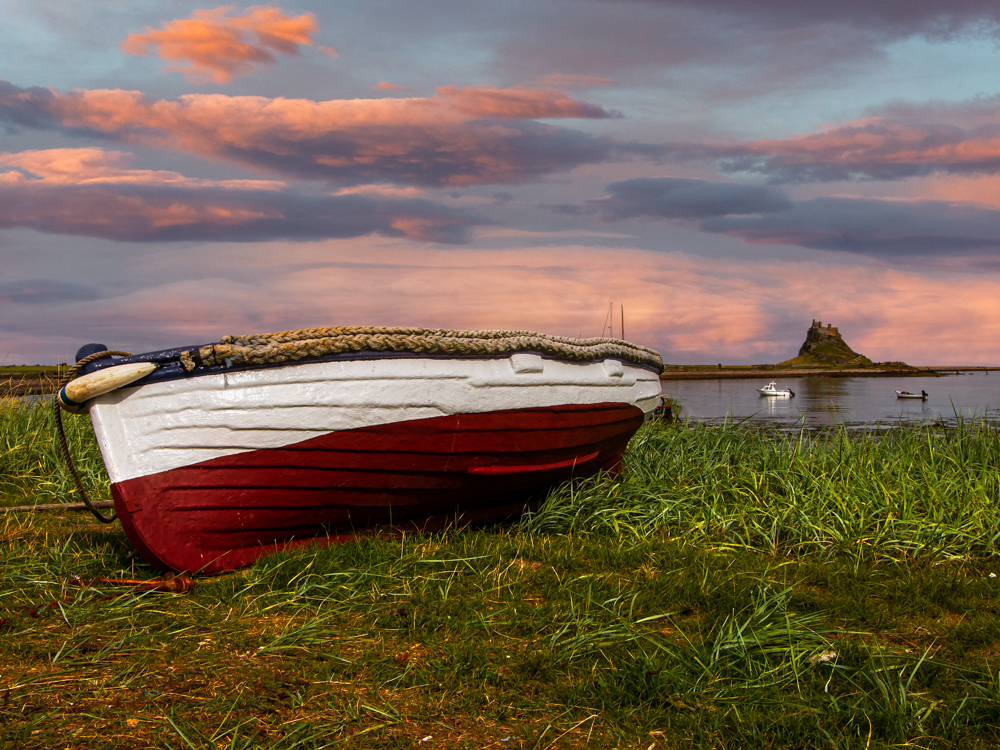
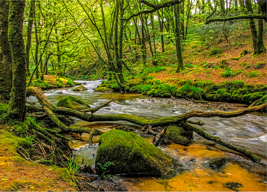
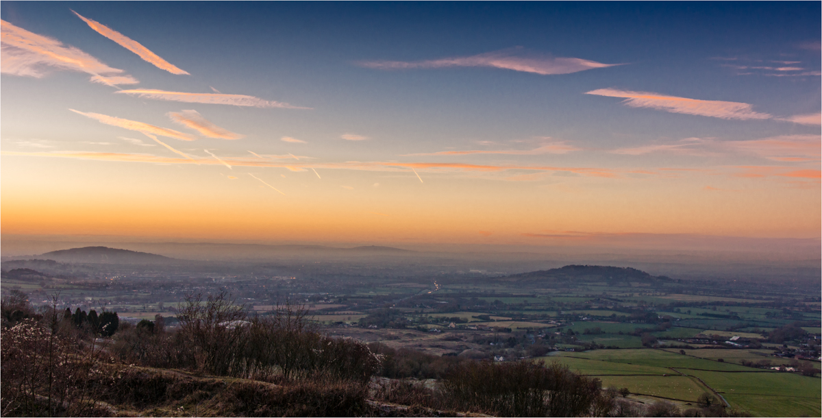
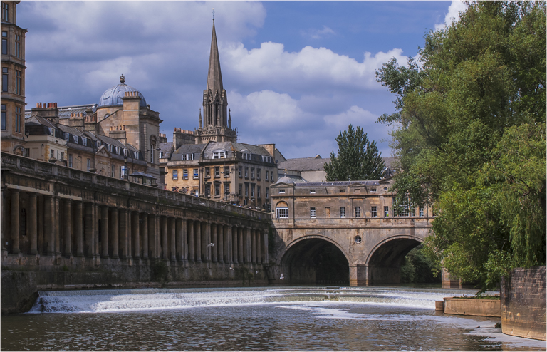
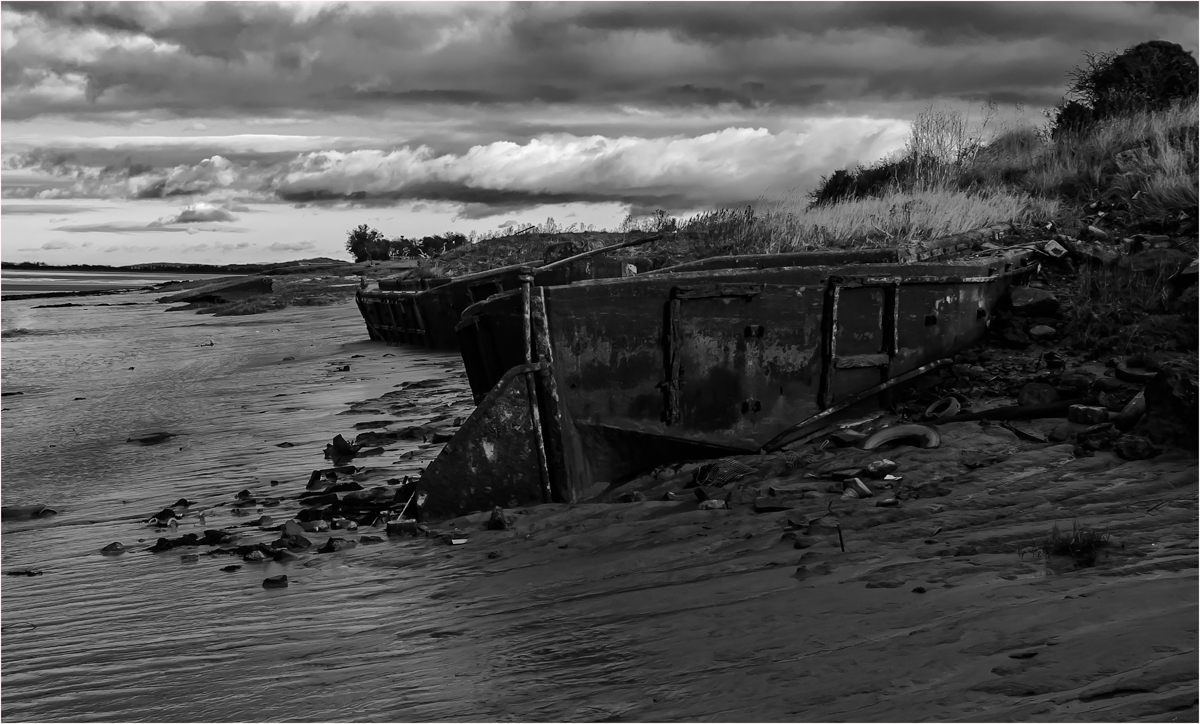
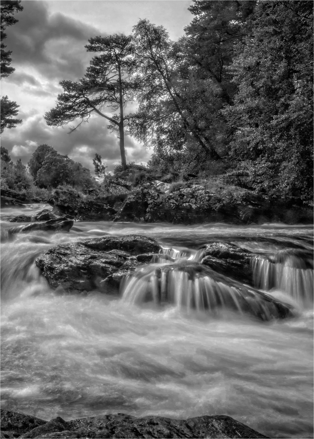
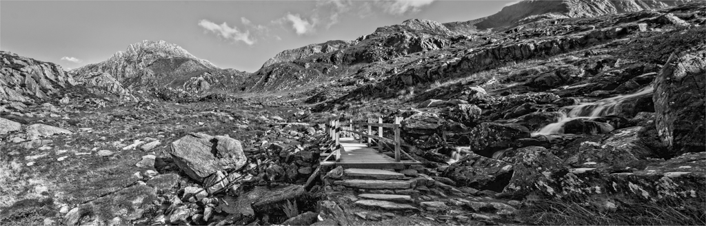
This must have been great to see live and the early morning light must have lit this place up great. Have the foreground interest is great. I know you were out of breath and hurting, but thinking what was in front of you before you snapped would have improved this image. A movement to the left to use those logs in a better way and also get the second Arch out from the tree would have improved the view and then focusing on the logs at F8 to F11 would have got that pin sharp.
But I bet you the hike was worth while to see all this. |
Oct 18th |
| 33 |
Oct 18 |
Comment |
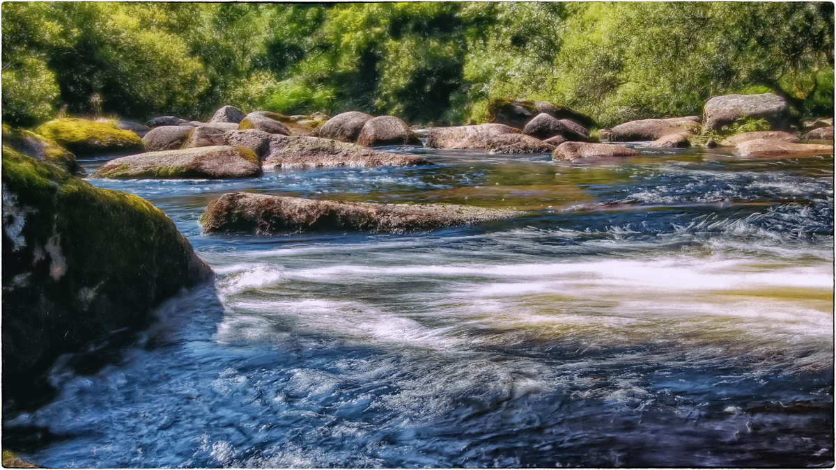
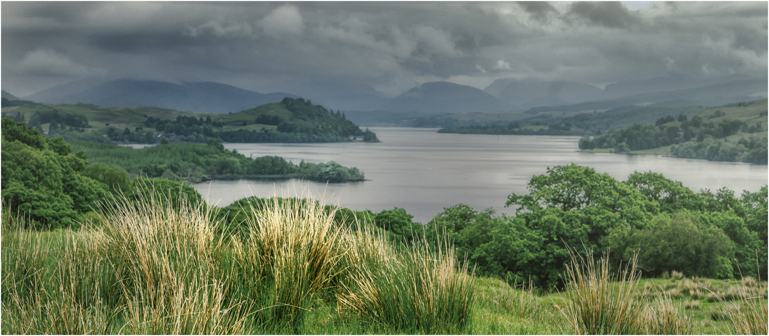
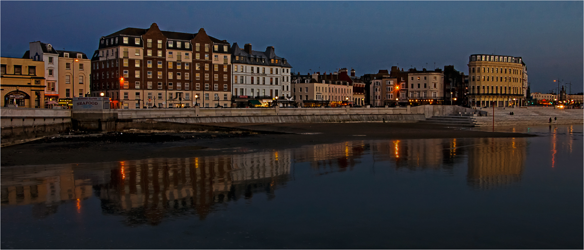
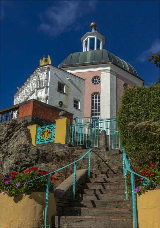
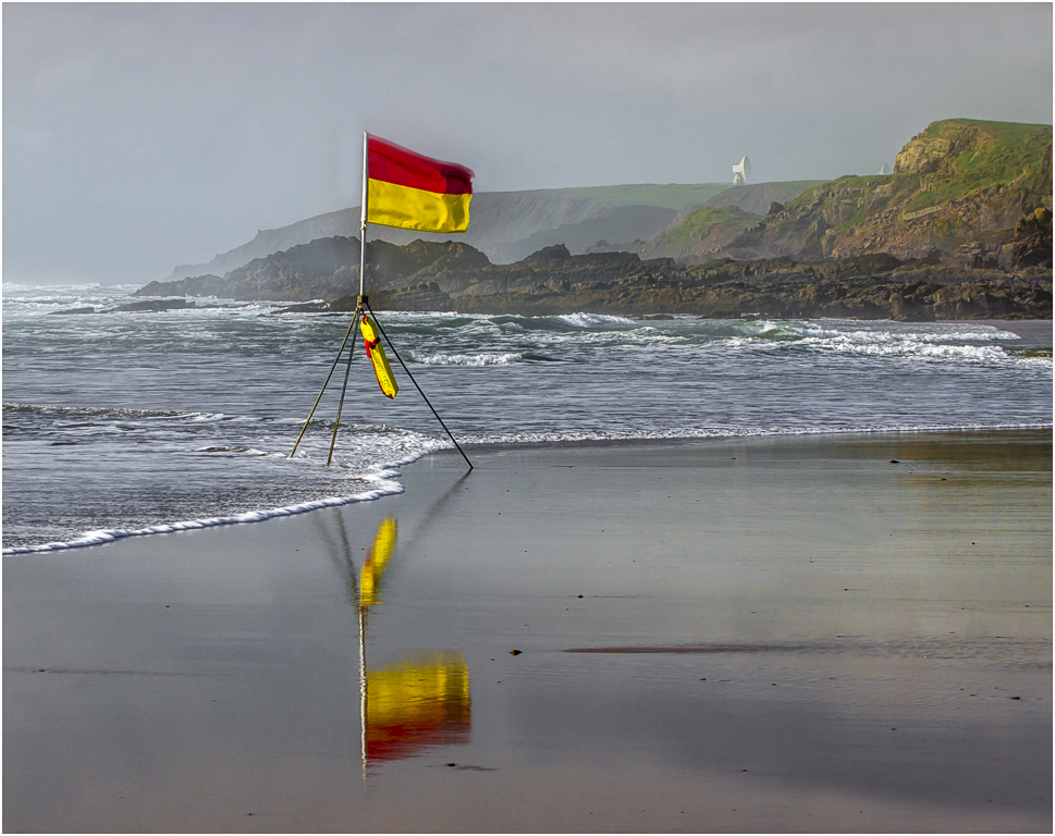
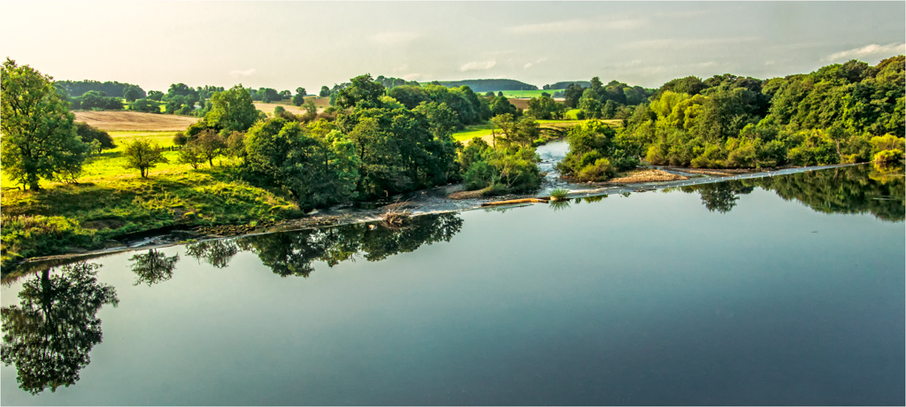
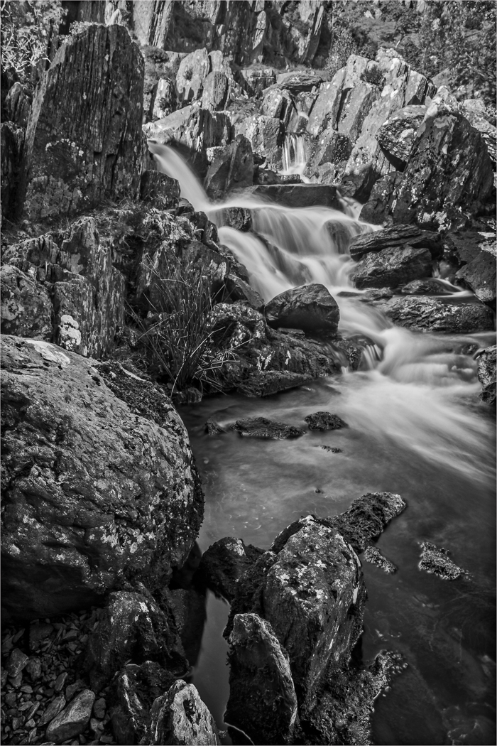
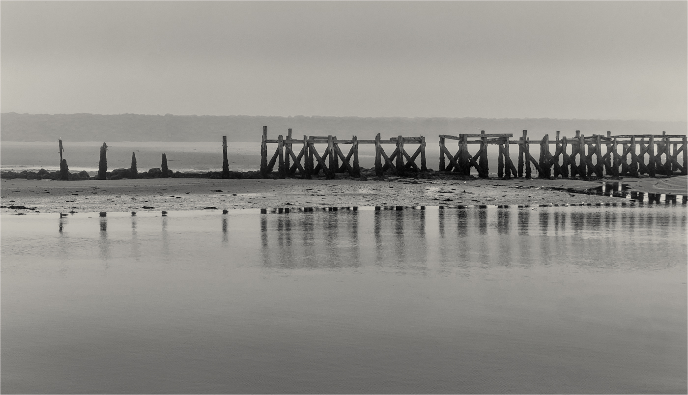
What makes this image is your dramatic angle you have chosen to take this picture that makes the viewer become part of the scene. The colours and tones are spot on and the water movement is just right. One little niggle, I would have liked about 5mm more on the top just to give the little more gap. But great Pano and do more if this is the result. |
Oct 18th |
| 33 |
Oct 18 |
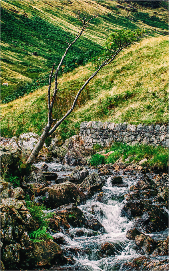
Comment |
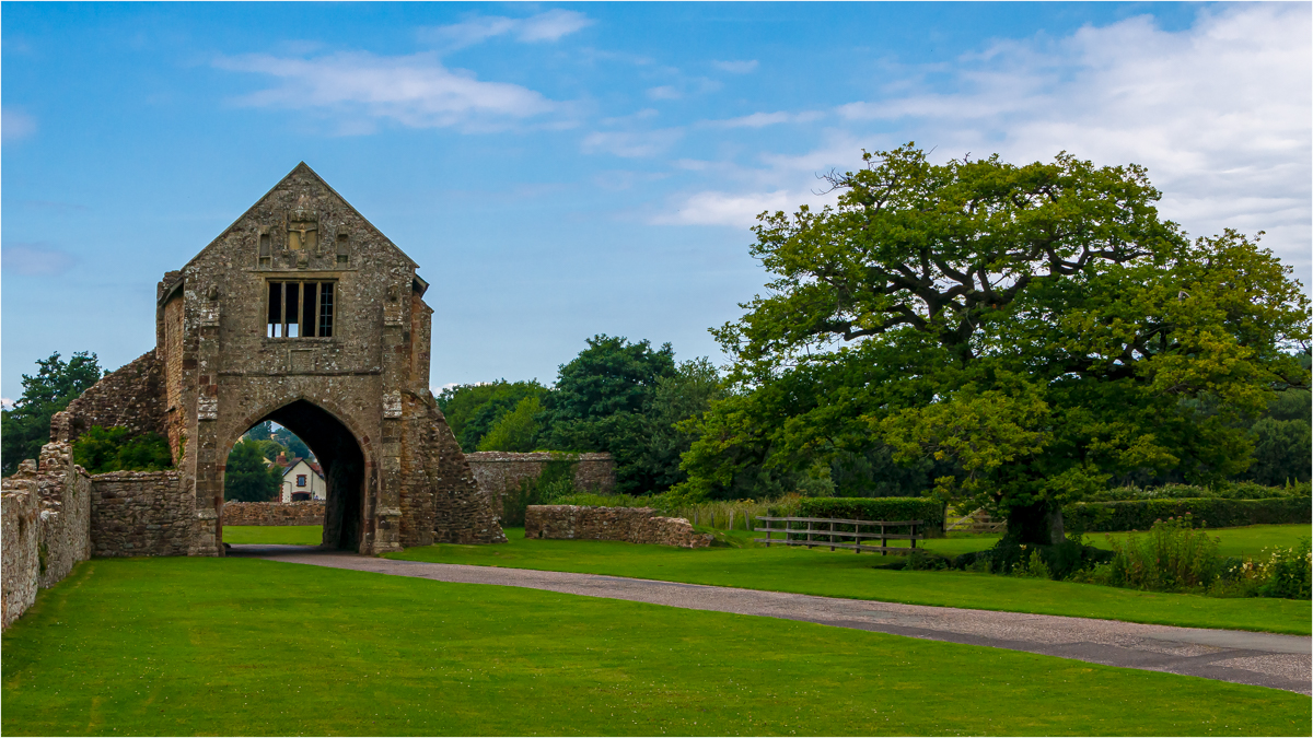
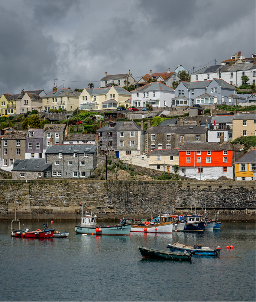
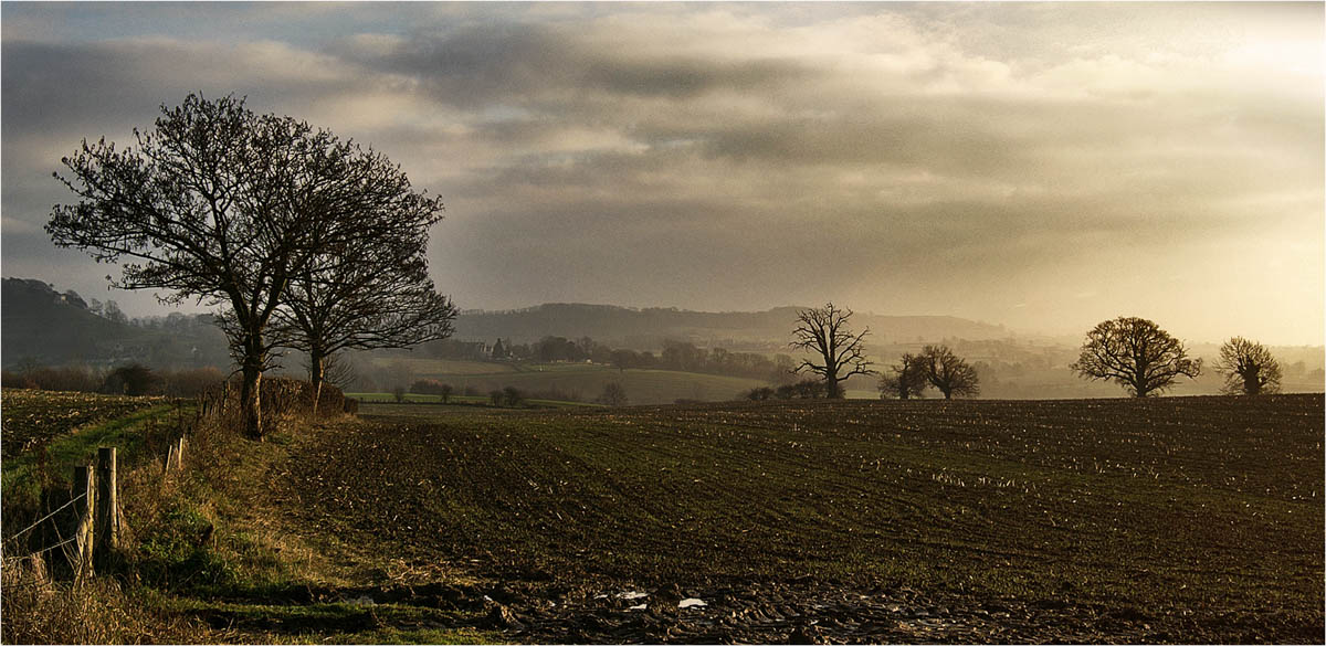
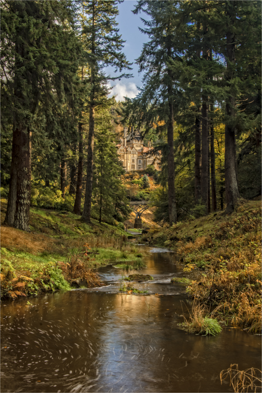
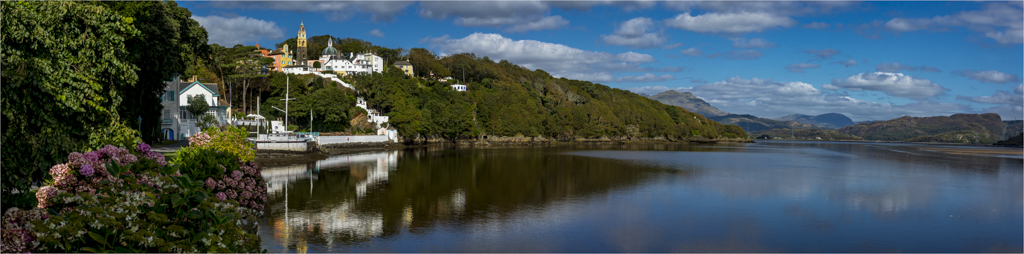
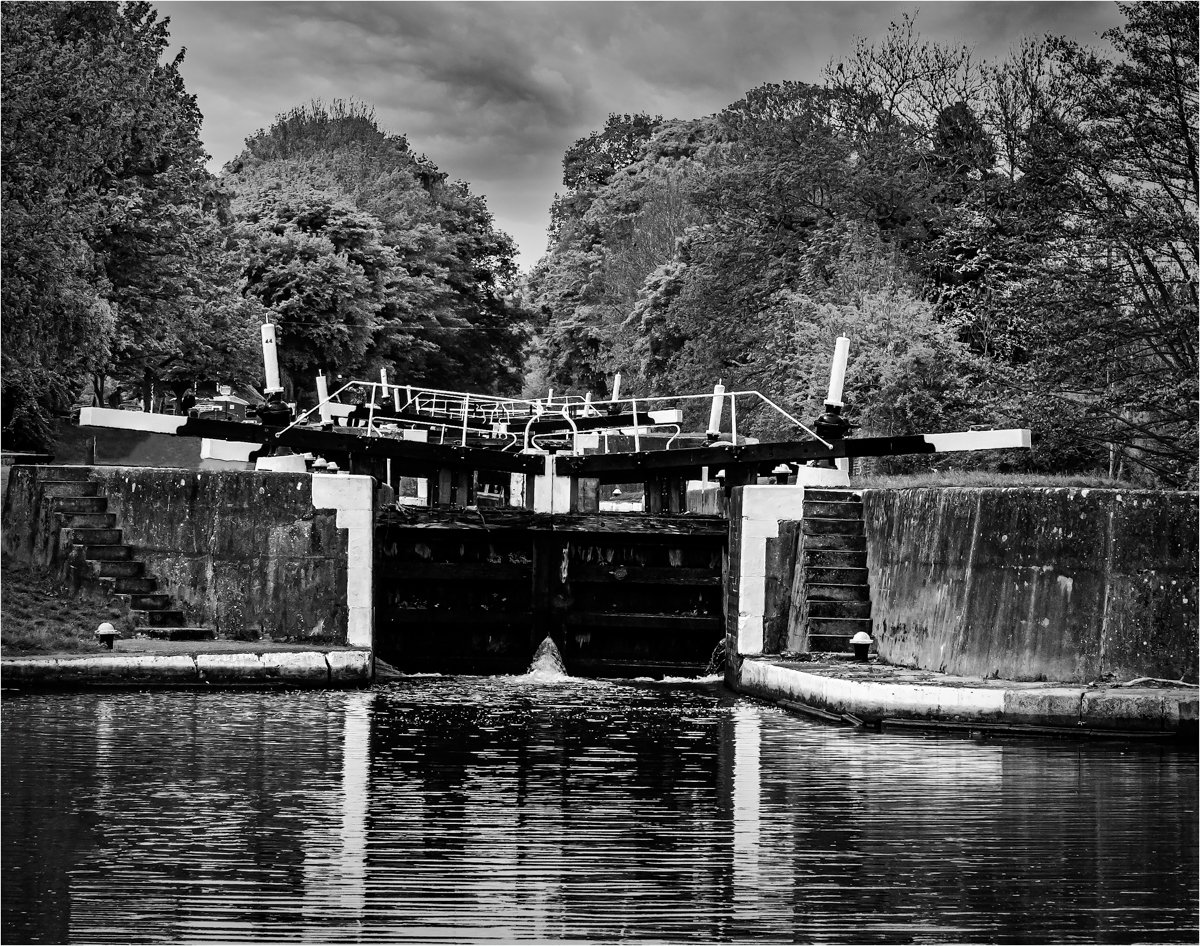
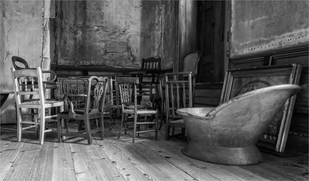
You have seen a pleasing image and have composed it well, I to would have like the tree to be whole and not so cropped. I am not going to say how you can fix the picture in front of me as I think you are fighting a losing battle.
There is a woodworking law that says measure twice and cut once and in a way this is also true about photography. We need to think of what we are taking and then take what is needed. With an image like this you are looking at an HDR or bracketed image to cope with the variation in light, shade, contrast and reflections. You are never going to get this right with one image and 95% of cameras are going to struggle with this. If this was me I would have looked at this and taken 4 images, Water, Sky, Bank and building and the rest. Then bought together in PS with Luminosity Masks.
Your focusing and the detail on the far bank is spot on but the light is just beating you. |
Oct 18th |
| 33 |
Oct 18 |
Comment |
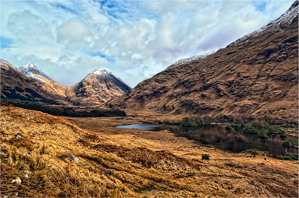
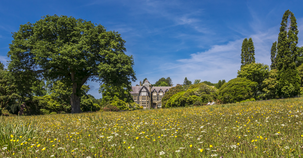
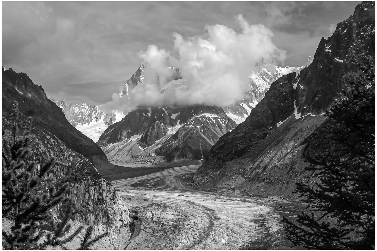
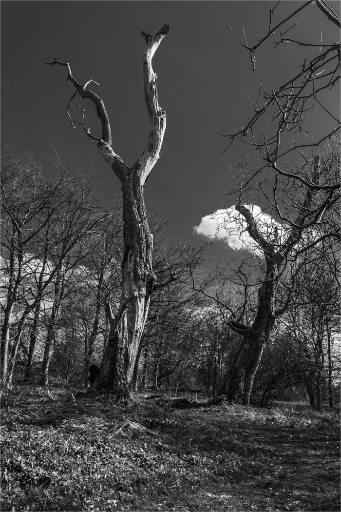
Well you have captured simplicity and the placement of the clouds are nicely done. The problem I have with images like this is the colour does start to dominate the image and for me this image is much stronger as a monochrome. |
Oct 18th |
 |
5 comments - 0 replies for Group 33
|
| 39 |
Oct 18 |
Comment |
I think this is quite a nice image, but I am not a fan of the tint. I am not so worried about the sky as I think if fits the feel of the image better as it is. But I do think this image is much better in monochrome as you do see so much more when you peel that colour away. I know that sounds silly but you do. |
Oct 18th |
 |
| 39 |
Oct 18 |
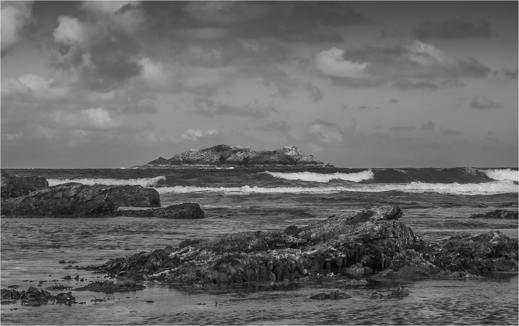
Comment |
For your first attempt at a 10 stop this is very good, the water and land is spot on and is full of detail and the water has a nice sheen to it. The sky is dynamic and I am waiting for the space ship to appear, but I find the sky does not suit the land and I may have taken two images and blended them together.
Very naughty to miss the large sensor spot in the middle of the image. F27 is a bit overkill where with this image F16 or even F11 would have done.
Vignette, I not going to tell you it wrong as you know it is now but after years of practice this is the best way of doing an vignette.
In Photoshop, Duplicate Layer (Control J). Press Control & M for curve pallet. Grab the right hand dot and pull down half way. (With practice you can very this to taist) then press ok. Select Lasso Tool and draw a lasso around the edge of image say 3cm in or to your taist from the edge. Press Shift F6 for Feather Tool and set 222 pixels. Do not tick box and press ok. Press control-shift-I to inverse selection. At the bottom of Layer Pallet Box press Add Layer Mask icon button to add layer mask this will add a mask of the feather. Adjust opacity to suit your taist. It is also fully editable as it is now masked. Worth a try and practice as it has done me well over many years.
|
Oct 18th |
| 39 |
Oct 18 |
Comment |
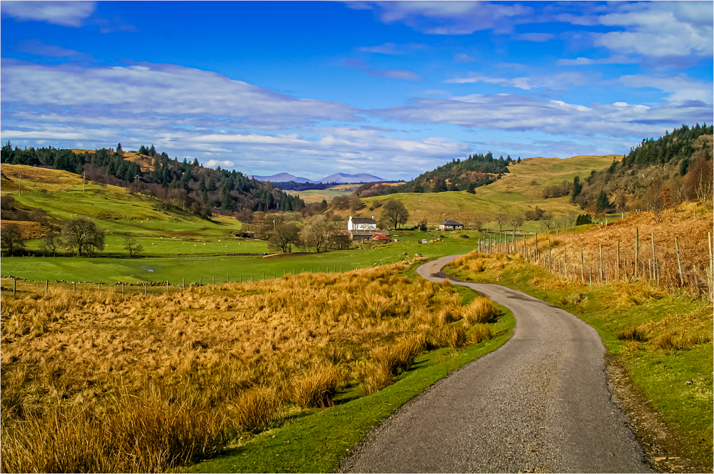
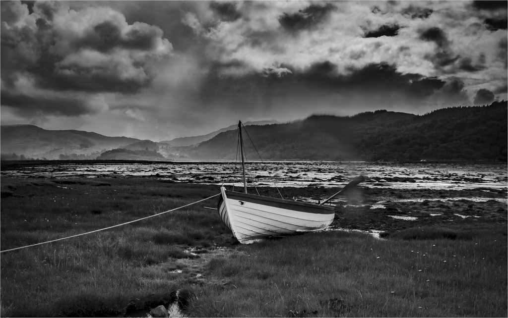
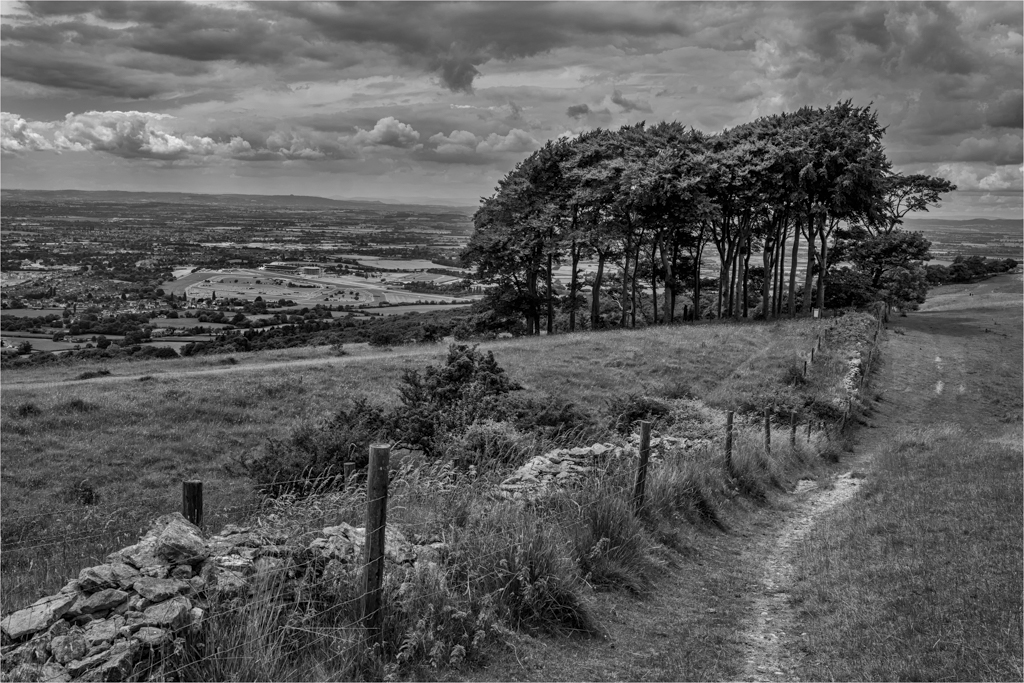
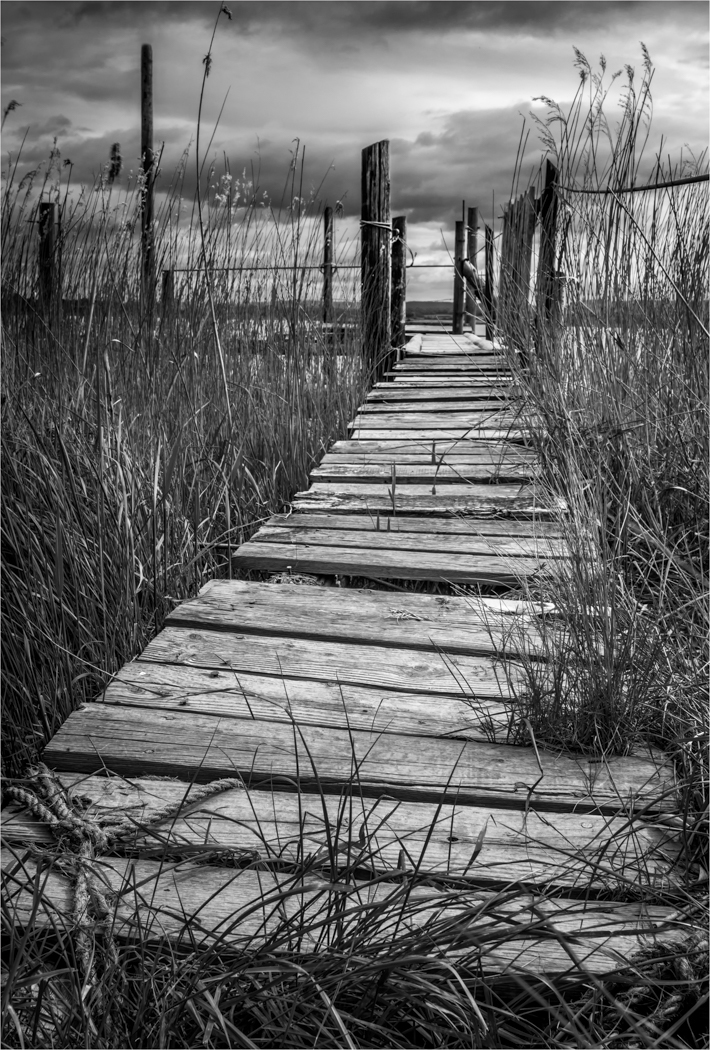
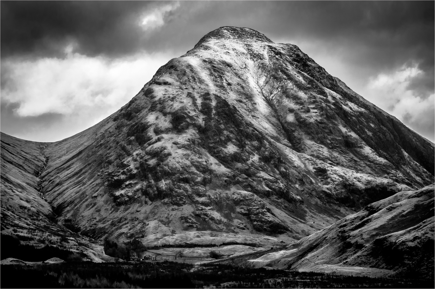
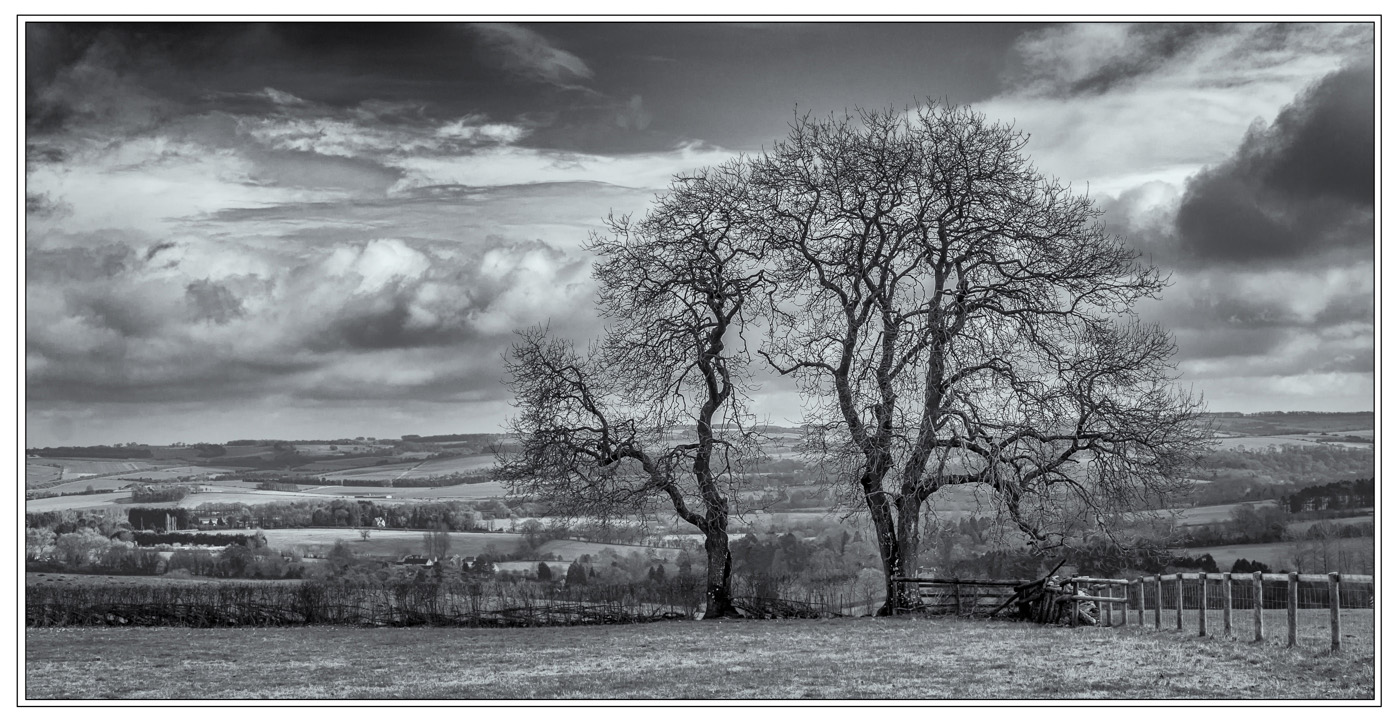
Very simple image with a tonne of drama. The landscape gods were with you with those clouds and you have composed the image well. I have to agree with the lower angle but that is only minor.
My one niggle and I apologies if its because of the low res files, but I would love this image to be sharper as I would like the fence sharp. But well seen. |
Oct 18th |
| 39 |
Oct 18 |
Comment |
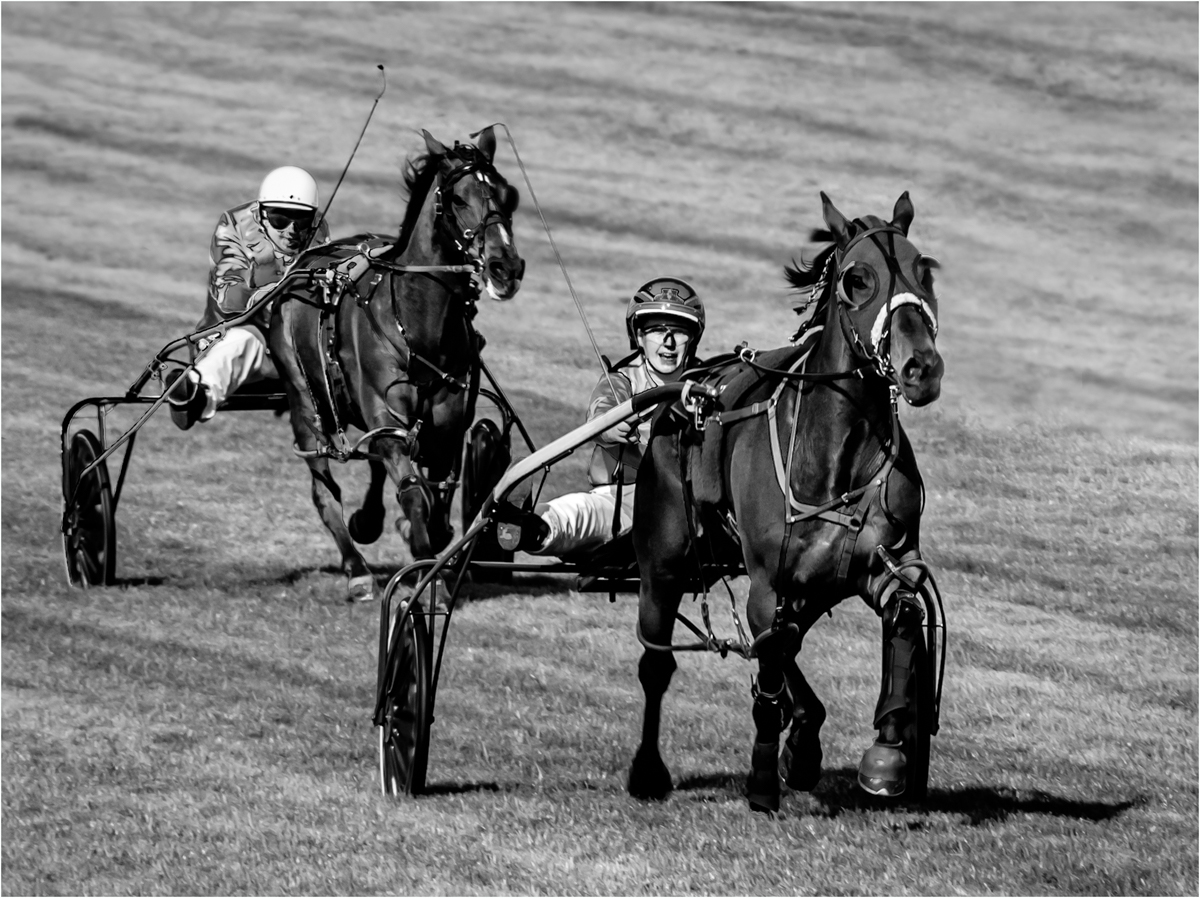
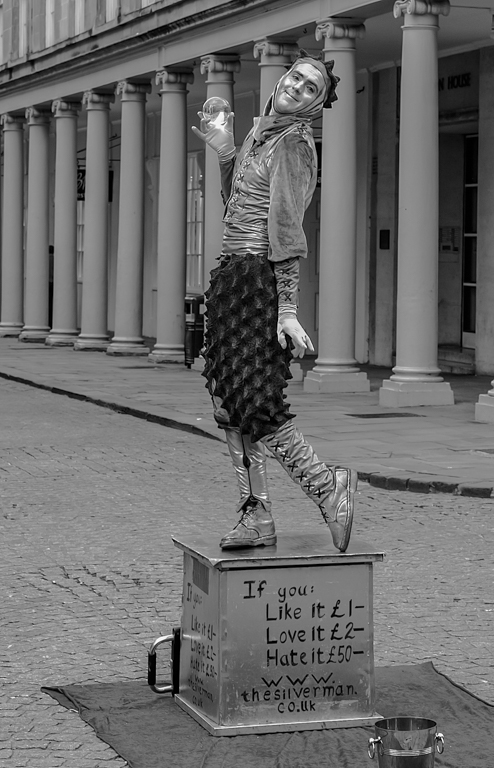
I think the concept of this image is a good one, but I think the image taking has been missed slightly. The composition is good but there is not a specific area for the viewer to stop and look at then view the rest of the image. I agree that a shallow DOF would work with this image but I think those first two camel feet need to be pin sharp for the viewer to be drawn into the picture.
I also think a little subtle tonal work could be done to draw the viewers eyes. They do need all the help you know. |
Oct 18th |
| 39 |
Oct 18 |
Comment |
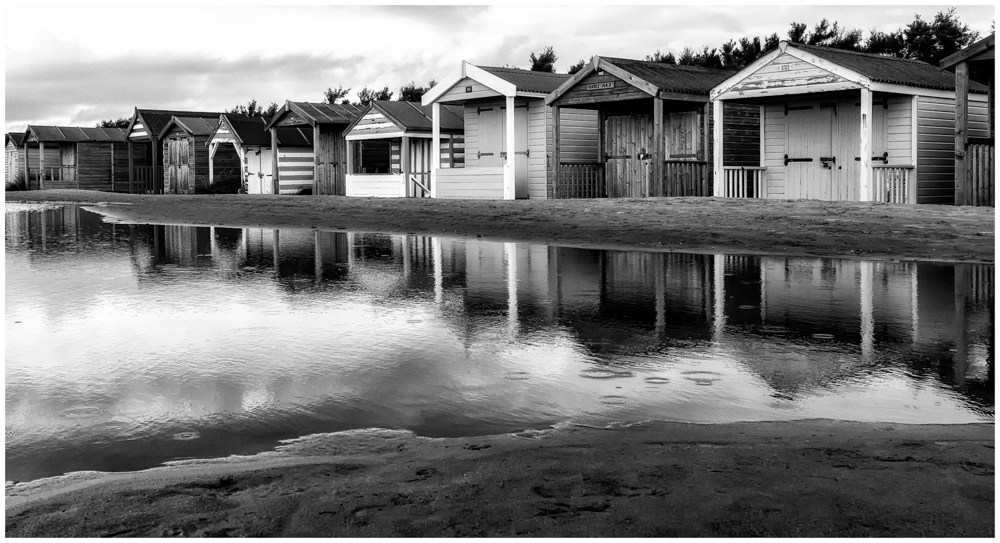
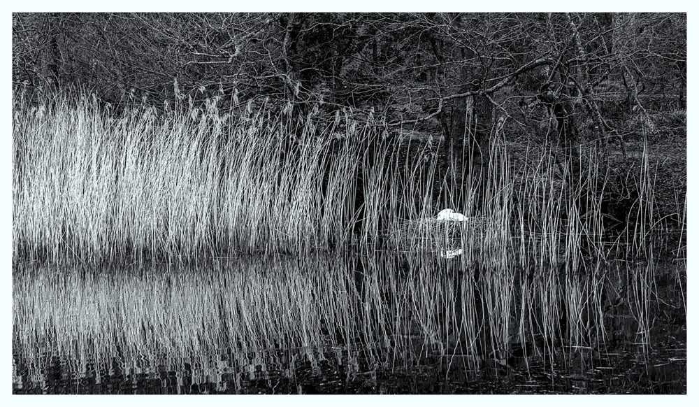
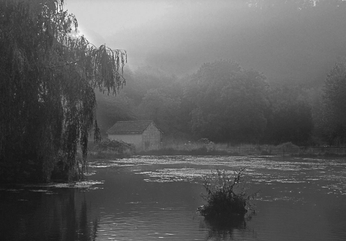
I am quite amazed when viewing the monochrome and colour versions together how much the colour version foreshorten the image. The mono image gives the feeling of space and scale and the placing of the boat house in the centre works really well.
The detail and tones you have held in the trees and the subtle tones in the reflections do compliment to harshness of the bright boathouse. Pleasing picture. |
Oct 18th |
| 39 |
Oct 18 |
Comment |
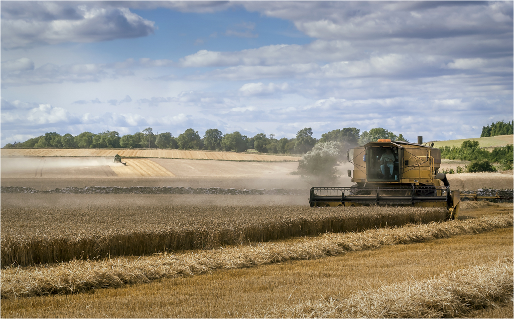
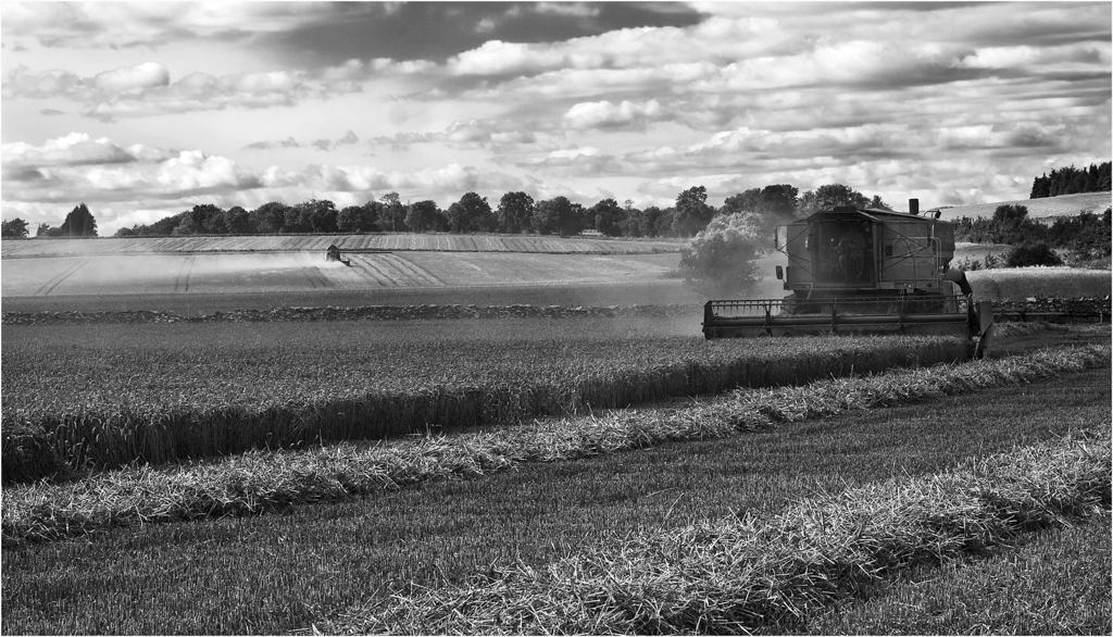
Your going to hate the for comment, I hate toned images. But for once this works and is so much stronger than the straight monochrome image. What I also like about the toning is the affect that has appeared in the wheat and sky on the left where you seem to have a ghostly mist forming like the soul of the wheat leaving.
The birds are so important to the image as it adds scale and balance. I have to say I like the item on the right as it gives somewhere for the combine to send the corn or it would be putting it straight back into the field.
This image really works and for me is made by that affect of mist. Well done. |
Oct 2nd |
| 39 |
Oct 18 |
Reply |
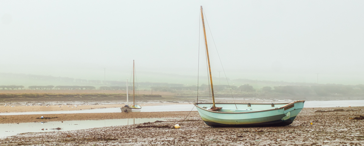
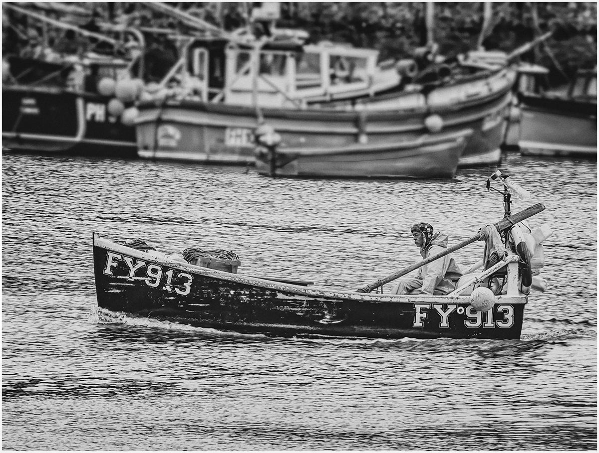
The blur on the oar is a rain drop on the lens but I left it as I liked the effect, but the blur in the middle is rain, few mins later I was sitting in the car and could not see the boat for the rain that was hitting the car. |
Oct 2nd |
6 comments - 1 reply for Group 39
|
11 comments - 1 reply Total
|