|
| Group |
Round |
C/R |
Comment |
Date |
Image |
| 33 |
Feb 18 |
Comment |
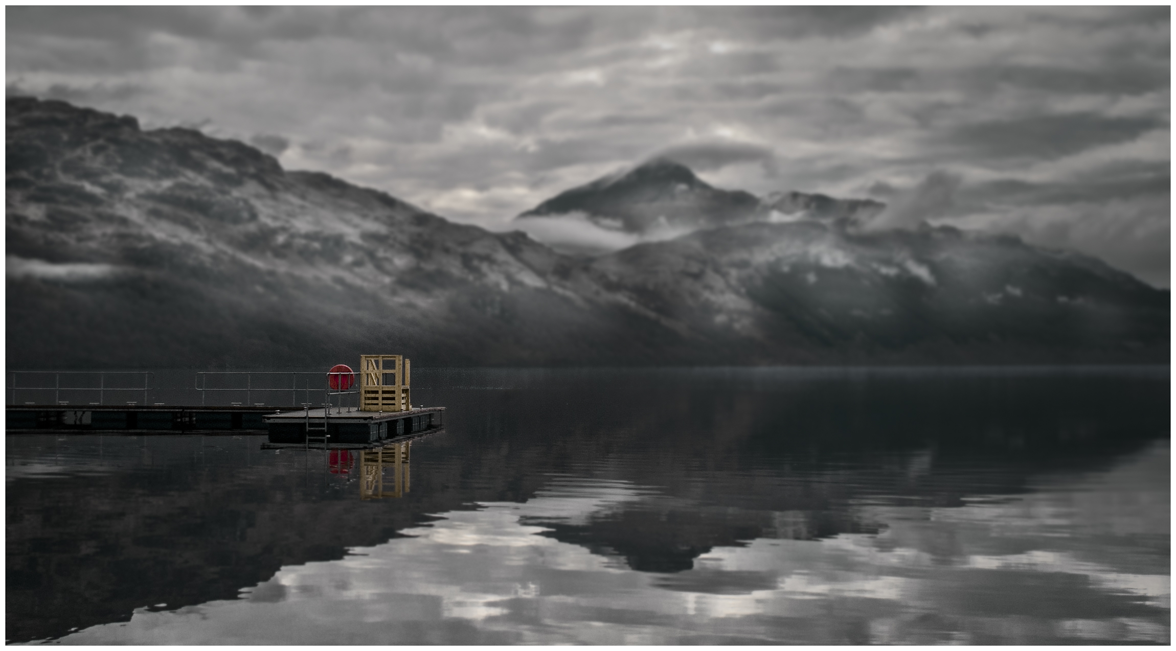
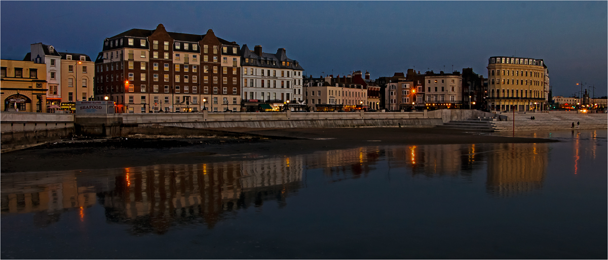
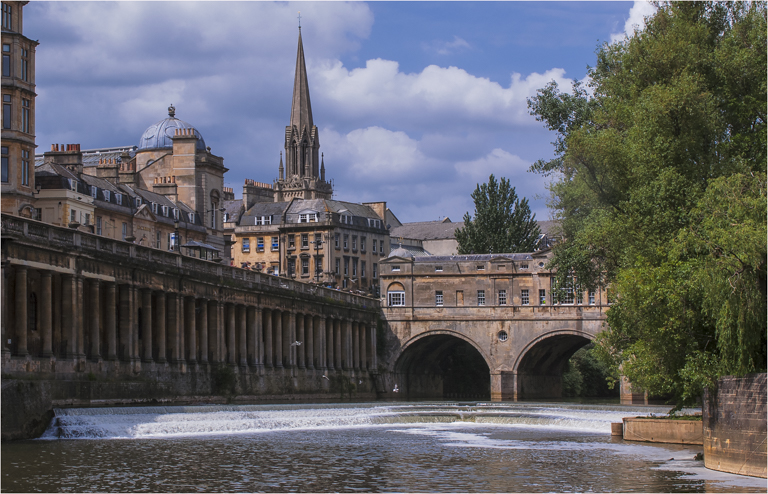
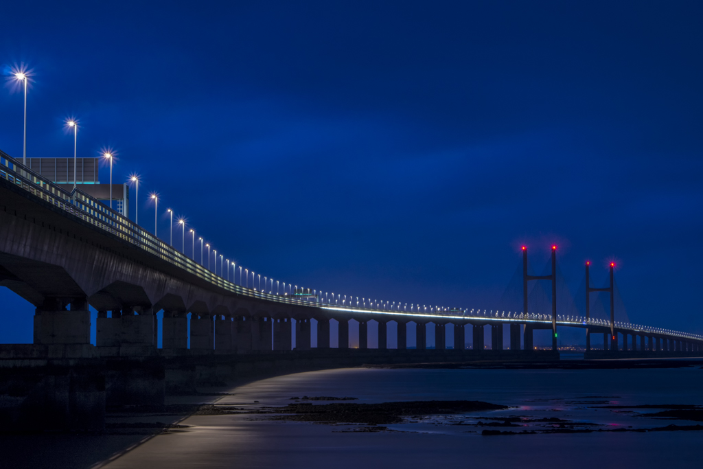
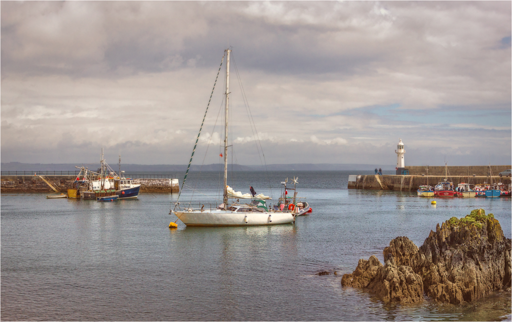
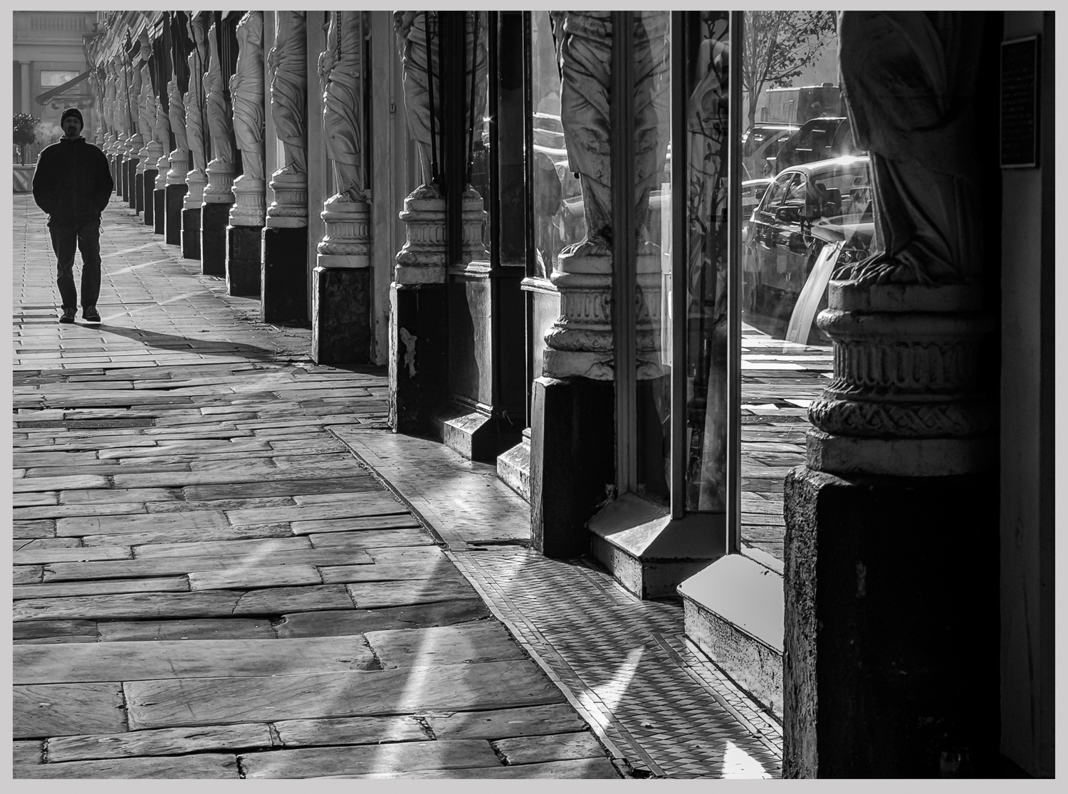
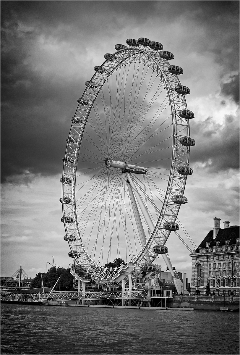
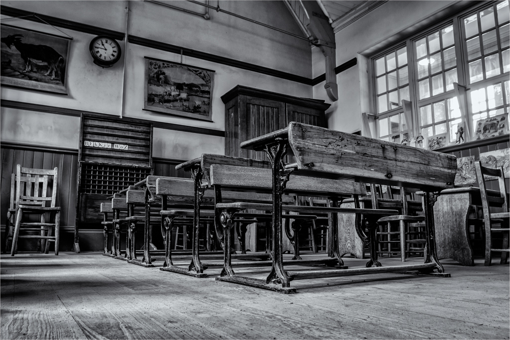
I am going to break this down into two parts. The taking. I like you composition and the use of those three tower like things. The placement of the strongest building on the left vertical third is very good and it is a great viewpoint of the city. I do question in my head if I would like to have more on the foot to allow more of the reflection to lead me into the image and lose a touch of that heavy sky on the top left that is just fighting the main building a touch. But that is only minor. Your long exposure is very brave and have produced a nice effect, but looking at the image I get the feeling that there is just a touch of tripod movement. But a great effort in the taking.
But when I view the image I do get the feeling that it has been over processed. You have the hard white lines on the edge of the builds (very noticeable on the dark building). I find it very grey and does lack in contrast. I also find parts of the image very soft where they should be very rigid. But reading your description I do wonder if you had done to much.
I do think this is a dramatic image that I hope you will try again and again, I also hope to see a night shot of this one day. Very good effort. |
Feb 16th |
| 33 |
Feb 18 |
Reply |
If you use Lightroom, use the export command as it is much better than Photoshop. But this is much better to use. But I do think it is time that the PSA caught up with the rest of the world. |
Feb 16th |
| 33 |
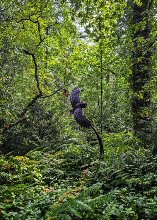
Feb 18 |
Comment |
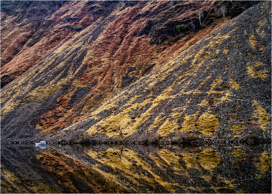
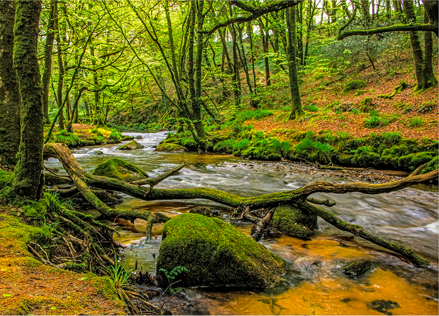
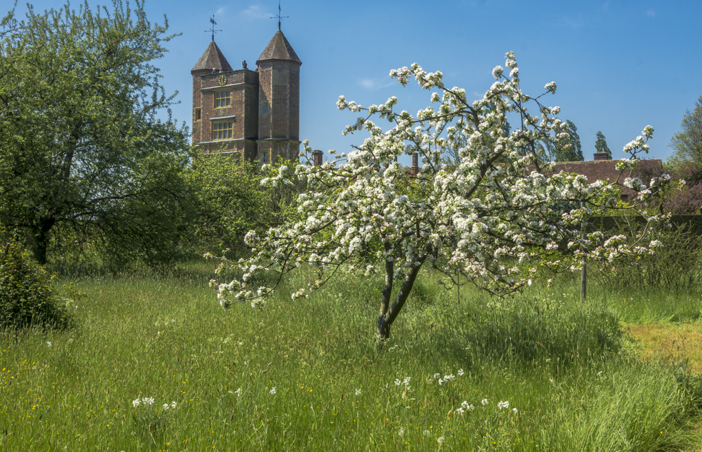
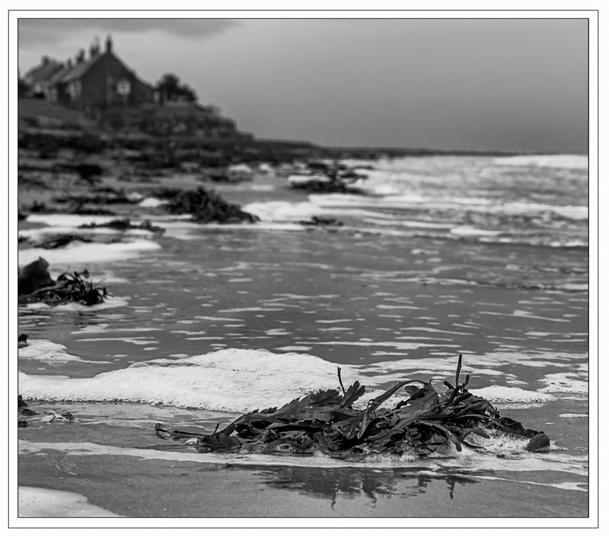
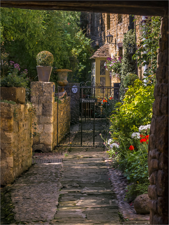
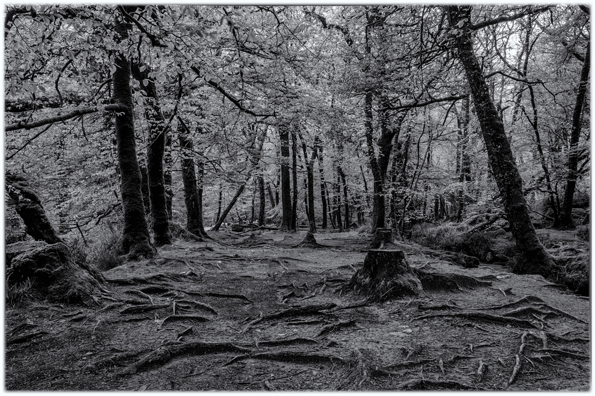
Taking the branch out was a good move as the space allows the viewer to enter the image from the bottom to the top. I think your image is nicely balanced. |
Feb 14th |
| 33 |
Feb 18 |
Reply |
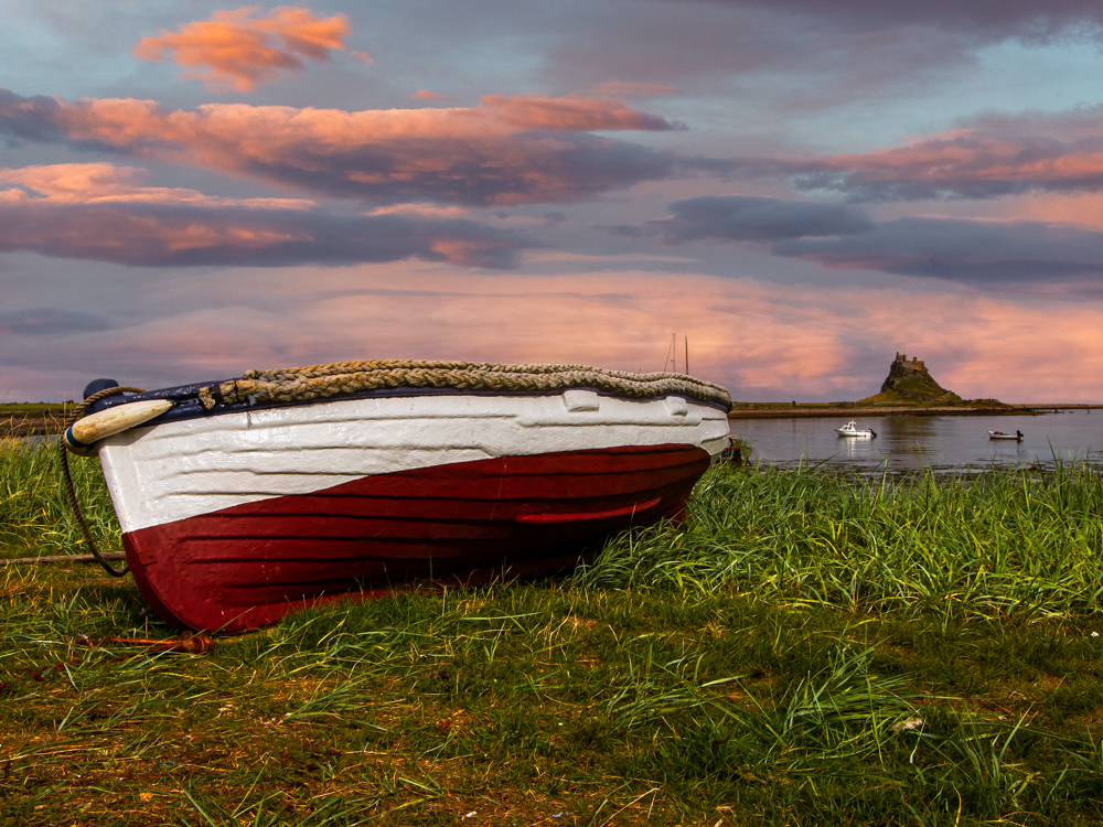
I would not make it brighter as it would draw the eye, at the moment it acts as a good scale and for my acts as a good anchor for the image. |
Feb 14th |
| 33 |
Feb 18 |
Comment |
Dan I see from your comment that you sent in with the wrong preset, you have the option to add an image in the comments, could you add the image with the right preset before I comment on the image. |
Feb 13th |
| 33 |
Feb 18 |
Comment |
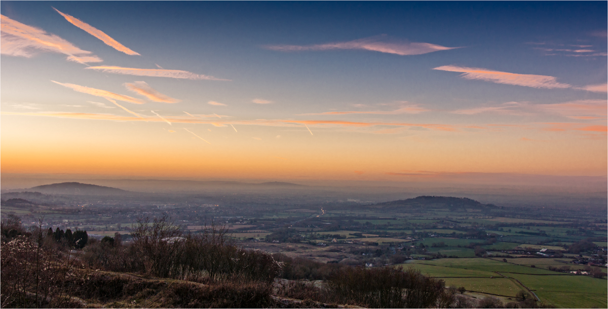
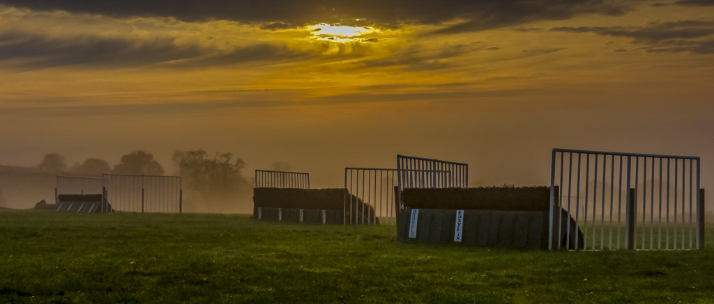
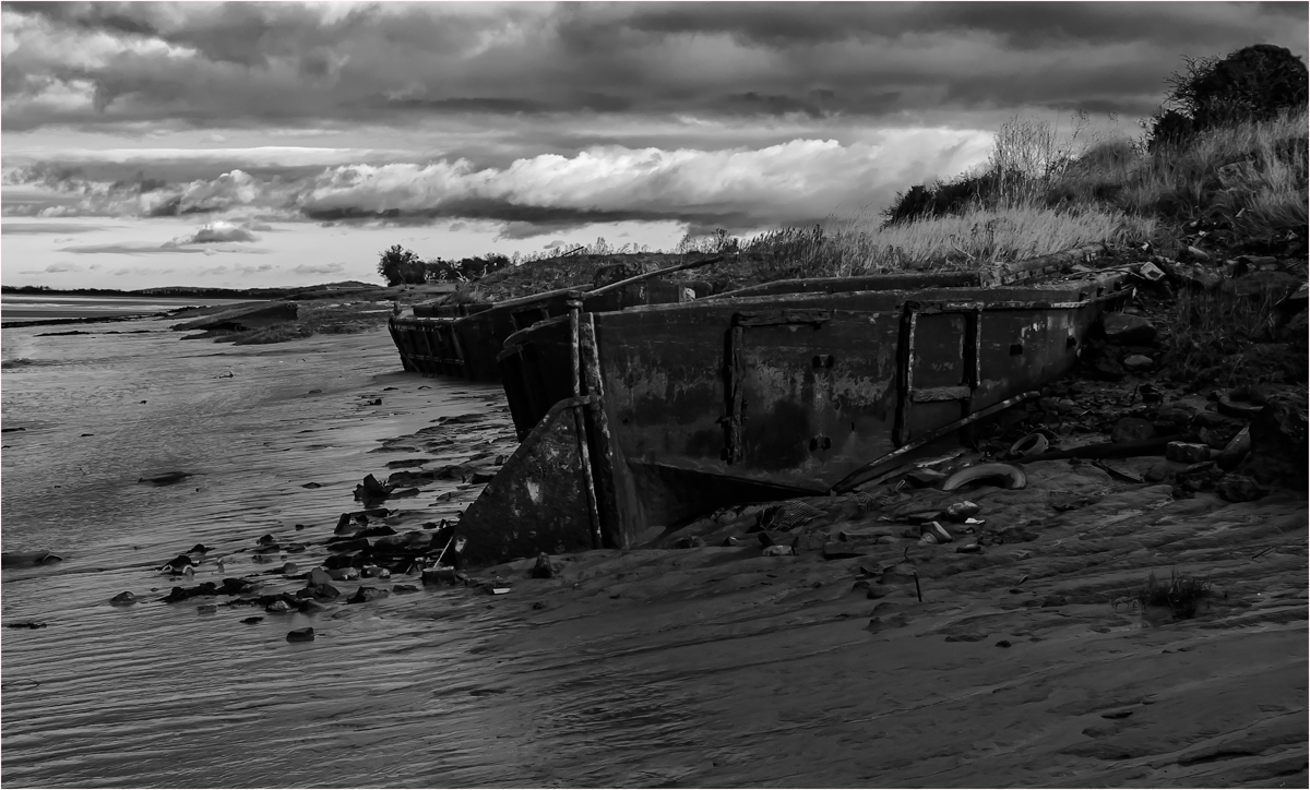
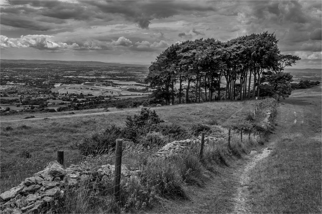
Oh my did you take a chisel and hammer with you as those clouds are fantastic. Can see why you stopped and took this, Beautiful colours and tones with nice lead by the dirt road. But those clouds are brilliant. |
Feb 13th |
| 33 |
Feb 18 |
Comment |
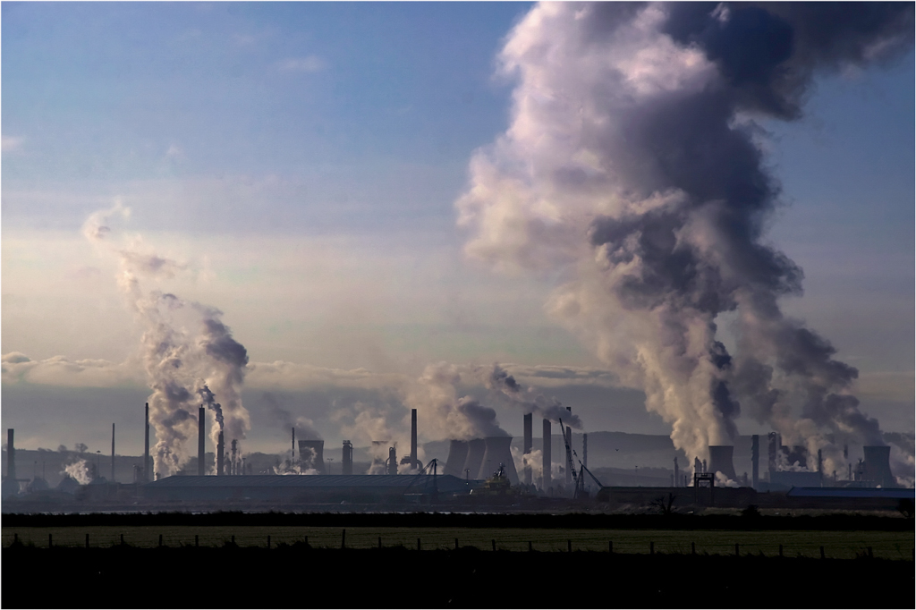
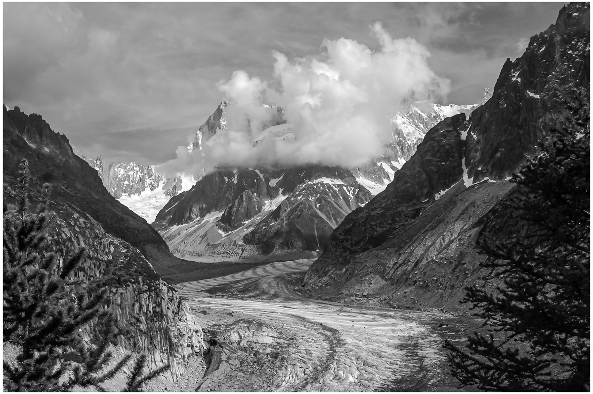
Sorry I can only be honest, I think you found a great subject for an image that is cry out for a long exposure full of detail colour or black and white image, but for me not and IR image that has filled in all the detail that I would want to see in this picture. |
Feb 13th |
| 33 |
Feb 18 |
Comment |
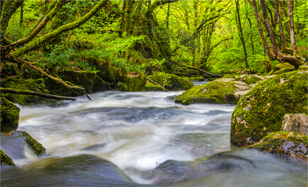
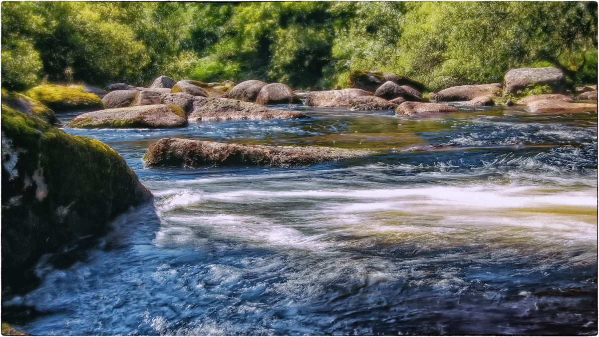
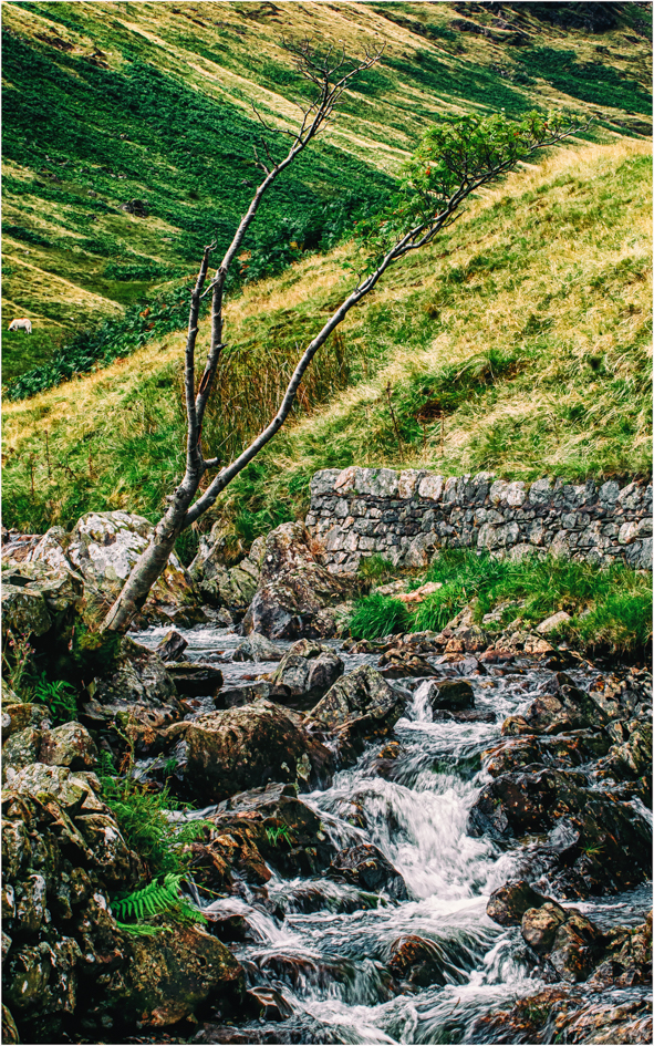
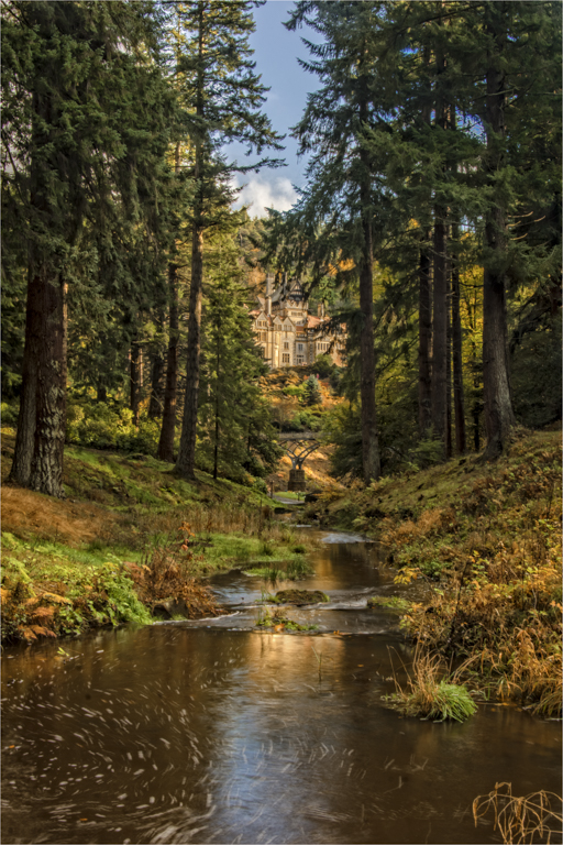
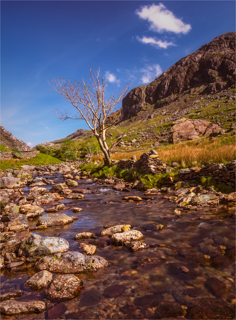
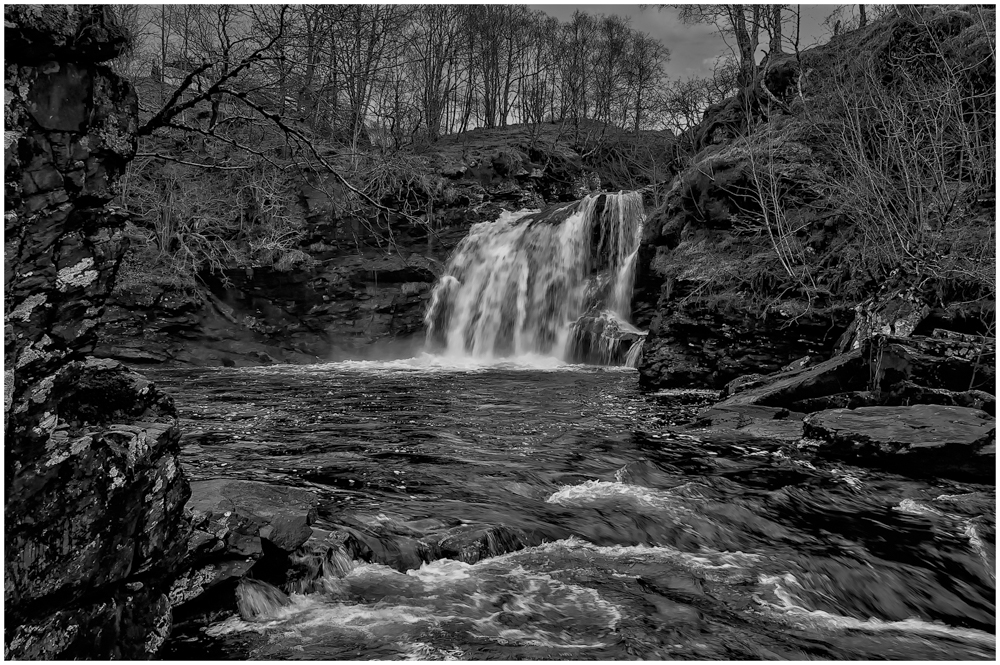
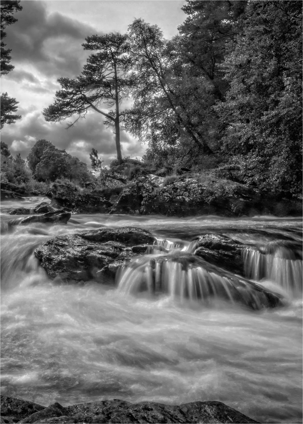
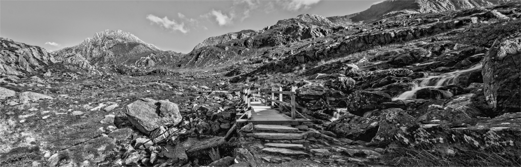
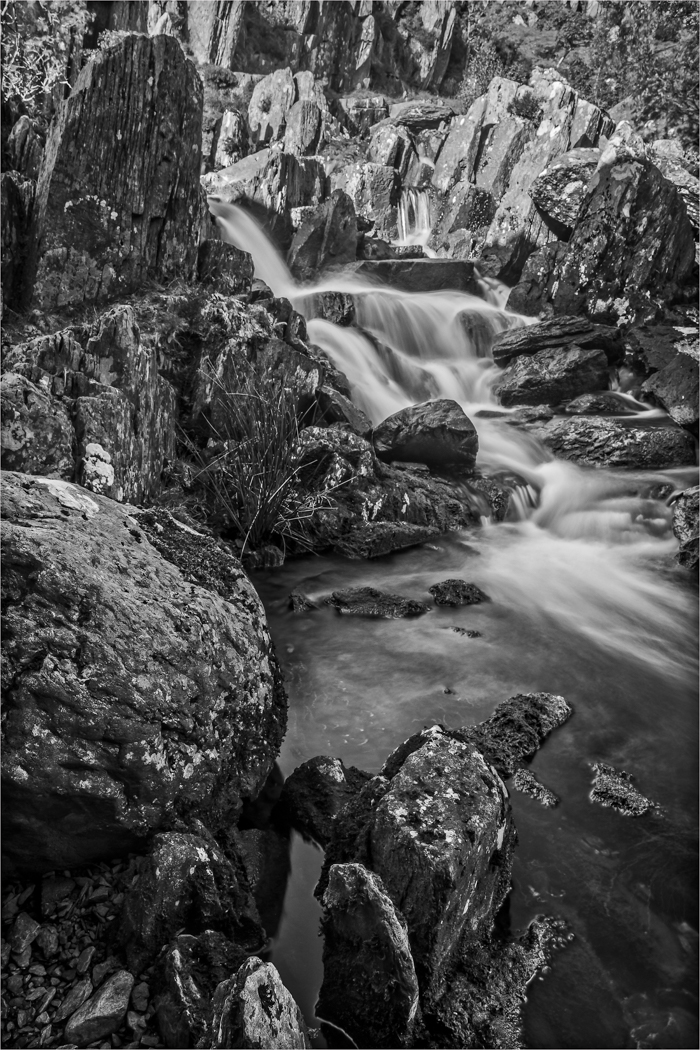
You have a lovely timing to this image and with the water just milky enough to give all the detail you want but to have that lovely flow. The surrounding rock are lovely colours a detail with some very good texture. The leaves tones and colour are spot on and balance the image just right. The only thing I would do is remove the horse shape scratch in the rock top left as it draws the eye. Very nice image. |
Feb 13th |
| 33 |
Feb 18 |
Comment |
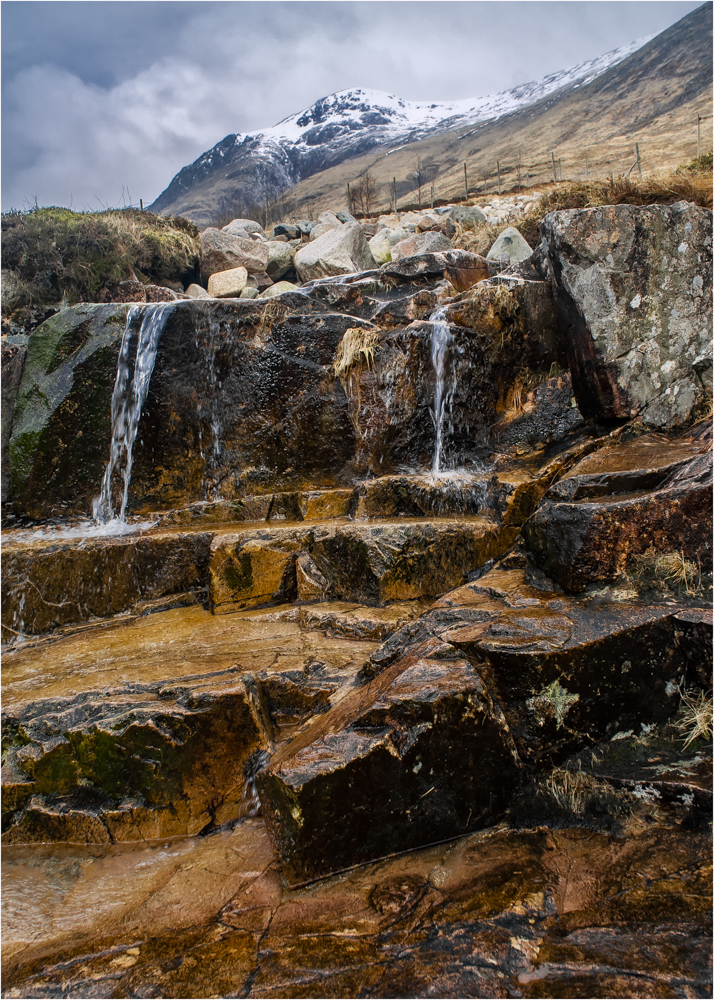
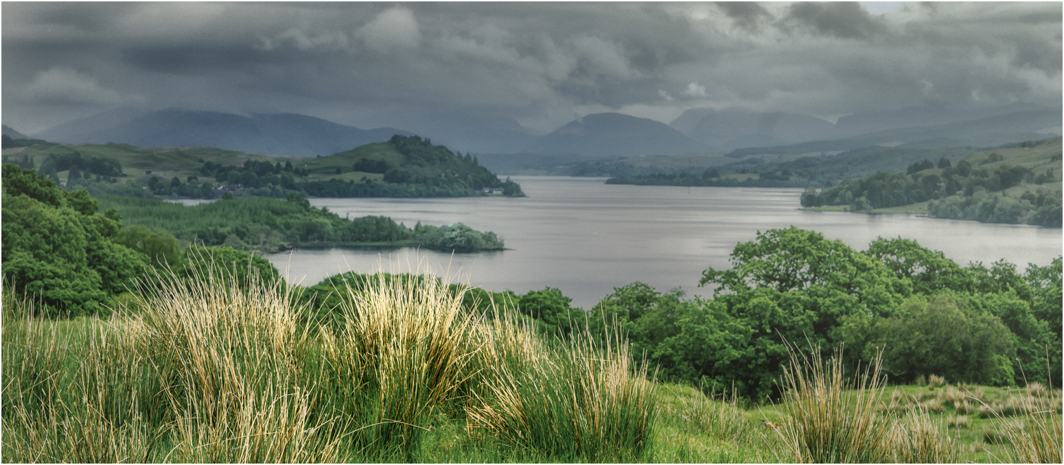
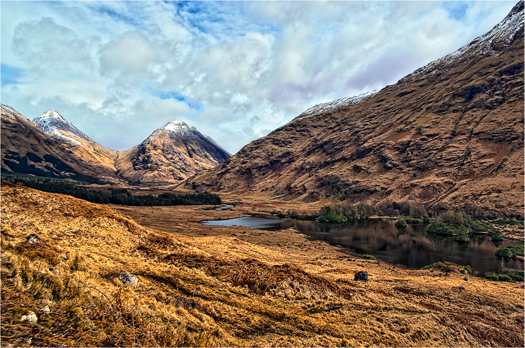
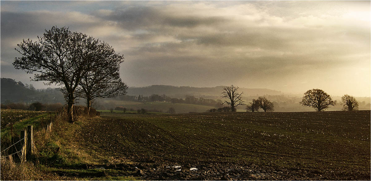
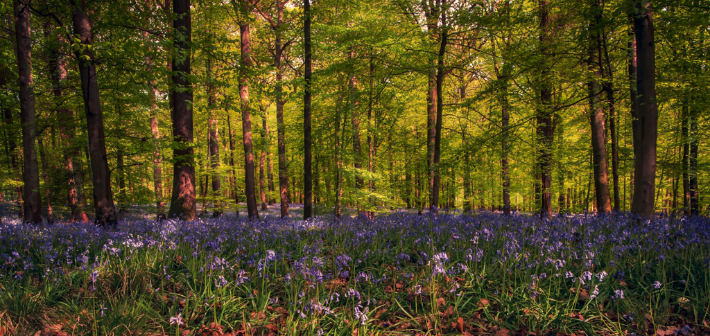
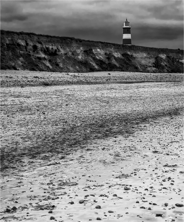
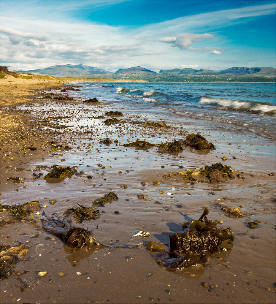
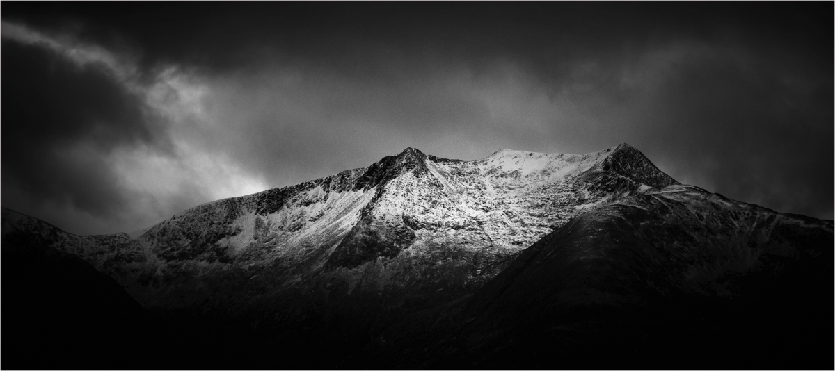
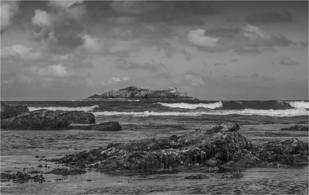
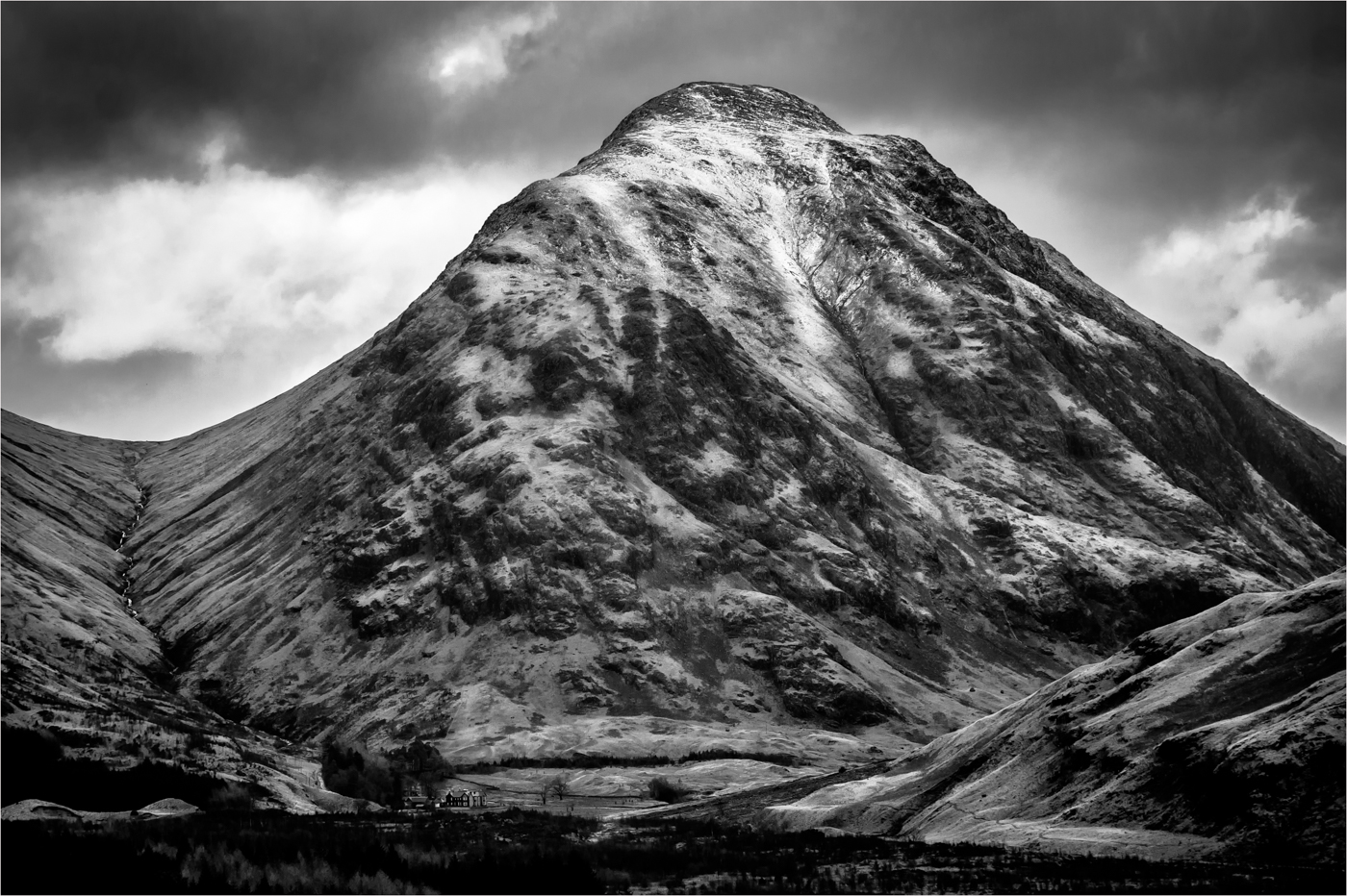
You have seen and composed a good seen with good flow from top left to bottom right. There is good tonality in the image, but I do think that you highlights are blown out on the central rock face. The cloud in the top right is so important for me as it anchors the image and in a way gives a sense of scale. Very pleasing image to view. |
Feb 13th |
7 comments - 2 replies for Group 33
|
| 39 |
Feb 18 |
Comment |
Firstly you have not given us any information of your table set up, is this window light? What is your background? I would love to know the distance of the black background from the vase? I agree this image needs a stroke line.
Composition of the vase and flowers is very good in the frame, the contrast of the lighting of the heads is quite nice. You have just got a touch of blow of on a couple of heads. I do think it could be a tad sharper, those front flower heads need to be pin sharp.
If I was taking this image I would have had a 4 to 6 foot gap between the vase and the background, I would then put a soft snoot onto the background, you can do the same effect with one of those small point torches, this would just help with the separation from the background and would give a more 3D effect. But this is a very good effect and would do very well in club competitions. |
Feb 19th |
| 39 |
Feb 18 |
Comment |
Have to agree with David here. This is a very nice image, that could be improved with one of your favourites in Silver Efex. I would like Selenium 2. I know we are a black and white circle but this image in colour is magic, that glow on the foliage is just magic and is one of those images you should print big and hang on the wall. |
Feb 13th |
| 39 |
Feb 18 |
Comment |
What a great idea for an image, guest what I am going looking at in a different way. Your placement in the centre of the frame works and I love the way the next four pylons are just poking their heads over the horizon. However I think this needs some work. You looks at this image and it is dominated by the bright sky at the top of the image so I would crop to just below that. If I was taking this I would have included a touch more ground just to give the image a bit more base to work with. I also think this image would benefit from tonal adjustment and I recommend you investigate luminosity masking. This will allow a much cleaner balance to the sky while keeping the image looking natural. View Shaun Bagshaw on YouTube or look up Tony Kyper. |
Feb 13th |
| 39 |
Feb 18 |
Comment |
Sorry to hear about Carol hip replacement, hope she recovers soon. This works as an image, with some lovely detail in the main head part and some great tones throughout the image. I like the way the out of focus acts as leads flows into the centre area. I would not crop the image, yes it would lose some of the blur area, but it then makes that out of focus flower head jutting out at the bottom of the head very dominant in the frame and spaoils the image for me. The picture is well balanced at the moment. Nice picture, make good card. |
Feb 13th |
| 39 |
Feb 18 |
Comment |
I am always amazed when doing quiz nights and you get the questions "What country has the most camels" and the shock on peoples faces when they find out its Australia.
You have captured a great picture of the camel motorway with the lead group being pin sharp, the dust is adding nicely to the whole atmosphere. I find the main group a tad dark and wonder if there is more detail that could be pulled out from them. I do agree that a light cloud or a distant mountain range would be nice to fill that blank sky. But not something you would see driving up and down the M4. Nice picture, thank you for sharing. |
Feb 13th |
| 39 |
Feb 18 |
Comment |
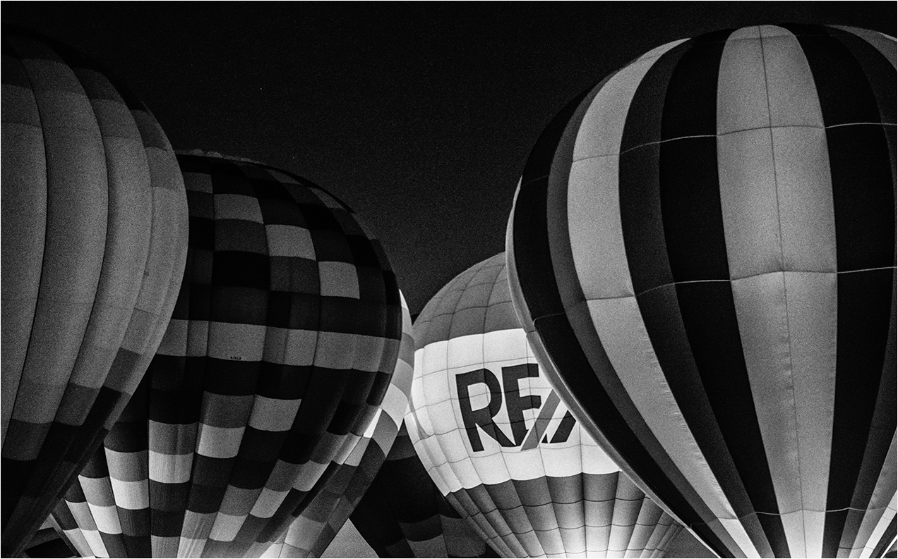
You have chosen a good view point and the lead to the centre is very good with the main interest of the bright area and the lettering. I like the checkering on the left balloon, but I find the left-hand side a touch heavy and could be cropped. I don't think the moon adds anything to the image a could be removed. |
Feb 13th |
 |
6 comments - 0 replies for Group 39
|
13 comments - 2 replies Total
|