|
| Group |
Round |
C/R |
Comment |
Date |
Image |
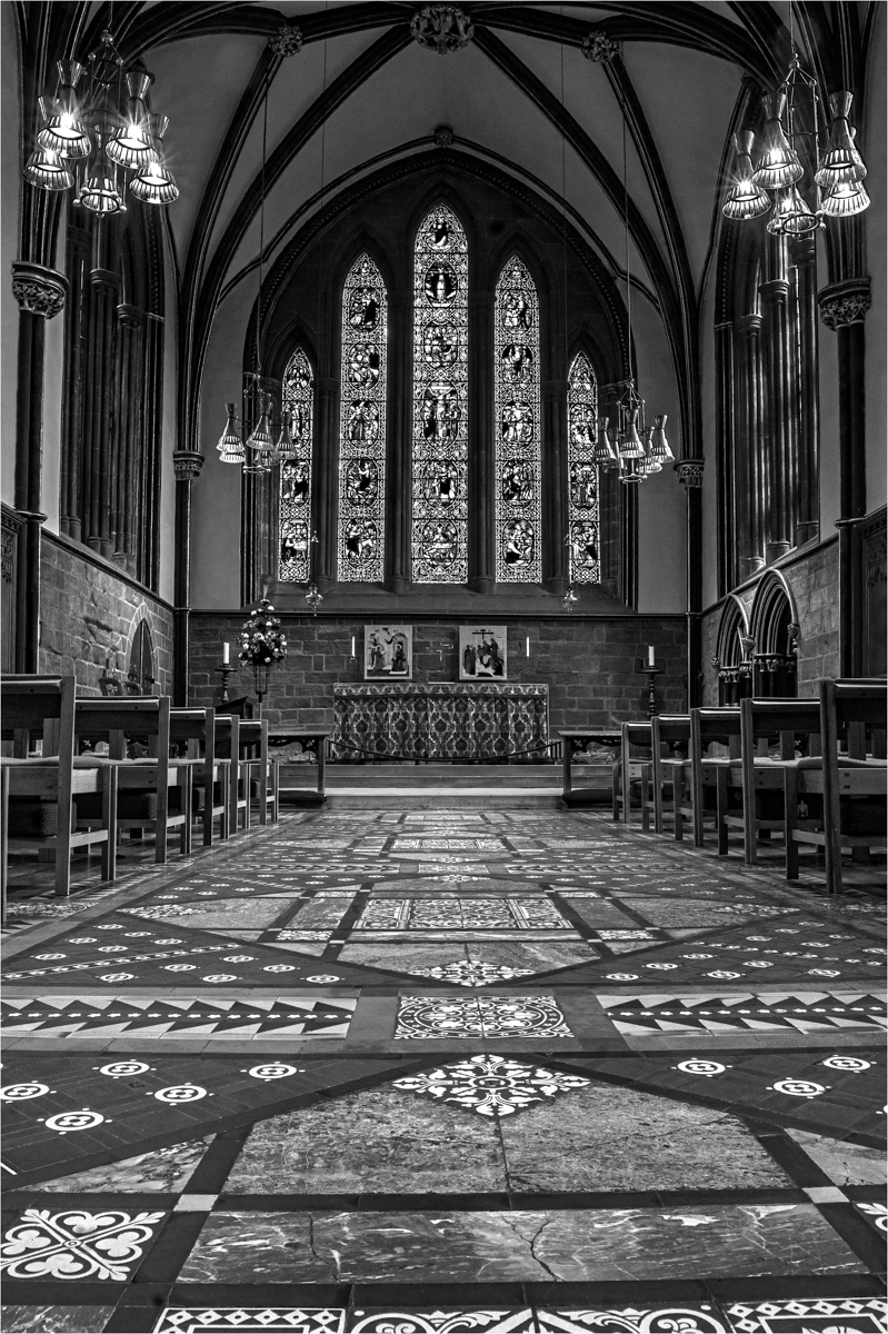
| 33 |
Feb 17 |
Comment |
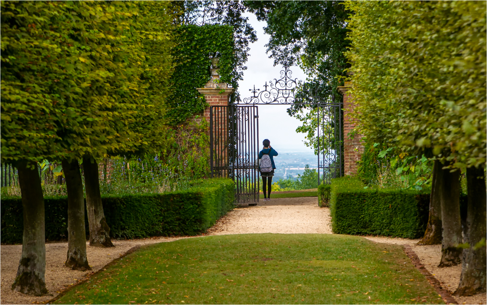
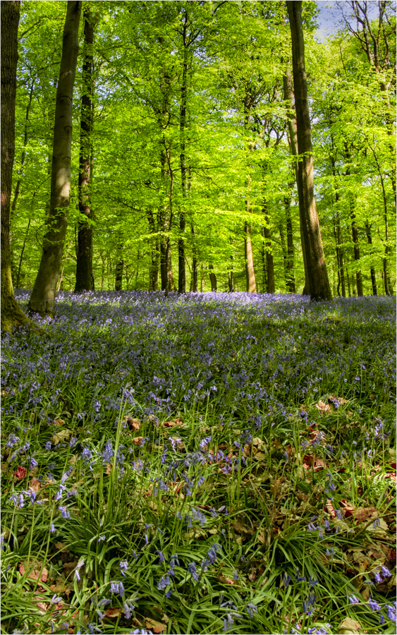
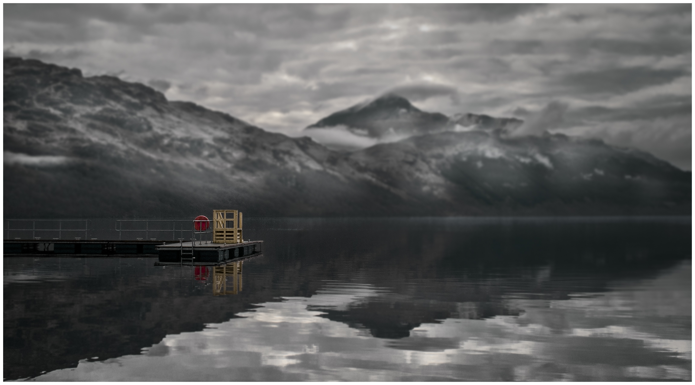
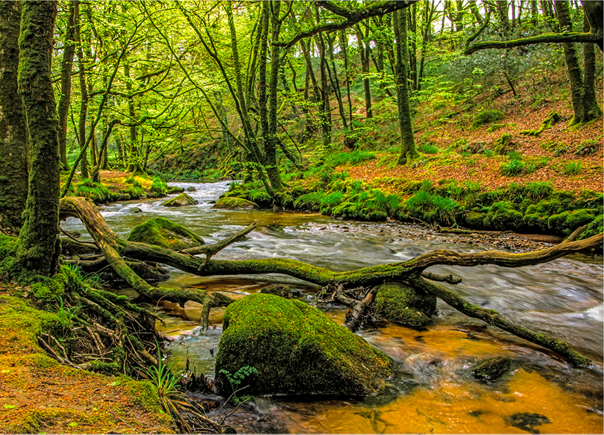
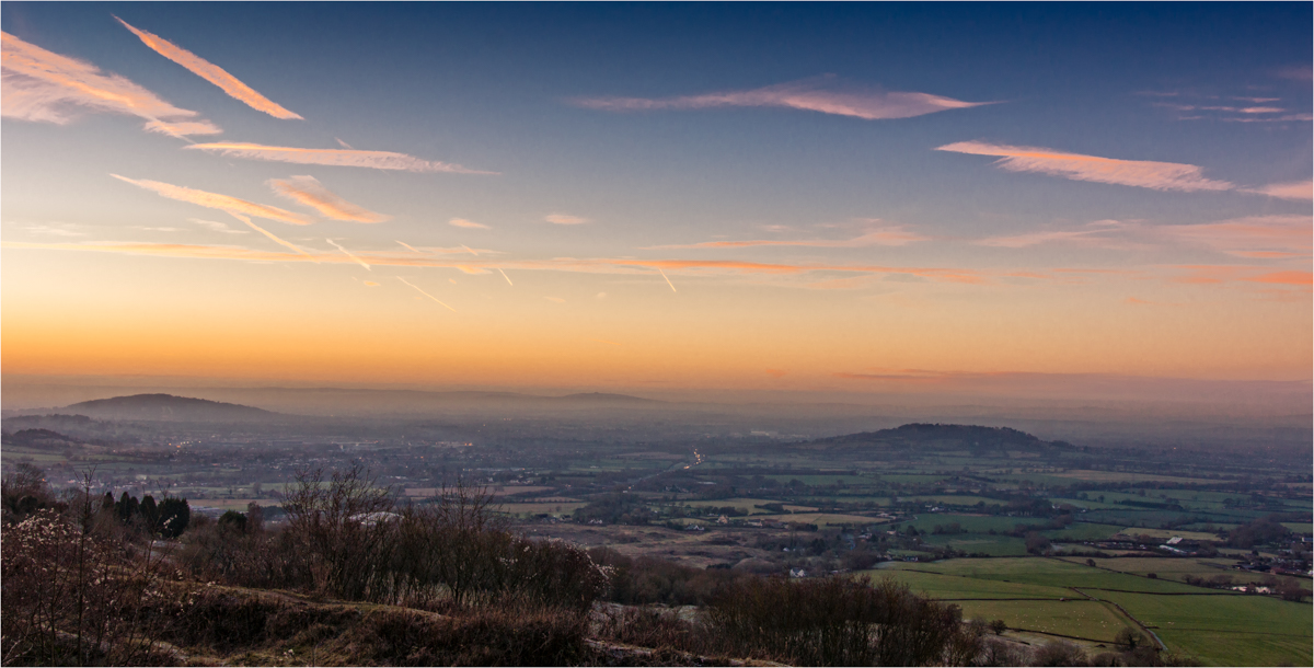
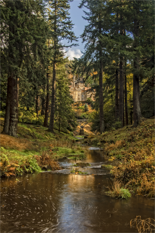
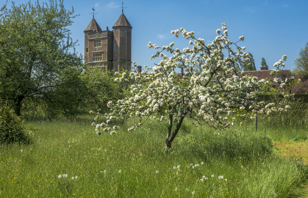
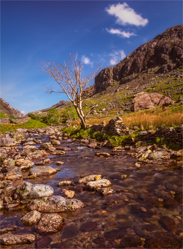
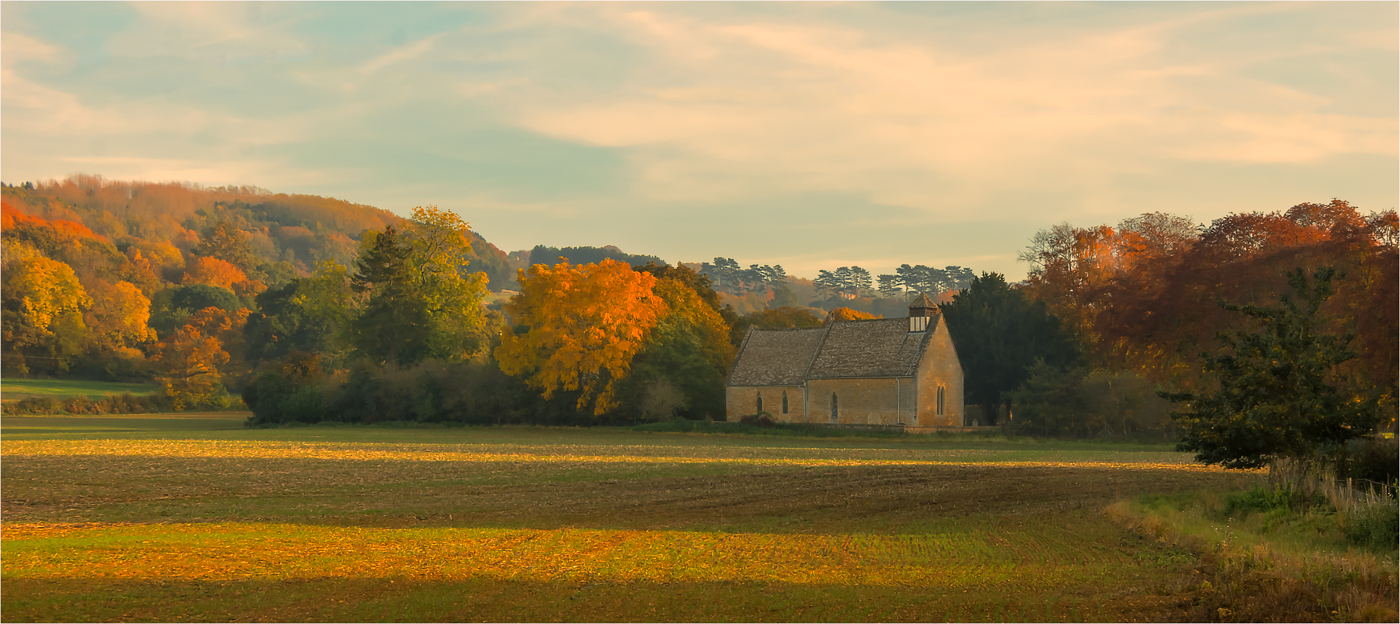
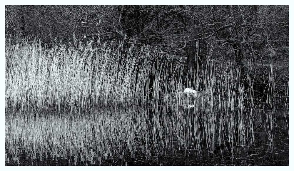
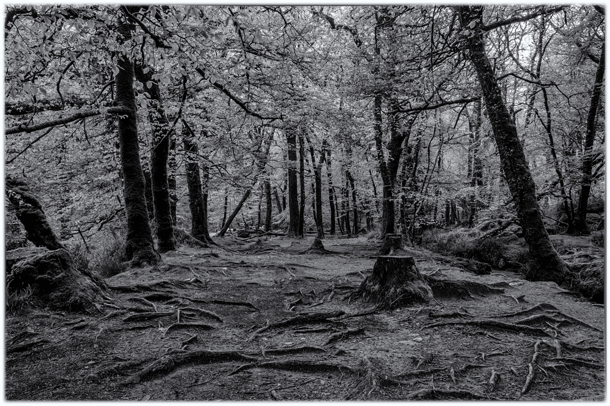
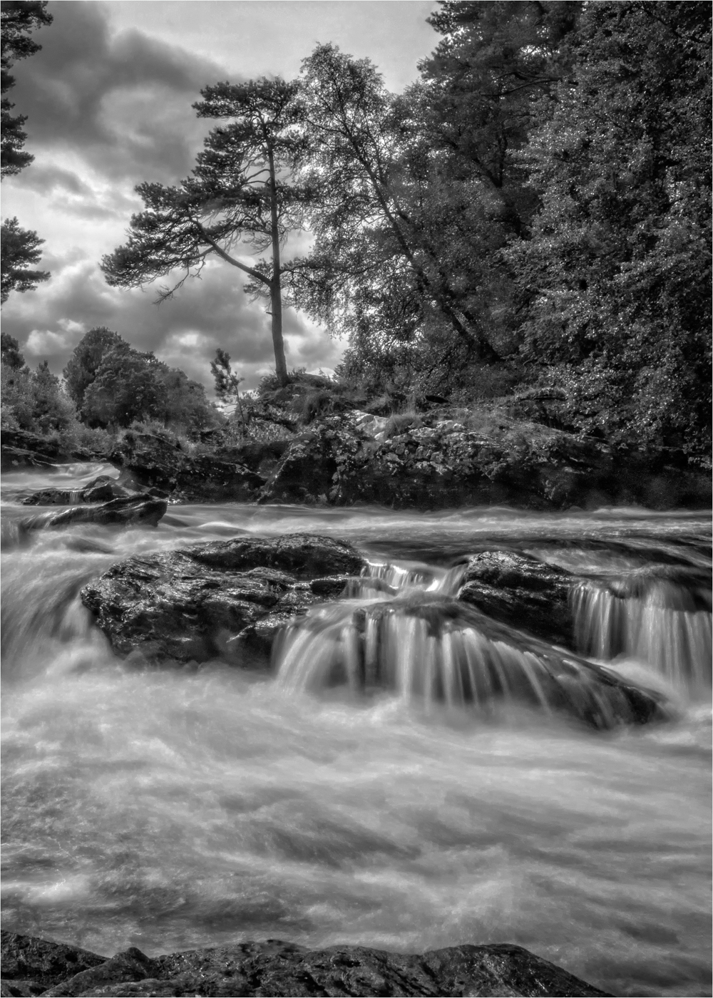
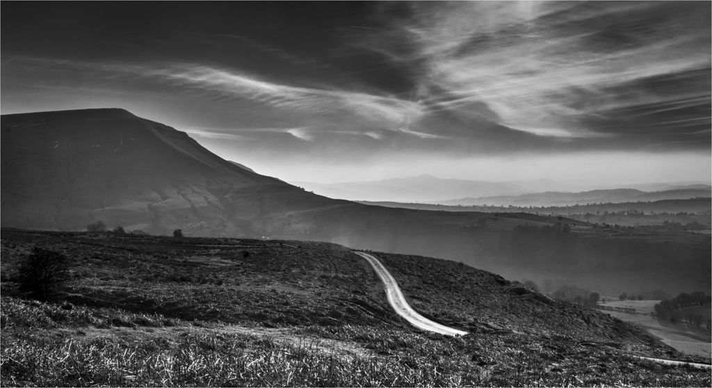
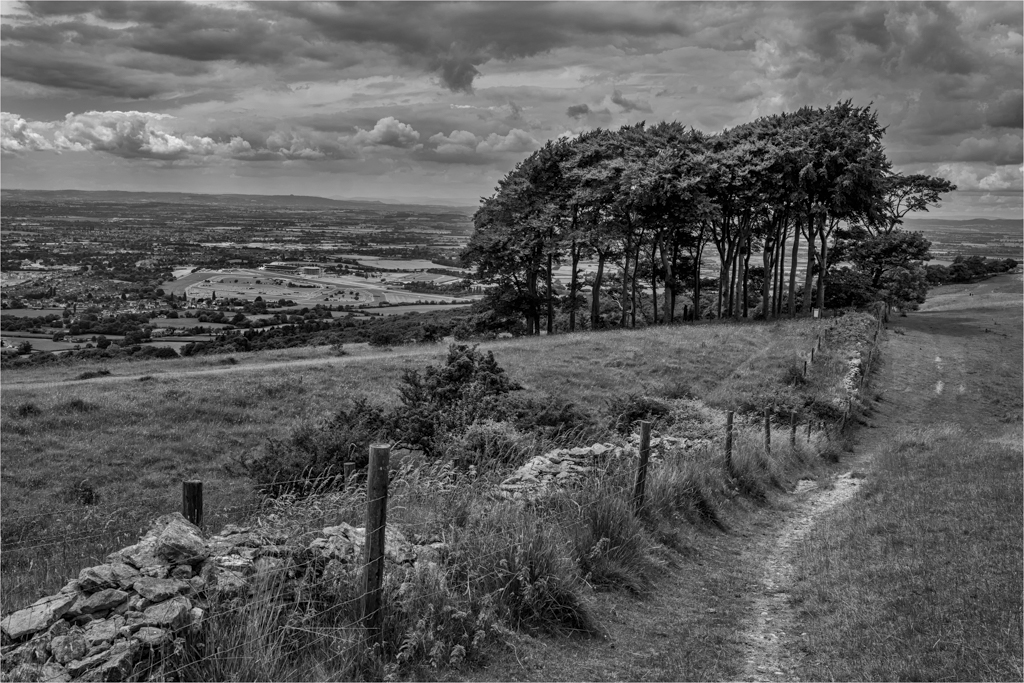
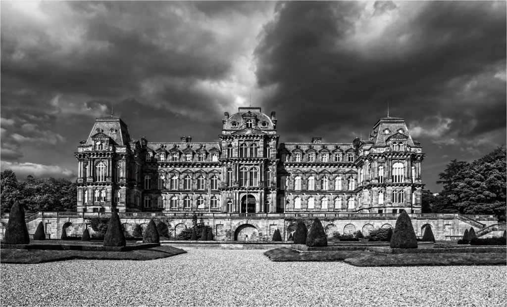
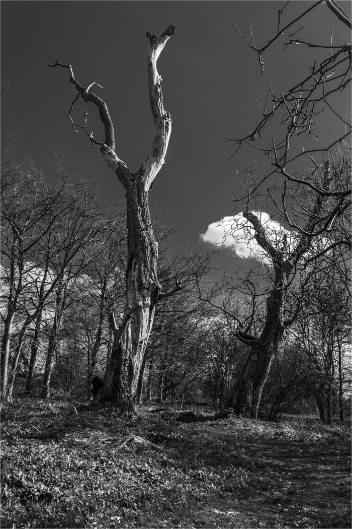
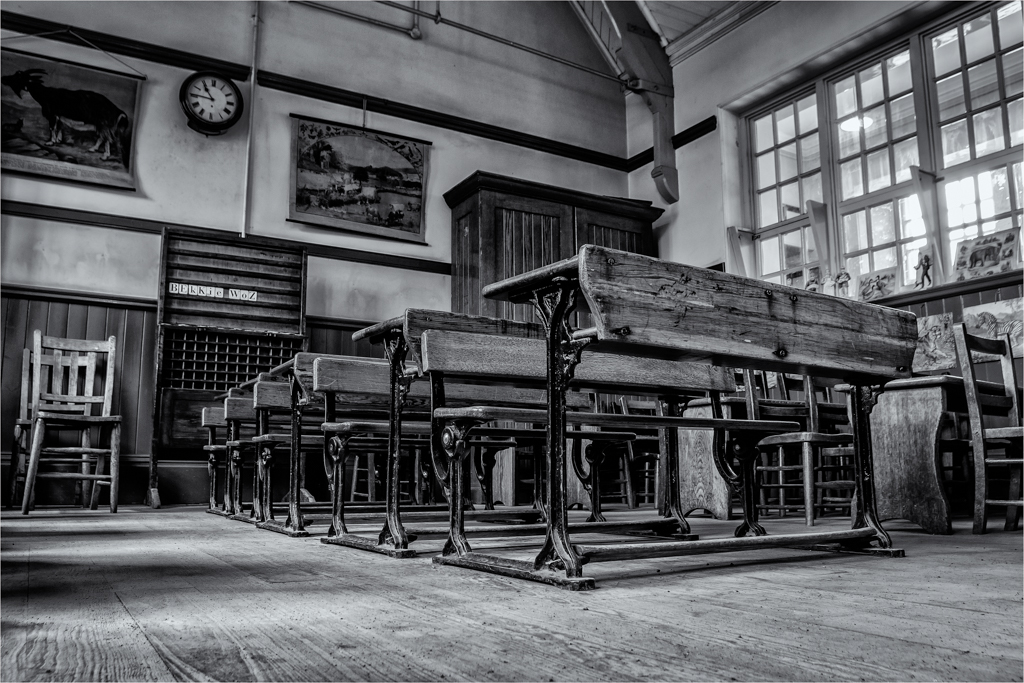
You have captured a lovely layer of trees which is dominated by that glorious white tree. Your detail is spot on and the graduation of tones is very good as it draws you through the image.
The sky is good for the image if not a tad bright to the right-hand side. I do find the vignette a touch heavy and as the main part of the image is set to the left and the vignette is set central your eye is being forced to the right-hand side and to that bright area on the lawn. I do think this image would have got away without a vignette or a much softer one. Cracking simple picture.
I do wish you all success for your rebuilding and your future, being flooded out in 2007 not to the extent you were I have a small idea of what you are going through.
|
Feb 10th |
| 33 |
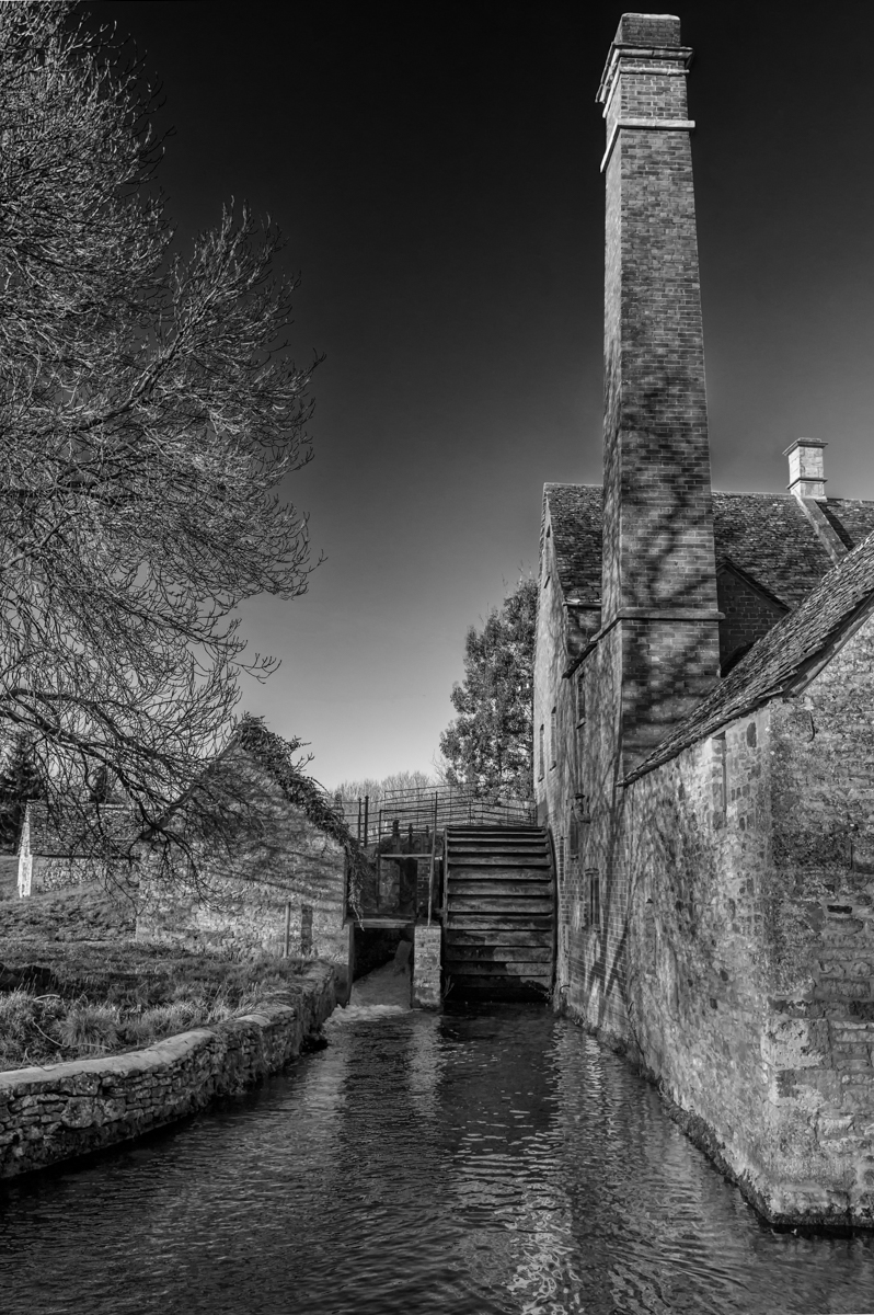
Feb 17 |
Comment |
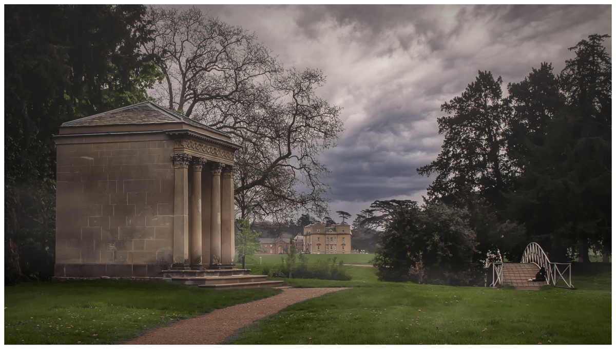
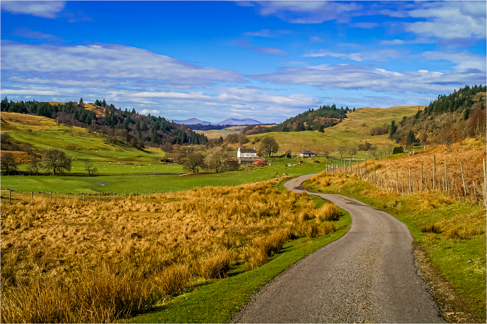
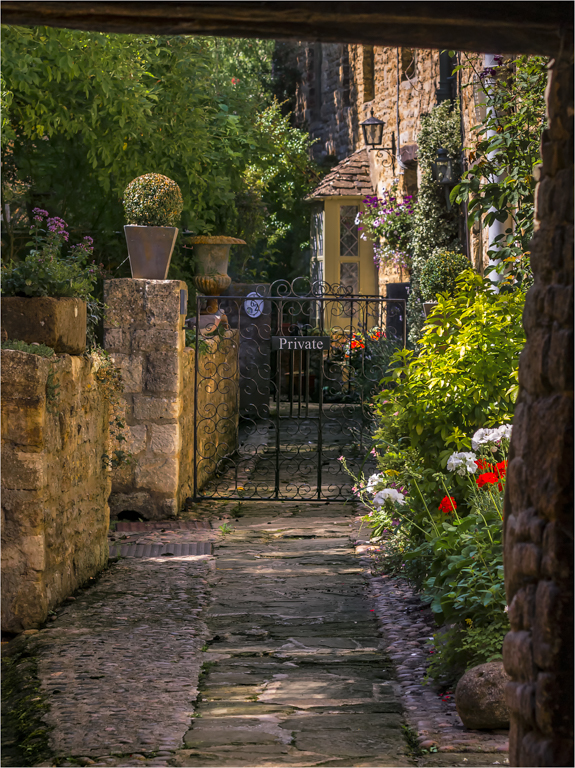
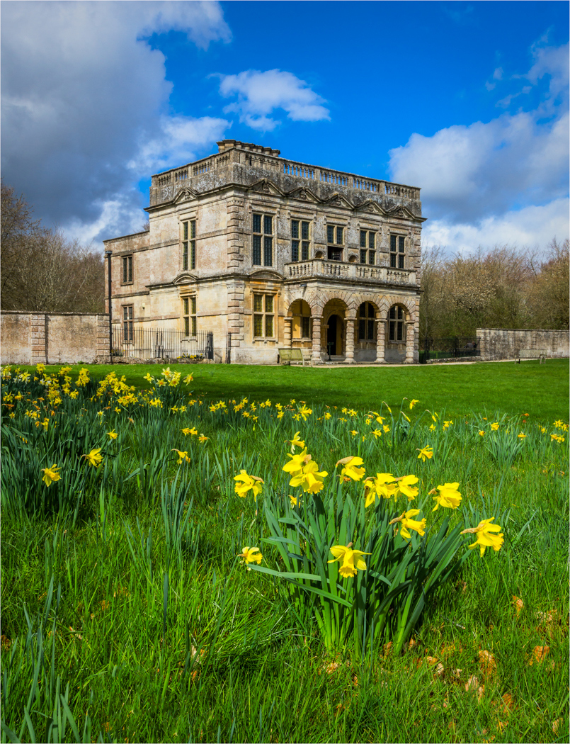
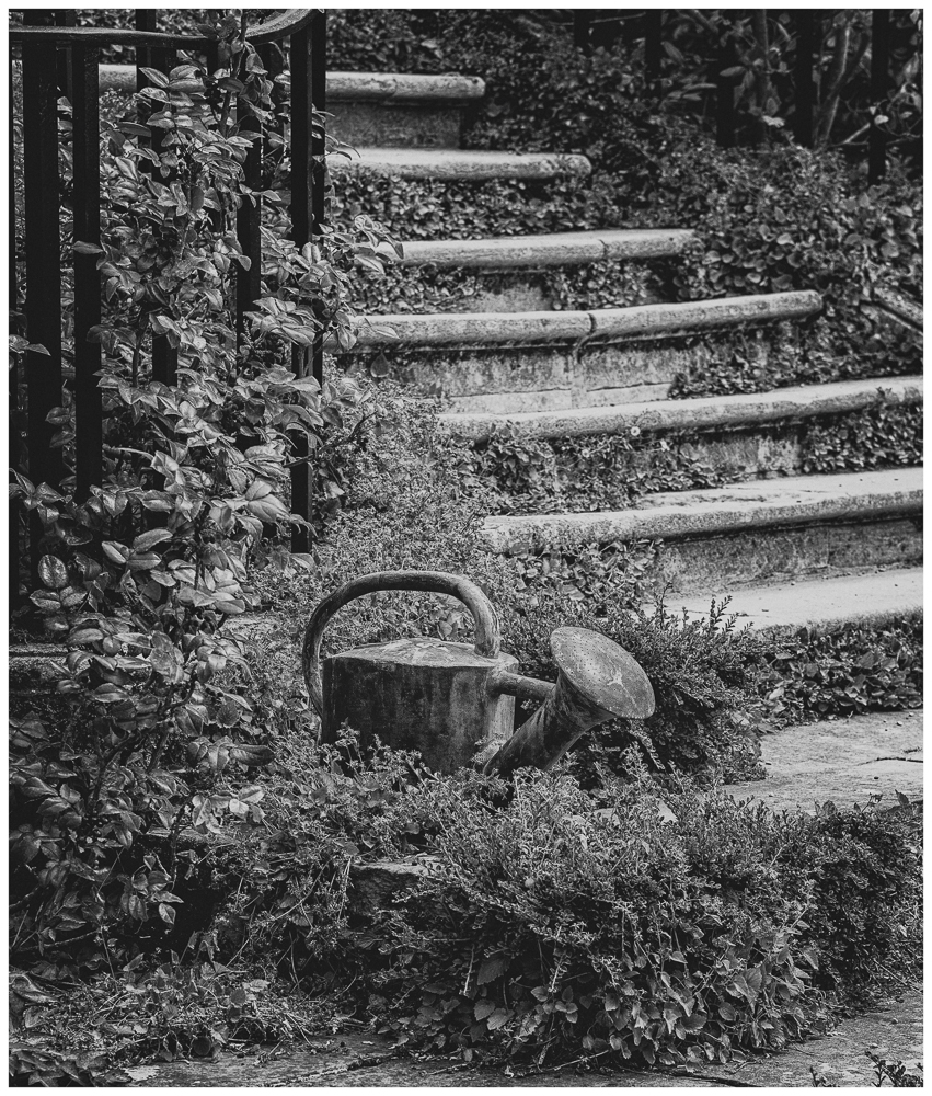
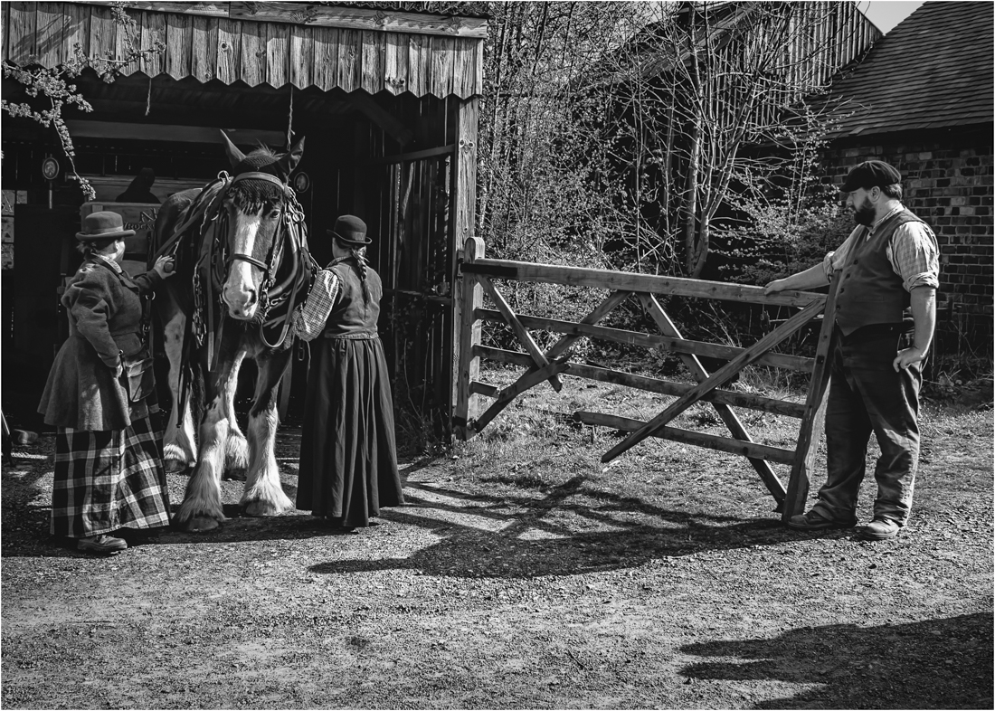
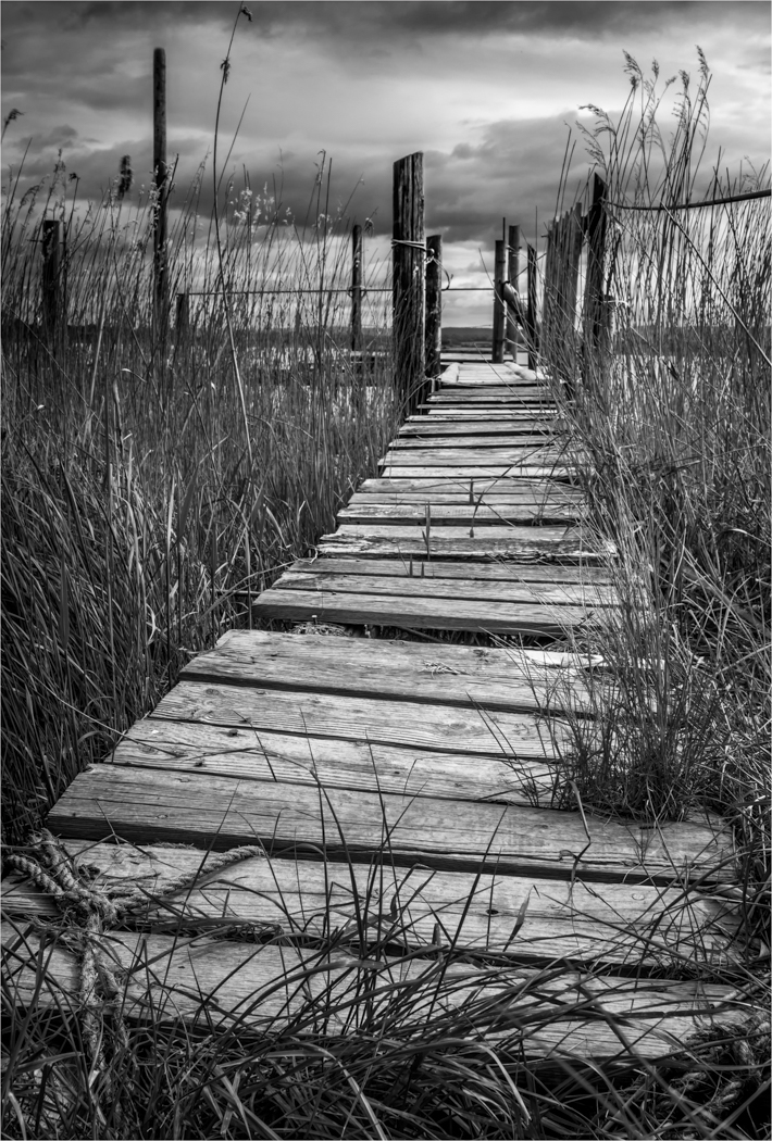
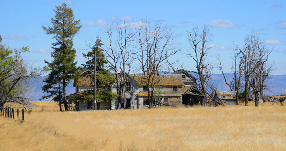
If we had a place like this in the UK it would have big fencing around it with keep out notices, look in USA they just leave it sitting there waiting for the photographer to come along and have fun. Looks like a lot of potential for some great shots to be taken.
You have chosen the right angle for the shot but maybe not the right position as the fence for me is acting as a natural blocker for the viewer to come into the image, I would of tried to find and angle to use the fence better or take it out altogether.
Your tones are nice if not a touch bright and the bright grass is dominating the image and could be pulled back a touch and a slight cropping of the image to remove the tree on the right helps.
I have done a slight idea of what I am talking about, I have removed most of the fence but left just a little bit of it at the far end, I have done luminosity masks for the yellow grass (curves & hue-saturation), LM for blue sky just to adjust tone and colour to add the depth. Then done a 2 stop darks mask to control the contrast in the house and trees. Done slight crop at foot and right hand side to balance image.
|
Feb 10th |
 |
| 33 |
Feb 17 |
Comment |
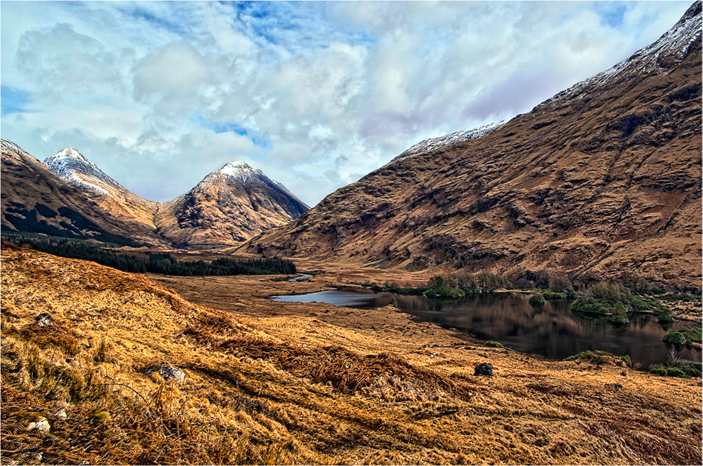
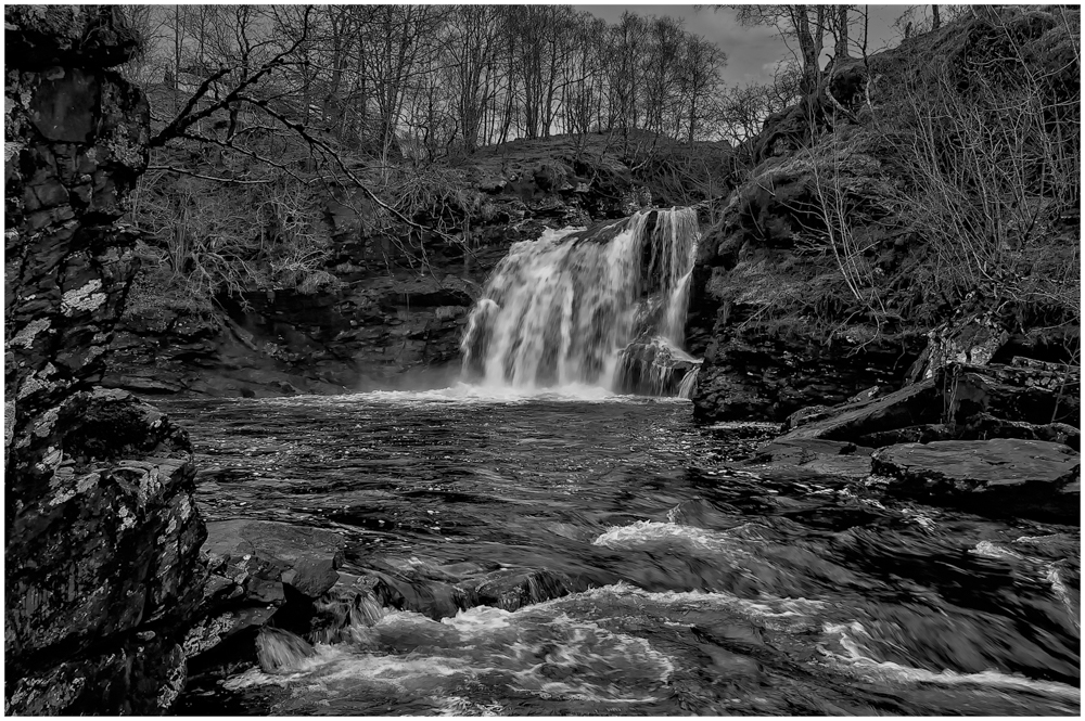
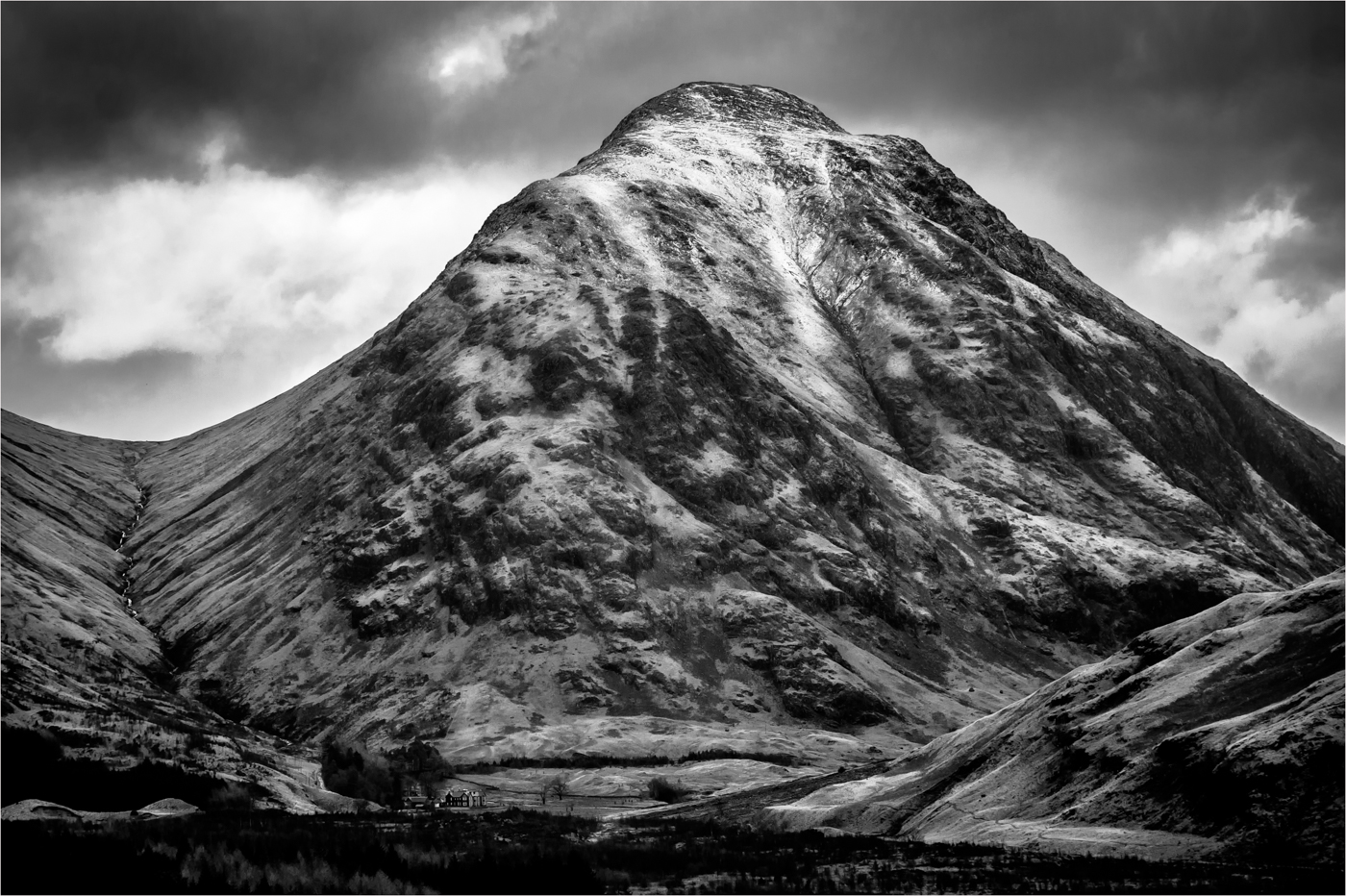
The classic shot of Ten Peaks that I have come to know so well but have never been there or taken a picture of. https://www.youtube.com/watch?v=9qbchHFc-58&t=22s Will explain why.
You have captured the classic view with your added extra with the rocks in the foreground. Your control of the detail in the trees and mountains are superb and you have some lovely rich tones coming out of the mountains.
I love the speed of the clouds and the timing you have chosen, I do wonder if we should have just a touch more of that in the reflection in the water, then we come to the blue, I do wonder if this could be a touch darker towards the Royal Blue spectrum, but you were there, but pictorially it does come over a touch in your face. But printed on fine art or pearl I could see this softening down.
I suggestion that one thing would improve is removing the vegetation from the bottom right corner as it breaks the symmetry to much.
|
Feb 10th |
| 33 |
Feb 17 |
Comment |
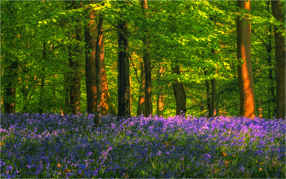
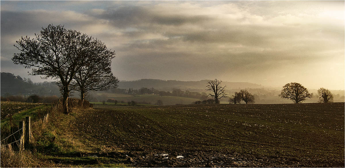
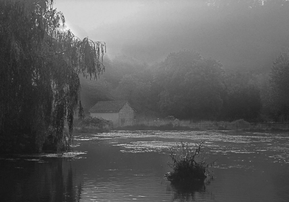
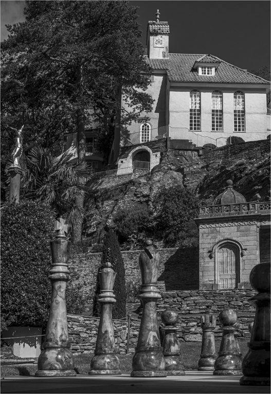
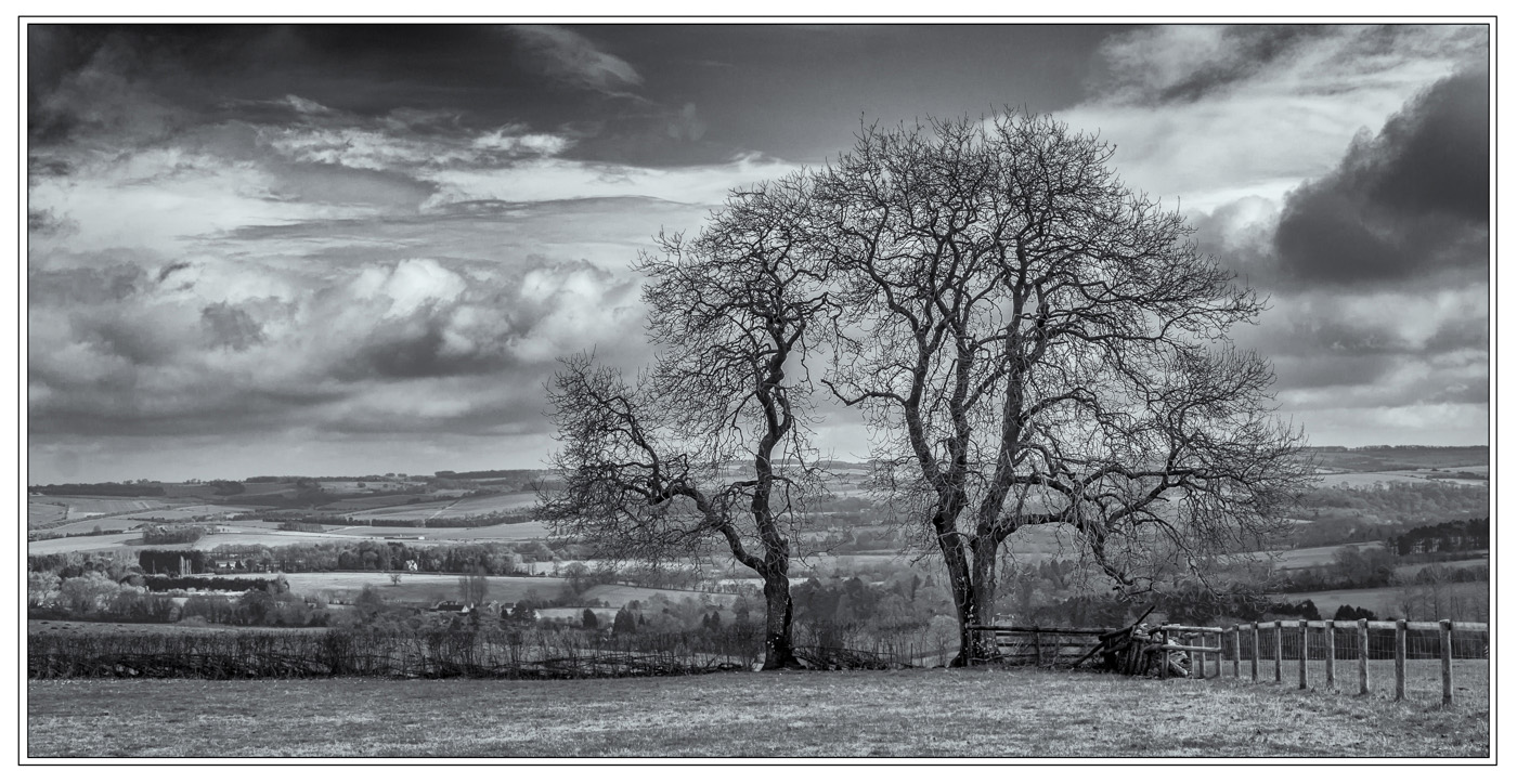
I look at this image and get an instant reaction the same that you get with nearly all images you view, but with a lot of the images that view can grow or change, but with this image it did not.
The foreground you have a wonderfully simple image that that is quite striking to view and those two bushes are beautifully lit and have lovely elongated shadows that add the depth and in a way they form a good image of their own.
Then you have the background that for me feels unreal as the colours feel unrealistic, specially the purples are to strong and dominate the image, and the background is not balancing with that great foreground for me. Sorry.
|
Feb 10th |
| 33 |
Feb 17 |
Comment |
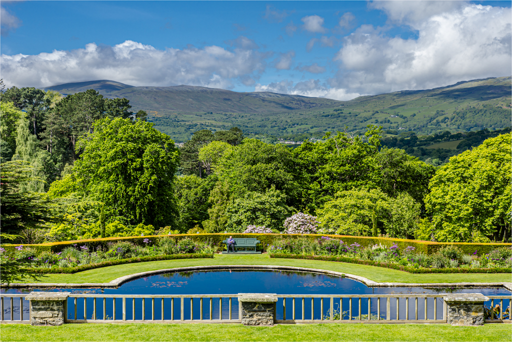
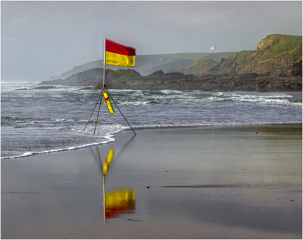
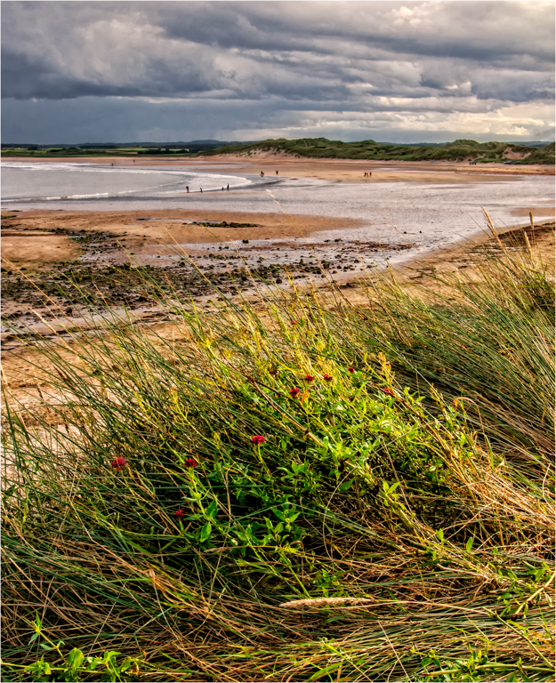
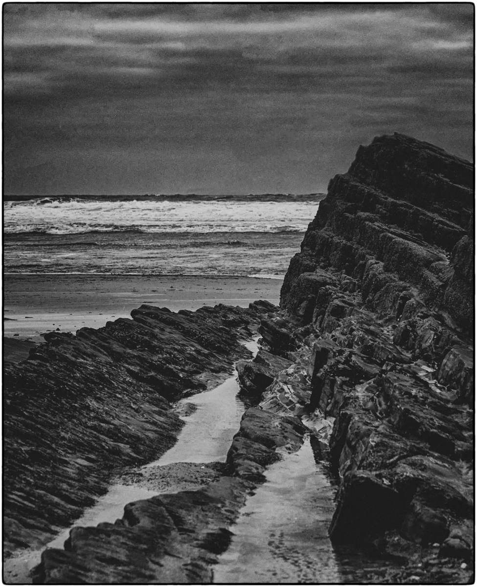
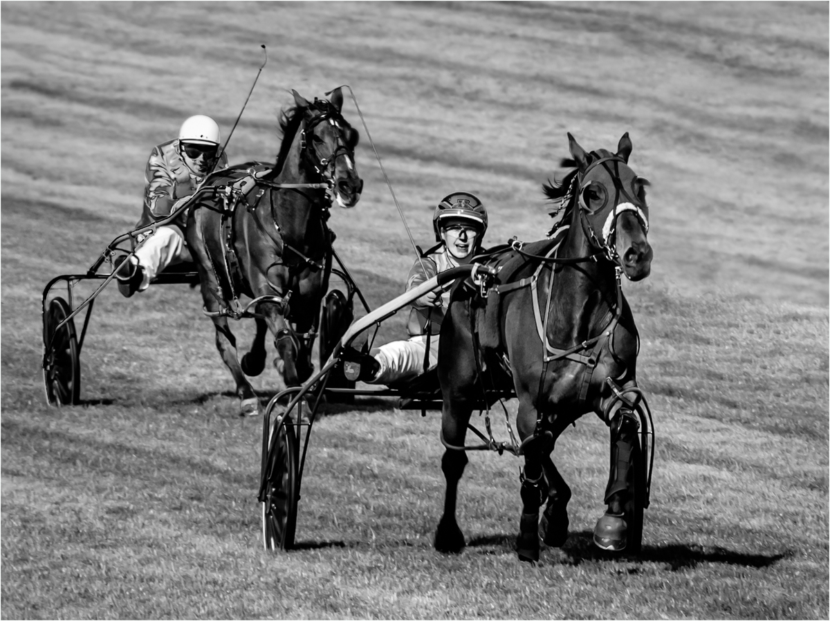
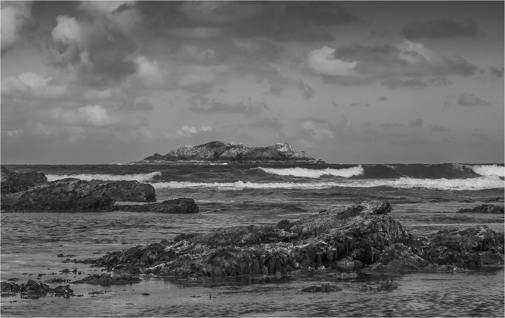
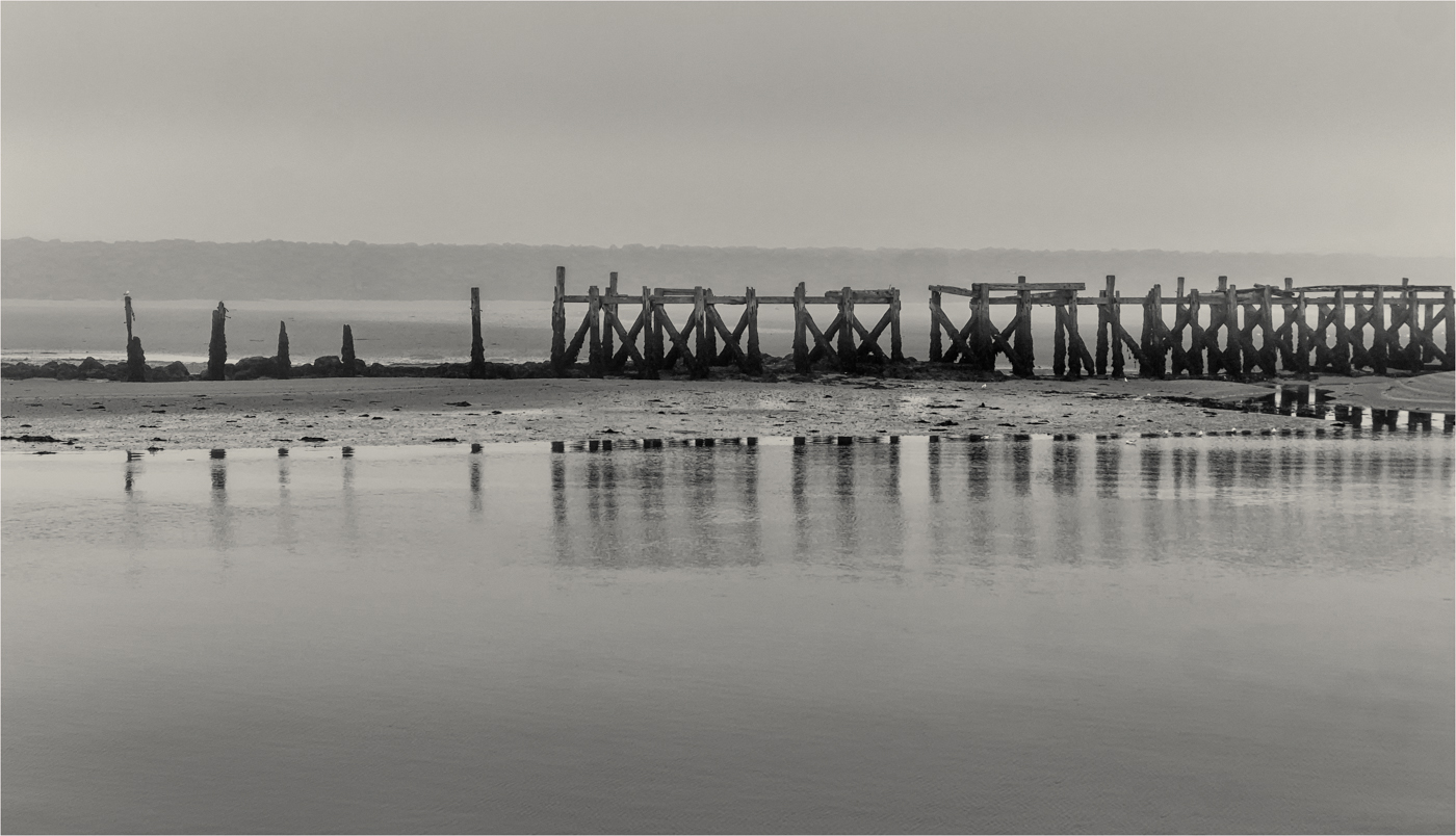
The image you have chosen has a very good shape formed by the main wave moving into the secondary waves in the distance, and I really like the touch of added colour and contrast in the image by the head of the main wave. I don’t get the feeling of sunrise but you have a good tone.
You have held your whites well, but I do think your other white wave tips could just be a touch brighter in other parts of the image.
Have you ever used Luminosity Masks, if not I would check out Tony Kyper & Shaw Bagshaw on YouTube as the new Tone Kyper V5 panel is quite exceptional and would solve all your problems in holding your whites & tones. Just a suggestion
|
Feb 10th |
5 comments - 0 replies for Group 33
|
| 39 |
Feb 17 |
Reply |
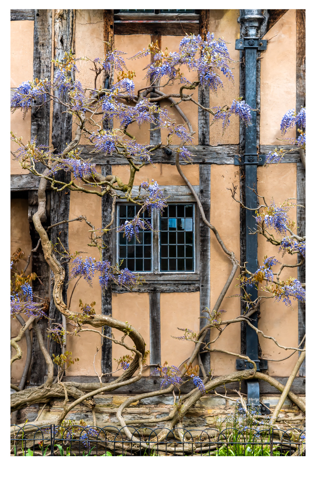
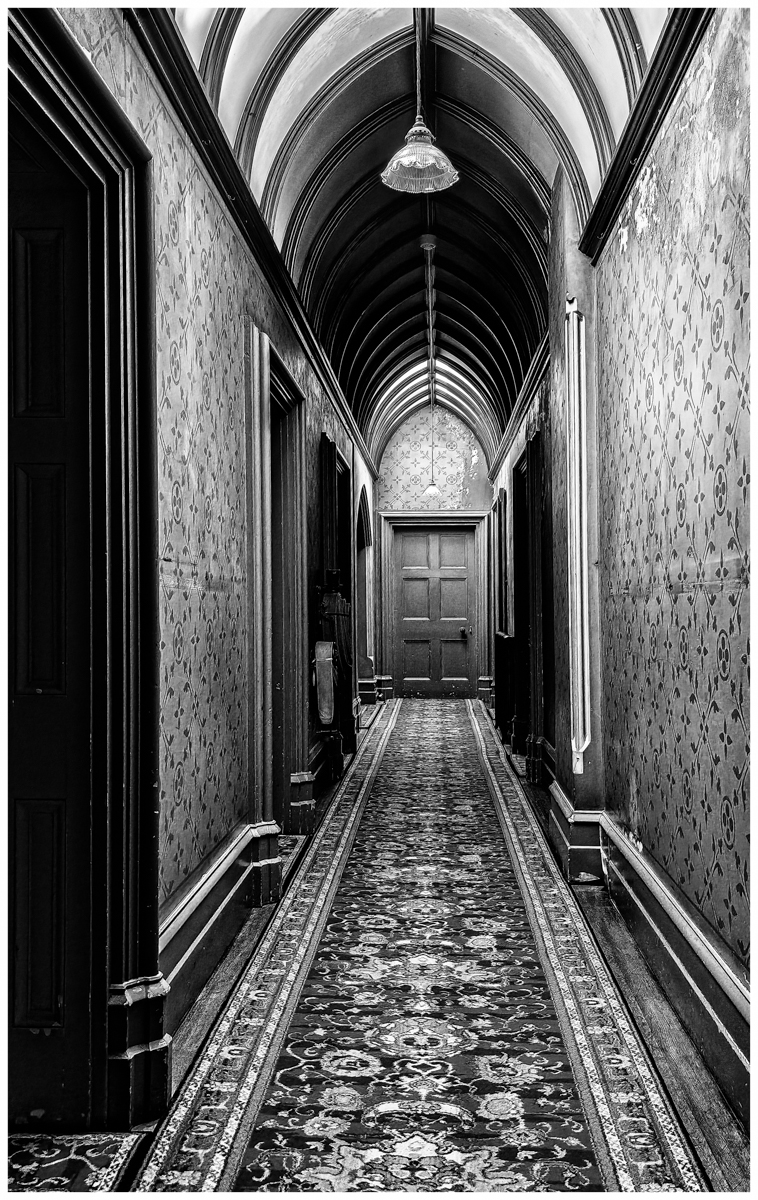
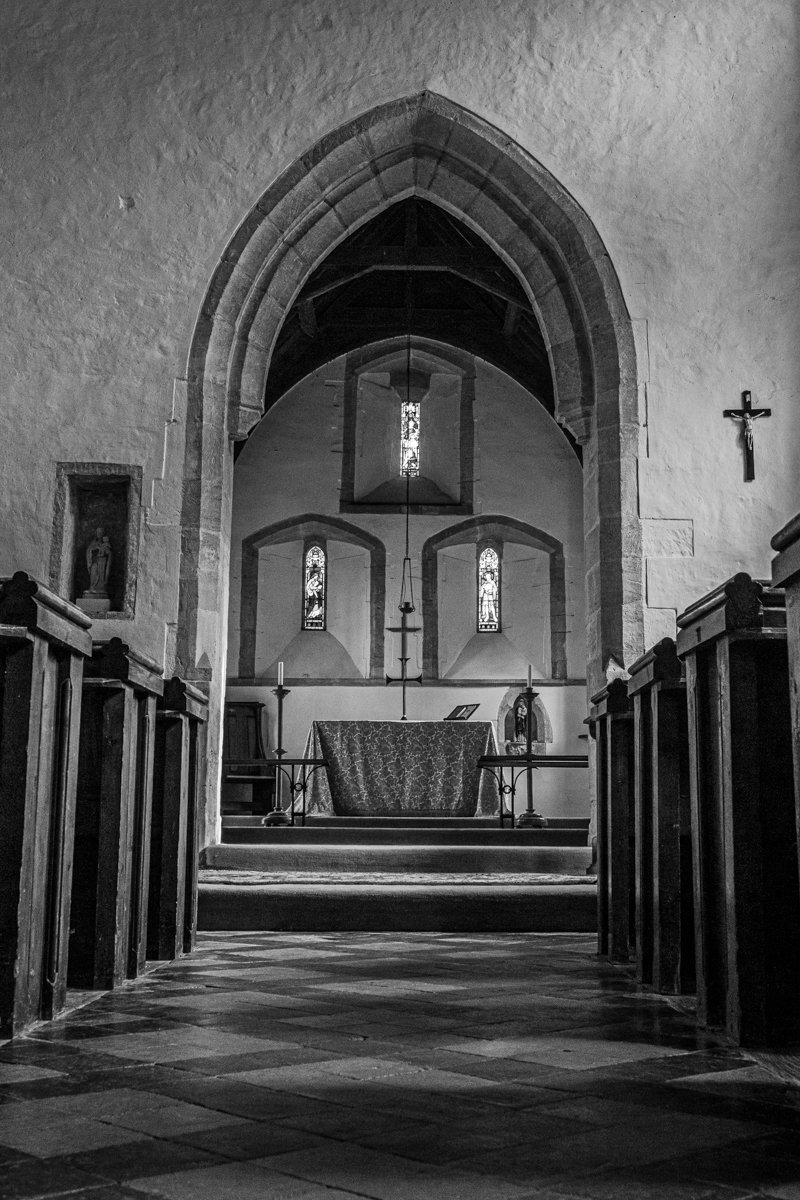
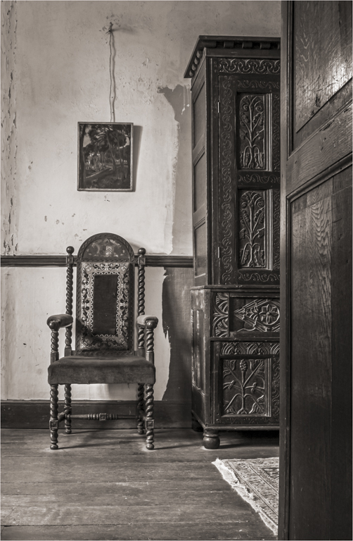
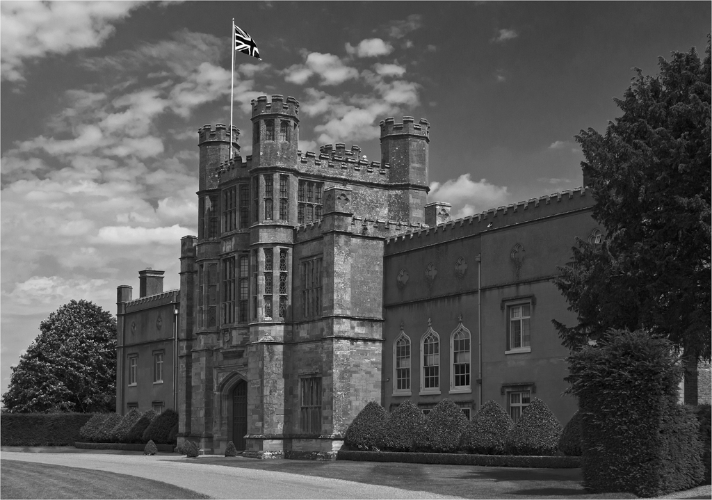
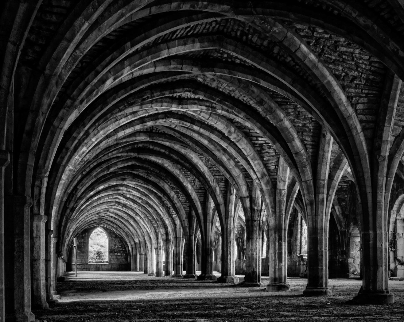
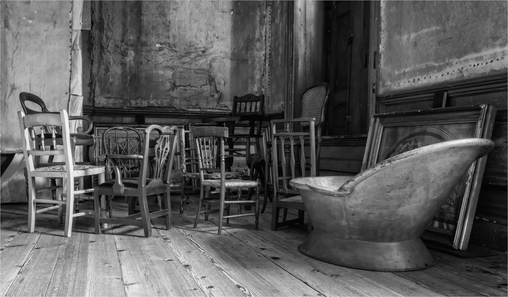
Being such an old house, I not sure there was a straight wall in the house. but that back wall definitely leaned to the right and those iron doors that lead nowhere. |
Feb 17th |
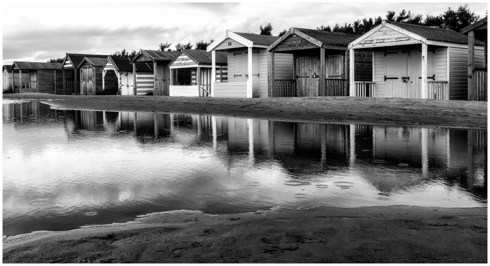
| 39 |
Feb 17 |
Comment |
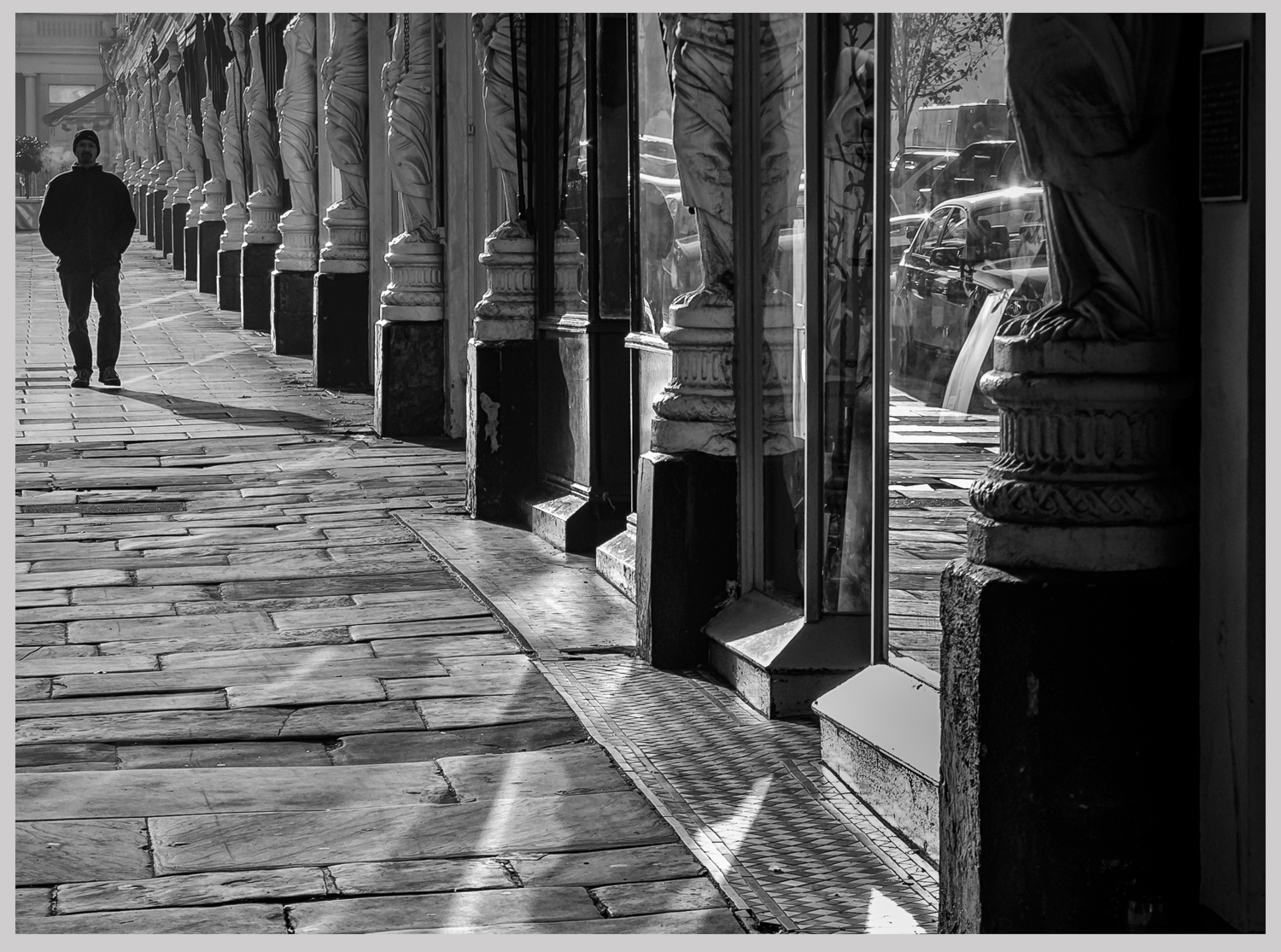
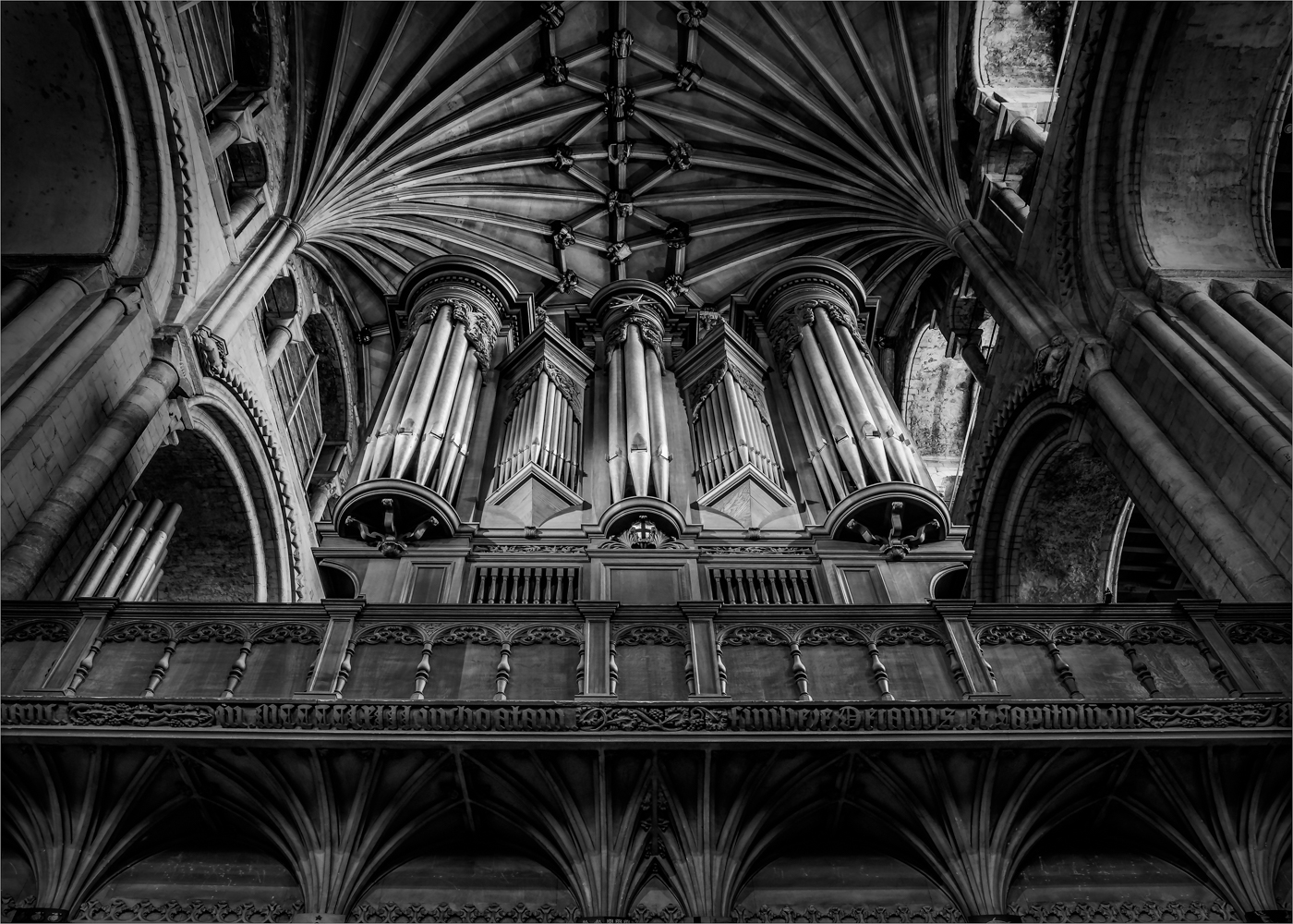
You have captured some lovely detail and texture and have a lovely mood in the sky. But I look at this image and wish you had taken a couple of steps back or given us a touch wider view point. That little window on the right bottom is so important to me and holds the rest of the image together but the black bar structure is leading you somewhere but where and this is the problems.
Also, the building is giving me the feeling of leaning to the left but correcting this would lose part or most of that small window. I would do a slight crop off the right to lose that bit of roof. Just needs a bit more room for me.
|
Feb 10th |
| 39 |
Feb 17 |
Comment |
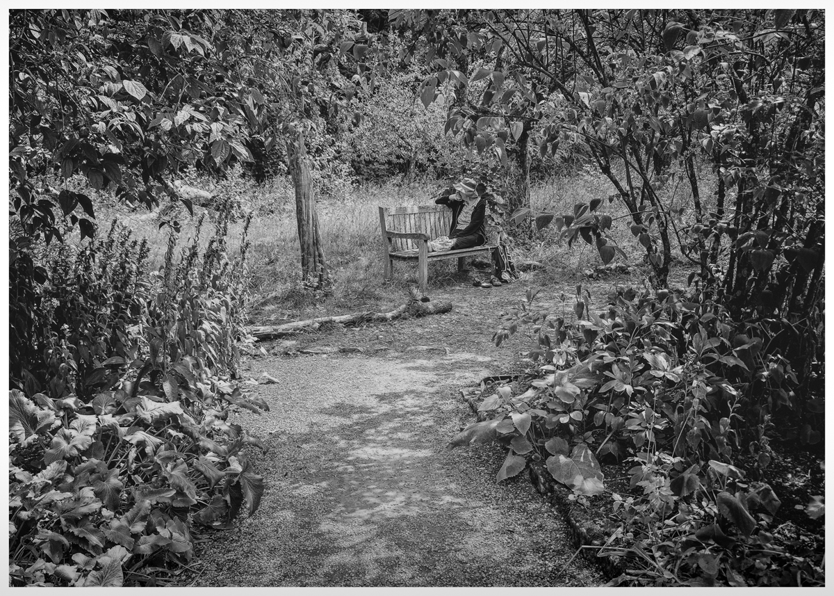
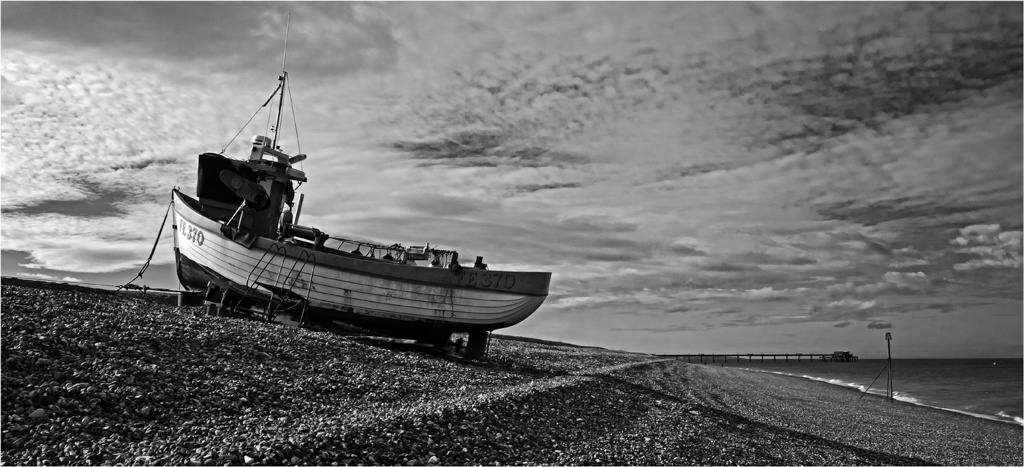
Jerry we know who you are, be nice to see it without the watermark.
Otherwise not much to say about this picture than "Bloody Marvellous".
So simple, breaks a lot of rules with blown highlights and no base but it works. Keep them coming. |
Feb 10th |
| 39 |
Feb 17 |
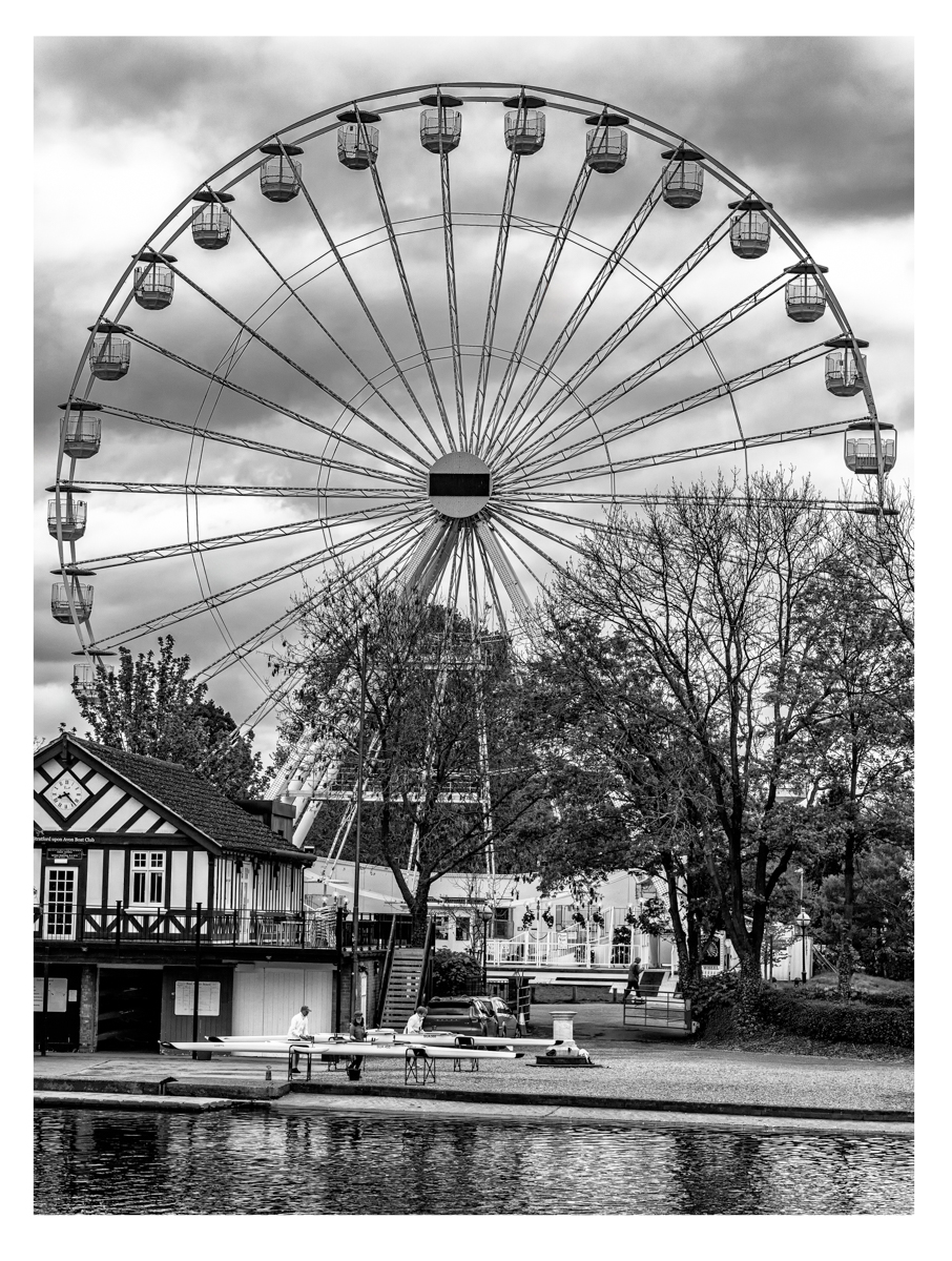
Comment |
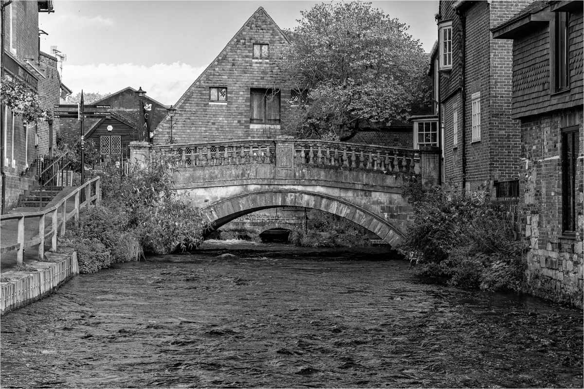
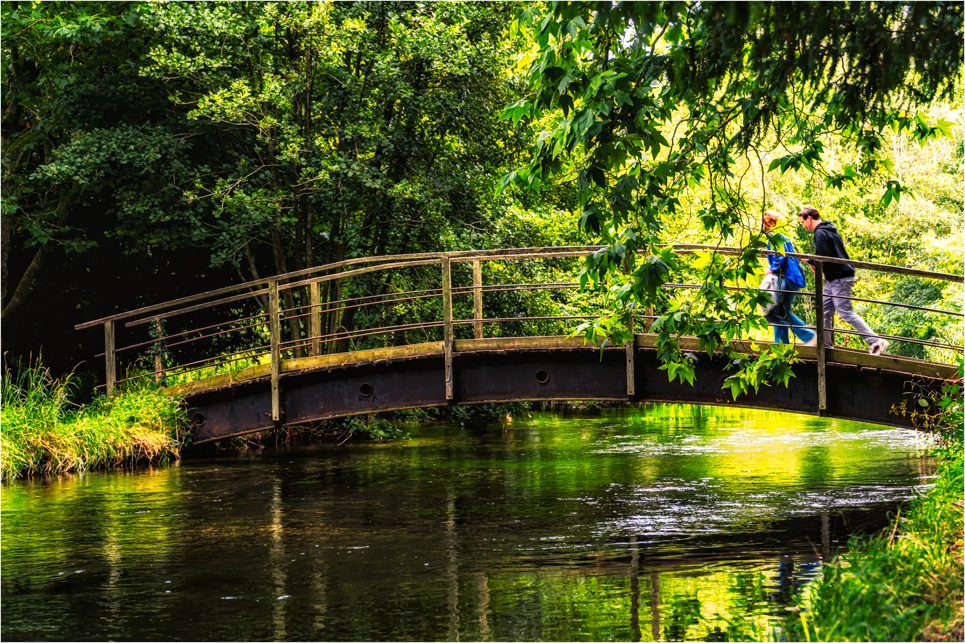
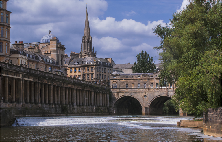
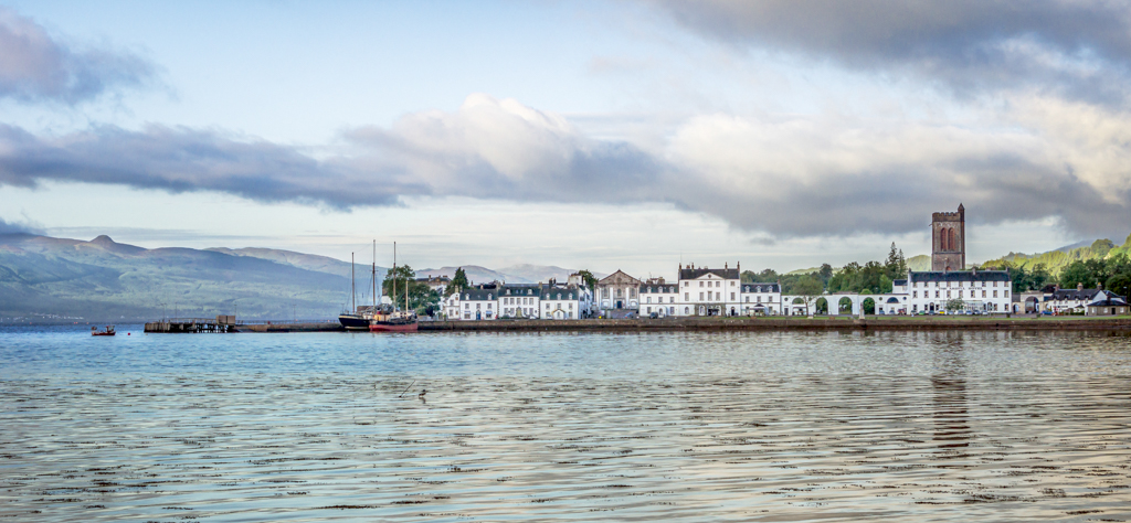
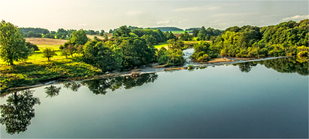
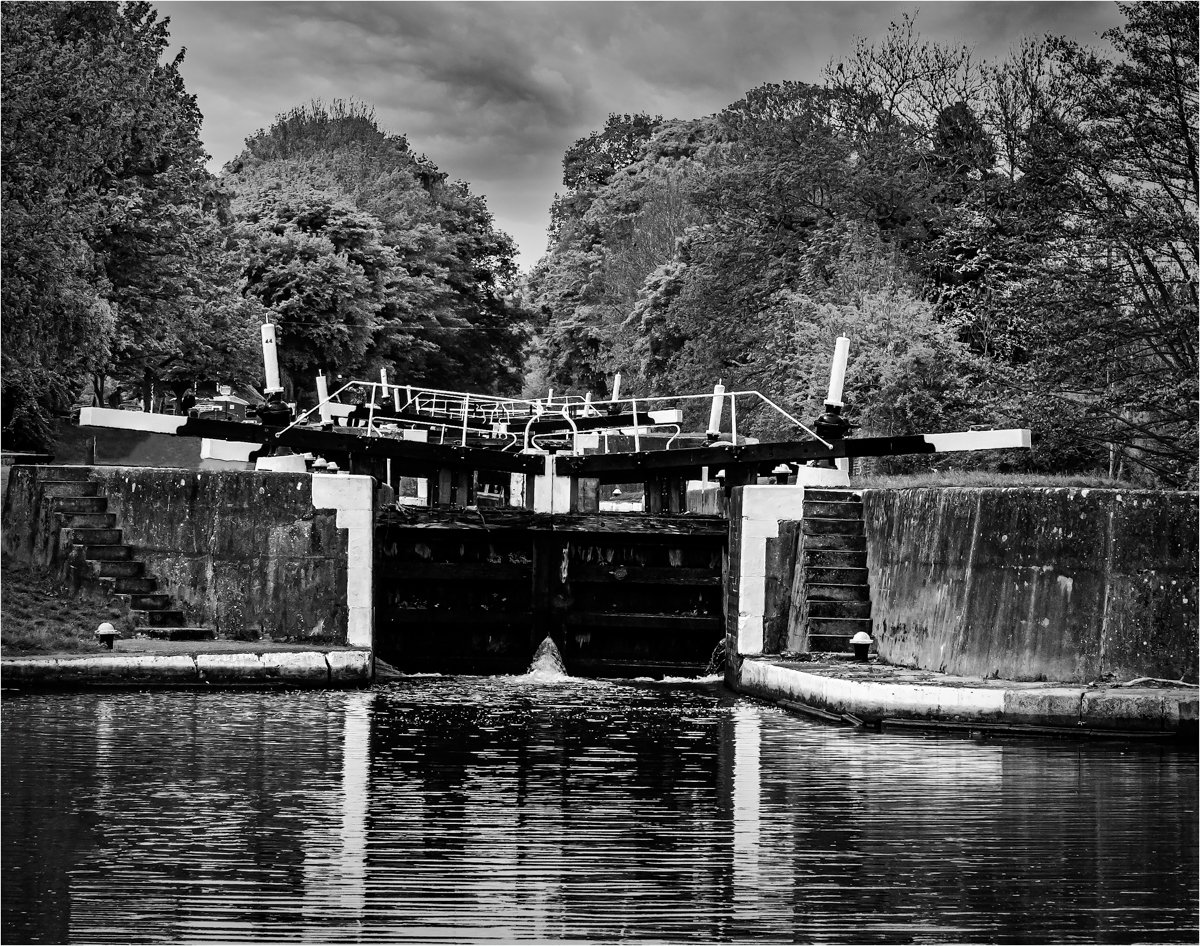
You have composed a very pleasing architectural landscape image and monochrome suits the picture perfectly. The lead from the right with the bright to the buildings on the far shore is spot on and you have a good reflection in the water.
I like the amount of foreground you have included in the image to hold the base and your timing has produced a good sky. One little niggle is the brightness of the water specially between the reflection of the bridge and the building and I think using a Luminosity Mask of a lights 1 or 2 would just bring that tone down a touch.
Can I just say the image you have supplied is rather small and not to the 768 x 1024 pixels we normally do.
|
Feb 10th |
| 39 |
Feb 17 |
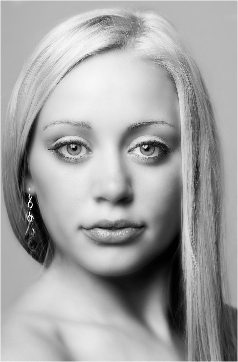
Comment |
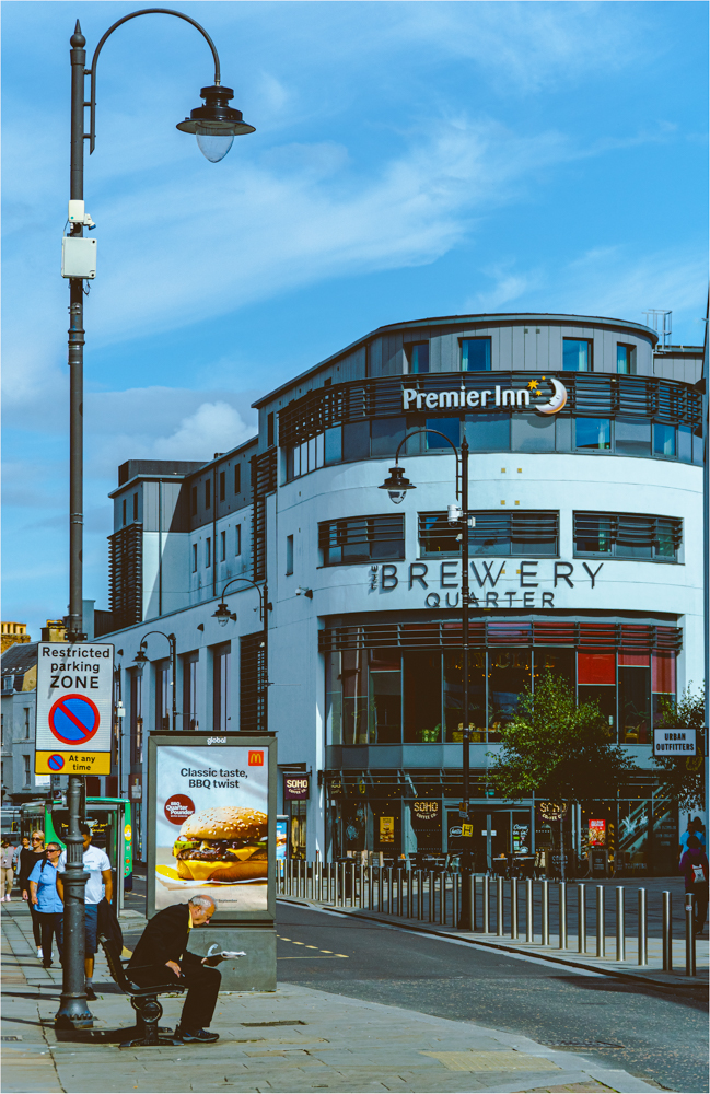
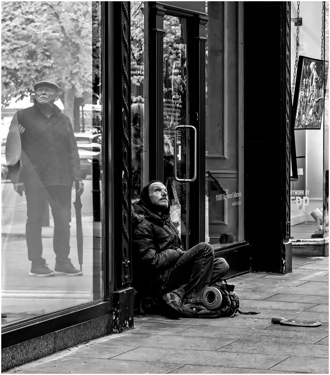
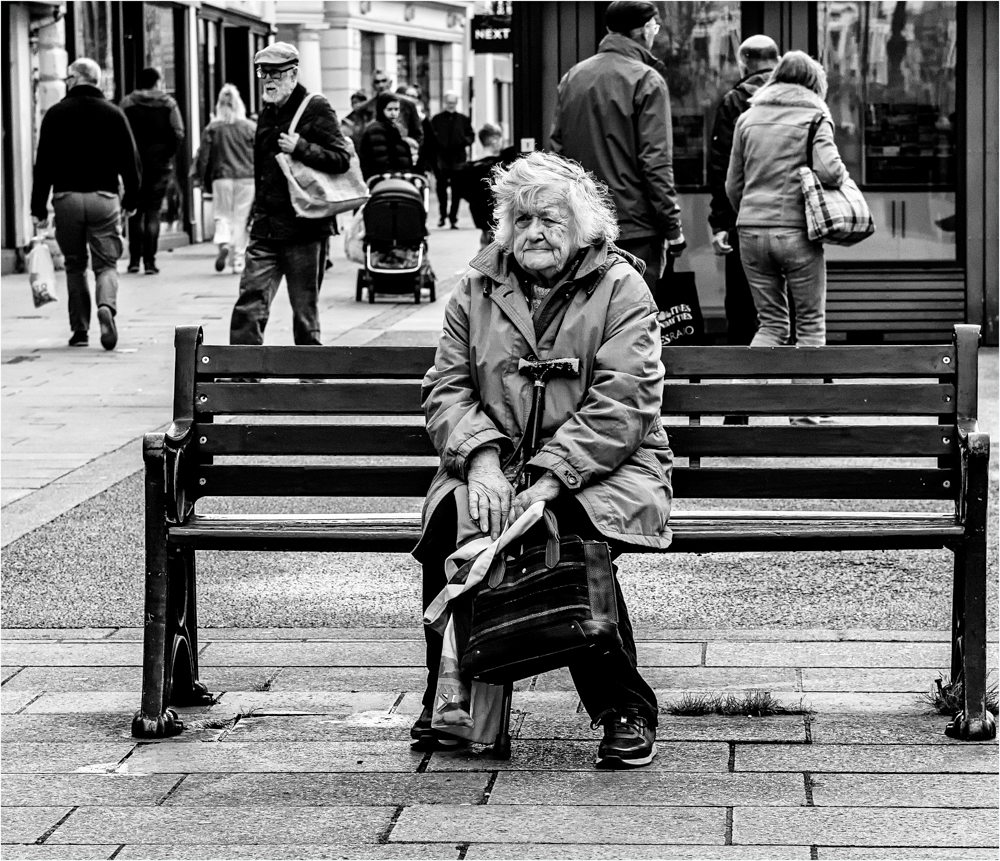
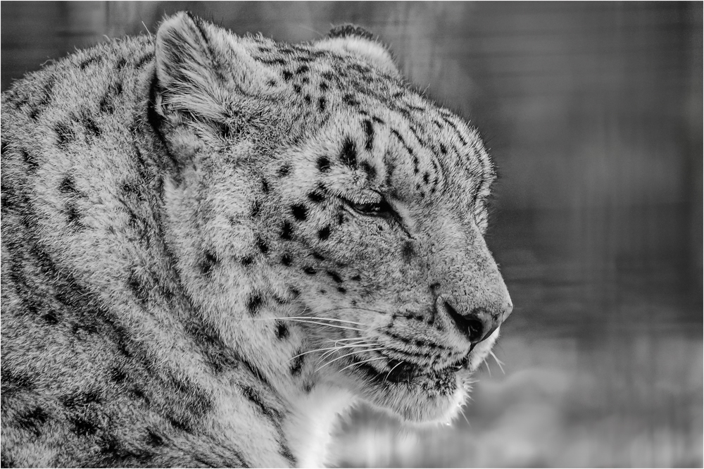
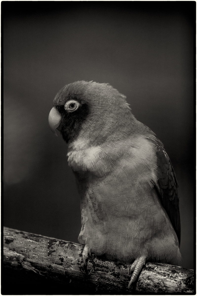
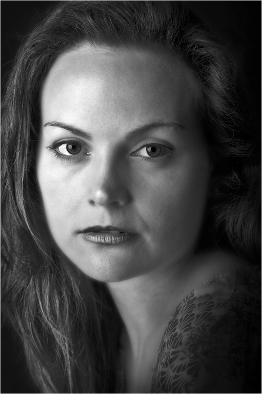
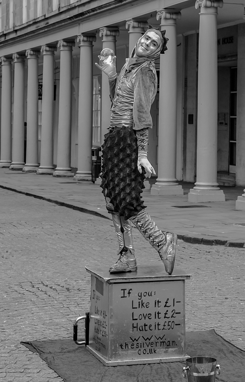
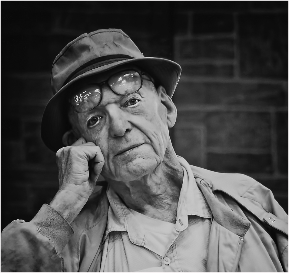
You have seen and captured a lovely picture that is well placed in the frame and as I would say if I was judging this at a club, “the surround material in the image is adding to the story”. But we are not at a club and not doing the normal cop out judge’s opinion. So, I think there is something very magical in this picture that all the object included in the image and the toning is helping to hide.
That face and those wonderful eyes tell enough story that you don’t need anything else to distract you from the importance of that soulful face. When you go to an Art gallery and you see the great master’s portraits the eyes seem to follow you around the room or just seem to stare right through you, well this face has those eyes and that is something magic.
I have done a slight rework where I have removed all the food items with a slight crop and some PS work and removed the drain pipe out of his head. Turned back to monochrome.
|
Feb 10th |
 |
4 comments - 1 reply for Group 39
|
9 comments - 1 reply Total
|