|
| Group |
Round |
C/R |
Comment |
Date |
Image |
| 39 |
Jun 21 |
Comment |
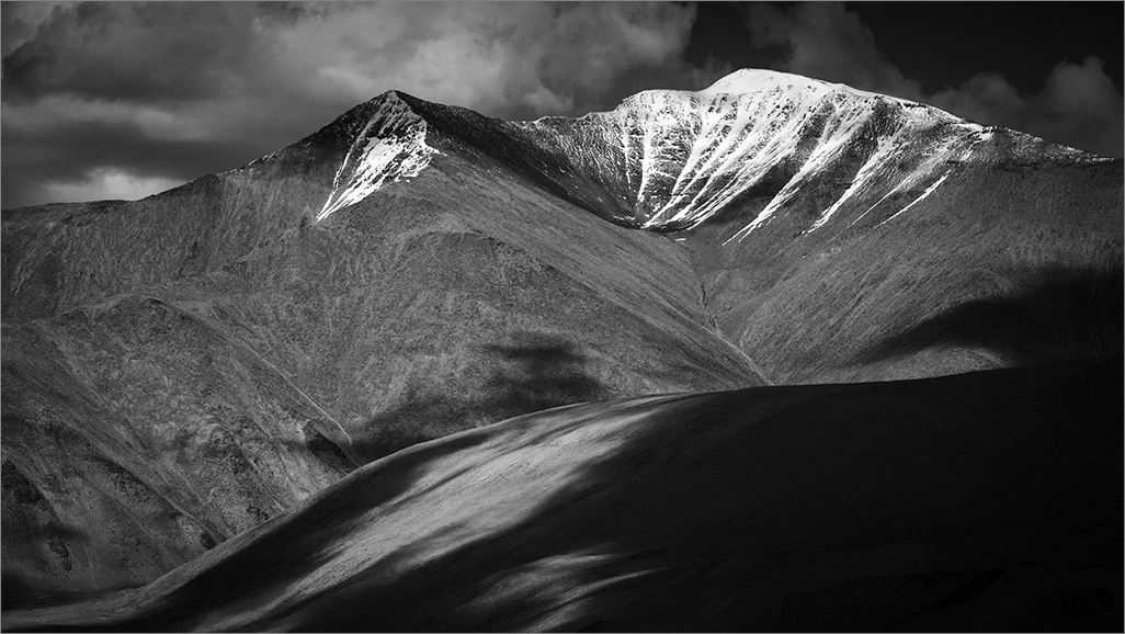
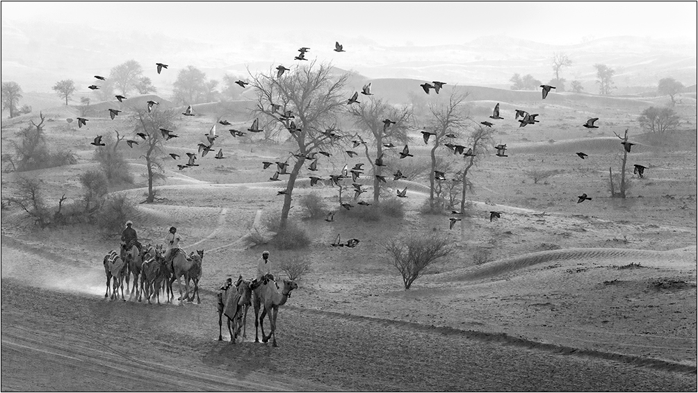
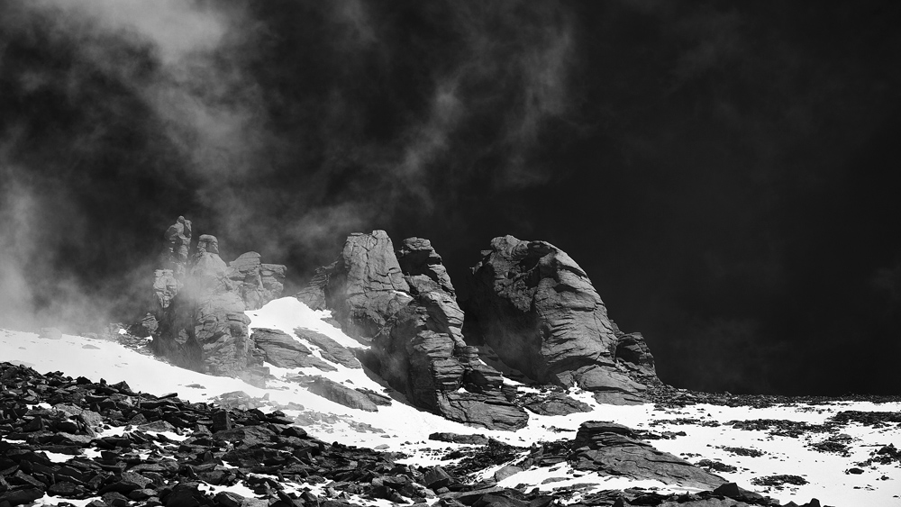
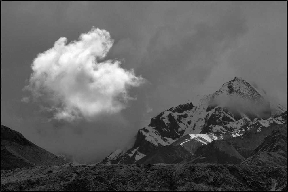
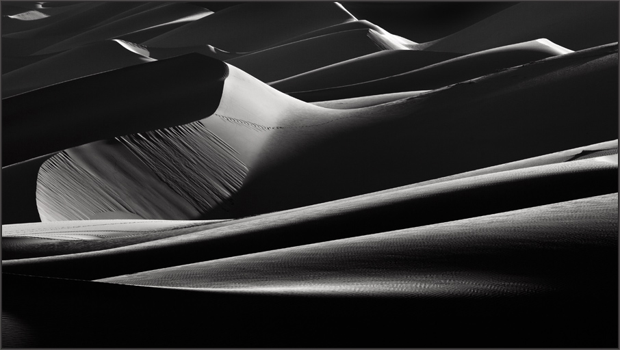
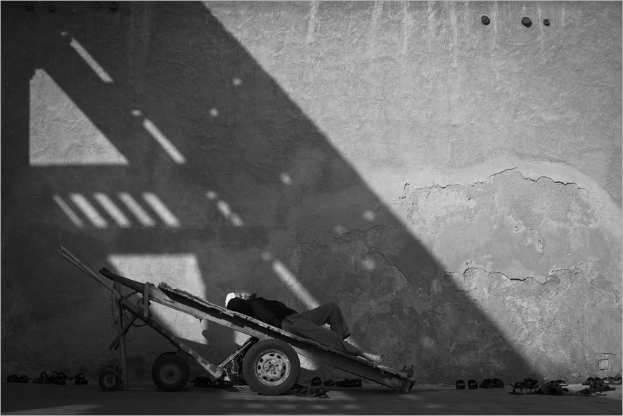
Vincent you have transformed a dull color image to one of impact with the mono conversion. The details have been rescued and you made the image stronger. I would also prefer to crop out until the first rocks as you have very aptly done in the response to Jerry. The tone and the scale provided by human elements make this image stand out. I only wonder whether the tones in the sky would be compromised with high grain in an enlargement as you have practically no contrast in the color version. In my experience just to share when the expo has issues the rescue for the tone is suitable only for smaller file sizes. But this is my opinion and you may have a better solution. Good light to you Vincent. |
Jun 13th |
| 39 |
Jun 21 |
Comment |
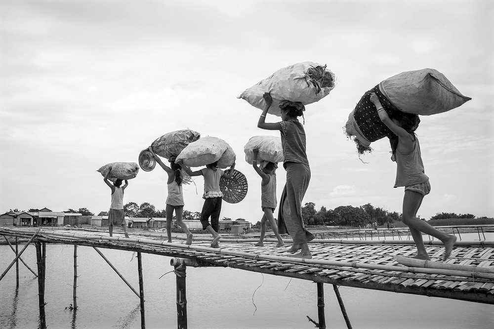
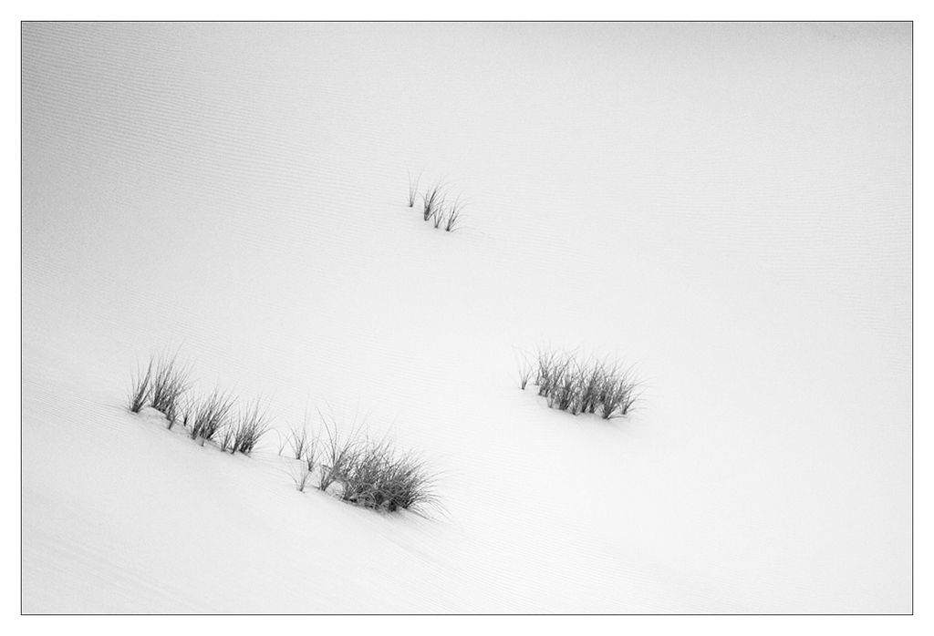
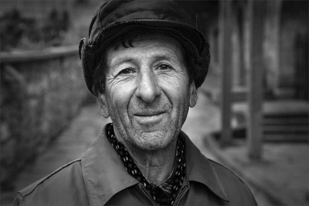
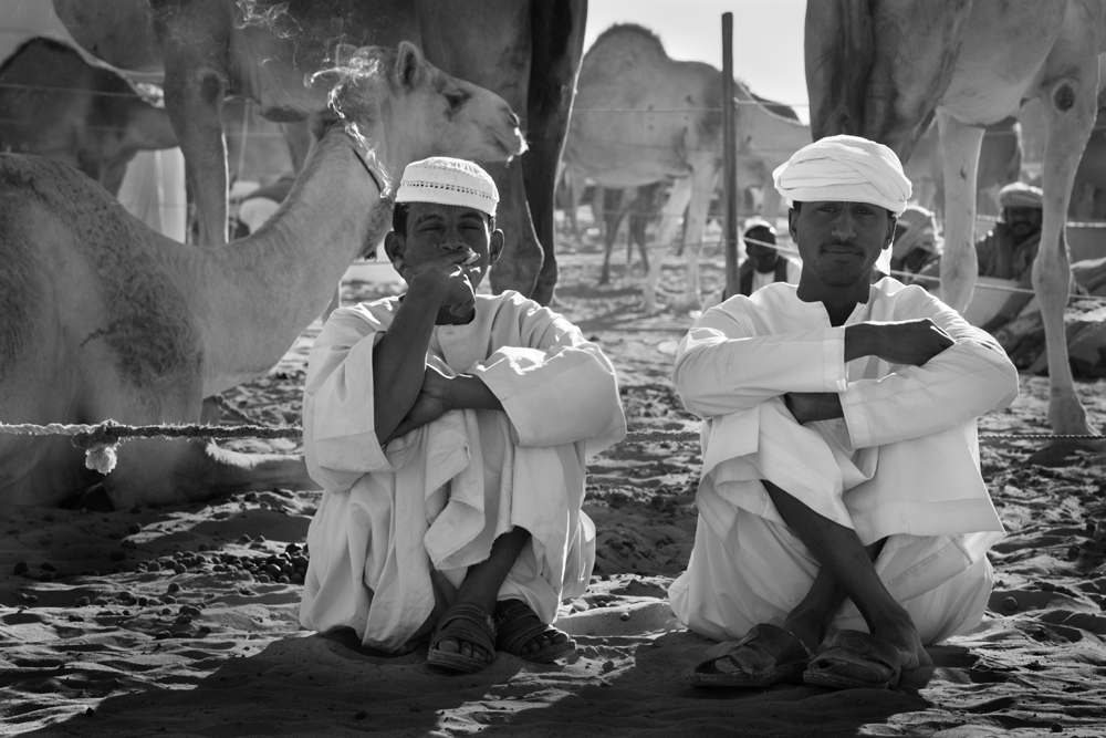
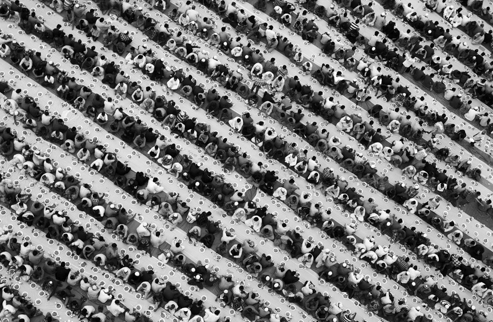
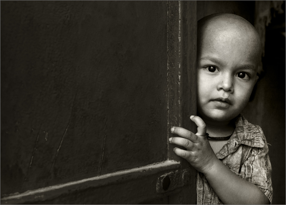
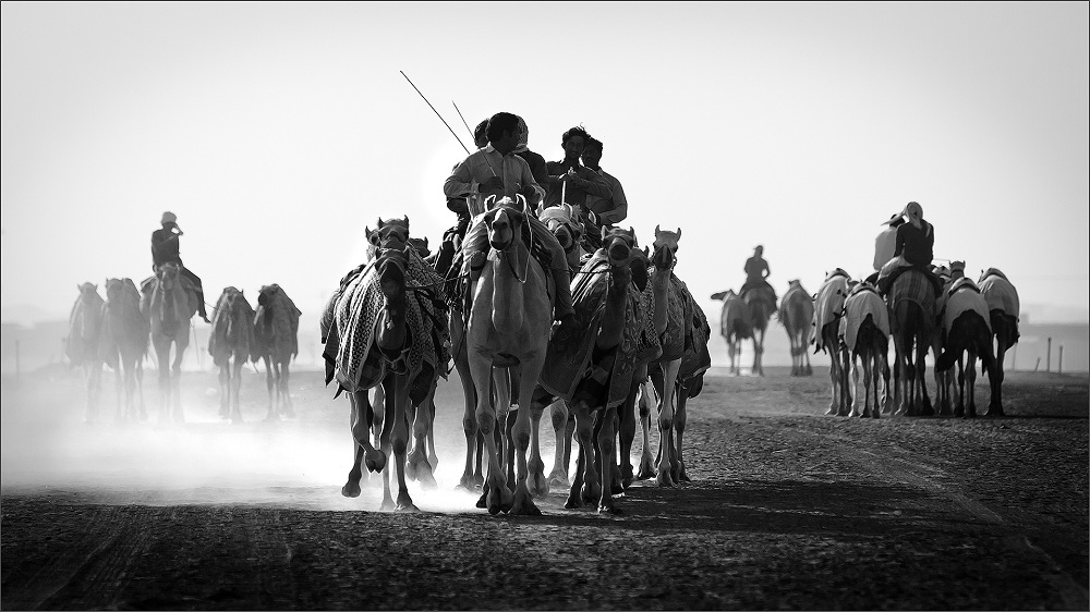
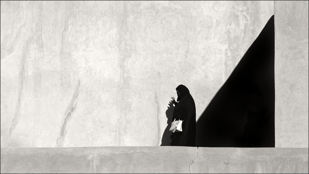
Beautiful moment captured. The storyline is well defined. I would prefer to reduce the black zone on the right and left as it has no detail, though it does frame the subject well. I would prefer to crop and make it a square as Paul mentioned. Good light to you Jerry. |
Jun 13th |
| 39 |
Jun 21 |
Comment |
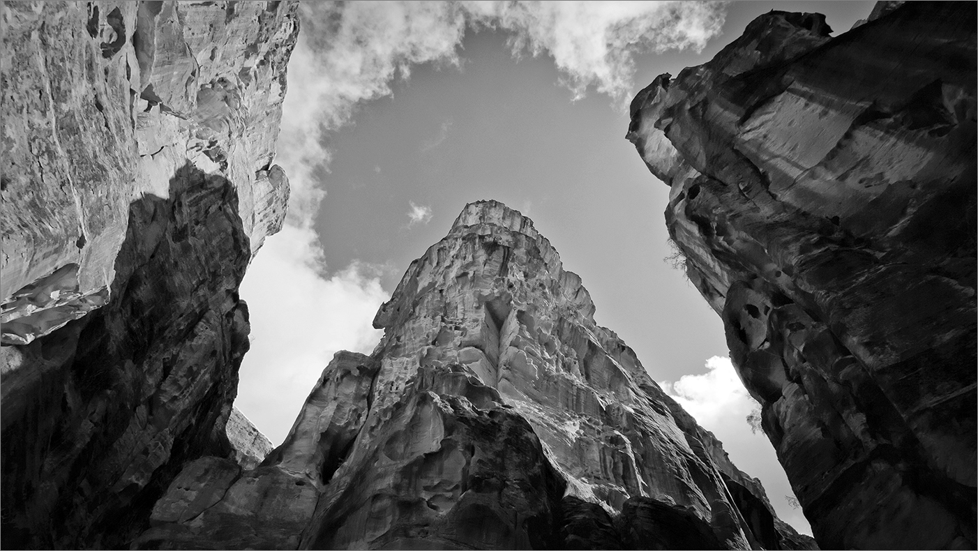
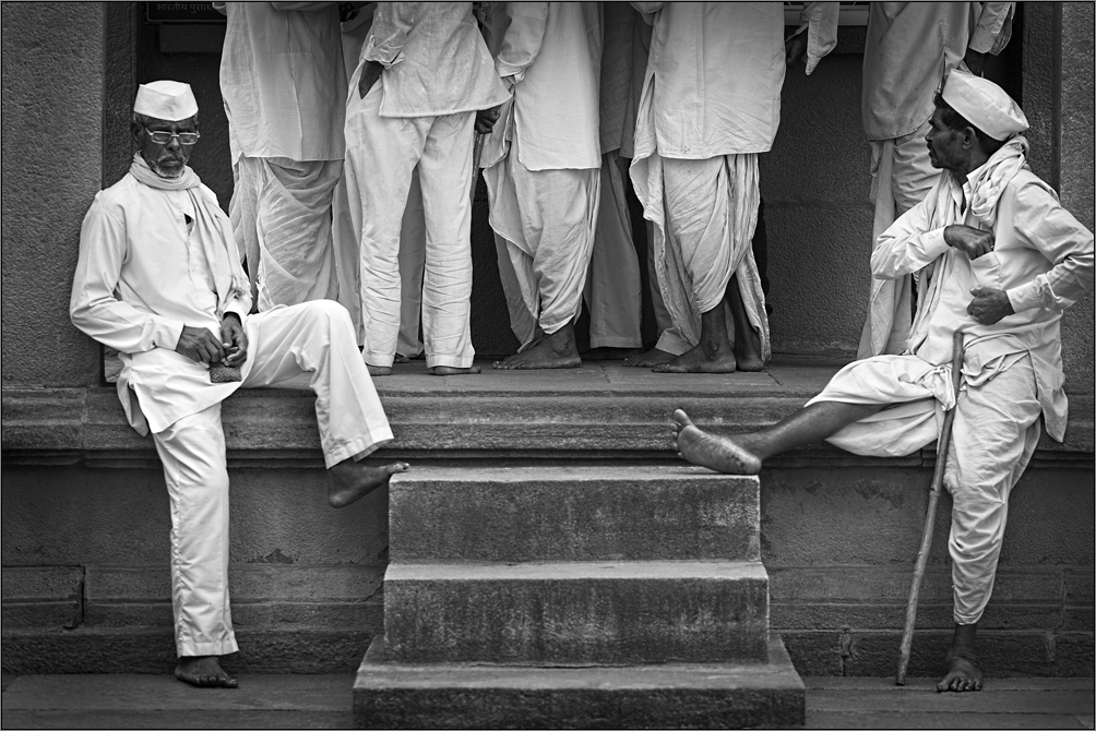
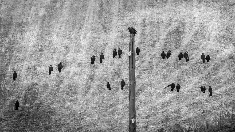
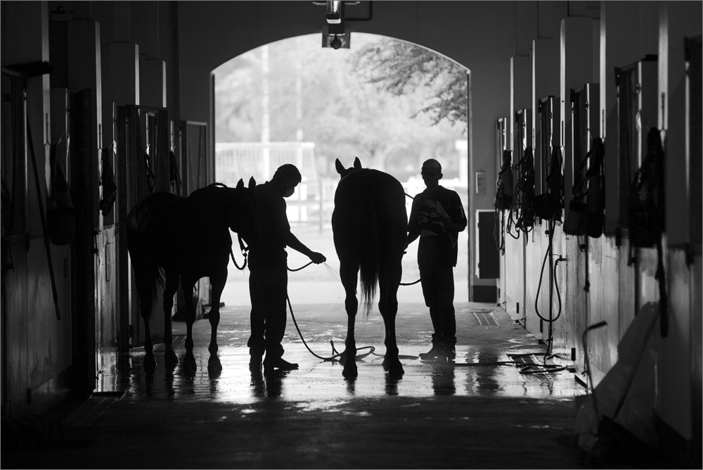
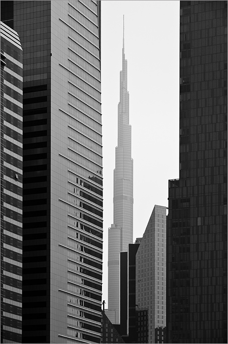
Interesting perspective and shows an eye for an image. But the image has some complexity. It takes some time to absorb it as compared to the color. But still it works due to its unique approach and surprise factor. |
Jun 13th |
| 39 |
Jun 21 |
Reply |
Thanks Paul, I hope one day I am able to photograph the winter landscape. That's a dream! Good light to you Paul. |
Jun 13th |
| 39 |
Jun 21 |
Reply |
Thank you Sir for your comment. Good light to you. |
Jun 13th |
| 39 |
Jun 21 |
Reply |
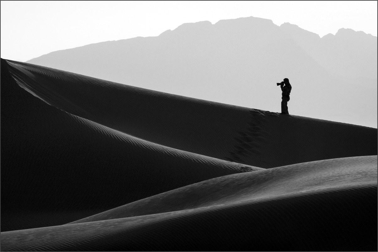
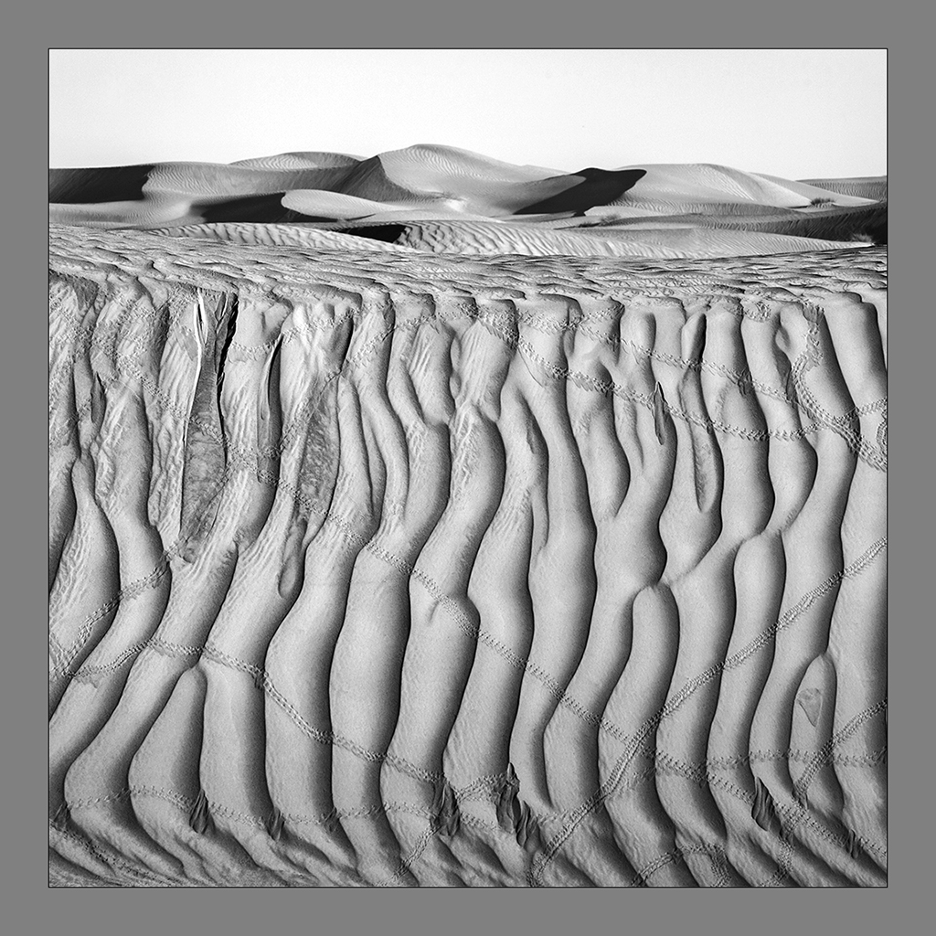
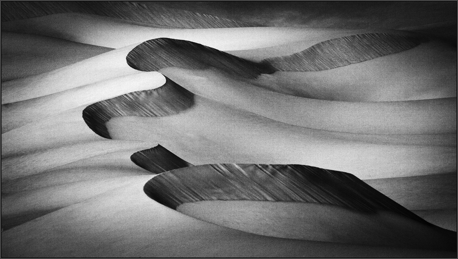
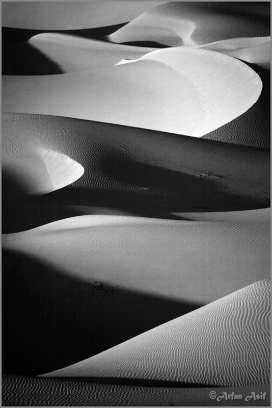
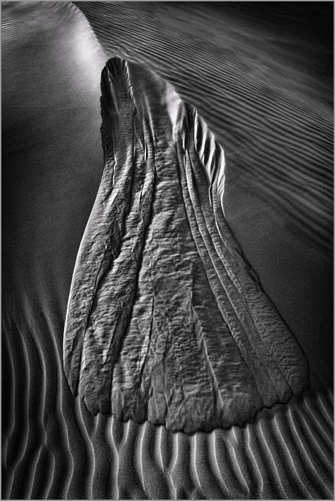
Thank you Jerry for your kind compliments. I was awarded the FRPS (Fellowship of The Royal Photographic Society) for Dunescapes last month. Many thanks. |
Jun 4th |
| 39 |
Jun 21 |
Comment |
Very nice Steve. I like the tone control here and the design aspect. The bold composition and impact and punch and engrosses the viewer. Yes the stroke at edge was required. Good light to you Steve. |
Jun 2nd |
| 39 |
Jun 21 |
Comment |
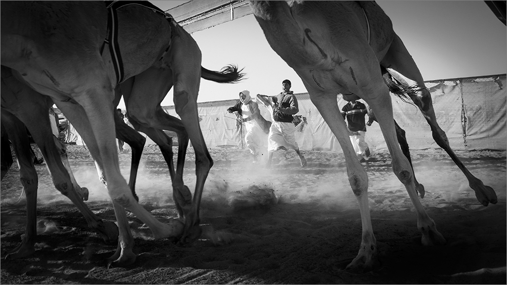
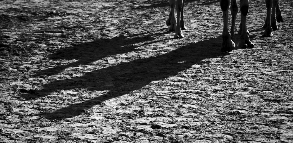
Very nice Paul. There is great energy in the shot and your timing to get the action at its peak is most commendable. Both the front legs in the air and the jockey looking down probably clenching his teeth though visible makes it very very interesting. Now if you permit, I am not sure if you got the right expo as I see the processing a bit compromised. It is slightly flat for me and I would like it to be bright. But then I notice the whites getting washed out and that is the reason you brought the whites a bit down. But I feel it affected the tonality of the entire frame and subdued it. I am sure you have a solution for it. I also agree with Dave that more space was required behind the horse and you too have preferred it that way. But for action shots compo always is a challenge. The fact that the shot shows the intensity and action is adequate. You did well and just my suggestion to pep up the image. Good light to you Paul. |
Jun 2nd |
 |
| 39 |
Jun 21 |
Comment |
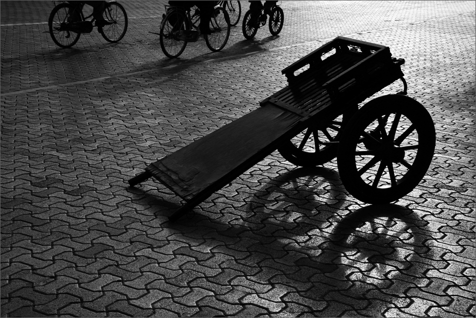
Very nice Dave. The storyline here is made interesting with that signboard. Thanks for sharing the info on the technique. I also like the border. It complements the signboard. Very effective imaging here. Good light to you Dave. |
Jun 2nd |
6 comments - 3 replies for Group 39
|
6 comments - 3 replies Total
|