|
| Group |
Round |
C/R |
Comment |
Date |
Image |
| 39 |
Dec 20 |
Comment |
Thank you Paul. I agree that I have to work on it a bit more to enhance the tonal quality. At the same time I need to improve my knowledge of processing in particular the utilization of layer masks. My processing is simple and direct and involves using levels and curves for the monochromes. Many thanks for your helpful insights. Good light to you. |
Dec 16th |
| 39 |
Dec 20 |
Reply |
Thank you Lance for stopping by. Appreciated. |
Dec 14th |
| 39 |
Dec 20 |
Comment |
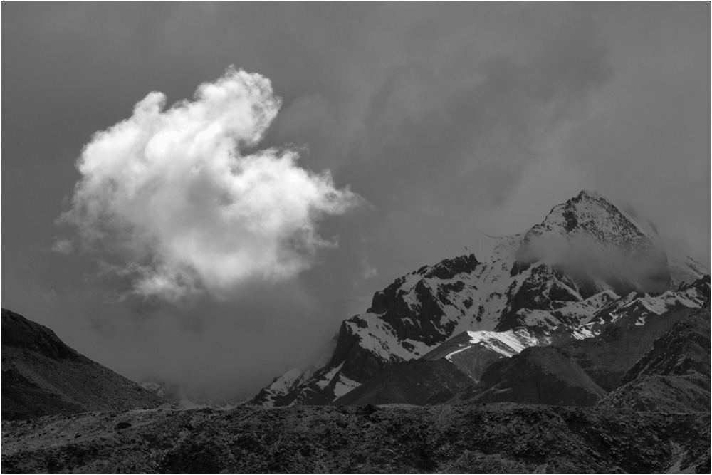
Beautiful tones here Larry. I liked the impact this image presents. But the downside is that you left too many dust spots. You need to carefully clone them out. I wonder your sensor has caught in too much of dust and it is time for a sensor clean up. Since you used aperture F14 it shows in plain areas. It is quite intense and affects the viewing pleasure. Further I would prefer to crop out some sky as the mountains bisect the frame. Either we have more sky or less. A beautiful frame that can be presented well to great advantage and impact. |
Dec 14th |
| 39 |
Dec 20 |
Comment |
Both mediums are interesting. For travel concepts the color is apt but the mono has an arty feel and the split toning does add a good mood to the frame. I note the vignetting is intense and good reasons for adding a pixel stroke for separating it from the background. I too see a slight tilt which can be corrected easily. Good one Steve. I was there years ago and understand the challenges. You did well and you made me go off in a tangent with that comment of Baryta paper :) Good light to you. |
Dec 14th |
| 39 |
Dec 20 |
Comment |
Nice one Vincent. The perspective is interesting and draws you into the picture and to Infinity. I note you have maintained the symmetry on both sides where the road touches the edge of the frame, though you were not exactly at the center of this road. I see an overlap of the first marking or is it painted as such. Slightly brightening up the center divide I believe would help draw the viewer forcefully into the image. I like the look you derived in this one. Good light. |
Dec 14th |
| 39 |
Dec 20 |
Comment |
Interesting one Paul. I like the slow shutter speed technique which is very apt for this image. I see more brightness in the whites in the skyzone than in the water zone. The image looks good as it is. But I would like to suggest brightening up a bit of the water zone near foreground to complement the upper half of the image and draw the viewer in. Liked it Paul. |
Dec 14th |
| 39 |
Dec 20 |
Comment |
I like the ambiance created in this image. It has a charm of its own. In particular the background is just beautiful. The image at the top left has some processing issues. I am sure Jerry will tackle that. It might be exaggerated on a print. A bit of darkening of the top part room of the structure would give it some punch, just below the top windows the roof there. It is a small issue. The overall image is just spectacular. Good light Jerry. |
Dec 8th |
| 39 |
Dec 20 |
Comment |
Very interesting image. The image is well structured and the spatial arrangement of all elements well grounded. The tonal quality of this image from the dense blacks to the pure whites is a delight. The balance created between the two elements on the side justifies the positioning of the lighthouse. The storm adds a dramatic impact. The image noise has been reduced substantially with the filter but a bit more would help though it gives character to the dark clouds. Good one Dave. |
Dec 8th |
7 comments - 1 reply for Group 39
|
7 comments - 1 reply Total
|