|
| Group |
Round |
C/R |
Comment |
Date |
Image |
| 39 |
Aug 20 |
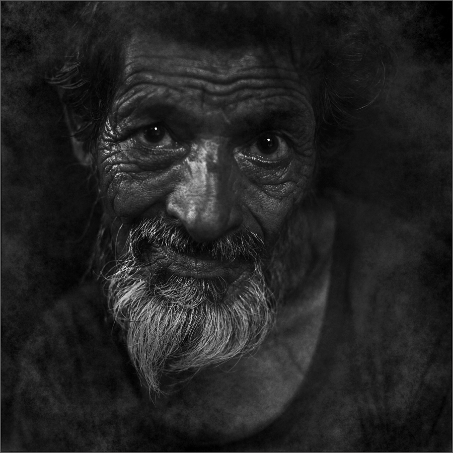
Comment |
Good one Larry. Neat conversion to mono with great impact. Liked it. |
Aug 20th |
| 39 |
Aug 20 |
Comment |
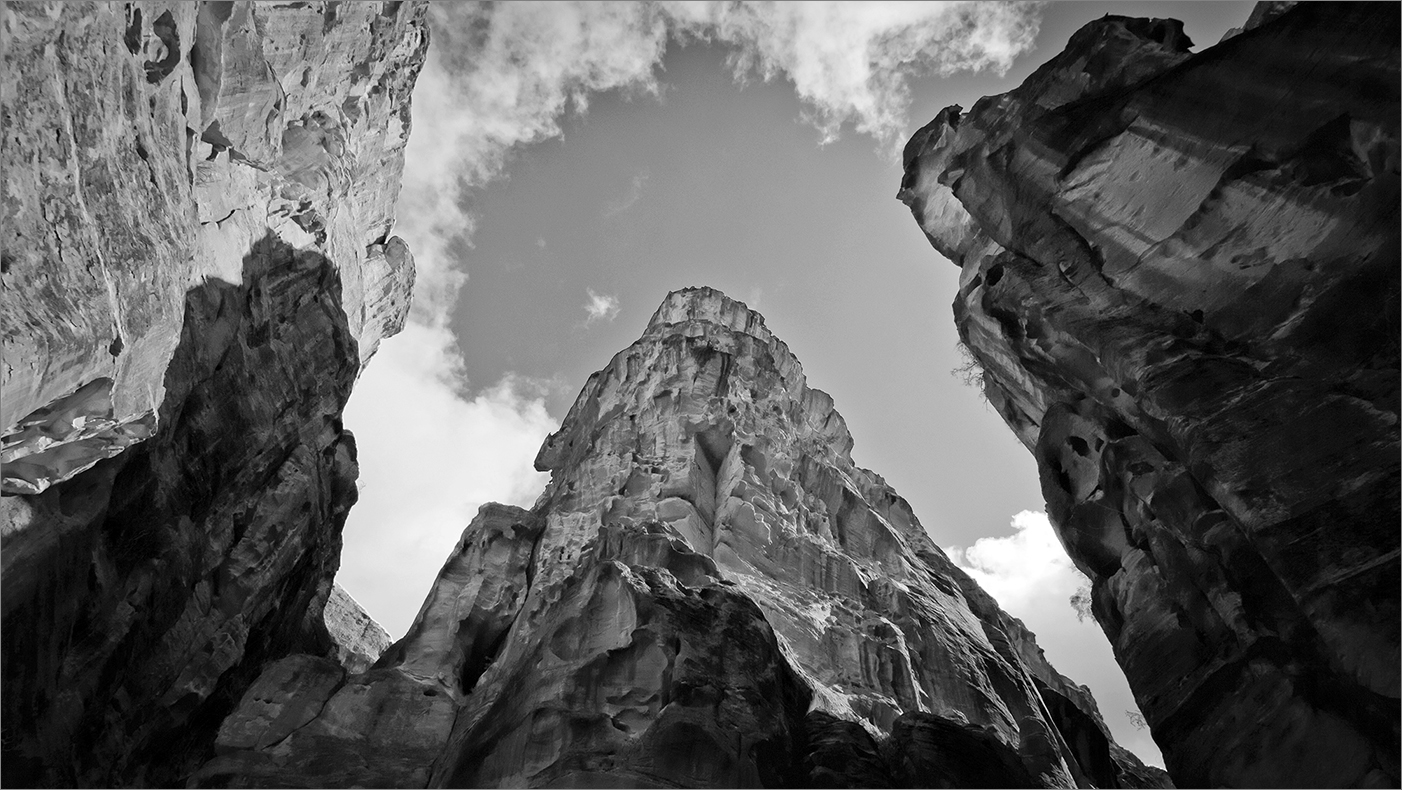
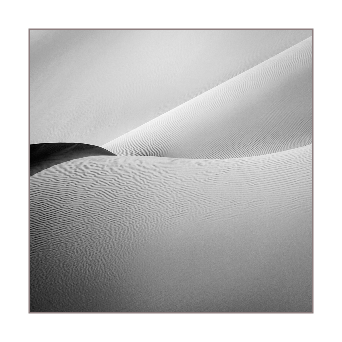
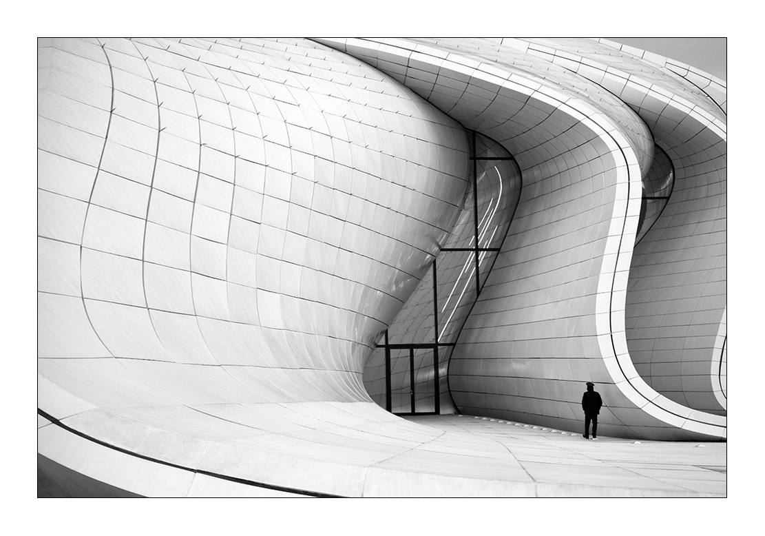
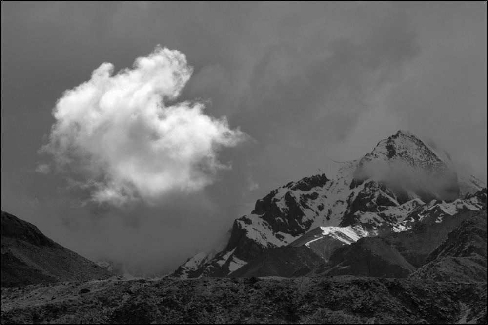
Interesting image with very good play of light. The mono version should ensure the clouds a bit different from the walls. The tones are now the same. I would prefer the white highlight on the wall at the top is worked on a bit more for details using the highlights slider on RAW before the mono conversion to get a tone that does not seem washed out. For me the contrast is on the high and when printed it may result in some challenges. The tone on the other areas where you see the play of light is better controlled and if this effect is replicated on the larger highlight it will be good. Just my view. |
Aug 20th |
| 39 |
Aug 20 |
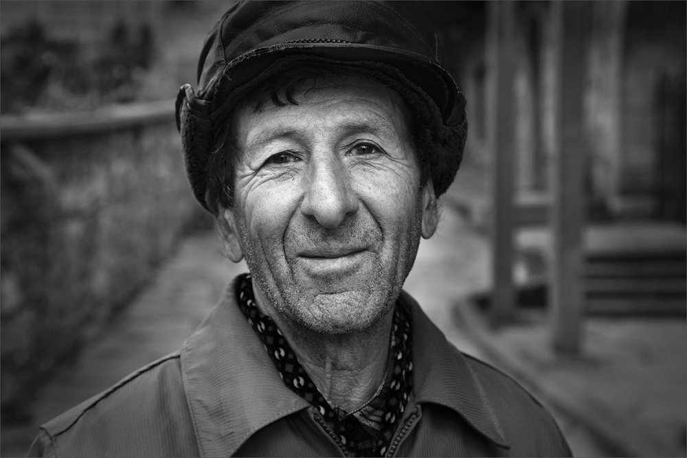
Comment |
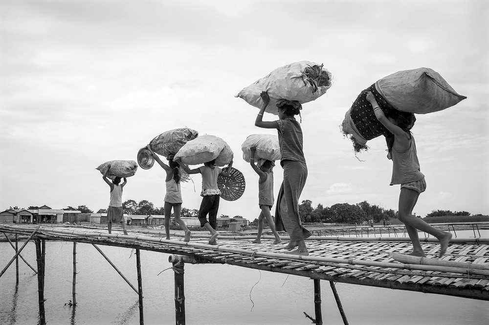
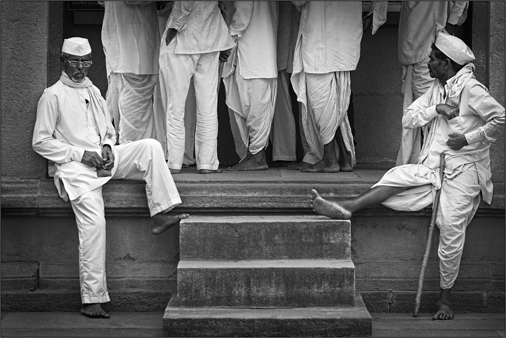
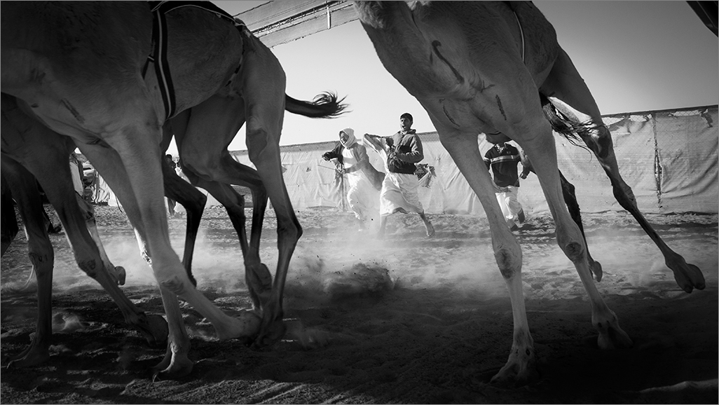
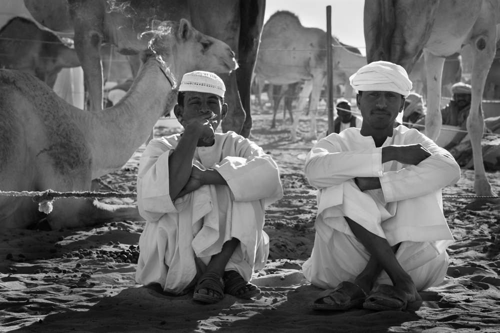
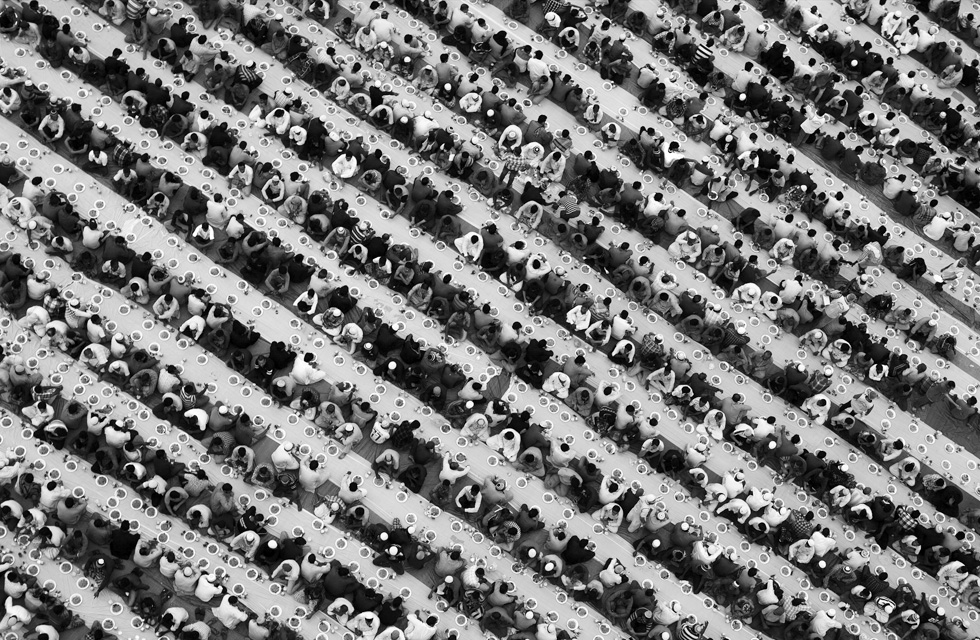
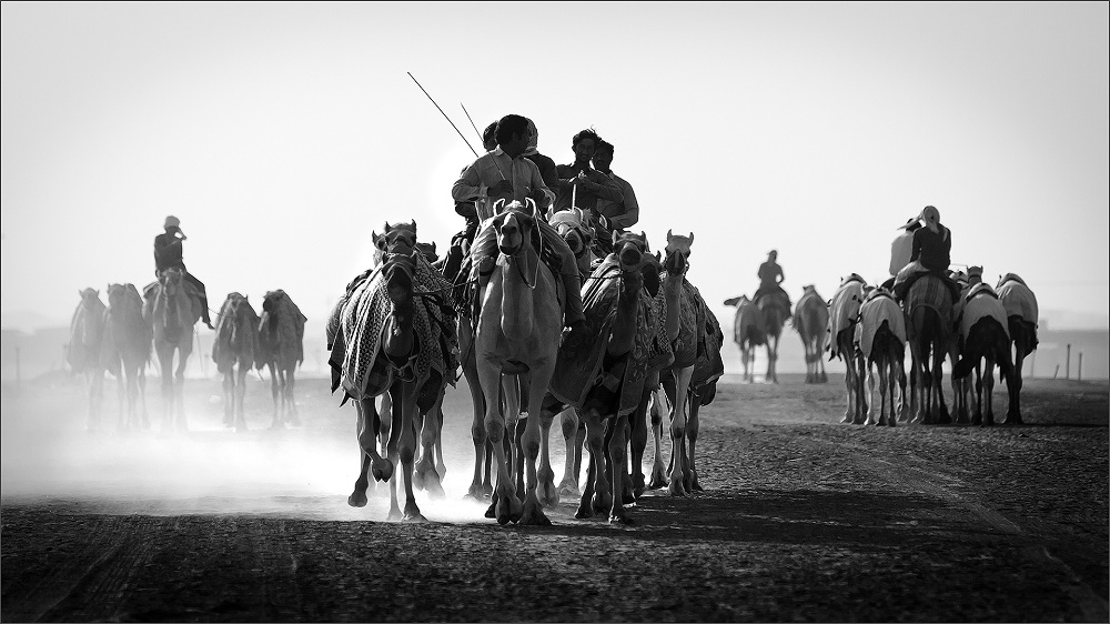
Very nice presentation / frame that harmonizes with the content well. I liked the look and the tone achieved. I wouldnt change anything here. The only issue is the body language of the men. That does not go well with the feel. Ofcourse my personal take the men seem out of sync with their existence over there. I understand you couldnt do much about that and they wouldnt be ready to be directed! |
Aug 20th |
| 39 |
Aug 20 |
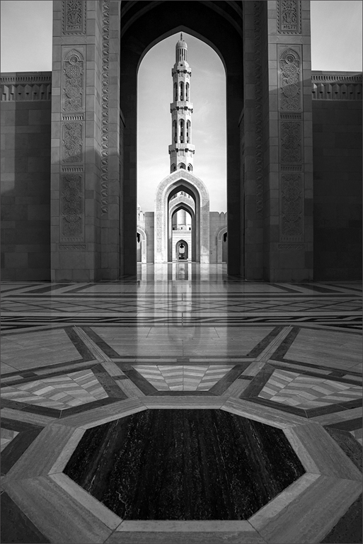
Comment |
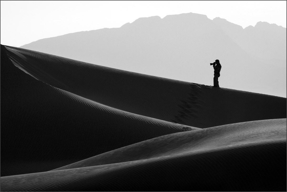
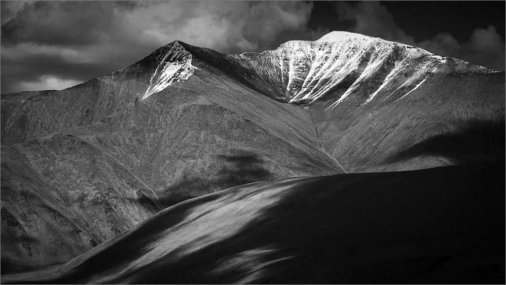
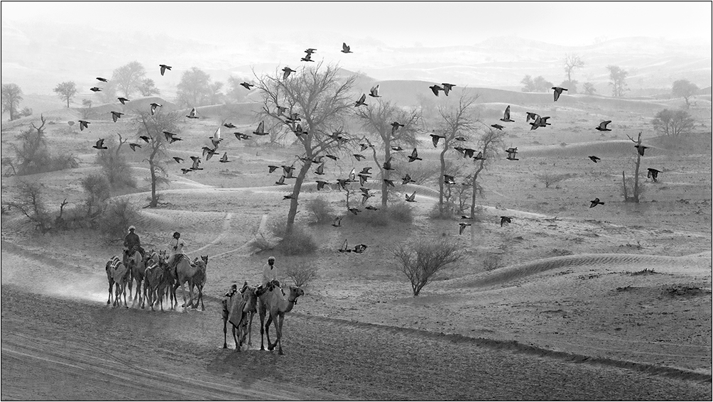
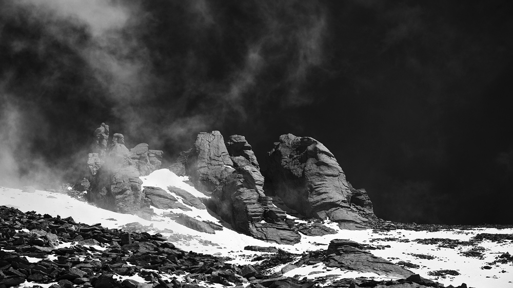
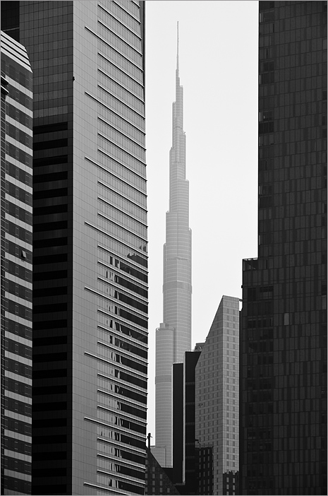
Good one Paul. The atmospheric mood takes one to a different level. Liked it. I would crop out some part of the top to avoid those gaps on the top right. |
Aug 20th |
| 39 |
Aug 20 |
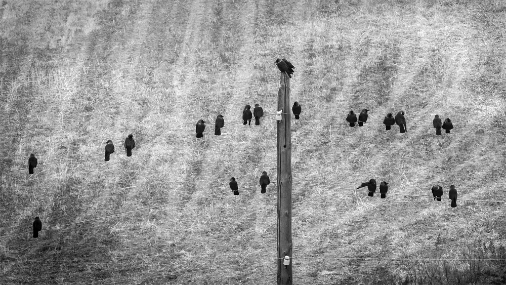
Comment |
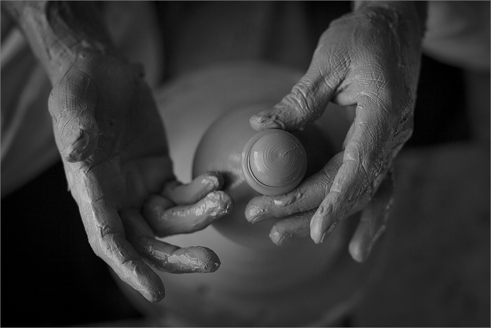
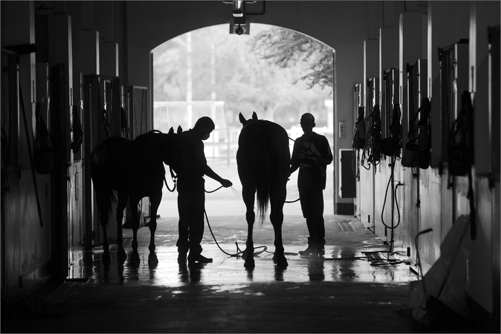
Interesting one Jerry. The tonality and the subject goes well for the monochrome approach. I like the content you present here. The sky and car seems odd to me. It would be preferable if the window is shown complete. Still a good one. |
Aug 20th |
| 39 |
Aug 20 |
Comment |
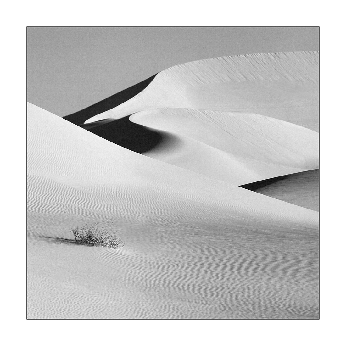
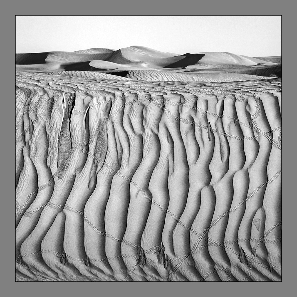
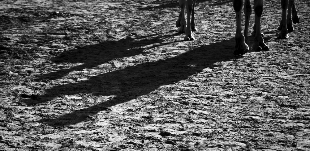
Interesting one Dave. The tonality, texture and feel of the image is good. I consider the foliage a distraction, but more important concern is the less space on top which is creating some tension. Obviously you have less space over there as the sky is bland. Cropping a bit of base and having some more mm on top would work and give breathing space. |
Aug 20th |
| 39 |
Aug 20 |
Reply |
Agree with you Dave. Thanks. |
Aug 20th |
| 39 |
Aug 20 |
Reply |
Thanks Larry. Indeed the general consensus is that the shadow zone at base is quite voluminous and affects the image. Your crop boxes the image and the play of light at the base is lost. Indeed the sky and mountains could form the basis of this image. On hindsight I think the compo here does not confirm tot he monochromatic approach while the color does not sound so heavy. Having stated, you all made me think ! Thanks. |
Aug 20th |
| 39 |
Aug 20 |
Reply |
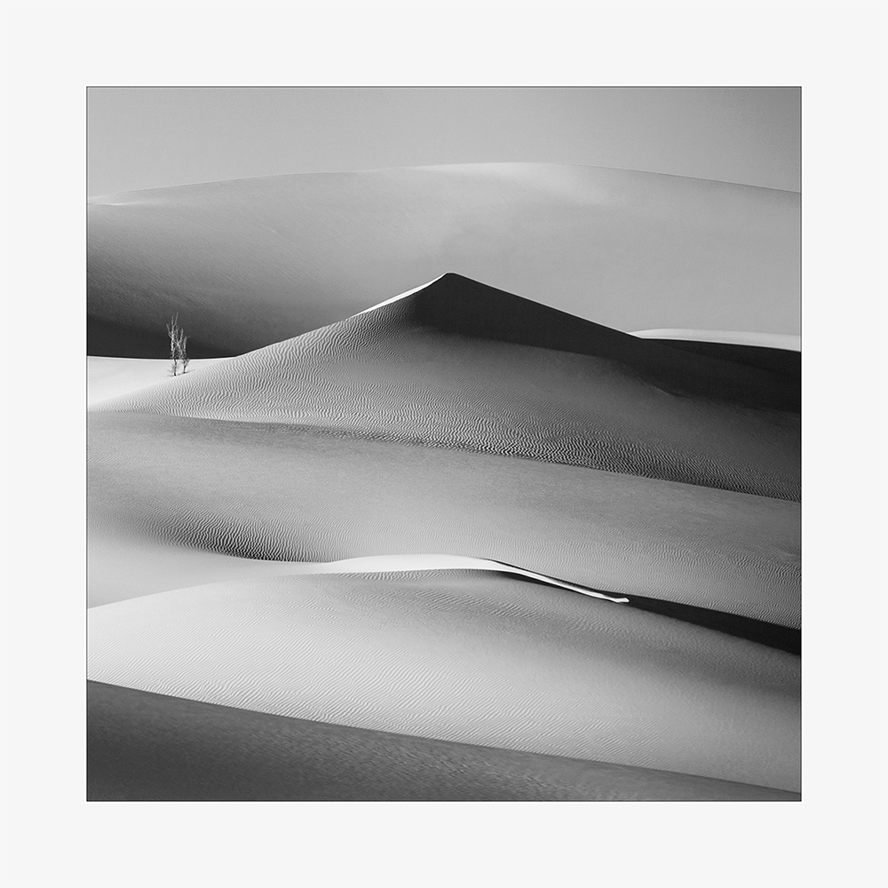
I understand the shadow zone is a bit heavy; makes me think! Thanks Dave. |
Aug 20th |
6 comments - 3 replies for Group 39
|
6 comments - 3 replies Total
|