|
| Group |
Round |
C/R |
Comment |
Date |
Image |
| 39 |
Jun 20 |
Comment |
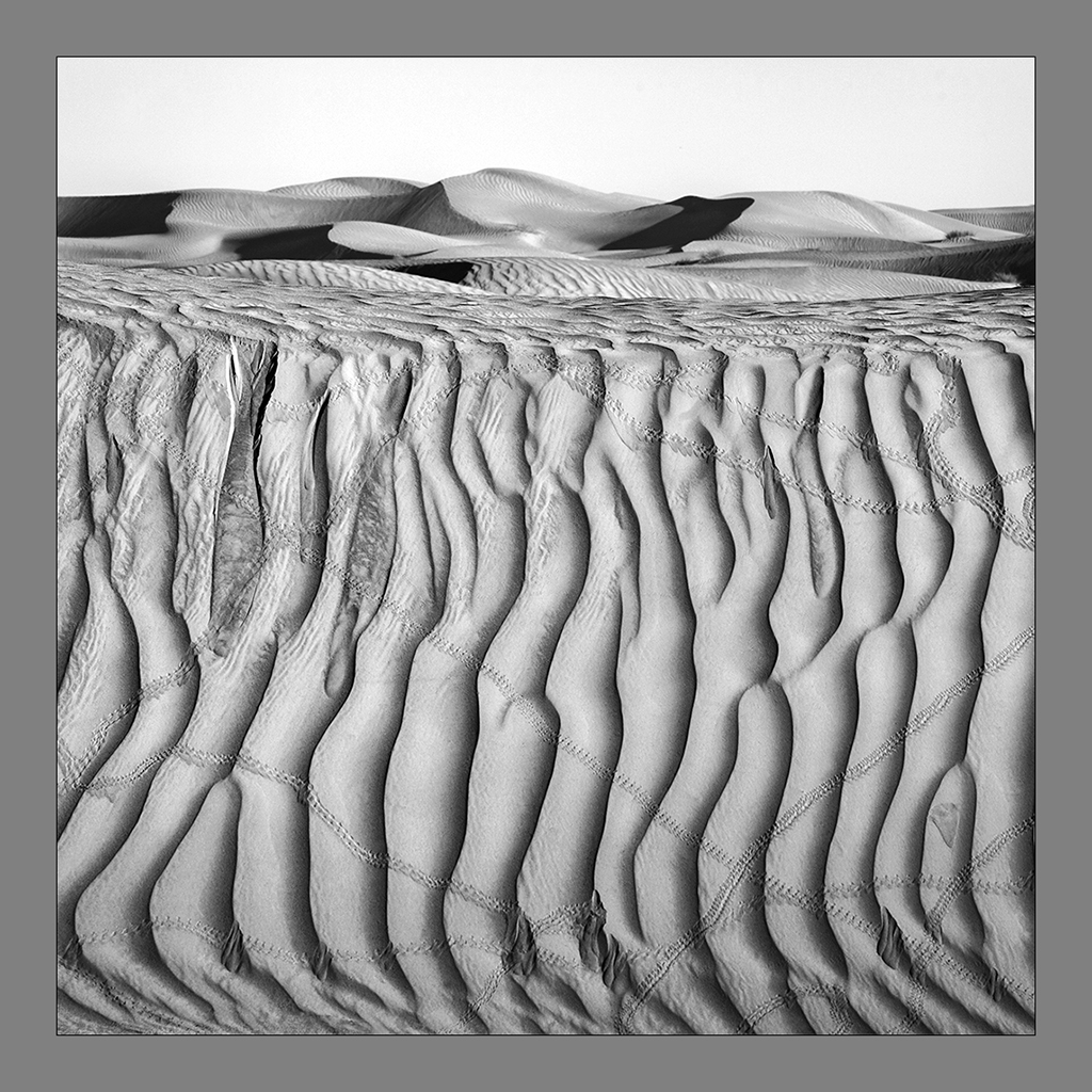
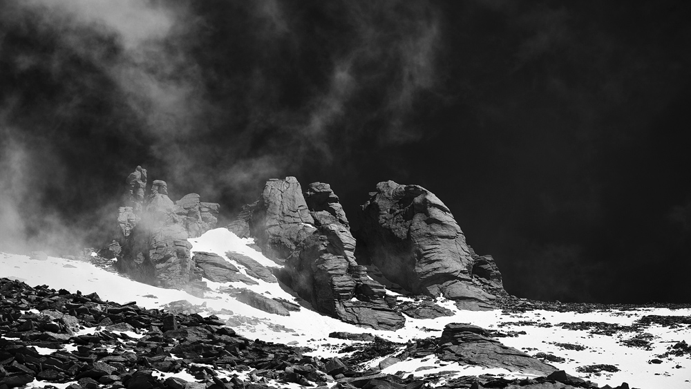
Thank you for the comments. Sometimes when you go out of the comfort zone you feel a bit hesitant and probably I thought about it quite a lot. This one was a bit different in my usual style and I gave it a try. I agree with all and thank you for the issue on details. I will try to ensure more details, a touch more, so that in no zone the whites are washed out. On a large dimension it does have. But I understand that I need to work on it a bit more. Many thanks for your advice. |
Jun 22nd |
| 39 |
Jun 20 |
Comment |
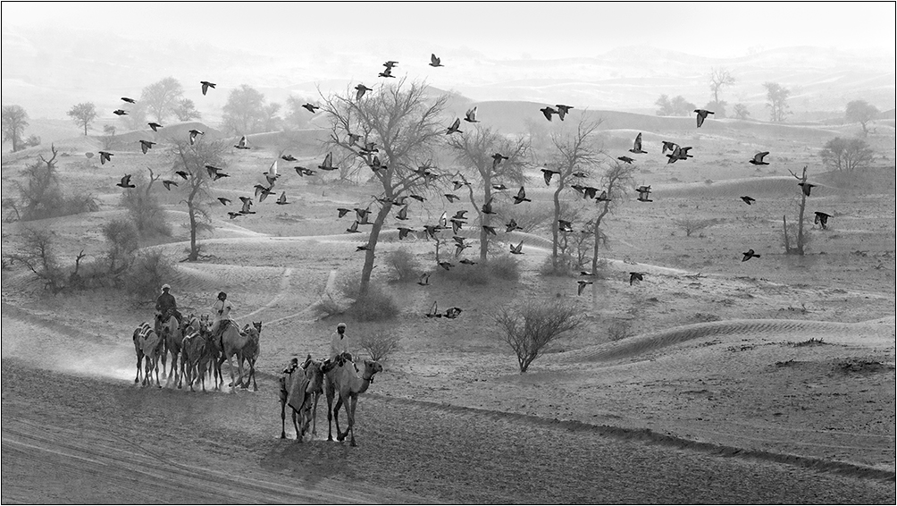
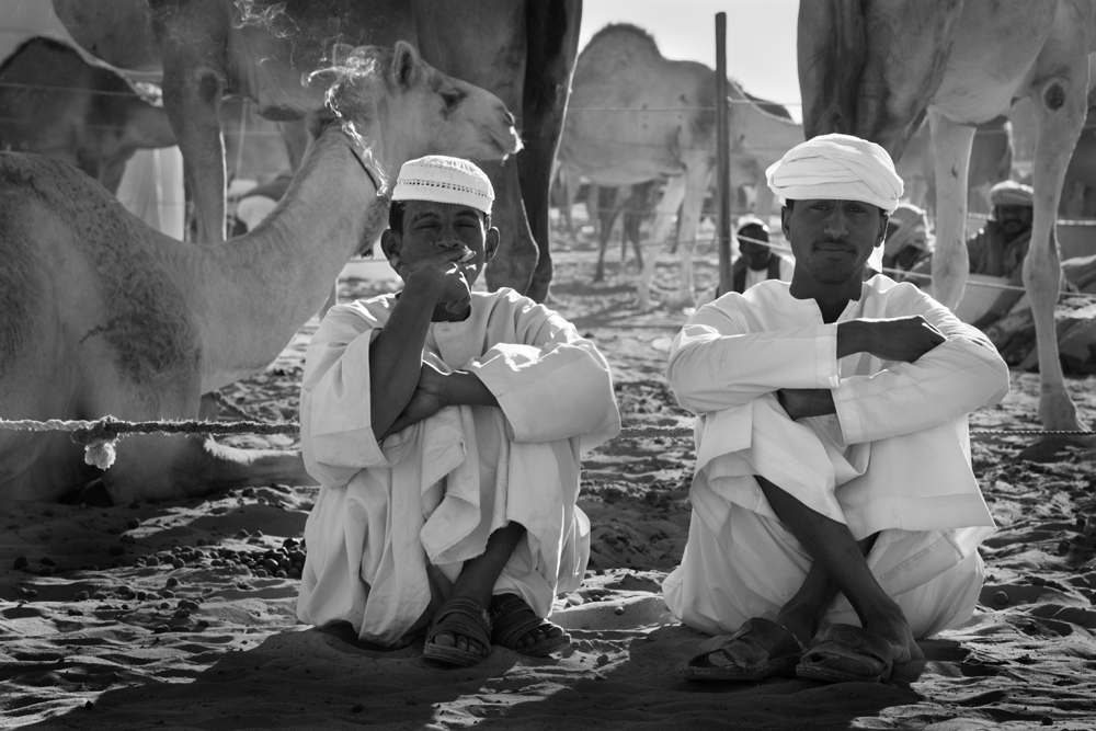
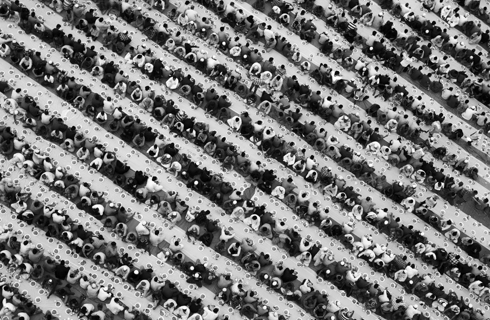
Interesting image with good processing and thoughtful aspect ratio. The pano image has good punch with the antelopes very clear. Very nice. |
Jun 7th |
| 39 |
Jun 20 |
Comment |
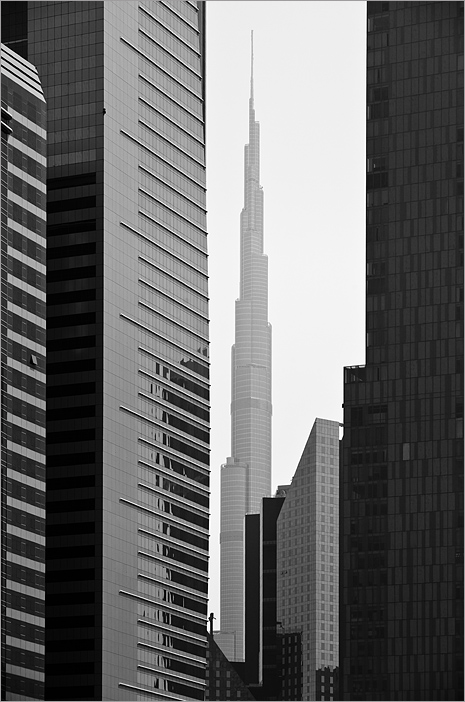
Beautiful image Steve. No matter how many images we see of this place, we enjoy it all the more. Good processing technique and specs makes this a very nice image. |
Jun 7th |
| 39 |
Jun 20 |
Comment |
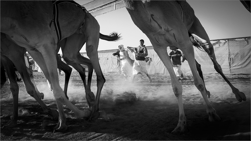
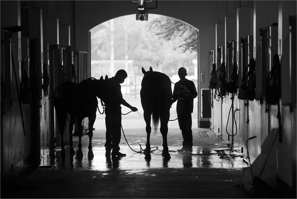
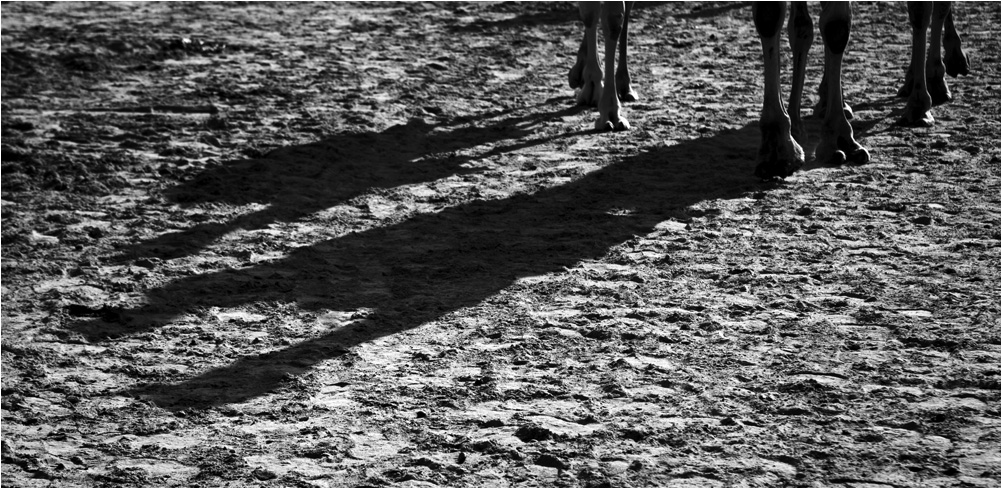
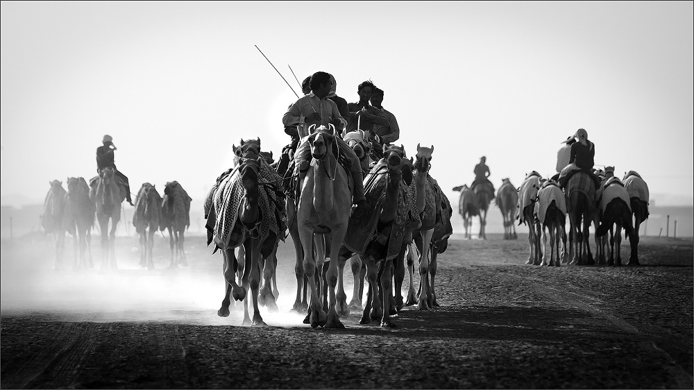
Dear Vincent, You tried under very difficult lighting conditions and rescued the image to a certain extent. I am sure such images challenge ps skills. Since you mention that these horses are within reach, I would prefer you take such lovely subjects in good lighting condition as the vignette is looking like a cut out and the whites compromised on many areas. Having stated you did wonderfully well to bring the image to this state which would have been very difficult for me! Good Light to you Vincent. |
Jun 7th |
| 39 |
Jun 20 |
Comment |
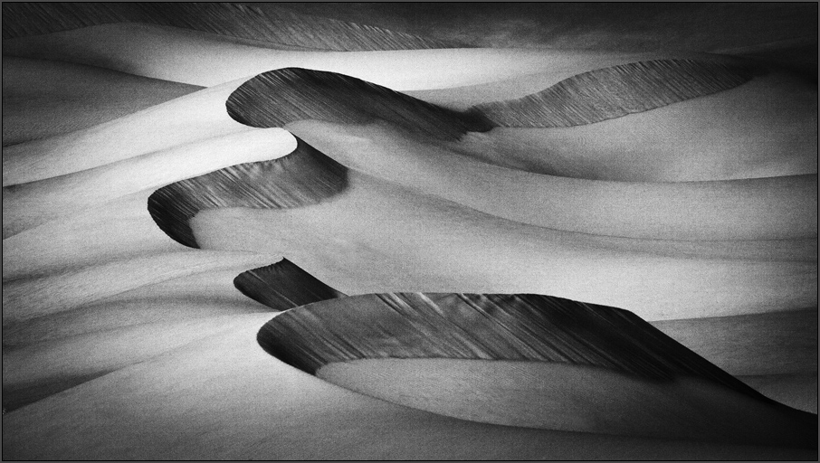
Interesting on Paul. I would be confused between the two mediums. Both seem apt and could work well. I note that the potential of the monochrome has not been tapped completely. I see some flatness and in some zones like the smoke on the train behind dull. I feel if the image tonality was improved, you would get more punch out of this image. It is a good frame to work on and I also recall Steiglitz images (Hand of Man series) of steam trains emphasizing those leading lines on the tracks. I agree with Jerry on the tree at right edge. Good work Paul. |
Jun 7th |
| 39 |
Jun 20 |
Comment |
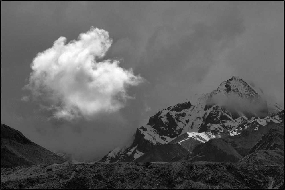
Very nice image Jerry with good technique and specs. I feel the intended effect has been achieved. I would prefer a vertical composition to emphasize the height of the falls and to be in line with the shape of the dominant. Half of that big rock on right to be cropped to get the vertical. But I understand you will lose some of the flow at the base. |
Jun 7th |
| 39 |
Jun 20 |
Comment |
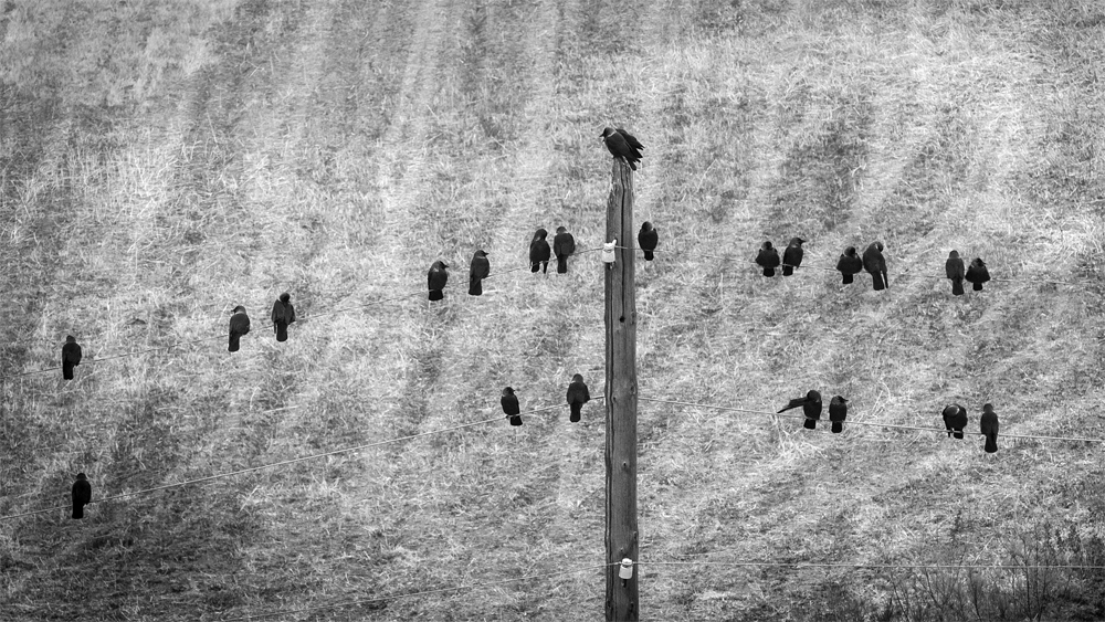
Interesting image. My opinion it looks better in color and agree with Jerry, the left is negative space and requires a crop. The eye and surrounding area are in close tone and therefore the challenges. The sharpness and perch are good. |
Jun 7th |
7 comments - 0 replies for Group 39
|
7 comments - 0 replies Total
|