|
| Group |
Round |
C/R |
Comment |
Date |
Image |
| 39 |
May 20 |
Comment |
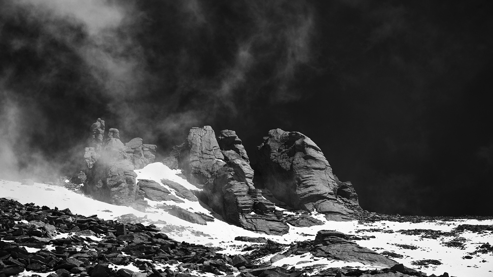
Very interesting image and discussion here. I agree each one of us would interpret it differently. My opinion is in sync with Larry's version. The original is high on contrast. Think about using dehaze along with clarity and combining the two to get the desired effect. I have done this to soften the image or a particular region which you find contrasty and it works well for landscapes. Sometimes the contrast decreases the impact and the blacks get eaten up as I note in the original. The tonality can definitely be improved and indeed a good discussion here. Good light to you Steve and good luck with the exhibition. |
May 26th |
| 39 |
May 20 |
Comment |
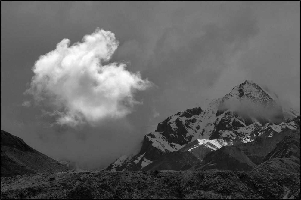
Fantastic Larry. This is definitely a hot spot, a very pristine place and a haven for landscapes, astro as well as heritage and culture. I prefer the mono version and the second try is definitely very good. The color content usually of the monasteries are good, but in this one it is the color of sky taking attention and the little led at the top of the architectural structures are quite less in volume for attention. Therefore I prefer the mono so that the sky does not take the attention due to color content. I definitely agree that there should be space on the right and I believe it was there. Maybe you do not have it in your file. The treatment of the mountainscape and the light on them gives them the required punch. Well done and Good light to you Larry. |
May 26th |
| 39 |
May 20 |
Reply |
Thank you Vincent. Good Light to you. |
May 26th |
| 39 |
May 20 |
Reply |
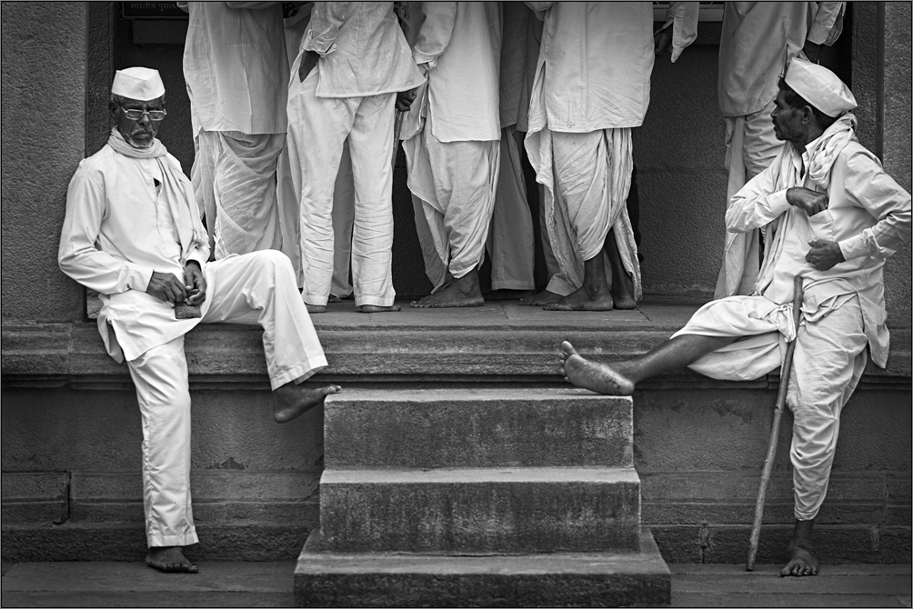
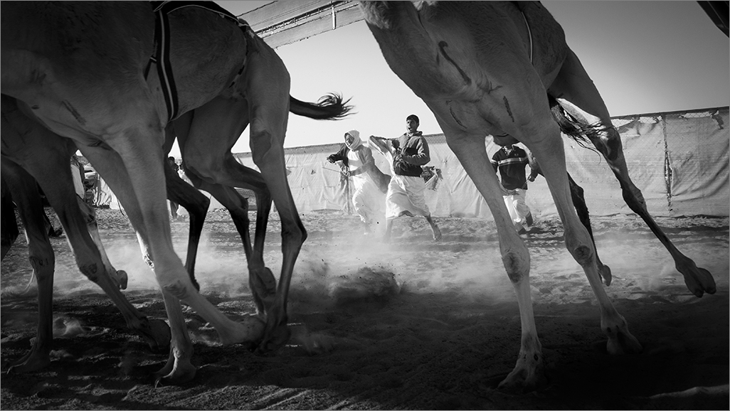
Thank you Paul. I completely agree about it. I did it very spontaneously and did not get a second chance as they changed position so quickly... But I agree about that elbow issue. |
May 26th |
| 39 |
May 20 |
Comment |
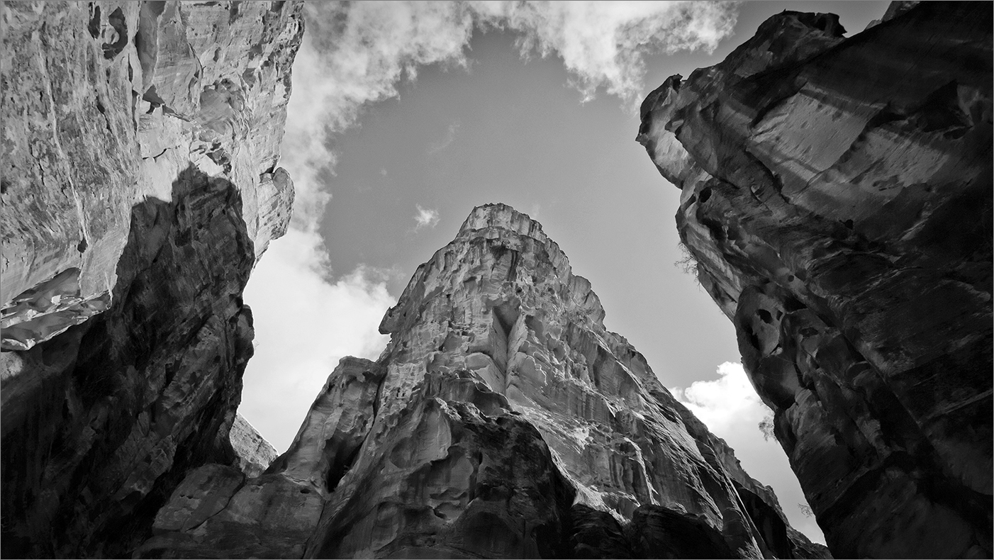
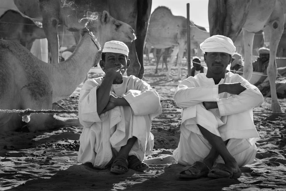
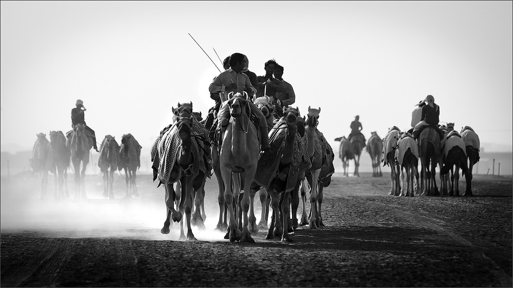
Vincent, very nice image. When my club judged an inter PSA travel, we saw a few from this location and it shows the same view. As one who has done landscapes, I feel this scenario suits the color medium more as the color content is the highlight. In the mono you have a challenge for this subject and you need to show tones which I note the original is lacking but can be improved. I like the version from Larry. Many of the inherent colors are in the same tone/light intensity and reflect merged in the mono without separation. As Jerry mentioned the scale of tones in an Ansel makes the image. Ansel was a craftsman who avoided the tonal mergers more with the dodge and burn tools used in traditional approach much more than the zone system. The zone system could only give him an exposure but could not separate colors with the same tone when printing mono. Your image has great potential and as every here indicated with more work can be a fantastic one. |
May 12th |
| 39 |
May 20 |
Comment |
Good one Paul. Piers are very interesting subject to show seascapes and though I prefer them in the morning and evening times against fiery skies, your mono is still very good as you show it in bold composition. As far as the tonality is concerned, I see it flat and definitely want some punch and contrast in this frame. I saw it on two screens and felt the same. I also see the horizon tilted and I think by using transform-distort it can be corrected along with the pole at the left edge. Still a very nice image. |
May 12th |
| 39 |
May 20 |
Comment |
Very apt image. The sign board is clear and I agree with Jerry on the title. I would have preferred more of the park to be shown, though it is clear no one is there. Still very nice and perfect for the current scenario. |
May 10th |
| 39 |
May 20 |
Comment |
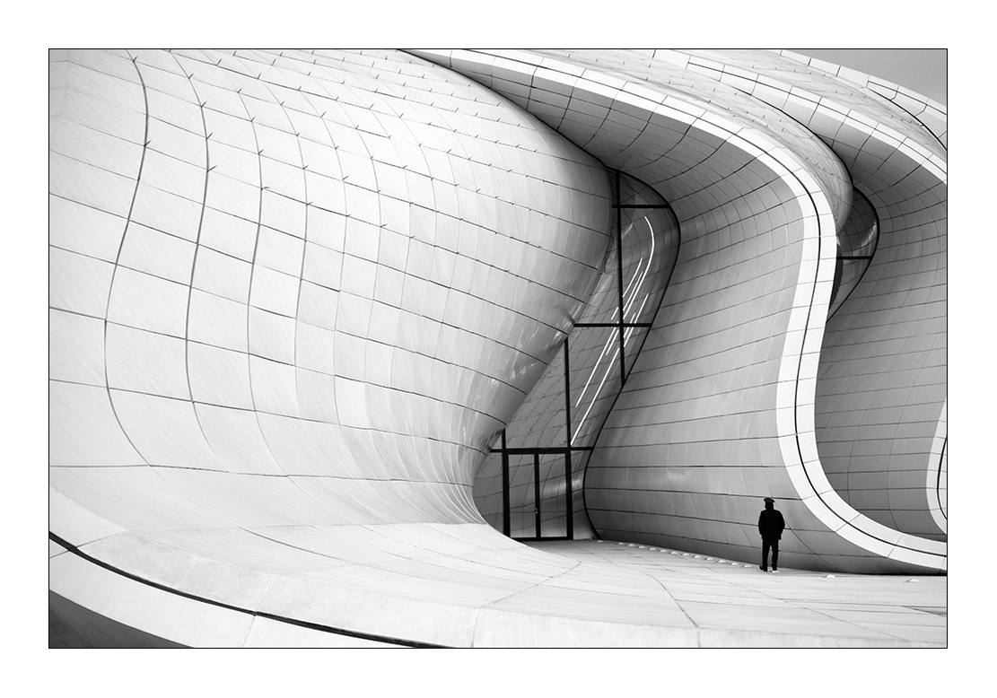
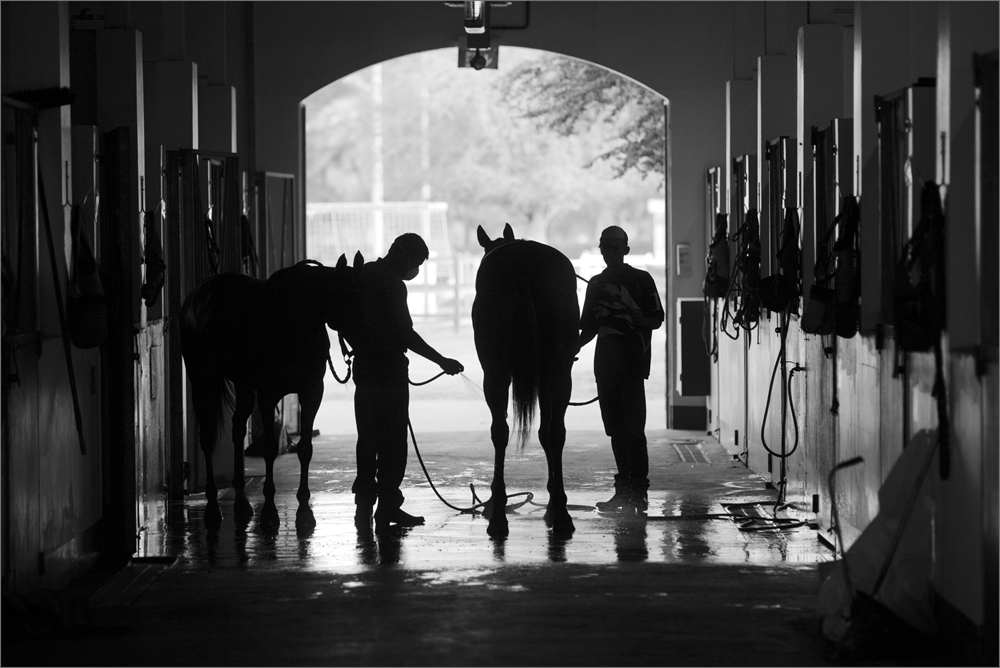
Dave, that is interesting. I cannot relate to the techy part which is difficult for me. But the image indicates the capability and possibility of interesting imaging. The image has been well 'treated' and the final outcome very nice. The swirls do add an interesting effect and help the viewer concentrate into the middle. I would have preferred some more space on the top for the tree not to bleed out. But I understand the control is not easy and you still presented a nice image. |
May 10th |
| 39 |
May 20 |
Reply |
Thank you Dave for your kind words. |
May 10th |
| 39 |
May 20 |
Reply |
Thank you Steve for your kind words. |
May 10th |
| 39 |
May 20 |
Reply |
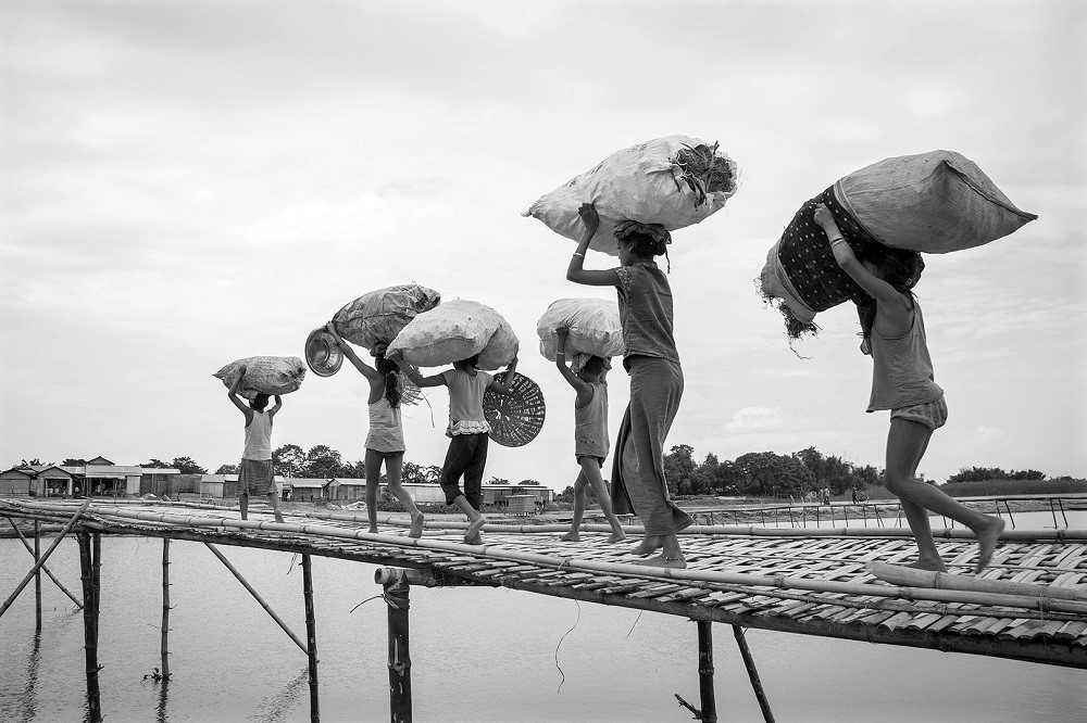
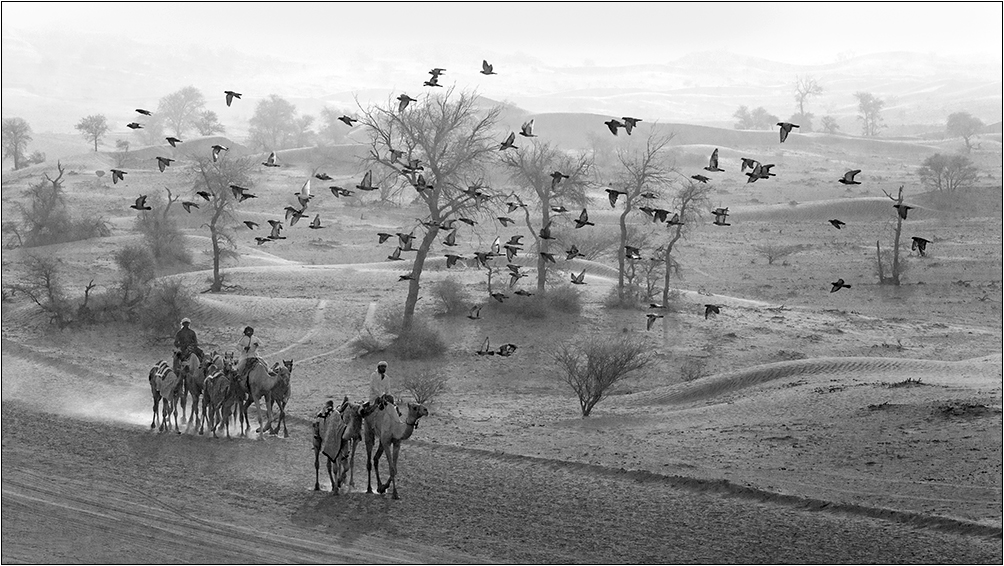
Thank you Larry. For me too it seems like a bygone age. Modernization development has transformed people, their attire, lifestyle and outlook to life per se. It is only in the remote villages where technology has not reached or influenced that may have such elements to capture. First I thought of a filter effect, but then realized that the originality of the scenario would be compromised and hence left it more for its photo journalistic approach. Many thanks. |
May 10th |
| 39 |
May 20 |
Reply |
Thank you Jerry. Indeed black and white images have a spice of their own. Color inherently can be distractful if not well conceptualized. Interested in the webinar you mention. As I am a black and white imaging fanatic, would like to know what Don Toothacker has to say. Thanks. |
May 10th |
6 comments - 6 replies for Group 39
|
6 comments - 6 replies Total
|