|
| Group |
Round |
C/R |
Comment |
Date |
Image |
| 39 |
Dec 19 |
Comment |
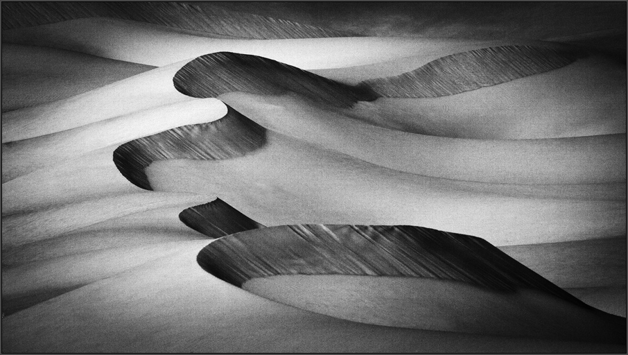
Yes, like Dave I also feel it has a painterly feel. For this effect I would prefer a color version rather than a mono. I like the thought process though and the eye for creating an interesting image out of the ordinary. |
Dec 12th |
| 39 |
Dec 19 |
Comment |
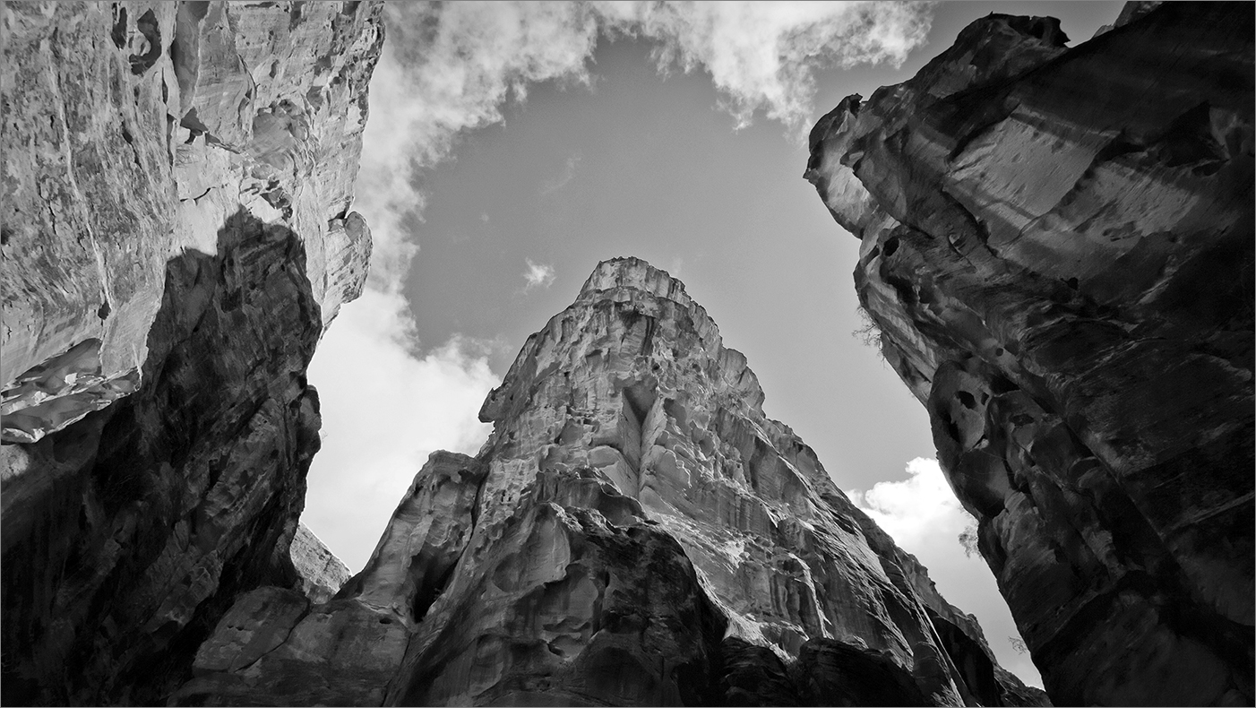
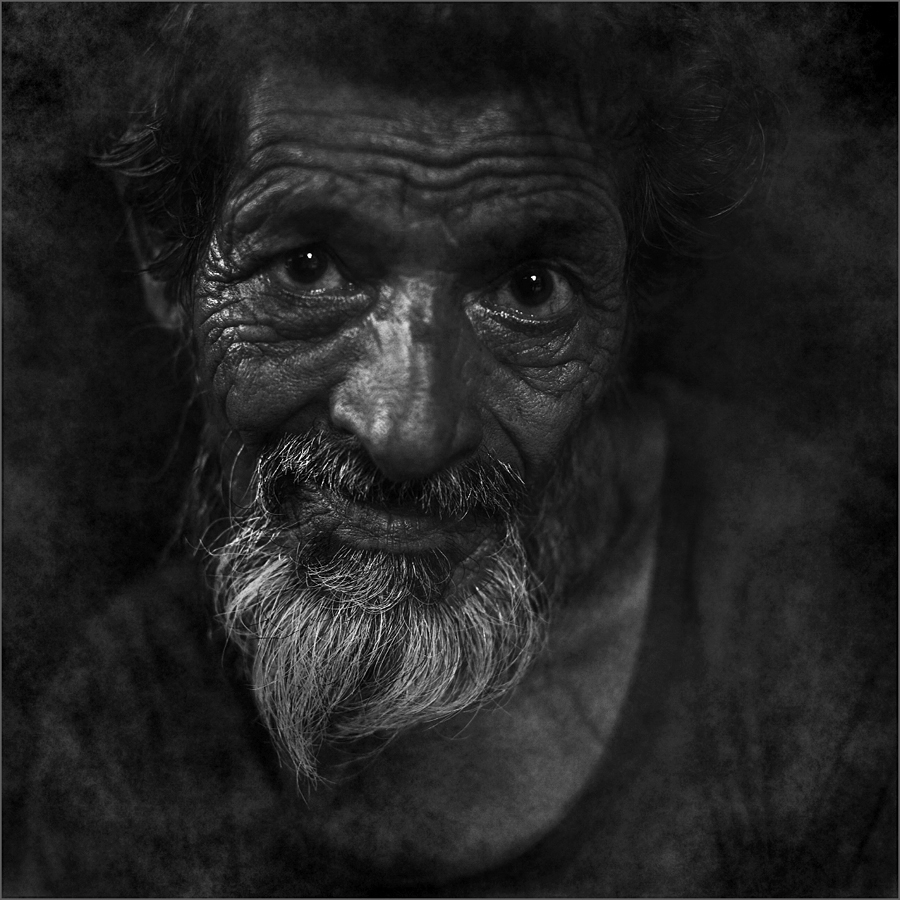
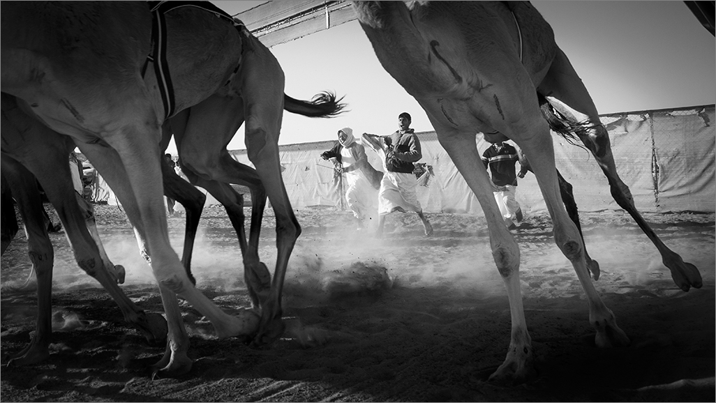
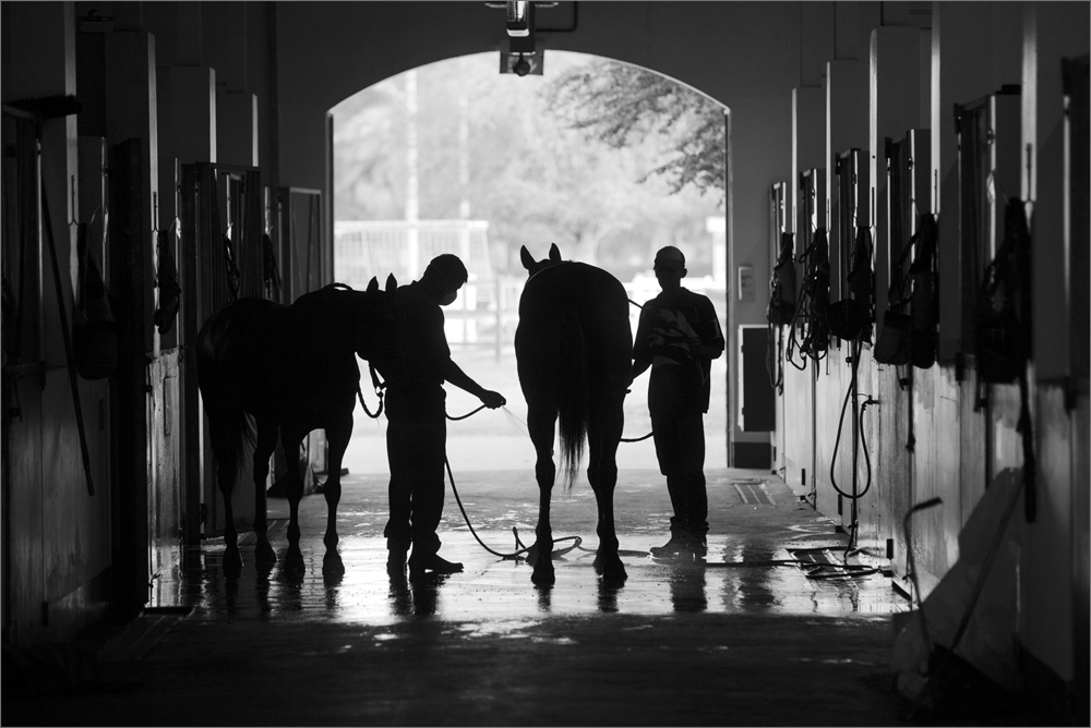
I wouldnt try out another version after seeing what Larry had done. I like the effect in this version. The other version give me a bleached effect and I am no fan of white vignettes. The blacks in Larry's version draws the viewer into the picture and doesnt bleed out. Moreover there is a dramatic impact compared to the soft version tried by Steve. Having stated, Larry has overdone the bells and the deep tones are muddy. A bit of a lighter tone on the bells would be better according to me. Also the left vertex base is too black and overdone a bit. Steve can try another version based on the impression provided by Larry and with the RAW file would have better control on the tones. A good shot Steve. |
Dec 12th |
| 39 |
Dec 19 |
Comment |
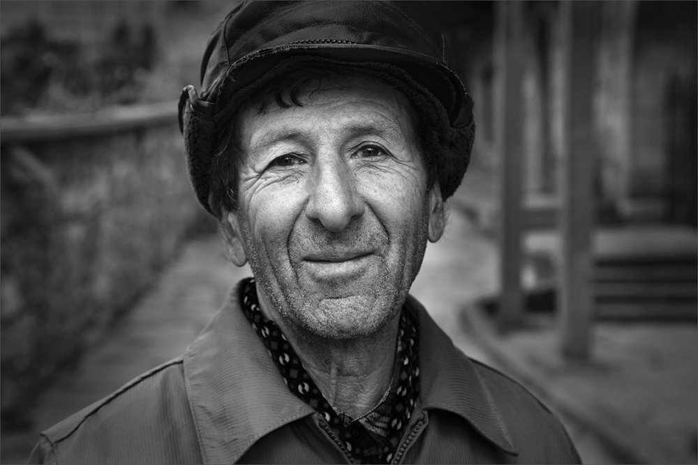
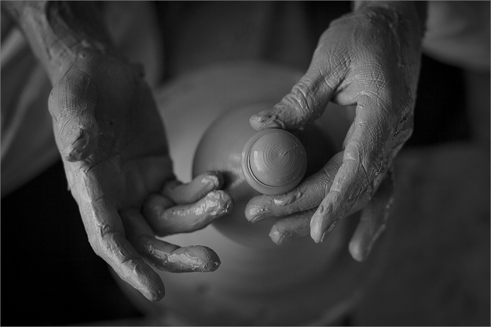
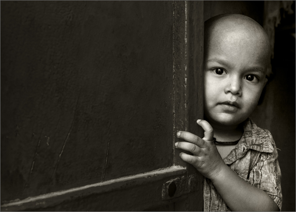
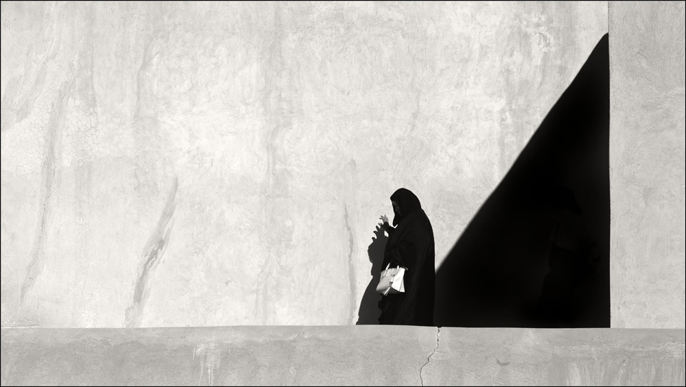
Great Vincent, what I see is just a casual shot in color converted to an impactful image with the mono conversion and treatment. It communicates well. Though the whites have been compromised, it brings in a different feel and complements the portrait quite convincingly. Good one. |
Dec 12th |
| 39 |
Dec 19 |
Comment |
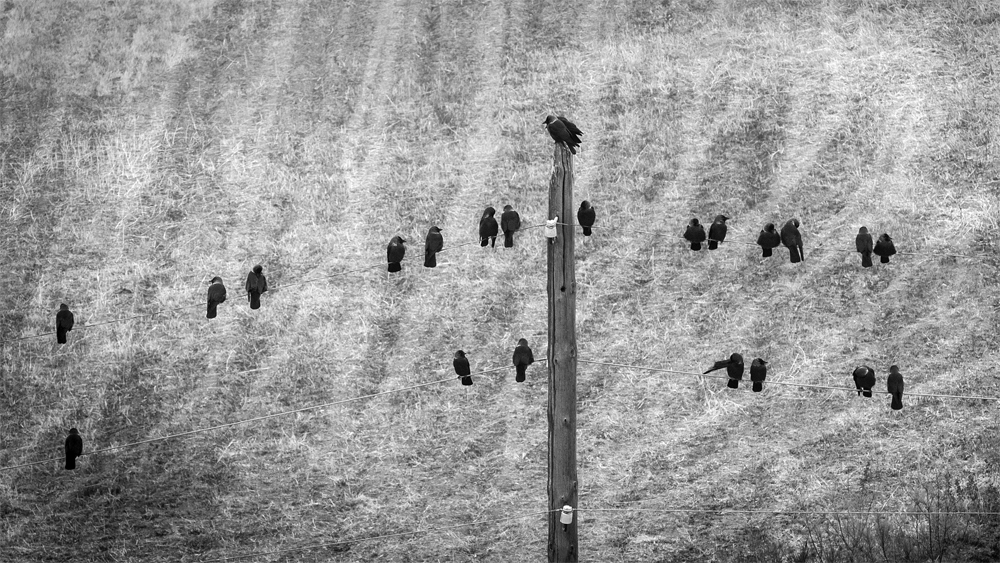
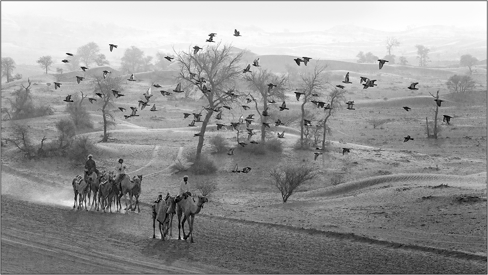
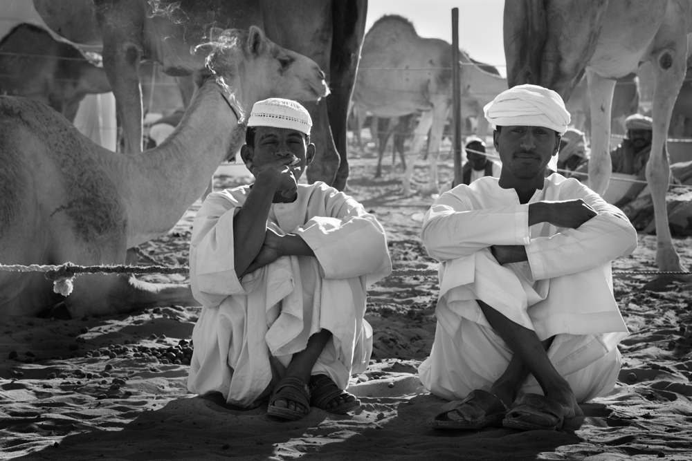
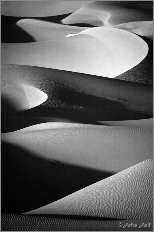
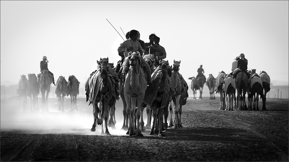
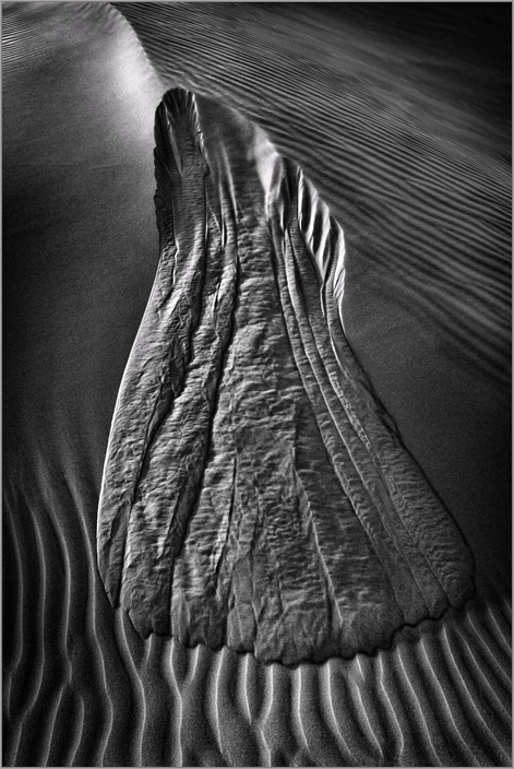
Amazing view, details, tonality and sharpness. Technically well done. I have an opinion that vertical 16x9 or panos dont work well for the eye. The only 16x9/panos I see with the adverts in the middle of the road of when I see people using mobile phones to see posts (I dont use a mobile phone, to let you know why I stated as such). The vertical format is best suited to 2:3 aspect or wider. Our eyes are more adapted to seeing a wide world in horizontal or vertical with broader dimensions. Having stated any aspect fits into a panel presentation where the eye would then move around different pictures ignoring the width of the view. I still like your image Jerry! |
Dec 12th |
| 39 |
Dec 19 |
Comment |
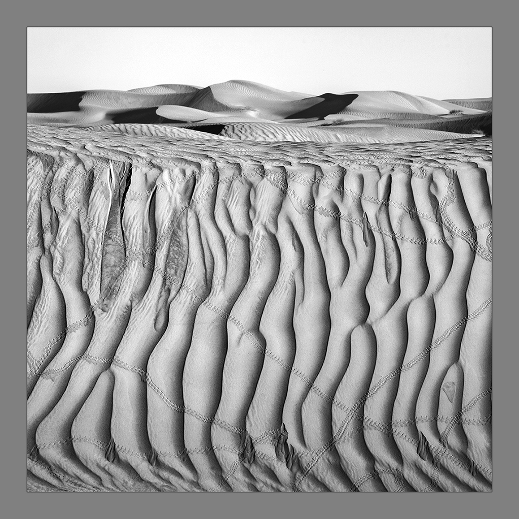
I note the image has changed and Dave has corrected. As Vincent has indicated my comment showing here is for the November image.
My comment for the December image - Falling Leaves of Fall.
Let me admit I love fall colors and coincidentally, I have travelled to many European countries during fall. Lucky to have captured the colors of fall. The light is tricky but the color saturation is awesome. Coming to this image, I like the concept and the different approach here. But I have concerns why does the leaf end at its tip in this way. Is there a real intent, I am not sure. I note the depth of field in the lower half of the leaf weak. There is beautiful details of the veins in the upper half but fuzzy at the lower part. I would have preferred the depth of field to take in the entire leaf. I like the tone and feel the square format justifies the content. |
Dec 12th |
| 39 |
Dec 19 |
Comment |
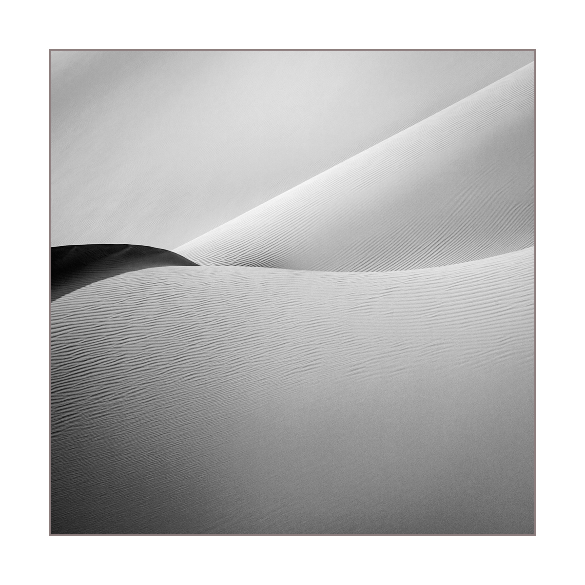
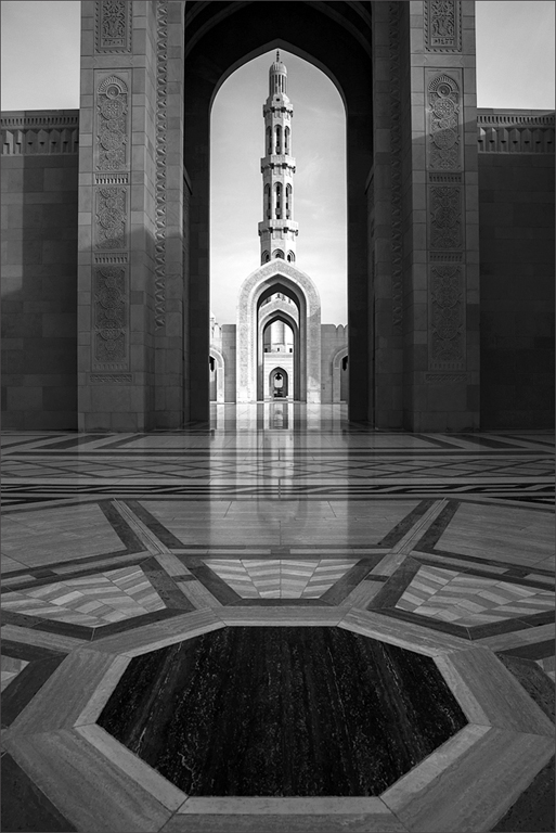
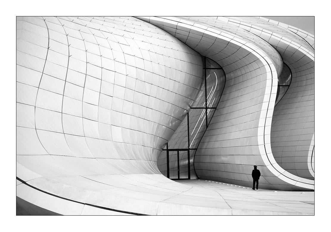
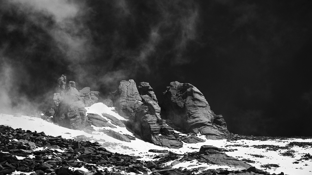
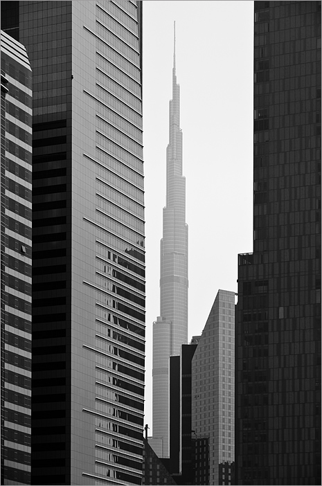
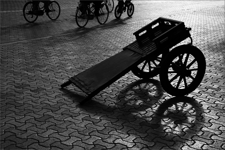
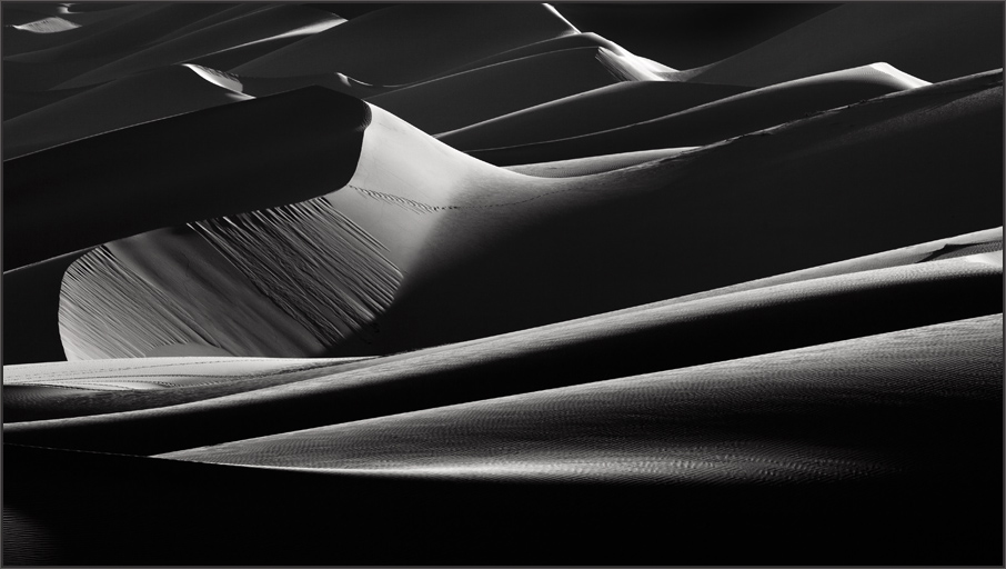
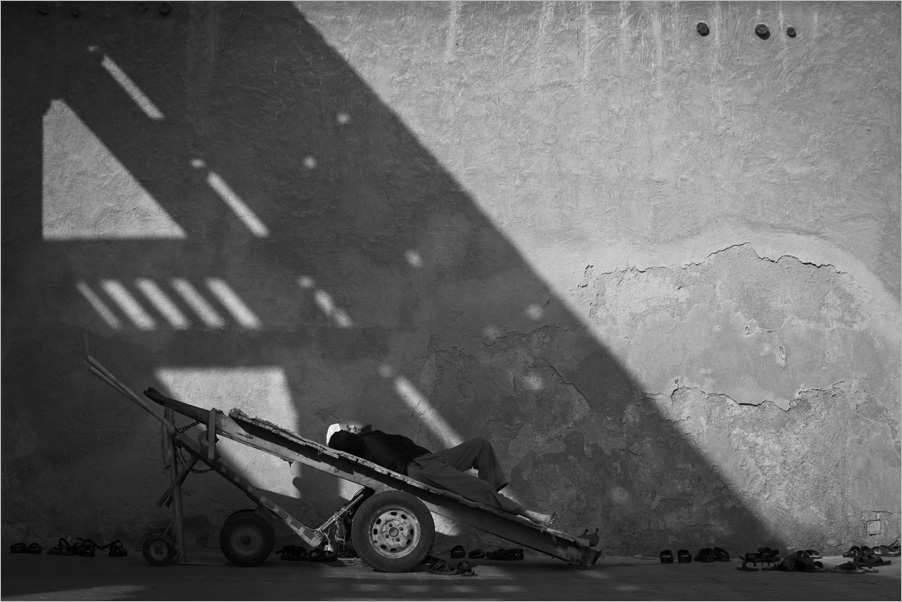
Very interesting image and indeed has an arty feel. Its all shapes and lines and the contemporary feel makes one ponder and look deeper at the image due to its strong compo. I feel the right is a bit large and getting negative. So my suggestion would be to decrease the spatial on the right to give it more balance as the line below does not curve all the way to justify the space. Still very interesting. Good light to you Dave. |
Dec 2nd |
6 comments - 0 replies for Group 39
|
6 comments - 0 replies Total
|