|
| Group |
Round |
C/R |
Comment |
Date |
Image |
| 39 |
Jun 19 |
Comment |
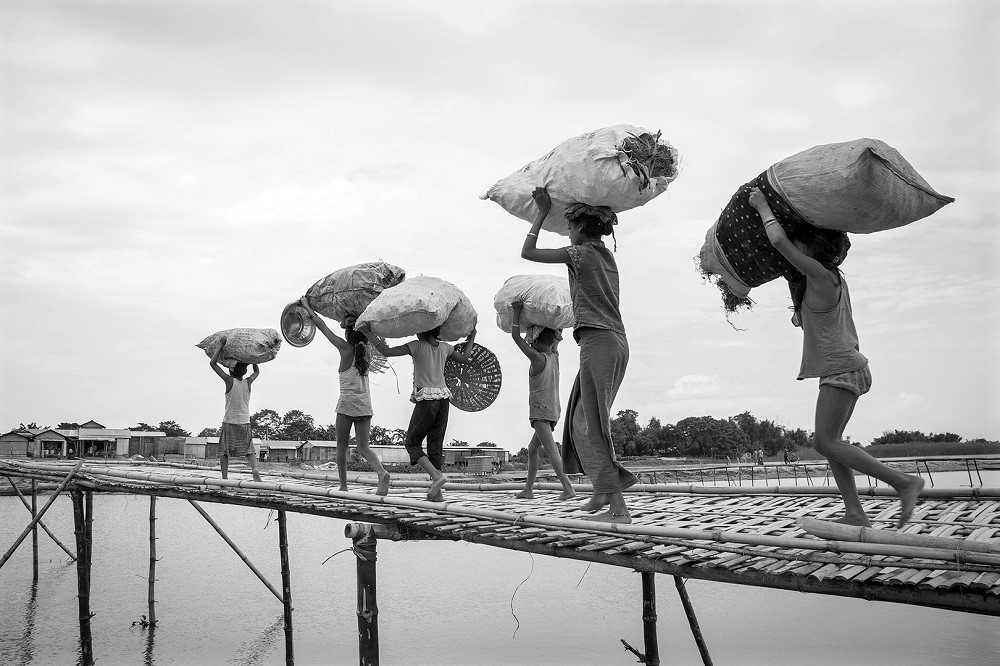
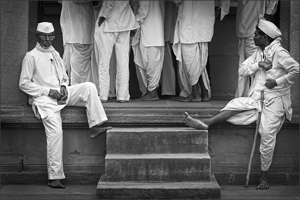
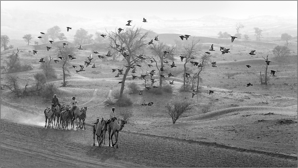
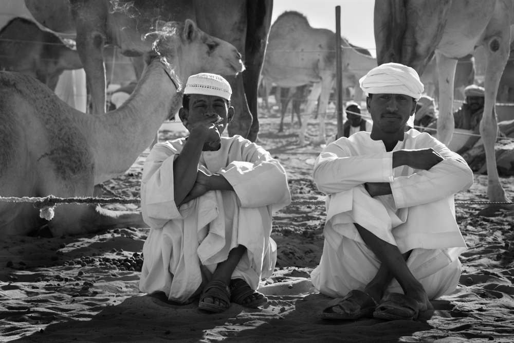
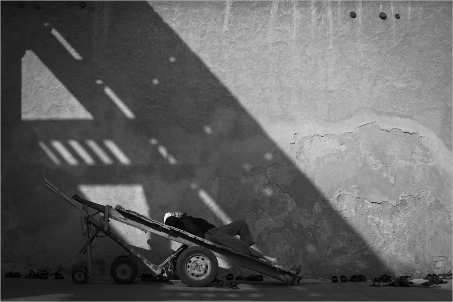
Interesting and alarming at the same time. People take risks even with their kids!!! You caught the moment and shows your spontaneous reflex here. I like the leading lines that takes to the secondary elements of your frame. The processing is good. The aspect ratio looks odd, but I understand you have your reasons due to the content and crop. Good light to you Larry. |
Jun 23rd |
| 39 |
Jun 19 |
Comment |
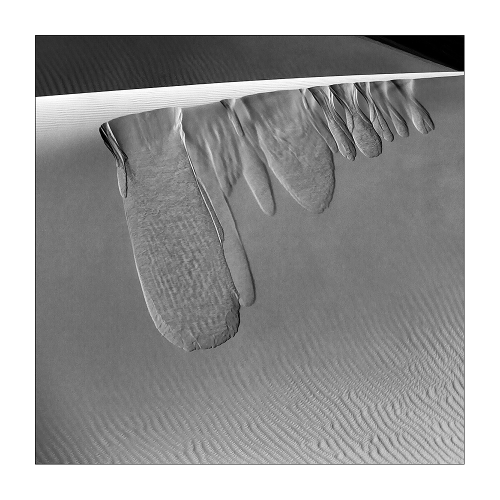
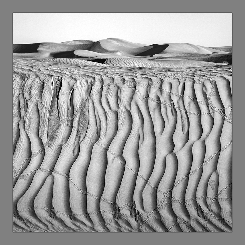
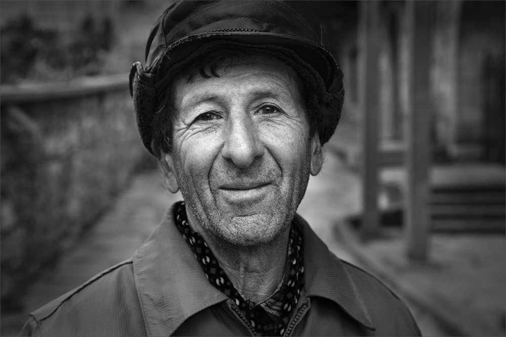
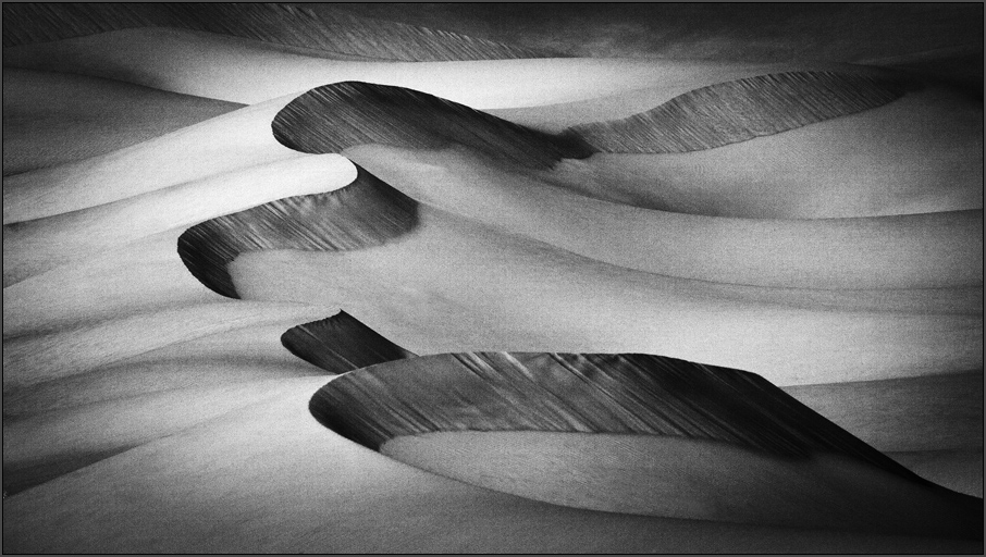
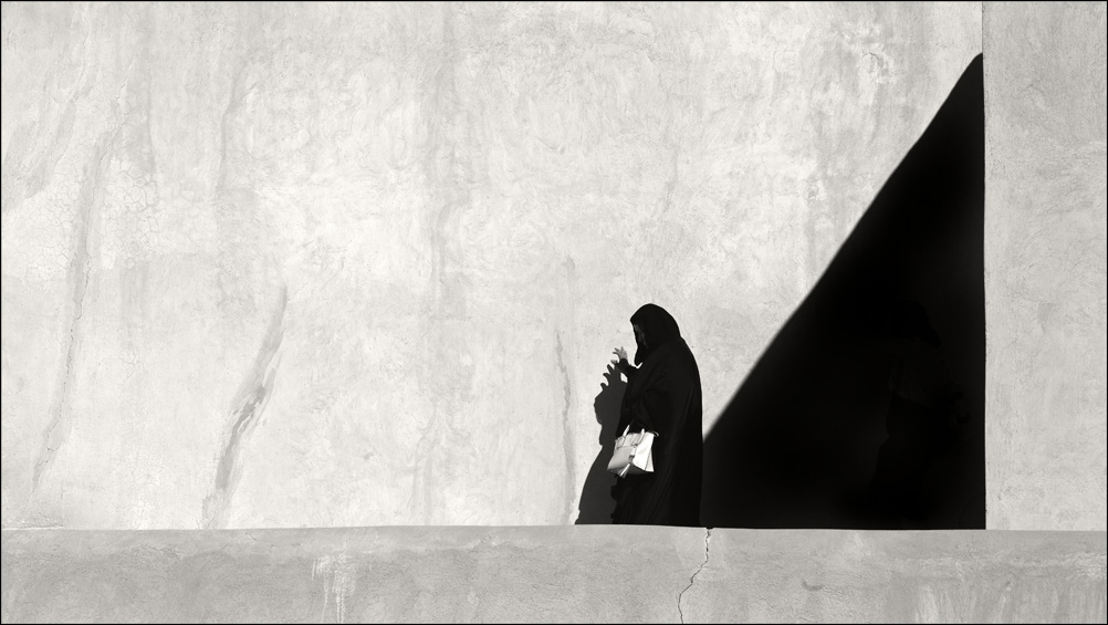
Nice one Steve. The tonality of this image is excellent and I like the way your processed. I agree with the rest, the base needs to be cropped a bit as it is going negative with the brightness; alternatively you can deepen it a bit to maintain the aspect ratio. Good light to you Steve. |
Jun 23rd |
| 39 |
Jun 19 |
Comment |
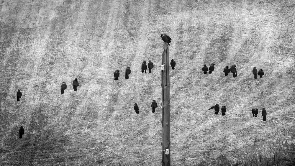
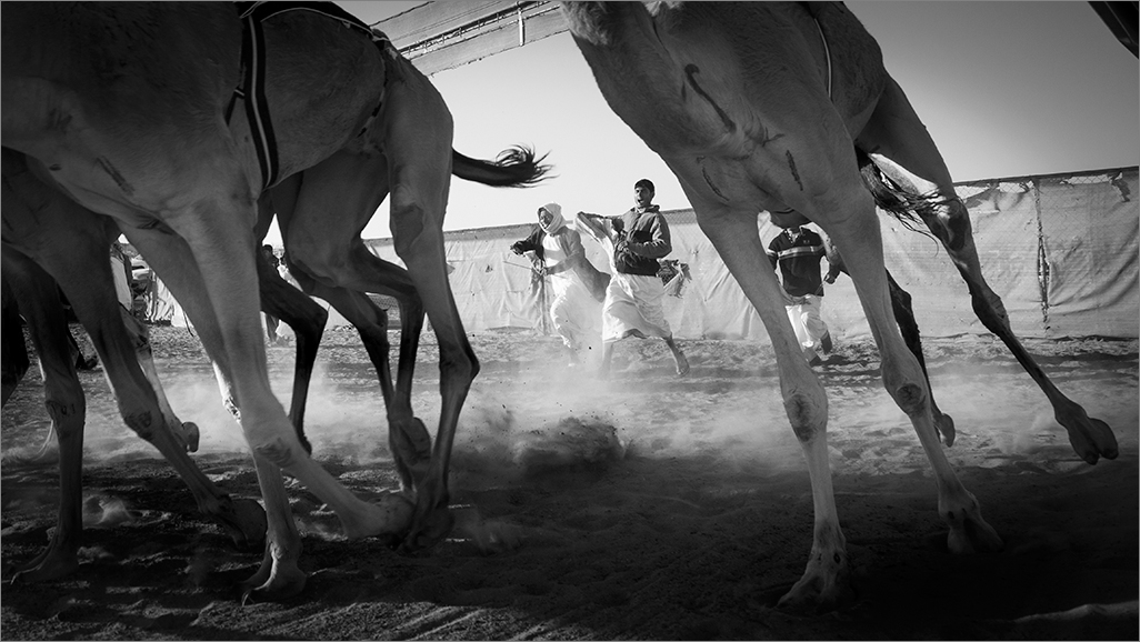
Interesting one. All seem to be in action and movement. There are many elements here and makes the image busy. In such images keeping the central element static and the rest in subject blur emphasizes the atmosphere well, but I understand waiting for the moment when the central dancer is static and the rest in action is not easy. You did well and I like the image. |
Jun 23rd |
| 39 |
Jun 19 |
Comment |
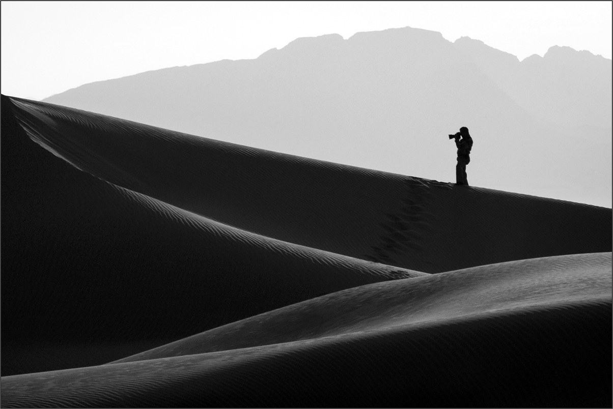
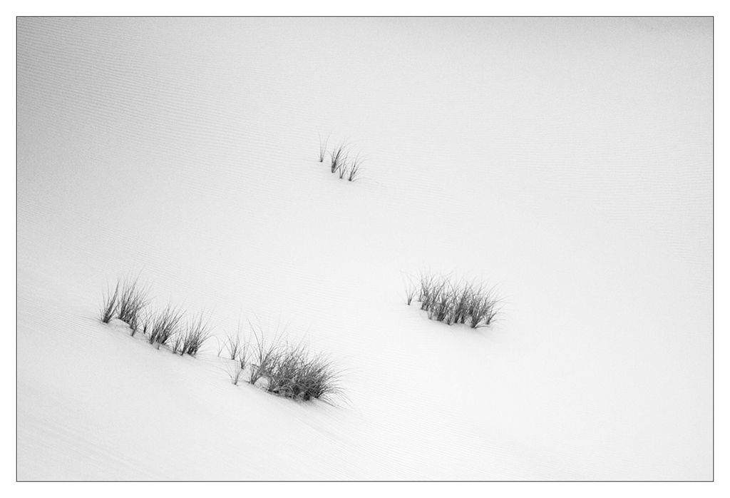
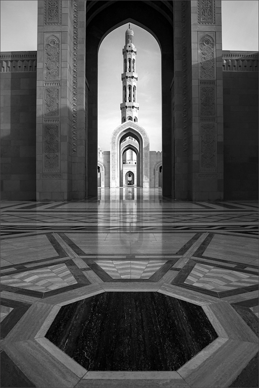
Paul, this is an interesting one. I would prefer a focal point, a human element to add more dimensions to the story line. Still it has its own charm. The processing is a bit aggressive with the whites compromised and subdued aggressively. The blacks too are muddy, making this image tonally deep and devoid of the expected highlights of the lights. |
Jun 23rd |
| 39 |
Jun 19 |
Comment |
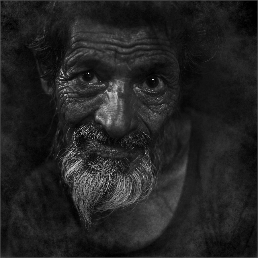
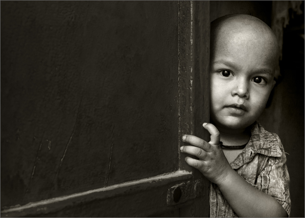
Dear Jerry, Interesting one. I see the edges all around the subject compromised and the selections rough and appear as a cut and paste effect. The hand catches my attention more than the face. The subject looks all concentration and thought, but I think according to me you were a bit lower in camera angle and hence affected the features of his face. Also the selection has chopped off some part of his nose tip and hair/head. I also feel the blacks are muddy. I hope you dont mind my comments as this image does not work for me. Sorry for that. |
Jun 23rd |
| 39 |
Jun 19 |
Reply |
Thank you Dave. |
Jun 23rd |
| 39 |
Jun 19 |
Reply |
Thanks Larry. I agree with you regarding the light on the hands to add more texture and contrast. I was concerned I would lose the shadow details on the palm with a stronger highlight. But a tad more would definitely be helpful. I would not be cropping the hands more as it would suddenly bleed out without that wrist in. Thanks for your input. |
Jun 23rd |
| 39 |
Jun 19 |
Reply |
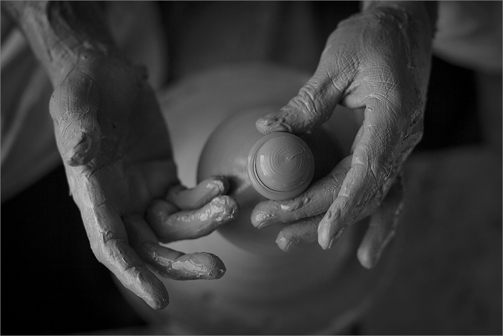
Thanks Vincent. I agree a tad crop on the right would be more effective, but I might lose the aspect ratio maintained. The speed is indeed 1/750 and the pot is spinning quite fast. At this close distance obviously it gets magnified and results in subject movement. |
Jun 23rd |
| 39 |
Jun 19 |
Comment |
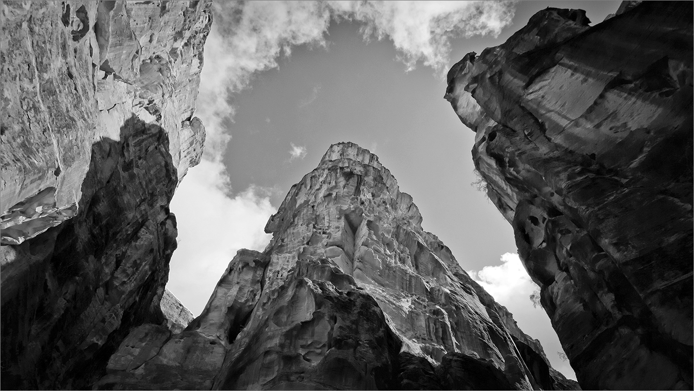
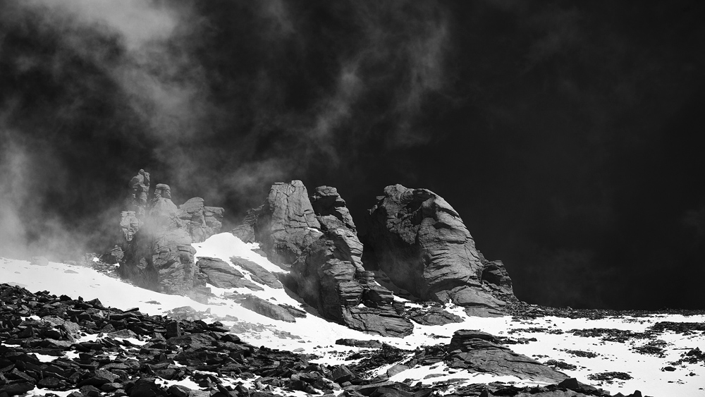
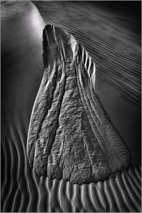
Beautiful image Dave. Sharp and dramatic. But I find the tones flat. A bit of fine tuning on the tonality and this is a superb piece of photographic work. I would prefer to clone or deepen the white highlight at the base edge towards the right. It is catching my attention. Good Light to you Dave. |
Jun 23rd |
6 comments - 3 replies for Group 39
|
6 comments - 3 replies Total
|