Activity for User 200 - M. Arfan Asif - arfan7@yahoo.com
Avatar
Close this Tab when done
188 Comments / 44 Replies Posted
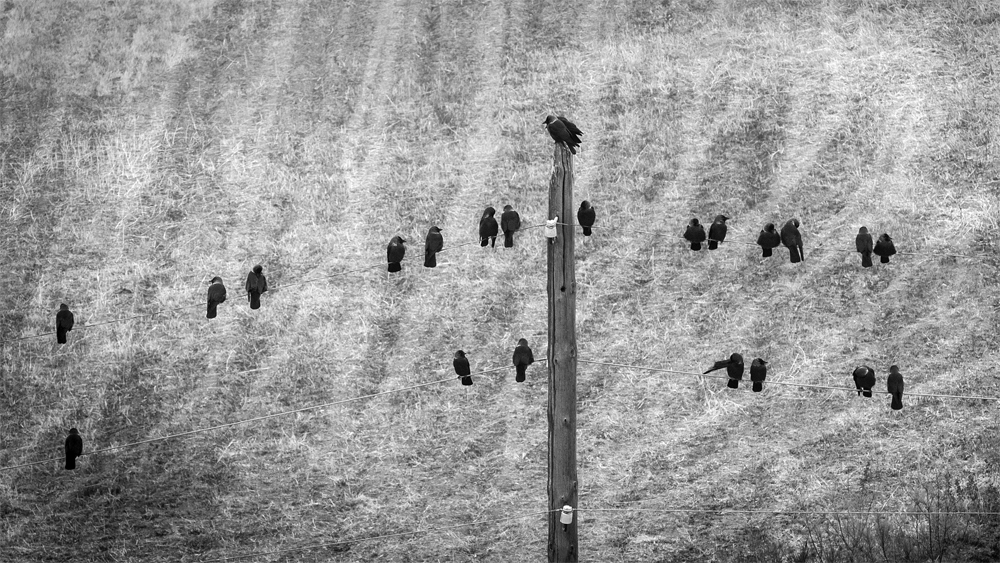
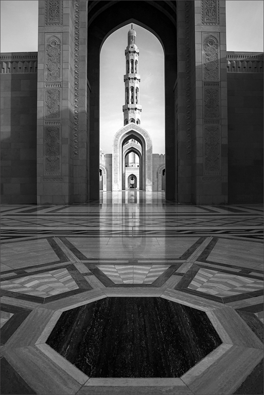
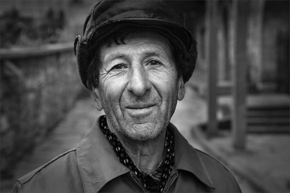
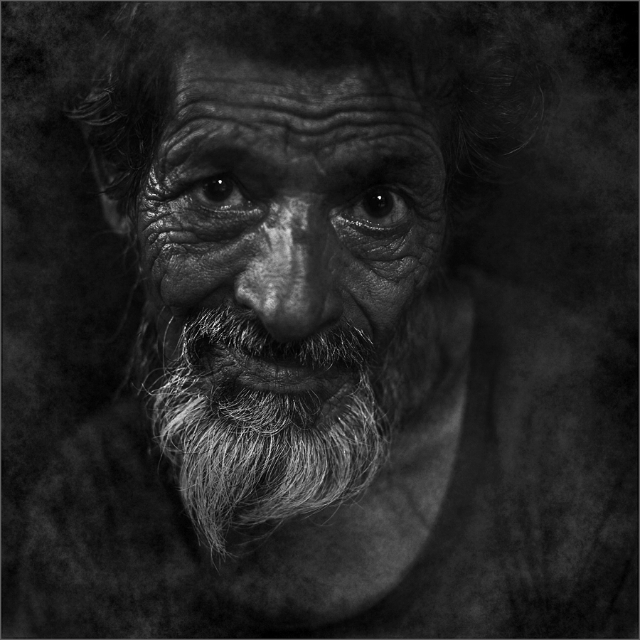
41 Images Posted
| = Current Round | = Previous Round |
| Group 39 | |||||||||||
|---|---|---|---|---|---|---|---|---|---|---|---|
 Jan 22 |
 Dec 21 |
 Nov 21 |
 Oct 21 |
 Jul 21 |
 Jun 21 |
 Apr 21 |
 Mar 21 |
 Feb 21 |
 Dec 20 |
 Nov 20 |
 Aug 20 |
 Jun 20 |
 May 20 |
 Apr 20 |
 Feb 20 |
 Dec 19 |
 Oct 19 |
 Sep 19 |
 Aug 19 |
 Jul 19 |
 Jun 19 |
 May 19 |
 Apr 19 |
 Feb 19 |
 Jan 19 |
 Dec 18 |
 Nov 18 |
 Oct 18 |
 Sep 18 |
 Jun 18 |
 May 18 |
 Apr 18 |
 Mar 18 |
 Feb 18 |
 Jan 18 |
 Dec 17 |
 Oct 17 |
 May 17 |
 Apr 17 |
 Feb 17 |
|||||||