|
| Group |
Round |
C/R |
Comment |
Date |
Image |
| 39 |
Nov 18 |
Comment |
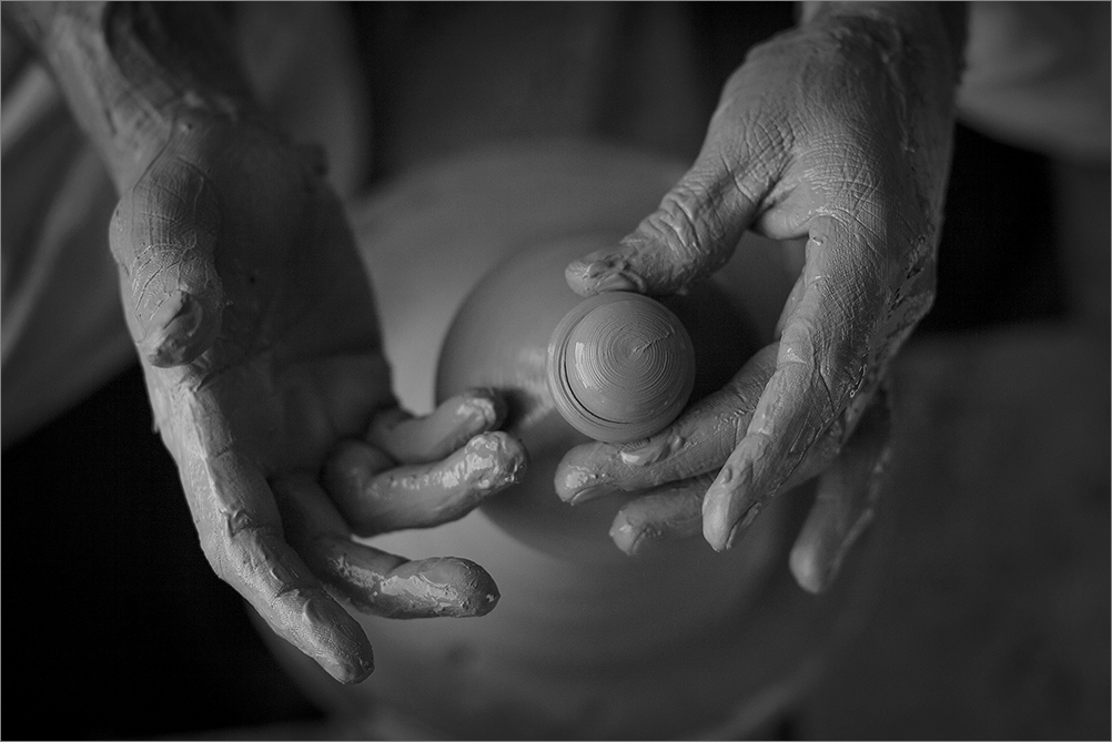
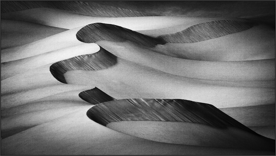
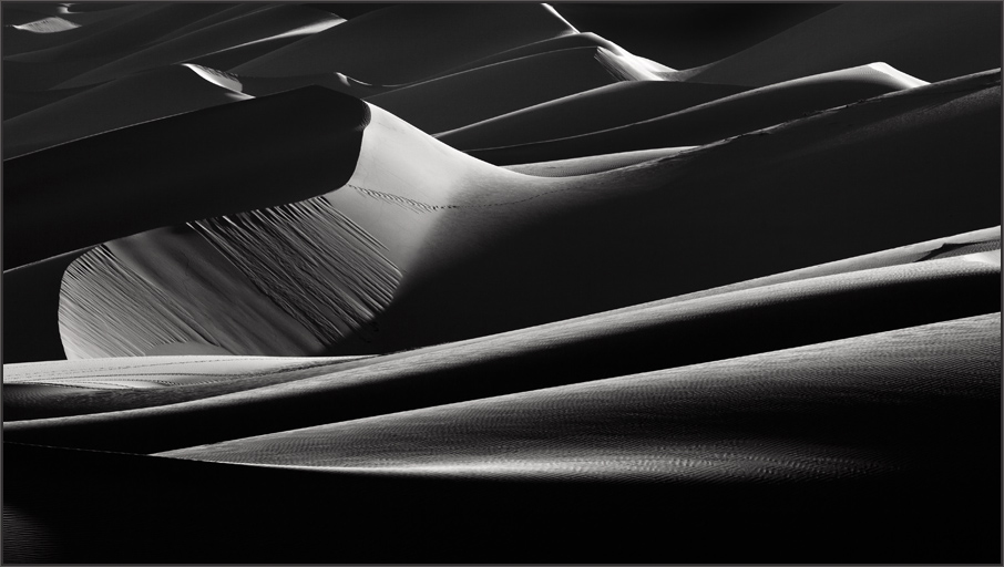
Good one. Interesting art captured here. I agree with Dave the central zone should not be dabbed dark as it affects the harmony. I see the background sky deepened a bit on the higher side causing pixelation. Good one. |
Nov 7th |
| 39 |
Nov 18 |
Comment |
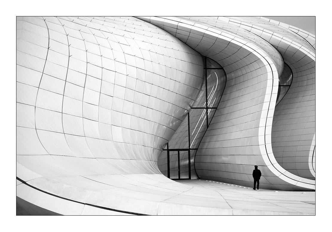
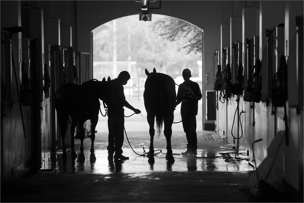
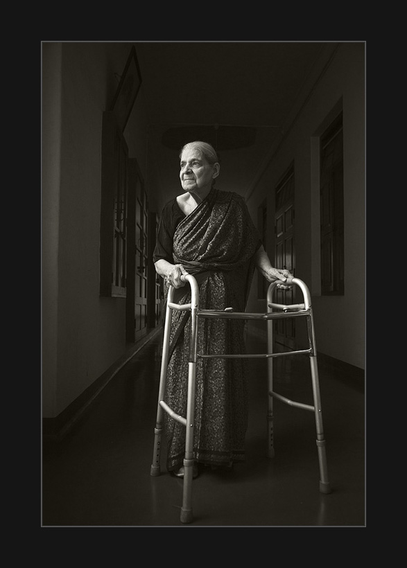
Beautiful work here and most impactful in monochrome. I would brighten it up a bit and as Dave said the stroke around the frame is essential. Well done. |
Nov 7th |
| 39 |
Nov 18 |
Comment |
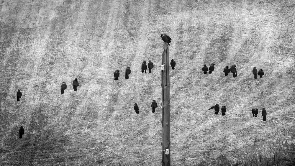
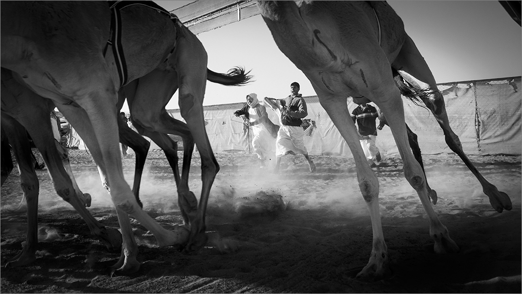
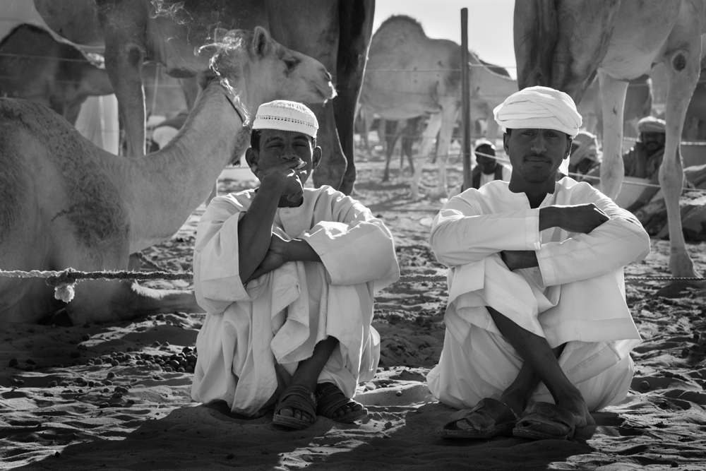
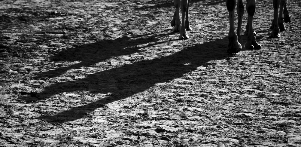
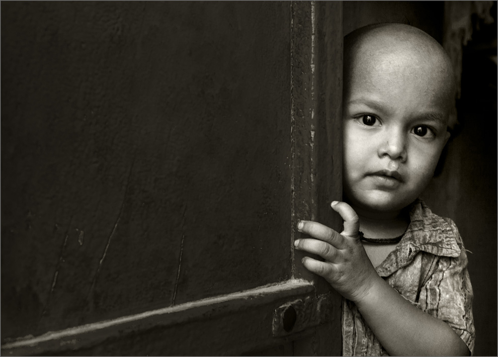
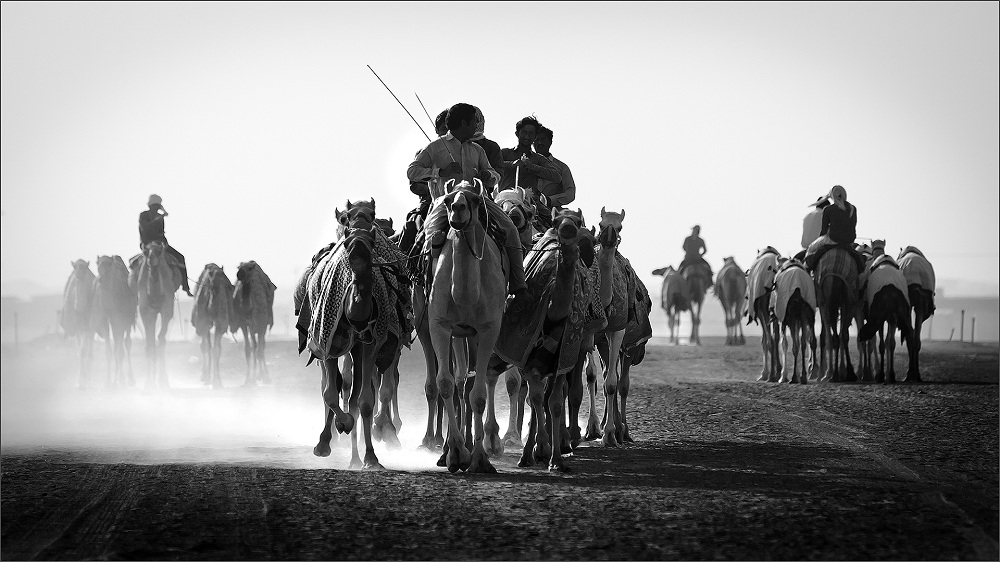
Wow! I love horses to photograph! You image has timing and you did well to capture the moment. I do see some flatness in your image which needs attention. A bit of pumping up the tones would help with better tonality and contrast. I would prefer more space in the front as I find the compo a bit constraint. Still as you have mentioned you did have some challenges and you did the best possible. Good light to you Paul. |
Nov 7th |
| 39 |
Nov 18 |
Comment |
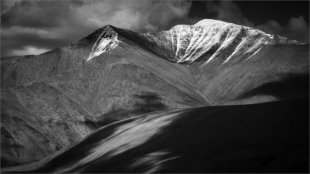
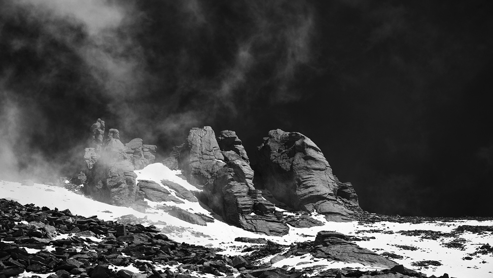
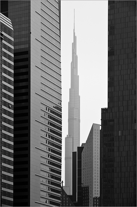
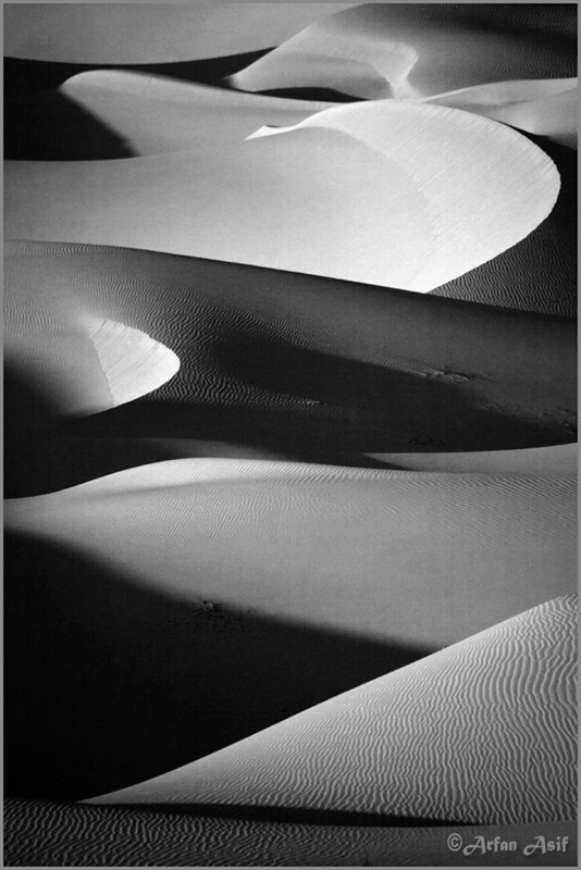
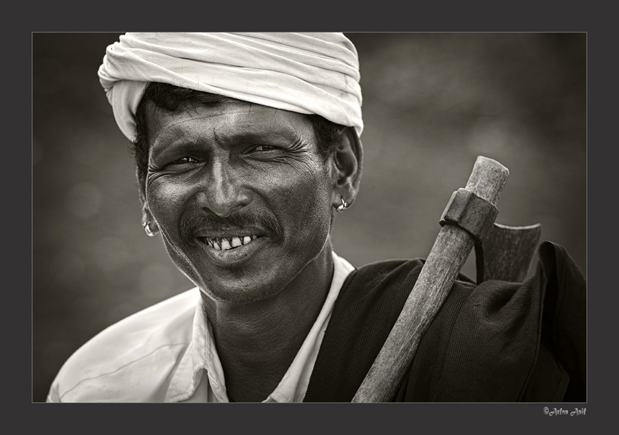
Interesting one Jerry. I agree with David here. You have a way with these apps and filters. An ordinary scene has been converted to an exotic ambiance. All that I would recommend is to tone down/ darken the base of the frame; that strip across is a bit more bright than needed. I state this as you have a large area of highlights on top and you need some dark zones to balance it. I like it. |
Nov 7th |
| 39 |
Nov 18 |
Comment |
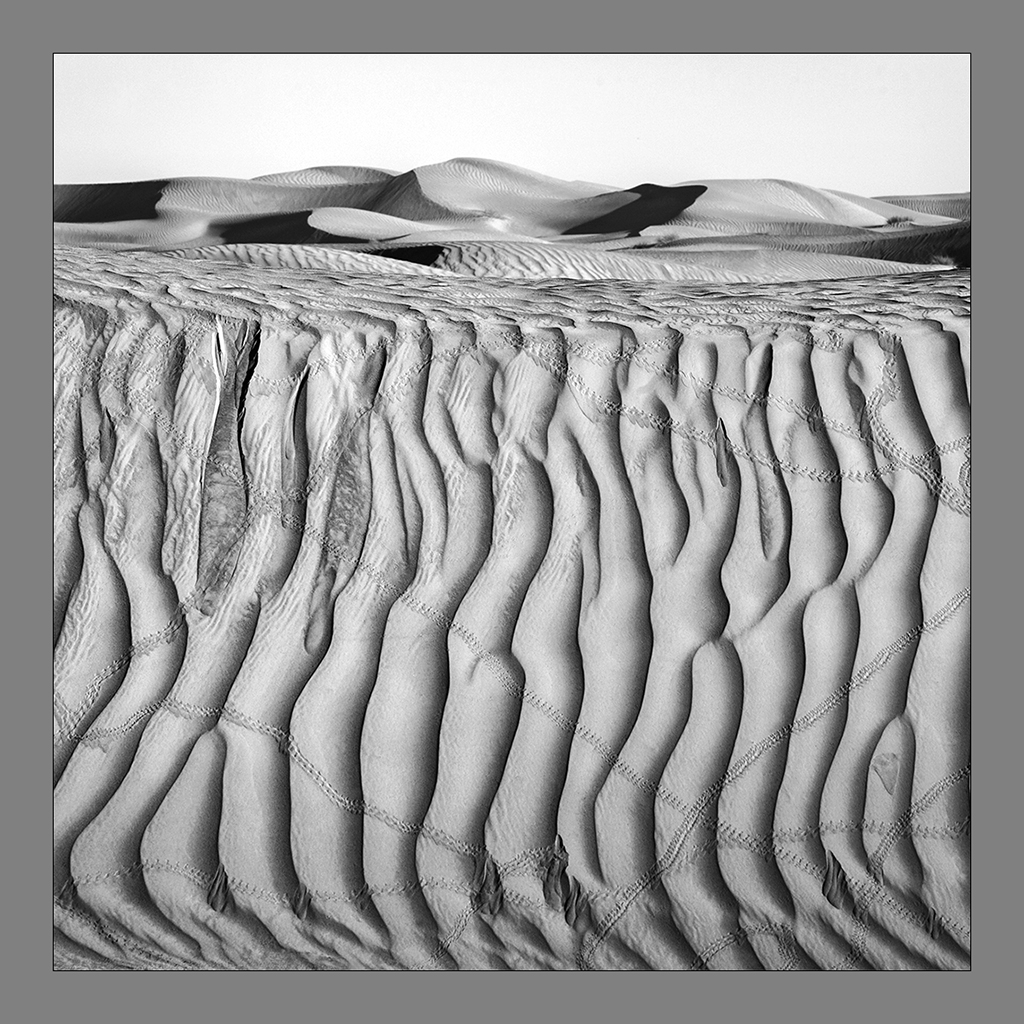
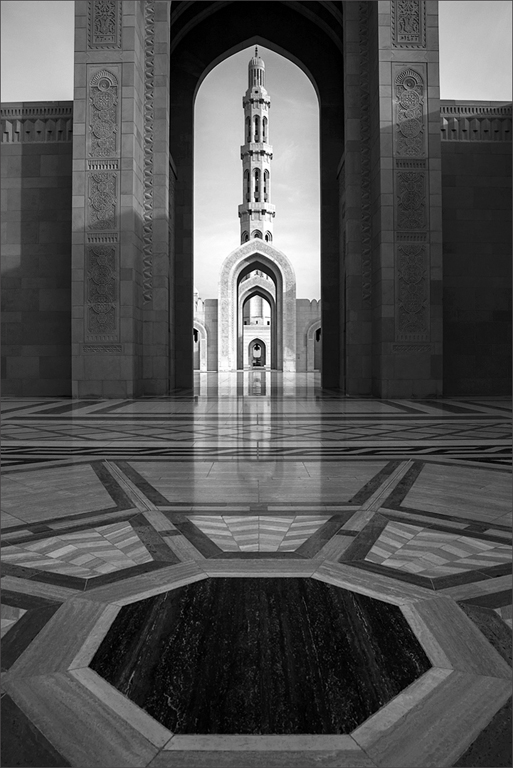
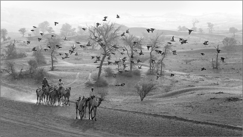
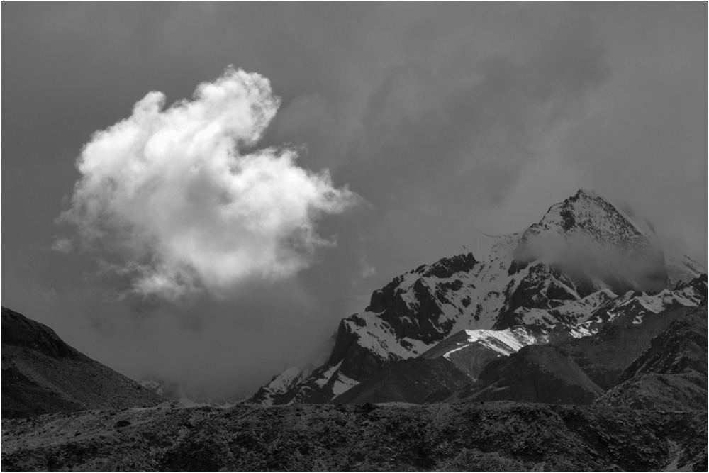
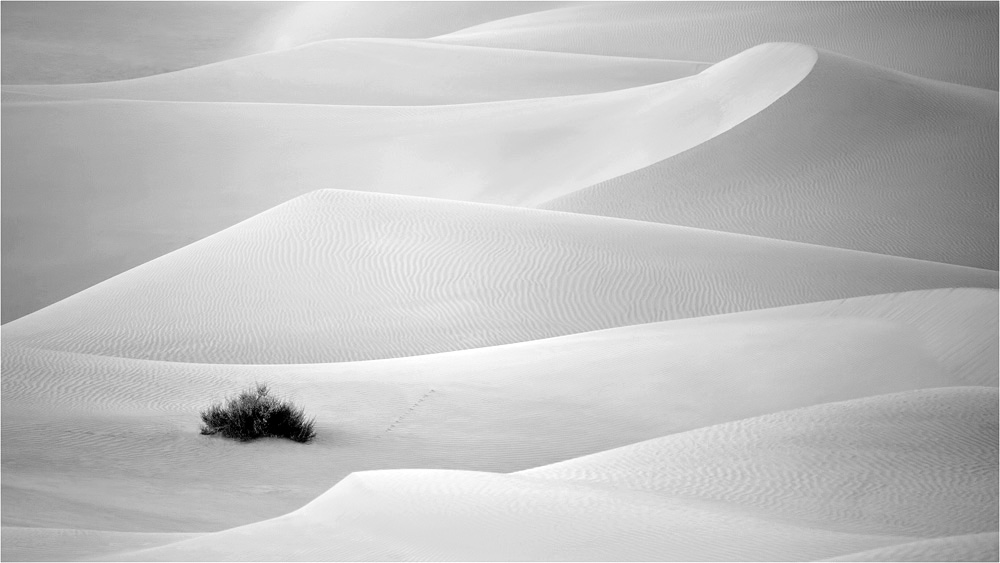
Beautiful image. An image that suits the mono theme most aptly giving good impact and feel. The pictorial values are evident and you have nice shrubs sitting below as base to ensure a balanced composition. Now I have two points to state which I would do if I was author! First correct the tilt towards left though you would state this is the natural alignment of the tress on location. I feel there is slight bending towards the right. The second is I would make those whites stand out with more contrast and punch to take advantage of the scenario of tones. I would deepen the area behind the 8 dominant trees closest to the viewer. I see a tone on the whites, though I do agree a washed out effect is not desirable. Still I will brighten them up to stand against the background. Ofcourse this is just a thinking. Well done Dave. Good light to you. |
Nov 7th |
5 comments - 0 replies for Group 39
|
5 comments - 0 replies Total
|