|
| Group |
Round |
C/R |
Comment |
Date |
Image |
| 39 |
Apr 18 |
Comment |
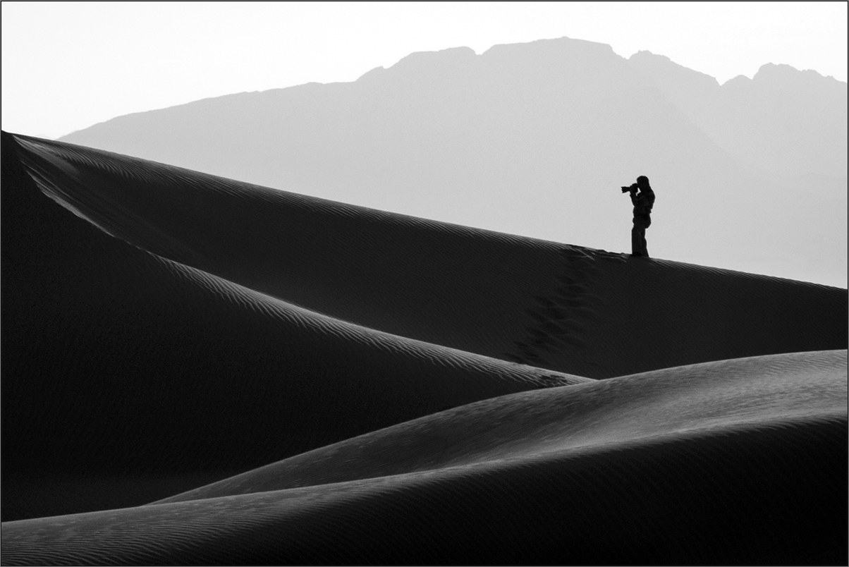
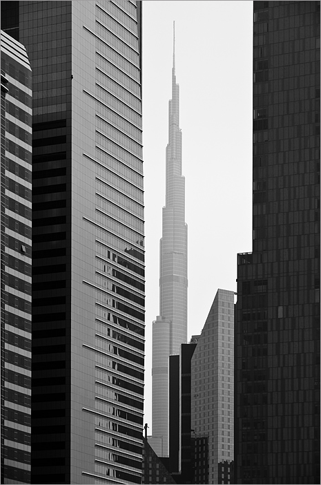
Good one Don. I like the image for the compo and would agree for more base as the building comes quite close to the edge. I note that the clouds were not moving much for a 30 sec expose. Still you managed an image which has good impact. Well done Don. |
Apr 11th |
| 39 |
Apr 18 |
Comment |
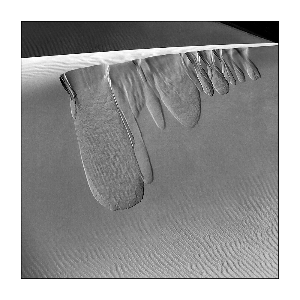
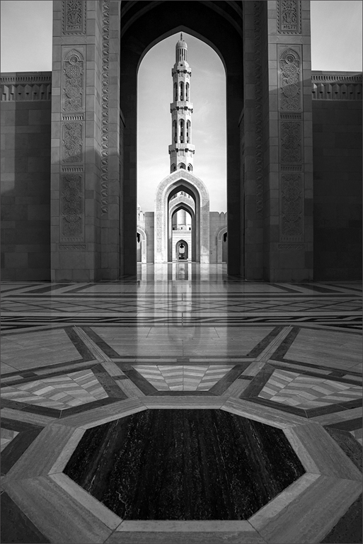
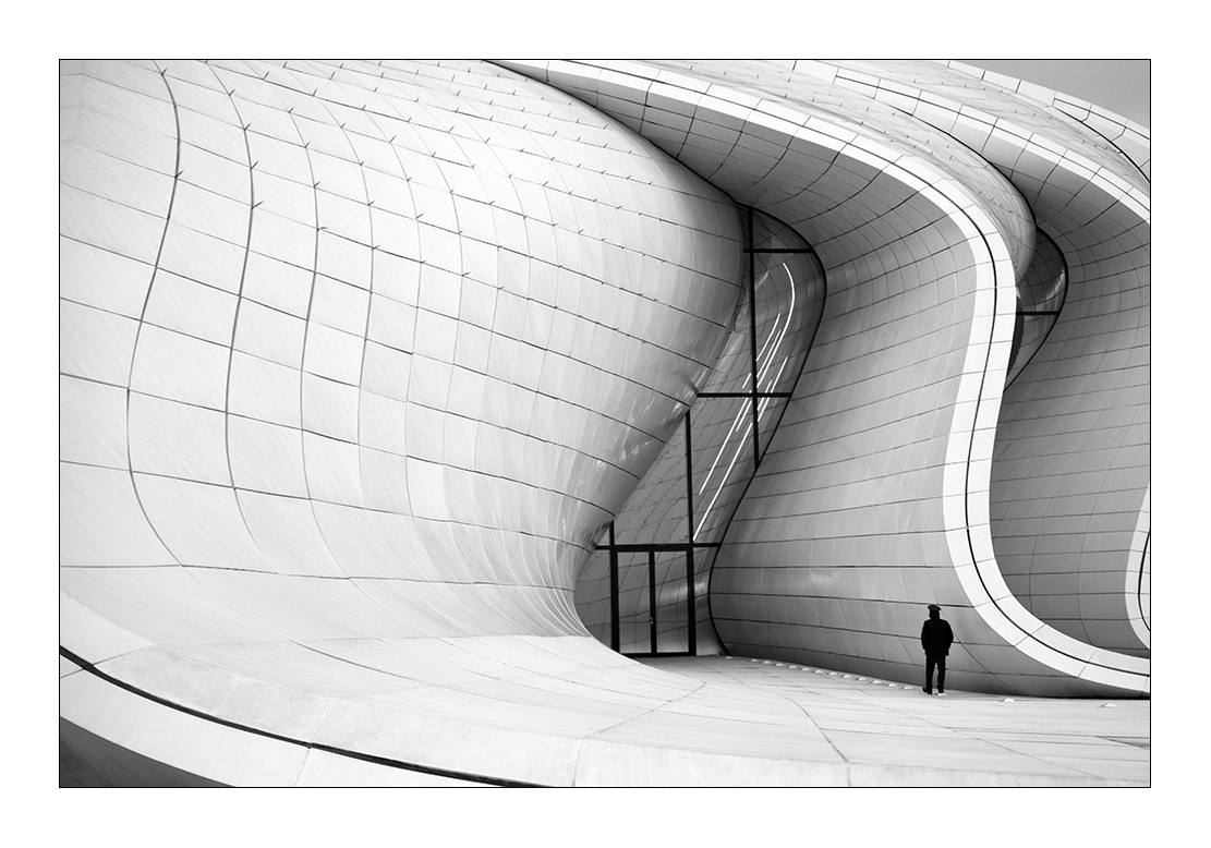
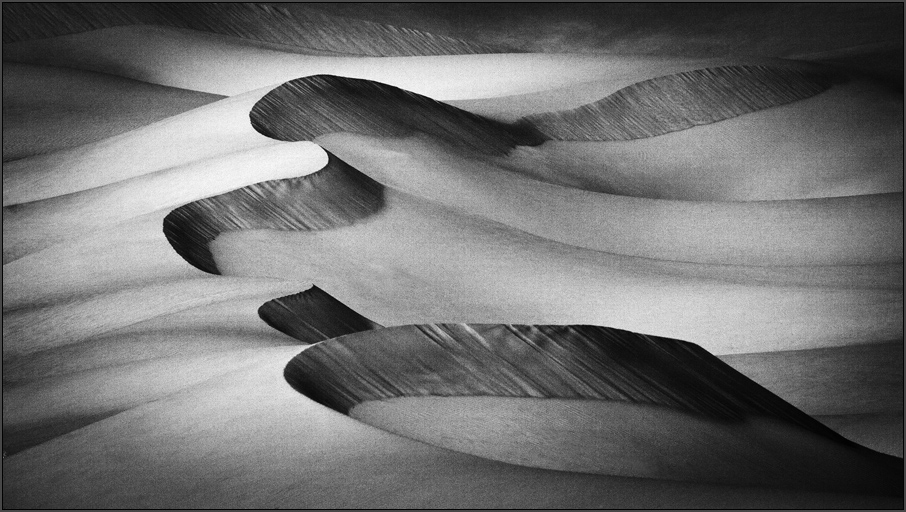
Congratulations on your PSA Gold. Wishing you many more. The tones and the finer details of your image stand out. I would suggest that you improve the symmetrical aspect of your frame. By using transform tool you can make the fence in the foreground parallel to the base edge and also the bridge. I note this is due to the 16mm and your position being a bit angled to central axis of the bridge. This is a small refinement and in no way affects the quality of your imaging. Once again congrats for your gold. |
Apr 11th |
| 39 |
Apr 18 |
Comment |
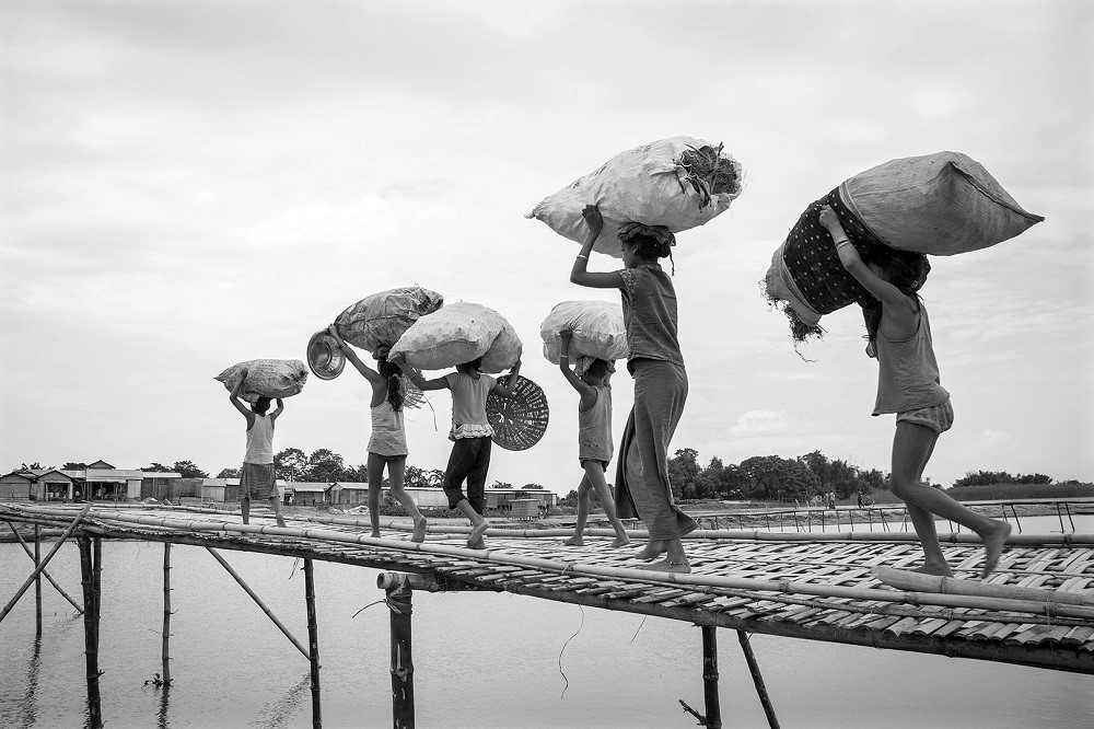
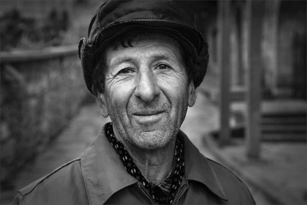
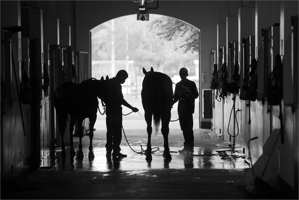
Good one Paul. You have a good subject and agree with Jerry that the tonal shift catches the eye. I would also add that the bridge needs some work to give it more prominence by deepening the area around and giving the bridge some lighter tones. It is the focal point of your image and the eye needs to discover it a bit easier. |
Apr 11th |
| 39 |
Apr 18 |
Comment |
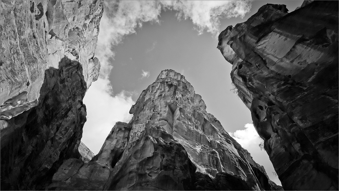
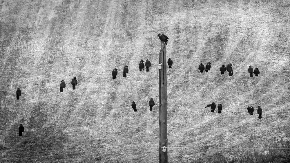
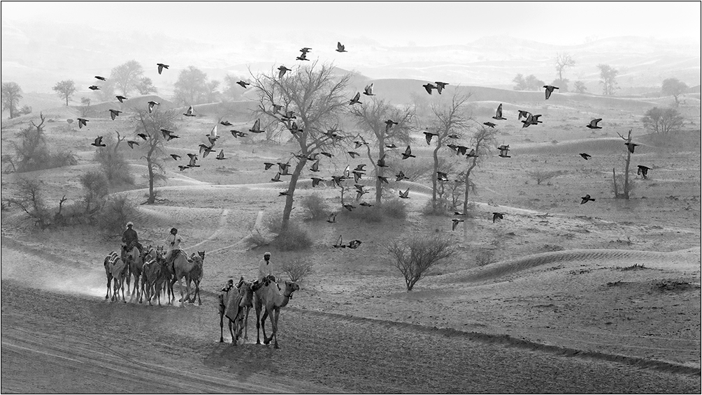
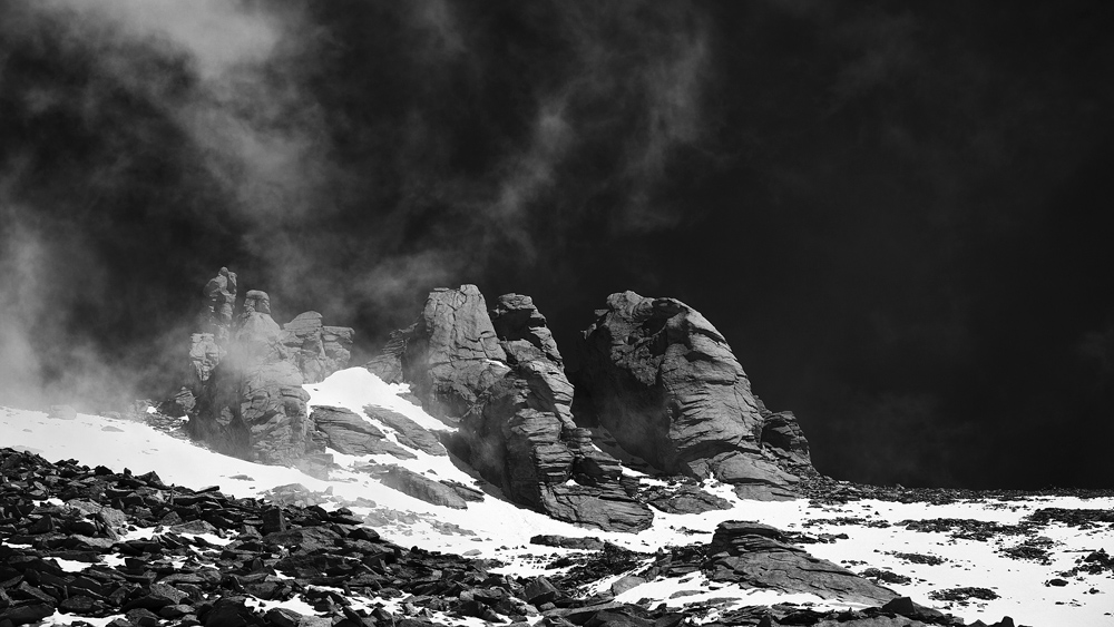
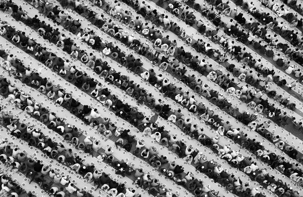
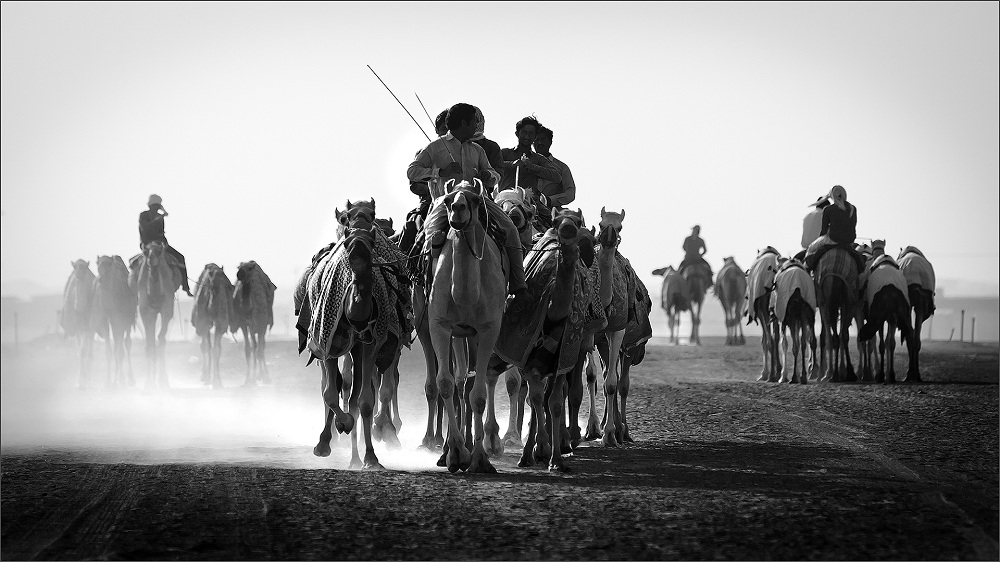
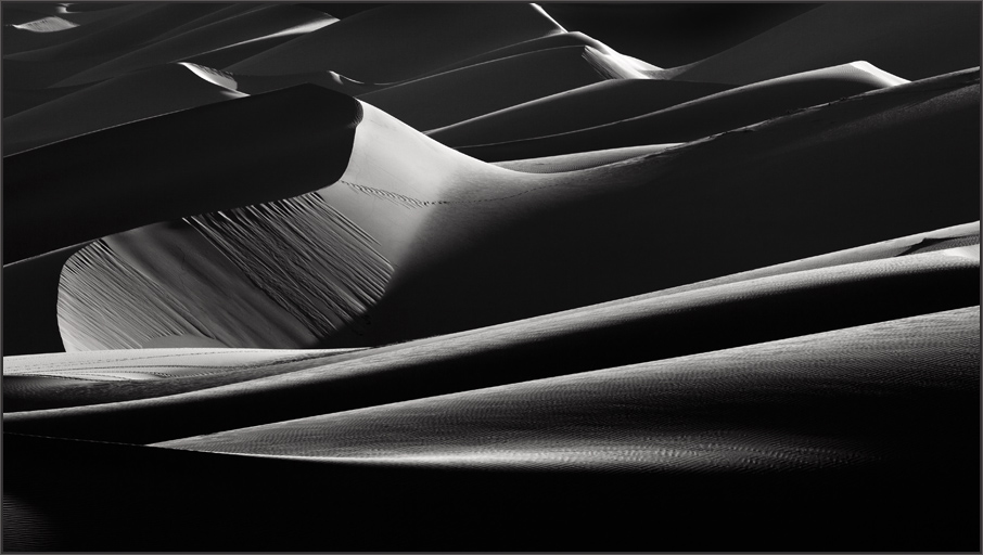
Interesting one Jerry. That is not only a strong contrast but a strong image with great leading lines. I do agree with David on the top left issue, but would still prefer the contrast in a vertical format. I agree with Mark that the 1:1 has diminished the intent. Moreover the square waits for another element to be added. While the vert format clearly presents approach. I would recommend a bit of work on the zones which have those muddy blacks due to extreme contrast. Taking care of those black details will enhance the image. Liked it. |
Apr 11th |
| 39 |
Apr 18 |
Comment |
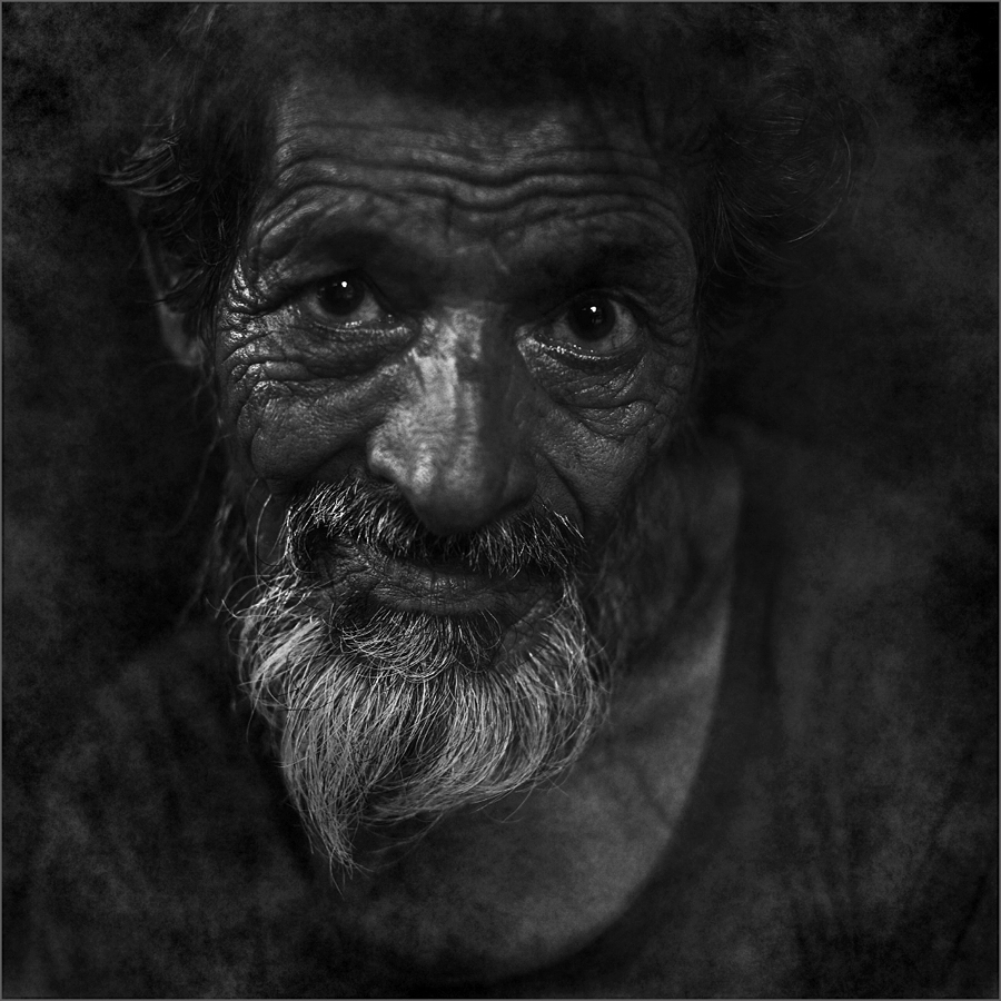
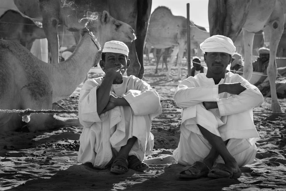
Interesting image David. I like it because it is very unconventional to present it the way you have done and the intent is clear. Generally we prefer the color medium for such colorful subjects and the aspiration is to have a clearing to present natural history of the subject. I like the fuzziness of the surrounding branches and it gives a good look for the frame. There is one on a tangent above the head which may need some taming! Good work David. |
Apr 11th |
5 comments - 0 replies for Group 39
|
5 comments - 0 replies Total
|