|
| Group |
Round |
C/R |
Comment |
Date |
Image |
| 39 |
Feb 18 |
Comment |
Good one Lois. I agree, the colors would be a different story, though for me the monotone also works. It is good timing and those cirrus clouds add a good touch. Reduce the pixel stroke width a bit as I see it too much. A 2-4 pixel stroke would suffice. Good light to you. |
Feb 22nd |
| 39 |
Feb 18 |
Comment |
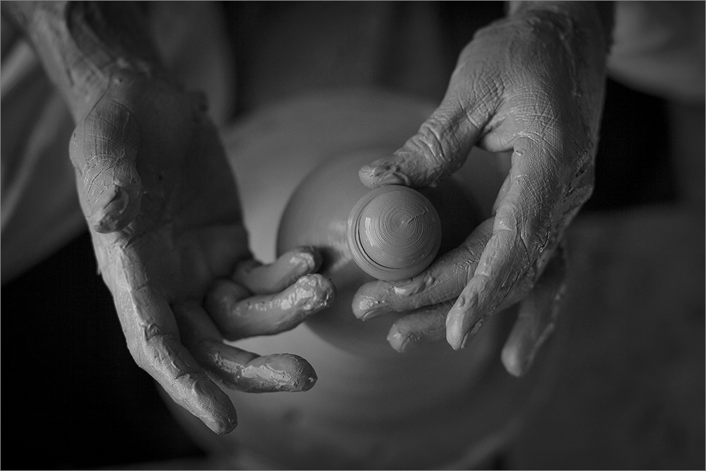
Don, Welcome to the group. You have done well with the specs and made a neat image. I would suggest more tonality on the glass as it is a tad deep. Paul has given a good suggestion and I believe there is room for improving this image in photo shop using curves. Still a good shot. Good light to you. |
Feb 22nd |
| 39 |
Feb 18 |
Comment |
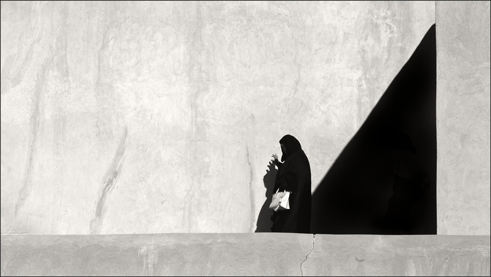
Vincent, welcome to our group. You have an eye for a picture. You have made an ordinary subject extraordinary with your approach. Yes agree that the tonality can be further enhanced to add greater impact. But if you permit to state, the sensor has too much dust on it and those dust marks are not a pleasant sight to see. For a small size view one may not notice, but when enlarged they will show up. Good light to you. |
Feb 22nd |
| 39 |
Feb 18 |
Comment |
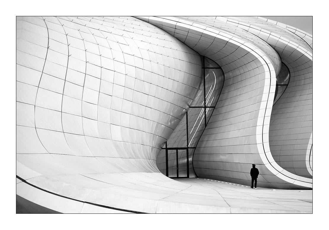
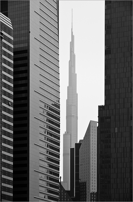
Beautiful work with good tonality and use of good light, very dramatic.
The architecture has been highlighted well. If you have the pixels, then would suggest to reduce the foreground a bit and have more of the sky. I note that the top of the building is creating a bisection of the frame. In a sense you could emphasize the sky more than the foreground lawn, the brightness of which is competing with the brightness of the building. This would enhance the building brightness against the deeper tones of the sky. Again this is just a suggestion. |
Feb 22nd |
| 39 |
Feb 18 |
Comment |
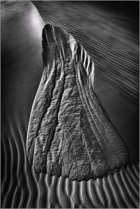
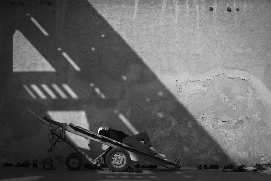
Simple and effective... and you do it with the mobile phone! Jerry; in my discussions here I mention about your photography as an example that it is the vision and nothing to do with the sophistication of gadgetry. By now my 95 odd bugs whom I have mentored would have heard of you and googled up Jerry on the www. Earlier I would sometimes ignore the comments and description; but after the email from Lois I reading! I would like to add that I would prefer to smoothing the grain a bit and soften the tones; atleast at the base zone in semicircular fashion as they are a tad darker than the core elements. Wishing Carol speedy recovery. Good light to you. |
Feb 22nd |
| 39 |
Feb 18 |
Comment |
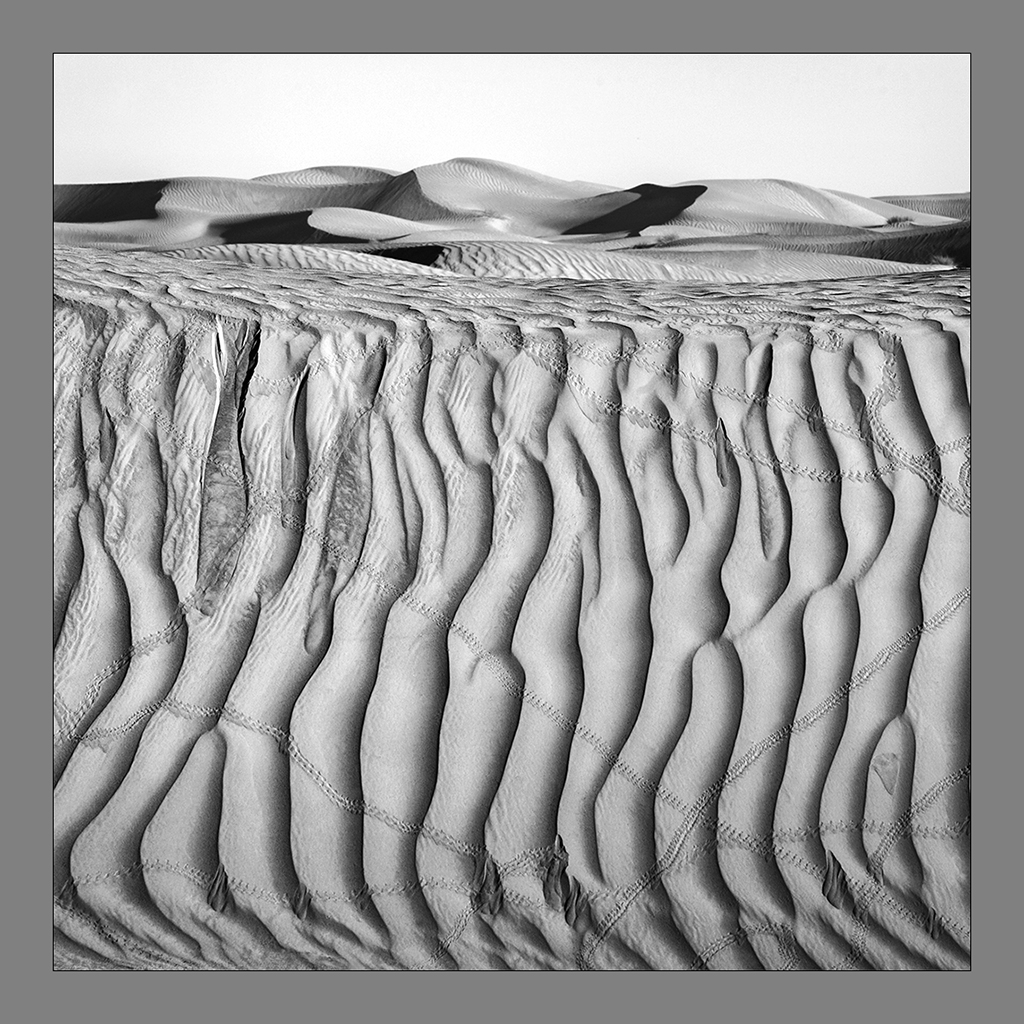
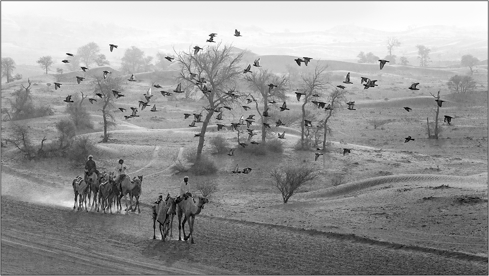
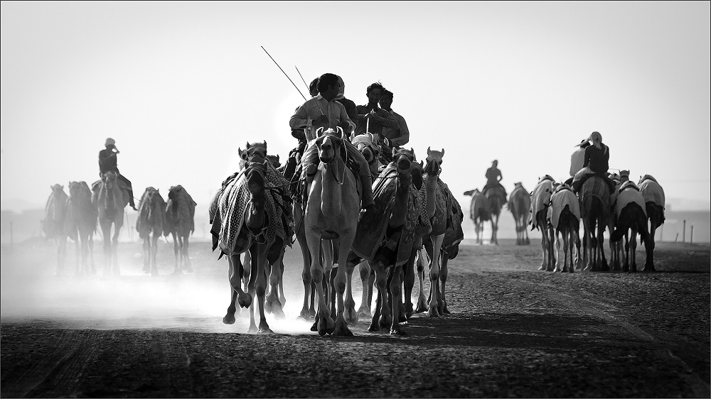
Thank you for the comments and time. I agree with Vincent and wish there was better tonal gradation or elements in the sky rather than a stark blank sky. I also agree that the central elements could be a tad lighter as Paul indicated. The dust off on towards the left was much more and had to tone it down as I do not like the whites to bleed out of the frame. I forgot mentioning that in my description. @ Lois, you are most welcome to visit the place and you can have a great experience photographing the desert and the camels which have been my subject for the past two decades @ David; thanks I will reduce the sharpening a bit. Good light to all. |
Feb 22nd |
| 39 |
Feb 18 |
Comment |
Good effort David. It must have been a challenge. The ISO is quite high but you managed to get good grain. Just a thought that comes to my mind; the placement of the moon is fine when centered on the horizontal axis but on the vertical axis would prefer to push it a bit above. In all a very controlled image. |
Feb 22nd |
7 comments - 0 replies for Group 39
|
7 comments - 0 replies Total
|