|
| Group |
Round |
C/R |
Comment |
Date |
Image |
| 5 |
Apr 26 |
Reply |
Thank you Bev! |
Apr 19th |
| 5 |
Apr 26 |
Reply |
Thanks very much Natalia! |
Apr 19th |
| 5 |
Apr 26 |
Reply |
Thanks so much Sophia! |
Apr 19th |
| 5 |
Apr 26 |
Reply |
Thanks, Mark. Good pick up! |
Apr 9th |
| 5 |
Apr 26 |
Reply |
Thanks, Pete! Yes, I like both yours and Richard's tweaks. |
Apr 6th |
| 5 |
Apr 26 |
Reply |
Thanks very much, Richard. |
Apr 3rd |
| 5 |
Apr 26 |
Comment |
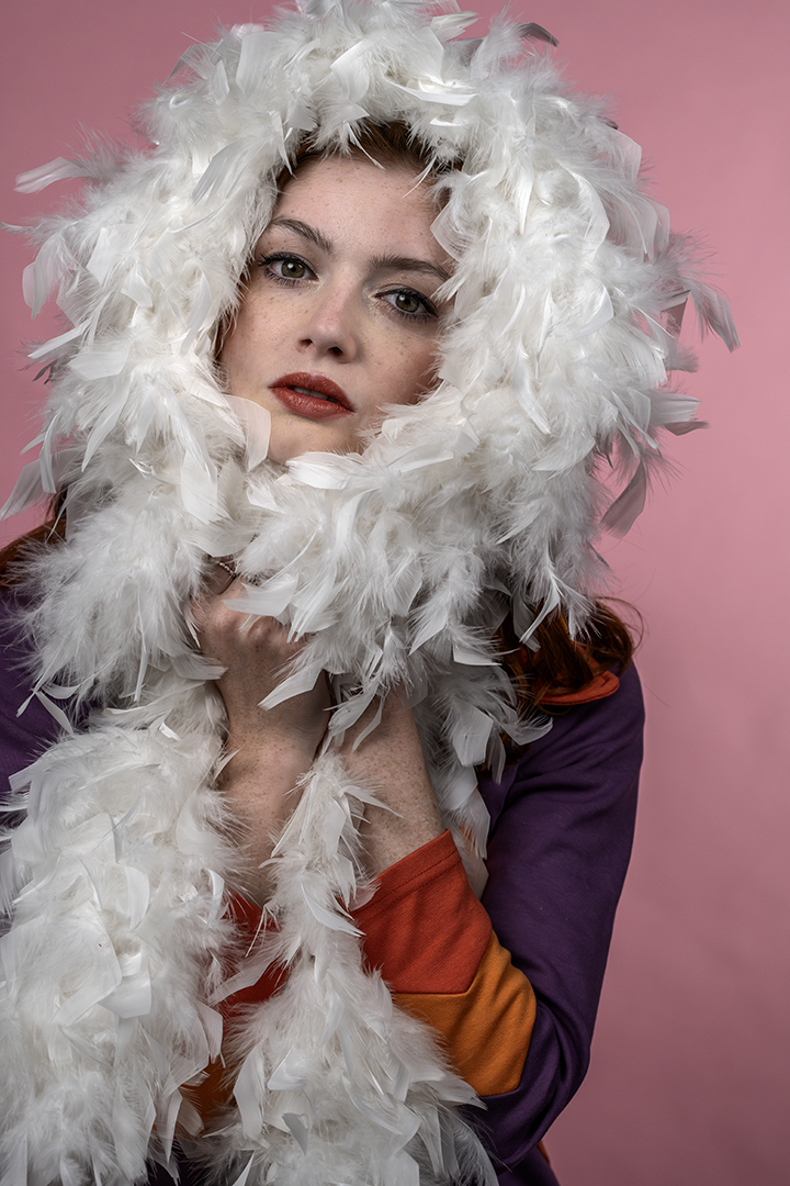
Hi Richard. That's very strong eye contact! The lower viewpoint has worked well. It gives the bird stronger presence. I think it just needs a little more separation between the subject and the background. Perhaps darkening down and desaturating the background a little. Also have a look at the white balance. There seems to be a bit of greenish colour cast in the feathers. There is good texture and detail in the feathers otherwise. |
Apr 3rd |
| 5 |
Apr 26 |
Comment |
Hi Sophia. The eye contact is very strong and engaging. One rule of thumb that I try to use is to have the eyes on the top third. Sometimes you might have to crop through the top of the head which I do in my portraits. It's not everyone's cup of tea but I think it's a good way to help bring the focus to the eyes without having to darken down the background as much. The background is lovely and soft as it is. You have a good eye for seeing what will make an engaging portrait! |
Apr 3rd |
| 5 |
Apr 26 |
Comment |
For Mark's image, I really like the texture in the stone and the mining equipment. I'd bring that out even more. Perhaps a lower viewpoint would have blocked out the window in the distance. I wonder what a colour version would look like? There's probably rust and discolouration that is lost in the B&W. The lighting is nice and does bring out that texture. |
Apr 3rd |
| 5 |
Apr 26 |
Comment |
I read recently about how to save files in ACR as a jpeg (without sending it to PS first). I just gave it a go and it seems to work. I'm interested whether anyone else has tried it. In ACR, go to the 'convert and save image' symbol. It's next to the settings wheel. In here, you can set the image format to jpeg and limit the size to 1mb (without having to resize the image in PS). It then creates a new file. Hope that makes sense! |
Apr 3rd |
| 5 |
Apr 26 |
Comment |
Hi Pete. I really like the composition. The butterfly is sitting just on the edge of the flower. The eye and antennae are very sharp. There is a little loss of depth of field out towards the edge of the wings and in particular the top wing. Now that the exhibit is back, maybe it's worth experimenting with some different settings? The background is lovely and soft. Have fun at the opening day! |
Apr 3rd |
| 5 |
Apr 26 |
Comment |
Hi Anna. I also liked the colour version. In terms of the black and white, I think the shadows in the main rocks are just a little too dark. There's not enough separation between them. I'd lift the shadows just a little. I do like the portrait crop. It gives the image a sense of space. I think Pete might have cropped just a little off the top and bottom and I think that does bring the viewpoint more on the rocks. The sky definitely gives the image a moody feel. |
Apr 3rd |
| 5 |
Apr 26 |
Comment |
Hi Natalia. This is a lovely, simple image. I like the soft, muted colours. To simplify it even further, you could consider cropping off the very top to remove that branch in the background and the bottom. To bring the focus more onto just those 2 buds. The top bud also seems to be a little sharper so perhaps you could add some clarity to the bottom one. I think the water droplets really lift the image. |
Apr 3rd |
7 comments - 6 replies for Group 5
|
7 comments - 6 replies Total
|