|
| Group |
Round |
C/R |
Comment |
Date |
Image |
| 5 |
Sep 25 |
Reply |
I really like the B&W version. I think it brings out the tones and the mood. |
Sep 27th |
| 5 |
Sep 25 |
Reply |
Thanks very much Mark. |
Sep 27th |
| 5 |
Sep 25 |
Reply |
Thanks very much Sophia. |
Sep 27th |
| 5 |
Sep 25 |
Reply |
Thank you Oliver. Yes, I do like the tighter crop. Many thanks! |
Sep 13th |
| 5 |
Sep 25 |
Comment |
Hi Richard. Lovely image and one I'm sure she will cherish. I agree with the comments regarding the post processing artifacts. I would also darken down her fingers just slightly as they are a little bright and draw the viewer's eye. |
Sep 12th |
| 5 |
Sep 25 |
Comment |
Hi Sophia. There are some great suggestions from the others. I do like Richard's vertical crop. It really brings us closer to the action. I'd also consider selectively desaturating the green trees and grass slightly, to really make that blue stand out. Good luck with the competition! |
Sep 12th |
| 5 |
Sep 25 |
Comment |
Hi Mark. I love the shapes and lines in this. They are very striking. I'd consider bringing out the texture in those walls even more with some additional contrast and clarity. I agree with the other comments about the sky being too bright and I think you can remove that to simplify the image. I think the square crop works well and suits the image. |
Sep 11th |
| 5 |
Sep 25 |
Comment |
Hi Oliver. Taking images of 'someone else's art' is always tricky but I think you've done well here to bring some of your own interpretation to it. I agree with the comments about cloning out the shadows. I'd also consider darkening down the background a little more so that the 'subjects' pop from the background. I wonder what it would look like in black and white to simplify the image even more. |
Sep 11th |
| 5 |
Sep 25 |
Comment |
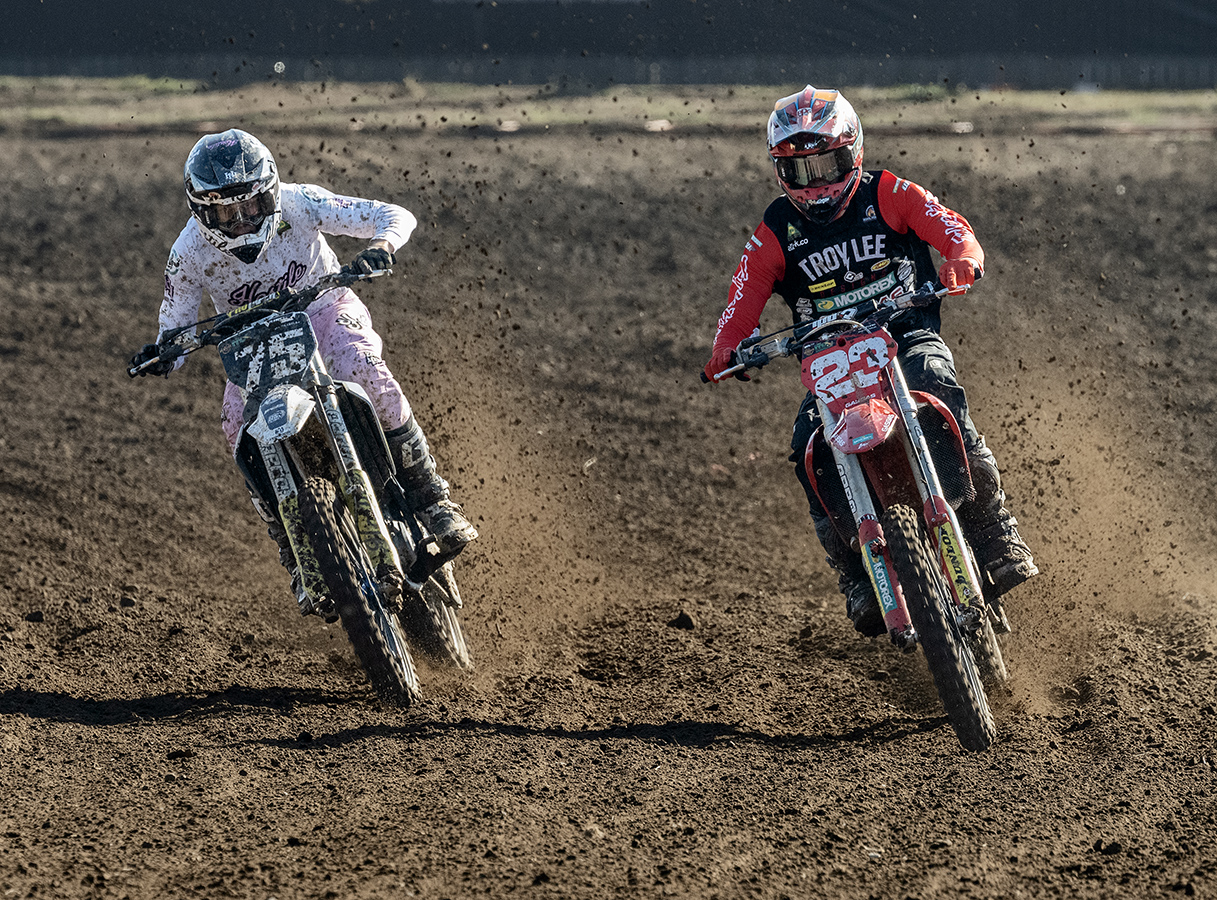
Hi Xiao. The pose of your subject is very strong. He looks confident. I feel that taking the image looking down on him does diminish this power a little. There is good contrast and clarity in the image. I agree with the comments about toning down the highlights on his face. I would also consider darkening down his hands slightly as they are a little bright and draw the eye of the viewer. |
Sep 11th |
| 5 |
Sep 25 |
Comment |
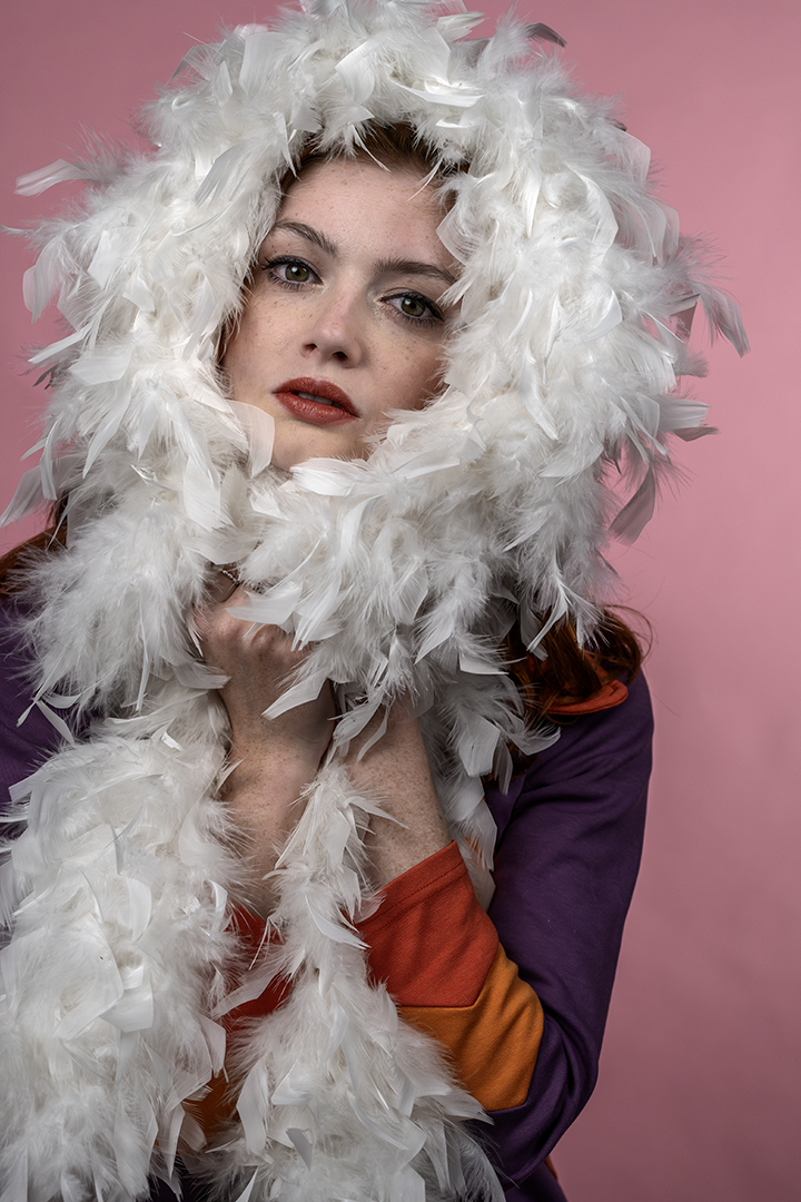
Hi Natalie. The expression on the girl's face and the position of her hand, does give the image a 'dreamy' quality. It's something a little different which I liked. It makes me wonder what is happening and what has drawn her attention. As others have mentioned, the image feels a little bright and some darkening down of the background will help your subject to stand out more. I feel that there is a little too much of the whites of her eyes showing and maybe taking a small step to the left would have helped here. Easier said than done I know! Hopefully you will have the opportunity to take more of these kinds of images. |
Sep 11th |
6 comments - 4 replies for Group 5
|
6 comments - 4 replies Total
|