|
| Group |
Round |
C/R |
Comment |
Date |
Image |
| 45 |
Apr 26 |
Reply |
Well, I was a textile dyer early in my career, and spent pretty much 40 years in the color business one way or the other. BUT, it might just be my monitor, too. But, I see a little violet tone in both corners, although the one Cindy mentioned is more pronounced. |
Apr 6th |
| 45 |
Apr 26 |
Comment |
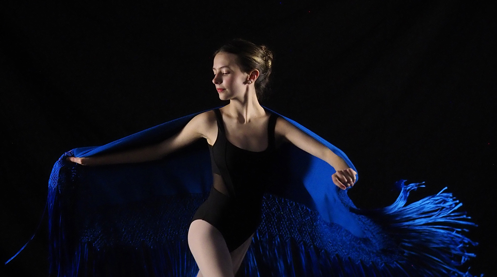
I think you made the right choice to go with the high key. It is one of my favorite looks, and I don't use it enough! It fits perfectly with the story of this image in my mind...the ELEVATION (sky bridge), the bright light, the mysterious background. Even the support cables.
Knowing the story of WHERE the bridge is adds even more of a connection in my mind, with the brilliant light of knowledge behind the student. Very well composed, photographed, and edited. |
Apr 5th |
| 45 |
Apr 26 |
Comment |
Love the changes you made, and glad it was not in monochrome! The contrast adjustments on the dahlia itself (I assume the Georgia O'Keefe filter??) make it jump off the screen. So 3-D. I have never tried Topaz Impressions. But, now I might have to. Also, the small flowers look white on my screen in the original. The pale pink is a perfect foil for the deep wine color of the dahlia. And, I like the way that you darkened the unimportant stuff at the bottom and rear left. Did you tinker with the hue of the rose? To me, it grates a little, adjoining the dahlia.
But, more than the editing, you set it up right to photograph. Right angle, right height above the flowers, right amount of light. Without the right starting point, the editing would have been even harder, and may not have produced such a satisfying image. |
Apr 5th |
| 45 |
Apr 26 |
Comment |
Very interesting and eye-catching image, Bob. From the comments of those who have weighed in so far, looks like we have two camps...stark and more open. I am in the stark camp. To me, it is about the lines and the man at the top. I'd stay dark with the rest. Yes, we know those are stairs, and an overhang. But, the edited light on the overhang looks wrong to me. And, unless the picture is of the stairwell, I like the dark stairs better. I love that you put light on the man's face. That looks real and natural.
One thing I wish I could see changed is the dark wedge shadow on the top left. I don't like it because the angle doesn't match the other leading lines, and it is SUCH A BIG CONTRAST in a part of the photo that has no other interest. I'd love to see it with the shadow removed (as if that part of the wall was in the sunshine), and leave the horizontal and vertical line underlying the shadow. That would add a little interest in that part of the image, remove the distraction of the contrast. BUT, I am not sure it is possible to raise the exposure in that area enough. Not that it is allowed under the PSA rules, but that seems to be a challenge for AI Remove tool..."Remove the shadow, leave the wall".) Wonder what it would do? |
Apr 5th |
| 45 |
Apr 26 |
Comment |
Wow, great photo. The monochrome choice is wonderful, even though I suspect it looks darn good in color as well. Your depth of field and focus is ideal...hair, weave in the denim jeans, the hand and brush, and the sketch book sharp and crisp. The background inconsequentially soft, yet with enough light patterning to draw some attention as well. Even the use of contrasting light and dark where the line of the jeans meets with the background is dramatic. Don't know if that crop was intentional or not, but it is one more thing I like about the photo. |
Apr 5th |
| 45 |
Apr 26 |
Comment |
I love to shoot crocus, as they are so vibrant and delicate. This is a very lovely grouping. Good job on editing them to remove the distracting leaves.
A suggestion slightly different from Cindy's on the violet color in the upper left corner...rather than remove it, just change the hue more to the brown side. The same could be said for the lower left corner, which seems to have a slightly violet cast.
When I first read Mike's comment about the angle, I thought, "Yeah, taking the picture from just a few inches to the left might have introduced a little more of an arc to the line of the flowers." But, that wasn't what he meant. I am not sure that lowering the camera toward the ground would improve the image. The strong contrast of the orange and violet may be minimized or lost. |
Apr 5th |
| 45 |
Apr 26 |
Comment |
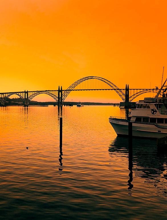
40 years ago, my mother-in-law went to a Picasso exhibit. She didn't buy a painting, or even a print. She bought a coffee cup with Picasso's signature on it. I am so glad she did. Because when she died, it became MY coffee cup, which I drink out of every day, and which I value highly. It reminds me to make the artistic choices that please me. To me, your color choice is bold. And, if it fits the purpose for which it was chosen (even if that purpose was "I like it"), then great. The color grabbed my attention and held it. I also like the building reflecting in the water, creating a leading line, the ripples in the water, and the old tree on the shoreline.
As I studied the photo, I noticed a couple of other things.
First, on the top right of the image, there is a bright streak that I cannot identify. Now that I have seen it, it distracts me. Second, the photo seems a little unbalanced, with so much to see on the right, and very little on the left. Yes, it gives the boat room to float away, and it gives more room for the yellow color to fade. Maybe a small crop on the left side, perhaps where the sky reflects in the water? |
Apr 5th |
| 45 |
Apr 26 |
Reply |
Perfect, Cindy. It is such a simple thing to do, and yet I rarely think to try it. Somehow, my brain gets stuck on the subject as we saw it. Sometimes the scene is such a well-known subject that flipping it is disturbing for the viewer. But this is an ideal place to use a flip. NO ONE would know or care that the image was flipped, and yet it makes so much difference to the presentation. Thank you! |
Apr 5th |
6 comments - 2 replies for Group 45
|
6 comments - 2 replies Total
|