|
| Group |
Round |
C/R |
Comment |
Date |
Image |
| 45 |
Jan 26 |
Comment |
Just about perfect.
The editing took a very good photo and made it even better. The colors are intense, and vibrant, which might seem a little unreal for the typical lighting in a church of this type. But it makes for a fine photograph! The crop and straightening are just right. You put the chandelier in just the right place. And the figure in the pew just makes everything coalesce; the exposure on that person, while only slightly adjusted from the original is just right, and the size of the person relative to the statue is exquisite. Now, I have used every positive adjective that I know.
My only suggestion...can you remove the guard rails? |
Jan 15th |
| 45 |
Jan 26 |
Comment |
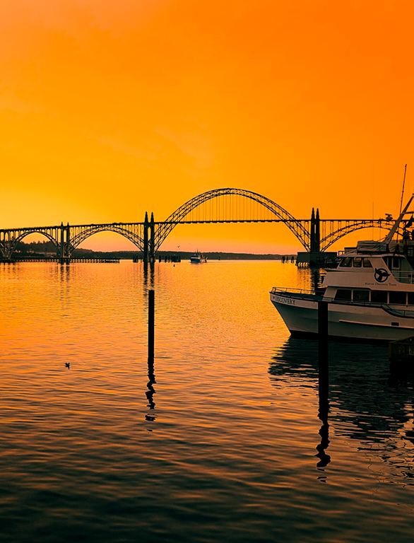
Hi, Robert,
A superb subject, one I would like to photograph some day. You picked a great day to do it. I like the way the buildings fade into the fog, and prevent the eye from leaving the picture. I also like your position, both on the right shore and slightly below the bridge.
Could be a great monochrome image, as well.
I tend to agree with David that maybe the color saturation on the bridge is a bit strong, especially on the left side, where one would assume it would be dulled by the fog. Not sure if you tried to brighten or darken, or use clarity/contrast to make the bridge stand out more, rather than color.
A couple of other things that might help the bridge step forward...
First, as David mentioned, darken or use a vignette to reduce the brightness of the water
Second, the understructure of the bridge seems to be very interesting. Maybe brightening it up a bit, especially under the two arches on the right side, would focus the eye more on the bridge. That assumes the noise in that dark area is not too bad.
|
Jan 15th |
 |
| 45 |
Jan 26 |
Comment |
Hi, Crystal,
Very nice shot. The gharial is such a unique and wonderful species to photograph; I think there is one at The Alligator Farm in St. Augustine Florida, as well. You did a great job with this image, especially the composition and the editing. I like the way you darkened not only the background (without making it pure black), but also (as Robert pointed out) the animal itself. That certainly added to the detail.
Only possible correction I see (and it may be the saturation on my monitor) is that there seems to be some patches of aqua in several places on the body and lower jaw of the animal. |
Jan 15th |
| 45 |
Jan 26 |
Reply |
Thanks for the reminder on denoising it, Cindy. Since I was in LR, with a jpeg, I decided to wait until the color adjustments had been done until I denoised...and then I forgot! The vignette, yes, I did add one, but not as dark as what you did, and I like yours better. Thanks. |
Jan 15th |
| 45 |
Jan 26 |
Reply |
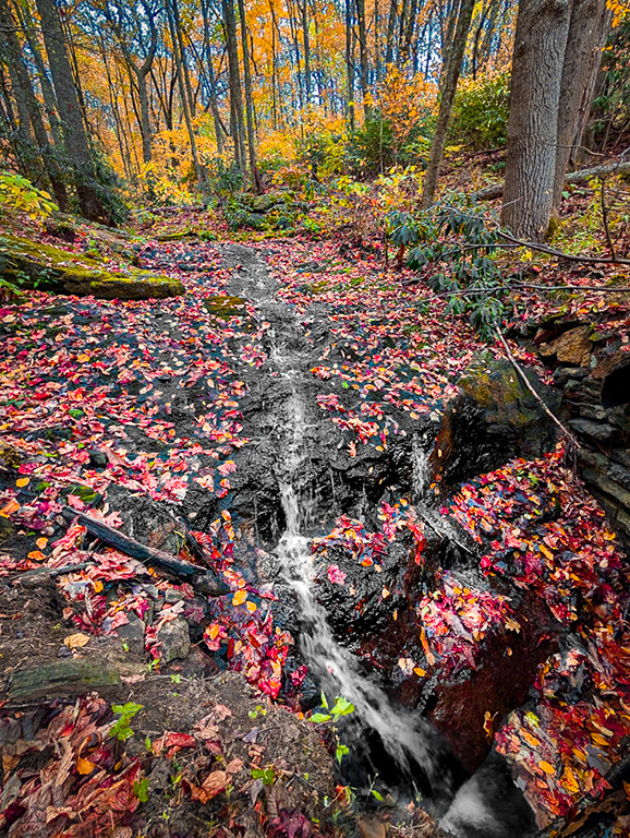
Thanks for the kind words, David. The color adjustments with the Calibration panel were not the only ones used, but that did the heavy lifting. Then, I used the conventional color panel to tweak a few details, especially around the stream, and some desaturation there, as well. |
Jan 15th |
| 45 |
Jan 26 |
Comment |
Where is Jason??? Keep an eye out behind you.
I love those moon shots silhouetting trees in front. Having the clouds shrouding the moon really helps with preventing the moonlight from blowing out the image.
Interesting the way the orange cast to the clouds fades away around the moon. I might have considered putting an orange mask over the gray; but without doing it, I can't be sure I would like it any better. With the 400 mm focal length, you might have tried a smaller f-stop; maybe f/14 of f/16, to improve the sharpness of the closer branches and bring out a little more definition in the clouds...that is, if you wanted more definition in the clouds.
I shot some fun "February Moon" shots a few years ago. For some reason, I like that month, probably because of where the moon is in the sky, relative to the trees in my neighborhood. You have inspired me to get out and shoot them again this year. So, you might see one in the future. Maybe I will get lucky and get a thin cloud layer, too.
|
Jan 15th |
| 45 |
Jan 26 |
Comment |
When I first glanced at the image, I thought it was Mesa Arch in Canyonlands NP, which I have seen many pictures of. So, I was pleased and surprised that it was NOT that at all. But, it made an interesting connection for me. I like the framing and picture-in-a-picture style. The saturation may indeed be a unrealistically high, but I think the sky needs that to create separation from the sculptured frame. So, it doesn't bother me. A slight improvement may have been possible by shooting from just a foot or two further to the right, or from a little closer to the opening, allowing a little more of the background on the left side to be visible. |
Jan 15th |
5 comments - 2 replies for Group 45
|
5 comments - 2 replies Total
|