|
| Group |
Round |
C/R |
Comment |
Date |
Image |
| 39 |
Feb 19 |
Comment |
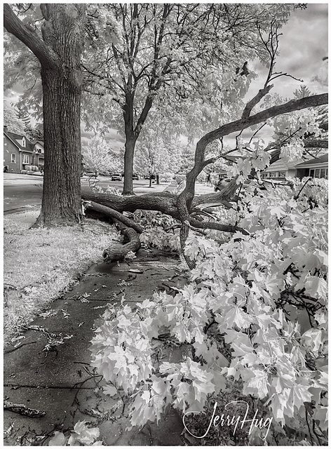
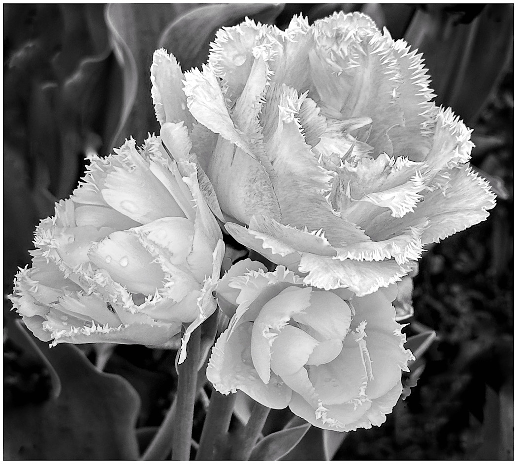
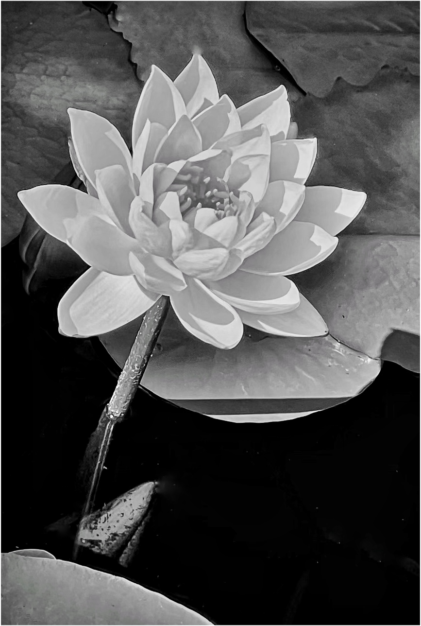
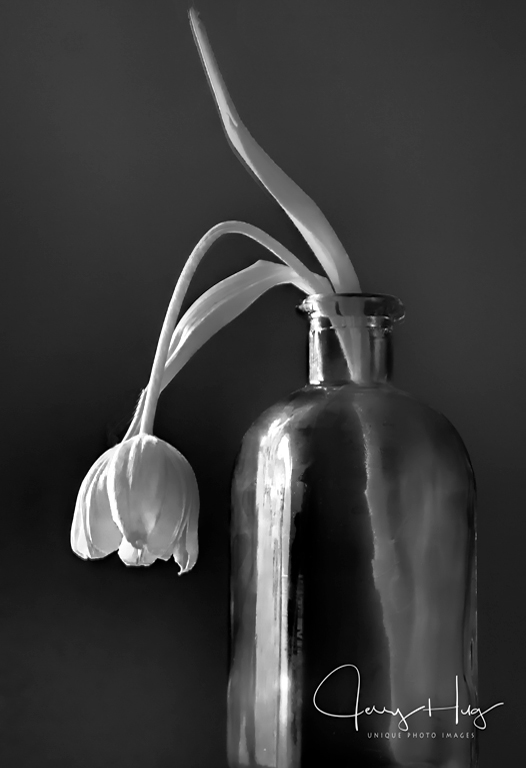
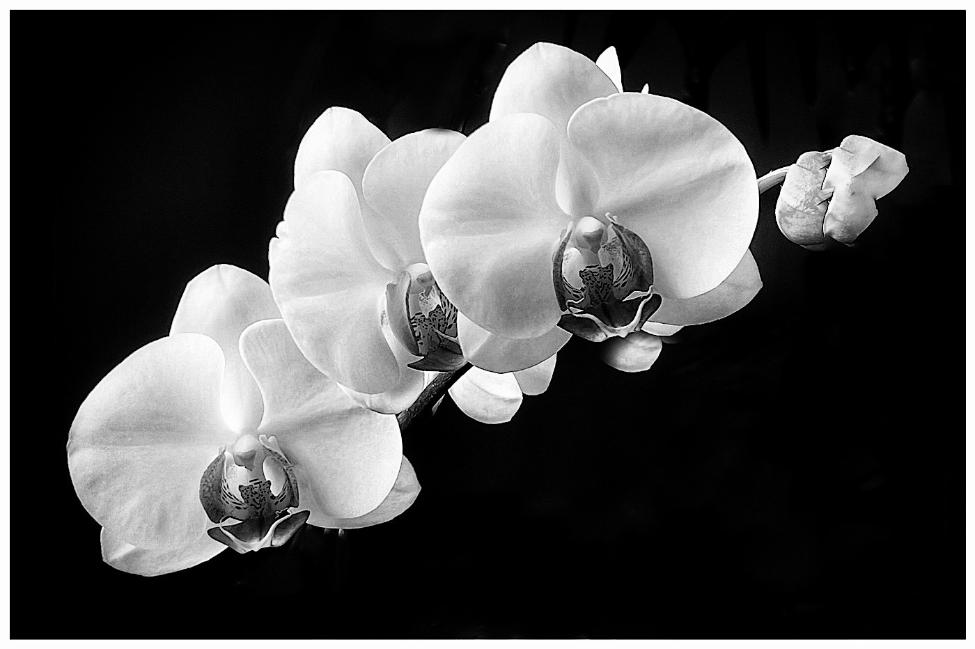
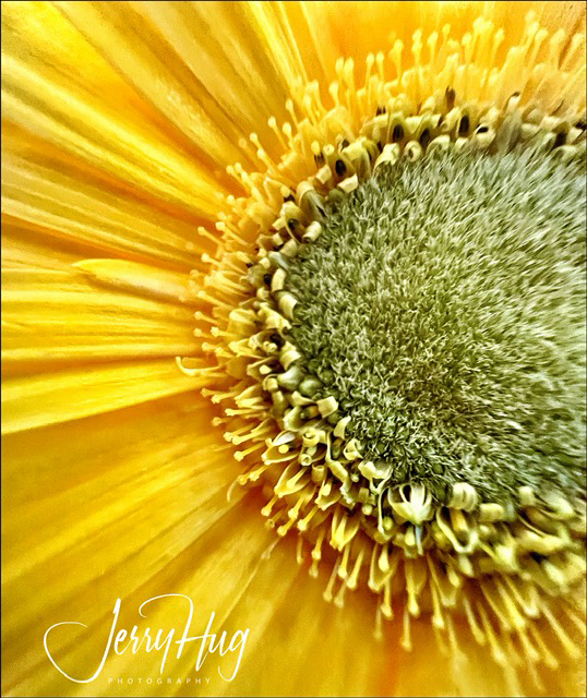
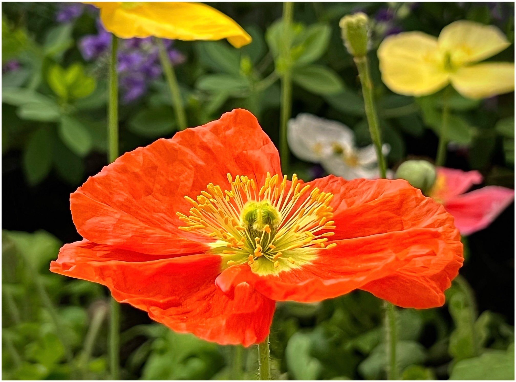
Changing a yellow flower into B/W is very interesting to say the least. I would suggest trying various color filter in PS of one of the B/W conversion plugging like Tolpaz of NIK. The dark grey does look like the cut rose is three weeks old? You really can prevent this with NIK Silver Effects Pro and other software techniques.
Got to the library and check out Robert Mapplethorpe and his flowers. Jerry |
Feb 13th |
| 39 |
Feb 19 |
Comment |
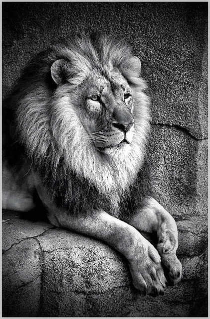
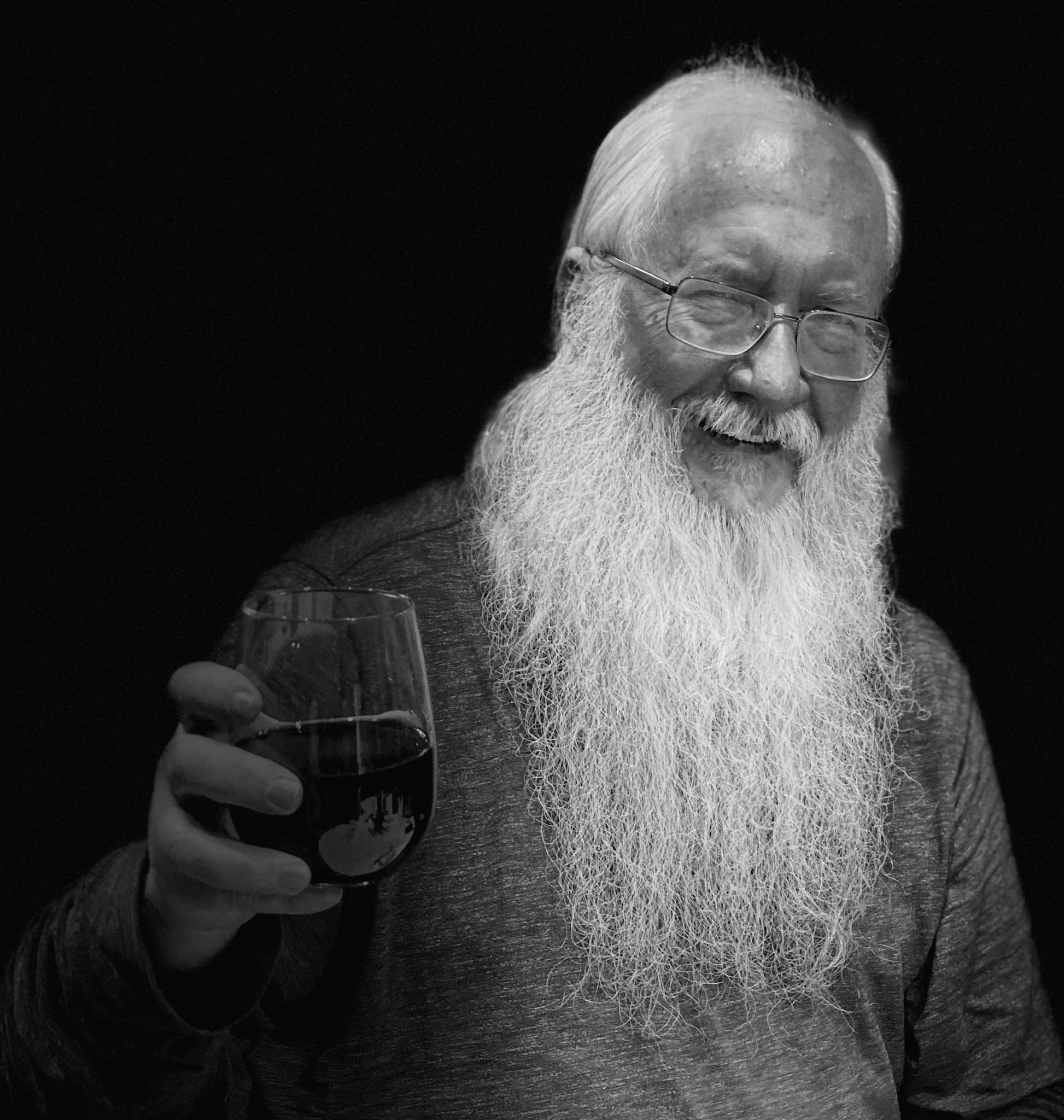
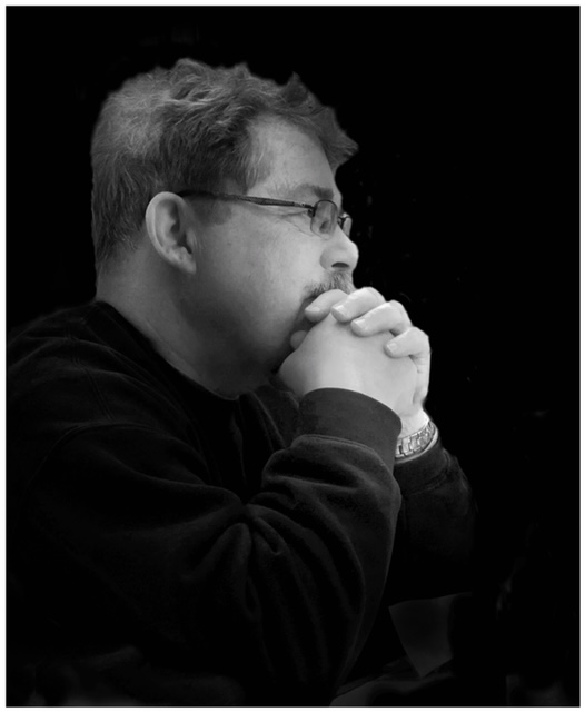
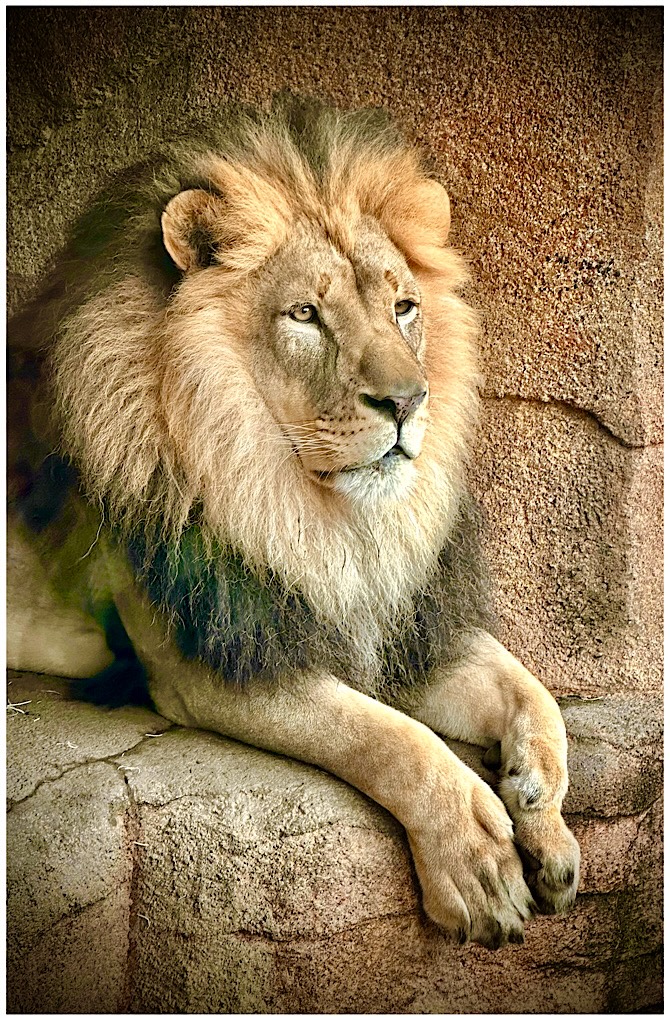
Vincent, a great shot of this old fashioned movie star type of lighting.
I think Paul hit the one point that was my firsat reaction. He was standing too close to the wall and you got the distracting fall off shadow that would fall off with more distance to the wall.
Yes, the one hand could be burned in (toned down) a little so as to not distract from the handsome face. This guy knew how to pose in a very present way with the slight tilt of the head. The B/W is so much better than the color photo. Jerrry |
Feb 13th |
| 39 |
Feb 19 |
Comment |
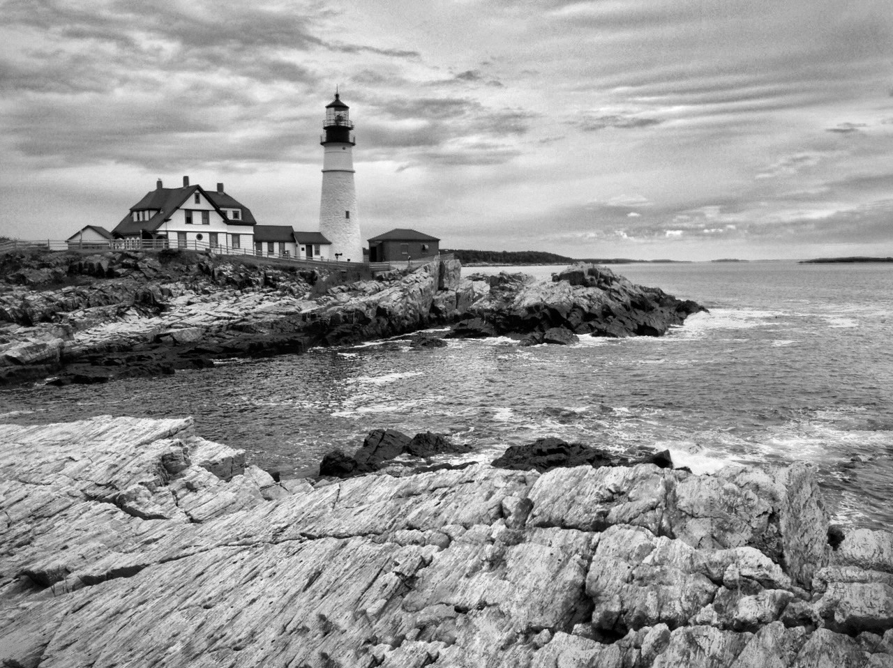
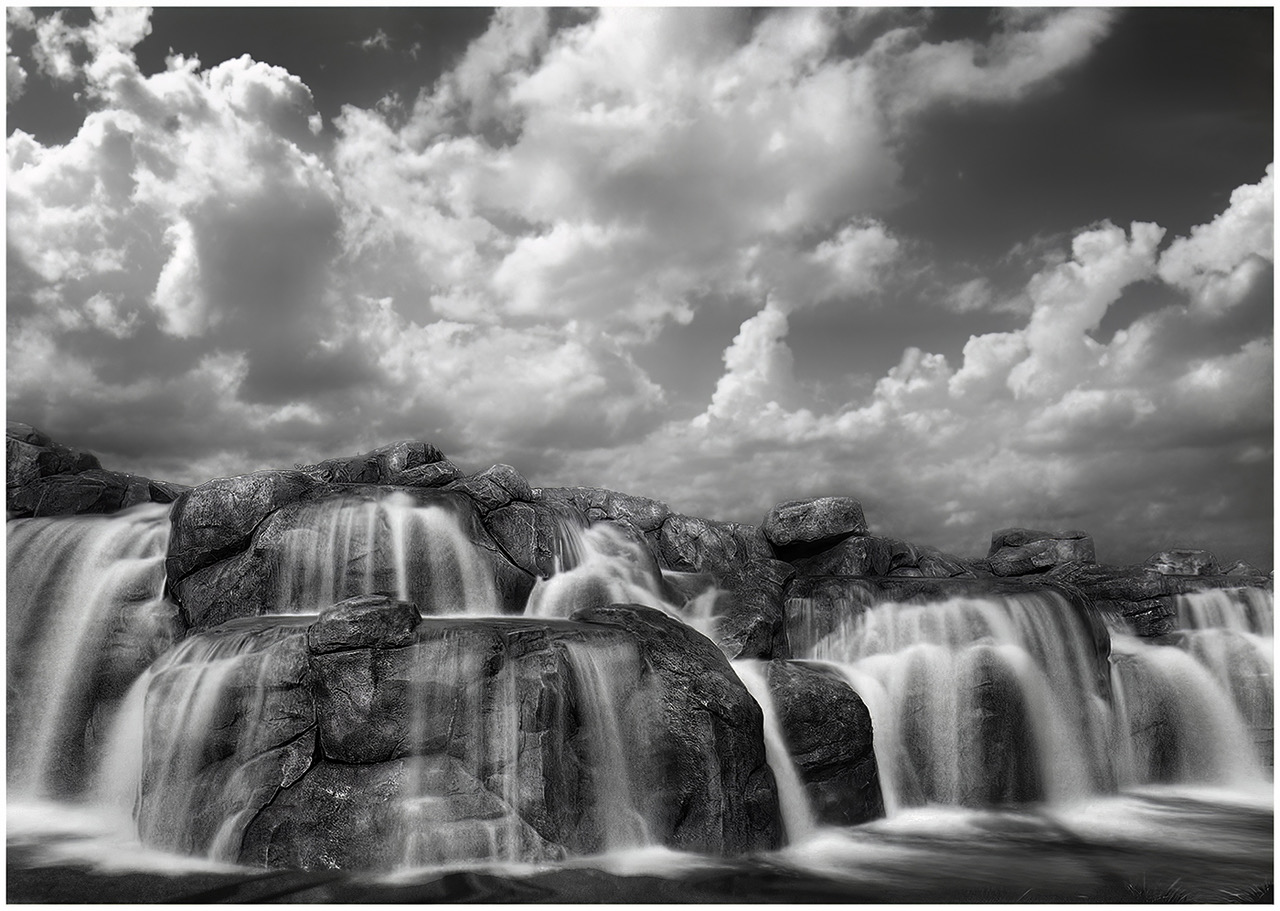
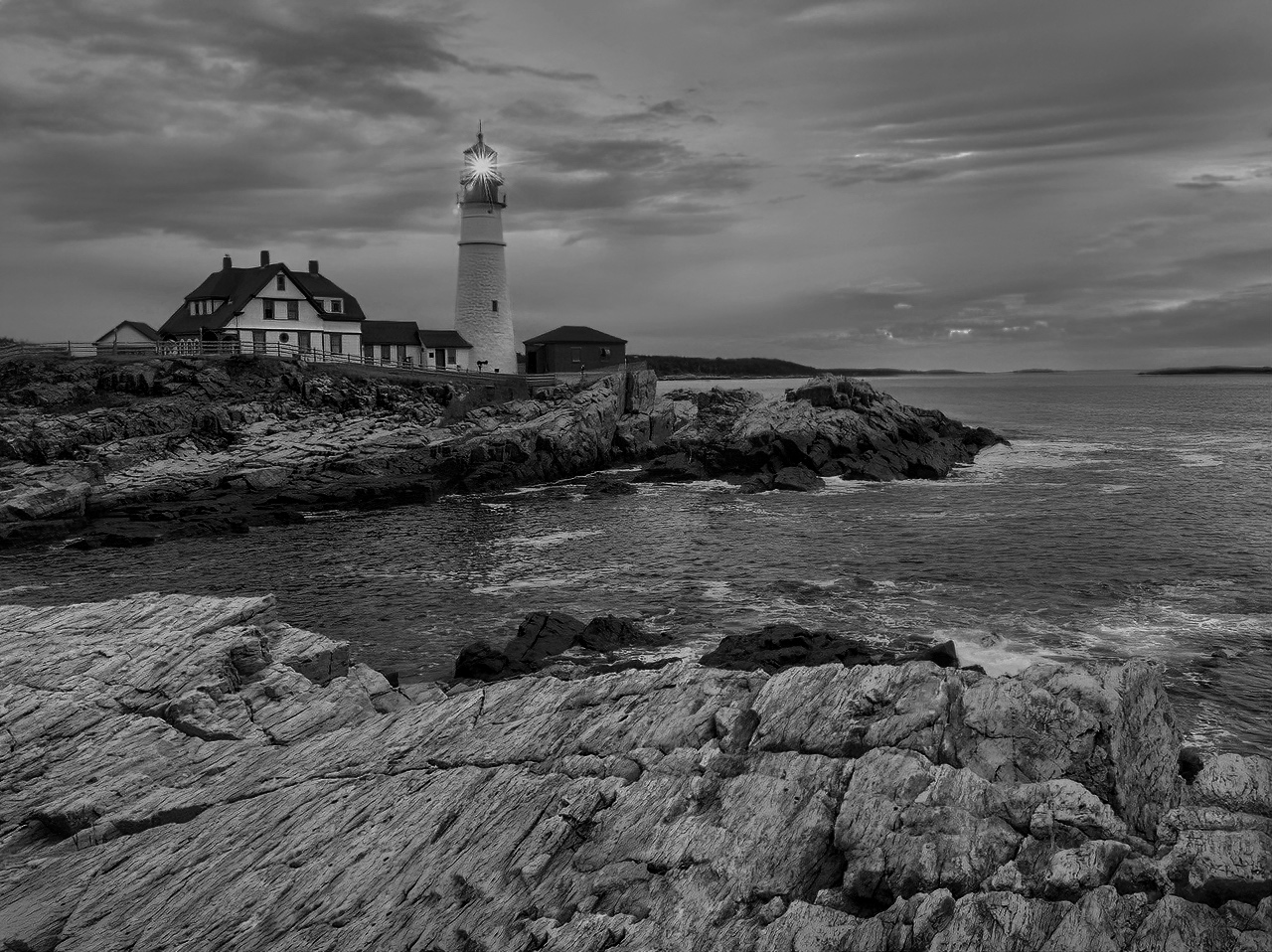
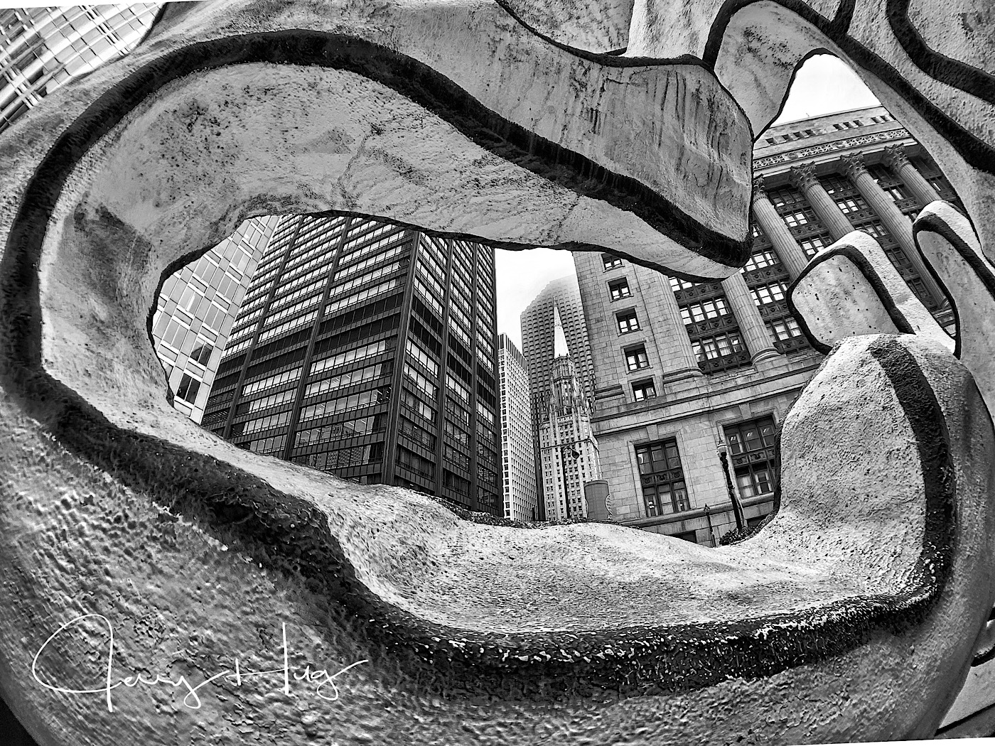
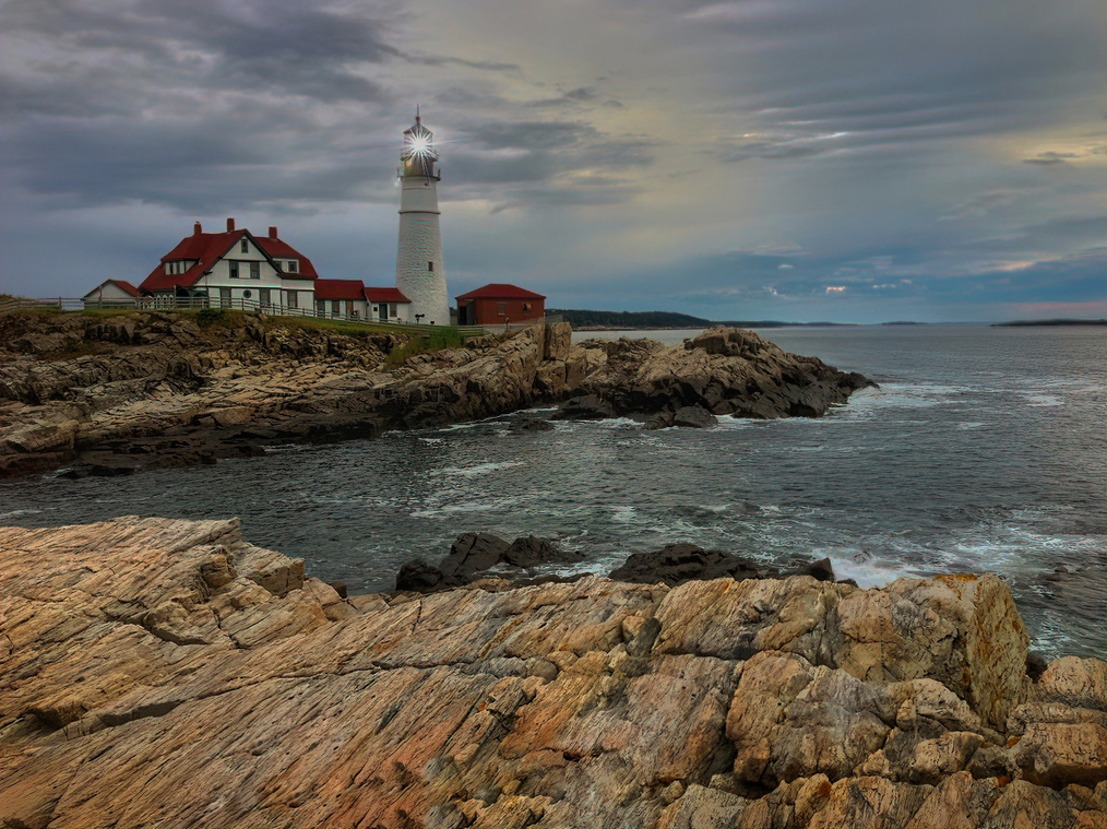
As usual Paul I like your B/W images. The lighthouse and water around is superb. I also like the bottom of the image. I think you got just the right tones to show the area and not distract from the lighthouse.
I would like to suggest that you crop off the top of the image somewhere above the brilliant white clouds near the center of the image. This is a drastic idea, but do consider that you have already made a great image with wonderful foreground middle ground and background. The rest of the sky is just filler for me? Especially the very top clouds. Jerry |
Feb 13th |
| 39 |
Feb 19 |
Comment |
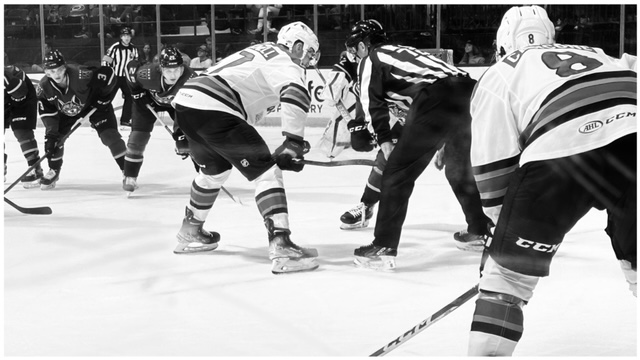
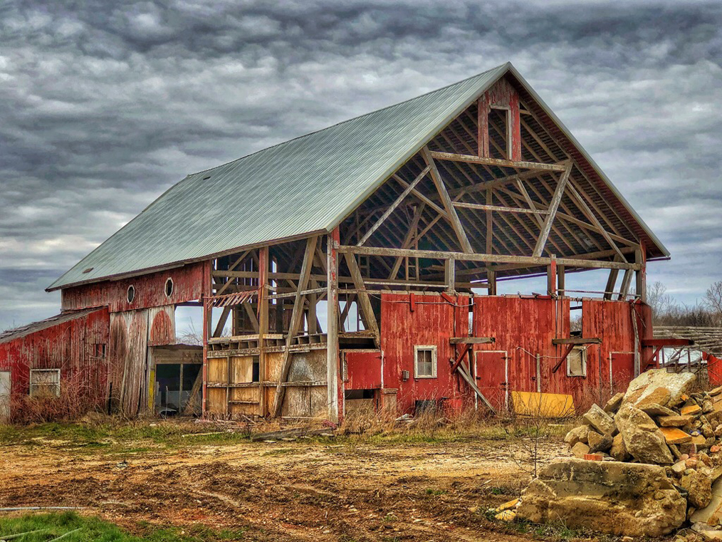
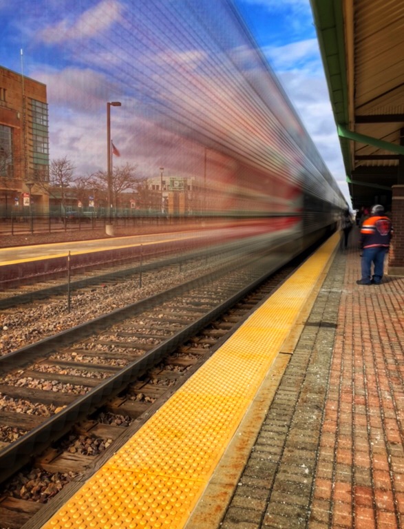
This is a very strong B/W image and shows the action in the stables. Using the longer than normal lens pulls everything together very well. The high contrast works for me.
I am sure the stables would love to have a copy for their walls. |
Feb 13th |
| 39 |
Feb 19 |
Comment |
David, I really like the contrast between the boy and the 2 adults behind him. The boy's skin is picture perfect. The woman on the left could be burned down a tad. Especially when you blow it up on a big screen.
The round vessel on the bottom left could be toned down just a little. I could consider cropping off the bottom of the photo and take off the distracting syrup bottle and then take off the one single dust spot on the table. The contrast between the boy and the 2 adults tells it all. |
Feb 13th |
5 comments - 0 replies for Group 39
|
| 51 |
Feb 19 |
Comment |
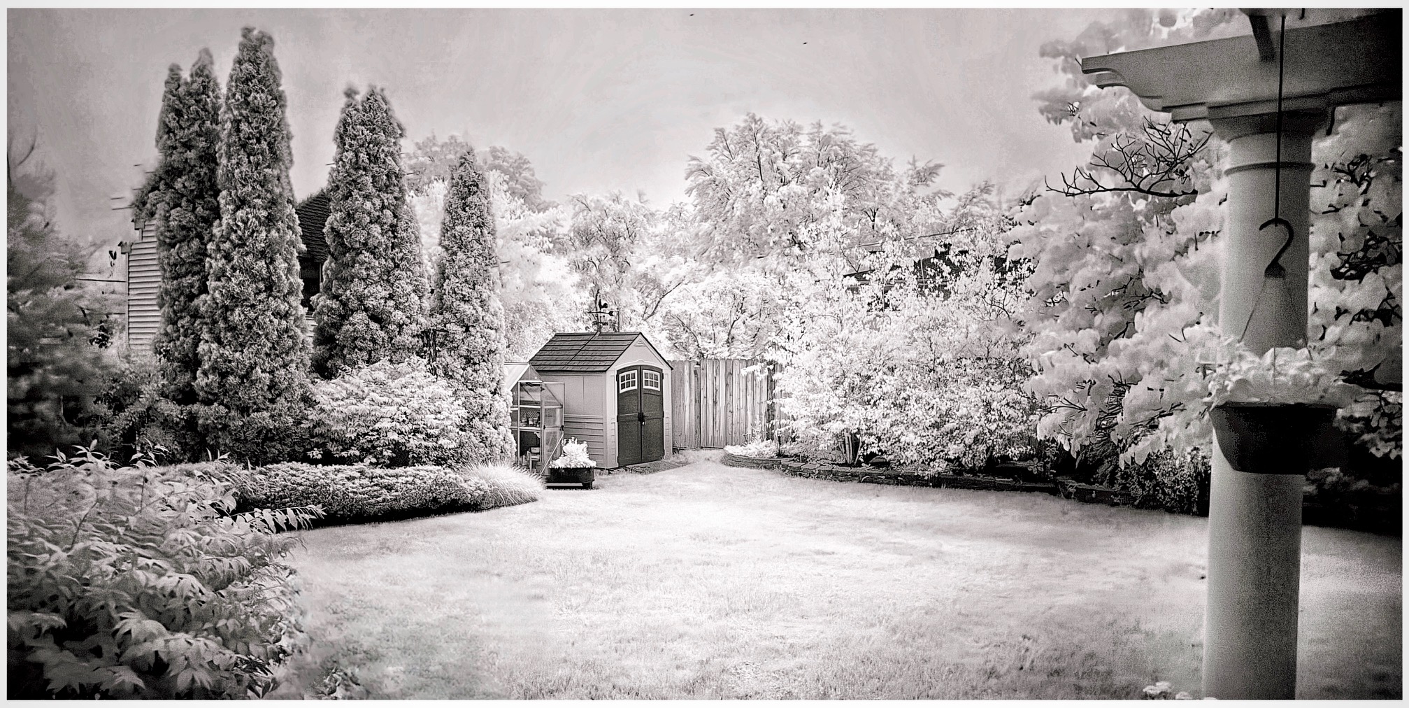
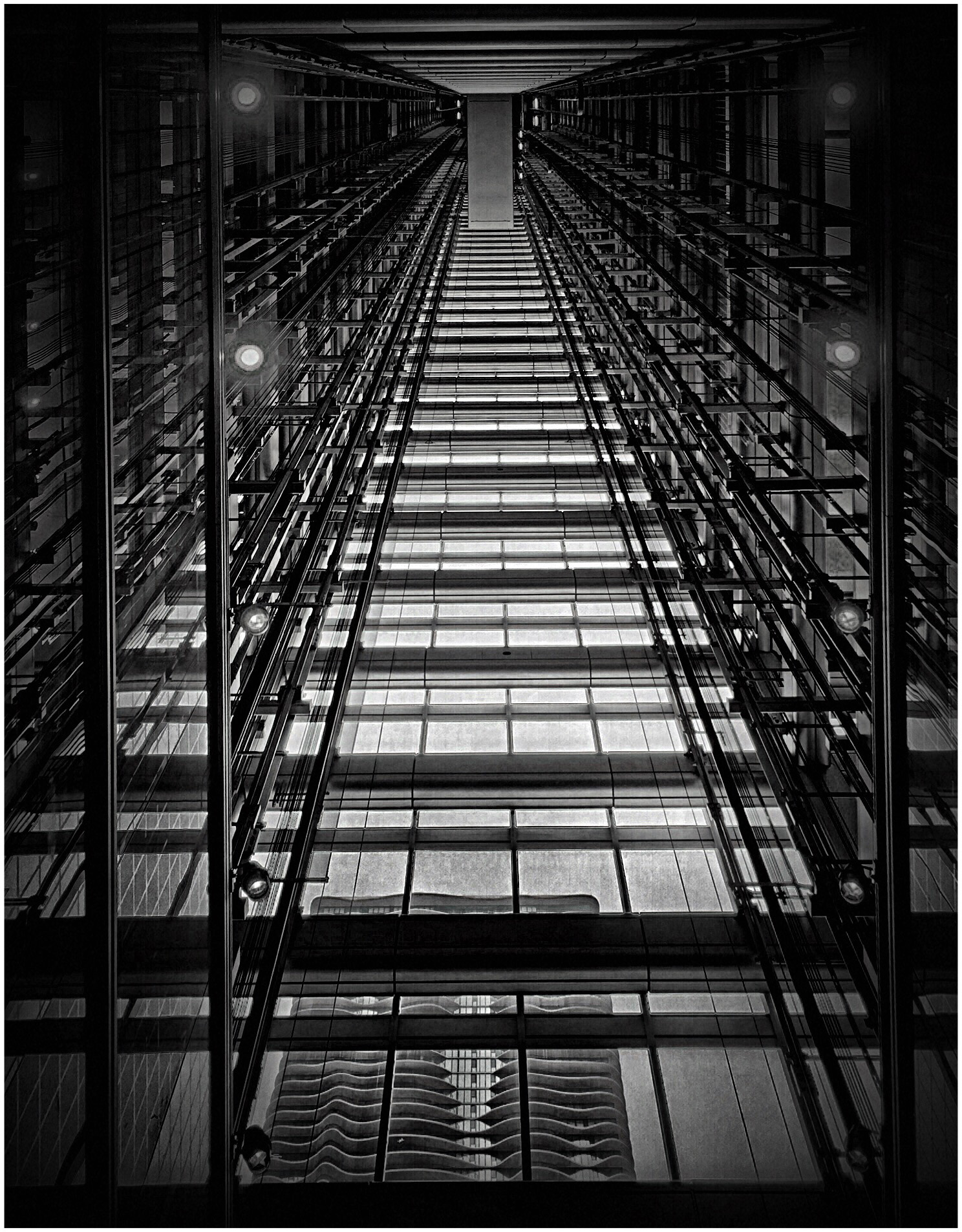
Really an interesting image. Was the part of the Black Door Pulls shadows? Before you told me what is was, I thought it was some kind of oriental writing. I agree the cream tones of the background is very nice.
You could consider using Snapseed and correct the keystone effect. Use the free setting for better control. For real hard corrections, I use SKRWT app. No need to purchase for this and many other corrections. Jerry |
Feb 5th |
| 51 |
Feb 19 |
Comment |
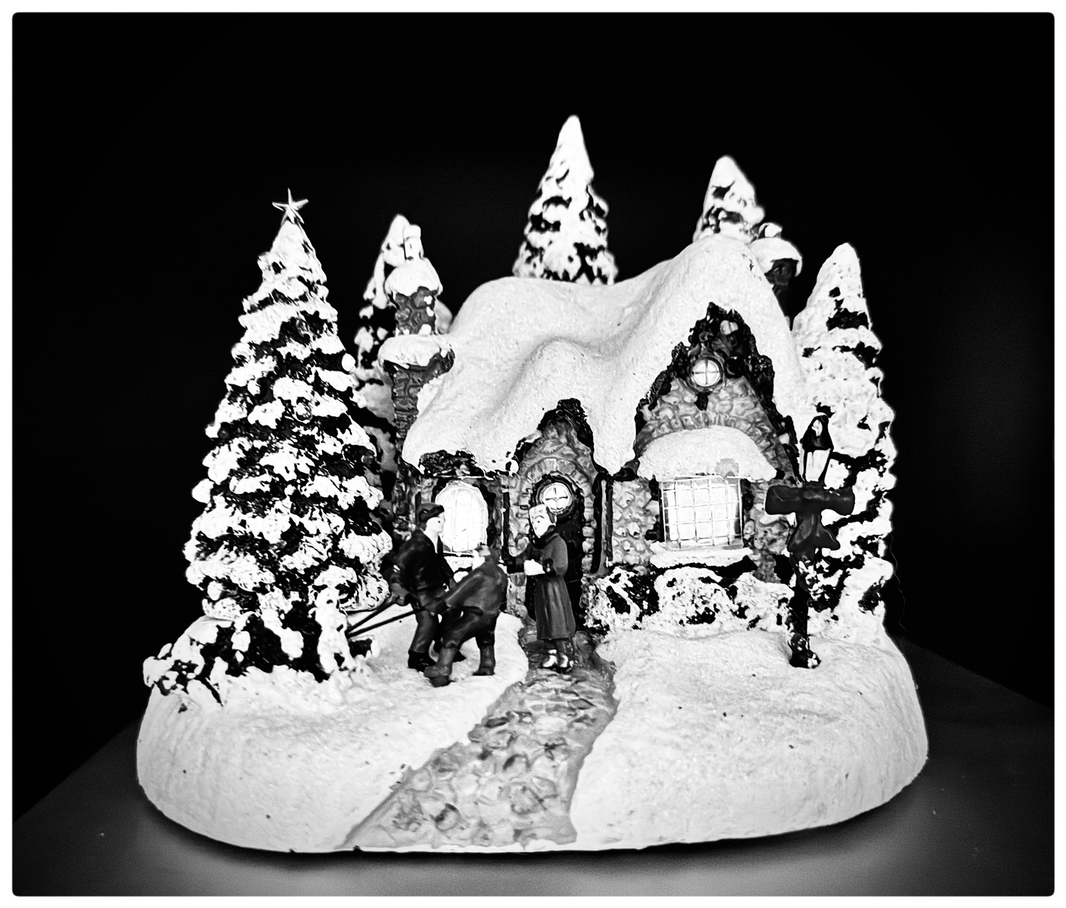
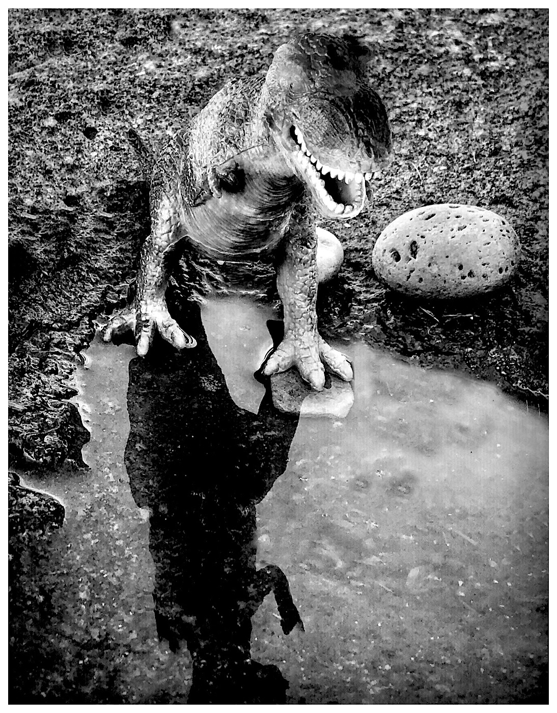
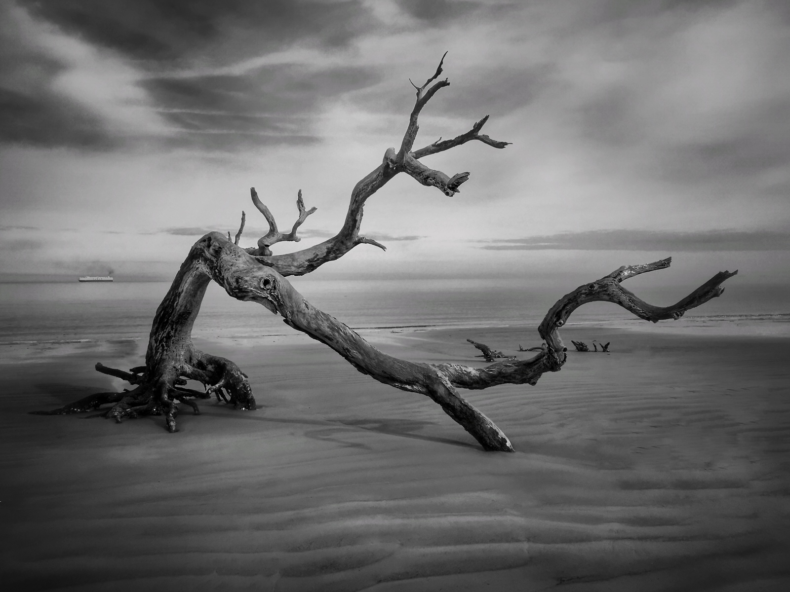
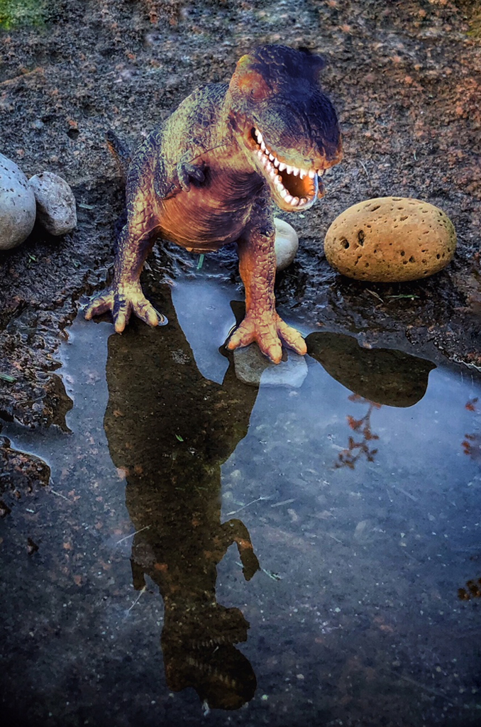
Good catch. I could not get and lower with my knees and back. Age has hampered a lot of my flexibility. That is why I use selfie sticks to do this kind of thing. It even works for little tiny wild flowers. I can get down but getting back up is a real chore.
Here is where a selfie stick would get you right down on the ground and make it look like a real big ship that got grounded on the beach. There is a well know artist that goes around with dollar store toys and makes great images by doing this same idea. The ship is so well lit? Was with the natural sun light or did you have the flash turned on?
You are so lucky that someone left this on the beach. What a find!
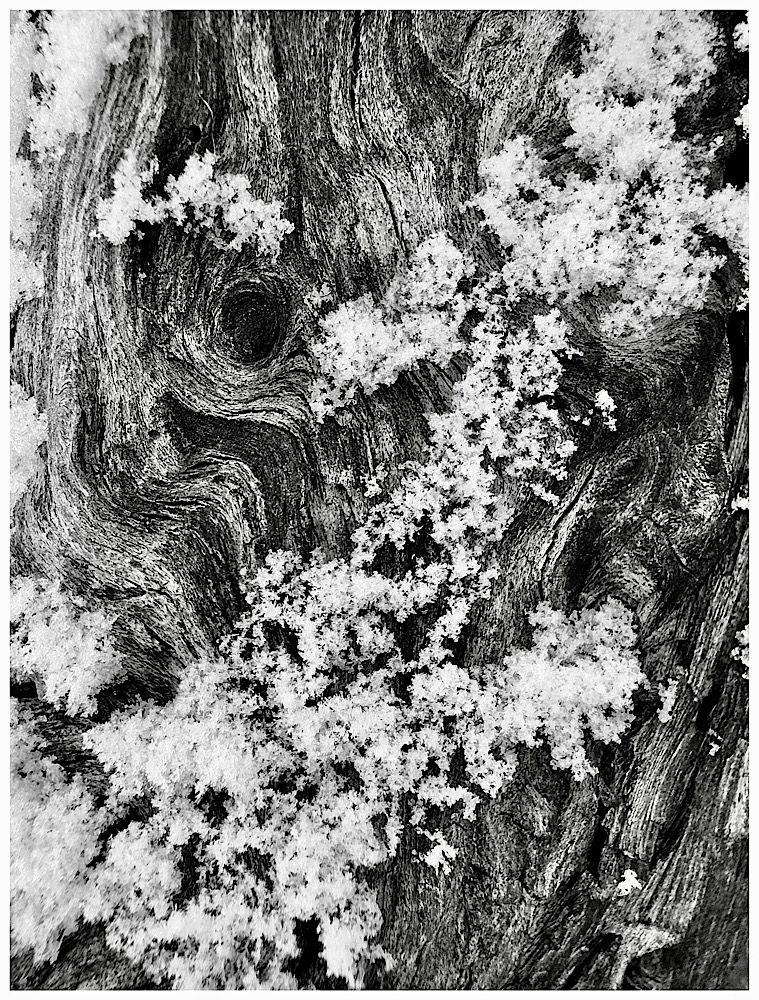
Here are 2 images that used toys and camera was right on the ground.
|
Feb 5th |
 |
| 51 |
Feb 19 |
Comment |
Great action PJ Shot. Yes you got great colors. So much activity, I like it.
The man on the sand waving the flag and the girl on the beach walking make the image. Contrast and action always help make an image. I kind of wish the flag was not not cut off, even though I can not read nor do I need to know what it says.
I like the straight horizon of the ocean. Jerry |
Feb 5th |
| 51 |
Feb 19 |
Comment |
Bob, whatever I cannot see is not a concern. One suggestion is crop off a tad from the top of the sky. Burn (darken the edges just a little) so that the viewed really can see that you did it. It won't take much.
Bring a little more life to the sky by painting a little brightness (like +5) into that beautiful lighter area in the clouds near the center of the image. I love the birds.
All this can be accomplished in Snapseed. |
Feb 5th |
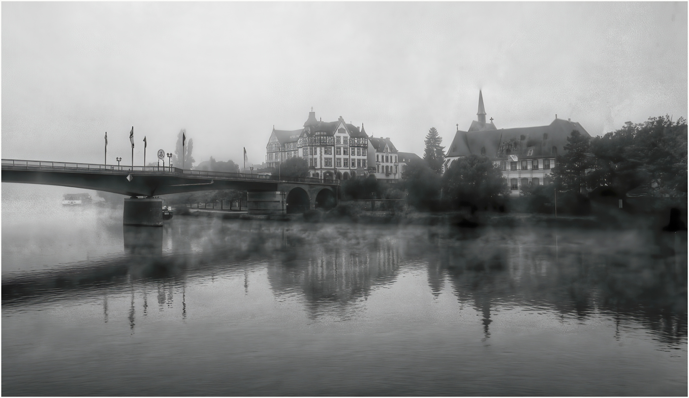
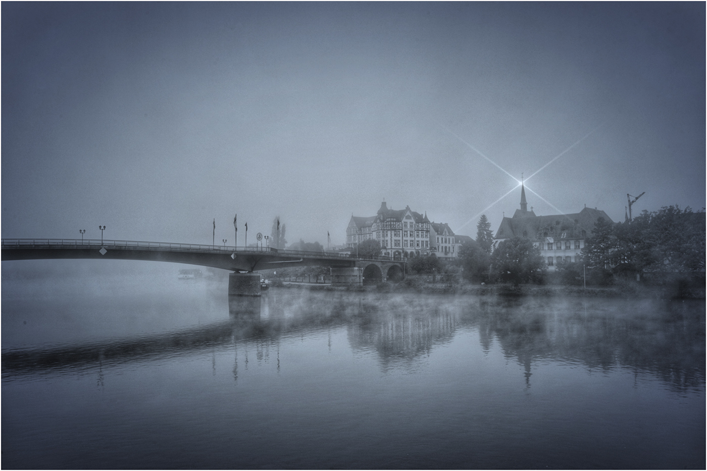
| 51 |
Feb 19 |
Comment |
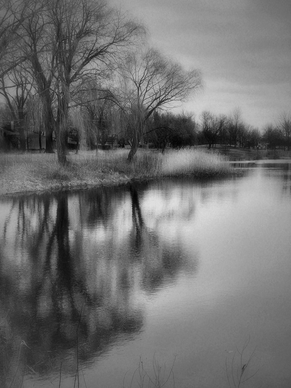
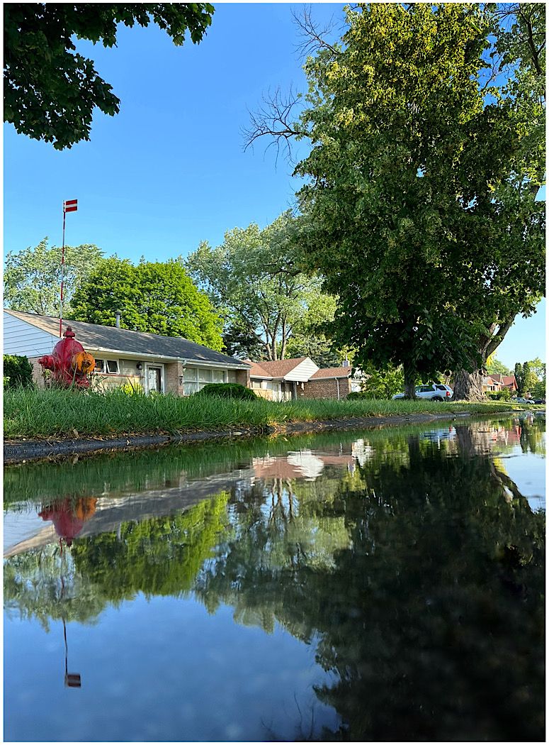
Dick, tell me a little about what apps you used and what you did. I see that you cropped off some of the distractions on the right side and I like that very much. The scene is so serene and peaceful. It show a wonderful slice of history then and now with that old boat. Here are just some ideas to consider.
1. Darken the trees at the right edge of the image. That pulls my eye away from the lady walking in the image. Also balance the green felection on the right edge.
2. Consider taking out just a few of the distractions in the water. The white spots that do not relate or help the reflection?
3. Darken the edges a very small amount. You will know that you did it but the viewer will not. Again to keep the viewers eyes in the beautiful image. Jerry
|
Feb 5th |
| 51 |
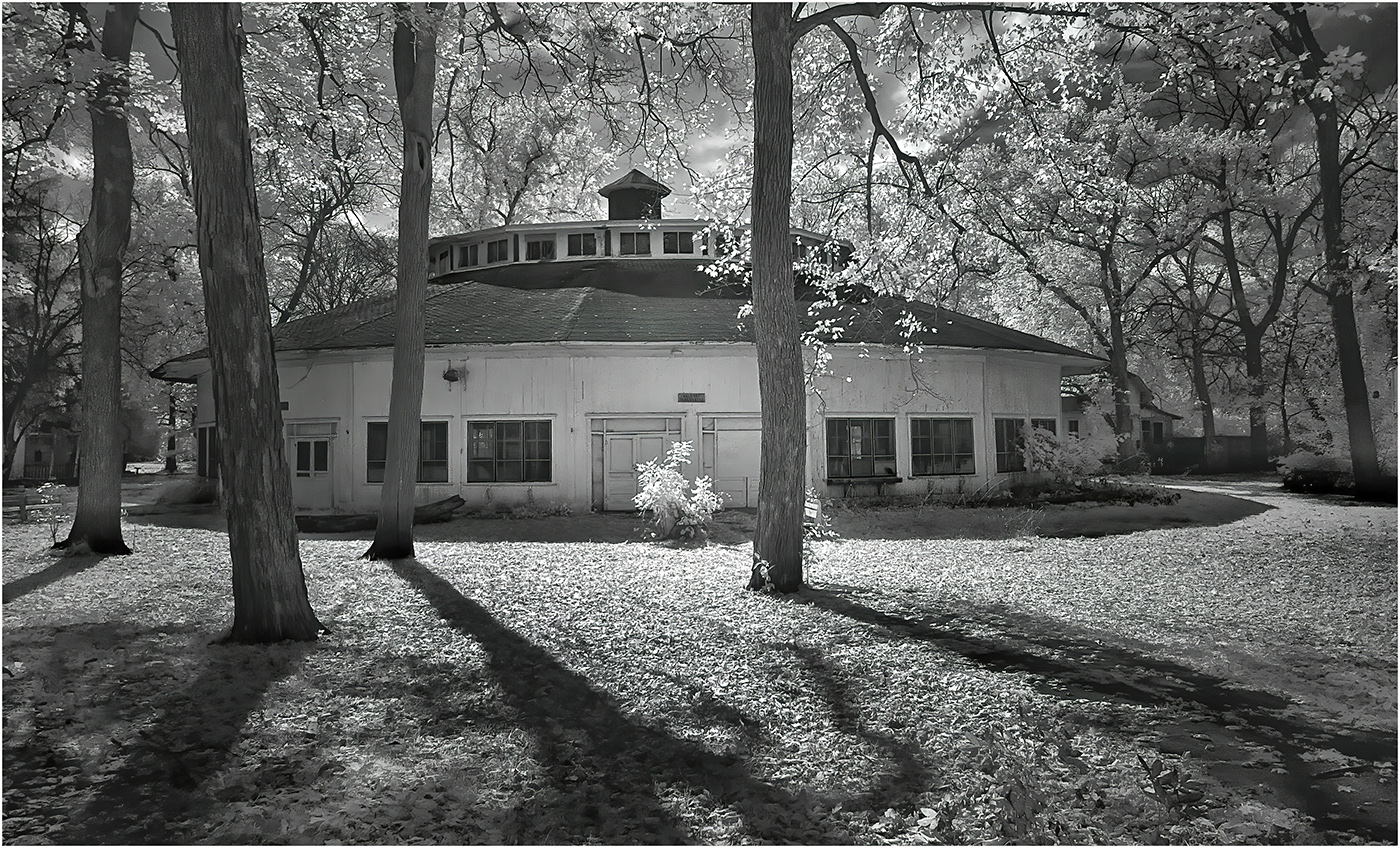
Feb 19 |
Comment |
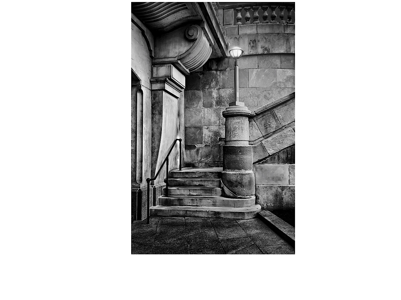
Very nice image and capture Dave. Looking at a monochrome image with a spot of color, I have just a few ideas for you to think about.
1. Do you really want all that negative space (Blacktop area at the bottom of the prints)?
2. Does the tall stone post on the left edge really cause the eye to stop on edge? I am not sure if it distracts from the center of interest, the red door?
3. I love the dome (back of the band shell). The dark bush is almos too dark and not details. I would just play with shadows in Snapseed and see if you like a little more details and the trees etc. You could also pull down the highlights in the sky in a separate edit and then just paint in the area where you want to tone down the highlights. |
Feb 5th |
6 comments - 0 replies for Group 51
|
11 comments - 0 replies Total
|