|
| Group |
Round |
C/R |
Comment |
Date |
Image |
| 96 |
Jul 25 |
Reply |
Nice! That's one of the great things about photography imo, it is all an artistic choice. |
Jul 25th |
| 96 |
Jul 25 |
Comment |
Nice image Bruce, though I would echo what Robert said about it feeling tight. I'd probably repeat a bit about what I mentioned about Pinaki's image. I'd want to highlight the epicness, if that is a word, if the surroundings. I might also step back to make the building smaller in relation to the mountains. I think the shadow detail is fine, the blacks aren't crushed as far as I can tell. The clouds make a nice point of interest as well. I might consider a black and white conversion using a virtual red filter to darken the blue in the sky. That having all been said, a really nice image. :) |
Jul 25th |
| 96 |
Jul 25 |
Comment |
I also like the composition, and will echo the comments regarding using a bit more contrast since the colors feels a little flat. Could be the vibe you were going for, which is cool. I'd keep the powerlines, they are additive to the overall vibe of the shot. I could almost believe that this was an analog shot on film. |
Jul 25th |
| 96 |
Jul 25 |
Comment |
Hi Rick, a VERY interesting image of a skyline that is only about 90 min away. It's great to see a newer take on an already beautiful view. Just a couple of notes. There seems to be a lot of banding in the sky. I'm not sure if it is a function of the stretching process, an artifact of a smaller file size, or an artistic choice. In any event, I think it is a bit distracting. I also found the color choice interesting for the foreground, as they seem quite purple(?), which I assume they are not in actuality. Was this an artistic choice? I'm not sure if I like it or not (certainly just a personal choice on my part). I do like the rock in the foreground however, as they create balance especially the rocks on the right side of the image balancing the Bay Bridge. A bit of an older image too, since the Salesforce building is under construction in the image. |
Jul 25th |
| 96 |
Jul 25 |
Comment |
I love the idea here. The foreground has great texture and patterns. As rick mentioned, I also think that the background feels too constricted. I would have liked to see more sky, I would think that a sky with more textured clouds would provide balance with the rocks as well as more visual interest in the midground. But, returning when conditions are better may not be an option. Also, from a background perspective, as well as feeling constricted, I would also play with a linear gradient to darken down the mountains which could add balance with the dark rocks.
Lastly, this might be a good candidate for a black and white image and lean into a more contrasty vibe. |
Jul 25th |
| 96 |
Jul 25 |
Comment |
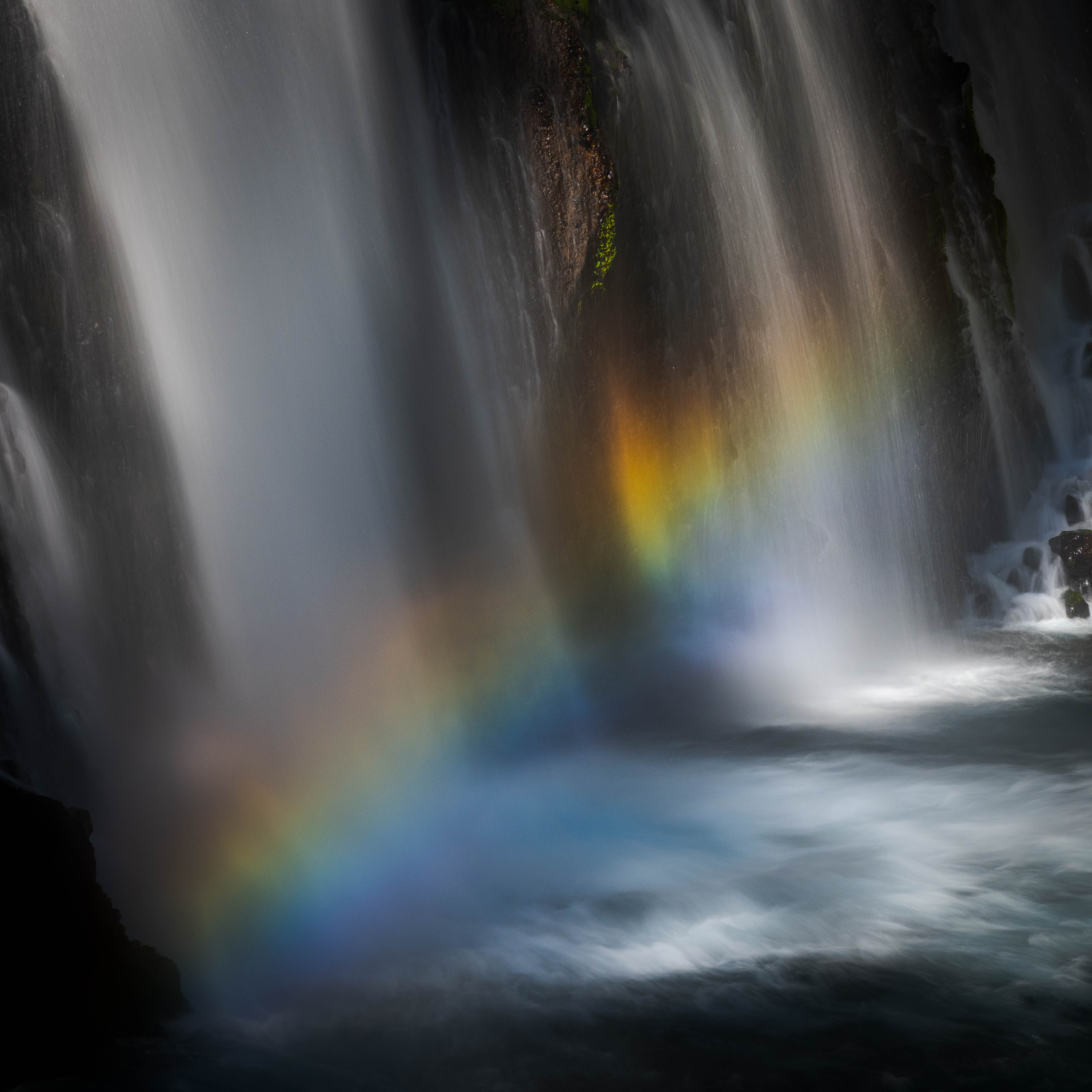
As Robert mentioned, and I agree with, the noise (odd since you used Topaz Denoise and your iso was at 100) being distracting, though it almost had to be added for affect, and the spot in the top left hand side of the image. Easily repaired. I suspect your histogram was heavily biased towards the middle. I'd seek extending the whites and black to add contrast. This can be done in several ways each are nearly the same from a result standpoint imo.
From a composition perspective, I would have perhaps liked to see a wider angle thus making the boat maybe a third of the size. This would make the scene for more epic. Of course, this only works if the surrounding scene is epic. :)
I do love the layering in the image, and might try and find a way to highlight that more. Also maybe finding a way to highlight the glacier by contrasting it with the darker mountains. |
Jul 25th |
5 comments - 1 reply for Group 96
|
5 comments - 1 reply Total
|