|
| Group |
Round |
C/R |
Comment |
Date |
Image |
| 33 |
Apr 26 |
Reply |
Thanks, Carl! Good input. |
Apr 8th |
| 33 |
Apr 26 |
Reply |
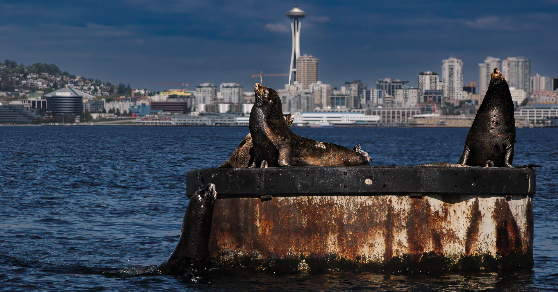
Thanks for your feedback. You are correct; the composition would be improved without the second boat behind the subject. Timing is such a tricky thing! (Sometimes waiting helps, other times the compositional angle is lost.)
And yes, a portrait orientation would have been a better choice for including more of the subject, a good suggestion.
Good input! |
Apr 7th |
| 33 |
Apr 26 |
Comment |
Love the light here! A beautiful blend of light and shadow, and a fabulous path that takes the eye into the composition. Nice symmetry.
An inviting image; makes me want to walk down that footpath! |
Apr 7th |
| 33 |
Apr 26 |
Comment |
Love the symmetry with the reflection. I"m with Marilyn; a great choice for monochrome. The human element give a sense of scale and action to the image; a nice blend of the stationary (buildings) and animated (the motorcyclist).
Marilyn (rightly) suggested that the image of a sailboat I submitted for this month's critique could use more "headroom" (the upper part frame seems truncated). Perhaps a similar thought for the tops of the buildings in this image - including more of their tops with the sky above might be good - ? |
Apr 7th |
| 33 |
Apr 26 |
Comment |
Holy cow - what a view! Love the colors and shapes here; wish I could have been there in person! Lots of food for the imagination.
Thanks for sharing this view from the garden in Singapore. Would love to see more pictures from your trip; I've never been there! |
Apr 7th |
| 33 |
Apr 26 |
Comment |
I love views of historic buildings, so this has appeal for me. So amazing to see artifacts from the 300's; incredible how long that structure has been standing!
This image has good compositional elements - there is the strong subject in the foreground, a zig-zag road takes the eye up to the lighthouse, and a definite sense of fore/middle/backgrounds. Definitely shows the subject in its environment.
Some thoughts (FWIW). Bear in mind that the following, subjective views come from someone who gravitates toward minimalism.If your goal was an environmental composition, then you hit the mark.
Proximity. Not sure how close one can get to the castle (perhaps you could only view it from a vehicle), but I would love to have the rough, weathered surfaces in greater detail. Perhaps consider a tighter crop around the castle?
Camera angle. I'm finding the structure behind the castle and next to the road a bit distracting. I'm not sure if you had much latitude in choosing camera angle, but if were possible, using the castle to "hide" the other building and the flag poles would simplify the composition.
All in all, a wonderful image. Thank you for sharing this part of the world with us! |
Apr 7th |
| 33 |
Apr 26 |
Reply |
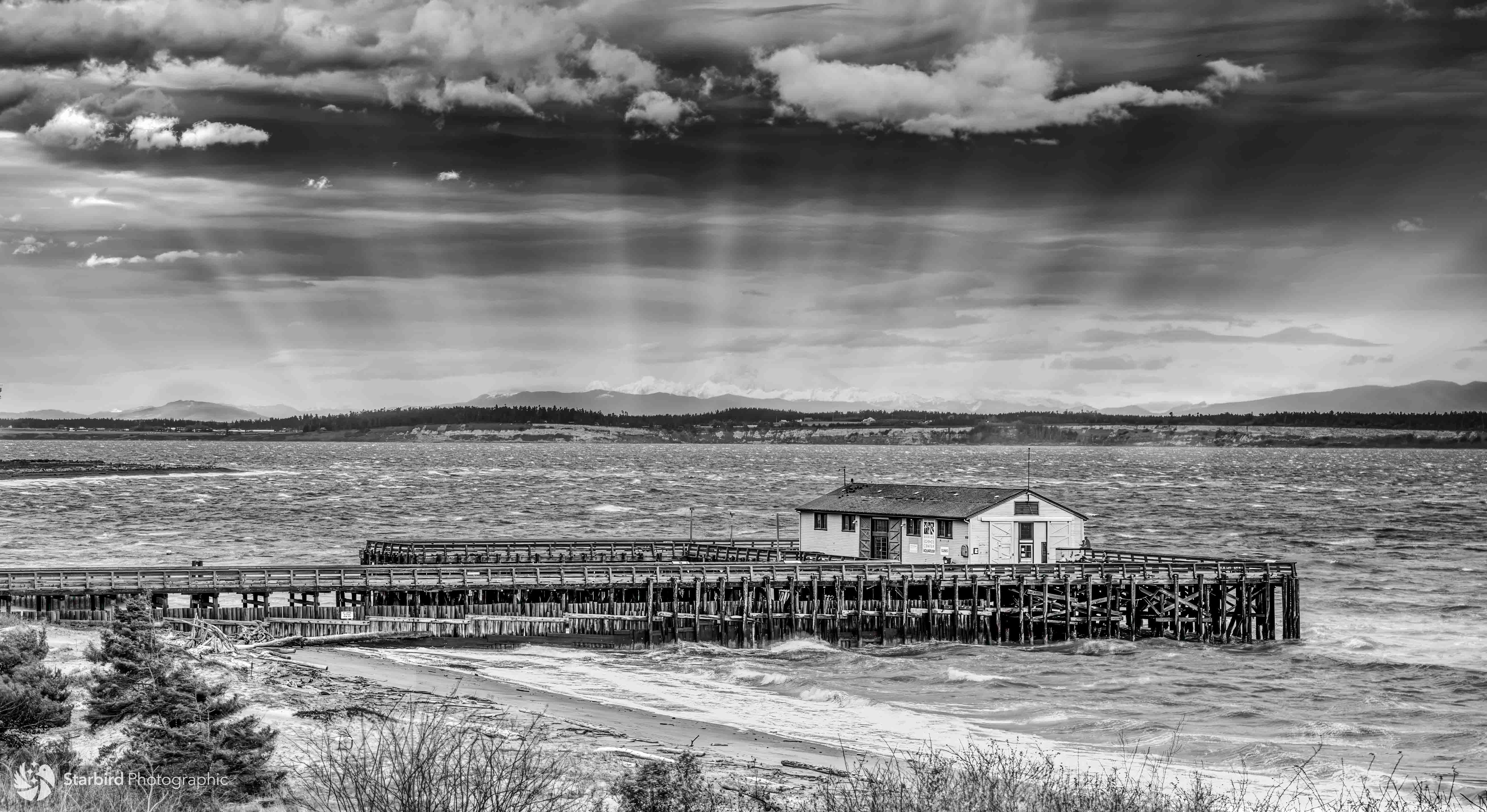
Thanks for your feedback. I can see your point about the top and bottom of the frame; will keep that in mind next time! |
Apr 6th |
4 comments - 3 replies for Group 33
|
4 comments - 3 replies Total
|