|
| Group |
Round |
C/R |
Comment |
Date |
Image |
| 33 |
Feb 26 |
Reply |
Thanks, Carl! |
Feb 26th |
| 33 |
Feb 26 |
Comment |
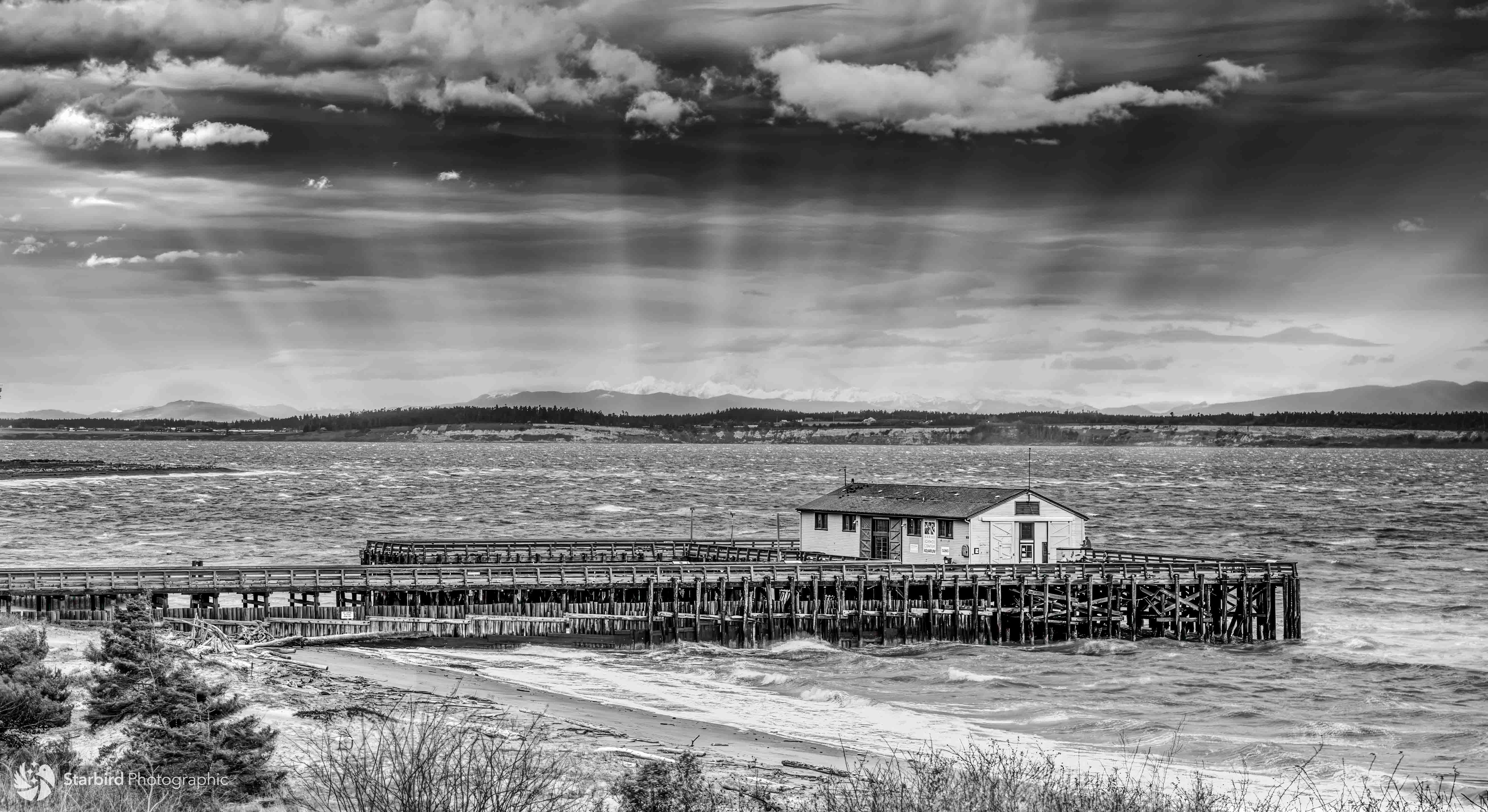
Your picture, in monochrome, reminds me of some of the wonderful, gritty images of industry and cityscapes in the mid-20th century. I love it when a person/bird/animal/other interesting element appears at the "right time". The steam definitely gives a sense of "city" and interest to the image. (I'm imagining it without the steam, and it is very much not the same.) |
Feb 18th |
| 33 |
Feb 26 |
Comment |
A beautiful choice for monochrome. You were certainly rewarded for your three stops, 7 hours, and 1,250 steps - this is a very winning image. Nicely captured, handheld at .3 seconds - ! As others have commented, the many textures and shapes make a wonderful composition. Your treatment of the luminosity is very well done. |
Feb 18th |
| 33 |
Feb 26 |
Comment |
This picture reminds me of an illustration from a fantasy tale - magical, a touch fanciful, and just waiting for the narrator to begin the story. I'm with Paul on his comment on the weather-worn textures on the rock - scored, but still standing "unfazed". I love the juxtaposition of of hard/soft, natural/human-made, and the warmth of the foreground and coolness in the sky. The lone, vertical "finger" on the horizon between the taller rock formations adds an interesting element. |
Feb 18th |
| 33 |
Feb 26 |
Comment |
This is a beautifully composed and rendered image. The subject is very apparent by its position in the frame and its colorful presence. The smoke adds a mystical, romantic sense and helps keep my eye on the subject. Interesting about the human element - a fun "Easter egg" in the composition! I agree with Paul (and with you) - the monochrome edition is also a beautiful, near-haunting variation! |
Feb 18th |
| 33 |
Feb 26 |
Reply |
Hi Marilyn, thanks for your feedback. I agree with your thoughts on a blurry background to give the sense of motion to the cable car and appreciate your thought on the "Golden Gate " sign. |
Feb 15th |
| 33 |
Feb 26 |
Reply |
Hi Arief,
Thanks for your feedback! |
Feb 13th |
| 33 |
Feb 26 |
Reply |
Thanks for your feedback and suggestion on including more of the surroundings. I lean toward making the subject dominant in the frame, which (of course) is not always the best choice. Appreciate your thoughts. I will definitely keep that in mind! |
Feb 9th |
| 33 |
Feb 26 |
Comment |
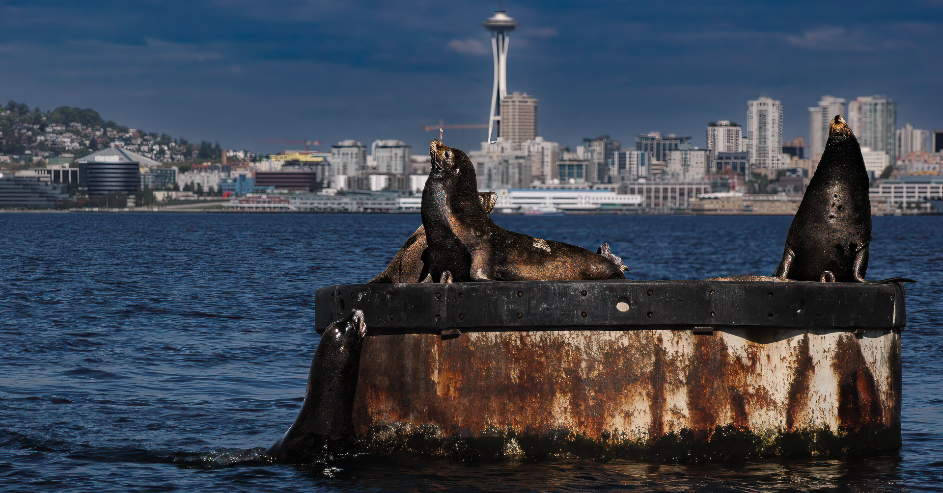
Dramatic. I love the contrast of horizontal elements (water, marine vessels, buildings with the majestic vertical presence of the tower. What a magnificent and graceful architectural design. The masts of the tall ships also complement the more modern vessels. You chose a great camera angle to feature these elements, and have the clouds "embrace" the tower. Wonderful rendition in monochrome.
The only (minor) suggestion for improvement might be to slightly raise the luminosity of the ferry and the converging center pillars of the tower to help them stand out. Nice work! |
Feb 2nd |
5 comments - 4 replies for Group 33
|
5 comments - 4 replies Total
|