|
| Group |
Round |
C/R |
Comment |
Date |
Image |
| 33 |
Aug 25 |
Reply |
Thanks for your feedback, Carl. The light rays do appear to be radiating upward, hadn't noticed that. I'm pretty sure they were actually radiating downward, but it's been a while so that's a recollection (albeit from a distant memory).
All the feedback has been most helpful - I am in agreement with you, others, and especially Arief that the tighter crop improves the image. |
Aug 27th |
| 33 |
Aug 25 |
Reply |
Thanks for your comments, Paul. I think Arief's cropping suggestion improved the image, and I appreciate your thoughts on using an ND filter+tripod to see how the image would have differed - a good tip for next time! |
Aug 19th |
| 33 |
Aug 25 |
Reply |
Hi Arief,
Thank you for your feedback. The lightrays were present (they are real), and seemed to stand out more in monochrome (as did the textures in the water), so I chose B&W. Appreciate your thoughts on the foreground elements, your cropped rendition of my image is strong! |
Aug 18th |
| 33 |
Aug 25 |
Reply |
Your artistic choice on composition is sound. Well done! |
Aug 18th |
| 33 |
Aug 25 |
Comment |
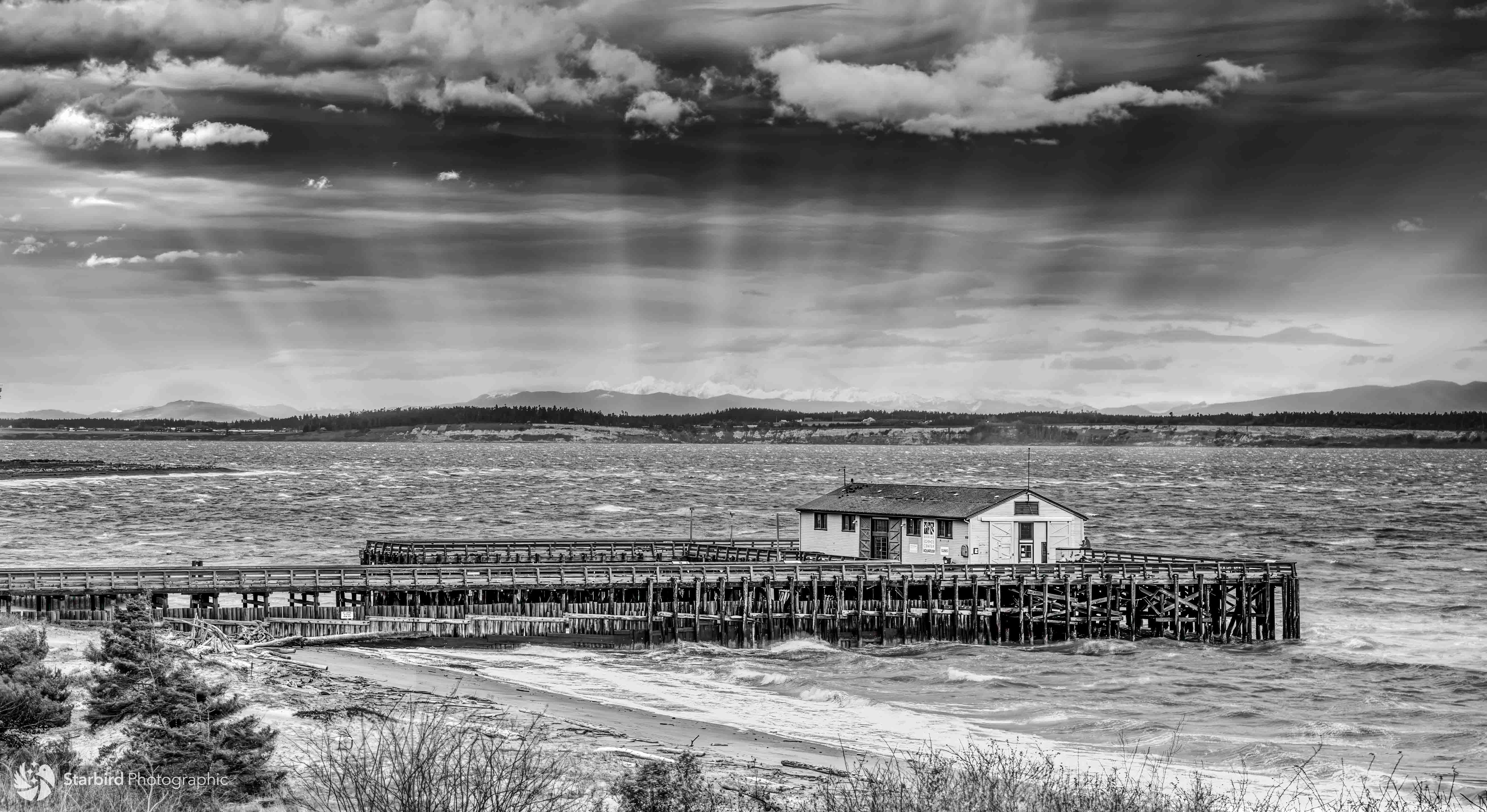
Hi Carl,
"Deserted" is certainly an apt caption for this image - beautifully rendered in monochrome, the lone tree trunk amid a hardscrabble landscape evokes a sense of solitude, abandonment, a time forgotten. The twisty branches stand out as a strong vertical element among many horizontals. The hazy mountains and sky make a dramatic background. The composition is nicely balance left-to-right.
Some thoughts: consider raising the luminosity (brightness) of the tree to make it just a bit more dominant in the frame. Also, reducing the bright spot on the horizontal trunk on the bottom right of the frame might also help bring more attention to the vertical trunk (the bright spot is pretty much pure white, so that might not be possible.)
Overall, a great image! |
Aug 14th |
| 33 |
Aug 25 |
Comment |
Hi Nanette,
This is a beautiful night shot of the Castel. The rich cool colors of sky and water nicely complement the warm lights of the bridge, buildings, and reflections on the water. The trees soften the hard surfaces of the architectures. The long exposure is a good choice between a shorter duration (which would make the reflections more "static" and a longer one (which would have made the refections more creamy).
Given the ISO and f-stop, perhaps 4 seconds was optimal for the light as well. I love architectural shots, so this one hits the mark for me! |
Aug 11th |
| 33 |
Aug 25 |
Comment |
Hi Marilyn,
What a beautiful garden and conservatory! I'm glad you had a chance to visit it, and bring back this image of the scene.
The composition is nicely symmetrical with the trees on both side of the building, the planting areas on the left and right, and the building centered in the frame. The clouds add a nice background, and the paved road leads the eye straight in to the main subject. Lighting is very nice, and it looks like the color fidelity is true.
Some considerations:
you might consider cropping up from the bottom (possibly even quite a bit) to make the building more dominant in the frame.
Also, you might consider bringing up the brightness of the building itself to show off its graceful lines and help it stand out. |
Aug 9th |
| 33 |
Aug 25 |
Comment |
Hi Paul,
A beautiful image of this manor. Love how you carefully chose your camera angle to place the impressive center of the building dead center in the frame. The pano mode of your phone camera worked well to make a symmetrical image, and your choice of where to "start" and "end" the pano was well-chosen, fitting for symmetry. The warm tones in the building, grounds, and roads are a nice complement to the rich blue of the sky.
For consideration: not sure if it was possible (it may well not have been possible), but I find the pathway/road to the building in the center just slightly aligned to camera right. It may just be my perception, but I think it would be stronger if the that pathway was perfectly straight ahead. Again, I wasn't there, and I'm sure you tried multiple camera angles to find the best one. Also, you might try just slightly raising the luminosity of the shadowed areas to the left and right of the center structure of the building to offer more detail. ??Overall, a great image!
Also, thanks for the background info on the manor! |
Aug 8th |
| 33 |
Aug 25 |
Comment |
Hi Arief,
I love this image on many levels - the "exotic" nature of people in another country at work, their unusual (to an American) approach to fishing, the compassion of fishermen and their environment, the silky tide coming into the shore, etc. A wonderful choice for monochrome.
For consideration: you might think about cropping both from the top and bottom to make the fishermen more dominant features in the frame. If the rocks in the foreground are meant to complement the rock formation in the middle ground (which would be an excellent artistic choice), then think about just cropping some of the sky. Also - for next time, consider squatting down a bit - that make the sky more a background for the fishermen, and emphasize the height of their fishing perches.
Great work! |
Aug 8th |
| 33 |
Aug 25 |
Comment |
Hi Francois,
This is a beautiful image of the waterfalls. The rich greens and earth hues give a deep sense of serenity. The moss, rocks, and foliage have crisp detail, and I love where the silky waterfall make the radiation of white where the falling water splashes into the stream below. This is a perfect instance for a symmetrical composition (in keeping with the peaceful nature of the image) rather than an off-center composition (more suitable for a dynamic scene.
For consideration: you might think about cropping up from the bottom, to reduce the amount of foreground; doing so would make the waterfall more dominant in the composition. (That is, unless the foreground rocks were intended to balance those in the middle ground.)
Also - how do I go about submitting an image to this group? (I looked for but didn't find a means to post an image.) |
Aug 8th |
7 comments - 5 replies for Group 33
|
7 comments - 5 replies Total
|