|
| Group |
Round |
C/R |
Comment |
Date |
Image |
| 49 |
Mar 25 |
Reply |
Woo-Hoo! Josh, you.ve made my day. Thank you very much. |
Mar 19th |
| 49 |
Mar 25 |
Reply |
Coincidentally, Lisa will doing a presentation to my camera club this Thursday. I look forward to attending and hearing her thoughts, In the meantime, we can conclude this consideration in the same way the Wiki article ends:
"In 2009, Marcel Theroux presented "In Search of Wabi Sabi" on BBC Four, as part of the channel's Hidden Japan season of programming, travelling throughout Japan trying to understand the aesthetic tastes of its people. Theroux began by comically enacting a challenge from the book Living Wabi Sabi by Taro Gold, asking members of the public on a street in Tokyo to describe wabi-sabi - the results of which showed that, just as Gold predicted, "they will likely give you a polite shrug and explain that Wabi Sabi is simply unexplainable."" |
Mar 15th |
| 49 |
Mar 25 |
Reply |
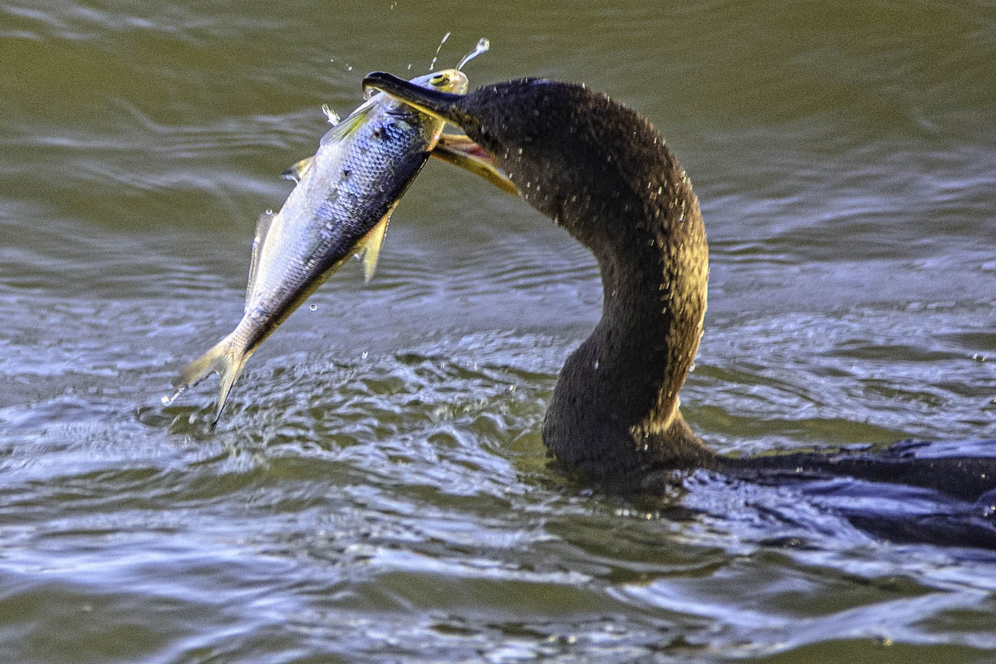
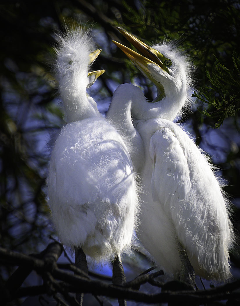
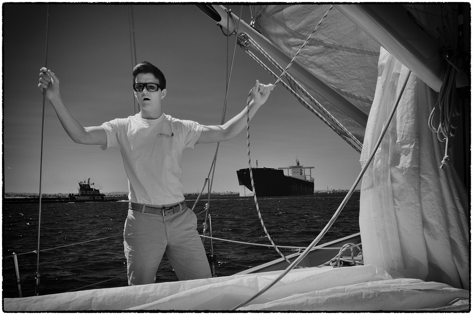
Thank you. It was my first outing with my recently purchased Z 7ii, and I was hoping that focusing would be faster. Seems like my expectations were not in vain. |
Mar 15th |
| 49 |
Mar 25 |
Comment |
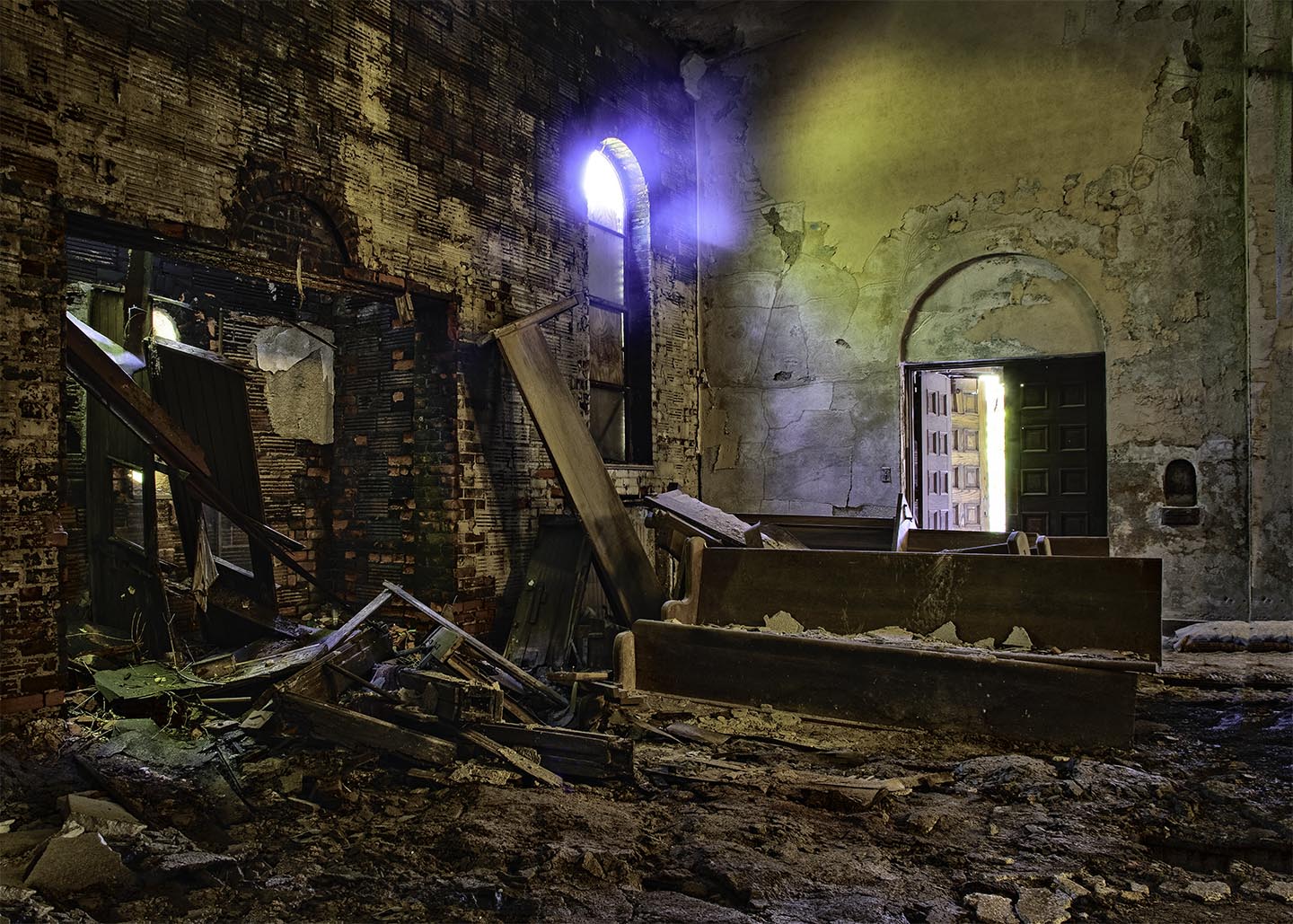
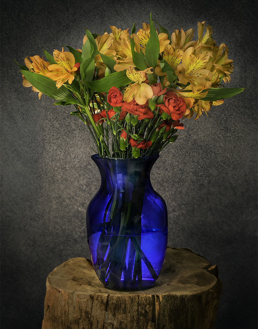
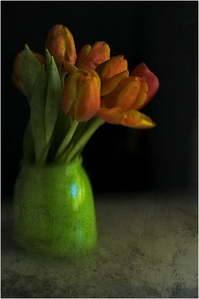
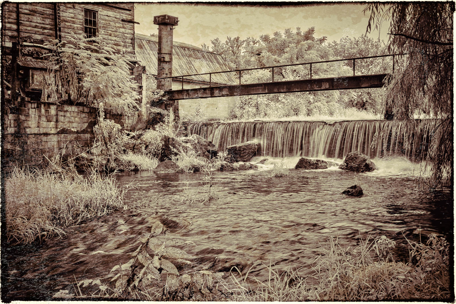
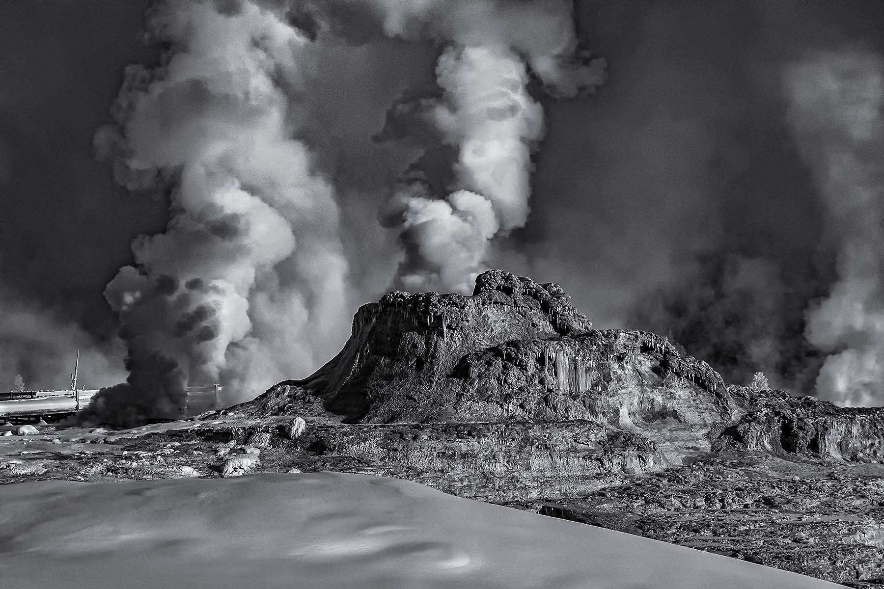
I can't say that this subject conforms to my usual definition of wabi-sabe. The concept embraces the beauties of long use, accentuating the permanence of the object. The classic example is an old scholar's ink stone. Here you emphasize impermanence. I am attaching an image from my "Ghost Factories" exhibit that conveys the concept.
Judging the image, I see the definitive tilt to the right, and I'm not sure if having a wooden table and a wooden vase is too many wood tones. I would suggest straightening the image, and setting the vase on on gray or black tile to simplify the image. Conversely, you might have tried to use a glass vase, which would reveal the stems and add some visual interest by refraction. |
Mar 15th |
 |
| 49 |
Mar 25 |
Comment |
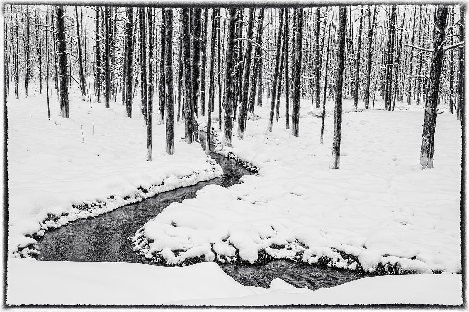
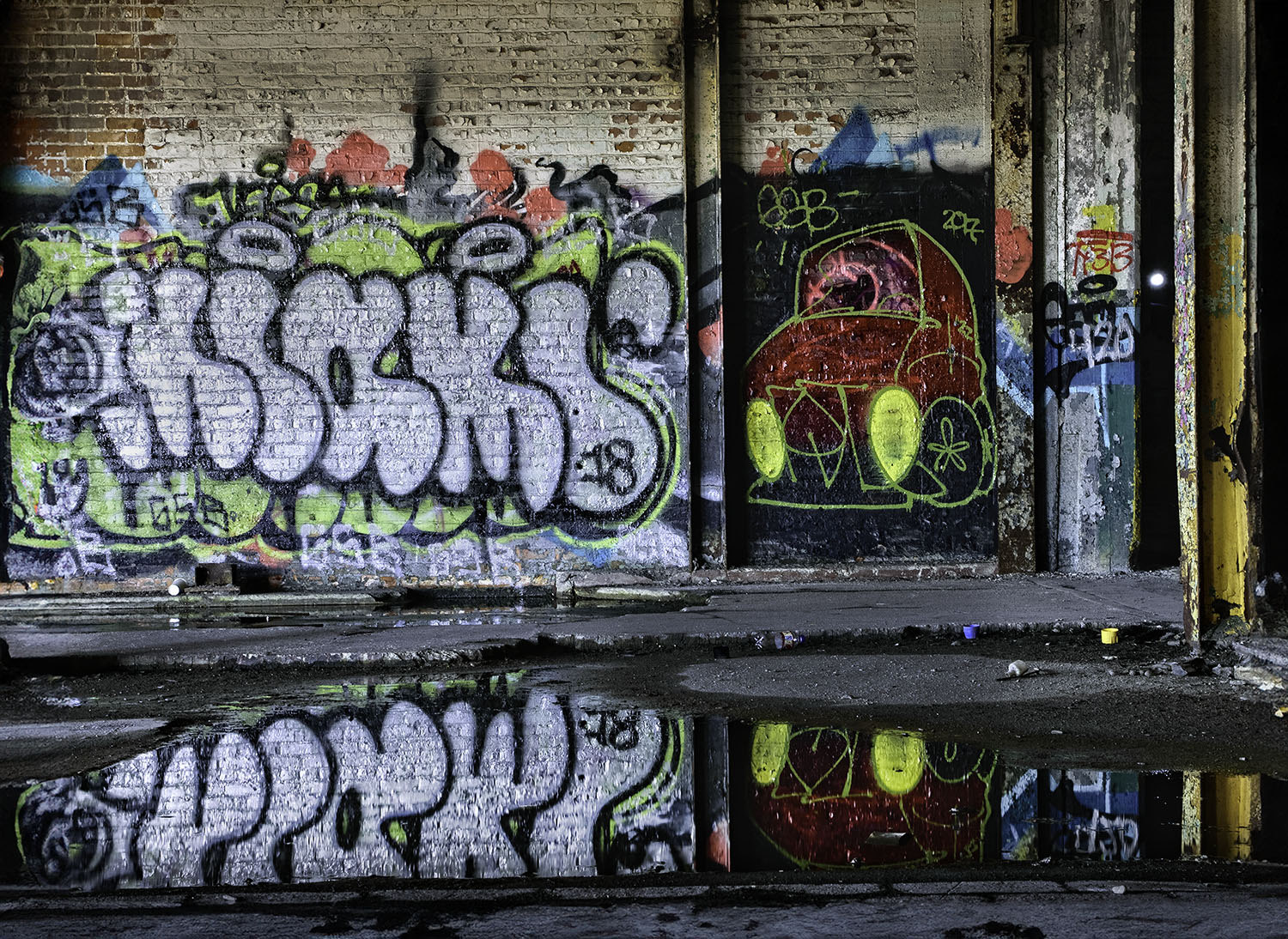
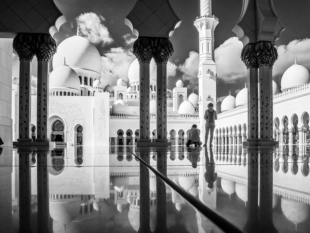
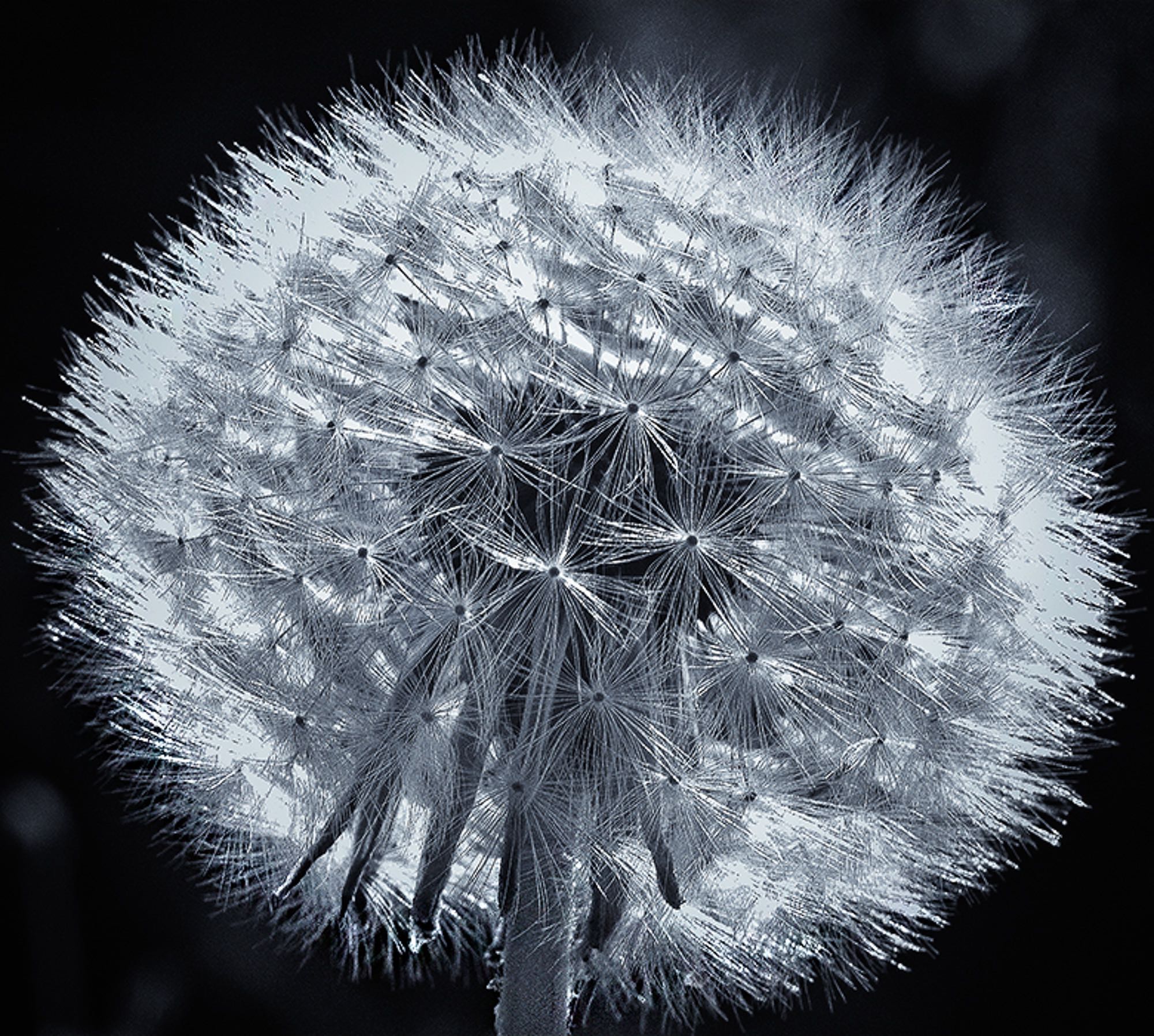
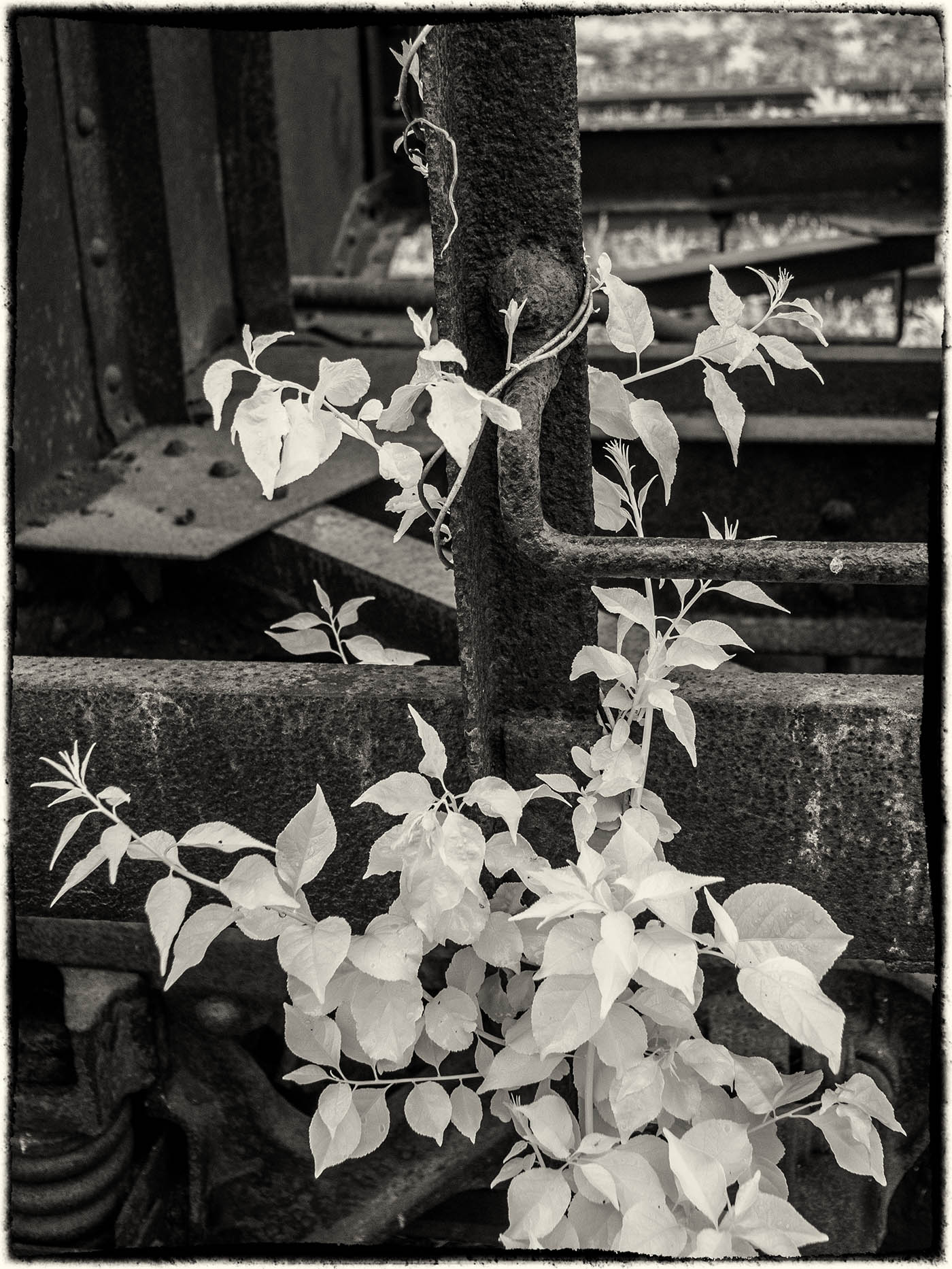
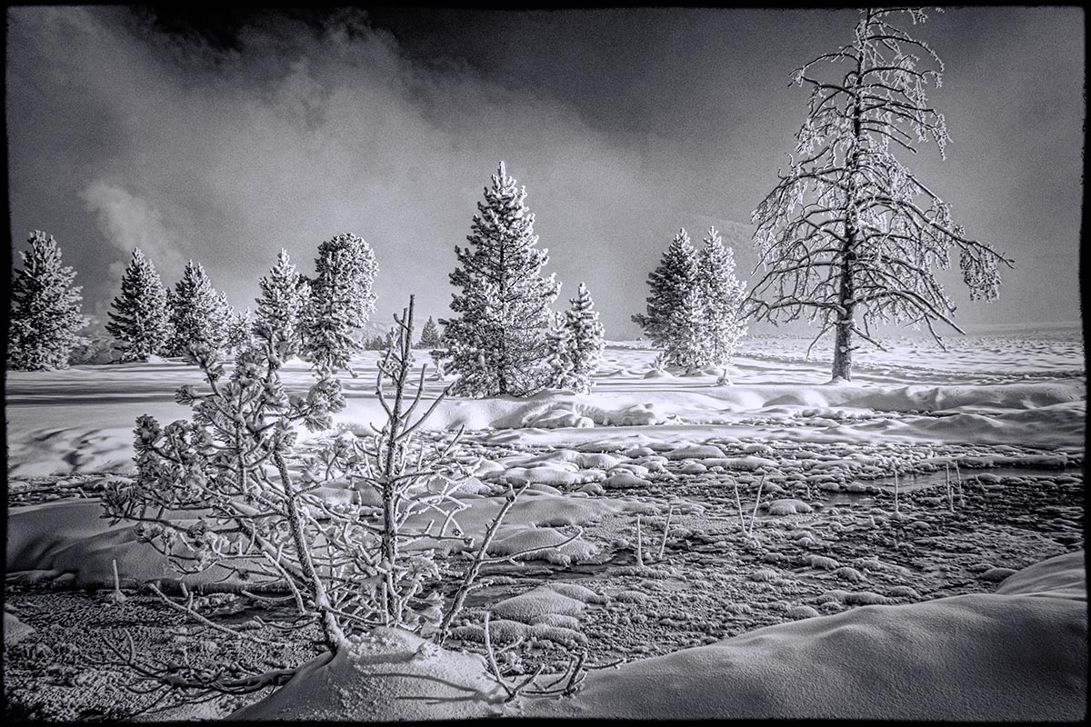
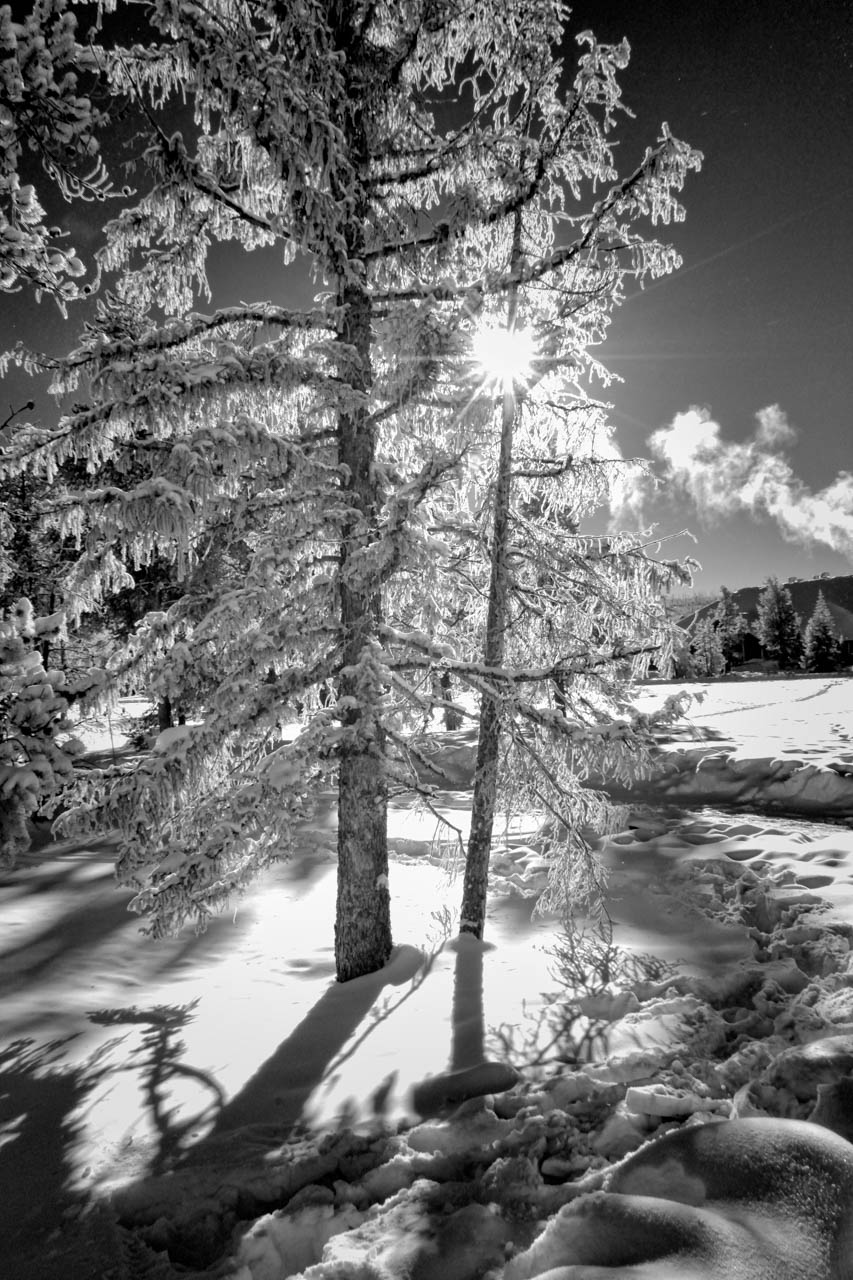
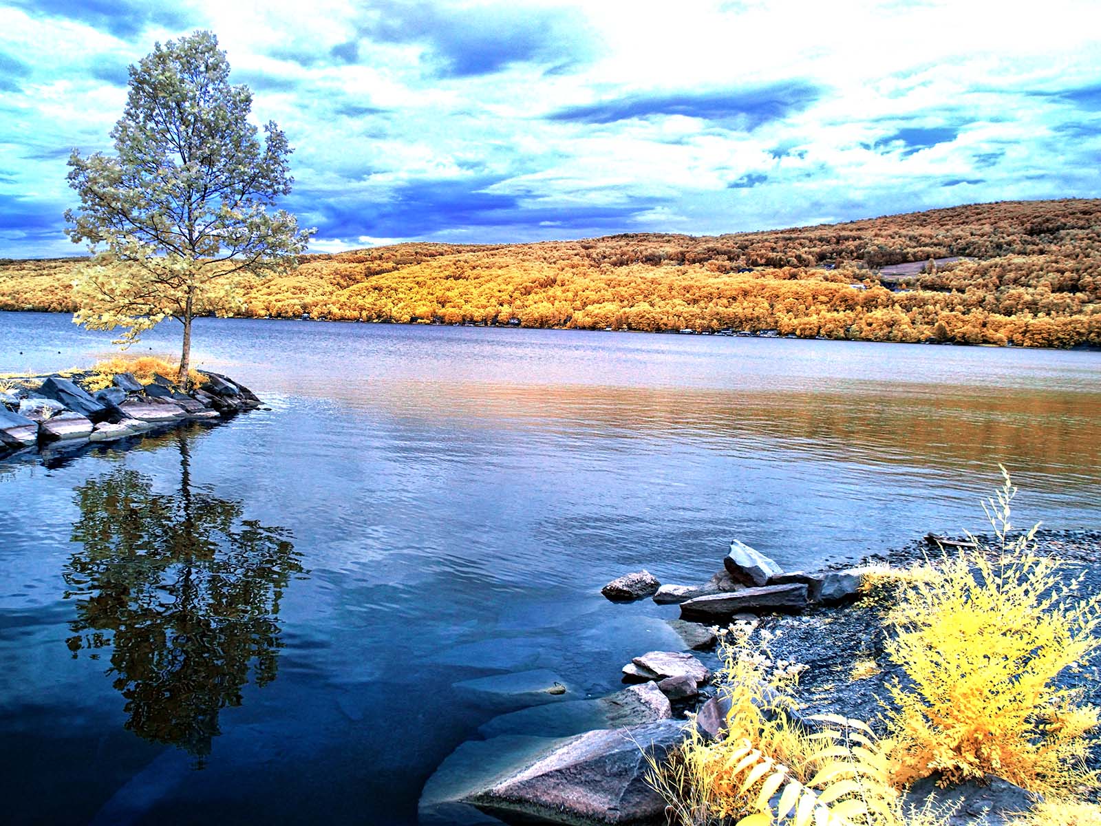
Great, almost abstract, inage. You maintained a perfect contrast level in a difficult subject. My first thought on seeing the image was tree bark.
Since you were using Silver-Efex Pro, did you play with any of the B/w filter options to monkey with the contrast a bit? On an orange red subject, I would try a green filter to see the effect. |
Mar 15th |
| 49 |
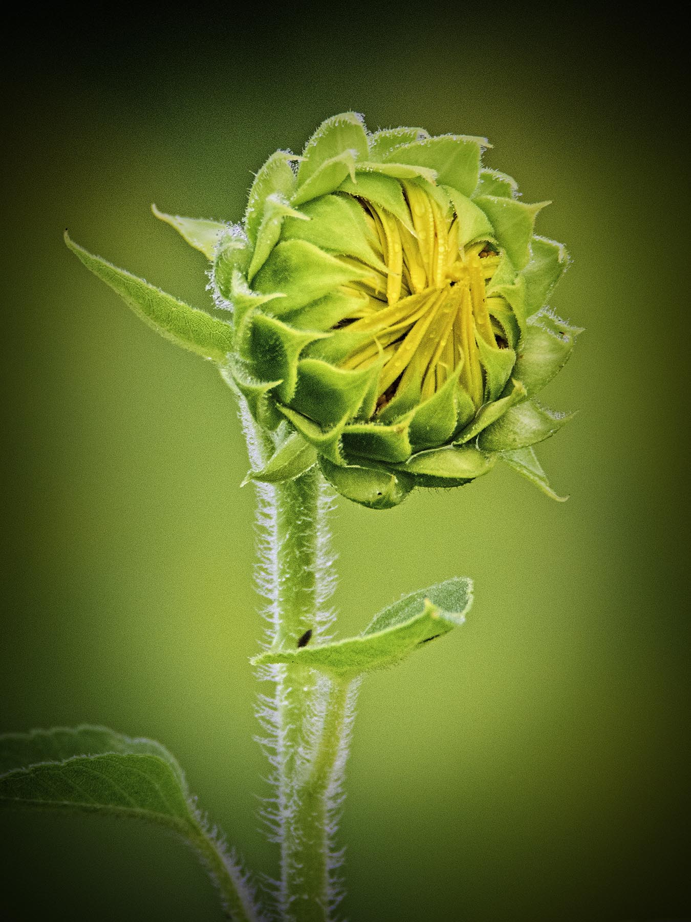
Mar 25 |
Comment |
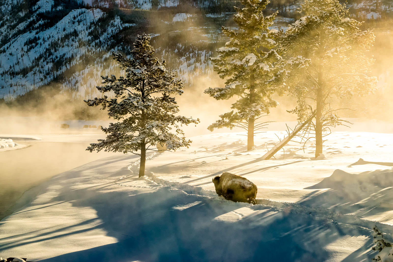
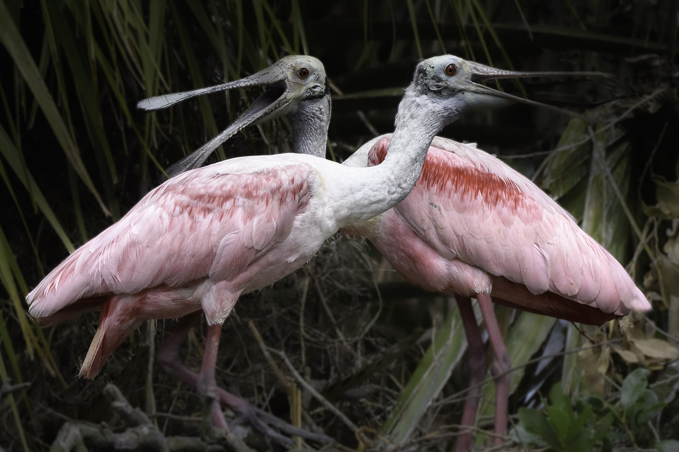
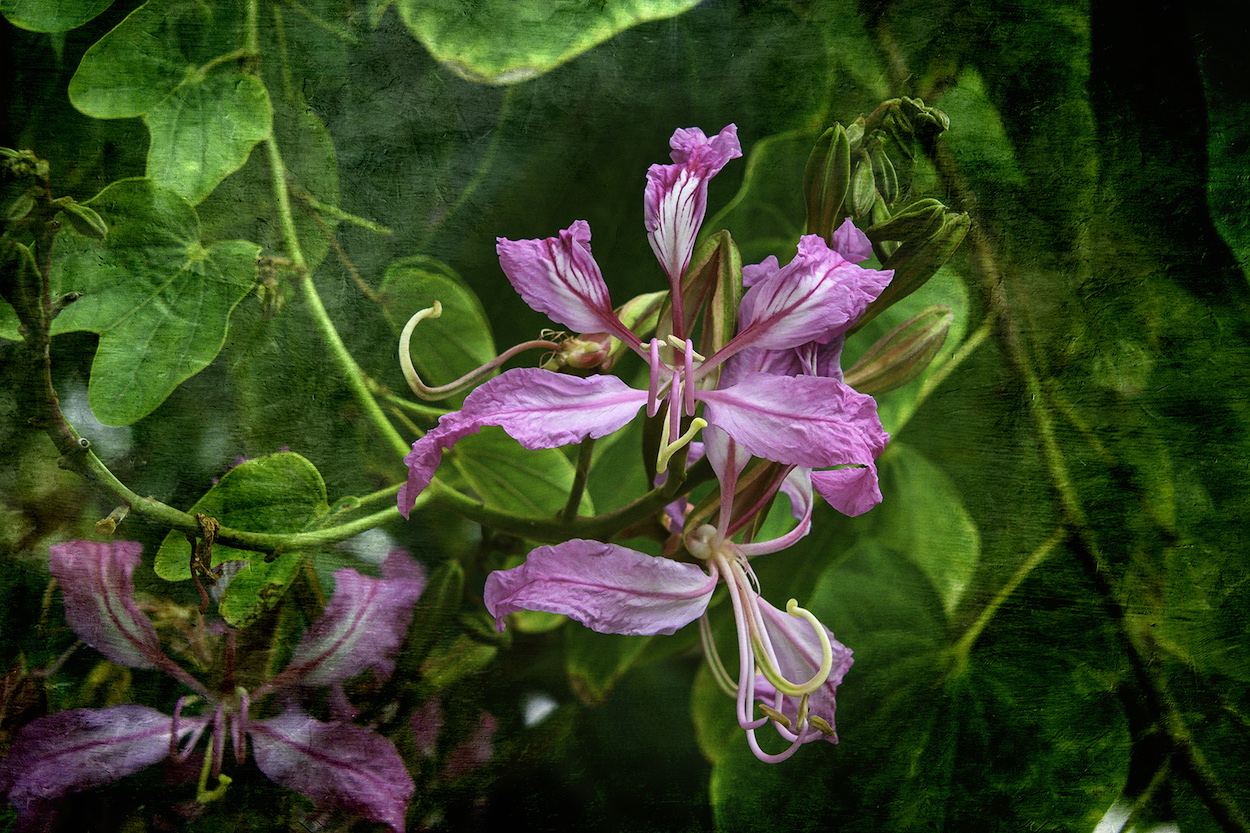
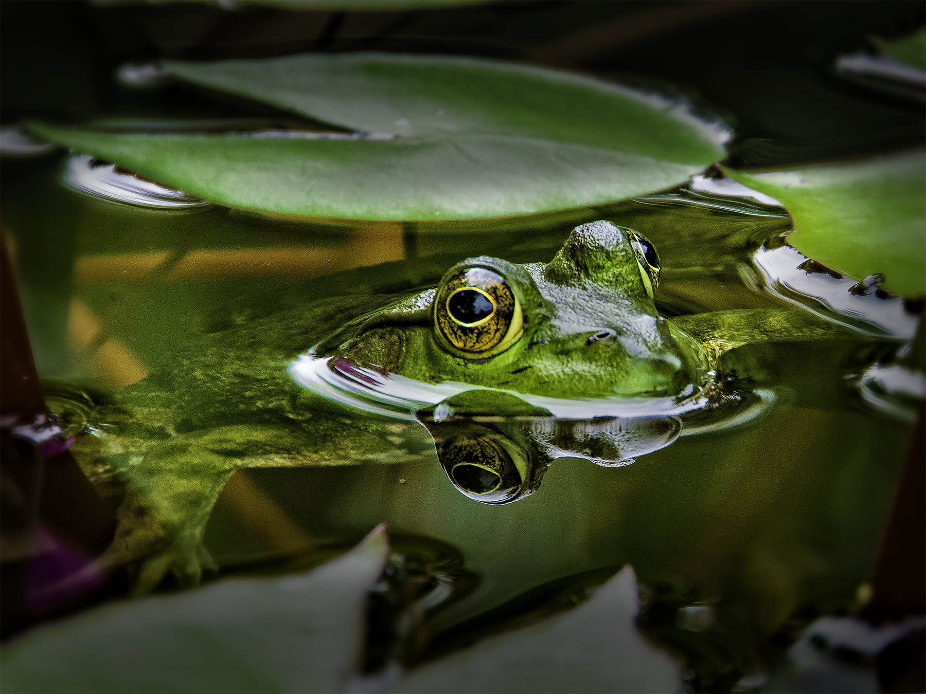
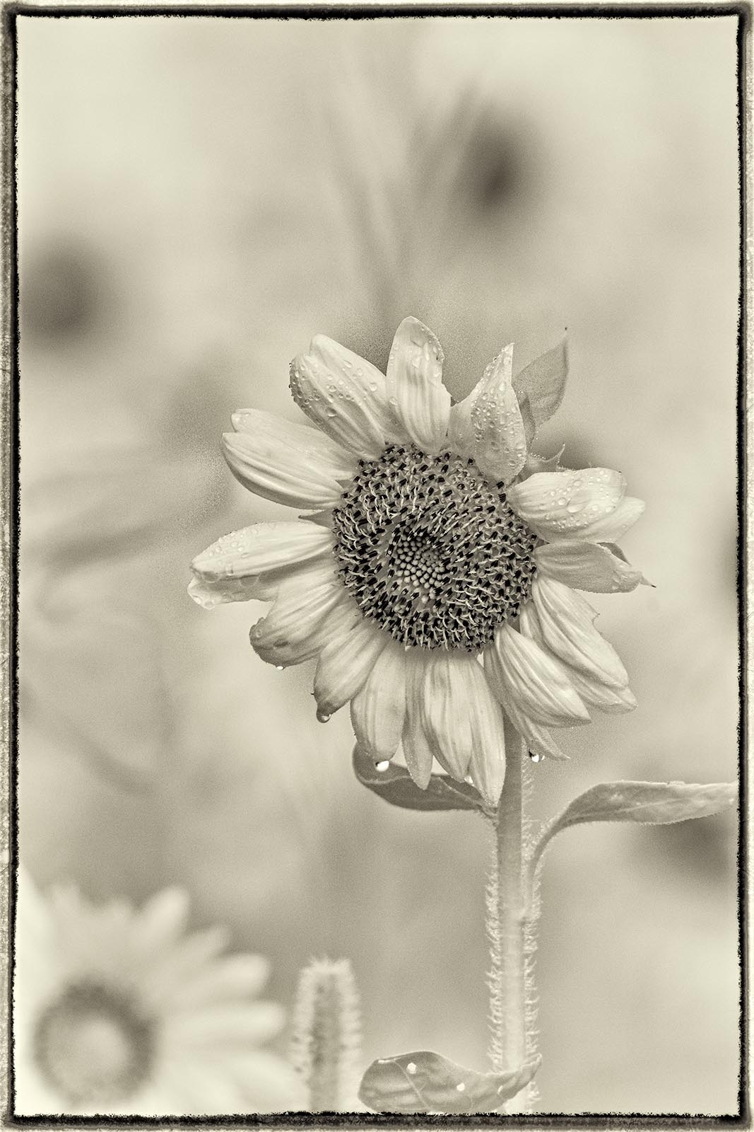
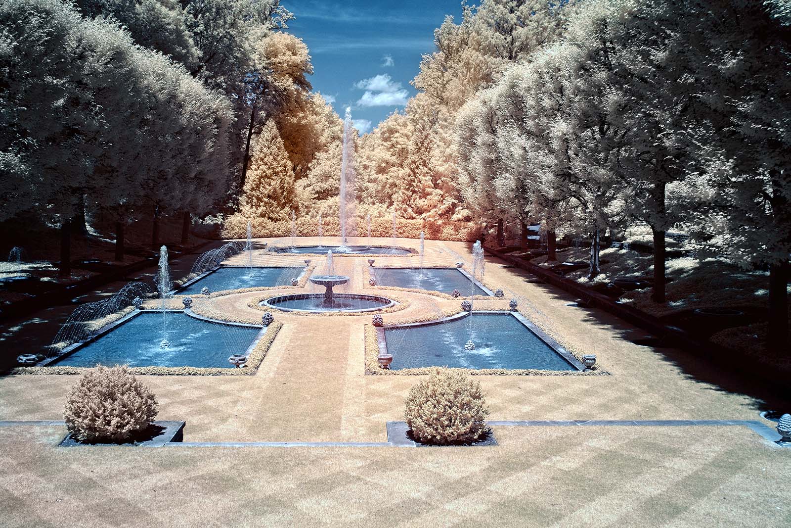
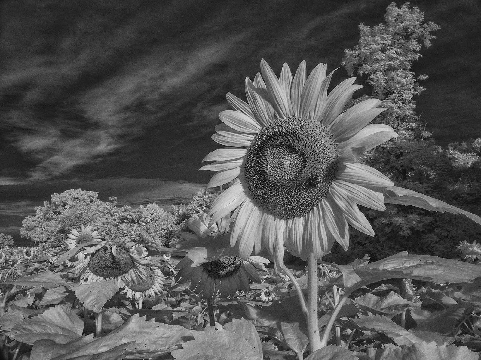
Nice perspective, and a good background color. The gradual focus fall-off helps spotlight the center of the bloom. You did a very good job with just a supermarket bouquet! |
Mar 15th |
3 comments - 3 replies for Group 49
|
3 comments - 3 replies Total
|