|
| Group |
Round |
C/R |
Comment |
Date |
Image |
| 49 |
Nov 23 |
Comment |
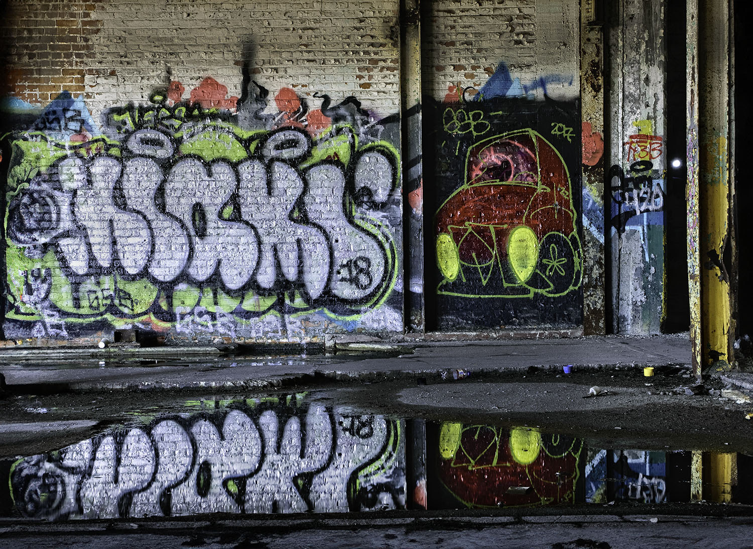
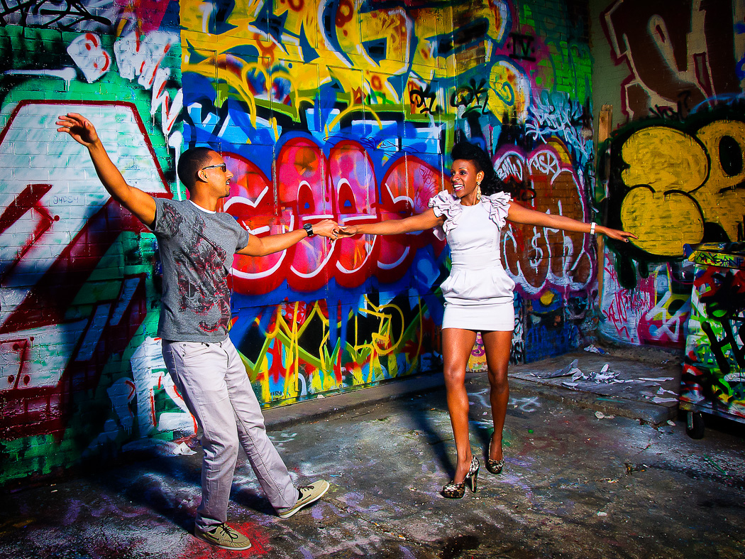
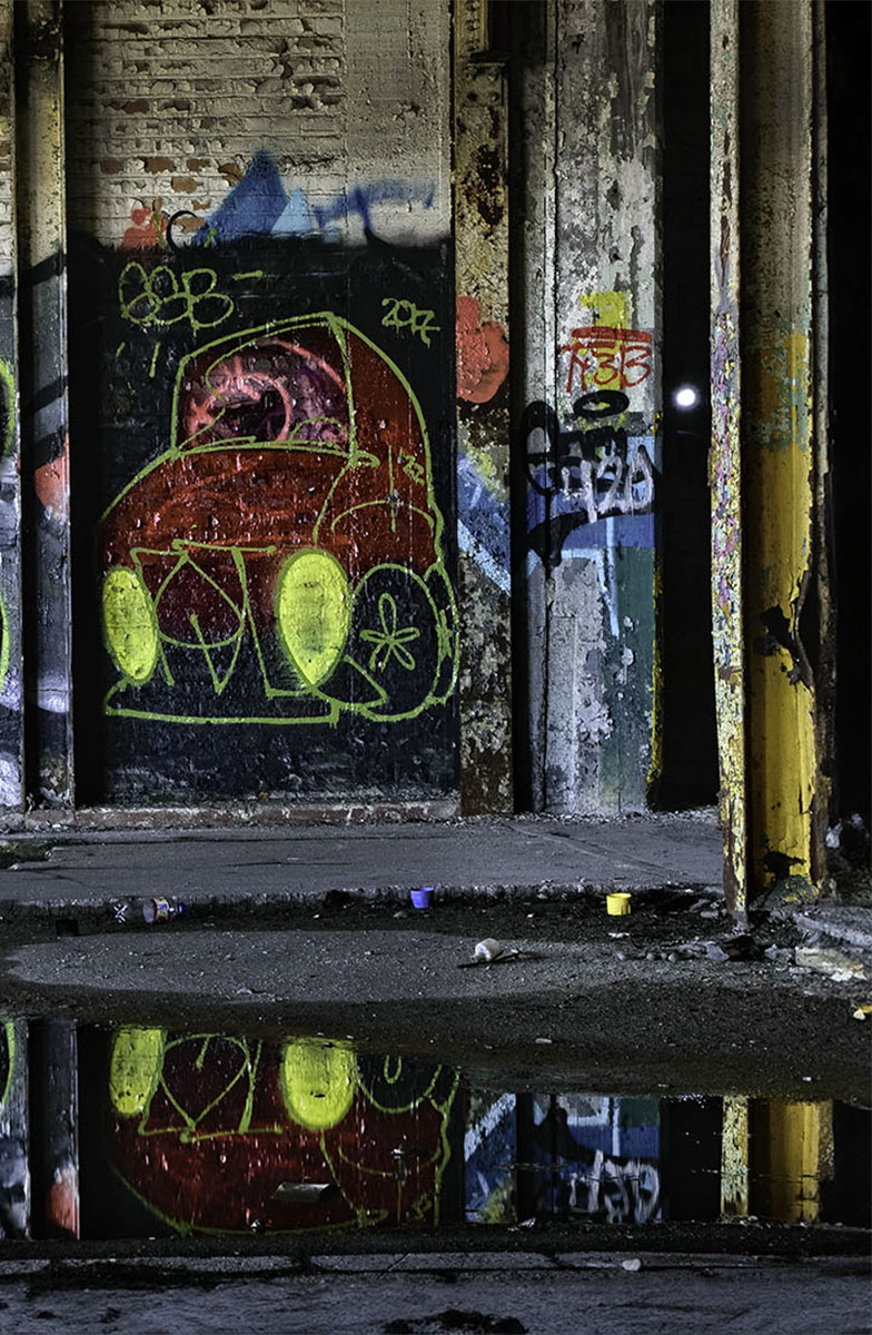
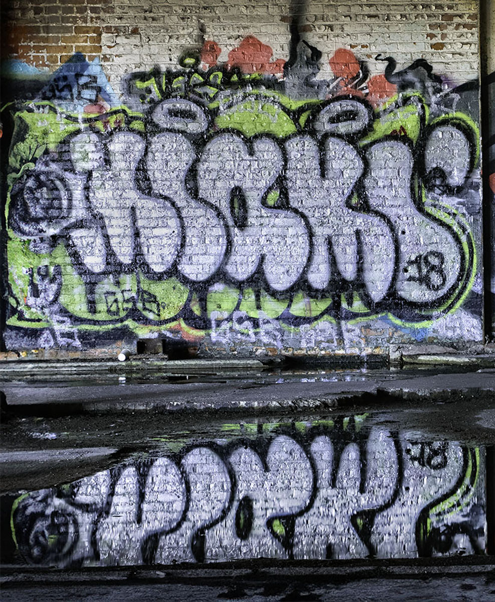
Now looking at these images, if I had to choose an image, I'd pick the first one, withthe bubble letters.
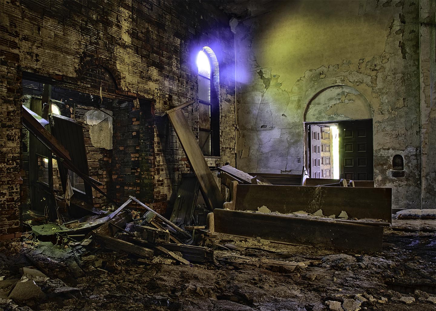
But here's a thought: this photo is about confusion. The Fisher body plant was a triumph of its time, the largest floor space built with reinforced concrete in the 1920's. It symbolized belief in continuing progress, both for the United States and Detroit. Then it was abandoned and the grafitti artists and vandals conquered all.That's not a Photoshop reflection on the floor, it is a giant puddle.
So if you're troubled by the lack of a central vision, that is probably what I wast struggling to say. Where is the center of interest in a building that was a triumph of engineering that has been abandoned to the elements, and a number of drug-addled painters?
So ultimately I still lean toward the original image. So maybe this is a good place to have a dialog. What are your thoughts having seen all the images? |
Nov 18th |
 |
| 49 |
Nov 23 |
Comment |
It seems like there is a concensus here that this image is confusing, and lacks a formal center of interest, due to two competing subjects. I will concede that this may be true, and I am suffering from 'tripoditis' here, as I mentioned in my post on Peggy's barn picture. So like Solomon, I cut tthe baby in half, and made two photos, which I am posting here. |
Nov 18th |
 |
| 49 |
Nov 23 |
Comment |
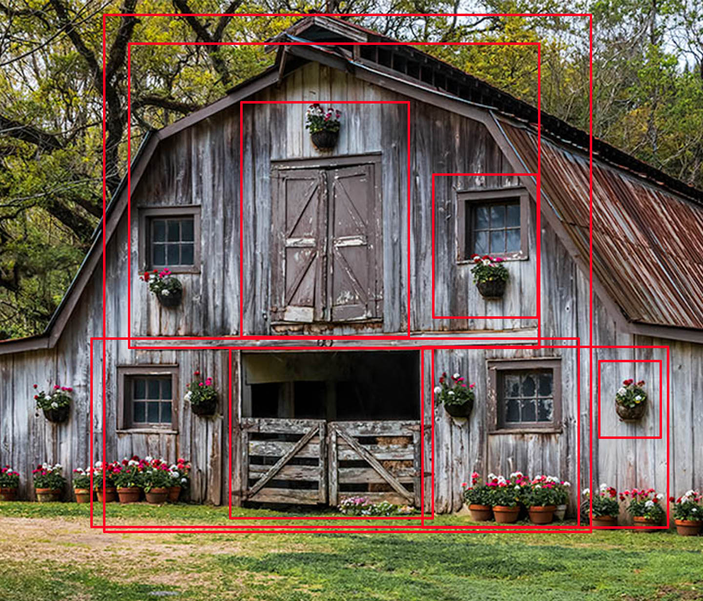
Peggy, I second the comments made by everyone here. But now I'm going to add one! Most photographers, including me, suffer from what I call 'tripoditis'. You come upon a scene, find a spot to shoot from and fall in love with it, and take all you shots from that angle. I am now sometimes forcing myself to walk completely around a place like this barn with the camera still packed in the bag. I whistle, kick dirt, and put my hands in my pockets, And I notice: things like those neat flower boxes and pots, the symmetrical arrangement of windows and doors, etc. after a few ,inutes of this enforced idleness, out comes the camerra and I start shooting.
I think of my photography as a little bit like a movie, first a long shot to set the scerne, like this one, then close-ups. For the accompanying image, I selected the fron tof the barn, then outlined some shots I might make in red. I count 9 frames, as well as your original photo. Perhaps you already do this exercise, but if you haven't, you might give it a try. My only other advice is to look down from time to time, In a barnyard, you really have to be careful what you're kicking! |
Nov 18th |
 |
| 49 |
Nov 23 |
Comment |
My problem with this photo is that the 'hero tree' you selected as your center of interest chops through the outlin of the hills. If you look at the Joshua tree in the exavt center of the picture does not chop the hill outline. If you had moved in on this tree and shot from just before it chopped out of the outline, you might have been able to compose a stronger image. |
Nov 18th |
| 49 |
Nov 23 |
Comment |
David,
I see where Josh is heading, I choose to saty with your original crop and clone the branch out, then burn in the distracting foliage on the right This creates a mysterious area of darkness on eitther side, and may provide a sense of balance. |
Nov 18th |
 |
| 49 |
Nov 23 |
Comment |
The overall lightness of this shot is what strikes me first when I look at this image. In lightroom, I would reduce the overall exposure to bring out the detail in the highlit areas, then I would open up the shadows.Then I would crop on the right side, as suggested by David, and finish with a soft vignette to draw the eye to that triumphant quarterback. |
Nov 18th |
 |
| 49 |
Nov 23 |
Comment |
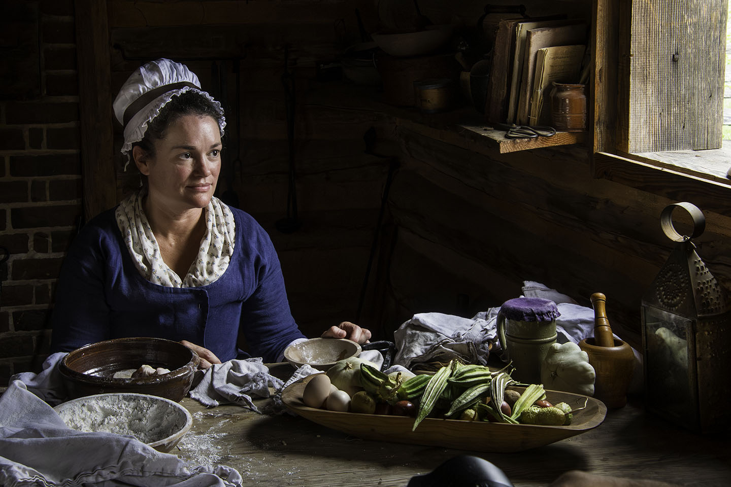
Stephen I much prefer the second image you posted in respose to Josh's comment. Environmental portraits always create a problem in balancing the 'native habitat' so to speak and having the subject lost in all the distraction. Also, possibly because of all the work done in opening the shadows on the face, the face lloks very odd to me. I think a small flash unit at low power or an LED light panel placed to the right and facing the craftsman would have filled in the shadows nicely and created a nicer protrait. You canuse a flash at a low power to fill in natural light, and no one will be distracted by it. |
Nov 18th |
| 49 |
Nov 23 |
Comment |
Good comment, and one I ask myself more and more both of my own images and ones that I judge in competition. My center of interest was the graffiti and its reflection in the puddle. The I-beam merely acted as a frame. I felt that was emphasized in the cropping and treatment of the image, but I will reconsider waus to make this more clear. |
Nov 13th |
8 comments - 0 replies for Group 49
|
8 comments - 0 replies Total
|