Activity for User 198 - Craig Callan - ccallan@his.com

avatar
Avatar

Close this Tab when done


308 Comments / 69 Replies Posted
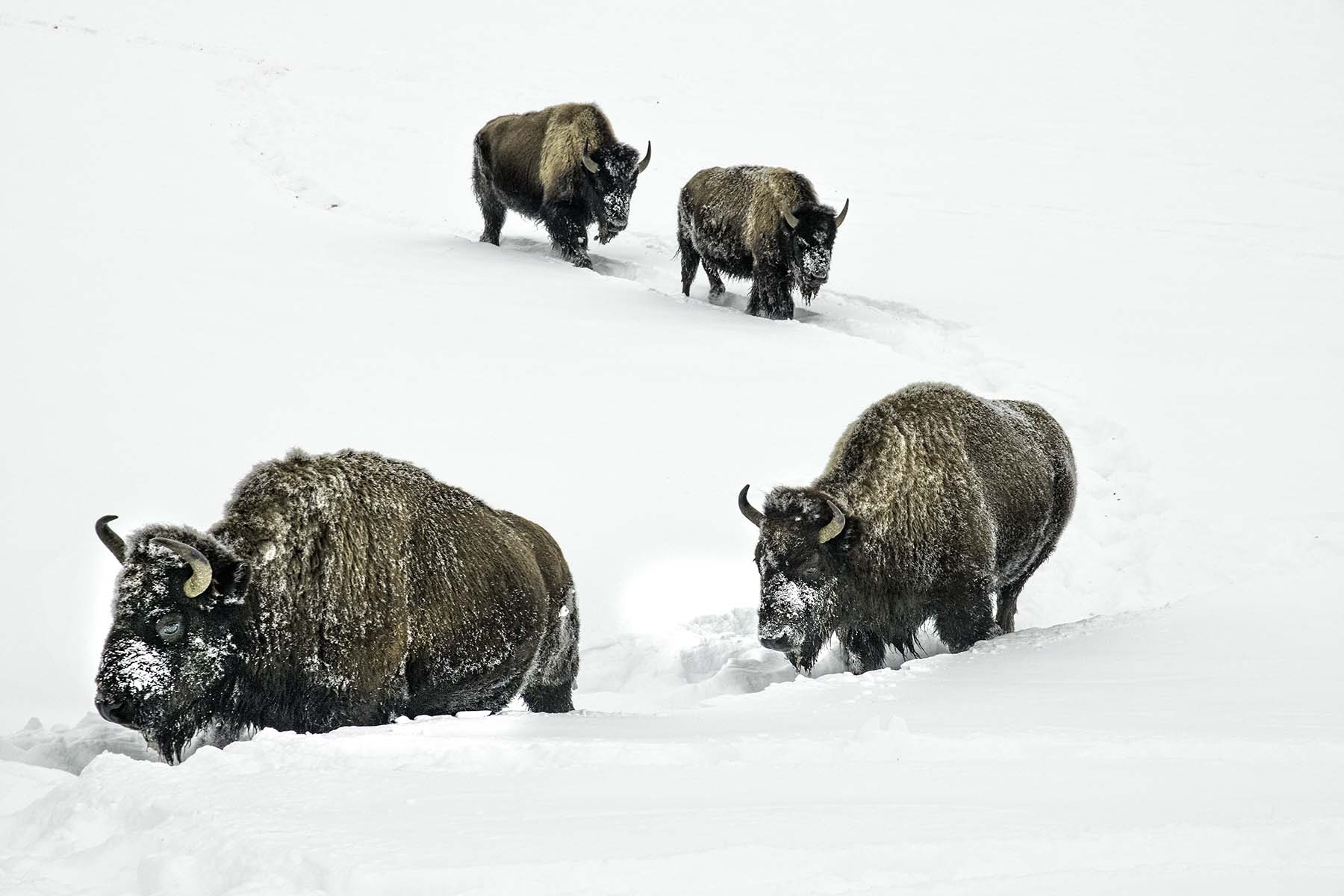
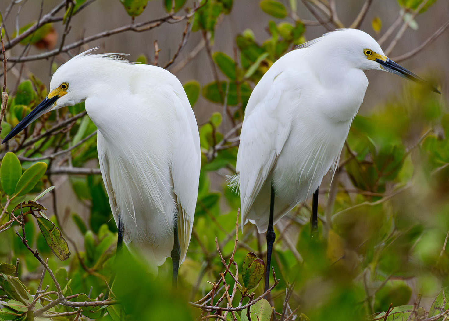
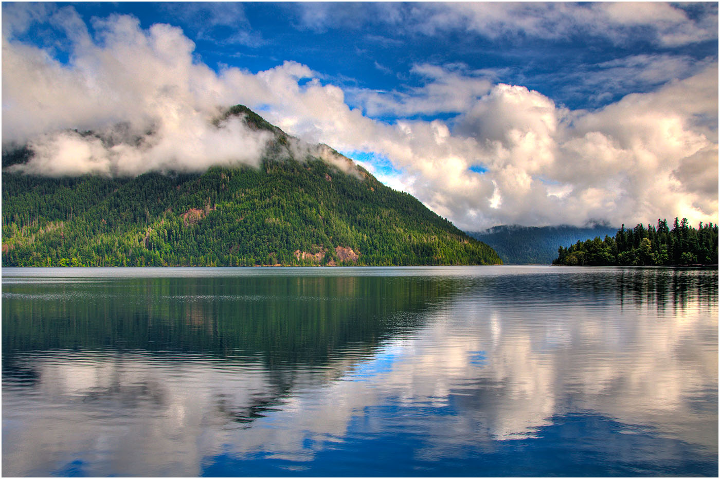
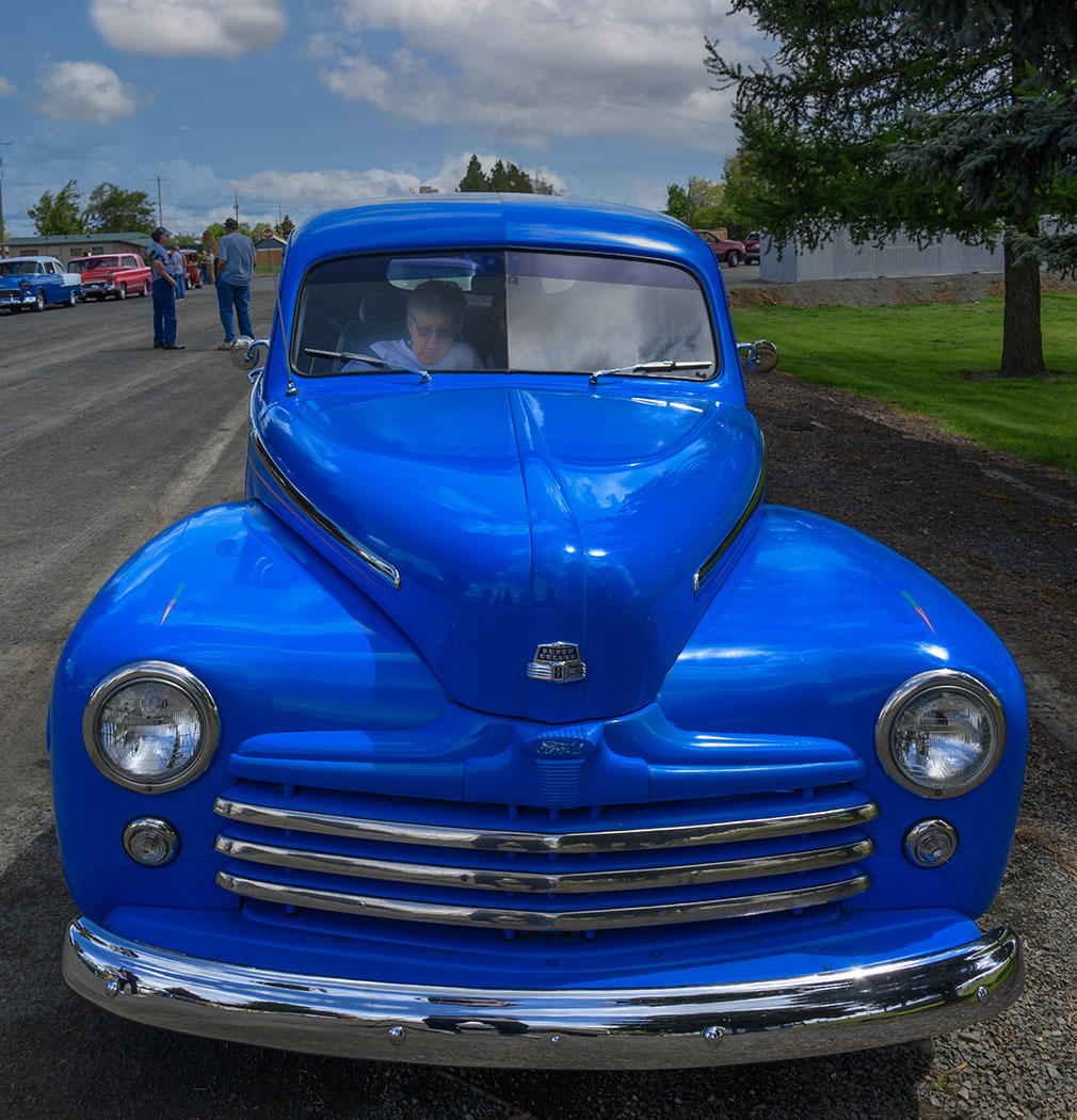
  = Current Round   = Previous Round
Group Round C/R Comment Date Image
49 May 22 Reply Well, um, it was an alley. Not much room to maneuver. To be honest, I was looking for vivid, and I still prefer it that way. Captures the urban feel, to my mind. May 14th
49 May 22 Reply Dicky, I'd usually try to eliminate the clutter, but since we're in an alley, it's part of the message, to my thinking.
May 11th
49 May 22 Reply Hmm.. Maybe something like this? It has possibilities. May 10th
49 May 22 Comment Agree with Alan, it's a good compsition. H
ere is the image with:
- Highlights reduced
- Dehaze applied
- Vibrance increased.
- Color adjustent of blues and aquas.
May 10th
49 May 22 Comment Lovely shot. Two thoughts:

1) sometimes when I darken a background, I add just a little field blur and slightly reduce saturation to "pop" my subject a little more.
2) LR Classic 2022 allows you to select and invert the subject from within the app - no need to go to Photoshop.
May 10th
49 May 22 Comment Here's the curve May 10th
49 May 22 Comment My though is that you could have kicked out the jams a little more here by lightening the highlights and midtone to make the leaves glow a bit more. This would also bring out the delicate tracery of the trunks and branches. I'm attaching an edited image and the curve that I applied May 10th
49 May 22 Comment Really nice image with good use of sharpness and DOF. Excellent tonal range and shadow detail, as well.
Just two (minor) suggestions:
1) Rotate the image about 3 degrees CCW to straighten the tilted rug.
2) Slight amount of burning-in on the light space at top left to hold the viewer's eye in the frame.
May 10th
49 May 22 Comment I think the reflections in the open space at the bottom add a sense of peace that contrasts nicely with the menace of the gator. But like Alan, I think you should have allowed a little more space on the left side. May 10th
49 May 22 Comment I usually like to crop flowers tightly, but you've got the right idea here. The diagonals formed by the stalks are an excellent composition, and the parallel lines really add to the strength, by giving you an upward thrust that represents growth, and the soft colors say "spring".

I'm not sure flipping it adds anything - it works both ways. Well done! I think Monet would be proud.
May 10th

7 comments - 3 replies for Group 49


7 comments - 3 replies Total


73 Images Posted

  = Current Round   = Previous Round
Group 38

Dec 17

Nov 17

Oct 17

Sep 17

Aug 17

Jul 17

May 17

Apr 17

Mar 17

Feb 17

Jan 17
Group 49

Apr 26

Mar 26

Feb 26

Jan 26

Dec 25

Nov 25

Oct 25

Sep 25

Aug 25

Jul 25

Jun 25

May 25

Apr 25

Mar 25

Feb 25

Jan 25

Dec 24

Nov 24

Oct 24

Sep 24

Aug 24

Jul 24

Jun 24

May 24

Apr 24

Mar 24

Feb 24

Jan 24

Dec 23

Nov 23

Oct 23

Sep 23

Aug 23

Jul 23

Jun 23

May 23

Apr 23

Mar 23

Feb 23

Jan 23

Nov 22

Oct 22

Sep 22

Aug 22

Jul 22

Jun 22

May 22

Apr 22

Mar 22

Feb 22

Jan 22
Group 66

Dec 17

Nov 17

Oct 17

Sep 17

Aug 17

Jul 17

May 17

Apr 17

Mar 17

Feb 17

Jan 17

Close this Tab when done