|
| Group |
Round |
C/R |
Comment |
Date |
Image |
| 38 |
Sep 17 |
Reply |
Sorry, the bright spot was in the upper LEFT corner. My apologies! |
Sep 16th |
| 38 |
Sep 17 |
Comment |
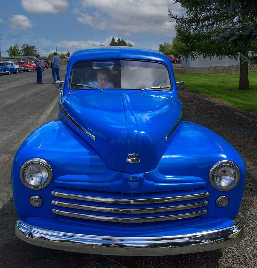
Peter, truly a great shot. I like how you set the exposure so well for the people on the landing across the canal. |
Sep 15th |
| 38 |
Sep 17 |
Comment |
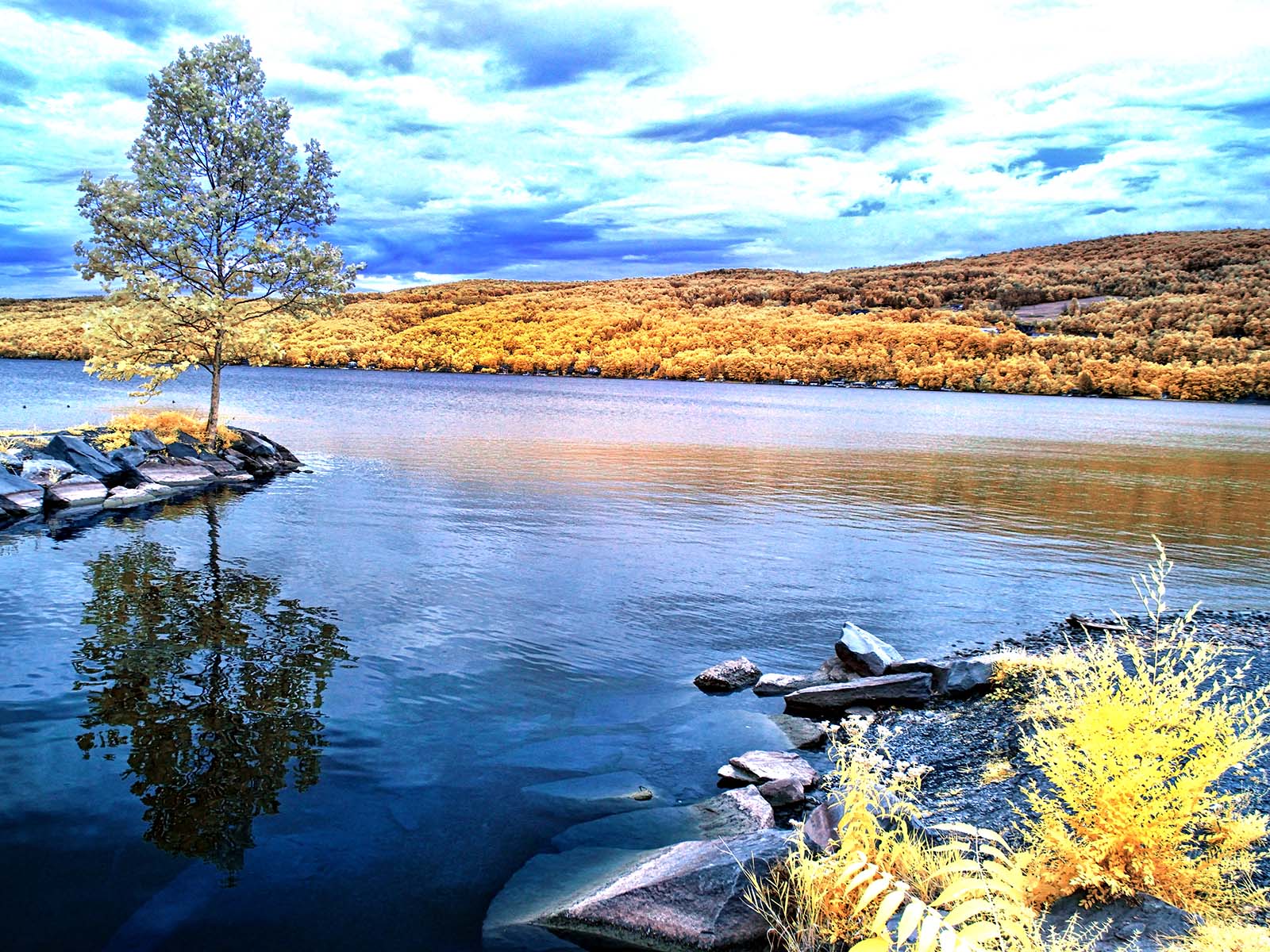
It;s a classic landscape, well executed. Using a gradated mask in PS, I lightened the foreground a bit, then inverted the mask and darkened the sky and rock very slightly, and added vibrance. I then used OnOne's Dynamic Contrast and Vignette Filters to add some 'pop'. |
Sep 15th |
 |
| 38 |
Sep 17 |
Comment |
I like it, too Kerstin. In the US, we call this a "mackerel sky" since the bumps in the clouds look like fish scales. |
Sep 15th |
| 38 |
Sep 17 |
Comment |
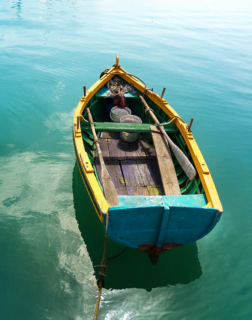
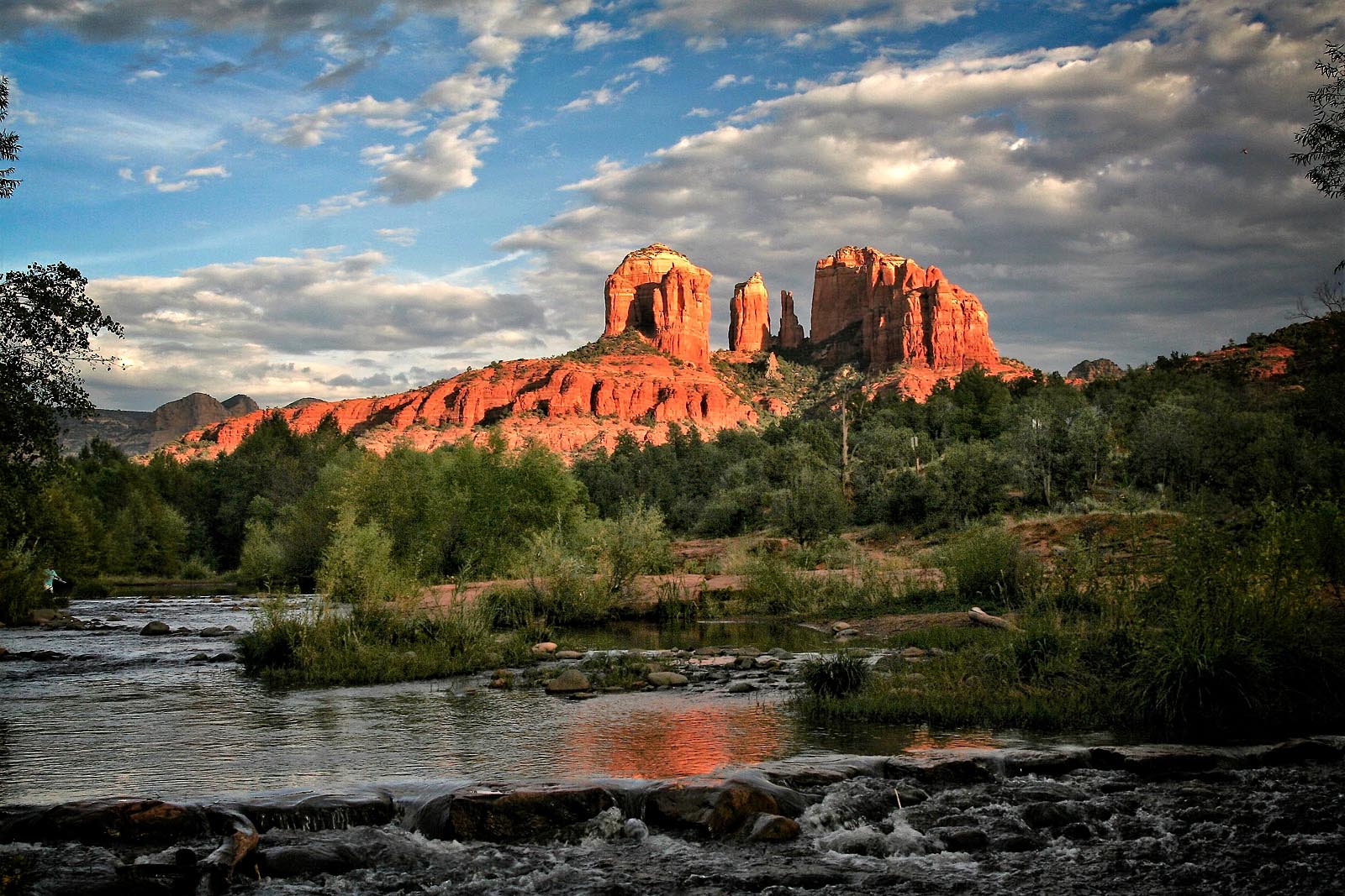
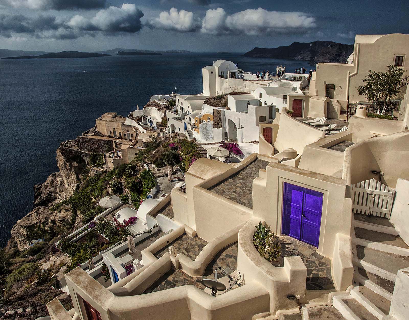
A classic image, beautifully composed. Looking at the clouds, I would say the image is a bit on the blue side. For mu edit, I added some of the warmth back in Viveza, then used Replace Color in PS to make the door a nice Aegean Blue. Somehow the image flipped horizontally in this process! |
Sep 15th |
 |
| 38 |
Sep 17 |
Comment |
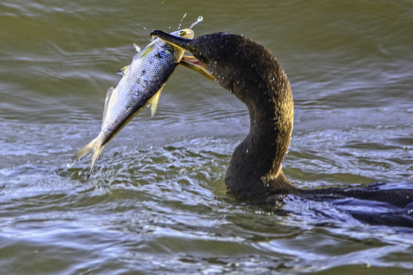
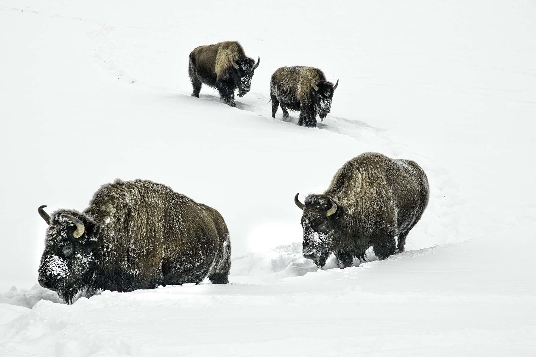
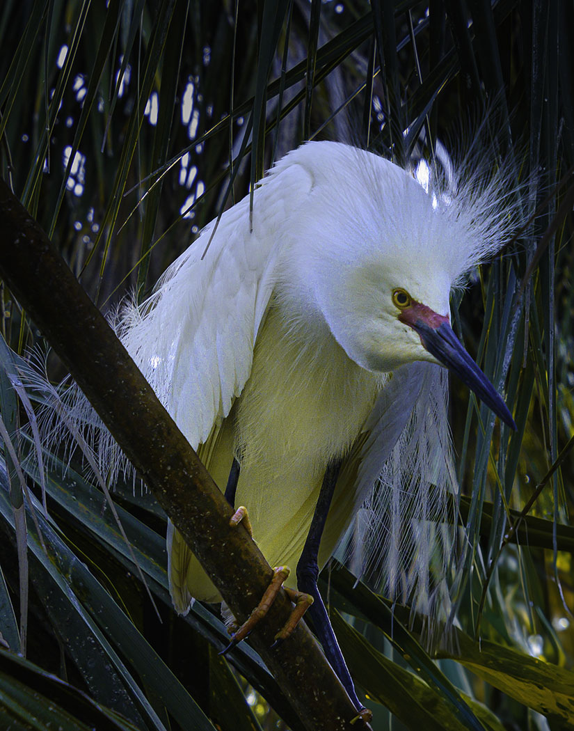
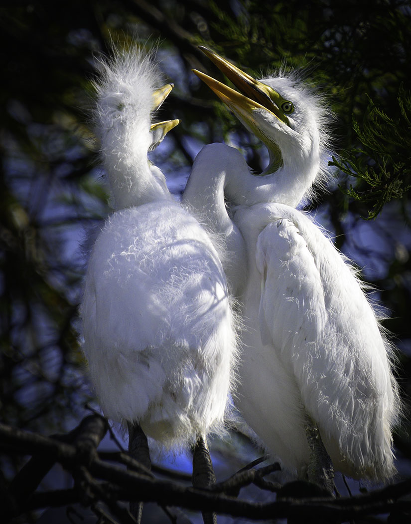
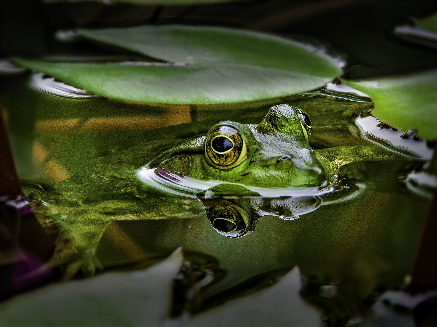
Ummm... No suggestions this month. Outstanding image! Wait! NEEDS MORE FISH! |
Sep 15th |
| 38 |
Sep 17 |
Comment |
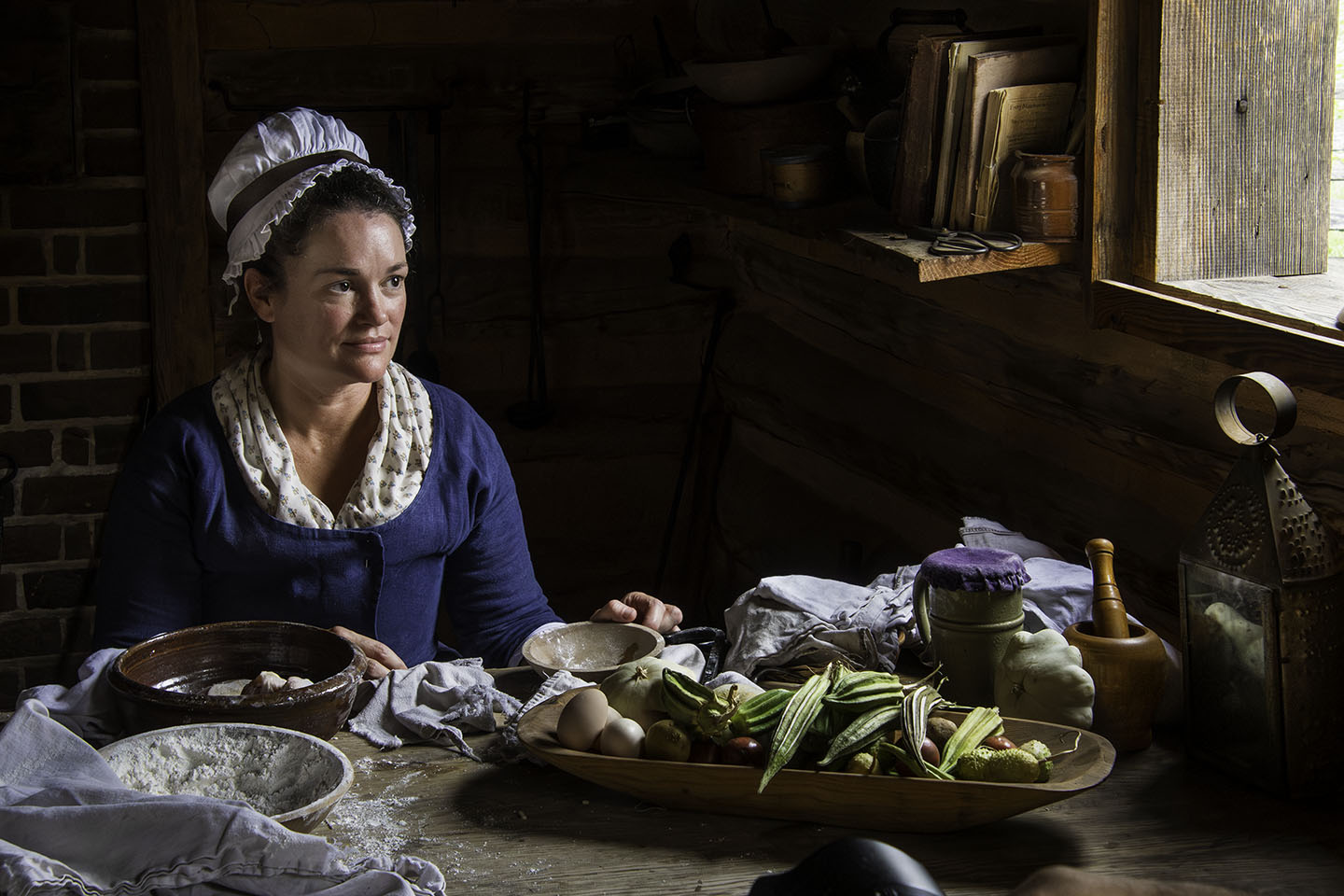
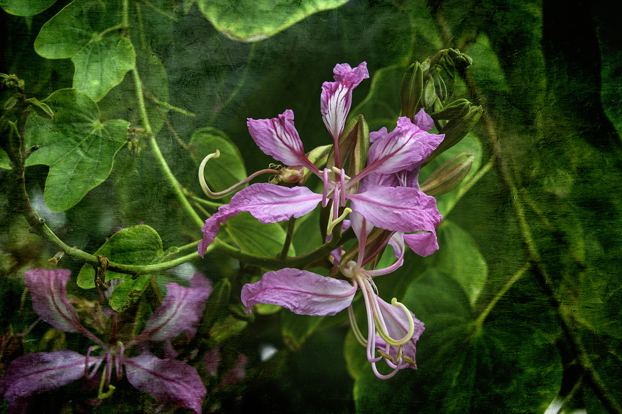
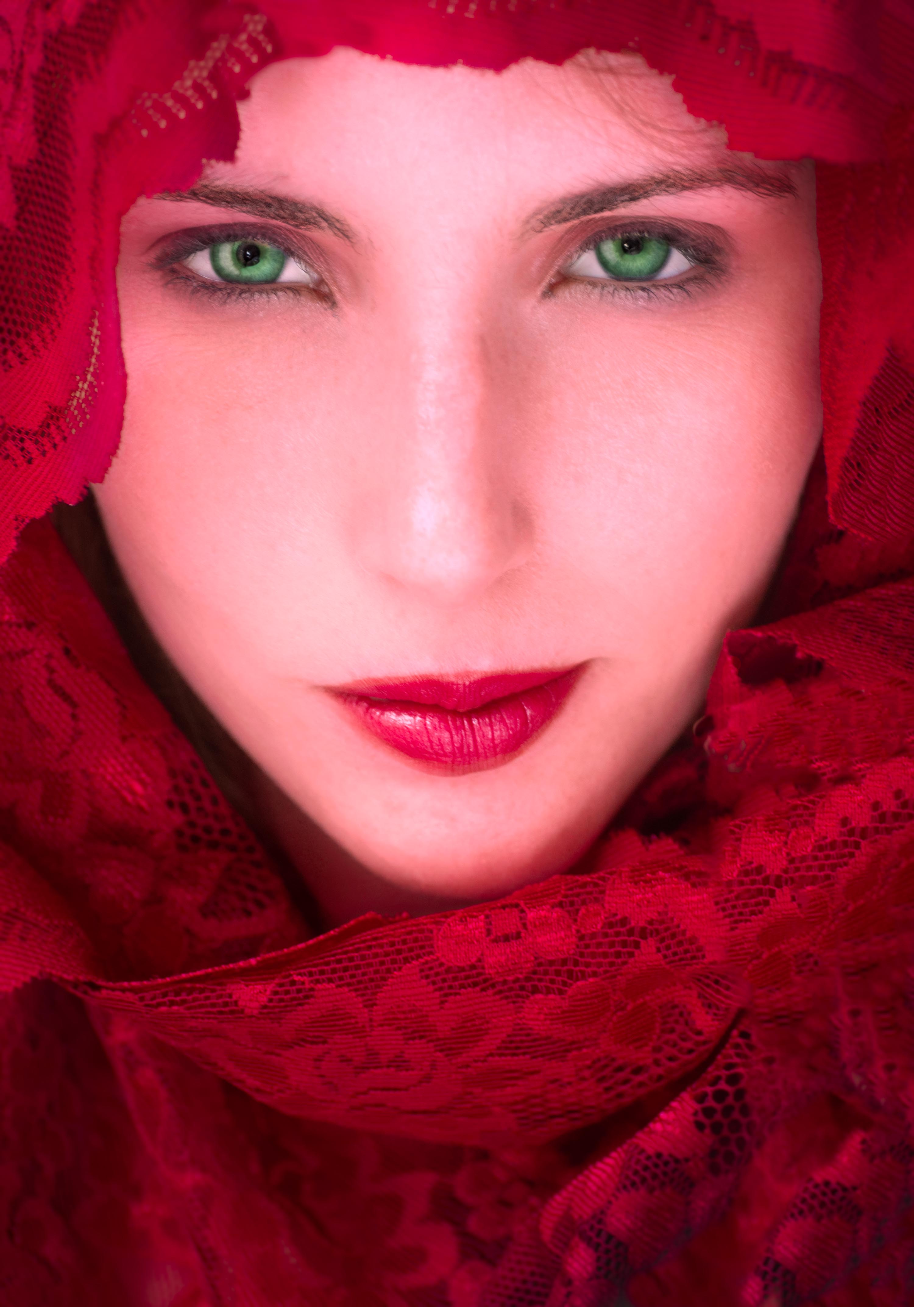
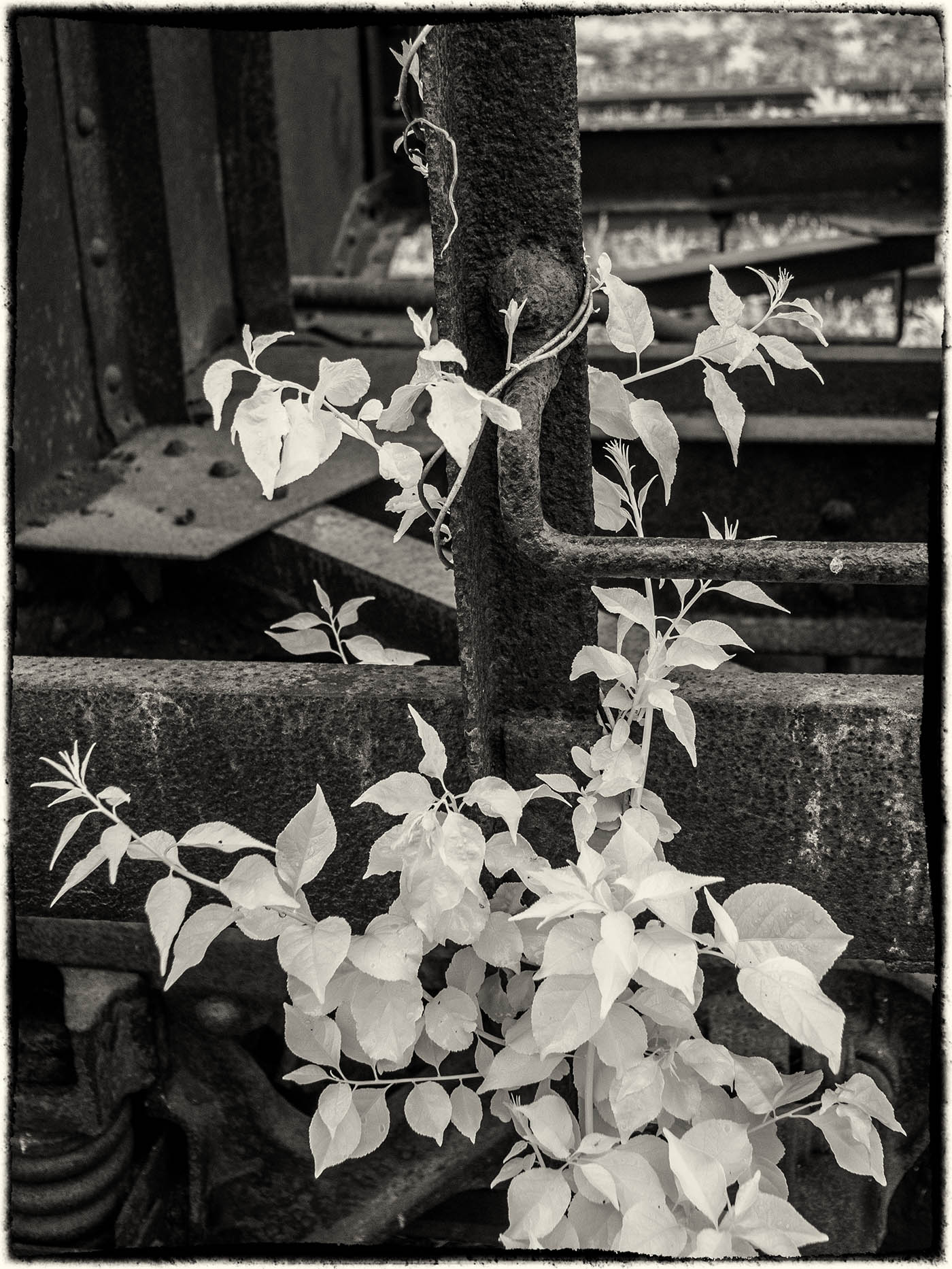
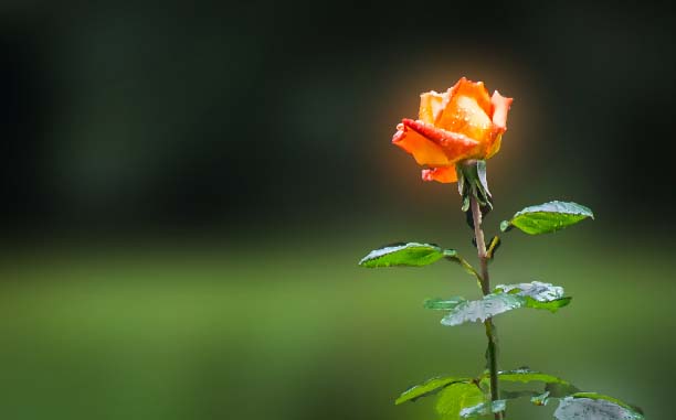
I, too, like your concept, Gabrielle, especially the off-center composition. Since I wanted to see a bit more rose, I cropped it slightly to remove the distracting bright spot in the upper right corner, and added a vignette to draw the viewer in. I also toned the leaves down, per Gerhard. |
Sep 15th |
 |
6 comments - 1 reply for Group 38
|
| 66 |
Sep 17 |
Reply |
Palli, If you mean an e-mail every time that comments are posted, you can turn that on and off yourself. Immediately below this comments section, when you are logged in to the site, you will see a message in white text that tells you whether "Comment Notifications" are on or off. Right next to that is an orange text block that offers you the ability to toggle between opting in or out. |
Sep 16th |
| 66 |
Sep 17 |
Comment |
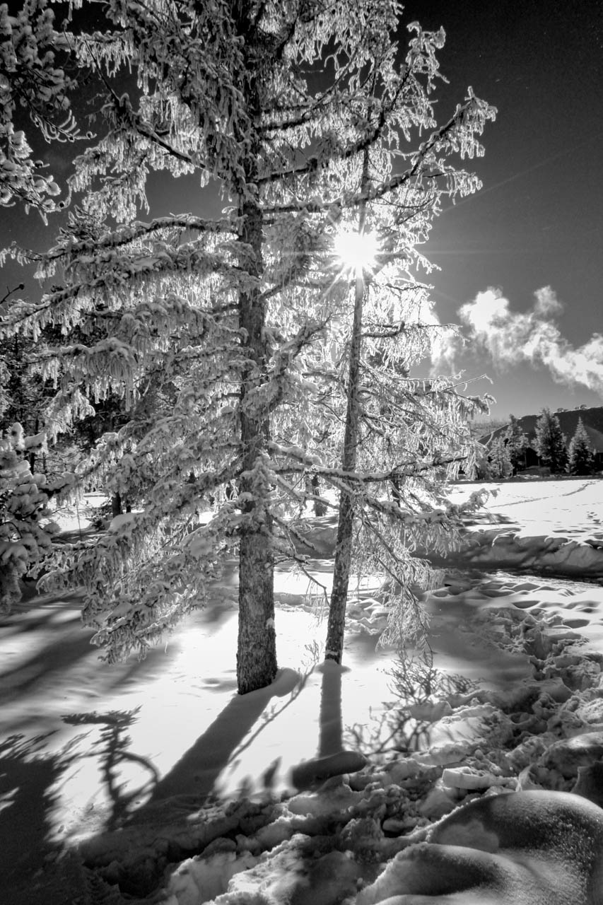
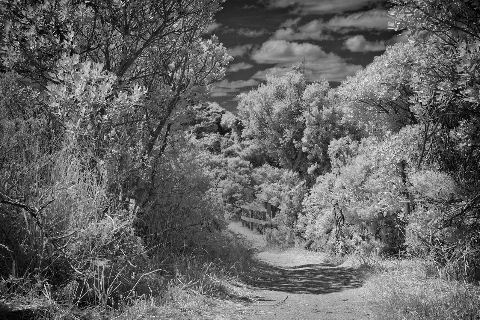
I get a very overprocessed feel from this image, perhaps "death by detail" where everything is maybe TOO sharp and TOO contrasty. If you look at the original image you can see a nice circular area of shadow that goes through the tree on the left and its shadow on the path, but is lost in the final image. I went back to the original and tried again. Let me know what you think. |
Sep 16th |
 |
| 66 |
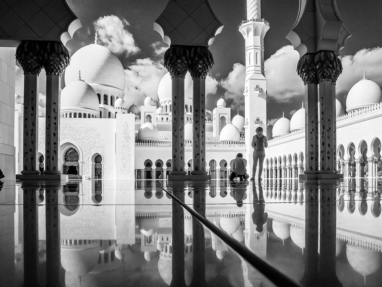
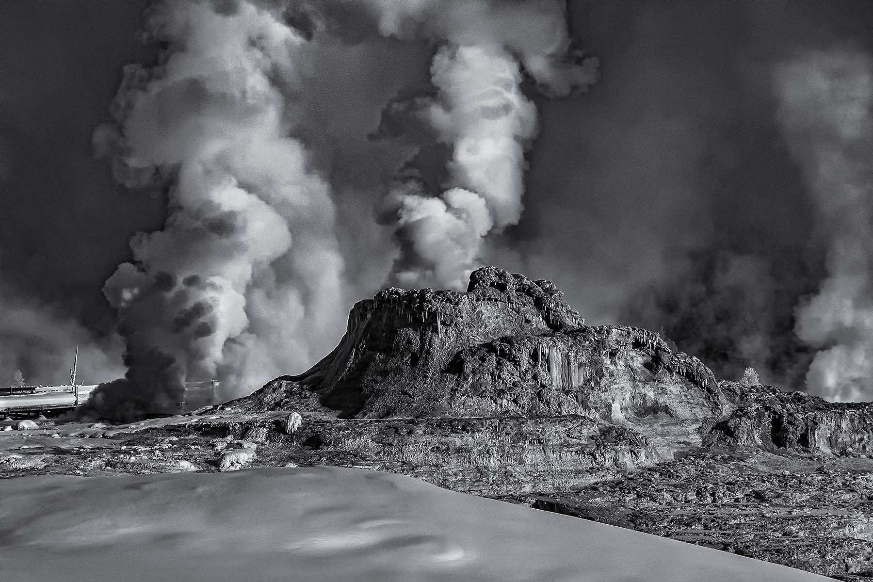
Sep 17 |
Comment |
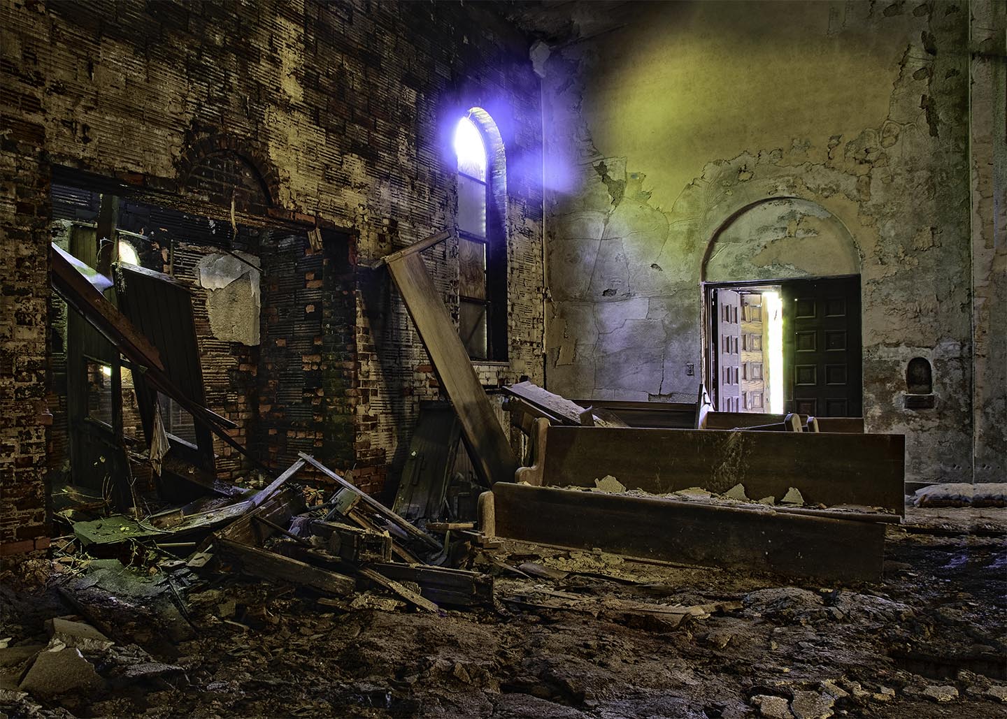
An excellent image treatment. I see what Melanie is saying. Perhaps you might consider taking that little cloud area in the upper left corner out?
That would contribute to the "tornado" effect. |
Sep 15th |
| 66 |
Sep 17 |
Comment |
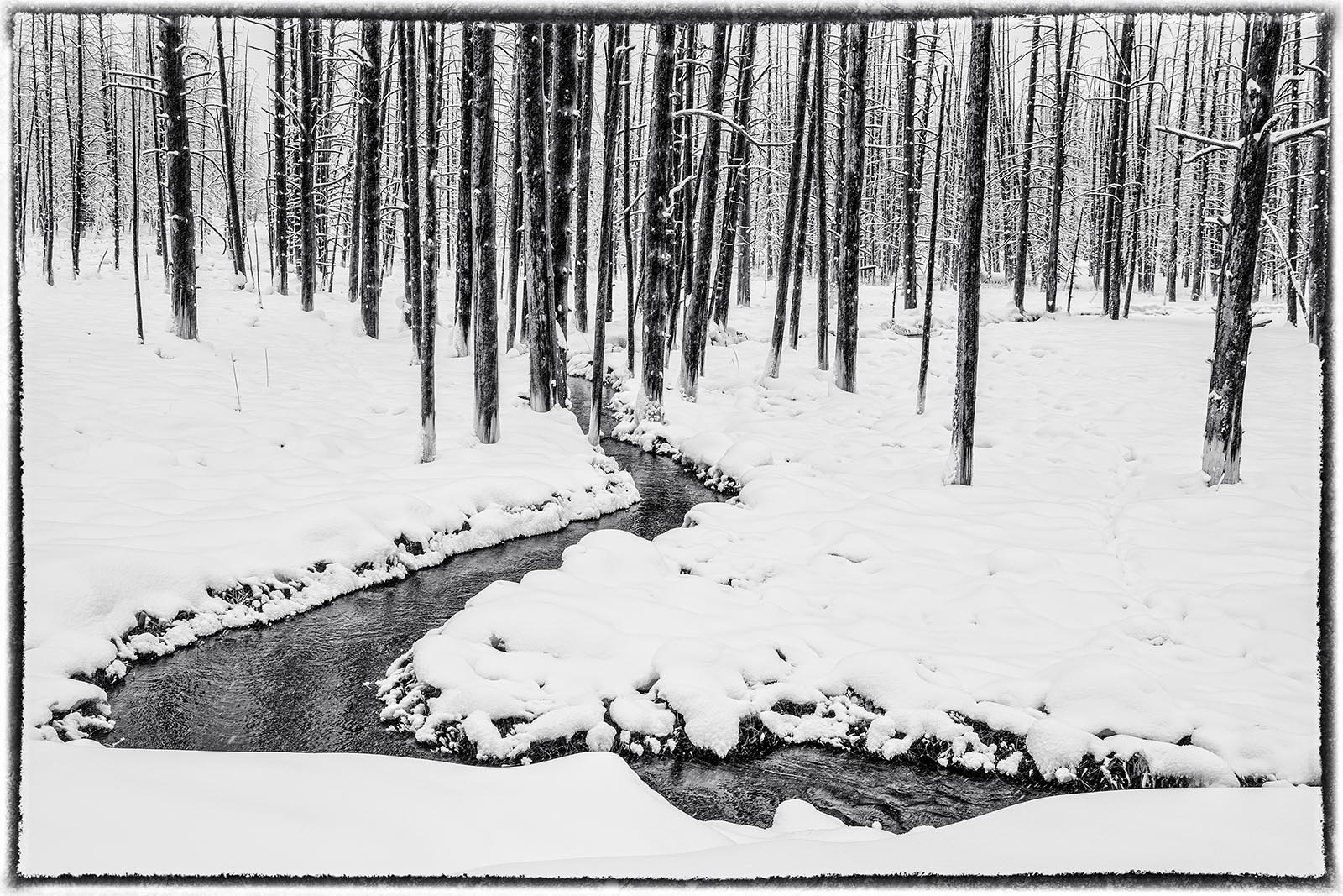
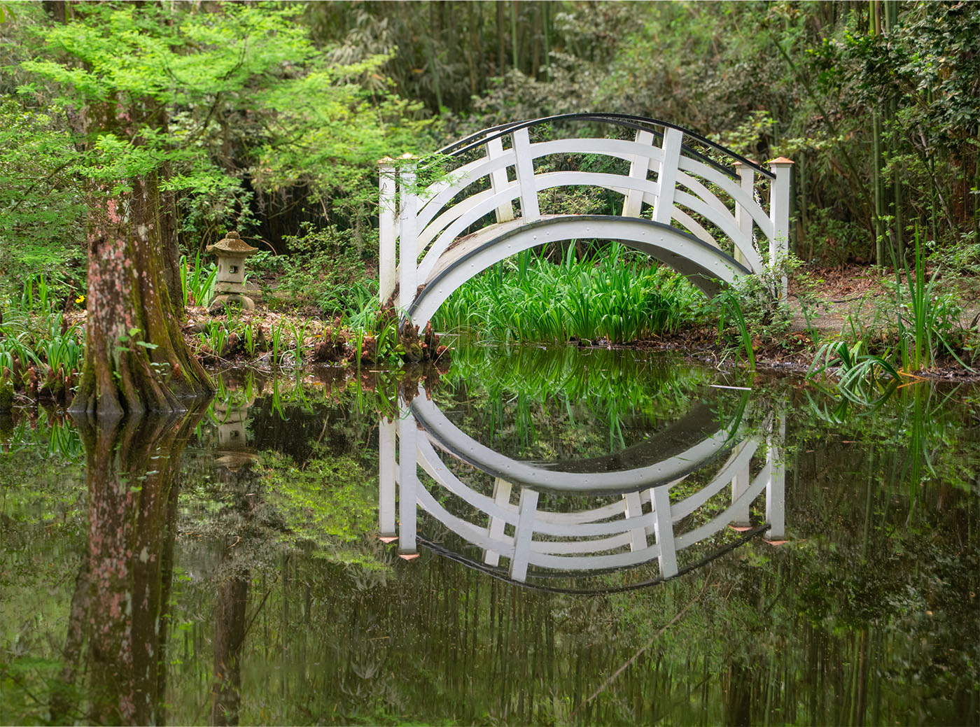
Melanie - I love the reaching effect of those pointed arches just wonderful. Nice camera work to match the scene with its reflections. |
Sep 15th |
| 66 |
Sep 17 |
Comment |
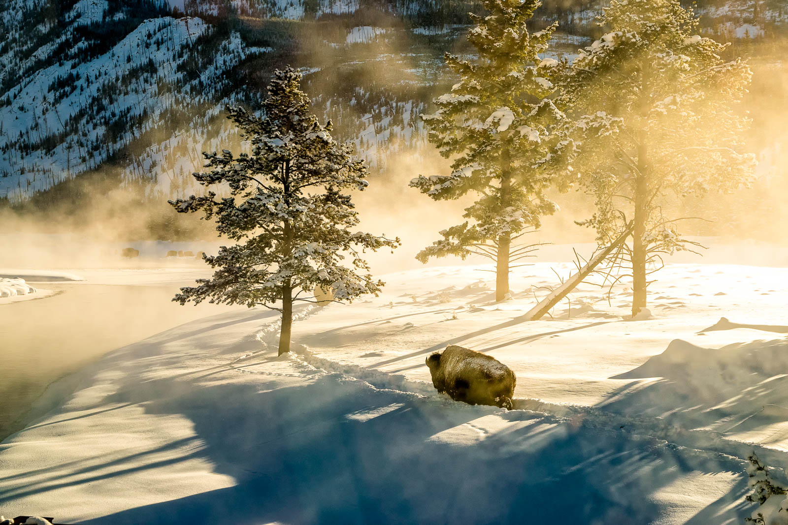
Jack, you've composed a perfect image here, and posed the perfect question. I agree with Palli's answer, it;s just what this image needs to take it over the top. |
Sep 15th |
4 comments - 1 reply for Group 66
|
10 comments - 2 replies Total
|