|
| Group |
Round |
C/R |
Comment |
Date |
Image |
| 8 |
Feb 26 |
Reply |
I cropped it and submitted the redone photo in one of the earlier replies. It does seem to be an improvement. Thanks |
Feb 26th |
| 8 |
Feb 26 |
Reply |
Thanks for your suggestion! This is the most dialogue I've had since joining this group. I can try to bring down the brightness in that streetlight. |
Feb 24th |
| 8 |
Feb 26 |
Comment |
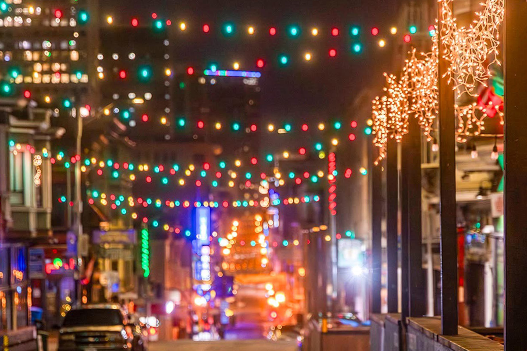
It was well before sunrise-There is usually less traffic in the early morning than at night.I have others that are more traditionally taken, but the strings of light appeared further apart and that wasn't what I saw. I submitted this one to see what the response would be-perhaps its too confusing. I tried cropping-is that better? |
Feb 22nd |
 |
| 8 |
Feb 26 |
Reply |
Oh, sorry-my memory isn't very good these days. I went back and looked at the previous photo and I like this version better. The vertical framing gives a sense of upward mobility. |
Feb 20th |
| 8 |
Feb 26 |
Reply |
I tried your suggestion about cropping, and yes it is an improvement! I have other photos that were more focused, but this one is more how I saw the scene. When there was a lot of depth of field, the light looked too far apart. Thanks! |
Feb 20th |
| 8 |
Feb 26 |
Comment |
This scene would have caught my eye too! I like the sun's rays creating a warm look to the photo. Nice balance with the trees to the right and people walking on the left. Perhaps standing more to the right would have moved the orange stanchions more to the left of the image. I try not to use photo shop tools to remove unwanted items in my photos, but I might remove just the first orange pole. |
Feb 20th |
| 8 |
Feb 26 |
Comment |
I like the cleanliness of this image. Good idea to make it black and white and at this time of year when the trees are bare. I like the oil paint filter, but also think it would look good without it. I would probably remove the welcome sign too. Nicely done. |
Feb 20th |
| 8 |
Feb 26 |
Comment |
This is an intriguing project. You probably have a lot of ideas on your own and I don't know how much you can manipulate the smaller light, but I think I would like there to be more connection between the two lights. Perhaps a repeating theme?
|
Feb 20th |
| 8 |
Feb 26 |
Reply |
That's a hard question-there are so many cool things to see. I think it's mostly anchovies swimming in circles but other exhibits mix in sardines. The kelp forest and the jellys are probably my favorite but I also like to take photos of people, especially kids at watching the sea otters. I think they swim in a pool for protection but not sure why it's counterclockwise. |
Feb 20th |
| 8 |
Feb 26 |
Comment |
My eye is drawn to the center gold figure with the raised arm pointing to the dramatic sky. The whites in the image are well exposed and the colors are vibrant. I'm wondering what the surrounding area looks like and whether to capture more of that. Nice image. |
Feb 19th |
| 8 |
Feb 26 |
Comment |
This is a creative and imaginative image. It looks like a charcoal drawing to me. Nice balance, color and contrast. I've been to the Monterey Bay Aquarium and saw that exhibit. I like the way you captured this image out of context. |
Feb 19th |
| 8 |
Feb 26 |
Comment |
This is a creative and imaginative image. It looks like a charcoal drawing to me. Nice balance, color and contrast. I've been to the Monterey Bay Aquarium and saw that exhibit. I like the way you captured this image out of context. |
Feb 19th |
7 comments - 5 replies for Group 8
|
7 comments - 5 replies Total
|