|
| Group |
Round |
C/R |
Comment |
Date |
Image |
| 18 |
Aug 17 |
Comment |
Great colors and I really like the gradient effect. A striking image. |
Aug 16th |
| 18 |
Aug 17 |
Reply |
Love it Peter. Yes,the scale is better in the painted acrylic version.;)
|
Aug 9th |
| 18 |
Aug 17 |
Comment |
A great composite image. I really like the painted effect on this. I feel you have achieved that sense of isolation. I think though the phone box could be a bit bigger in scale or the man smaller. Well done. |
Aug 9th |
| 18 |
Aug 17 |
Comment |
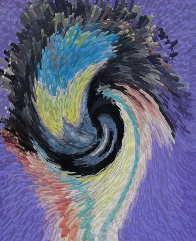
I love the soft flowing look of this image, and the colors as well, though I like it too in the black and white version.The brown on the butterfly adds a nice diversion for the eye to rest on. An overall pleasant image. |
Aug 7th |
| 18 |
Aug 17 |
Comment |
I do like the effect of this effect, especially in the smoke and on the brick wall. I do find the red post on the right to be a distraction as it draws my eye away from the subject. |
Aug 7th |
| 18 |
Aug 17 |
Reply |
Yes, Mike, I see what you mean. I will fix it on the original before I print it for my grandson.
|
Aug 6th |
4 comments - 2 replies for Group 18
|
4 comments - 2 replies Total
|