|
| Group |
Round |
C/R |
Comment |
Date |
Image |
| 18 |
Feb 17 |
Comment |
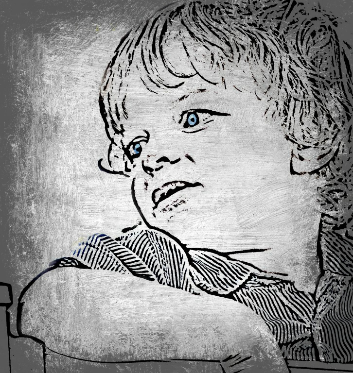
I really like the filters used here. It gives the image a moody look and the colors seem to just pop. I do find the glare of the glass on the doors or windows a bit too distracting. |
Feb 17th |
| 18 |
Feb 17 |
Reply |
Yes, Meg.. that was my thought as well.. |
Feb 14th |
| 18 |
Feb 17 |
Comment |
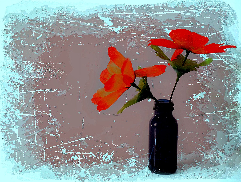
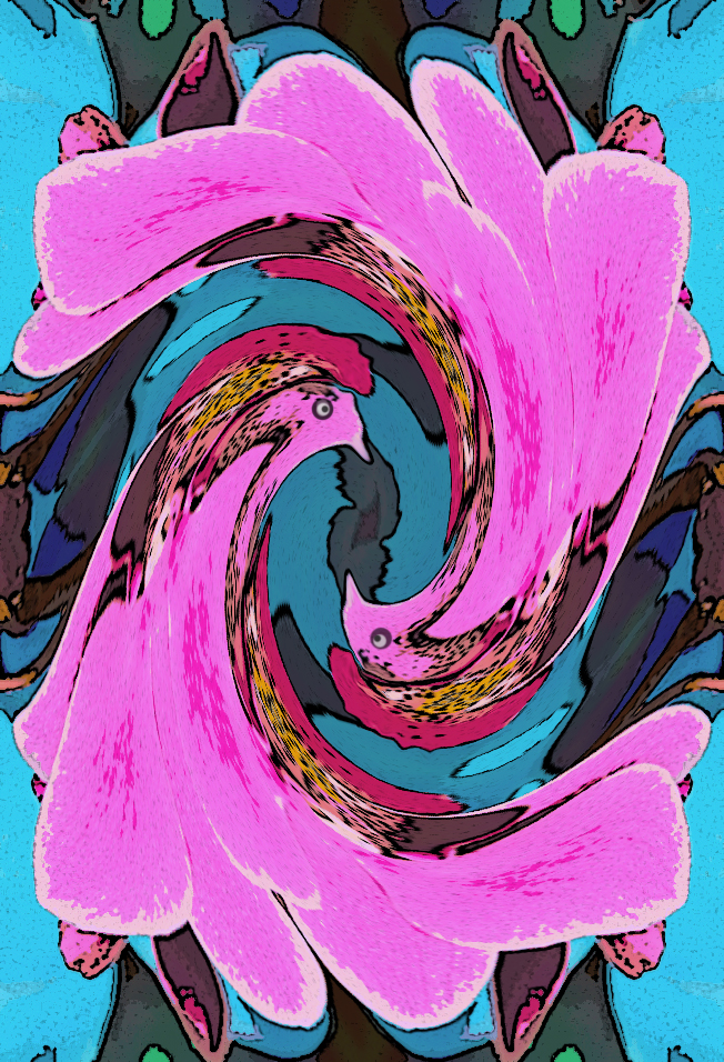
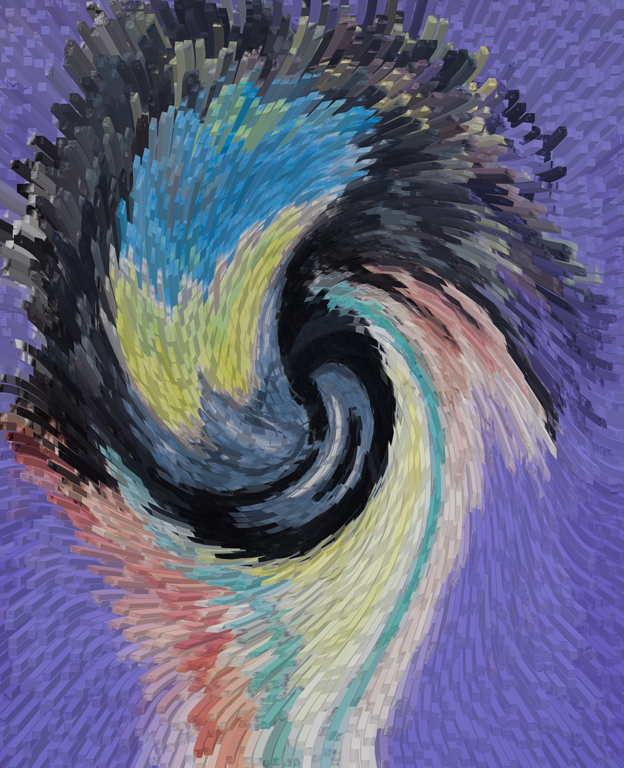
Love the colors that came out with the Haze Removal. Very pretty. This would make a great overlay or background for another image. |
Feb 14th |
| 18 |
Feb 17 |
Comment |
I like the overlay, but perhaps it needs to be desaturated a bit so it is not so overwhelming. It does have nice colors though. |
Feb 14th |
| 18 |
Feb 17 |
Comment |
Yes, I agree with both Mike and Meg.. the man's face could use more definition... but I do like the effect on the mural with its bright colors. |
Feb 14th |
| 18 |
Feb 17 |
Comment |
I like this image both ways.. the bright bold colors and the soft pastel ones too.
Congratulations on the first place win. |
Feb 14th |
5 comments - 1 reply for Group 18
|
5 comments - 1 reply Total
|