|
| Group |
Round |
C/R |
Comment |
Date |
Image |
| 30 |
Jan 26 |
Reply |
You could use Perspective Warp or Transform: Distort to straighten out the stovepipe on the right. Again, the stovepipe on the left edge may have great detail but I think it is too bright and leads the eye away from where you want it to go. |
Jan 13th |
| 30 |
Jan 26 |
Comment |
Thank you all for your comments. I think the image looks cut off and unbalanced if the reflection is removed. I agree the reflection could be a little brighter, so I did a quick edit with a brush in ACR. |
Jan 13th |
 |
| 30 |
Jan 26 |
Comment |
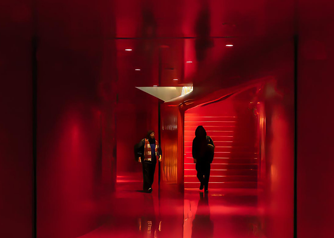
I really the leading lines, leading the eye to the figure in red in the bottom center. The image looks noisy and low contrast -- is that intentional? Also I would remove the tire tracks bottom right. |
Jan 5th |
| 30 |
Jan 26 |
Comment |
I think this is a well-composed image with lots of detail to enjoy. I like the repeating elements. I like the monochrome, contrasty look. Reminds me of Tri-X film. I have been taught that our eyes tend to go to the brightest area in the image first, and from left to right. So my eye went first to the door top left, then the stovepipe on the right, and then down the fire escape to the containers at the bottom. Not a perfect triangle but I think it works fine here. I would remove the bright bit of stovepipipe on the left edge. The stovepipe on the right edge is not quite straight and a little cut off at the bottom. Was that intentional? Just some minor nitpicks. I really like this one, Jody! |
Jan 5th |
| 30 |
Jan 26 |
Comment |
Nice idea, would explore more. More contrast would be nice. Also, there are a lot of dust specks on the vase which are distracting to my eye. |
Jan 5th |
| 30 |
Jan 26 |
Comment |
Fill light was the right choice to brighten up the model against the beautiful background light. However the harsh light from the pop-up flash doesn't work for me. |
Jan 5th |
| 30 |
Jan 26 |
Comment |
I like the moody feel of the image. The bright reflection at the bottom of the image, and the vertical lines that are not quite straight detract for me. I did a little crop and straightening using the distort tool in PS. |
Jan 5th |
 |
| 30 |
Jan 26 |
Comment |
Nice candid group portrait! The lighting, focus, and color are all good. I'd crop a little off the top of the frame. |
Jan 5th |
7 comments - 1 reply for Group 30
|
| 85 |
Jan 26 |
Reply |
Thank you Richard! |
Jan 18th |
| 85 |
Jan 26 |
Reply |
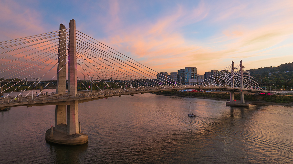
Thank you Pete! As discussed above, there are distractions to the left of the frame as cropped, and also buildings to the right of the frame. So the angles are limited. That said, I'll be trying this again at some point. |
Jan 18th |
| 85 |
Jan 26 |
Reply |
I can match the sky on the first image with a little more work. I could spend another hour trying to remove the distractions at the left edge, but it's just not worth the effort. :-) I think the first crop was a better solution. |
Jan 15th |
| 85 |
Jan 26 |
Reply |
The image looks noise-free and has great color. Congrats on the new drone! |
Jan 14th |
| 85 |
Jan 26 |
Reply |
The reflection and the color are very nice. It's a subtle image, not flashy or overly dramatic, which I think is just fine. |
Jan 14th |
| 85 |
Jan 26 |
Reply |
Thank you Alex! I brightened up the bottom of the image a bit, which is why the shadow of the bridge is not so noticeable. |
Jan 14th |
| 85 |
Jan 26 |
Reply |
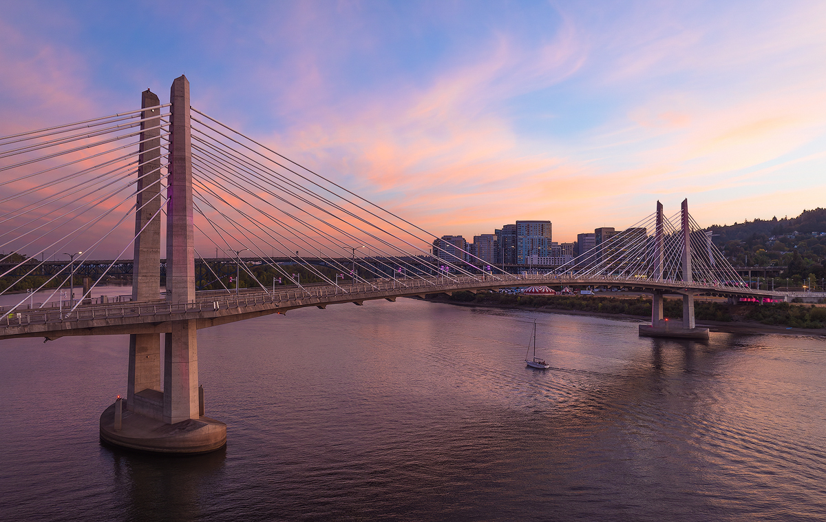
Thank you Drema! DxO PureRaw does a great job with lens correction, noise reduction, and sharpening. So I use it on all my edits now.
I went back to the source file and tried the different crop as you suggested. The reason for the initial crop was to take out some distracting stuff behind the bridge on the left edge. I cropped it a little, and tried to remove the left over bits, but without success. Here is the result: |
Jan 14th |
 |
| 85 |
Jan 26 |
Reply |
Thank you Lou! |
Jan 14th |
| 85 |
Jan 26 |
Comment |
Fascinating subject, worthy of more exploration if you are able! On this image, I'd be inclined to increase contrast and brightness a little, and crop a little off the top. Remove the remnant of the leftover power pole at the top. |
Jan 5th |
| 85 |
Jan 26 |
Comment |
Nice fall sunrise. Nice processing and reflection on the water. As a lifelong west coaster I always think there is no open space east of the Mississippi, LOL! Glad to see there is in fact beautiful open space close to NYC.
I wish there was something on the water or the water's edge to draw in the viewer, such as a boat, or a cabin. |
Jan 5th |
| 85 |
Jan 26 |
Comment |
Very nice documentary style image, Lou! I think your edits are well done, except for your attempt to remove the building on the left edge. The result does not look convincing to me. Repeating cloned footsteps in the snow, a brightened shadow of an absent building, and the lots of noise in the shadow itself. I do like how you cropped our most of the big building at the bottom left. Maybe, since it's a documentary type image, just leave the buildings in and maybe brighten them up a little so they don't look so dark. But be careful to match the shadow on the big ship. |
Jan 5th |
| 85 |
Jan 26 |
Comment |
The color of the buildings against that beautiful light in the sky, contrasted against the near monochrome of the hill itself, and the train at the bottom, certainly says something, but what?
A much closer view of the church that great lighting would be so nice to see! |
Jan 5th |
| 85 |
Jan 26 |
Comment |
Very nice abstract, Pete!
For me, it's always a struggle to create a compelling comp with these type of images.
I would be tempted to brighten this image up a little and use a little more contrast, to bring out all the crazy shapes and colors of this location. |
Jan 5th |
| 85 |
Jan 26 |
Comment |
The lush summer greens and the puffy clouds against the blue sky are welcome this time of year!
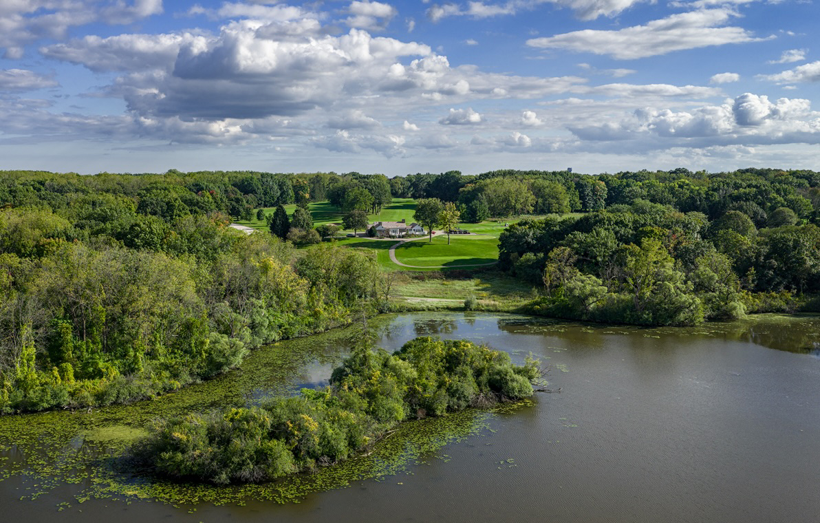
My only suggestion it move the island in the foreground off dead center. So I did a quick edit and cropped your image a little bit.
Also, the water in the foreground is mostly muddy brown, not very exciting, which reminds me of the Tualatin River close to where we live. It can look more blue if you are shooting down at a more acute angle. |
Jan 5th |
 |
| 85 |
Jan 26 |
Comment |
I like the idea and thought about doing something similar in our neighborhood too! Maybe next year.
I like the bright Christmas lights, street lights, and headlights against the darkened houses. I think the saturated colors work great here. The image looks very noise-free. Did you have to do noise reduction in post?
I think if the overall comp had more of a diagonal, or if the POV was shifted a bit to the right, it would be stronger. |
Jan 5th |
7 comments - 8 replies for Group 85
|
14 comments - 9 replies Total
|