|
| Group |
Round |
C/R |
Comment |
Date |
Image |
| 30 |
Nov 25 |
Reply |
Let me second that comment from Jody! |
Nov 24th |
| 30 |
Nov 25 |
Reply |
Thanks Leonid! |
Nov 20th |
| 30 |
Nov 25 |
Comment |
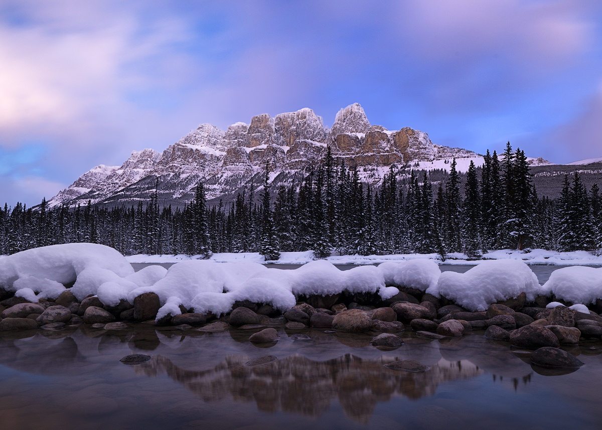
It's a nice rural landscape. I like the reflection that you caught in the stream, and the curve toward the viewer of the stream and plowed land. The sky looks too bright to me compared with the foreground, and the whites look blown out. I'd suggest using a mask in ACR or LR to work on the sky. Also I agree with Dorinda that using a radial gradient to create a vignette might help here. |
Nov 11th |
| 30 |
Nov 25 |
Comment |
I'll chime in and say that I also really like how you edited this image, Jody! Beautiful light and reflections. My only suggestion is that the bright areas on the far left take my eye away from the main focal point in the right 1/3 of the frame. I tried a little crop on your image. What do you think? |
Nov 11th |
 |
| 30 |
Nov 25 |
Comment |
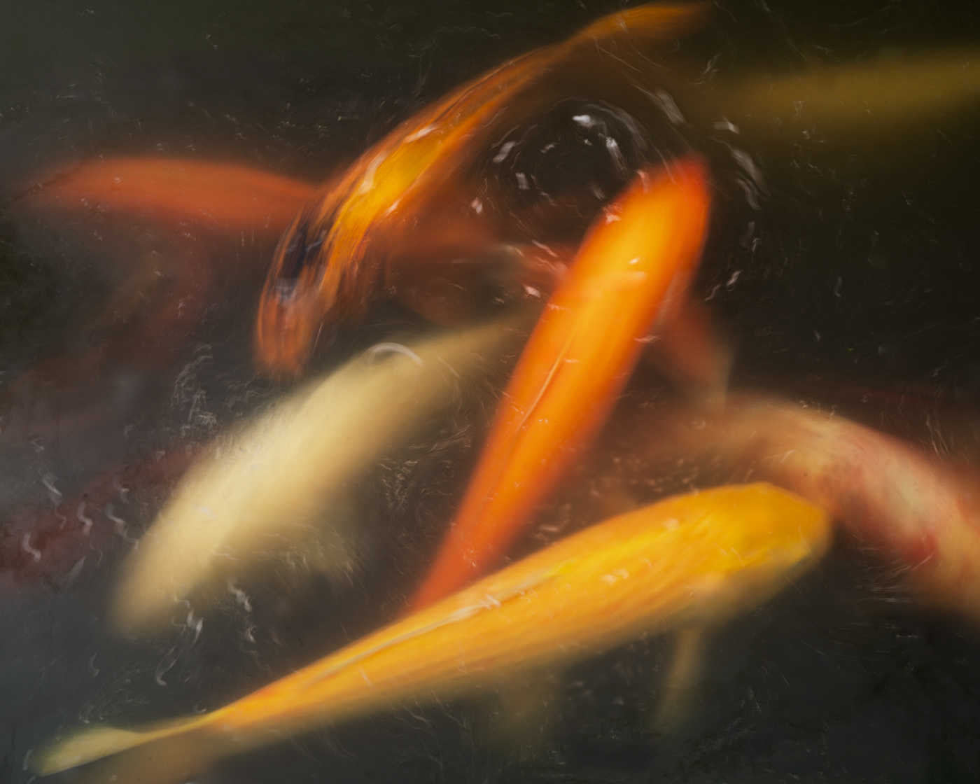
Interesting capture, almost like an abstract. Nicely composed. |
Nov 11th |
| 30 |
Nov 25 |
Comment |
Mark, you captured a nice portrait of a bighorn ram, but I agree that the juniper bushes are distracting. I'd also maybe crop off a little bit on the right side of the frame. |
Nov 11th |
| 30 |
Nov 25 |
Comment |
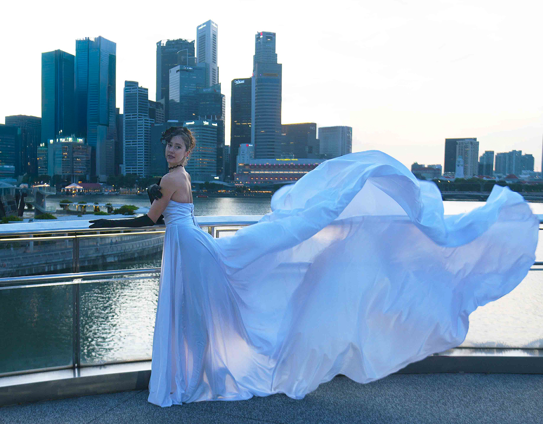
Walter, this is one of those images where I ask, "what is the subject?" If it is a portrait of a beautiful young woman, then why is the frame dominated by the large building on the left? To my eye, the building (and the railing) just don't add any appeal. I really like her pose of the model, with the flowing dress behind her, and the outline of her legs showing through the dress. But her face, upper body and arms are too dark. In this case, I think fill flash would probably destroy the beautiful see-through effect of the dress.
I downloaded your image and did a quick edit in Adobe Camera Raw. I cropped out the left half of the frame, used the remove tool to take out the remnant of the large building, and used a mask to brighten up the face, torso and arms of the model. I'd consider converting this to monochrome as well. |
Nov 11th |
 |
| 30 |
Nov 25 |
Comment |
I love the humor in this image, Dorinda! Typical weather here in the Pacific Northwest. I agree that the gray structures in the background are a little distracting. I prefer the color version by a country mile. |
Nov 11th |
| 30 |
Nov 25 |
Reply |
Walter, thanks for your input. I plan to explore using the Adamski effect further with other images. |
Nov 11th |
| 30 |
Nov 25 |
Reply |
Thanks Judy! If I was a bird photographer I would love living in Florida! :-) |
Nov 11th |
| 30 |
Nov 25 |
Reply |
Thanks Dorinda! |
Nov 11th |
6 comments - 5 replies for Group 30
|
| 85 |
Nov 25 |
Reply |
Thanks Richard! |
Nov 29th |
| 85 |
Nov 25 |
Comment |
Hi Drema, I think the lighthouse and coastline are a great subject and scene and probably worth it to go back sometime when the light is better. I like the colors, but overall the edit looks a little flat and low contrast to my eye. I would be tempted to crop a little off the left side. I'd also want to get closer to the lighthouse. (Now that you have the Mavic 4, you have two longer focal length lens to work with!) |
Nov 24th |
| 85 |
Nov 25 |
Comment |
Hi Alex, sorry that you lost your drone! I crashed my first drone into a tree about a month after I purchased it. Fortunately I had DJI Care at the time. I was able to fish the drone out of the water, retrieve the memory card, and replace it for nominal cost.
Kauai is so beautiful and colorful that I don't think it needs that much color saturation! I'd love to see this scene with drone lower to the ground pointing more level, with something interesting in the foreground. A beautiful girl or handsome couple walking on the beach, or a pier, or even a turtle. |
Nov 24th |
| 85 |
Nov 25 |
Comment |
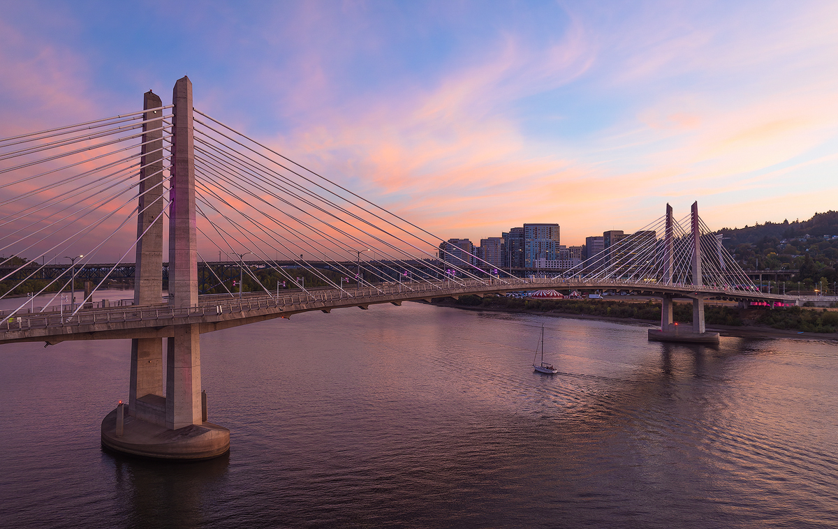
Hi Mike, I think this is an interesting and well-composed documentary style image of a bridge under construction. It's well exposed and there is lots of detail to appreciate. The diagonals in the road/bridge and the cranes are visually appealing, as is the sky. I'd lose the two trucks in the bottom of the frame, as others have pointed out. |
Nov 24th |
| 85 |
Nov 25 |
Comment |
Hi Richard, I like your idea to check on the harvest date and plan accordingly! The harvester with all of the dust makes for an interesting focal point in your composition. I like your sky replacement. I agree with Pete the harvester in the center of the frame makes the image "static" and not as interesting. I wish the lines in the field were more diagonal, going from top L to bottom R. I think a lower POV, more to the right of the harvester, and closer to the harvester would be more dynamic and visually appealing. |
Nov 24th |
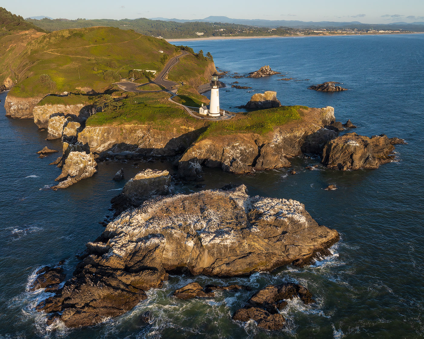
| 85 |
Nov 25 |
Comment |
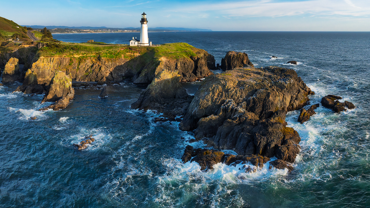
Hi Lou, this is a great subject and I think you did it justice! I like your comp and crop. The subtle color on the horizon balances nicely with the trees and lighthouse. Overall, I think you did a good job adjusting the tonality from your starting point. To my eye, the trees and lighthouse look a little unnaturally bright compared with the rest of the frame. The shoreline and trees look a bit "crunchy." Also, I agree with Drema about the bright spot in the water on the far right hand side of the frame. Just some minor adjustments and you have a wall hanger for sure! |
Nov 24th |
| 85 |
Nov 25 |
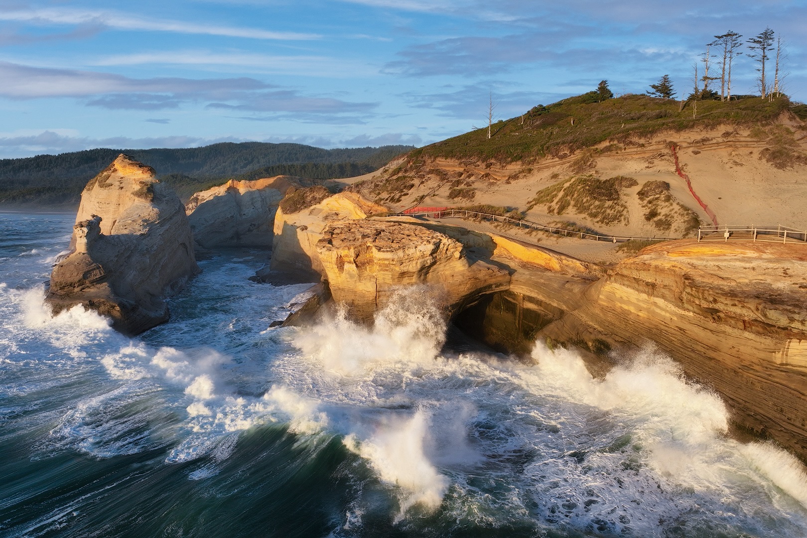
Comment |
Hi Pete, this spot is on my bucket list, so thank you for the tips on getting there. It's an iconic spot for sure. I think the monochrome treatment works given the conditions you cited. I wonder what a sepia toning would look like? I like the textures and shapes and the dramatic light. I agree with Drema that the shadow from the main spire does tend to overpower the rest of the frame. The sky doesn't do much for me. I think it is too dark and probably would crop it a little as well.
I wonder what this scene would look like if your drone was much lower on the horizon, and closer in to the spires, so that they become the dominant feature in the image? |
Nov 24th |
| 85 |
Nov 25 |
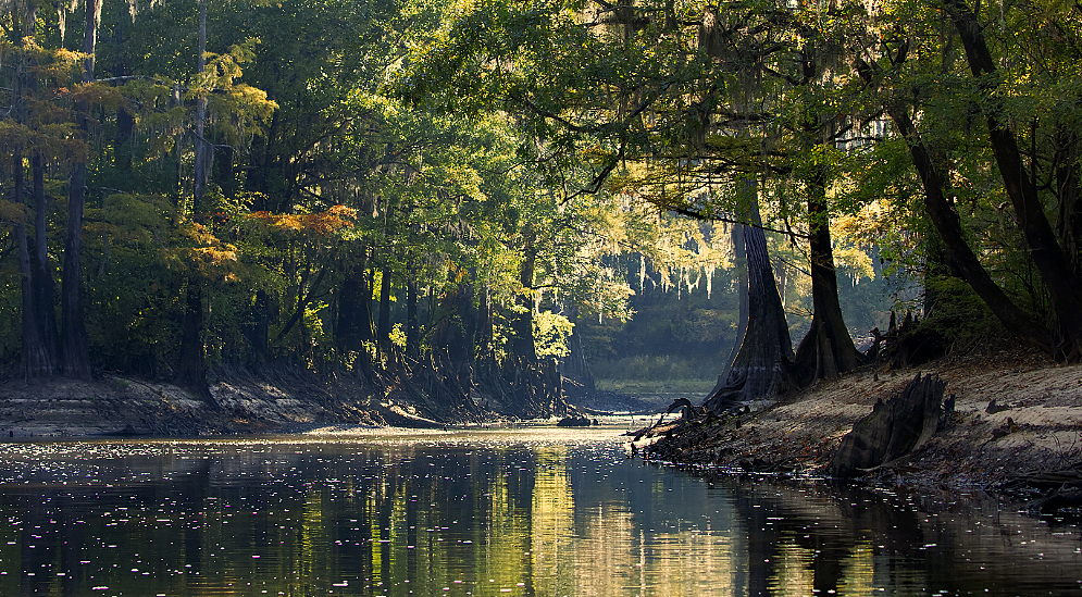
Comment |
Hi Lisa, I like the colors and textures in the trees and clouds, and the complementary colors. However, the overall composition just feels haphazard to me. What is the primary subject?
|
Nov 24th |
| 85 |
Nov 25 |
Reply |
Thanks Mike! |
Nov 13th |
| 85 |
Nov 25 |
Reply |
Thanks Drema for your comments. After I posted this, I thought the foliage looked too yellow. So I'll work on that. ACR and TK Panels both have tools for adjusting the hues and saturation. Thanks for the tip about using the variance slider! |
Nov 11th |
| 85 |
Nov 25 |
Reply |
Thanks Pete for your nice comments. The bridge is not flat, so I did not alter it. |
Nov 11th |
7 comments - 4 replies for Group 85
|
13 comments - 9 replies Total
|