|
| Group |
Round |
C/R |
Comment |
Date |
Image |
| 30 |
Oct 25 |
Comment |
It's nice pastoral scene, with some interesting patterns in the water. I think the color saturation is too high. I think the contrast is too high, with the result that the sky is blown out and the bottom of the image is too dark to see any detail. Not having the unprocessed image to compare, I don't know much latitude you have, but if it were me I would definitely re-edit for a less color saturated, less contrasty look than what I see here. I think that would better convey the peaceful nature of this scene. |
Oct 11th |
| 30 |
Oct 25 |
Comment |
Jody, this would be a fantastic image if only it was sharp. |
Oct 11th |
| 30 |
Oct 25 |
Comment |
Beautiful portrait of a beautiful lady! I'll also chime in that the crop is a little tight. I like how Dorinda lightened up her face and darkened the background. Also, there are some hot spots above her left eyebrow, on the tip of her nose, and her lip (from a fill flash?) that could be toned down. The lock of hair over her forehead and the stray hairs distract me, and I really want to hit them with the remove tool. (It's a fashion portrait, so everything has to be perfect, right?) In your edited version, there are weird patterns in the background that look like artifact. |
Oct 11th |
| 30 |
Oct 25 |
Comment |
Nice one, Mark! I'm no expert on studio lighting but the lighting looks fine to me. The skin tones look good, although the model's torso looks a little too saturated c/w her face. I also think a Halloween-themed background, or maybe just a very dark background, would enhance this very nice portrait. Background replacement has gotten a lot better and easier with LR and PS. |
Oct 11th |
| 30 |
Oct 25 |
Comment |
Walter, I really like this one. The expression and pose of the dancer are very graceful, in focus, and nicely lit. The reddish brown tones are very pleasing. The background is understated and shows off the main subject. Some minor nitpicks: I can only see one foot of the dancer, her right foot. Where is the other one? Also, the foreground beneath the dancer looks very blurred or out of focus. Was this intentional? Why? |
Oct 11th |
| 30 |
Oct 25 |
Comment |
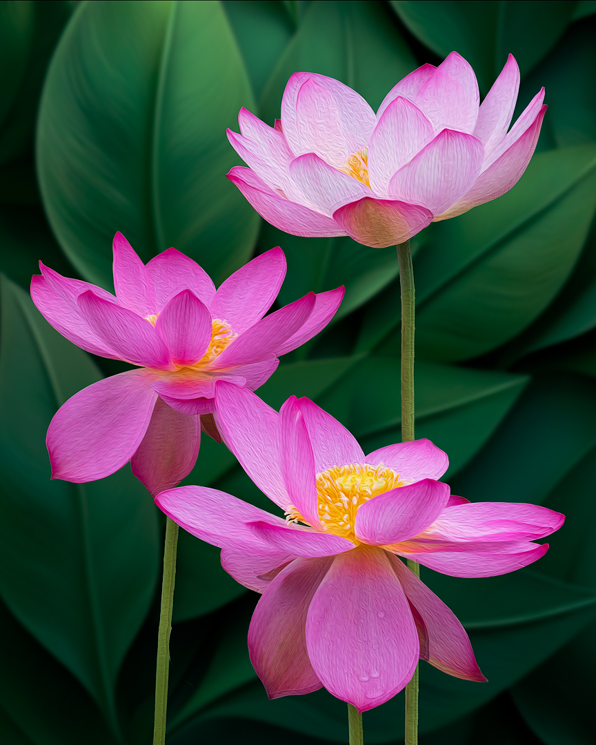
Very nice image, and the oil paint filter works for me. I also like the different background you chose. There is an area to the right of the flowers that could be brightened up a bit. |
Oct 11th |
| 30 |
Oct 25 |
Comment |
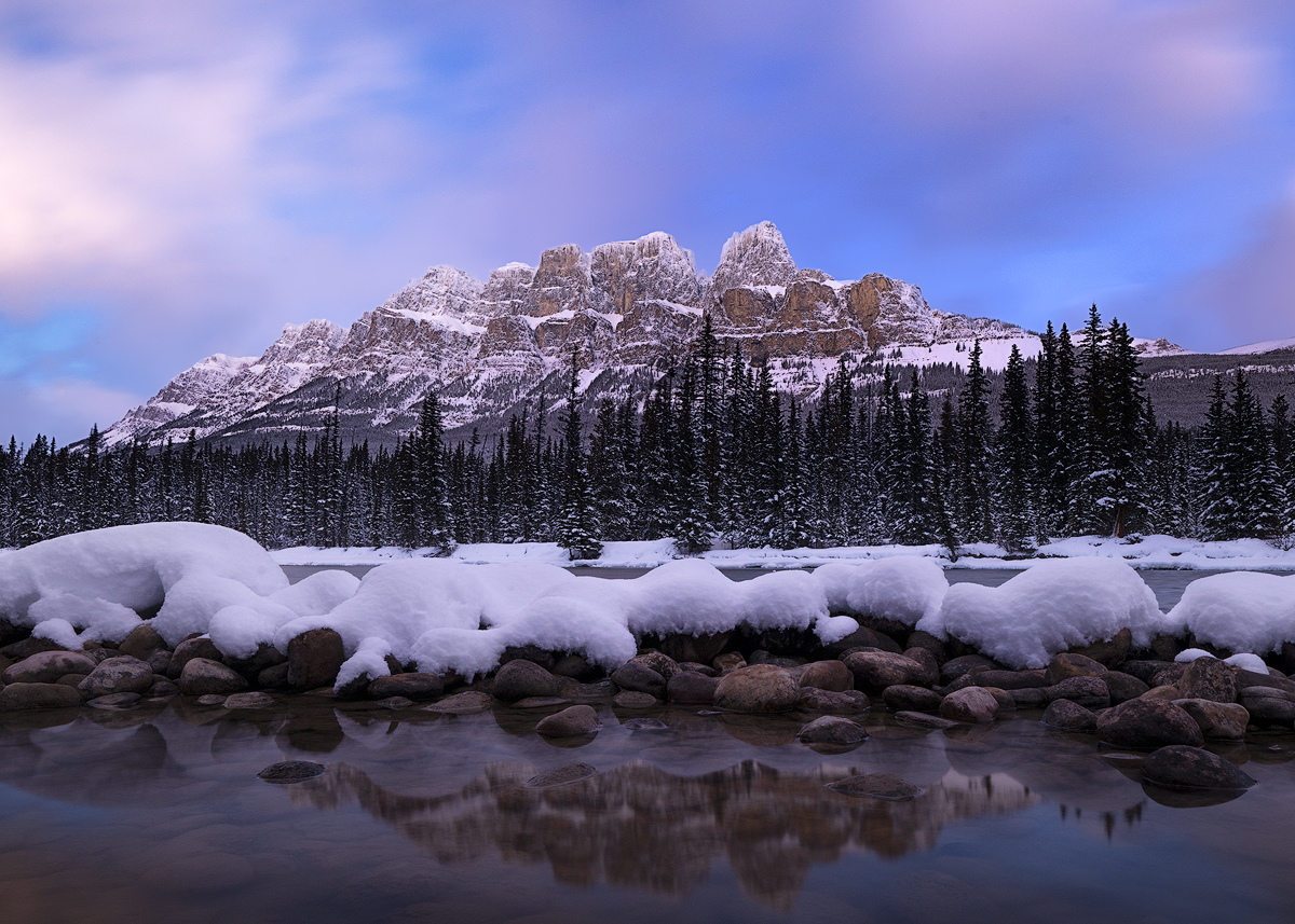
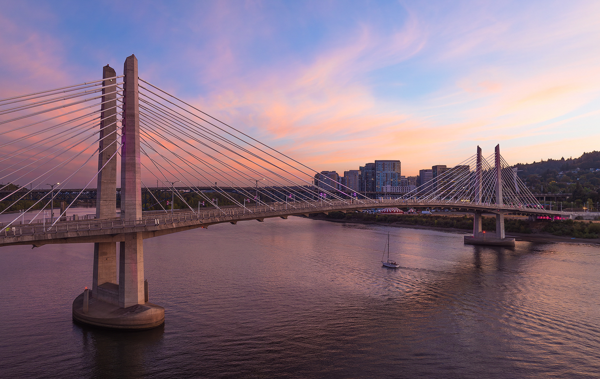
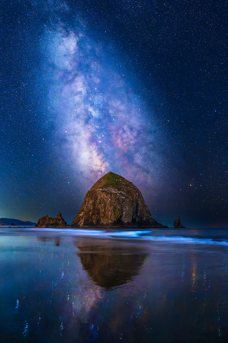
Thanks everyone for your comments. Yes, Cannon Beach was featured in The Goonies. LOL! I think the horizon is straight. I checked it with the grid view in PS before posting. I went back to the original file and re-processed the file with a different crop, 2:3, showing more of the sky, and some other tweaks. I had to crop some to keep the peak of Haystack Rock in the center of the frame. |
Oct 11th |
 |
7 comments - 0 replies for Group 30
|
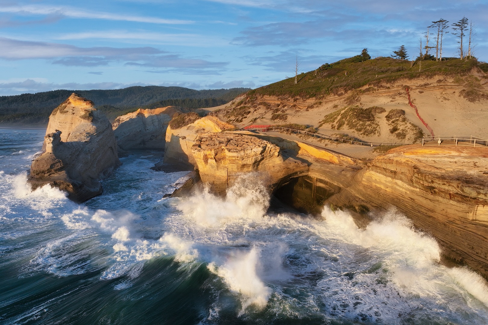
| 85 |
Oct 25 |
Reply |
Thanks Lou! This was my first attempt to shoot beautiful Cape Kiwanda. I'll keep that in mind in the future. |
Oct 31st |
| 85 |
Oct 25 |
Reply |
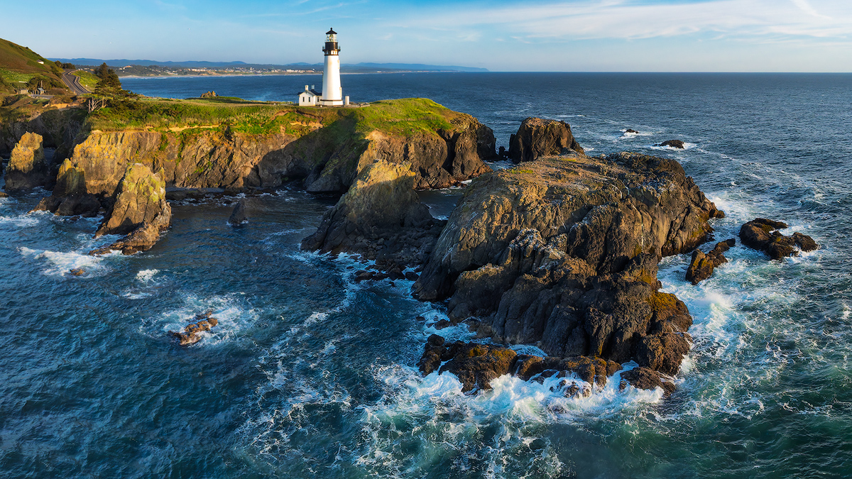
Too bad you weren't able to visit our gorgeous coast when you were in town, Lisa. This Haystack Rock is about one mile offshore, and larger than the one in Cannon Beach. It looks much closer in this image than it does from the beach. No straight down shots from this day, unfortunately.
The offshore rocks on the Oregon coast are all shorebird wildlife refuges, and it is illegal to harass the birds. So flying over the Haystack Rock in Cannon Beach, which has bird nests all over it, is a problem.
I plan to do more drone photography on the coast, as time and weather conditions permit!
|
Oct 31st |
| 85 |
Oct 25 |
Reply |
I'm more afraid of too much wind! The Mavic 3 is good up to about 25 mph. Please don't tell the FAA, but I can't see the drone when it is this far away from my launch point on the top of the cape in the background. |
Oct 31st |
| 85 |
Oct 25 |
Reply |
I sent you an email about my failed attempt to purchase Mavic 4 drone. |
Oct 26th |
| 85 |
Oct 25 |
Reply |
Thanks for the explanation, Drema! |
Oct 26th |
| 85 |
Oct 25 |
Reply |
Thanks for the further comments, Drema! What is a reflected gradient? |
Oct 12th |
| 85 |
Oct 25 |
Comment |
Drema, this is a gorgeous image, with great color and detail. The composition is pleasing and balanced to my eye. The tonality looks fine, not contrasty, which I think fits the scene and time of day. You make the Milwaukie waterfront look very beautiful!
Some of the highlights in the image look very saturated, and I wonder if you adjusted those individually. I think the effect is OK, but especially with the green patch in the bottom left corner, maybe you could selectively decrease the yellow/green saturation a little, and see if that makes it less prominent.
Now I really want a Mavic 4 Pro! |
Oct 11th |
| 85 |
Oct 25 |
Reply |
Drema, respectfully, I agree with some of your suggestions but not all. I did not want the bright background sky to compete with the sandstone cliffs. So I did a quick edit with a brush and decreased the exposure in the top of the image. I probably could refine that a little, and maybe brighten up the top of the sandstone hill a little, but I don't want the sky to be as bright as the cliffs.
When I did the initial processing, I was most concerned about blowing out the highlights (especially in the waves), and lightening up the shadows, but I think I ended up with overall contrast a little low.
I did a global WB adjust to the cooler (bluer side), and increased the magenta slightly. I agree that resulted in some pinkish tones in the tops of the cliffs. I can fix that!
Yes the image is tilted. Grrr.
Thanks for the feedback, and I'll work on this some more. |
Oct 11th |
| 85 |
Oct 25 |
Reply |
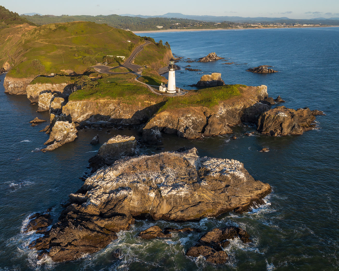
Hi Richard, I agree that my POV could have been a little lower, so that the trees don't blend with hills in the background. Next time! |
Oct 11th |
| 85 |
Oct 25 |
Comment |
Mike, this is a nice overall depiction of this picturesque location. I think the angle and the lighting are fine. I think you could make this image more appealing by incorporating some or all of Drema's suggestions. Brighten up the center, maybe increase the overall contrast, increase the color saturation (green - yellow), and darken the edges. Then it could be in the brochure for the location! |
Oct 11th |
| 85 |
Oct 25 |
Comment |
Some images are just meant to be documentary, and this is one of them. As intended it is fine. I think Drema's edit did improve your edit a bit more.
I was curious about the columns on the main building in the background. Are they that crooked, or is that lens distortion? (I think barrel distortion in this case, but I always get them mixed up.) I ask because with my Mavic 3, there is significant lens distortion. It doesn't seem that bad until I run the file through lens correction in ACR or DxO PureRaw. |
Oct 11th |
| 85 |
Oct 25 |
Comment |
Nice overall view of this huge abandoned grain elevator, with good exposure and color. I concur with Richard's additional perspective correction. I think this building has some great potential for excellent details shots (including the back side), and video, if you have time and interest. |
Oct 11th |
| 85 |
Oct 25 |
Comment |
Hi Richard, what I really like about this image is the contrast between the Country club building and the Manhattan skyscrapers in the background. What I don't like is the right half of the image, with the huge flag and the ship and industrial stuff behind it. I so want to see what it would look like if you viewpoint was a little to the right, angled more towards Manhattan. No flag and industrial stuff, just the clubhouse and the skyscrapers behind it. If that is not feasible, you could try lightening and blurring the stuff behind the flag, to make it a little less prominent. |
Oct 11th |
| 85 |
Oct 25 |
Comment |
Beautiful image, Pete! This one jumped out from the page! The detail and color in the land and sky are gorgeous. I wish the blue tones in the sky were a little less cyan and more towards blue, but that is personal preference. I also agree that cropping on the left a bit would put more attention on the main subject.
I'd love to see the unprocessed image to see what you started from, especially as you mentioned that you did a lot of dodging and burning. But the end result looks fine to me! |
Oct 10th |
7 comments - 8 replies for Group 85
|
14 comments - 8 replies Total
|