|
| Group |
Round |
C/R |
Comment |
Date |
Image |
| 30 |
Sep 25 |
Comment |
Nice candid capture of a lovely young Irish woman. The woman is in sharp focus and the background is nicely blurred. I like how Dorinda de-emphasized or removed some of the bright areas in the background. I'd like to see more of her torso and her entire left hand. I am also wondering what she is holding onto with her right hand. |
Sep 17th |
| 30 |
Sep 25 |
Comment |
Your version is certainly colorful, and a lot more interesting and creative than the image you started from! |
Sep 17th |
| 30 |
Sep 25 |
Comment |
Nice capture of an alligator in the wild. I hope you were in a boat and not on land with giant carnivorous reptiles all around you. Dorinda already addressed the issues I had with your image. |
Sep 17th |
| 30 |
Sep 25 |
Comment |
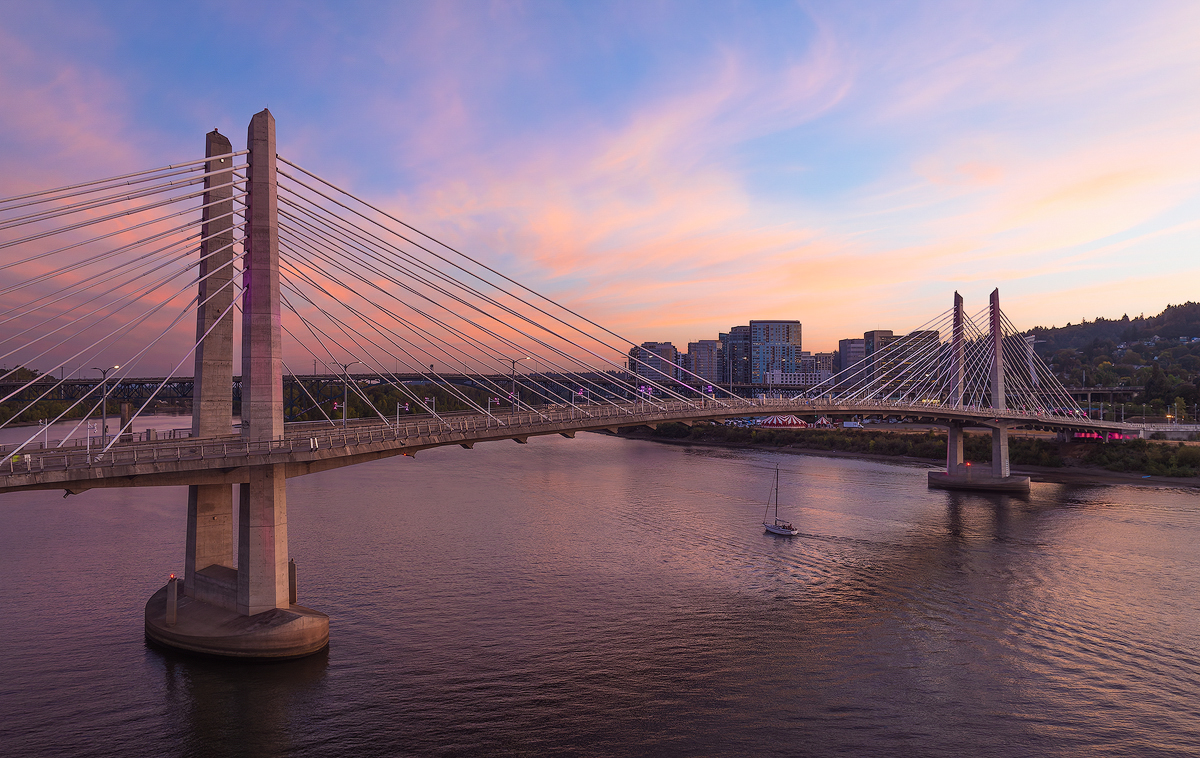
Fascinating subject matter, something I'd love to experience in person. As others have pointed out, there are a few issues. The original image is noisy. It also is not sharp and appears to have some motion blur. Both of those issues might be improved using Topaz Photo AI. The blue lights on the left edge, and the two figures with white shirts at the bottom of the image are distracting. Also, there is a light colored tent on the bottom rightthat is cut off and also distracts my eye. If this were my image I'd try the remove tool in PS on all of these. If that doesn't work, maybe crop a little off the bottom of the image. |
Sep 17th |
| 30 |
Sep 25 |
Comment |
Nice image, very colorful, and tells a story. I'd like to see a little bit of the burner in the frame. |
Sep 17th |
| 30 |
Sep 25 |
Comment |
Phu, you picked a fine subject for your portrait! I like the chiaoscuro look you were going for. However, key lights coming from both directions equally doesn't work for me. The center of his face and especially his eyes are too dark. If you have the opportunity, trying a key light coming from one direction, with maybe a second, less bright light to the other side of his face might be more pleasing. Also, the glasses hanging around his neck are distracting to my eye.
Of the other commenters efforts to edit your original image, I like Leonid's the best, although I agree with you that it appears the clarity or sharpness was overdone. |
Sep 17th |
| 30 |
Sep 25 |
Comment |
Dorinda, Mark, and Phu, thank you all for your comments. I think the consensus is that the background looks unnatural. I will go back to the files from that day and see what I can do to come up with a better background. |
Sep 17th |
7 comments - 0 replies for Group 30
|
| 85 |
Sep 25 |
Comment |
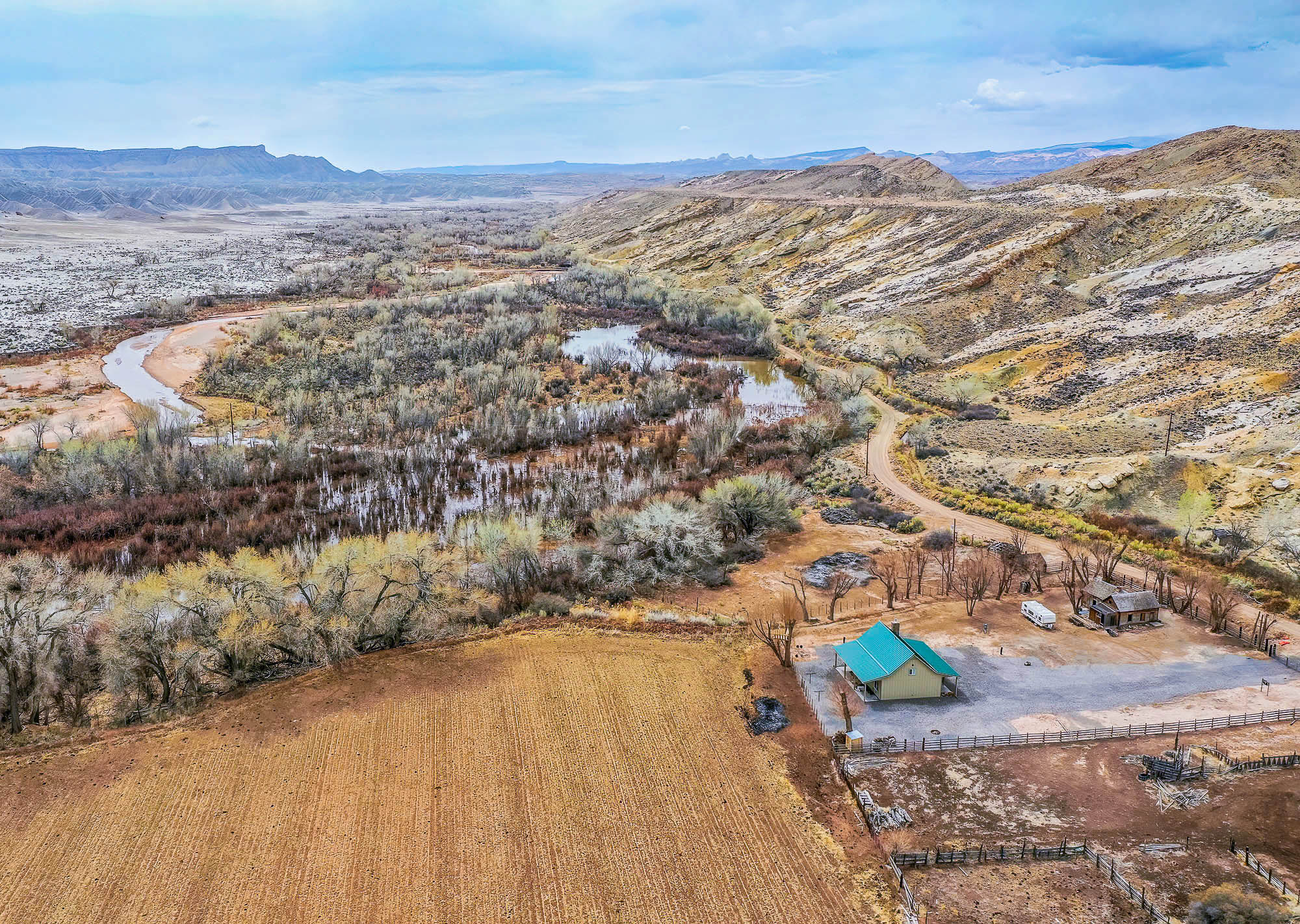
Hi Lou, a farm in the middle of badlands is an interesting subject, to be sure. However, the flooded river, the butte in the original, the farmhouse, and the bare field all compete for the viewer's attention. What is the main subject?
The overall image looks very muted, low contrast, and unnaturally warm to my eye. I took the liberty of downloading your edited image, increased the contrast, decreased the WB and increased the tint a little, and added some saturation and vibrance. It did bring out the farmhouse a little more, and maybe draw in the viewer's eye a little more. |
Sep 18th |
 |
| 85 |
Sep 25 |
Comment |
Hi Alex, I am in agreement with Pete that your image lacks a center of interest. A lot of nice elements that just don't fit together that well. It also looks a little underexposed and low contrast. |
Sep 18th |
| 85 |
Sep 25 |
Comment |
Hi Mike, this is a nice aerial viewpoint of your subject. I don't think it is cropped too tight. Overall, it looks a little underexposed and low contrast to me, and might benefit from some adjustment. |
Sep 18th |
| 85 |
Sep 25 |
Comment |
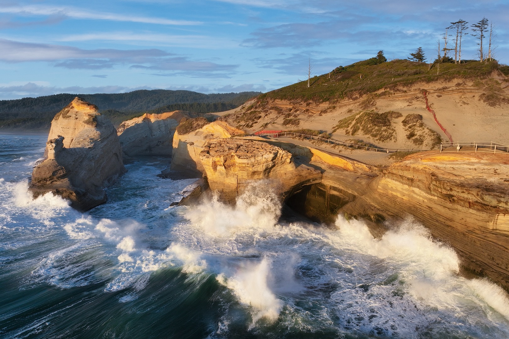
Hi Richard, I think this is a nice abstract image. The diagonal of the stream breaks up the surrounding hills. The color and contrast look good to my eye. I wonder what this scene would look like if shot from lower to the ground, and not looking top down? |
Sep 18th |
| 85 |
Sep 25 |
Comment |
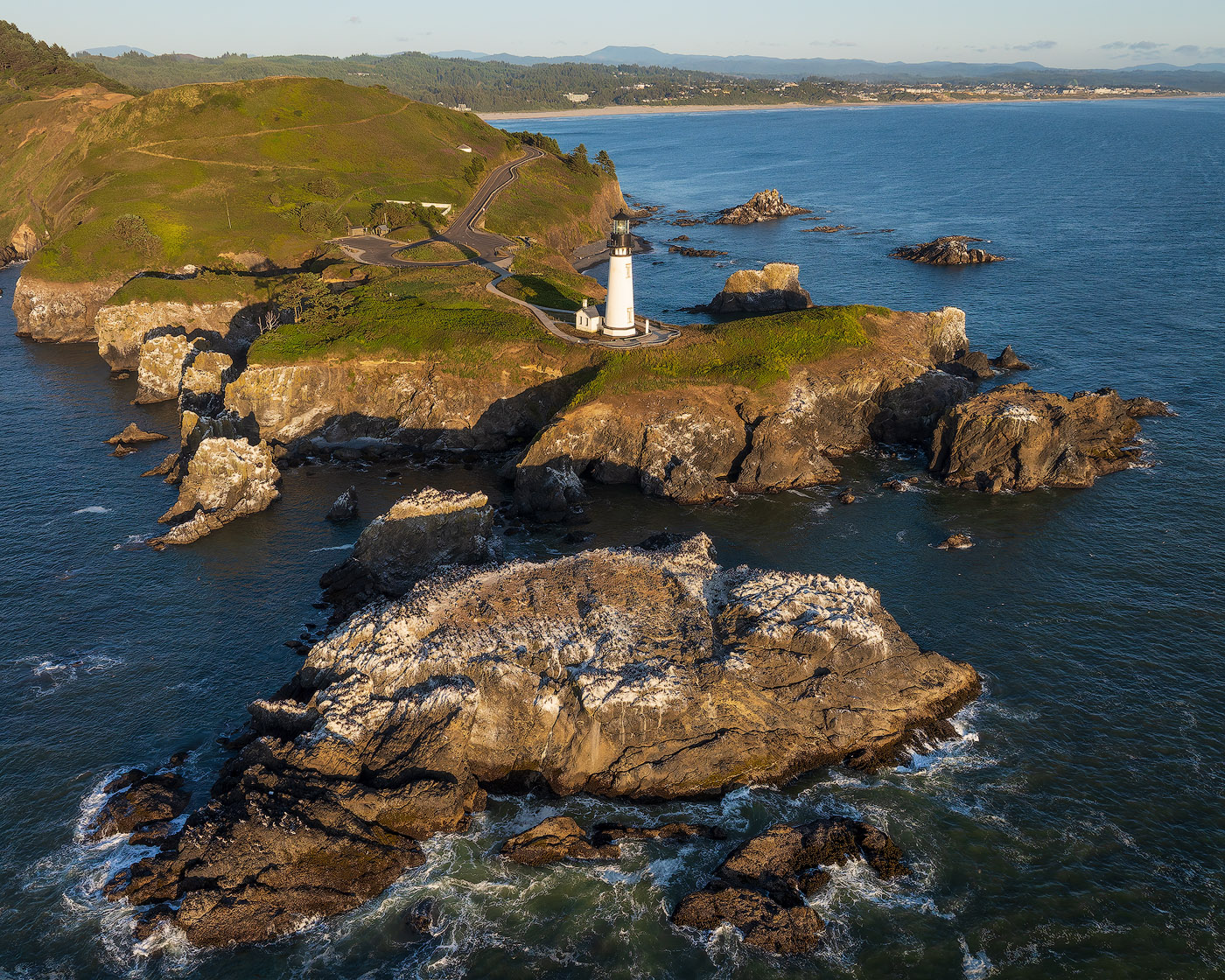
Hi Pete, this area seems like it was designed for drone photography! It's a nice abstract, but my eye tends to wander around the frame. I think it needs a stronger focal point. Your presence could be that, but if so, I think it would be a stronger image if you were top left in the frame and larger. |
Sep 18th |
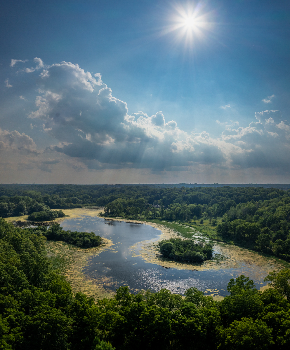
| 85 |
Sep 25 |
Comment |
Hi Drema, the sunstar, the god rays, and the clouds are really nice here. I wish the top of the sun star was not cut off. I tried a crop to make your image a little less square and places the sun at the right 1/3 line. The brown algal growth is not all that interesting to me, and I would be tempted to darken it or even try some color replacement. Also you could try brightening up dark areas at the very bottom of your image. |
Sep 18th |
 |
| 85 |
Sep 25 |
Comment |
Drema, thanks for your compliments and detailed critique! My main issue with the source file(s) was the blah sky, so I tried to add a more interesting and hopefully convincing sky. It appears that I succeeded. I'll try lightening/darkening areas and combining the waves differently as you suggested.
|
Sep 17th |
| 85 |
Sep 25 |
Reply |
Thanks for the suggestions and compliments, Pete. This is one time when I wished I had a drone with a longer focal length camera! I'm reluctant to crop too much with only a 20 MP sensor. I'll try removing the fence as well as you suggested. |
Sep 17th |
7 comments - 1 reply for Group 85
|
14 comments - 1 reply Total
|