|
| Group |
Round |
C/R |
Comment |
Date |
Image |
| 30 |
Jul 25 |
Reply |
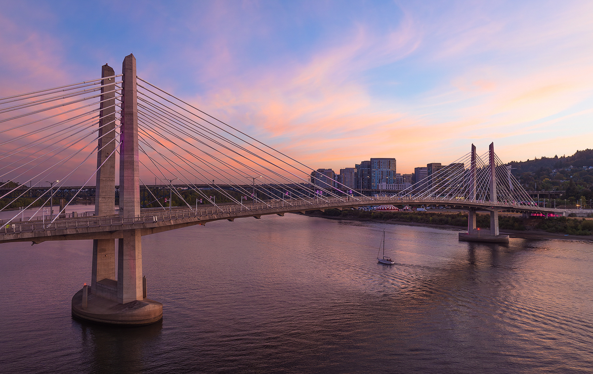
Thank you Jody. The lighthouse actually does light up, but I wasn't smart enough to capture that, so I had to add it later. Choice of color is so subjective! I prefer the blues in my submission, without so much aqua. Are you using a calibrated monitor? |
Jul 16th |
| 30 |
Jul 25 |
Reply |
Thank you Leonid. |
Jul 16th |
| 30 |
Jul 25 |
Reply |
Thank you Leonid. |
Jul 16th |
| 30 |
Jul 25 |
Reply |
Thank you Phu. I intentionally wanted to show the waves in the frame, thus the 1/3 for the sky. I avoid HDR unless absolutely necessary. |
Jul 16th |
| 30 |
Jul 25 |
Comment |
This is a picture I probably would have missed, so good for you, Leonid! The swans do help orient the viewer. In addition to agreeing with the above comments, I wish the vertical lines in the reflection were a little less curved on the edges. I think this could be improved using the distortion slider in the Optics tab in the LR Develop module. Also the horizontal lines in the reflection (only) are tilted a bit, which could be improved using the geometry section under the Crop tab in the LR Develop module. My left brain so wants these lines to be straight! :-) |
Jul 9th |
| 30 |
Jul 25 |
Comment |
Nicely done, Jody! The entire dragonfly is in focus. The complmentary colors and and the blurred background are nicely done. I like the vertical crop better too, but I also think you could crop some of the top and bottom to a 4 x 5 or even 1 x 1 aspect ratio. |
Jul 9th |
| 30 |
Jul 25 |
Comment |
Nicely seen and edited, Phu! I have nothing to add to the above, except I do think color works better for this image. |
Jul 9th |
| 30 |
Jul 25 |
Comment |
I was not familiar with the term "Dutch angle shot" so I looked it up. I found this article: https://www.studiobinder.com/blog/dutch-angle-shot-camera-movement/
In film, at least, it is often used to convey unease, tension, or disorientation. That does not seem to be the case in your image, but the camera tilt does add a little pizazz. I think it works, although the lines of the water and the background land are a bit far apart vertically for my taste. Also, I wish the bottom line of the water was a little farther up in the frame.
I think you could brighten up your model, the main subject, a bit. I don't know if you can do masks with PS Elements but that would make it easy, or just increase the shadows slider a bit. |
Jul 9th |
| 30 |
Jul 25 |
Comment |
Nice one, Walter! I like how you edited the photo, which transforms it into a very stark, minimalistic emphasis on the architectural details. |
Jul 9th |
| 30 |
Jul 25 |
Comment |
I like this image a lot. I'm always surprised at how much detail and color I can pull out of raw images--both in the light and dark areas. In this case, I think your "final" image would benefit from toning down the highlights and brightening up the darker areas. Jody's edit seems to have done some of that. The folds in the skirt, the cap, and the sweater have very nice texture and color, so my preference is for the color version. I like the olden times feel of the image a lot, but the eyeglasses and the photos on the windowsill definitely do not belong to that bygone era! |
Jul 9th |
| 30 |
Jul 25 |
Comment |
Thanks Mark, Dorinda, and Walter! |
Jul 8th |
7 comments - 4 replies for Group 30
|
| 85 |
Jul 25 |
Reply |
Thanks Drema, I like this version better as well. |
Jul 18th |
| 85 |
Jul 25 |
Comment |
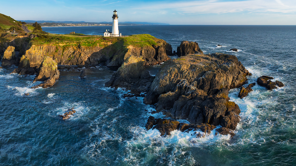
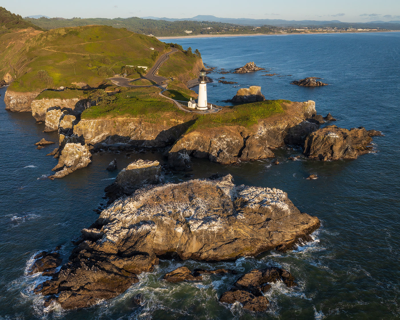
Hi Mike, I love lighthouses! I agree with Richard about shooting from a lower angle so that the top of the lighthouse is above the horizon.
Not being familiar with Florida, I had to look up Tarpon Springs. Looks like the sun sets over the ocean, just like on the West Coast. Rather than a sky replacement, I'd love to see you try this again when the sun is actually setting -- or very early in the day when the sun is just hitting the top of the lighthouse. Also, what would this look like if you are offshore shooting towards land?
I've never tried to launch or land my drone from a boat! Impressive! |
Jul 16th |
| 85 |
Jul 25 |
Reply |
Looks better Richard! |
Jul 16th |
| 85 |
Jul 25 |
Comment |
Per Drema's suggestion, I made the WB of the sky a little cooler. |
Jul 16th |
 |
| 85 |
Jul 25 |
Reply |
Thank you Richard! Looking forward to seeing more from you as well! |
Jul 16th |
| 85 |
Jul 25 |
Comment |
I agree with both of you. A vantage point a little higher so the trees aren't blocking the steps would be nice. Also, a 5 x 4 horizontal crop, taking out some of the sky, would put more emphasis on the primary subject. I know, it's a gorgeous sky, but is it the primary subject? |
Jul 10th |
| 85 |
Jul 25 |
Reply |
BTW, I am new to the PSA. I joined a local camera club this past year, and through them heard about the PSA convention in PDX this year, in conjunction with our regional 4Cs annual meeting. So I signed up and got the package deal. No travel or hotel expense is a big plus! |
Jul 10th |
| 85 |
Jul 25 |
Comment |
Thanks Drema for the critique and suggestion! I'll give that a try.
The entire West Coast has so many beautiful locations. I have lived within 2 hrs drive from the coast in OR and CA my entire life and know it pretty well, but am always finding new places. My wife tolerates my short solo trips to the coast but an extended trip would require delicate negotiation i.e. a major bribe! |
Jul 10th |
| 85 |
Jul 25 |
Comment |
Nice one, Richard! The structures are certainly visually interesting and appealing. I like the diagonal framing, and the complementary color scheme. The edges of the clouds look a little bit unnatural to me. Did you go a little heavy on the dehaze? :-)
BTW, there is a similar place in Bend, Oregon. It is called the Old Mill district, and is now an upscale outdoor shopping mall.
I look forward to seeing your images taken from the other side of this structure! |
Jul 9th |
| 85 |
Jul 25 |
Comment |
Hi Peter, I have to agree with Drema. The interesting part of this image is the boat, but it is very small. The contrasting colors look nice against the green background. |
Jul 9th |
| 85 |
Jul 25 |
Comment |
Hi Alex, I used to live in Redding, so I'm very familiar with Mt. Shasta. It is a gorgeous, 14K ft. mountain and it dominates the skyline in the North State. This is a nice image! I agree with Drema on a cropping out most of the sky. Maybe a 2:1 aspect ratio. I also agree with Drema on brightening up the darks, especially in the trees. The entire image looks bit underexposed to me. Also, the white balance looks a bit to cool to me. |
Jul 9th |
| 85 |
Jul 25 |
Comment |
Hi Lou, I recognize that butte! I have been very close to this spot on a photography workshop a couple of years ago. Like you and Richard I also found farming in such an arid area to be a surprise. Is that the story you are trying to tell here?
I would also be tempted to make the sky look a little less stormy. |
Jul 9th |
| 85 |
Jul 25 |
Comment |
It's a lovely building and you captured it in beautiful light! I love the complementary color palette and colorful sky. The centered composition works well for me. The bare trees make the lower part of the structure more visible, which would not be the case if you shot this during the middle of summer. |
Jul 8th |
| 85 |
Jul 25 |
Reply |
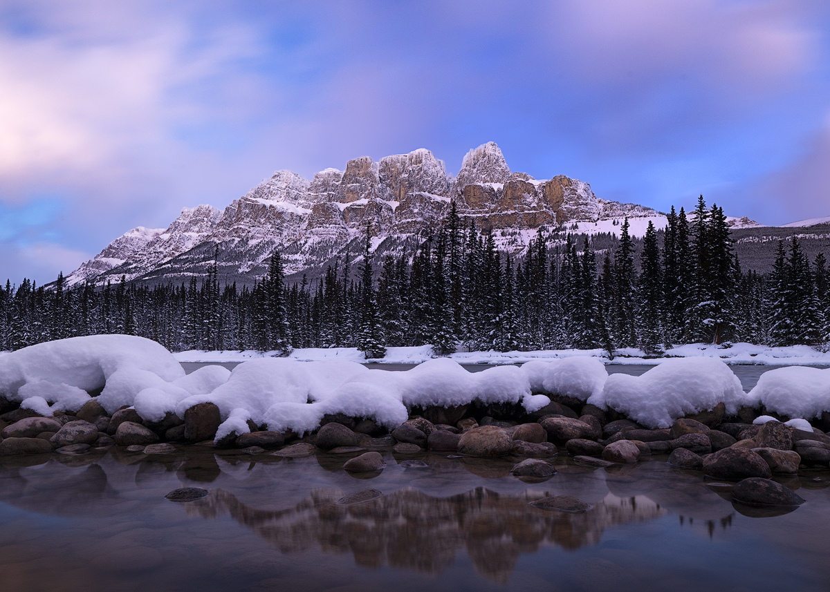
Thanks for the compliments and for the detailed critique, Drema! There are many lighthouses on the West Coast, and they are one of my favorite subjects as well. A similar shot I posted in Group 30 was felt to have too little sky. So I went back to the files and found this one. I think this one is about right. More than this, and I think the sky would overbalance the rest of the frame. Also, the sky was pretty bland on this particular evening, and I had to use some dehaze and other adjustments to bring out any detail at all.
When I was doing this shoot, I was struck by the beauty of the craggy rock formations as viewed from offshore. I tried to show these, but maybe didn't think enough about the other distractions you pointed out. I did another edit, cropping a little more from left hand side, which incidentally makes it a 3 x 2 aspect ratio and puts the lighthouse right in the crosshairs of the rule of thirds. I also warmed up the white balance a little, as I thought what I posted was little too much on the cool side. |
Jul 8th |
 |
9 comments - 5 replies for Group 85
|
16 comments - 9 replies Total
|