|
| Group |
Round |
C/R |
Comment |
Date |
Image |
| 34 |
Dec 25 |
Reply |
Thanks again, Bob. The Tone and Color Evaluation tools video by Blake Rudis was very instructive. |
Dec 29th |
| 34 |
Dec 25 |
Comment |
Steve, very cool piece. I had the same first impression that Jan expressed. The original tree stump is such a goofy creature - on the other hand the processed version of the stump creates quite an interesting face. I would eliminate the concrete in the background. |
Dec 15th |
| 34 |
Dec 25 |
Comment |
Jan, this image is so much fun! I can imagine the snail's tension at having so much distance to travel, and so little time. It's a perfect fairy tale picture. The blurring of the castle works perfectly at blending with the sidewalk, and also succeeds in turning the viewer's attention to the snail - the star of the show. I also like the canvas like texture you applied to the piece. |
Dec 15th |
| 34 |
Dec 25 |
Comment |
Wow Frans! Awesome piece!I like so many things about this composite. The size and color of the moon is..unearthly. The geometry of the roundabout and the artery leading into it makes the scene feel so alive. I like the way the color of the moon matches that of the hotel - and I don't know why I do!
|
Dec 15th |
| 34 |
Dec 25 |
Comment |
Very nice Bob! What was the purpose in using the gradient? It looks to me like it added a haze - like what you might see on a bright hazy day before you use a polarizing filter. Conversely, your original is analagous to what it would like using the polarizer. |
Dec 15th |
| 34 |
Dec 25 |
Reply |
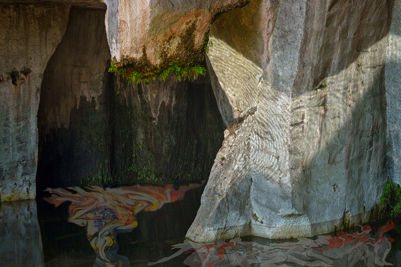
Thanks Steve, I struggled over how to make the figures look more under water. Ultimately I settled on some warp and some selective twirling of the tormented man. I experimented with different opacities of the figures under water, but each time when I lowered the opacities, I felt that the figures were not pronounced enough. |
Dec 15th |
| 34 |
Dec 25 |
Reply |
Thanks Bob. In this case I was too wedded to the original image to crop off the top. I like your rendering in black and white. |
Dec 15th |
| 34 |
Dec 25 |
Reply |
Thanks Jan, I like your placement of the tortured man and the desaturation of the color. However, I had it in my mind that the figure would be (buried) under water, but I think I could have done it more subtlely.
The original photo was one of my favorites - it initially was so dark that you could hardly see anything, but thanks to the RAW format, i was able to lighten it and that is when the circular mineral deposits on the cave wall became visible. |
Dec 15th |
4 comments - 4 replies for Group 34
|
4 comments - 4 replies Total
|