|
| Group |
Round |
C/R |
Comment |
Date |
Image |
| 34 |
Jul 25 |
Comment |
Jan,
I thought that I already commented on this - sorry! I like this piece a lot. In particular - I like the way you combine vastly different subjects into a piece that works very well. Not to mention your artistry in stitching it all together. I almost feel my vertigo coming on watching your husband casually walking the flamingo - hopping from cube to cube high above Manhattan. I also like the way you layer the clouds and birds, blur the buildings in the distance, and give the sky an oil painting like texture to give the piece a dreamy feel. |
Jul 28th |
| 34 |
Jul 25 |
Comment |
Thanks Frans. I had trouble with the lighting from the very beginning. (so much to learn...!) |
Jul 26th |
| 34 |
Jul 25 |
Comment |
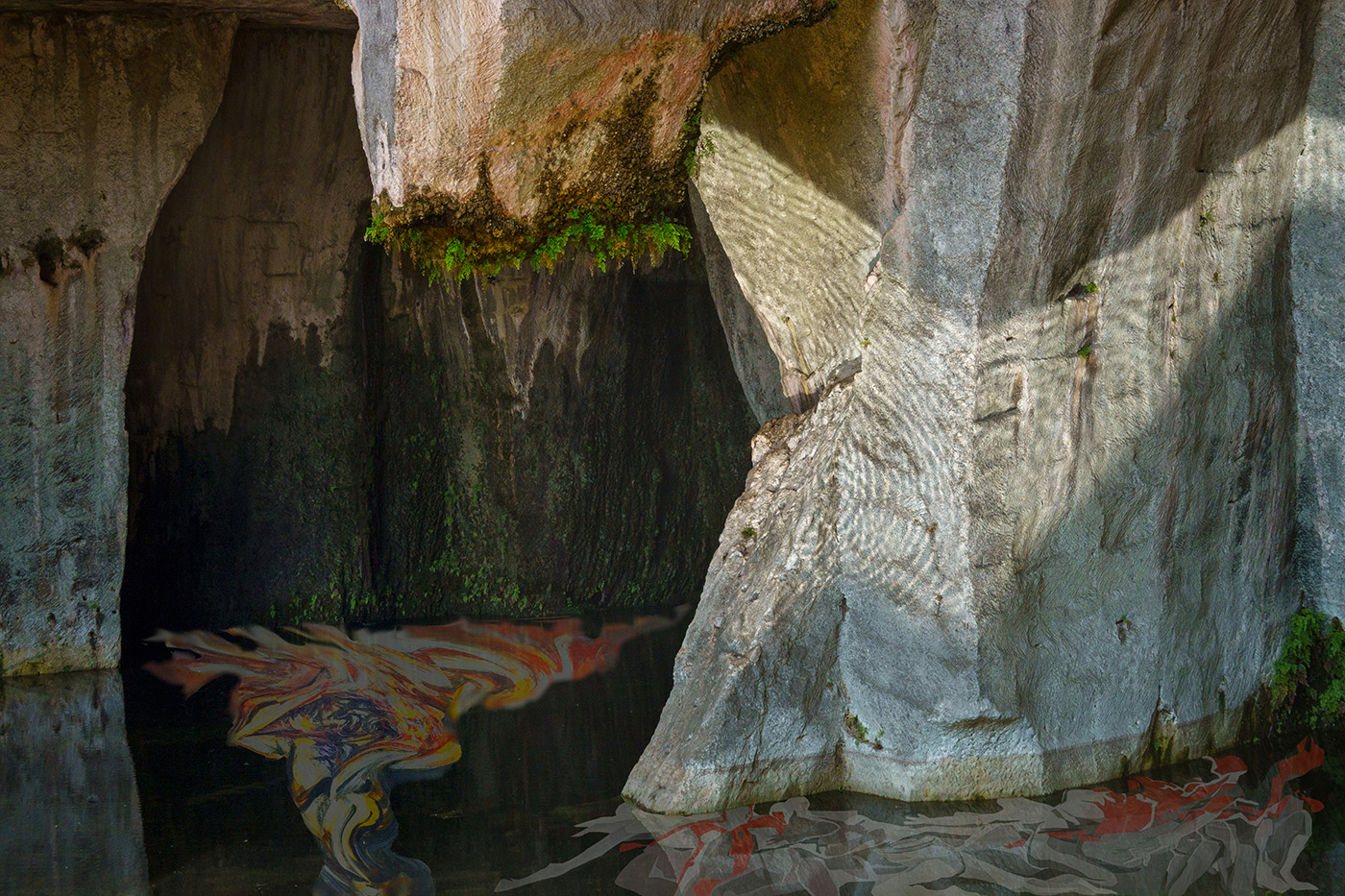
Frans, I agree with Patrick and Jan. I think that re-working the whale tales and fins could add a lot to your image. I like how you turned what might have been a disappointing... well certainly a physically uncomfortable whale watch... to an image composition challenge. Your technique summary spurred my interest in Nik 6 Silver Efex and luminosity masks. I have relied on using the curves adjustment in PS to accent various parts of an image - I can see how luminosity accomplishes this in a more controlled and better way. |
Jul 16th |
| 34 |
Jul 25 |
Comment |
Nice Steve! The image reminds me so much of the black light album covers from the 60's/70's. Where did the doglike cartoon figure at the top of the pine cone come from? |
Jul 14th |
| 34 |
Jul 25 |
Comment |
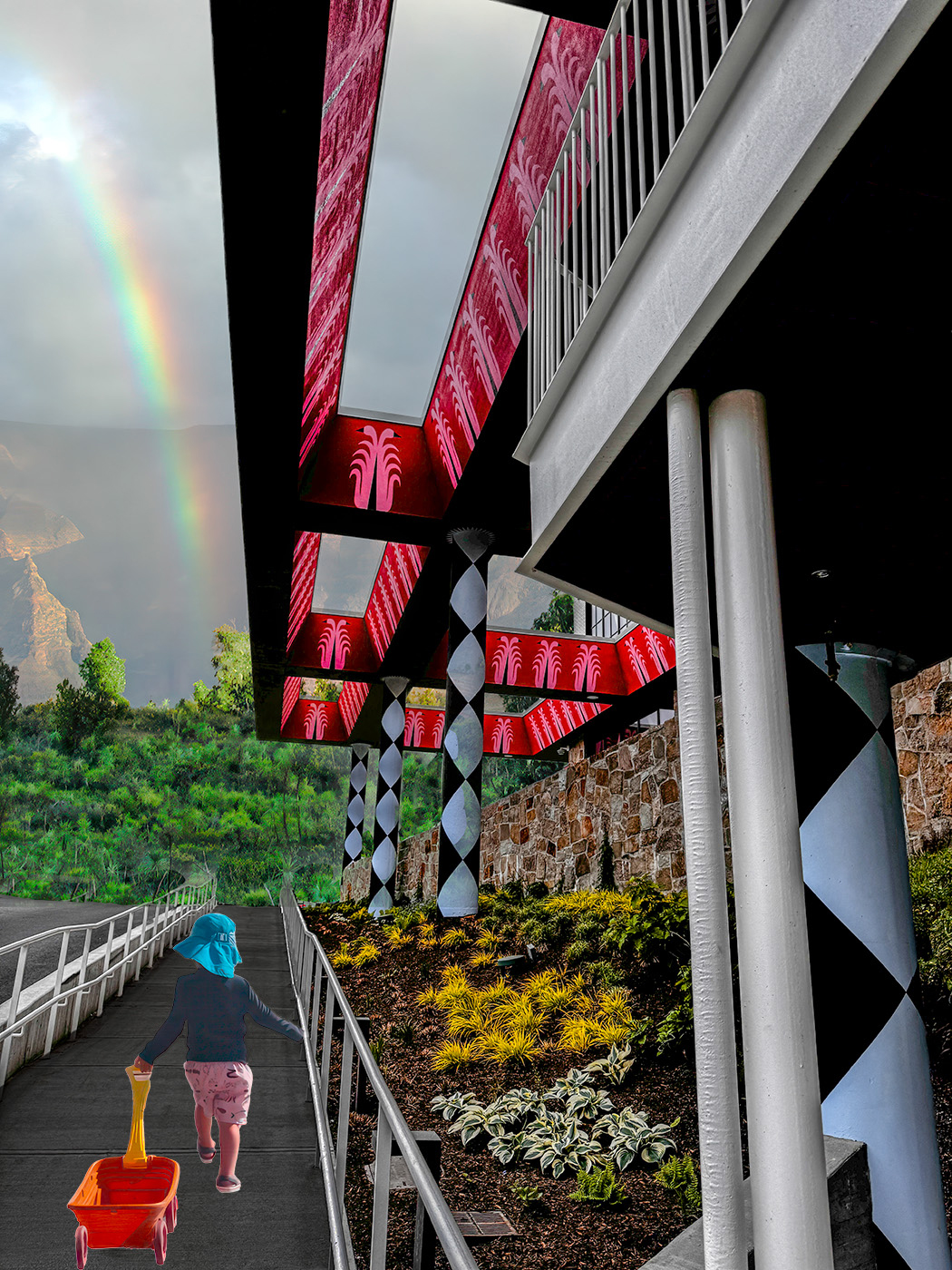
Nice Patrick! Your image is vividly realistic but also fantastical and menacing. I like the way you used the shark's teeth to construct a scary stamen (?) - and the eyes work wonderfully to give the viewer the unsettled feeling of being tracked by the flowers. The reflections on the water are very good, contributing to overall feeling of realism. And I love the timid flower in the background poking its head out from behind a tree trunk. |
Jul 14th |
| 34 |
Jul 25 |
Reply |
Thanks Jan - the colors of the structure above the wall were quite vivid to begin with. That is what initially drew my eye. I was a bit confused as to where the light should have been coming from, and the light on the boy's leg did seem a bit out of place.
Regarding the shadow - yes, I see how your modification improves the cut and paste look in my version. Could you describe how exactly you painted in the shadows? |
Jul 14th |
| 34 |
Jul 25 |
Reply |
Thanks for your comments Patrick. I struggled a bit with the light on the child's right leg, and in other places. I tried adjusting with brightness/contrast, but when I did that, the color was way off - and adjusting colors is one of the things I need to improve on in PS! |
Jul 14th |
5 comments - 2 replies for Group 34
|
5 comments - 2 replies Total
|